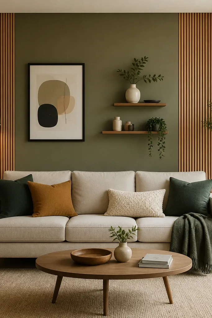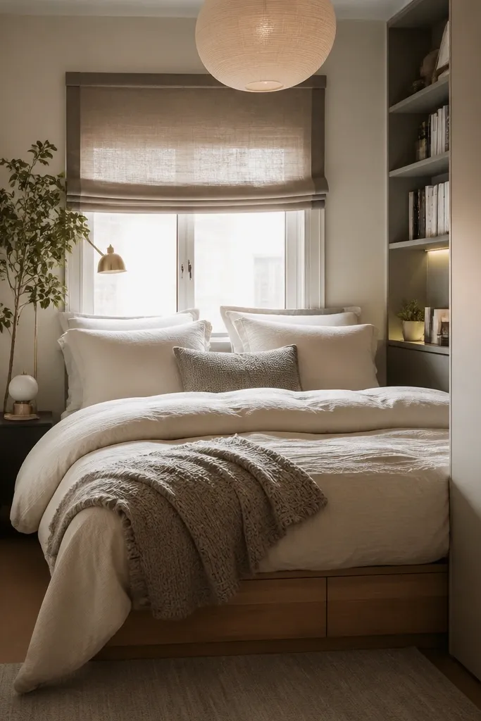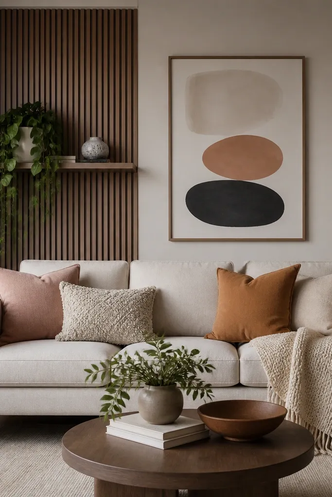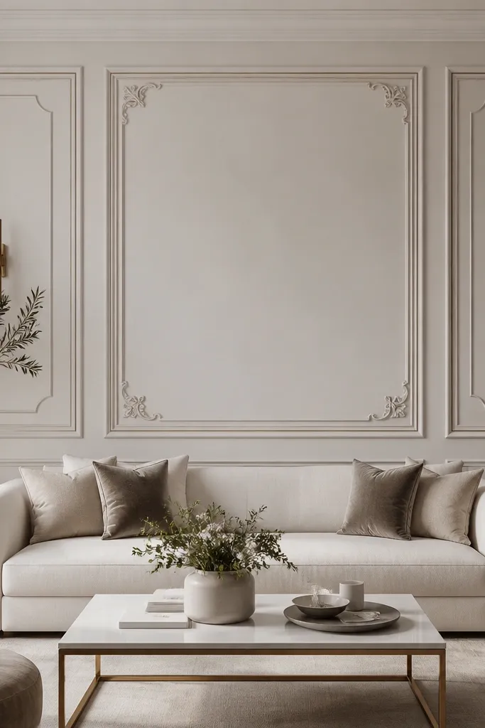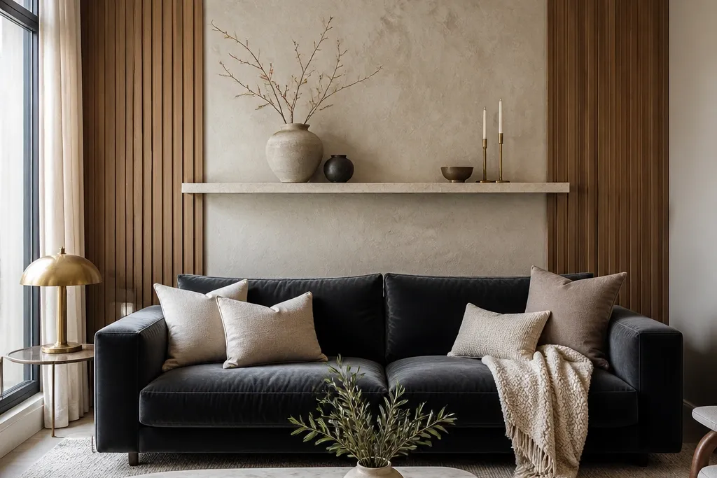

1. Fluted walnut wall panel with a centered sofa rail
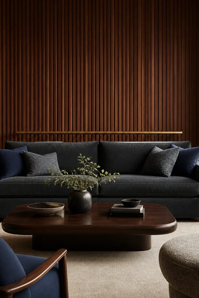
This is the closest thing to instant “expensive” without going maximal. The vertical fluting adds shadow lines that look sharp even in daylight, and walnut brings that warm, modern luxury tone against cooler fabrics like charcoal, navy, and mushroom beige. I like it best with a sofa that has a clean, straight back because the flutes echo the geometry. For lighter skin tones and warm undertones, walnut looks especially flattering because it warms the whole palette. The key is the centered rail — it tells your eye where the sofa’s back height belongs.
Start by marking the sofa centerline on the wall and measuring the panel width so it covers 60-75% of the sofa width. Install the fluted panel system first, keeping the top edge aligned with the top of the sofa back cushions (within 1-2 inches). Add a slim horizontal rail or picture ledge across the panel at cushion height, then paint the surrounding wall a soft off-white with a matte finish. Finally, run warm LED strips or recessed micro-washes so the light hits the flutes from above and slightly to the side.
Good to knowUse 2700K warm lighting and keep the LED brightness moderate so the wood grain looks like it has depth, not glare.
AvoidDon’t let the panel run full width to the edges of the wall — that makes it feel like a TV wall, not a sofa feature.
2. Oversized linen wall art triptych with matching frame widths
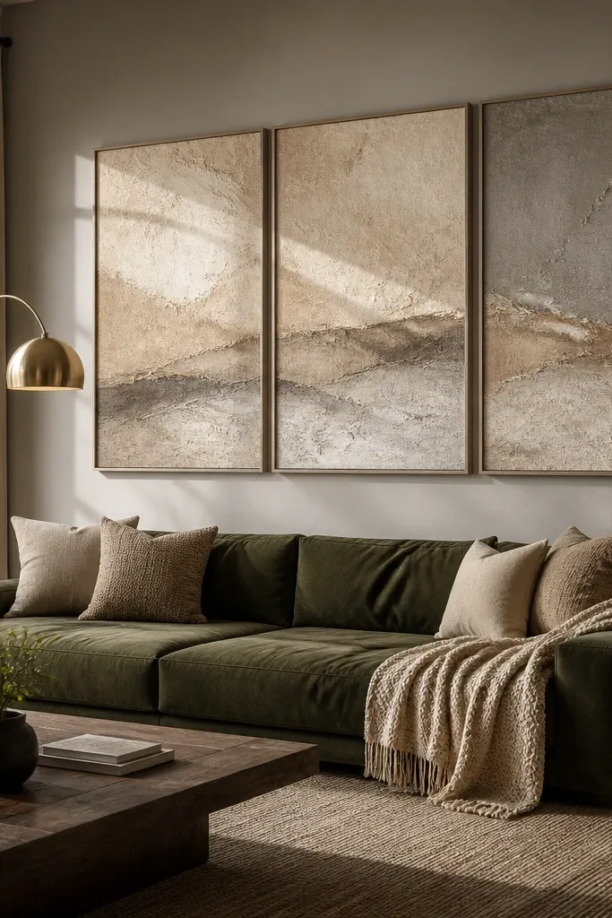
When your sofa has a lot going on (pillows, textured fabric, or a tufted back), big flat art keeps things calm. Linen wall art reads modern luxury because the texture is quiet and the colors feel expensive — oatmeal, sand, stone gray, and greige. I’ve used this over sofas in rooms with brass lamps and it still feels cohesive because the frames are matte, not shiny. It flatters most color palettes, especially if your rug has beige or taupe tones, because it creates a continuous warm band behind the sofa. The design principle is repetition: same frame width, same spacing, same tonal family.
Pick a triptych size that spans about 65% of your sofa width — for an 86-inch sofa, I’d aim for roughly 56 inches across total. Use frames with the same internal border width on all three pieces so the grid looks intentional. Hang the center panel so its midpoint lands about level with the sofa back cushions, then keep the vertical gap between panels around 2-3 inches. Finally, style one or two decor pieces on a console or shelf below in a matching material, like a ceramic vase in warm white and a small walnut tray.
Choose tonal art with a matte surface so it doesn’t reflect overhead lights and turn into a glare patch.
Skip glossy prints — they look cheap fast when the room has recessed lighting.
3. Stone-look tile slab wall with a micro-shelf ledge
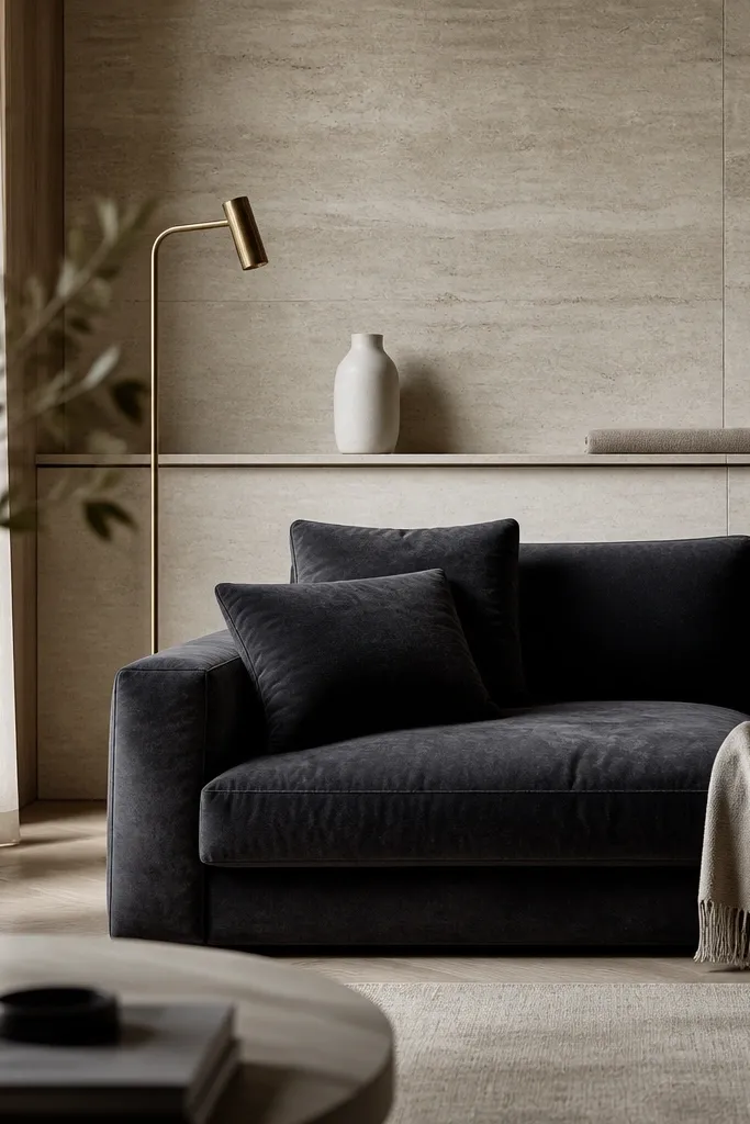
Stone-look tile behind a sofa gives you that luxury hotel feel without the weight and mess of real slabs. Honed travertine or calacatta-look porcelain reads clean and modern because the surface is not glossy. This works best when your sofa fabric is smooth (performance velvet, tightly woven linen, or leather) since the stone texture adds the richness. It also flatters cooler palettes like slate gray and crisp white because the warm undertone of travertine keeps the room from feeling sterile. The principle here is contrast: smooth seating in front, tactile wall behind.
Choose a tile format that looks slab-like, such as 24x48 or 24x24 large tiles, and plan grout lines so they stay minimal. Dry lay a test section on the floor and adjust tile order until the veining flow looks centered behind the sofa. Install the tile up to a height that lands the top edge around the sofa cushion height, then add a micro-shelf ledge (about 6-8 inches deep) centered under the feature. Finish with warm wall lighting aimed across the tile at a shallow angle so the texture shows.
Use a light warm grout (not bright white) so the stone reads like one continuous surface.
Don’t choose high-gloss stone-look tile — it reflects and makes the wall feel like a kitchen backsplash.
4. Grid of framed art with brass spacers and a black sofa rail line
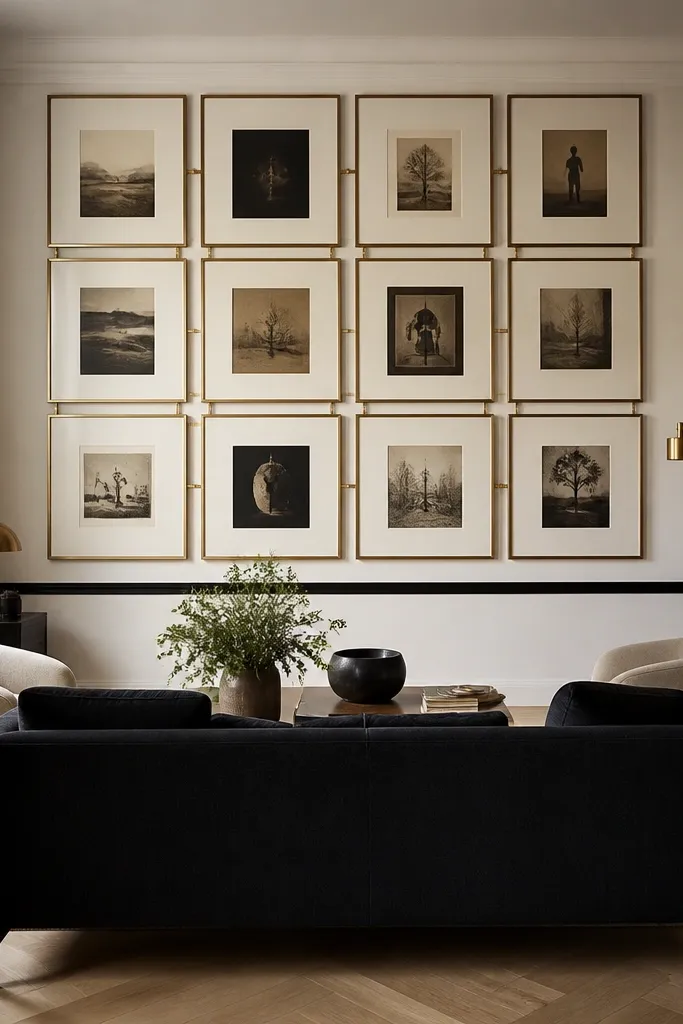
This is the modern luxury way to do a gallery wall — structured, not chaotic. The matte black frames keep it crisp, and the brass spacers add that subtle shine that reads expensive in person. I like it most behind a sofa with a low-to-mid back because the grid adds vertical structure without swallowing the room. For people with warm or medium skin undertones, brass looks great against creamy art tones and makes the whole wall feel warmer. The key is alignment: every frame shares the same top line and the same spacing so it looks designed, not hung randomly.
Pick six frames with matching sizes and keep the grid width at around 65-70% of sofa width. Use brass spacers or standoffs between frames, and keep the spacer thickness consistent so the light hits each gap evenly. Hang the top row so the grid’s center aligns with the sofa cushion height, then step back and check the vertical level from the room’s main seating position. Add a slim black molding or rail across the wall at cushion height only if your wall is otherwise plain — it anchors the whole composition. Style the console below with one brass item and one matte ceramic item so the metallics feel intentional.
Measure from the sofa centerline, not from the wall edge, so the grid stays centered even if your room has an odd layout.
Skip mixed frame finishes — the wall looks like a thrift haul instead of a luxury feature.
5. Tall bookcase panel behind the sofa with concealed LED toe kicks
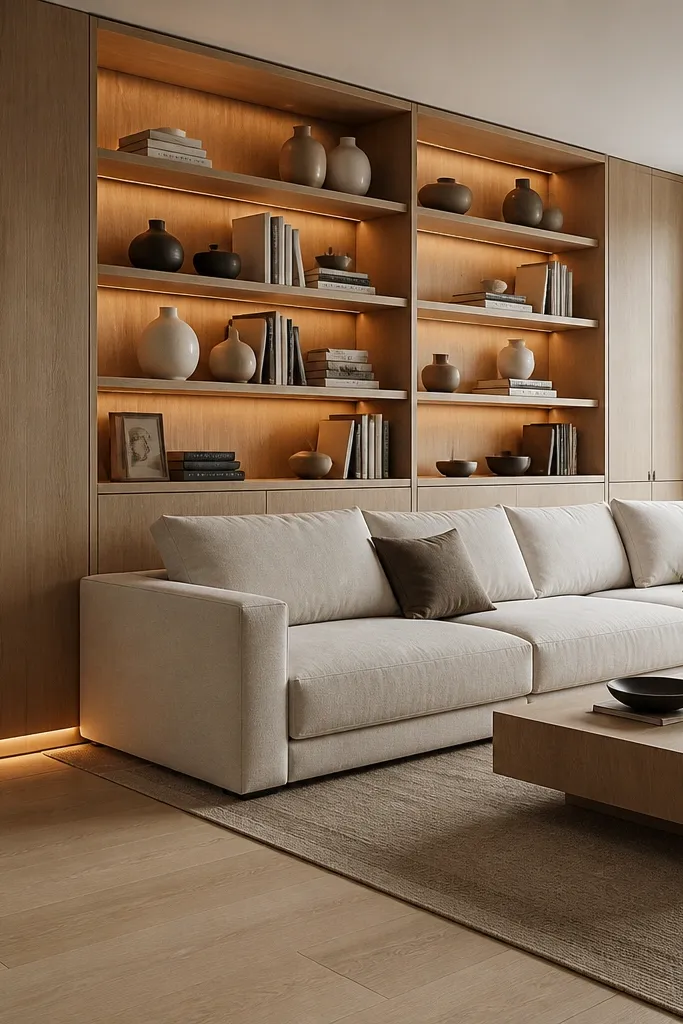
Built-in shelving behind a sofa is one of the few designs that keeps looking good as seasons change. You get storage, display space, and a clean architectural backdrop all in one. Warm oak and flat, minimalist trim read modern luxury because the lines are straight and the materials look real. This works especially well if your living room is narrow, because it adds height visually without adding bulk. It flatters rooms with neutral rugs and simple curtains since the shelves become the main texture. The principle is controlled styling: the wall is busy only where you want it to be.
Plan shelf height so the center shelf lines up with the sofa back cushion height; I aim for the middle shelf to sit around that level. Use LED toe-kick or under-shelf lighting so shadows fall softly into the shelf depth. Keep open shelves on the sides and consider a closed section or two at the bottom so clutter doesn’t show. Install with a consistent reveal (the small trim gap between shelves) so the wall looks intentional. Style with a 60/30/10 rule: 60% neutral books or objects, 30% negative space (leave shelves empty), 10% accent color like deep green or rust.
Use bookends in the same wood tone as the panel so the shelf edges don’t look mismatched.
Don’t fill every shelf — empty space is what makes the whole thing look designed.
6. Large-format mirage glass panels with a brushed nickel frame
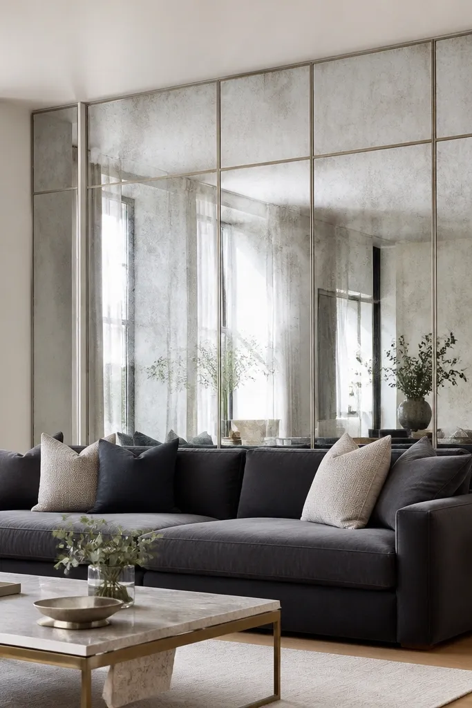
If you want modern luxury with a light, airy feel, glass panels behind the sofa do it fast. The brushed nickel frame keeps it cool and clean, while a subtle textured glass (not a perfect mirror) prevents the room from looking like a funhouse. This is a strong move for small living rooms because it brightens the wall without adding color. It also flatters people with lighter, cooler-toned palettes because the nickel harmonizes with whites and grays. The principle is controlled reflection: enough to bounce light, not enough to show every shadow and object.
Choose a panel size that covers about 60% of the sofa width and hang it so the bottom edge aligns around mid-cushion height. Use a frame depth that’s slim (around 1-2 inches) so it doesn’t look bulky. Mount with correct anchors into studs, then clean the glass with a streak-free solution before final installation. Style the wall with one minimal object below (a slim console with nothing piled on it) so the reflection doesn’t feel cluttered. Pair with matte black or brushed nickel hardware elsewhere so the metal doesn’t feel random.
Good to knowPick textured glass that blurs reflections slightly — it looks calmer at night.
AvoidAvoid fully reflective mirrors behind a sofa if you have overhead glare — it makes the wall look messy.
7. Oversized upholstered wall panels in charcoal with nailhead trim
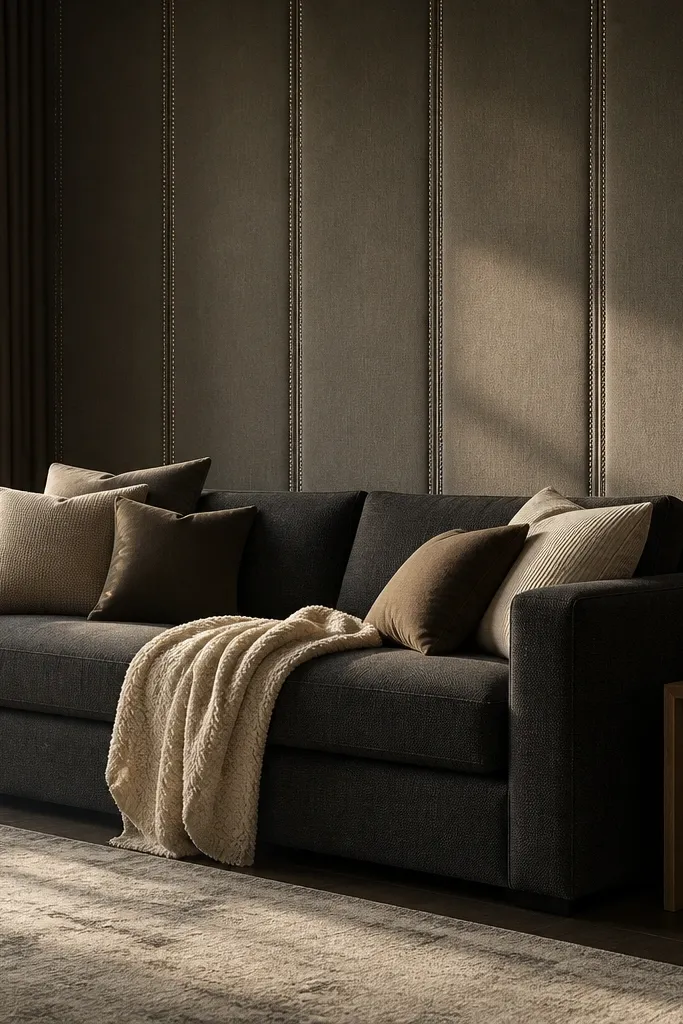
This is how you make a sofa back wall feel like it’s part of the furniture. Upholstered panels add sound dampening and warmth, which matters if your room has hard floors or echoing ceilings. Charcoal or deep taupe looks modern luxury because it anchors the space and makes the sofa fabric look richer. Nailhead trim adds a crisp edge without going flashy. I’ve used this in rooms with light wood floors and it looks expensive because the texture absorbs light instead of reflecting it. The principle is soft structure: a defined shape, upholstered like a headboard.
Measure the panel width so it covers roughly 70% of your sofa width, and decide on a height that lands the top edge near the sofa cushion height. Use a fabric with a tight weave or performance texture so it doesn’t look fuzzy from across the room. Install with a backing board (like plywood) first, then wrap the fabric taut and sew or staple neatly at the back. Add nailhead trim along the perimeter with consistent spacing, then mount wall sconces on either side at about eye level. Keep the console below simple — one tray and one lamp is enough.
Choose a fabric shade that’s 1-2 steps darker than your sofa for contrast without looking harsh.
Don’t use a loose, thick pile fabric that sheds — it looks sloppy quickly.
8. White limewash plinth wall with a centered black framed sconce
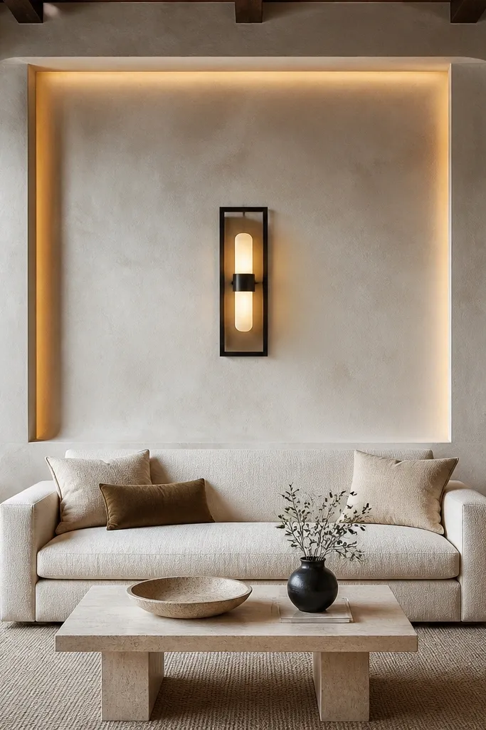
Limewash-style walls behind a sofa look like they belong in a design-forward apartment because they have depth even when the color is neutral. A plinth-like recessed area gives you a focal point without adding clutter. I love this when your sofa is a creamy beige, ivory, or light gray because the wall texture makes the fabric look richer. It flatters warm undertones because limewash has a soft, antique feel rather than a sterile white. The principle is texture over objects: the wall itself becomes the art.
Prep the wall by patching holes and sanding smooth, then apply a limewash or limewash-style paint in a white base with a soft gray undertone. Create the plinth effect by masking a centered rectangle and painting it one shade darker, keeping edges crisp with painter’s tape. Install a centered sconce with a black backplate so the focal point sits at sofa cushion height. If you want extra luxury, add a thin floating shelf below the sconce only 4-5 inches deep. Style the shelf with a single ceramic piece in warm white and stop there.
Test limewash samples on your actual wall under morning and night lighting; the undertone changes fast.
Don’t pick bright pure white — it makes limewash look flat and cheap.
9. Matte black slat wall with a floating media console line
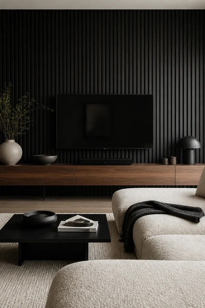
A slat wall is modern luxury when it’s matte, evenly spaced, and paired with clean furniture lines. Matte black makes the slats read like a graphic design — sharp from across the room, not glossy and messy up close. This looks best with a sofa that has a smooth back and minimal tufting because the slats already provide the texture. It flatters cool palettes and looks great with black metal accents, like lamp bases and curtain rods. The principle is a strict grid: the wall lines lead your eye to the center of the sofa.
Measure the sofa width and pick a slat wall width around 60-70% so it doesn’t overpower the space. Use 1-inch slats with consistent spacing (around 2-3 inches between centers) and keep the slats perfectly level before fastening. Paint the slats with a matte finish and let it cure fully before styling. Install a floating console below and keep its top edge aligned with the lower third of the slat wall for visual balance. Style with two items maximum on the console — one low ceramic and one tall vase — so the black doesn’t feel heavy.
Use a laser level for the first slat and pull a string line for the rest — slight drift shows immediately.
Don’t mix different slat widths — it reads sloppy instead of high-end.
10. Walnut picture ledge wall with vertical paneling and framed art
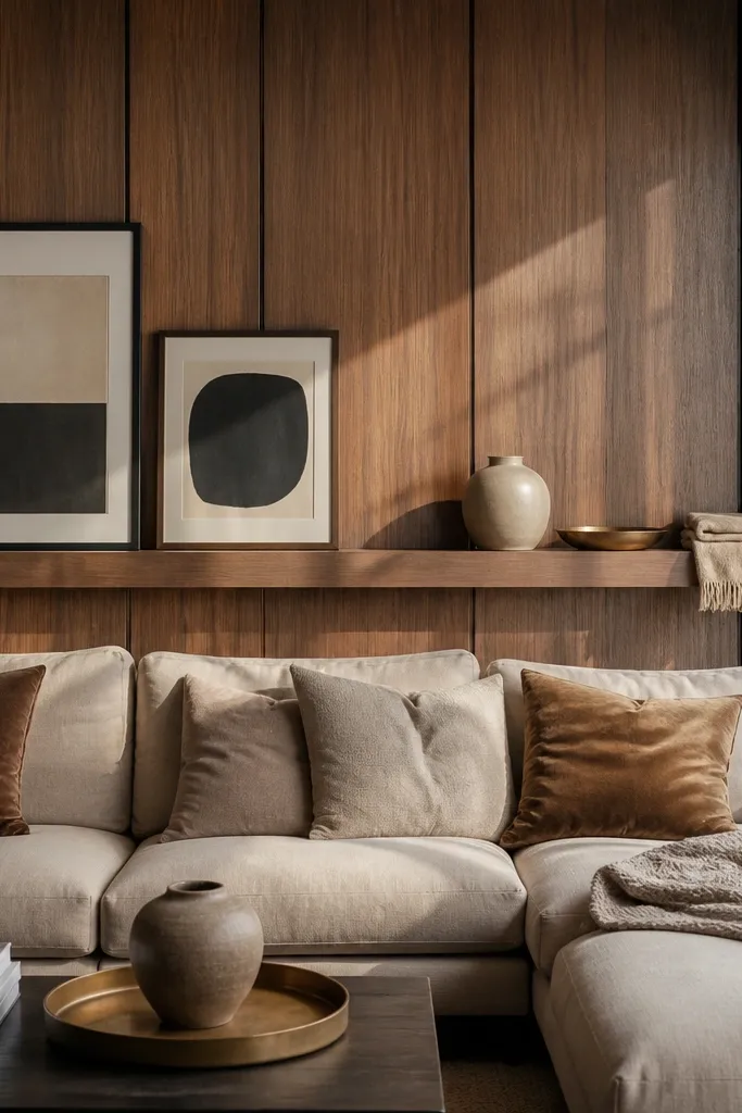
This design works when you want art but also want that built-in, modern luxury feel. Vertical walnut paneling adds warmth and depth, while the picture ledge creates a practical styling surface for objects that look good in close-up. I’ve done this in rooms where the wall is too narrow for a big art piece, and the ledge solves that by giving you a layered look. It flatters both warm and cool palettes because walnut tone bridges them. The principle is layering at different heights: wall texture, framed art, then small objects on the ledge.
Start with vertical paneling that spans 65-75% of the sofa width and keep the height around sofa cushion height. Install a picture ledge about 4-6 inches from the top of the sofa back cushions, centered. Hang one large framed piece or a small set above the ledge, using off-white mats to keep the tones soft. Keep frame wood tone consistent with the panel (light oak or walnut) and avoid heavy dark frames if your sofa is already dark. Style the ledge with one tall element and two flat items spaced evenly, leaving gaps between them.
Use picture hooks that let you adjust micro-leveling after the frames hang — it keeps the row straight.
Don’t overcrowd the ledge — five small objects read cluttered fast.
11. Monochrome plaster wall with a floating oval mirror
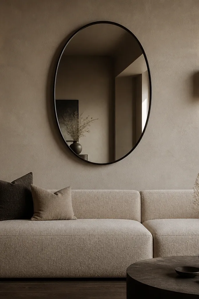
An oval mirror on a plaster-like wall feels modern luxury because it adds softness to straight furniture lines. The floating shadow gap is the detail that makes it look built-in, not like a random mirror you hung last. I use this when the sofa is low and wide because the mirror helps fill negative space without adding visual noise. It flatters most palettes because greige plaster is neutral and forgiving, and the oval shape flatters facial features when you catch reflections in the mirror at night. The principle is one hero shape: keep everything else quiet.
Choose a mirror width around 40-55% of your sofa width so it looks intentional and not like a bathroom fixture. Use a floating mirror mount or a mounting back with spacers so the mirror has a visible shadow gap of about 1/2 inch. Paint or finish the wall with a plaster-style product or matte, lime-plaster effect paint in greige. Hang the mirror so its center aligns with the sofa cushion height, then add one sconce on either side or a single wall light aimed slightly upward. Style the console below with one long, low object like a tray and stop.
If your room has a lot of overhead light, place the mirror so the light hits the wall behind it, not directly into the mirror.
Avoid ornate mirror frames — they fight the modern plaster texture.
12. Large-format wall wallpaper panel in warm geometric tones
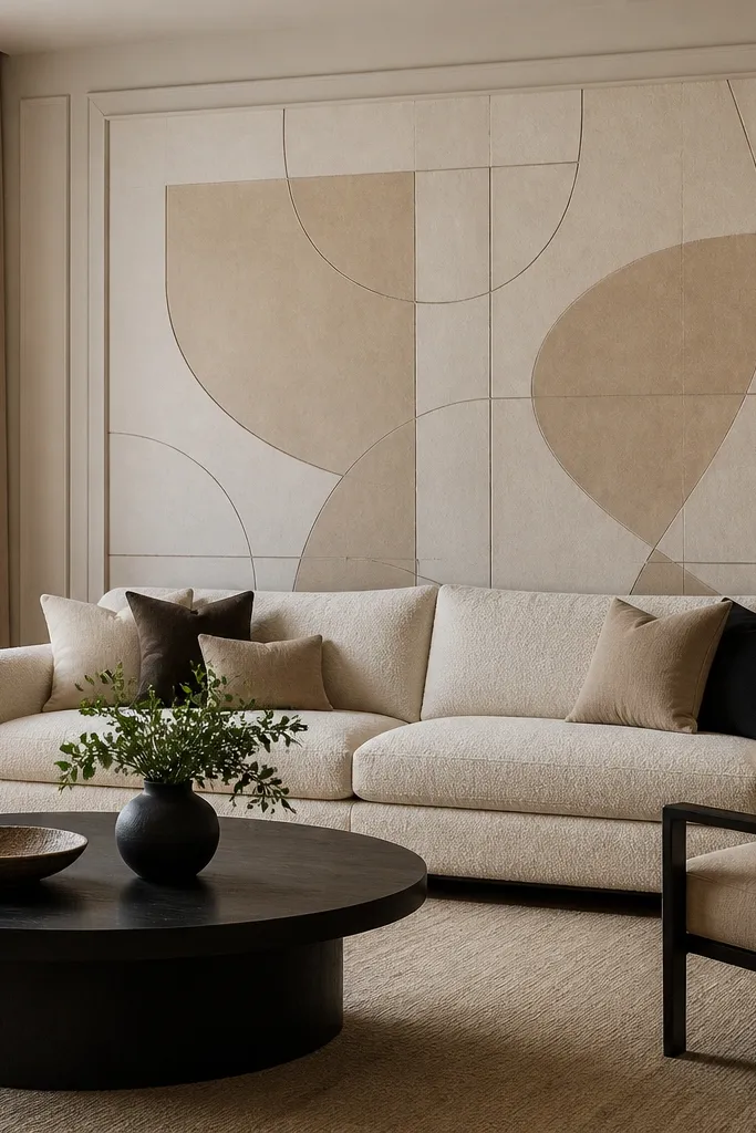
Wallpaper behind the sofa can look high-end when you treat it like a panel, not a full-room pattern. The key is choosing a geometric that’s subtle enough to feel like texture, not like wallpaper. Warm sand and taupe lines on a creamy base look luxury because they blend with wood tones and neutral upholstery. This works best for sofas in solid colors like oatmeal, camel, ivory, or light gray. It flatters people with warm undertones in the room because the palette stays gentle, not icy. The principle is framing: paint borders around the wallpaper panel so it reads intentional.
Pick a centered wallpaper panel width around 65% of sofa width and plan for a clean border of 6-12 inches of painted wall on each side. Apply wallpaper as a rectangle, aligning the pattern so the center point lands behind the sofa center. After it dries, use a straight edge and caulk to create a crisp border line, then paint the surrounding wall the same base color for cohesion. Hang art or a mirror above only if it doesn’t compete with the pattern; a single large piece works better than small clusters. Choose warm lighting (2700K) so the pattern shadows show up at night.
Use matte paint on the border area — glossy paint makes the wallpaper edges look cheap.
Don’t choose a loud high-contrast wallpaper — it turns the sofa wall into the room’s argument.
13. Two-tone wood slat wall with a light oak center stripe
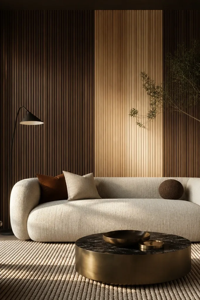
Two-tone wood makes a sofa back wall feel custom because it creates a clear hierarchy. Dark walnut on the outside frames the space, and a light oak center stripe pulls focus to the sofa. This is the modern luxury version of “architectural detail” without a full renovation. It flatters rooms with both warm and cool elements because the wood tones bridge them. I like this when your sofa is mid-tone gray, taupe, or cream because the contrast makes the upholstery read richer. The principle is a focal stripe: keep the rest quieter so the center stripe does the work.
Measure your sofa width and decide the center stripe width at about 30-40% of that measurement. Install dark slats across the full feature area first, then add the light oak center stripe with the same slat spacing so it looks intentional. Keep the top edge aligned with sofa cushion height and the bottom edge aligned with your chosen design height (often 12-18 inches above a console). Add a small recessed shelf or a slim ledge only in the center stripe so the detail repeats. Style the shelf with one object in ceramic and one in wood — no more.
Sand and finish the slats separately so the light oak doesn’t look like it was stained over dark wood.
Avoid uneven slat spacing between the two tones — it shows immediately and kills the luxury feel.
14. Oversized leather headboard-style wall panel in sand
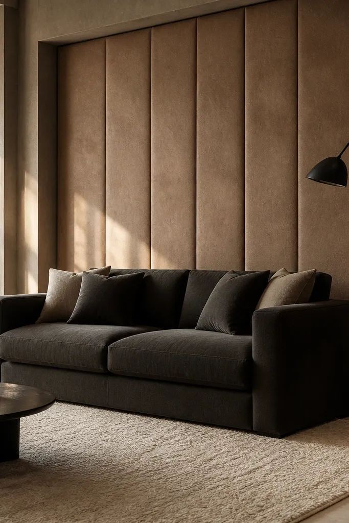
A leather headboard-style panel behind the sofa gives you that boutique-hotel comfort, even if you hate clutter. Sand leather looks modern luxury because it reads warm and clean, and it doesn’t compete with most rugs. This works best with sofas in charcoal, espresso brown, or crisp white because the sand panel creates a soft contrast band. It flatters warm and neutral undertones by adding warmth without orange. The principle is padding and edge control: a firm rectangular panel that looks tailored.
Choose a sand leather or leather-look material with a matte finish so it doesn’t glare under lights. Cover 65-75% of the sofa width and aim for a height that reaches the top of the sofa back cushions. Build the panel backing with plywood, then add foam padding so it has body, not floppy sag. Sew or stitch the perimeter for a crisp edge, then install two wall sconces symmetrically so light grazes the surface. Keep decor minimal below — one slim table or console with a single lamp shade in a warm fabric.
Good to knowIf you’re using leather-look, rub a white cotton cloth lightly — if it transfers, skip it.
AvoidDon’t use shiny bonded leather — it looks plasticky once the room is lit.
15. Curved arch wall niche with a recessed art light
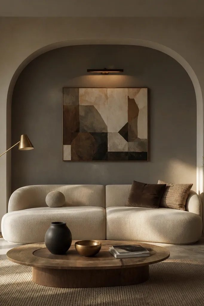
Curved niches feel modern luxury because they soften the hard lines of most sofas while still looking architectural. The trick is to keep the niche centered and proportional, so it reads like a built-in detail rather than a random alcove. Deep warm gray inside the niche makes the art and sofa look more saturated, especially with cream, oatmeal, or light gray upholstery. It flatters cool-toned rooms because the niche color adds warmth depth. The principle is lighting and framing: a recessed art light makes the artwork look like it’s on display, not stuck to a wall.
Mark the centerline and choose a niche width around 55-65% of your sofa width, then decide the arch height so the top lands near cushion height. Build the arch with drywall or a pre-made niche form, then paint it a warm gray with a satin finish for subtle reflectance. Place a framed piece inside with a mat in off-white so it doesn’t disappear into the niche. Add a recessed spotlight above the artwork with a warm bulb (2700K) and aim it so it lights the art surface, not the ceiling. Keep the surrounding wall simple — no extra molding — so the niche is the focal point.
Good to knowUse a dimmer for the art light so you can reduce glare when the sun hits the room.
AvoidDon’t make the niche too shallow — if the depth is less than about 3 inches, the arch won’t read.