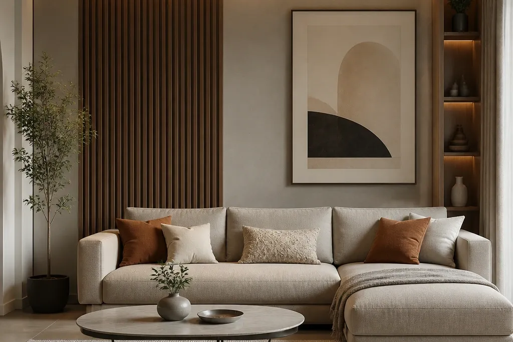
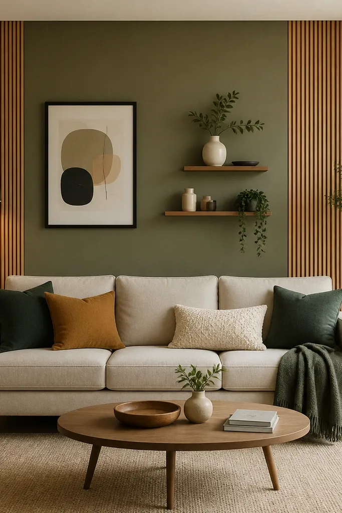
1. Two-tone vertical slat panel behind the sofa
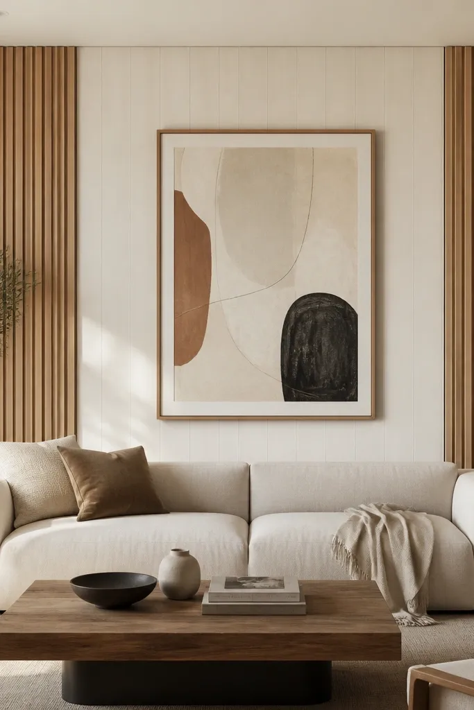
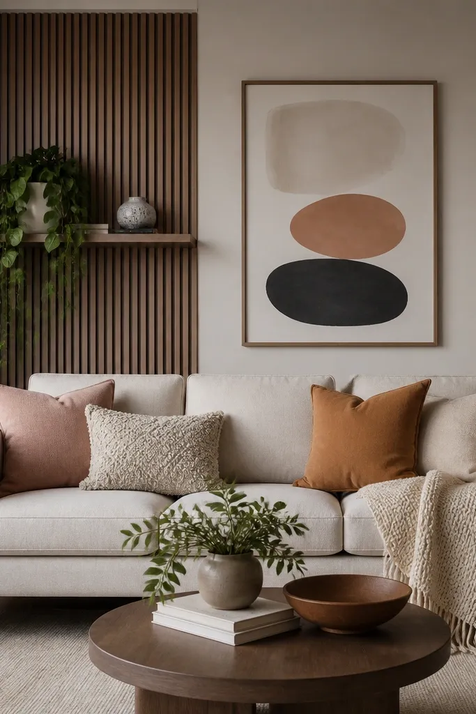
This design gives you that modern “built-in” look without actual carpentry. I’ve done it with 1x3-style slats (or pre-made MDF slats) spaced about 1 inch apart, and the contrast comes from painting the middle band a warmer white than the rest of the room. It flatters most sofa colors because the slats repeat vertical lines, which makes the wall feel taller and cleaner. It also looks great in rooms with medium to dark skin tones in the space because the warm white band doesn’t cast a cold shadow like gray paint can. Keep the art simple — one large piece — so the slats stay the main texture.
Start by marking a centerline on the wall with a level and measuring your sofa width. Decide your coverage — I aim for 80% of the sofa width — then mark top and bottom boundaries so the slat panel stays proportional. Install slats so they align with the boundaries, spacing them evenly and keeping the center band painted before you mount the art. Finish with a large frame centered on the middle band; use a frame width around 2-3 inches so it looks intentional against the vertical texture.
Use a matte paint for the center band and a satin or clearcoat on the slats so they don’t look plasticky in daylight.
Don’t paint slats the same exact shade as your wall — the panel needs contrast to read as a design.
2. Oversized arched mirror with a slim black frame
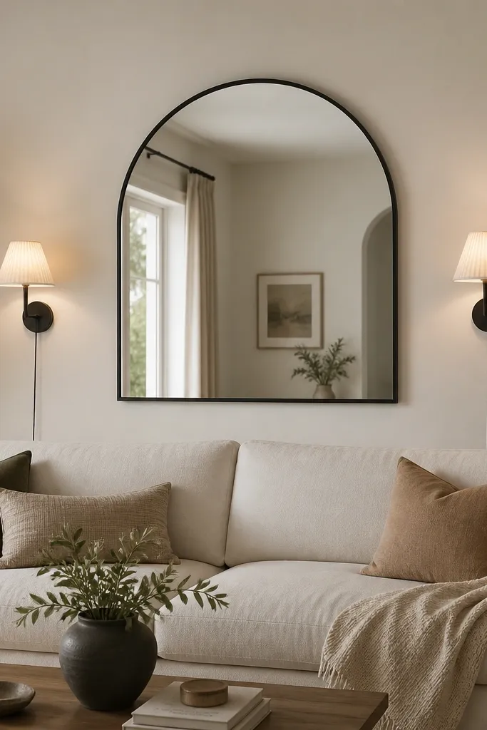
An arched mirror is my go-to when the room feels flat and you don’t want to cover the whole wall. The thin black frame adds a crisp edge, and the arch shape gives softness against straight sofa lines. It flatters small rooms because it bounces light and makes the wall feel deeper without adding clutter. In homes with medium wood floors and warm neutrals, the black frame ties everything together. Style it with two small sconces or wall lights so the mirror looks styled, not like it was hung last minute.
Start by finding the sofa center point and mark it with painter’s tape. Hang the mirror so the top of the arch is about 6-10 inches below the ceiling line, and keep the mirror’s center around 58-60 inches from the floor. Add two matching sconces at the same height on either side (about 4-6 inches from the mirror edge) so the symmetry reads instantly. Finish with a small tray on the sofa table — one candle or one sculptural object — so the mirror and objects feel like a set.
Good to knowChoose a mirror with a slight bevel or subtle texture; plain flat glass can look too harsh next to soft fabric sofas.
AvoidAvoid hanging the mirror too low — if it sits at or below eye level, it looks like a clearance find.
3. Gallery grid with 9 frames in a tight modern layout
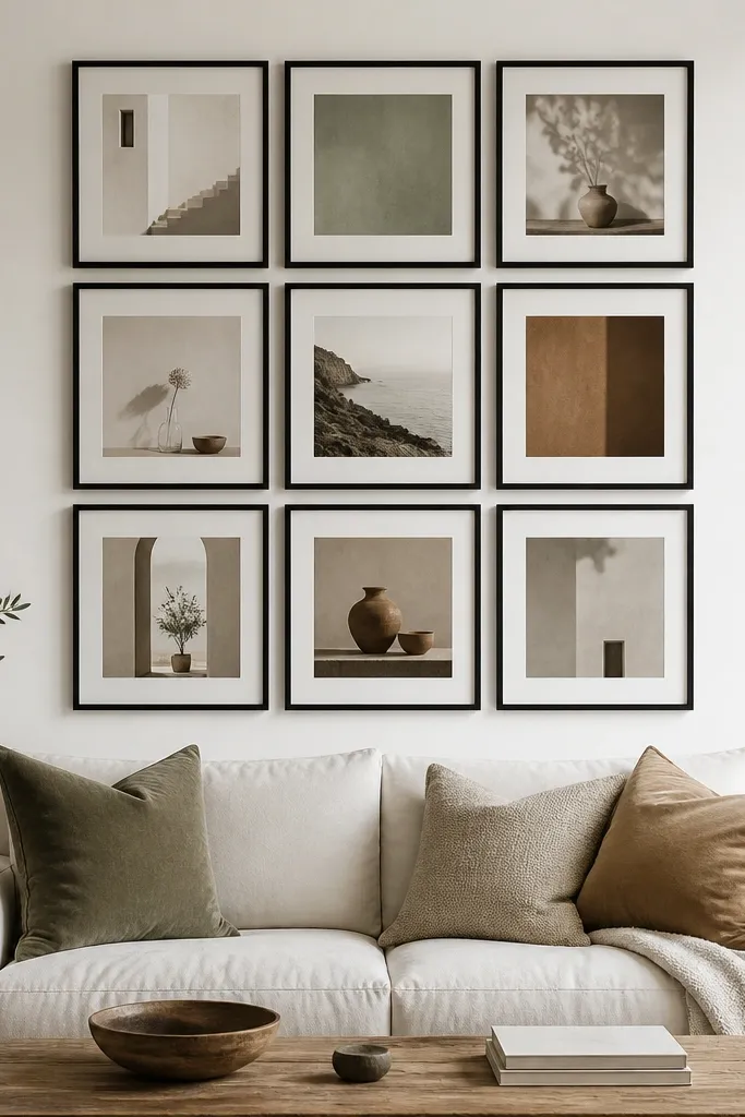
A tight 3x3 gallery grid looks modern because the spacing is controlled and the frames are consistent. I’ve used this layout in rooms with patterned pillows where the art needs to calm things down, and it works because you can keep a limited color palette. It flatters short walls because the grid creates a structured block that doesn’t rely on extra height. It also looks good with both light and dark skin tones in the room because the prints are neutral and don’t reflect weird skin undertones like glossy gold frames can. The trick is to keep the grid tight and the frames thin.
Start by picking frames all the same width, ideally 1-2 inches, and match the mat color to your room’s warm neutral (cream, not bright white). Lay out the grid on the floor first and measure the total width so it covers about 75-90% of the sofa width. Mark the top-left and bottom-right corners on the wall, then use painter’s tape to map the gaps before you drill. Hang the center frame first, then align the rest with a level so the grid stays straight.
Use one mat size across all frames so the gaps look even from across the room.
Don’t mix frame finishes like black and oak — it reads like a bargain bin wall.
4. Float-shelf row with two books and one sculpture per shelf
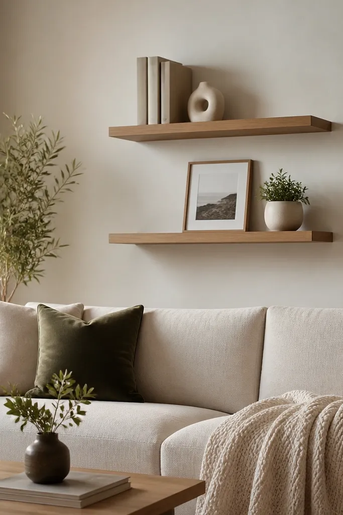
Floating shelves make the sofa back wall useful, and modern ones look clean when the styling is strict. I like a two-shelf setup because it gives height variation without turning into a storage shelf wall. This design flatters almost any living room color because you can keep the objects neutral and let your sofa and pillows do the color work. It’s especially good for rooms where you need a place for books without adding a bulky bookcase. The key is to repeat the same styling rhythm so the wall feels designed, not randomly filled.
Start by choosing shelves with a thin profile (around 1-1.5 inches deep) so they don’t look chunky. Mount the bottom shelf so it sits about 10-14 inches above the sofa back, then mount the top shelf roughly 10 inches above that. Style the shelves with a repeat pattern: two vertical book stacks on each end and one sculpture or plant in the center. Keep the frame on the bottom shelf centered and use a small mat so it doesn’t fight the books.
Good to knowUse book spines with the same tone family — cream, taupe, and charcoal — and hide the loud covers behind stacked books.
AvoidSkip knickknacks everywhere. If you fill every inch, it stops reading modern.
5. Painted picture frame molding around the sofa zone
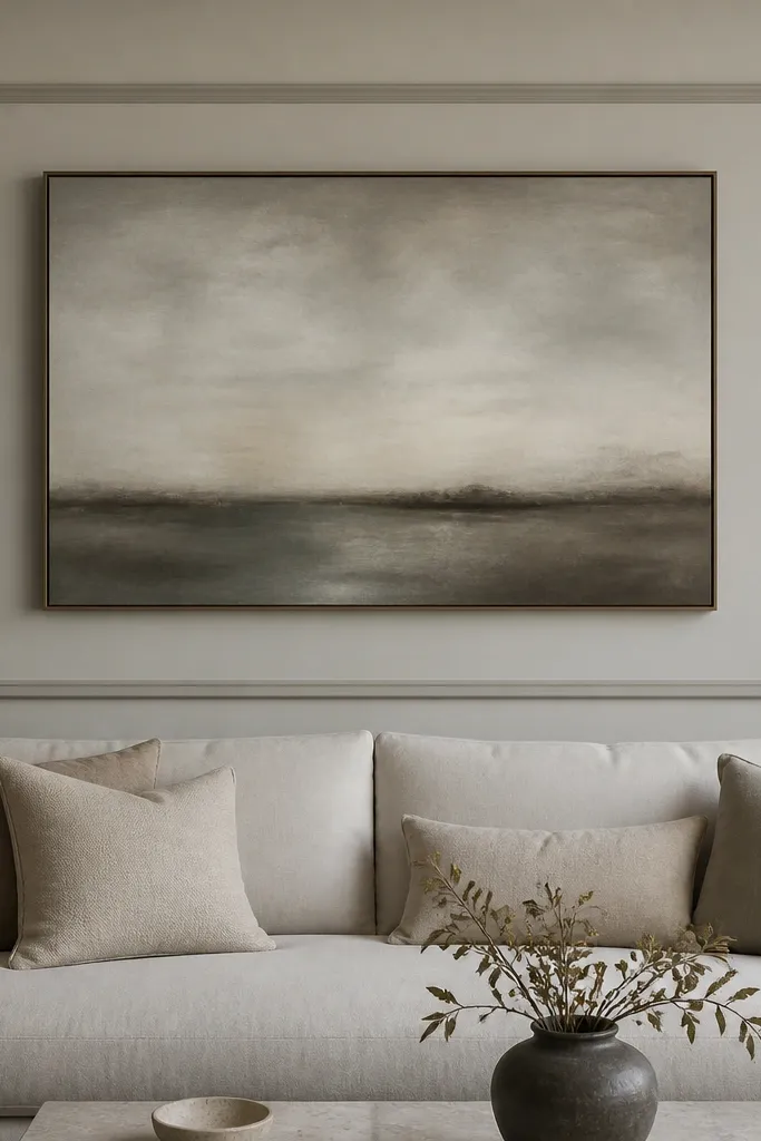
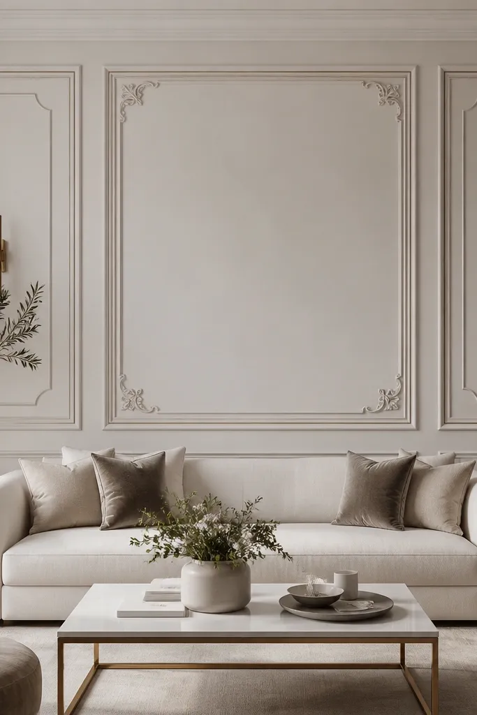
This is the cleanest way I know to make a plain wall look custom without buying furniture. The trick is using molding or trim to create a rectangular “photo frame” around the sofa zone, then painting the frame a shade deeper than the wall. It flatters rooms with plain walls and simple sofas because it adds a boundary your eye can follow. It also makes the art look more important, since the frame gives it context. If your room has a lot of straight lines — modern sofa legs, blinds, or a simple rug — this molding makes everything feel intentional.
Start by deciding the frame size: cover about 80% of your sofa width and keep the frame height around 55-65% of the sofa back height. Use 1x2 or similar thin trim pieces and cut corners cleanly. Paint the wall first, then paint the trim with a satin finish so the edges show. Mount the artwork centered inside the frame, leaving about 2-4 inches of border space between the art and the trim.
Good to knowUse painter’s tape to mask a crisp line and press it down hard along the trim edges before rolling paint.
AvoidDon’t choose a frame color that’s too close to the wall — if the difference is only a shade, it won’t read as a frame.
6. Vertical fabric wall panels with a neutral linen look
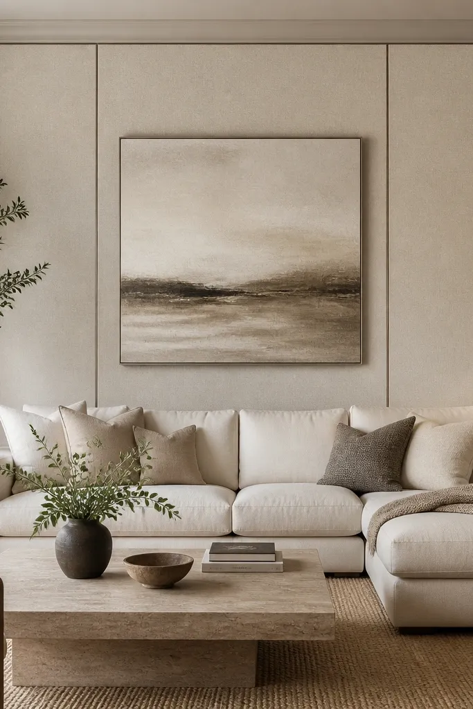
Upholstered panels behind the sofa make the room feel softer and quieter, and they look expensive when you keep the fabric matte. I’ve used linen-look panels in light oatmeal and camel tones because they hide wall imperfections and don’t glare under ceiling lights. This design flatters people who want a cozy living room without adding more cushions everywhere. It also works well if you have pets, since fabric texture hides scuffs better than glossy paint. Keep the sofa fabric simple so the wall texture becomes the star.
Start by measuring the sofa width and dividing the wall zone into three vertical sections, each about 25-30 inches wide depending on your space. Install panel frames or adhesive-backed panels with straight alignment to the centerline. Choose a matte linen-look fabric and keep seams aligned so the vertical lines stay clean. Hang one large centered canvas or framed print using a simple black or wood frame that matches the panel tone.
Use fabric panels with a slight variation in weave; perfectly smooth fabric can look like wallpaper and cheapen the look.
Don’t pick a wall fabric that’s too gray — it can make warm wood floors look dirty.
7. Large triptych art with consistent spacing
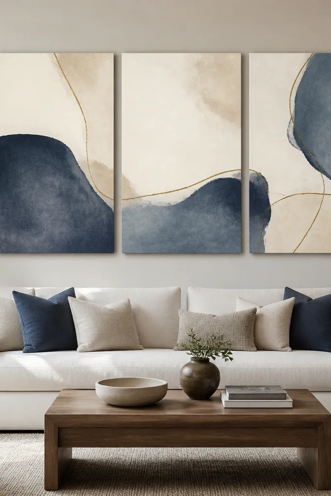
Triptych art is a smart modern move because it stretches across the wall while keeping one cohesive theme. I like muted color palettes here because the sofa and rug already carry the bolder tones in many living rooms. It flatters both small and medium spaces because the panels create visual movement without needing multiple frames. If your sofa is a solid color, triptych art gives dimension without adding clutter. And the best part is the spacing — when it’s consistent, the whole wall looks designed even from across the room.
Start by choosing a triptych where the total width covers about 80% of the sofa width. Mark the centerline and measure the gap you want between panels — I use 2-3 inches total gap across the triptych, split evenly between panels. Mount the center panel first, then use a level to align the left and right panels so the top edges stay level. Keep the artwork about 4-8 inches above the sofa back so it reads connected to the seating area.
Good to knowPick a frame-free or thin floater frame triptych so the wall stays modern and not overly ornate.
AvoidAvoid triptychs that are too small for the sofa — if it looks like it could hang in a hallway, it will.
8. Back wall wallpaper band with a calm geometric pattern
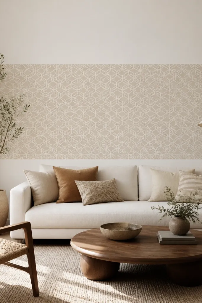
Wallpaper bands work because you get the pattern without committing to the entire room. I’ve installed a mid-height band that sits behind the sofa and it instantly makes the wall feel finished. Pick a geometric pattern with low contrast so it looks modern, not busy — taupe on cream is my favorite. This flatters almost every sofa color because the band is neutral and the shape repetition gives structure. If your rug has a pattern, a calm geometric band keeps everything cohesive rather than competing.
Start by measuring the exact wallpaper band height — I use about 60-70 inches tall, centered behind the sofa. Paint the wall first and let it cure, then apply the wallpaper band with careful alignment to the centerline. Use a straight edge to keep the top and bottom edges clean; I like adding a thin trim line at the edges if you want it to look custom. Hang a simple framed print centered in the middle of the band, or skip art if the wallpaper pattern is strong enough.
Use a matte primer and matte topcoat on the surrounding wall so the wallpaper and paint don’t shine differently under light.
Don’t choose a high-contrast wallpaper — it will fight your sofa pillows and make the whole wall look busy.
9. Slim ledge ledge shelf with a row of candles and books
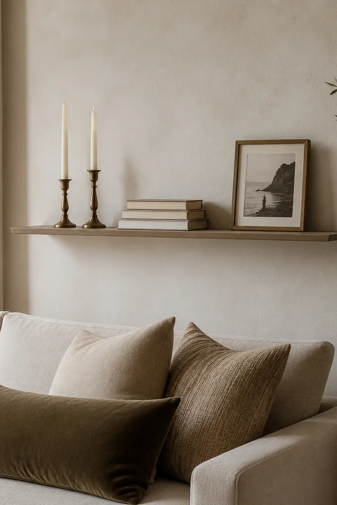
One slim ledge looks modern because it gives a horizontal line without turning the wall into a storage grid. I use this when the rest of the room already has strong vertical texture like a tall rug or curtains. It flatters rooms where you want a tidy back wall but don’t want to commit to lots of frames. The candle-and-book styling adds warmth and height variation, especially when the candles are different heights. Keep the palette neutral so the shelf doesn’t compete with your sofa upholstery.
Start by choosing a shelf depth around 3-4 inches, not deeper, so it stays visually light. Mount it about 8-12 inches above the sofa back and center it to the sofa. Style in a line: one stack of books centered, then place candles at both ends with a small framed photo or tiny plant in the middle. Leave at least 2-3 inches of empty space between objects so the shelf looks intentional.
Good to knowUse candleholders with the same finish (brushed metal or matte ceramic) so the line looks cohesive.
AvoidDon’t pack the shelf full. Crowded shelves read cheap fast.
10. Statement wall light sconces with a centered mirror
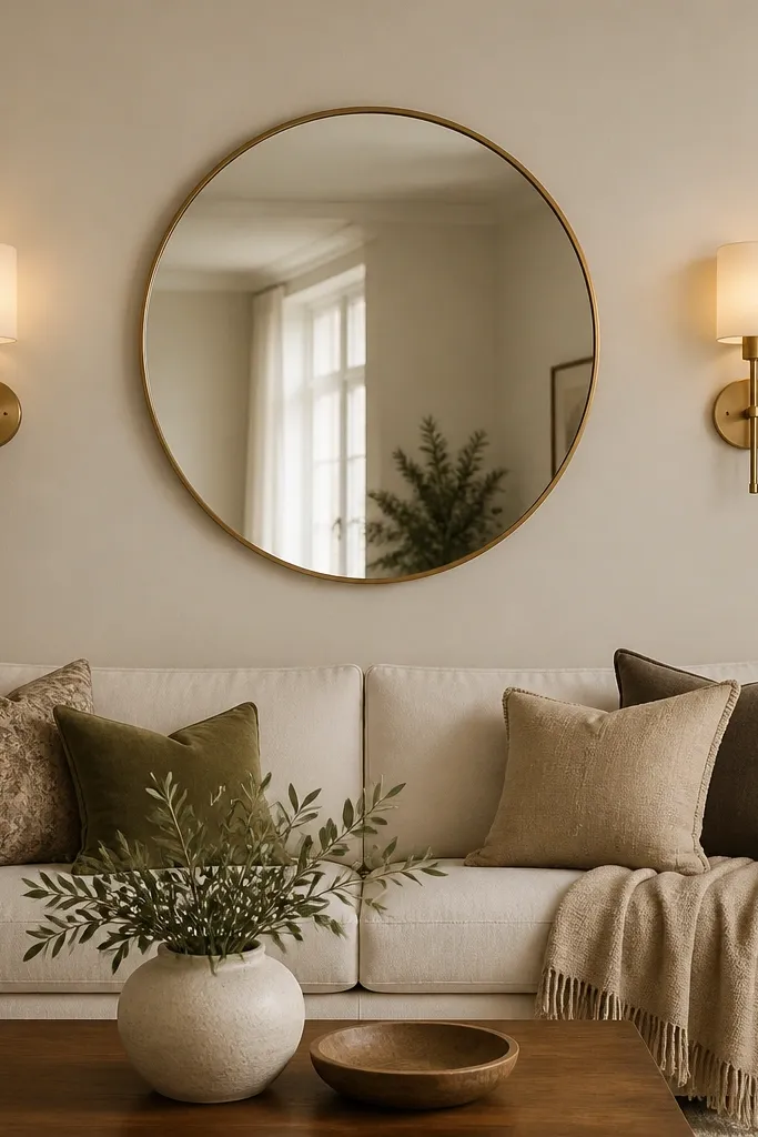
Lighting is the part people skip, then wonder why their sofa wall still looks flat. Pairing two matching sconces with a centered mirror makes the wall look layered and finished, even if you keep the rest simple. I love brushed brass sconces because they warm up neutral walls and look good against both cool and warm fabrics. This flatters people who want a modern look but still want cozy evening lighting. The mirror also helps the sconces reflect light, so the glow feels bigger than the fixture size.
Start by measuring the mirror width so it covers about 60-75% of the sofa width. Mark the centerline and mount the mirror first so its center lands around 58-60 inches from the floor. Then install the sconces symmetrically — the center of each sconce light should line up horizontally with the mirror’s midpoint. Use warm bulbs around 2700K for a soft glow and keep the sconces about 6-10 inches from the mirror edges so it doesn’t look crowded.
If you can, use dimmers. A sofa wall with dimmable sconces looks styled every night.
Avoid cool white bulbs (4000K). They make brass look dull and walls look gray.
11. Floating wood picture ledge with a large framed photo
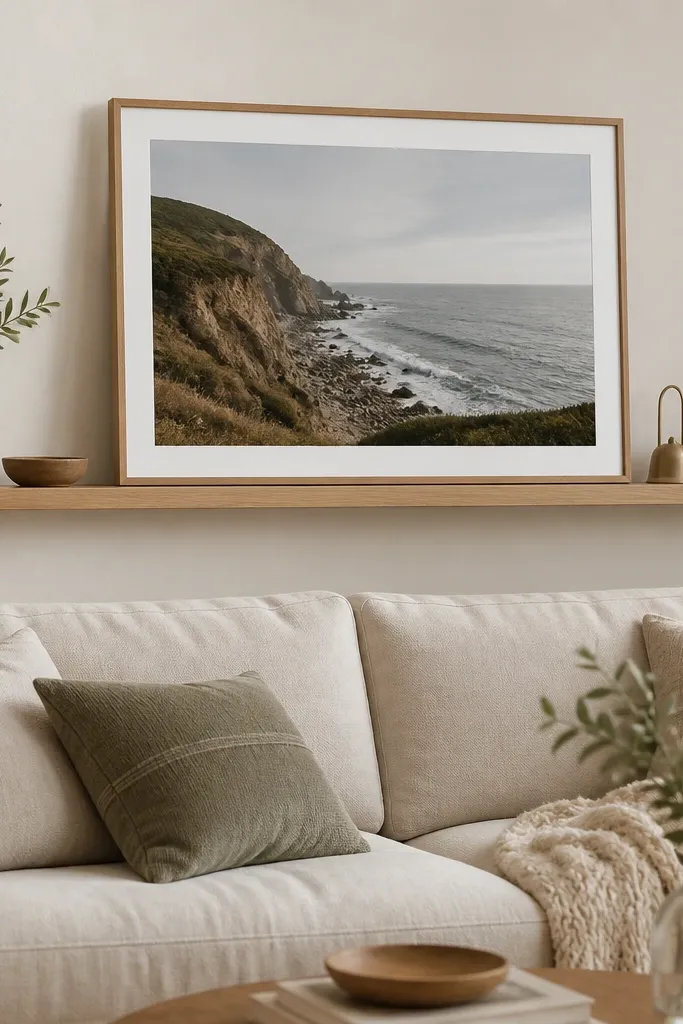
This is a modern twist on the standard framed art wall. Instead of hanging the frame directly, you mount a narrow ledge and let the frame sit on it, so the wall looks like a gallery display. I like it in rooms with light wood floors because the oak ledge matches without needing extra decor. It flatters sofas with bold legs or sleek silhouettes since the ledge keeps the back wall visually clean. The ledge also makes it easier to swap photos later without patching holes. Keep your frame size big — it’s the anchor.
Start by choosing a ledge depth about 4 inches and length around 70-90% of the sofa width. Mount it centered above the sofa, leaving 10-14 inches between the sofa back and the ledge so it doesn’t feel cramped. Place a large horizontal or portrait frame on the ledge and center it by measuring from both ends. Style with two small items only — one book and one small vase — and keep them at least 3 inches away from the frame edges.
Use rubber pads under the frame corners so it doesn’t slide and so the glass stays scratch-free.
Don’t use a ledge that’s too deep. Deep ledges look like a mantel and can feel bulky behind a sofa.
12. Large wall decals in a single color line motif
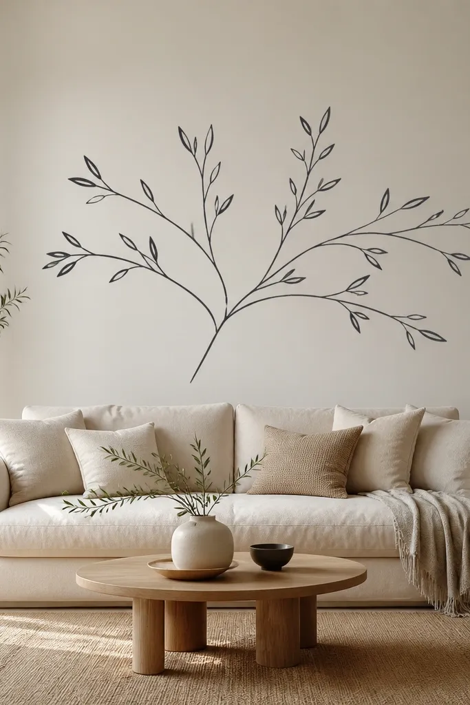
If you want modern without drilling, line-art wall decals are a smart option. The reason they look good is the design is usually thin and consistent, so it reads as graphic instead of clutter. I like charcoal on warm off-white because it looks sharp but not stark. This flatters small spaces because it doesn’t add texture bulk, and it works with both light and dark sofas since the line color can match your throw pillows. It’s also great if your landlord won’t allow paint or trim — you still get a focal point.
Start by wiping the wall with a damp cloth and letting it dry so the decal sticks cleanly. Use painter’s tape to outline the decal placement — I center the motif so the widest part sits around the middle of the sofa zone. Apply the decal in sections if it’s large, smoothing with a plastic card to avoid bubbles. Keep the rest of the wall calm: one simple framed print or none at all, so the line motif stays the star.
Pick a decal with a matte finish; glossy decals look like sticker paper in daylight.
Avoid placing it too high. If the motif sits above the sofa back like a random accent, it won’t feel intentional.
13. Textured 3D panel squares in a neutral stone tone
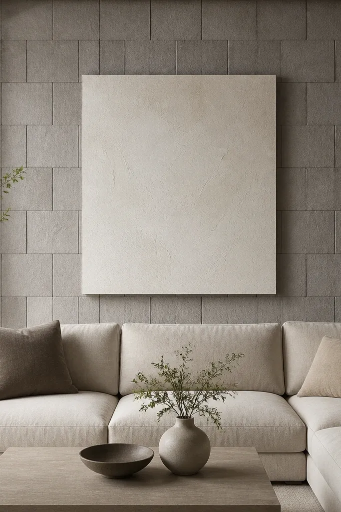
3D square panels give you depth even when you keep color simple. I’ve used shallow relief panels painted in a neutral stone gray so they look like architectural plaster rather than foam. The texture adds a modern feel without needing a lot of decor. It flatters people who want a sofa back wall that still looks good in winter when there’s less natural light. The texture also hides minor wall imperfections, which is a real win in older apartments. Pair it with one large artwork so the wall doesn’t become visually noisy.
Start by choosing a panel size that matches your wall scale — I like shallow 12-inch or 18-inch squares. Cover about 75-85% of the sofa width, then build the panel grid centered on the wall. Paint the panels a matte stone tone after installation so the texture looks unified. Hang a large canvas centered within the textured area, leaving enough breathing room around the edges so the pattern frames the art.
Good to knowUse a light-colored art with a lot of negative space so the relief texture stays the main event.
AvoidDon’t use glossy paint on the panels. Gloss makes the texture look harsh and cheap.
14. Mirrored wall panel behind sofa with one central frame
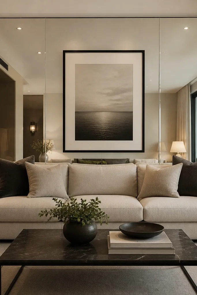
Mirrors behind the sofa create instant depth, especially in rooms where the wall feels too plain or too narrow. I’m not talking about covering the whole wall with reflective sheets — I like a single large mirrored panel placed behind the sofa zone so it looks intentional. The central artwork prevents the mirror from feeling like a disco ball. This design flatters modern interiors because it keeps lines clean and adds brightness without changing furniture. It also works well if you have warm lighting and want the wall to look brighter at night.
Start by measuring the sofa width and choosing a mirrored panel that covers about 70-80% of it. Mount the mirror so its center lines up with the sofa centerline and keep the top edge about 6-10 inches below the ceiling. Add a centered artwork on top of the mirror using standoffs or a mounting method that keeps it stable and flat. Style the sofa table with one reflective-friendly item only — a metal tray or a candle holder — so the mirror doesn’t reflect too many small objects.
Good to knowWipe the mirror with a microfiber cloth and glass cleaner before hanging the art; smudges show instantly in mirrored walls.
AvoidAvoid cluttered styling on the sofa table. Mirrors multiply reflections and make mess look bigger.
15. Large centered wall shelf with a tight styling stack
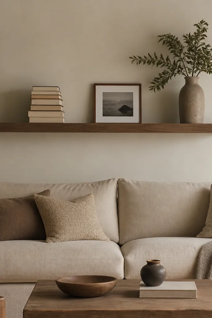
A wide centered shelf works when you want the sofa back wall to look like it belongs in a magazine but you don’t want a complicated gallery. The shelf creates a strong horizontal line, and the tall stack of books adds vertical contrast so the wall doesn’t flatten out. I’ve used this in living rooms with mid-tone walls where a single focal point needed more structure. This design flatters people who like a clean look but still want personality through books and one sculptural item. Keep the shelf surface free enough that the negative space feels calm.
Start by choosing a shelf length that matches the sofa width — aim for 75-90% of the sofa width. Mount it so there’s about 10-16 inches between the shelf and the sofa back cushion. Style with a three-part layout: left tall book stack, center small framed photo or two minimal objects, right tall vase or candle lantern. Keep all objects in the same height zone with one taller anchor piece so your eye has a path across the shelf.
Good to knowUse book covers in the same family of colors and rotate the stack so spine labels face inward or are hidden.
AvoidDon’t place the tallest item dead center. It makes the wall look top-heavy.
16. Horizontal wood slat band across the wall
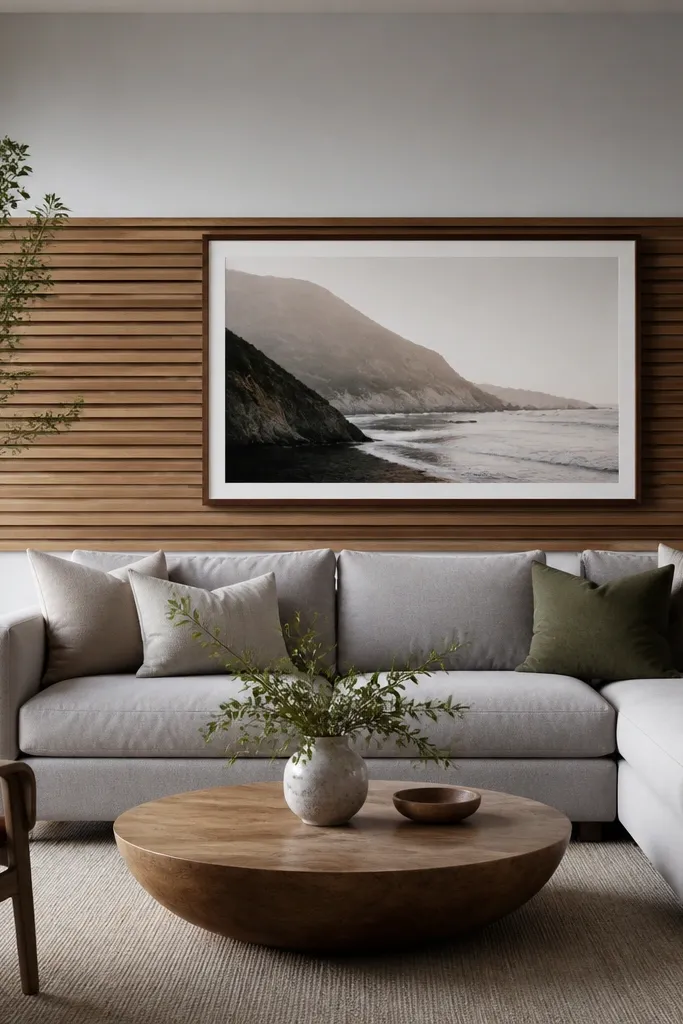
Horizontal slats are great when your ceiling is already low or your room has lots of vertical features you don’t want to emphasize. The band creates a modern strip of texture that feels grounded, and it’s easier than covering the entire wall. I like a warm natural slat tone because it keeps the room from looking cold, especially if your sofa is gray or charcoal. This flatters bold rugs because the slats add texture without adding color. It also looks good in spaces with long sofas, where a full panel might feel too heavy.
Start by measuring the sofa width and deciding your band height — I use a band height around 24-30 inches. Install slats across that band area, keeping consistent spacing and aligning the ends with the centerline so it feels symmetrical. Paint the surrounding wall first, then mount the slat band so it reads as a clean architectural feature. Hang a large framed print centered within the band, leaving about 3-5 inches of margin between the frame and the slats.
Use a stain that shows grain but stays matte so the slats don’t reflect like polished wood.
Avoid mixing slat tones with your furniture wood. Choose one wood family and match undertones.
17. Double-row framed art with a thin divider line
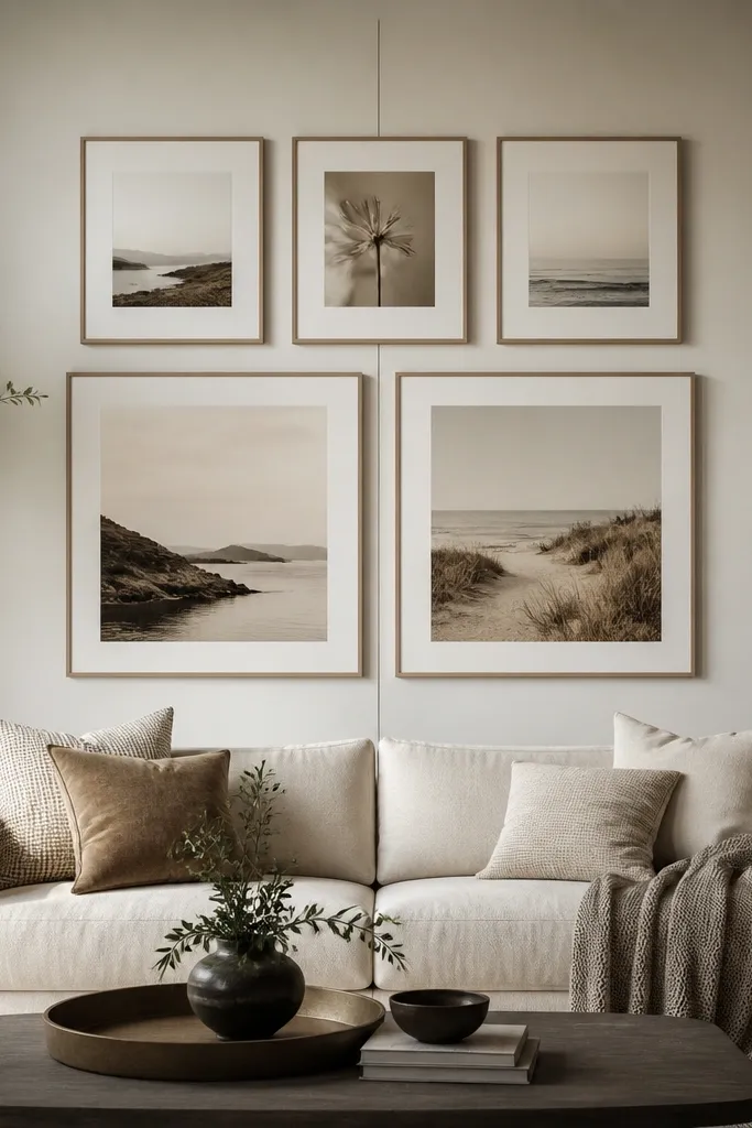
This layout looks modern because it breaks the single-art-center rule without turning into a random collage. The thin divider line gives your eye a structure, and the two-row arrangement adds rhythm. I’ve used it in living rooms where the sofa is a little too wide for one big piece and one gallery grid feels too busy. It flatters rooms with patterned throw pillows because the art frames can repeat a consistent color palette, like cream mats with black frames. The result is styled but not loud.
Start by choosing frames with the same width and mat color, so the different sizes look intentional. Cover about 70-85% of the sofa width with the overall arrangement and keep gaps between frames around 2-3 inches. Mark a vertical centerline and place the middle of the divider line at the center of the sofa. Hang the bottom row first, then align the top row so the overall block stays level and evenly spaced.
Pick one dominant print color and repeat it in at least two frames so the wall feels cohesive.
Don’t mix frame thicknesses. Thin and thick together looks like a DIY mismatch.
18. Japanese-inspired shoji panels with warm light behind
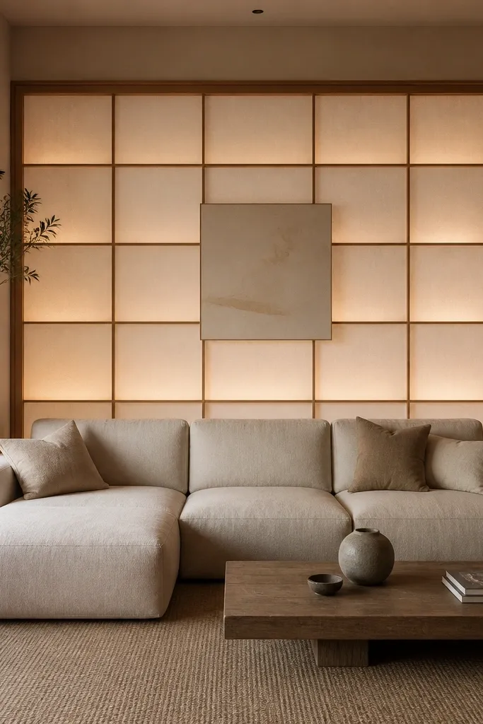
Shoji-inspired panels add a calm, modern softness that still feels architectural. I’ve used a grid-style panel with warm backlighting, and the effect is cozy without needing extra lamps on the floor. It flatters people who want their living room to feel restful, especially when the sofa is dark or the walls are cool-toned. The warm light also makes skin tones look natural in photos, which matters more than people think. Keep the rest of the wall minimal — one small centered piece — so the panel stays the main feature.
Start by measuring the sofa width and selecting a panel grid size that covers about 70-85% of that width. Install the panel so it’s centered and mounted securely, then connect the backlighting using a professional-friendly setup if you’re not comfortable with wiring. Choose warm bulbs around 2700K or LED panels with a similar color temperature. Mount a small minimal artwork or leave the center open so the light grid becomes the focal point.
Good to knowUse dimmable lighting so you can turn the glow up for evenings and down for daytime.
AvoidAvoid cool blue light behind translucent panels — it makes the wall feel hospital instead of calm.
19. Oversized fabric wall hanging with a wooden dowel rod
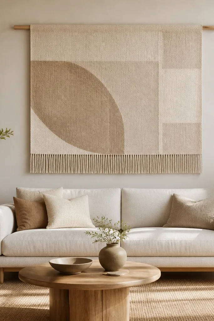
A fabric wall hanging is the fastest way to make a sofa back wall feel warm and modern without buying a bunch of frames. I use woven fabrics with subtle pattern and neutral tones because they drape nicely and don’t look like craft store decor. It flatters both light and dark sofas since the fabric brings softness and texture. If you have a lot of hard surfaces like wood floors and glass coffee tables, this adds a tactile break. The wooden dowel keeps it grounded and modern — not like a curtain rod.
Start by choosing a fabric width that covers about 70-90% of your sofa width. Sew or attach a simple rod pocket at the top edge, then slide a light oak dowel through and hang it centered on the wall. Mount the dowel so the bottom edge of the fabric is about level with the sofa back or slightly above it. Add one small framed print or a single plant near the sofa table, but keep the rest minimal so the fabric stays the focal texture.
Iron the fabric lightly before hanging so the drape looks intentional, not wrinkled.
Avoid cheap thin fabric that stretches and warps — it looks messy once it hangs.
20. Three stacked mirrors with staggered heights
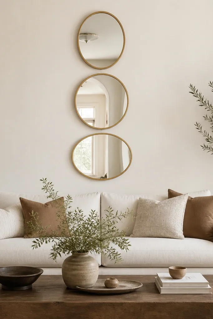
Stacked mirrors look modern because they create a geometric rhythm and reflect light in multiple directions. I like three mirrors for this because it’s enough variety to look styled but not so many that it becomes busy. Brushed brass frames warm up neutral walls and look good next to wood furniture. This flatters rooms that feel narrow because mirrors add width through reflection. It also works well with sofas that have a strong color, since the mirrors keep the wall from feeling heavy.
Start by choosing three mirrors with the same frame finish and similar sizes, but stagger their heights. Mark the sofa centerline and decide the overall height of the mirror stack — I keep it within the sofa zone so it doesn’t climb too high. Mount the middle mirror first at about 58-60 inches from the floor to its center. Then mount the top mirror about 6-10 inches above and the bottom mirror about 6-10 inches below, keeping the stagger consistent and level.
Good to knowUse the same bulb temperature in nearby lamps so the mirror reflections don’t look yellow-green.
AvoidAvoid mismatched mirror shapes — oval, round, and rectangle together looks random unless you’re very deliberate.