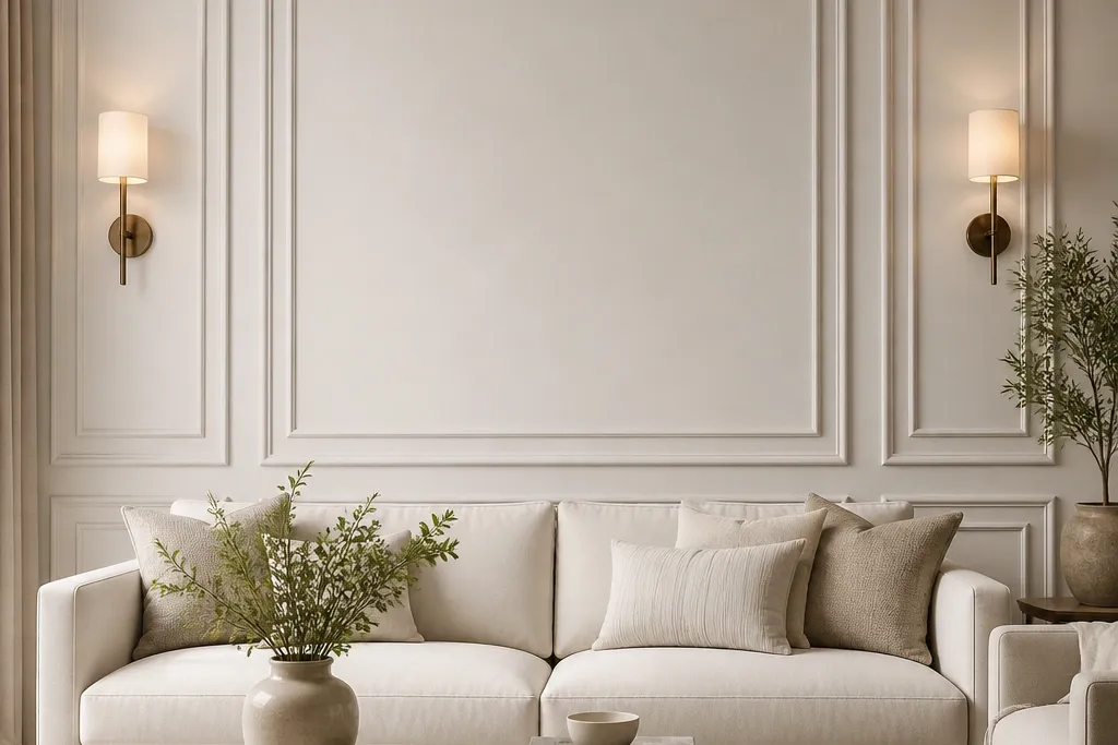
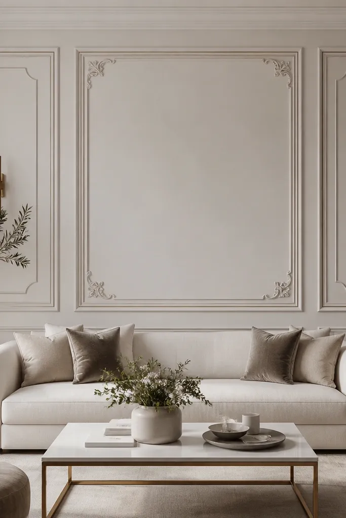
1. Classic Picture Frame Grid Behind the Sofa
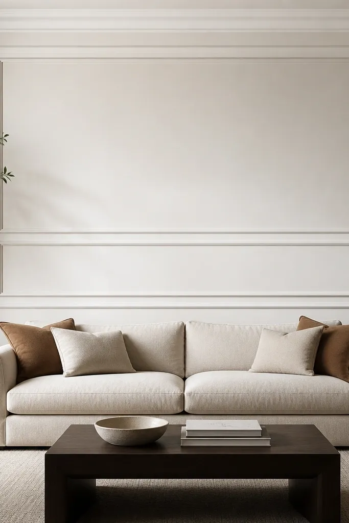
Start by drawing a centerline on the wall at the middle of your sofa back. Measure your sofa width and set your outer rectangle so it spans roughly 65-70% of that width, leaving about 15-18 cm of breathing space on each side. Install the outer moulding first, then add one inner horizontal rail about one-third down from the top of the frame, and one inner rail about two-thirds down. Finally, paint the moulding and wall trim in the same off-white shade and sheen, then seal any nail holes with lightweight filler before the final coat.
This layout works because it frames the couch like artwork, which instantly makes the whole seating zone look styled. I’ve used it with beige fabric sofas and it still looks sharp because the moulding lines create structure even when your upholstery is neutral. Choose an outer frame that is about 2/3 the sofa width and an inner border that leaves a consistent margin on all sides. The result reads calm and finished, especially in rooms with simple wall colours like warm white or greige. It also flatters most room proportions because you can stretch the grid vertically without turning it into a maze.
AvoidDon’t place the frame too high — if the top edge lands above your eye line, it feels like decoration floating over the furniture.
Good to knowUse a 45-degree miter on the corners if your walls are straight; if they’re not, do butt joints and caulk the seams to keep the shadow line clean.
2. Two-Tier Floating Border with a Thin Inner Rail
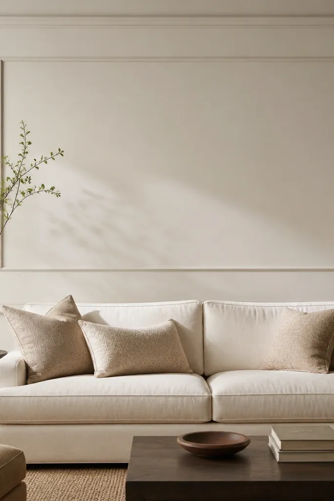
This design is my go-to when you want depth without heavy ornament. The wider outer border gives you that architectural “frame,” and the thin inner rail adds a crisp line that looks expensive in photos. It works beautifully behind a leather sofa because the glossy upholstery picks up the moulding shadows and makes the wall look dimensional. I’ve done this in small condos where the wall is narrow — the thin inner line keeps everything from feeling bulky. It also flatters cooler-toned interiors (navy, charcoal, cool greige) because the moulding reads as clean geometry rather than a decorative pattern.
Start by installing the outer rectangle moulding at a height where the rectangle’s center aligns with the center of your sofa cushions. Use a consistent gap from the sofa top — I aim for about 10-20 cm between the sofa back and the inner edge of the frame. Add the outer border first, then attach a thin inner rail using spacers or painter’s tape to keep the gap even all around. Caulk the outer seams, fill nail holes, then paint in a slightly brighter white than the wall so the shadow line stays visible.
If you want a “floating” look, use a slightly stepped profile moulding or add a 6-10 mm spacer behind the inner rail.
Avoid using mismatched paint sheen between wall and moulding — the difference creates a halo that looks DIY.
3. Vertical Panel Columns Flanking the Sofa
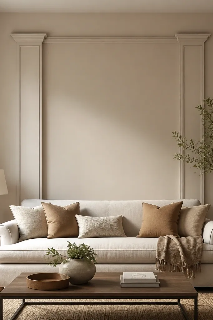
Vertical columns make the sofa zone feel taller and more “designed,” even when the wall is blank. This is the layout I reach for when your sofa is long and you want focus on the center without turning the whole wall into a grid. It looks especially good with low-profile sofas and rooms with tall ceilings, because the columns pull the eye upward. If you have a darker sofa (espresso brown, black), the vertical lines give a clean contrast without needing bold colours. It also works well with patterned pillows because the moulding stays simple.
Mark three vertical lines: one at the center of the wall and one at each side where the columns will sit. Keep each column width around 10-12 cm and space them evenly from the sofa edges by about 12-18 cm. Install a top horizontal cap moulding that ties the columns together, then leave the center panel plain for a calm backdrop. Paint everything the same colour as the wall if you want subtle elegance; paint the moulding a slightly brighter white if you want a more dramatic, modern look.
Use a laser level for the column lines — off-straight columns are the fastest way to make this look cheap.
Don’t add too many columns; three vertical elements (two sides plus a center hint if you want it) looks intentional.
4. Mirror-Like Center Arch with Side Rectangles
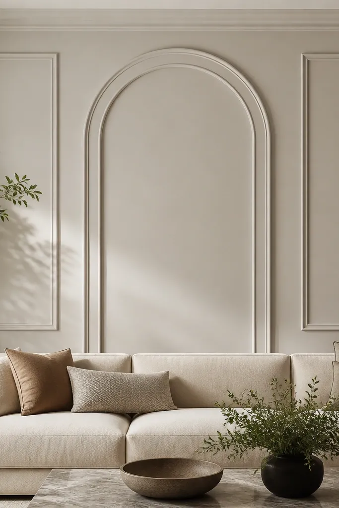
A center arch adds softness to straight-backed sofas and makes the whole wall feel like it has a focal point. I’ve used this with neutral boucle and it looks extra good because the texture of boucle plus the smooth moulding curve creates contrast. The side rectangles keep the design grounded so it doesn’t feel like a theme park doorway. This layout looks best when your wall has enough height for the arch to breathe — aim for at least 8 ft (2.4 m) ceilings or a tall wall section above the sofa. It also flatters warm, traditional interiors and looks surprisingly modern when you paint it in a crisp white against a greige wall.
Start by choosing your arch height — I keep it around 55-65% of the wall height segment behind the sofa. Build the arch outer edge first using flexible MDF or pre-made arch moulding, then add a thin inner arch border about 4-6 cm inside. Place two vertical rectangles on either side with matching widths and align their top edge with the arch’s top. Paint the arch and rectangles in a bright white, then lightly caulk the inner seams so the curve stays clean.
If your arch moulding is rigid, do it in two pieces and hide the seam at the arch’s center line.
Don’t make the arch too short — a stubby arch makes the sofa look squeezed.
5. Herringbone Moulding Accent Strip Behind the Middle Cushions
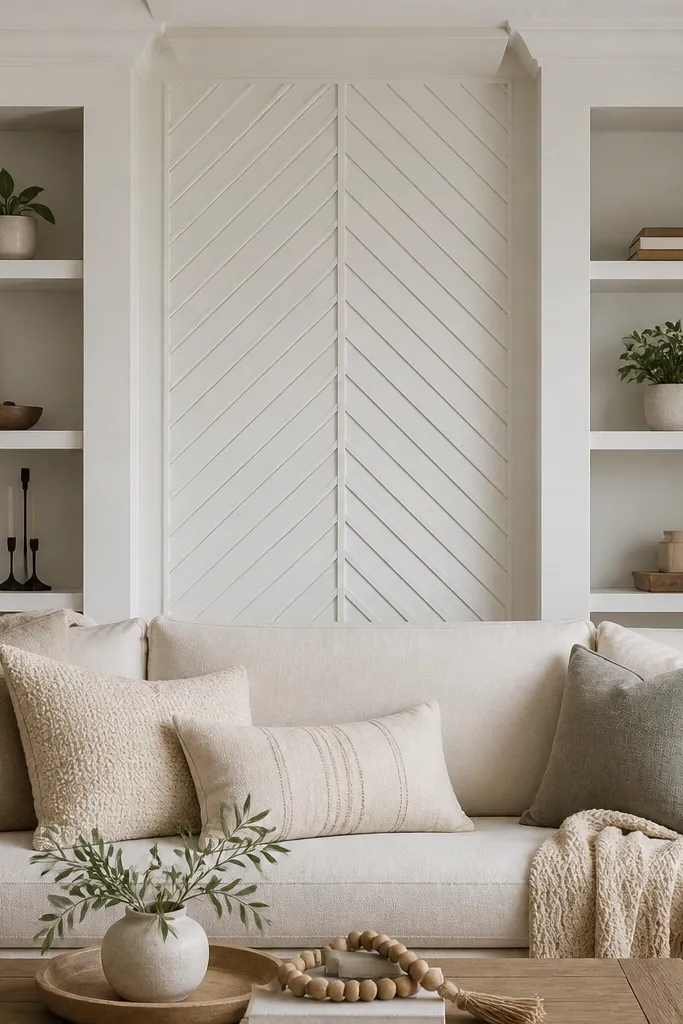
This is the layout for people who love detail but don’t want a full wall pattern. The herringbone strip pulls focus to the center of the sofa, which is where your eyes land when you walk into the room. I’ve done this behind velvet sofas and it looks even better because velvet reflects light differently across the angled lines. Keep the pattern area small enough that it feels like an accent, not wallpaper. It also works well in modern homes where you want texture without changing your furniture.
Start by marking a narrow rectangle centered behind the sofa, roughly 45-55% of the sofa width. Install a flat border around the rectangle first so the pattern has clean edges. Cut small strips of moulding (about 1.5-2.5 cm wide) and lay them in a consistent angle, alternating left and right to form the herringbone. Secure each strip with a brad nailer, then fill and caulk all seams before painting with the same primer and topcoat as the border.
Use a spacing jig made from scrap plywood so every strip gap stays identical.
Avoid mixing moulding strip widths; the pattern looks messy fast when widths vary.
6. Wainscot-Style Lower Frame with a Clean Upper Band
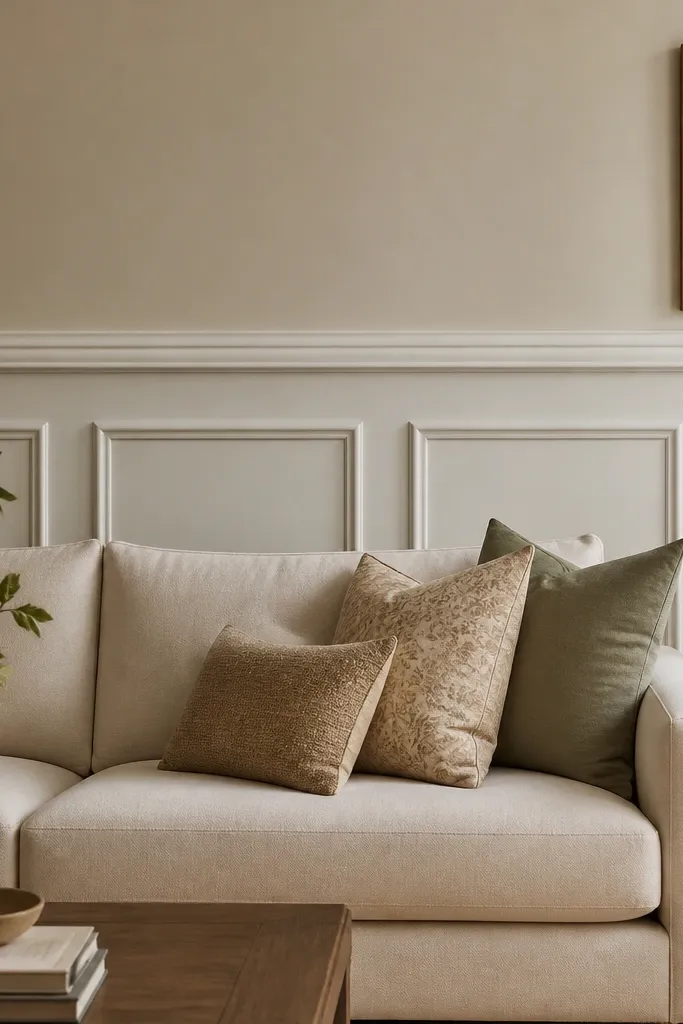
If your living room already has wainscot or trim work, this design makes the sofa wall match the rest of your home. The lower frame adds structure where your couch sits, and the upper band keeps the look from feeling heavy. I’ve seen this work with both fabric and leather sofas because the panel sections break up the upholstery silhouette. It also flatters rooms with low or average ceilings because most of the moulding mass stays lower. Paint the wainscot in a slightly warmer white than the wall if you want it to feel cozy.
Start by picking a wainscot height line that hits the top third of your sofa back, usually around 24-30 in (61-76 cm) from the floor. Install the horizontal cap at that height, then add vertical panel sections inside a lower rectangle area behind the sofa. Keep vertical panel widths around 20-30 cm so they look like intentional architecture rather than random rectangles. Finish with a thin horizontal band above the lower frame and paint both in the same trim colour.
Use painter’s tape to mask a straight line for the upper band before you nail the moulding.
Don’t extend the wainscot pattern too high — if it climbs behind the cushions, it starts fighting your sofa.
7. Simple Crown Moulding Shelf Above the Sofa
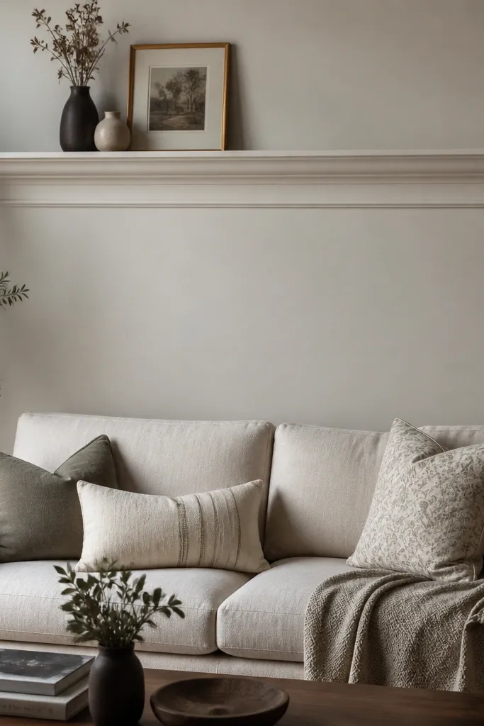
This is a clean option when you don’t want to frame the whole wall. The shelf effect gives you a strong top anchor, and the smaller inner line makes it look layered without adding clutter. I’ve used it behind a compact loveseat in a rental where drilling was limited — horizontal trim hides small wall imperfections better than full rectangles. It’s also a lifesaver when the wall has a doorway or awkward corner on one side; you can keep the design centered and stop cleanly. The look feels tailored in both modern and classic rooms when you match the trim to your existing ceiling moulding.
Start by measuring the top of your sofa back and mark a line 8-12 cm above it for the lower inner trim. Install the inner trim first as a straight guide, then add the larger crown-like shelf moulding above it so the shelf overhang creates a shadow. Keep the shelf length close to the sofa width, about 90-100% of it, and center it on the wall. Caulk the top edges, fill nail holes, then paint the shelf and inner trim in the same colour as your ceiling trim for cohesion.
If your ceiling is flat and plain, paint the shelf in a slightly brighter white than the wall for crisp contrast.
Avoid thin, low-profile trim that’s too small for your wall — it reads like a leftover border instead of a design.
8. French Style Mantel-Like Frame with Side Sconces
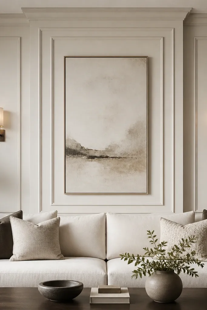
Start by installing a large central rectangle frame centered behind the sofa, leaving 10-15 cm clearance from the sofa edges. Add a top cap moulding that looks like a mantel shelf, then install two symmetrical side vertical supports. Place wall sconces so their center height lands around 50-60 in (127-152 cm) from the floor, matching the frame’s midline. Prime everything, then paint the moulding in a creamy white; use matte or satin depending on how much you want the shadows to show.
This layout makes a sofa wall feel like a focal fireplace wall without the fireplace. I like it when you have space for two sconces because the moulding gives the light something to bounce off. The straight-line mantel frame works with both traditional furniture and more modern silhouettes. It looks best with a sofa that has some height to the back and a clean fabric face so the frame doesn’t look oversized. If your wall is a warm cream, this design stays soft and romantic, especially when the sconces have warm bulbs.
AvoidDon’t pick ornate moulding profiles if your room already has busy patterns — keep the frame lines clean.
Good to knowHang sconces after you test the moulding position with painters tape so the light doesn’t land on a seam.
9. Corner-to-Corner Diagonal Braces in a Rectangle
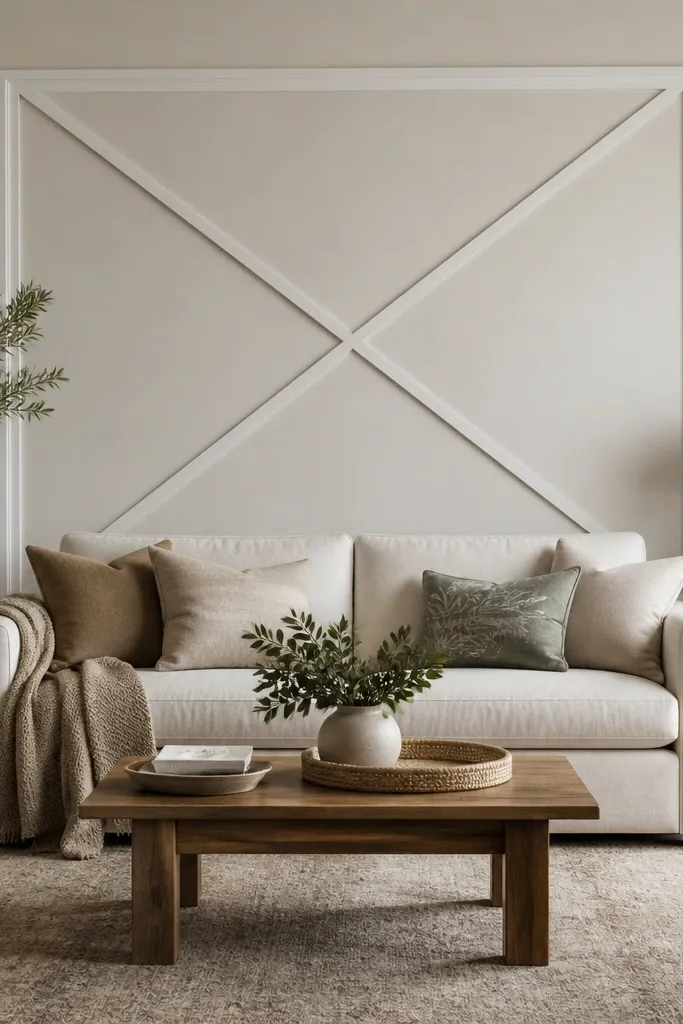
Diagonals add motion to a sofa wall and make the whole seating area feel dynamic. This works especially well behind sectionals because it visually ties the different sofa arms into one composition. I’ve used it with grey and navy walls and the contrast looks crisp without needing a bold colour. The rectangle keeps the diagonals from feeling chaotic, so it still reads polished. It also flatters people who want “design” but don’t want wallpaper — the lines are architectural and easy to clean.
Start by building a rectangle frame around the sofa back area, roughly 70-80% of sofa width. Install the four outer edges first, then measure the inner opening. Cut diagonal moulding braces so they meet at the center, and keep the diagonal width consistent, about 2-3 cm. Nail, caulk, and fill, then paint the entire design in one colour so the diagonals look like one planned structure.
Dry-fit the diagonals with tape before you cut — small angle errors are obvious in an X layout.
Avoid overly thick diagonals; heavy pieces make the wall feel crowded around the sofa.
10. Grid of Small Squares for a Playful Modern Look
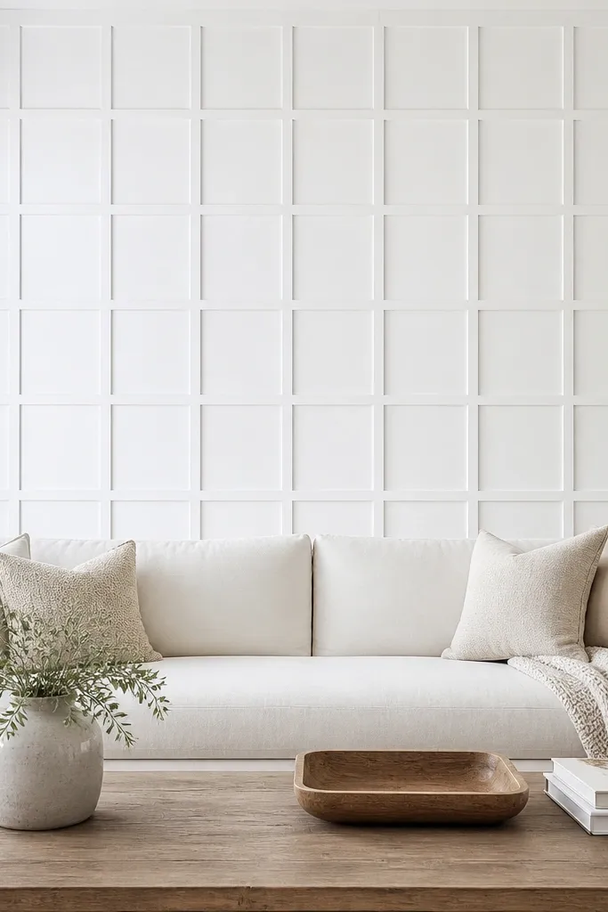
Start by marking a rectangle centered behind the sofa that spans about 75% of the sofa width. Install outer border moulding first, then decide your square size — I use 20-25 cm squares for a typical living room wall. Lay horizontal strips first, then vertical strips, keeping every junction aligned with a tape measure and level. Fill nail holes, caulk all seams, prime, then paint two coats so the square edges stay crisp.
A small-square grid creates a calm, modern rhythm that looks great with solid-colour sofas. I like this when your upholstery is smooth — linen, microfiber, or leather — because the moulding texture becomes the interest. It also works well in rooms with kids or lots of everyday life because the pattern is structured, not delicate. If your wall is a muted greige, bright white moulding makes the squares pop without looking loud. This is one of the few moulding styles that still looks good from a distance and close up.
AvoidDon’t make squares too small; tiny moulding strips look fussy and cheap when painted.
Good to knowUse a laser line to keep the grid straight; a slightly off grid is more noticeable than with frames.
11. Layered L-Shape Corners for a Minimal Sculpted Effect
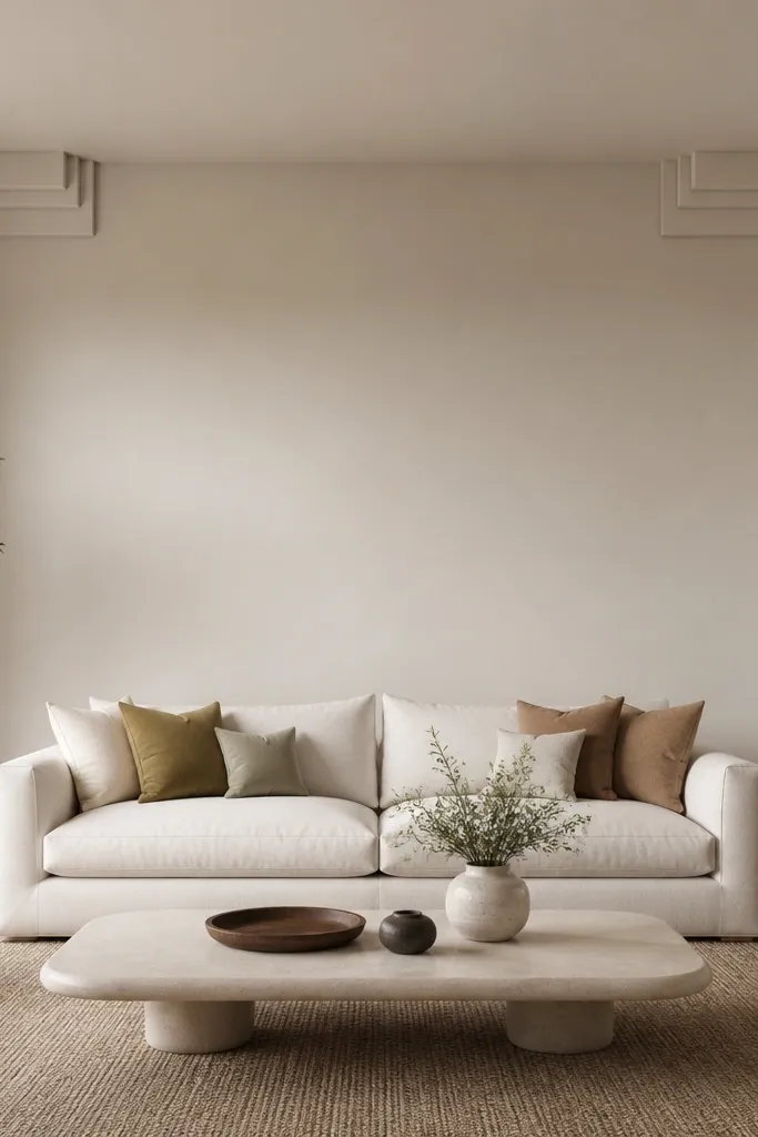
This is minimalist moulding that still reads as designed. The L-corner blocks create depth and a subtle frame without turning the wall into a full rectangle. I use this when the wall has a large window to one side or when you want the sofa wall to stay airy. It looks best with modern sofas that have clean lines and solid upholstery colours. The sculpted corners also flatter smaller rooms because you keep less moulding mass on the wall.
Start by marking where the rectangle corners would sit behind the sofa, using the sofa width as your reference. Install two small vertical and two small horizontal moulding pieces at each corner, leaving the center opening blank. Keep the corner blocks symmetrical so the eye reads balance — I aim for about 12-15 cm of moulding length in each arm. Caulk the outer edges lightly, then paint in a bright white or a shade slightly brighter than your wall for a clean contrast.
Match the moulding height to the cushion height so the corners line up with the sofa silhouette.
Avoid random corner sizes; asymmetry makes it look like unfinished construction.
12. Oversized Rounded Rectangle with a Thin Inner Outline
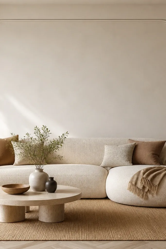
Rounded shapes soften the look of boxy sofas and keep the wall from feeling too strict. I’ve done this behind a square-backed sofa in a small living room, and it visually expands the space because the curves pull the eye smoothly. Pair it with a taupe or warm grey wall and paint the moulding in a crisp white for a modern, friendly contrast. This design also looks great with plants and tall floor lamps because the rounded geometry echoes organic shapes. It’s a good fit for people who want “aesthetic” but don’t want heavy ornament.
Start by choosing a rounded rectangle width around 70% of the sofa width. Install the outer rounded moulding first using flexible trim or pre-made rounded moulding pieces, keeping corner radius consistent. Add a thin inner outline about 5-7 cm inside the outer shape. Paint with primer and two topcoats, then use a fine caulk bead along the inner edge so the curve stays sharp.
If you can, use flexible moulding and a heat gun so the curve stays smooth with no bumps.
Don’t use a big radius that feels like a sticker outline — the curve should look proportional to your wall scale.
13. Wavy Horizontal Bands in a Single Frame
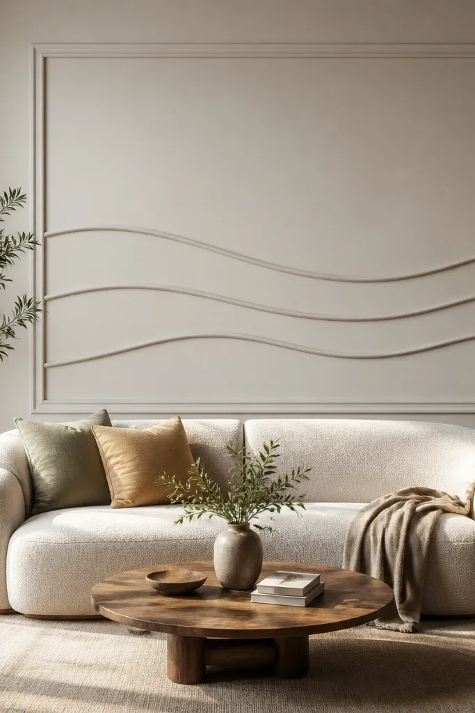
Start by installing a simple outer rectangle frame first, centered behind the sofa. Then mark the wave path with pencil and a flexible curve guide, keeping the wave amplitude around 2-3 cm from crest to trough. Install one wavy band, then add a second band 8-12 cm below it, leaving even spacing from the frame edges. Fill and caulk every seam, then paint in one colour so the waves look carved rather than assembled.
Wavy bands add a soft rhythm behind upholstery and stop the wall from looking like a flat backdrop. I’ve used this with a cream sofa and it looks especially good because the waves catch light differently along the wall. Keep the wave subtle; the moment the wave is too dramatic, it starts looking like a craft project. This layout is a great match for boho-modern rooms, but it still feels intentional because the entire wave sits inside a defined frame. If you have strong straight lines in your furniture, the waves balance it out.
AvoidAvoid leaving visible gaps at wave seams; the uneven shadow lines kill the polished look.
Good to knowTest your wave template on cardboard first — the line you like on paper is the line that will look right on the wall.
14. Sculpted Step-Back Panels for a Deep Shadow Look
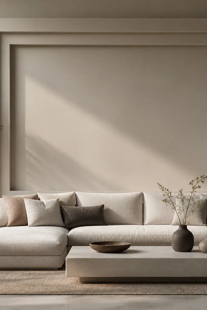
Start by choosing moulding profiles that have a built-in step or plan your own by layering flat strips with spacers. Install the outer frame first, then attach a recessed inner panel layer so it sits 6-10 mm back from the outer edge. Add a second recessed strip inside at a consistent offset, about 4-6 cm from the recessed panel edge. Caulk all layer transitions, then paint the whole design in a satin finish so the shadow depth stays visible.
If you want the moulding to look like it has depth you can feel, use step-back layers. This design creates strong shadows even in daylight because each layer sits back slightly from the one before it. I’ve done this with dark navy walls and a light sofa, and the contrast makes the seating zone feel gallery-like. It also looks great on sectionals because the deep shadow lines hold the shape across a larger footprint. The sculpted panels flatter rooms with natural light because the shadows shift throughout the day and make the wall feel alive without any extra decor.
AvoidAvoid using thick caulk to hide misalignment; it creates a messy ridge instead of a clean shadow.
Good to knowUse spacers that are identical thickness all the way around so the shadow line doesn’t wobble.
15. Tall Narrow Arched Panels for a Statuesque Wall
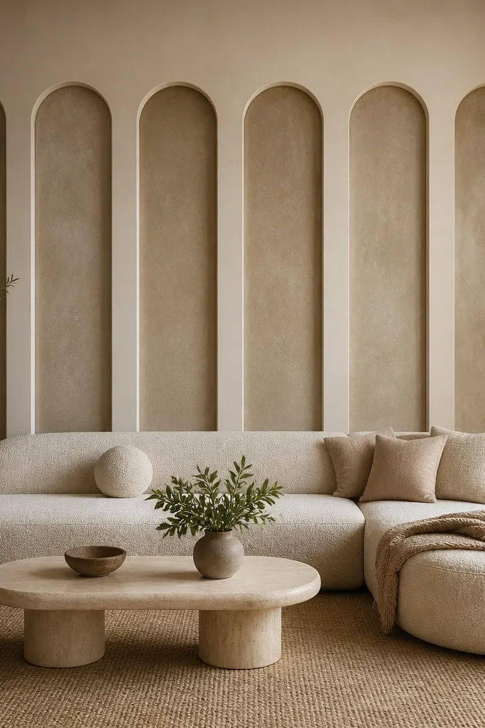
Tall narrow arches pull the eye upward and make a sofa wall feel more grand without needing heavy ornament. I like it in rooms where the ceiling is higher and you want the wall to look “designed” from across the room. This layout flatters slim sofas and also balances large sofas when you choose enough arches to fill the width. It looks great with warm white moulding on a soft grey wall, because the arches read like gentle architecture. The repeated arches also make the wall feel intentional even if you keep decor minimal.
Start by measuring the sofa width and plan how many arches fit comfortably, usually 3-5 arches depending on wall size. Install a top and bottom horizontal border to keep everything aligned. Then create each arch with consistent width, around 10-14 cm each, using pre-made arch moulding or flexible trim templates. Paint after caulking seams and filling nail holes, then hang your largest art or mirror above the arches so the composition doesn’t compete.
Keep all arch bottoms aligned; uneven bases are the one thing that makes this look amateur quickly.
Don’t overcrowd with too many narrow arches; it starts looking like decorative shelving instead of wall architecture.
16. Symmetrical Side Frames with a Center Negative Space
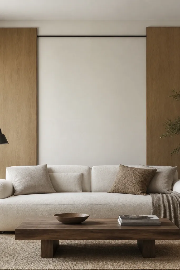
Start by centering a guideline behind the sofa and deciding the width of each side frame — I use about 35-45% of the sofa width total for both frames combined. Install a horizontal top connector first, then build the left and right vertical rectangles beneath it. Keep each side frame’s inner gap consistent from the sofa edges, around 12-16 cm. Finally, paint the frames and connector in a brighter white, and keep the center wall unpainted beyond the primer so the negative space stays clean.
Leaving negative space in the middle makes the sofa the star. This design works when you have a statement sofa back or a textured fabric that you don’t want boxed in by moulding. I’ve used it behind sofas with chunky cushions and it looks lighter than full-frame layouts. It also flatters modern rooms with big windows because the wall doesn’t feel crowded. Paint the side frames in a slightly brighter white than the wall and it looks crisp without requiring a lot of trim.
AvoidAvoid centering the side frames too close to the sofa; tight spacing makes the wall feel cramped.
Good to knowUse painter’s tape to outline the empty center before you nail anything — it’s the quickest way to confirm the balance.
17. Half-Panel Rectangles That Stop at Cushion Height
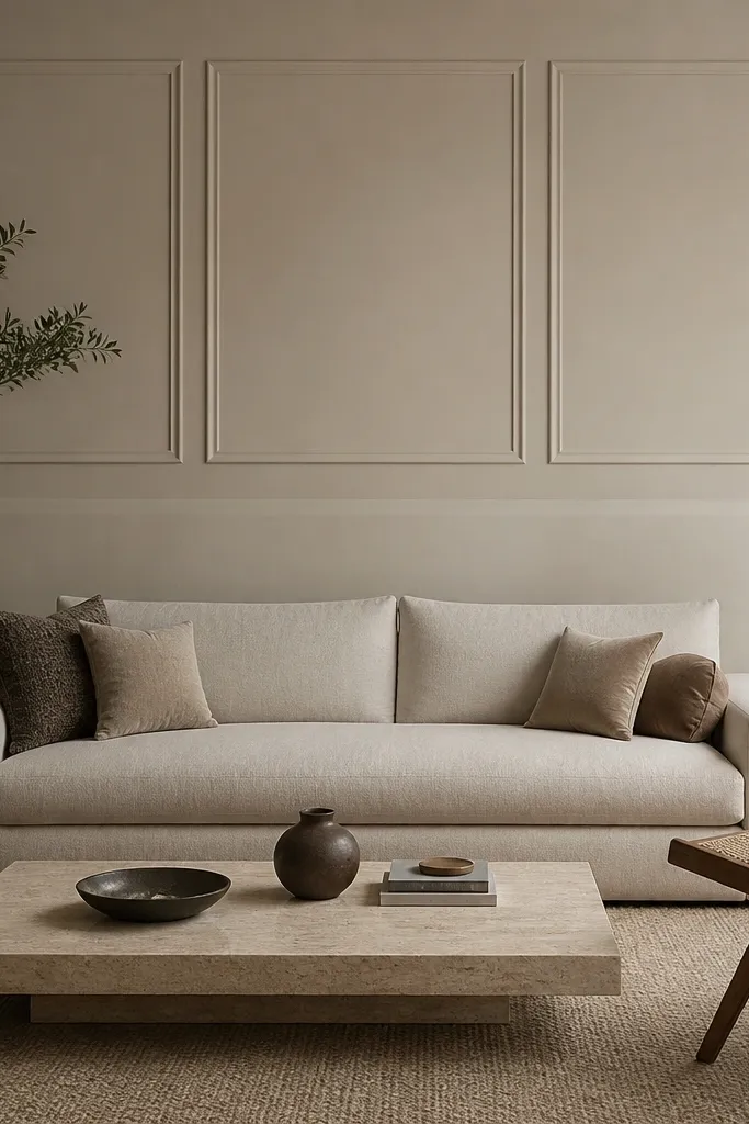
Stopping the moulding at cushion height keeps the design from fighting with everyday clutter. I’ve done this in living rooms where coffee tables, baskets, and daily items sit low, and the lower plain wall stays calm. The upper rectangles add structure where your eyes naturally land when you’re seated. This also flatters rooms with low ceilings because you’re not adding visual weight below. The design looks best with sofas that have a visible back height, like a bench-style or tall fabric back.
Start by measuring from the floor to the top of the sofa cushions and mark a stop line about 5-8 cm above it. Install a top horizontal border across the width you want, then add two or three vertical rectangles inside that top border. Keep the rectangle widths around 25-35 cm and align them symmetrically around the sofa center. Caulk and prime, then paint the moulding in the same trim colour as your baseboards for a cohesive finish.
If you’re unsure about height, tape paper rectangles on the wall first and sit on the sofa for 10 minutes to judge the scale.
Don’t extend the rectangles too low into the area your throws and cushions cover — the design disappears.
18. Single Oversized Rectangle with a Beveled Inner Edge
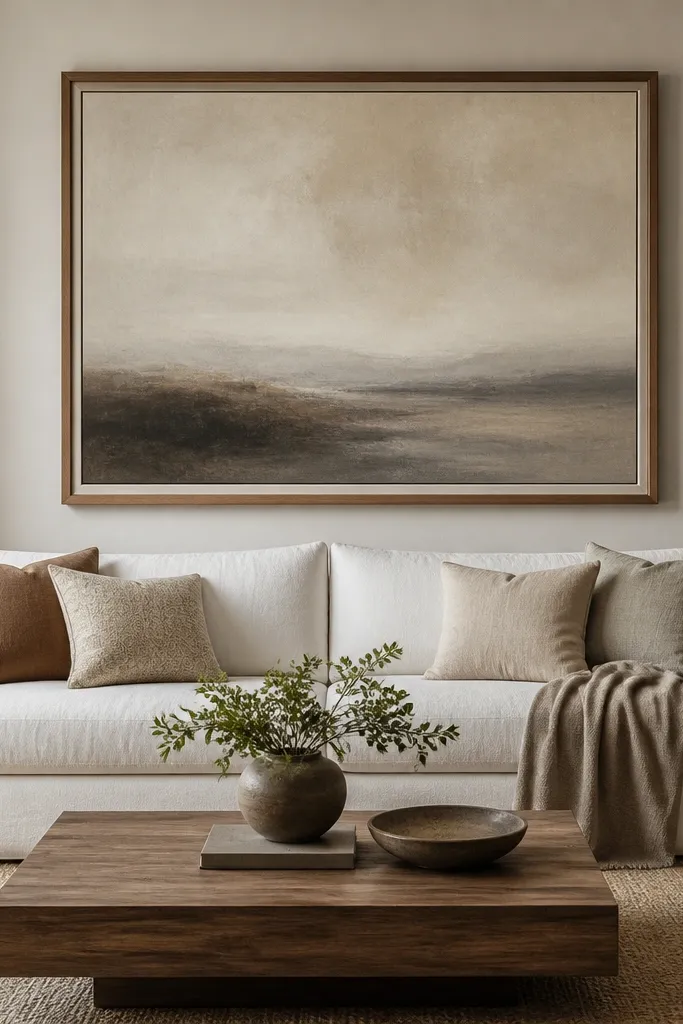
Start by installing the outer rectangle frame first, sized to about 80% of your sofa width and centered vertically behind the couch back. Use a moulding profile that has a beveled face for the inner edge so you get that highlight line. Attach the inner border about 8-12 cm inside the outer frame, keeping the gap even on all sides. Caulk seams, fill nail holes, then paint with a satin trim paint so the bevel catches light instead of flattening.
A single big rectangle is the easiest way to get an aesthetic sofa back wall moulding design without the wall becoming busy. The beveled inner edge gives you a thin highlight line that looks crisp and tailored, especially in bright daylight. I’ve used this with dark wood floors and it creates a clean visual boundary around the sofa. It looks good with both minimal and traditional rooms because the design is simple, but the inner bevel adds sophistication. If you have a neutral sofa, this layout still feels styled because the moulding does the work.
AvoidAvoid cheap flat moulding for the inner edge — without bevel detail, the design looks like basic trim.
Good to knowUse a foam roller for the moulding paint; brush strokes show in the bevel shadows.
19. Two Stacked Squares with a Center Divider
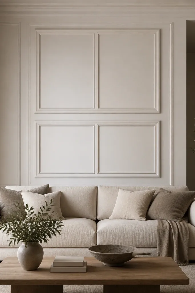
Start by drawing a rectangle area behind the sofa and decide on square size — I use squares around 60-70 cm per side for an average living room wall section. Install the outer border for both squares first, then add the horizontal divider between them. Add a vertical center divider that runs the full height of the two squares. Caulk and prime, then paint in one colour so the dividers look like one planned graphic layout.
This layout gives you a graphic, almost magazine look while staying structured. The stacked squares create a strong vertical rhythm that works well if your sofa is centered under a wall feature like an HVAC vent or a ceiling beam alignment. I’ve used it behind a sofa with patterned pillows where the wall needed to be “busy but controlled.” The narrow center divider adds a crisp line that keeps the design from feeling too boxy. It also flatters modern furniture and helps a room feel intentional even with simple decor.
AvoidAvoid making the squares too small — it turns into “trim clutter” instead of a clean design.
Good to knowKeep the square edges aligned with the sofa center seam or cushion seam so the symmetry feels natural.
20. Corner Picture Frames That Mirror Your Sofa Arms
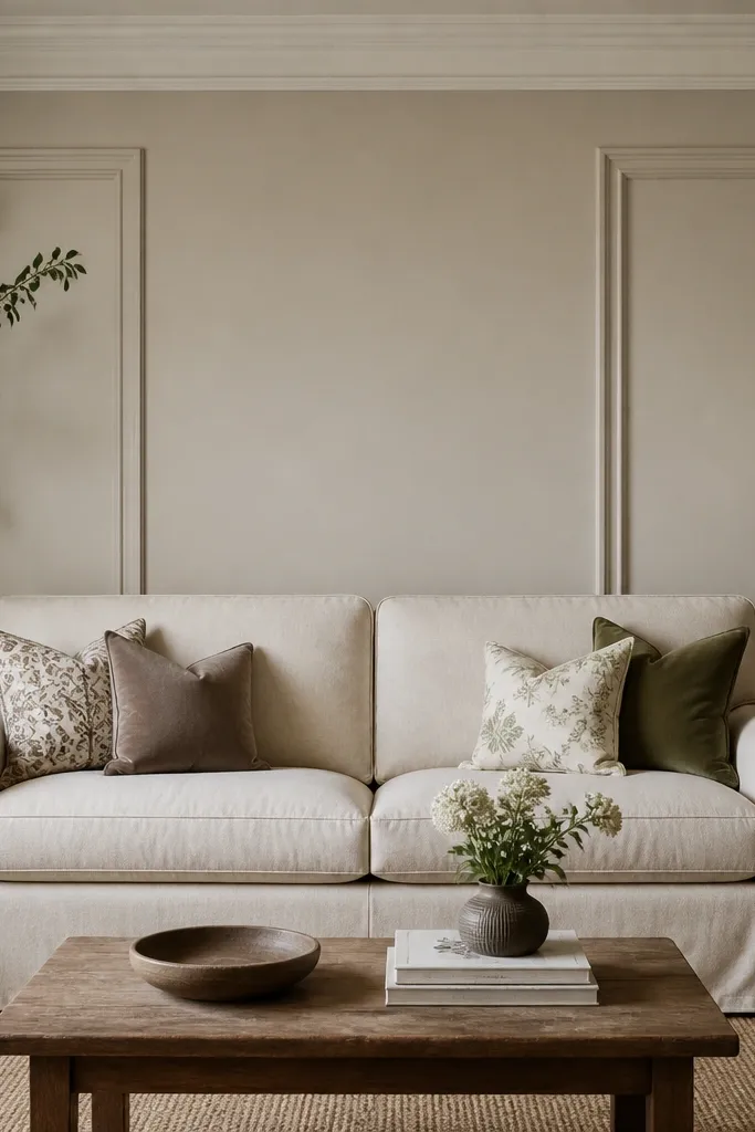
Start by measuring the space behind each sofa arm and set each frame width to about 40-45 cm for a standard living room sofa, adjusting up or down based on your scale. Install each frame separately so the center gap stays open — I keep at least 25-35 cm between them. Align the top of each frame with the top edge of the sofa back or the cushion seam. Caulk the joints, fill nail holes, then paint only the moulding frames with two coats so the center stays clean.
This design is great when your sofa has distinct left and right arm sections and you want the wall to echo that shape. I’ve used it with sofas that have tufting or visible seam lines, and the corner frames make the back wall feel designed without covering the entire area. The open center gives breathing room for art or a mirror above the sofa. It also works in rooms where the wall has a slight asymmetry, because the design sits in the “safe” zones behind the sofa arms. Paint the frames in a bright white for contrast or match the wall for a softer, modern blend.
AvoidDon’t center the frames too low — align to cushion height so the look matches what you see when sitting.
Good to knowUse a long straightedge to keep both frames level; tiny height differences show up immediately.