1. Centered Oversized Framed Print with a 2-Inch Border
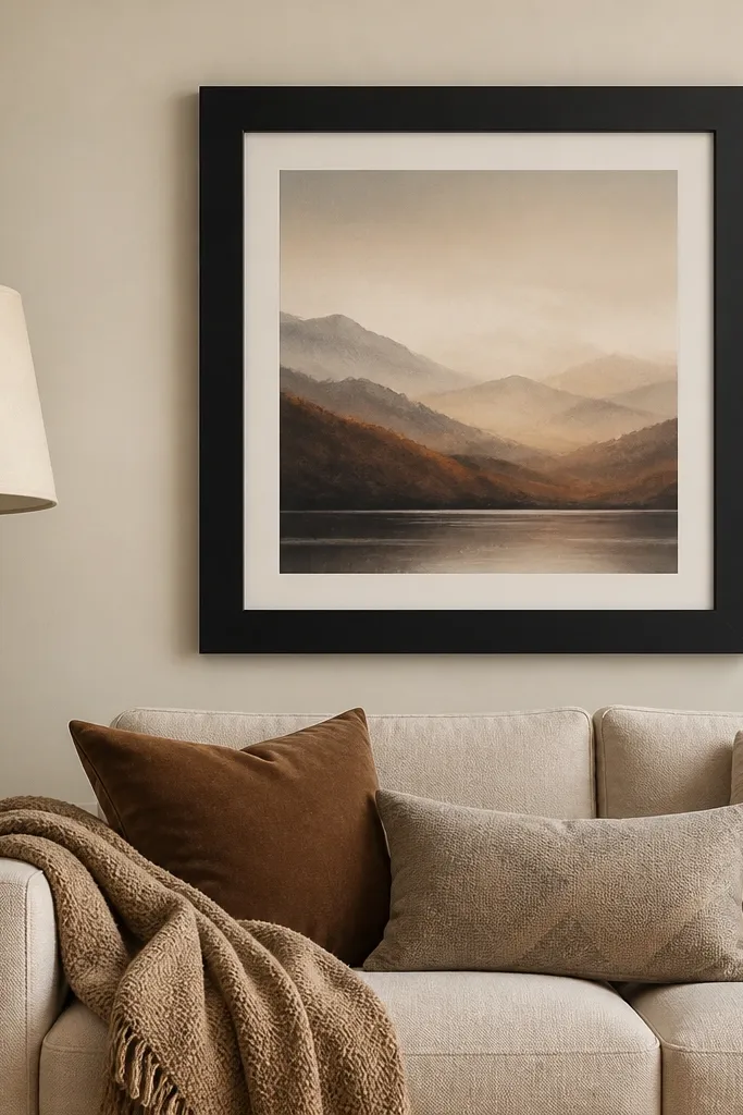
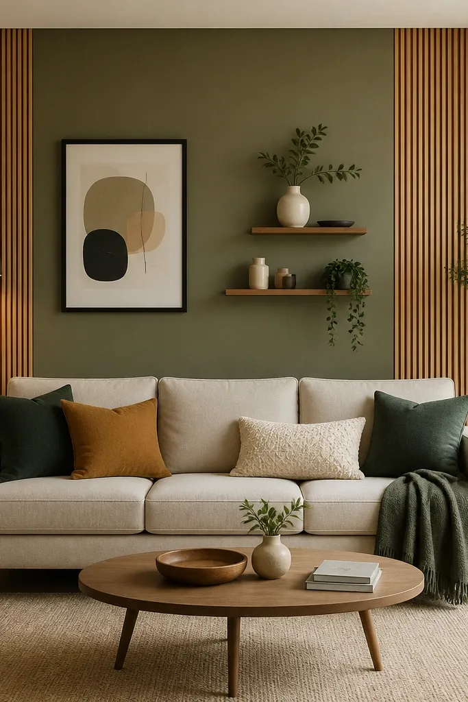
This is the fastest way I’ve found to make a sofa wall feel finished without clutter. You’ll want a frame that’s matte black or dark espresso with a border that reads clearly from across the room, like a simple 2-inch mat. Pick art in colors already in your sofa or rug — if your sofa is warm beige, choose clay, sage, and charcoal. This works especially well when your sofa back is fairly tall and you want the wall to feel calm instead of busy. I’ve used this layout in living rooms with white walls and it immediately adds depth because the frame creates a hard edge against the flat paint.
Start by centering the frame on the wall so the artwork’s bottom sits about 6-10 inches above the sofa back height. Use a level and mark two pencil dots for the hanging points. Choose a print size that’s roughly 2/3 to 3/4 the sofa width — if your sofa is 84 inches wide, aim for a framed width around 56-65 inches. Install with a picture-hanging kit that matches your wall type; then style the shelf-free look by adding one small plant on the side table and one matching throw texture on the sofa.
Keep the frame finish consistent with any metal lamp bases or curtain rods — matching black makes the room look “done.”
Don’t use a tiny print — if the artwork is smaller than your sofa arm width, it looks like an afterthought.
2. Two Tall Sconces with a Center Mirror
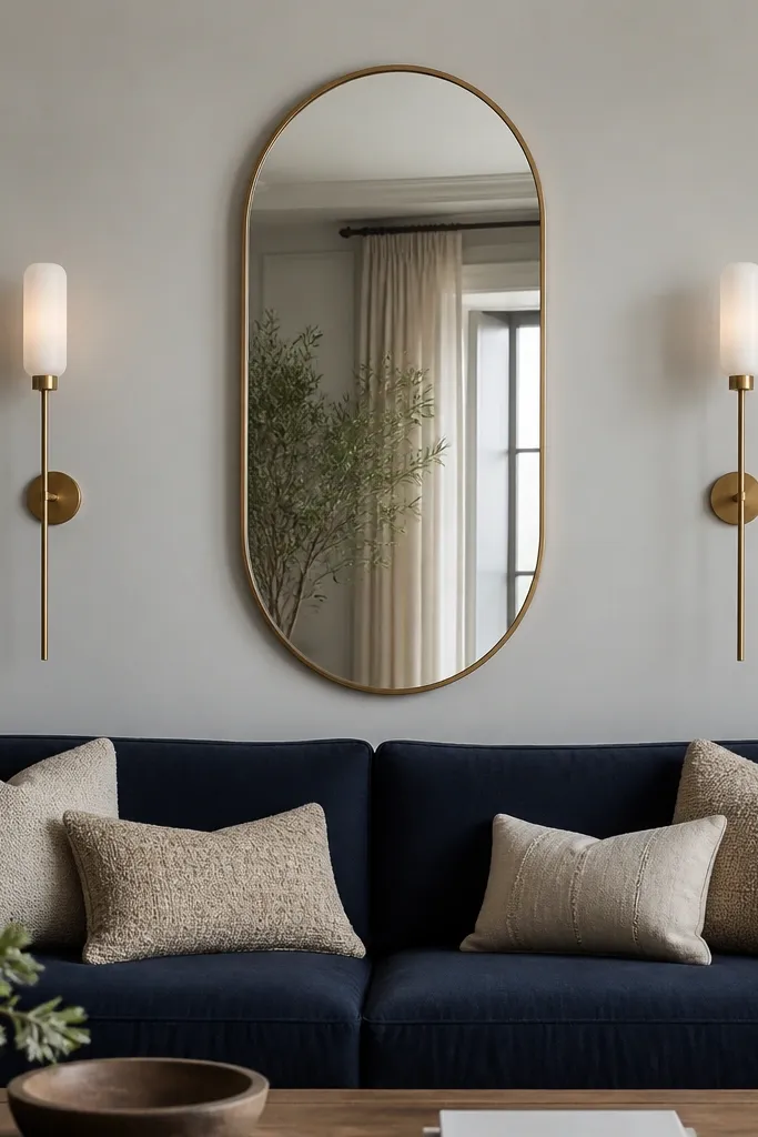
This combo gives you that “hotel lobby” feel without the fuss of a full gallery wall. The mirror brings light back into the room, and the two sconces create vertical rhythm that makes the wall look taller. I like warm brass with a white shade if your room already has warm wood or beige textiles; it softens the contrast against cooler paint tones like gray. This design flatters rooms where you want brightness and a little drama, especially if your sofa is darker. With the mirror centered, the sofa back area looks intentional even if you keep the rest of the wall minimal.
Start by choosing a mirror that’s tall enough to visually extend past the sofa back by about 10-14 inches. Mark the centerline of the wall, then place the mirror so its bottom is around 10-12 inches above the sofa back height. Install the sconces so their inner edges line up with the mirror’s sides, usually leaving 8-12 inches of space between each sconce and the mirror. Turn on the lights and check the glow on the sofa cushions — aim for warm, not yellow.
Use warm bulbs around 2700K so the mirror reflection looks cozy, not harsh.
Skip mismatched sconce heights — even a 1-inch difference shows up instantly in photos.
3. Wood Slat Panel Behind the Sofa (Half-Wall Width)
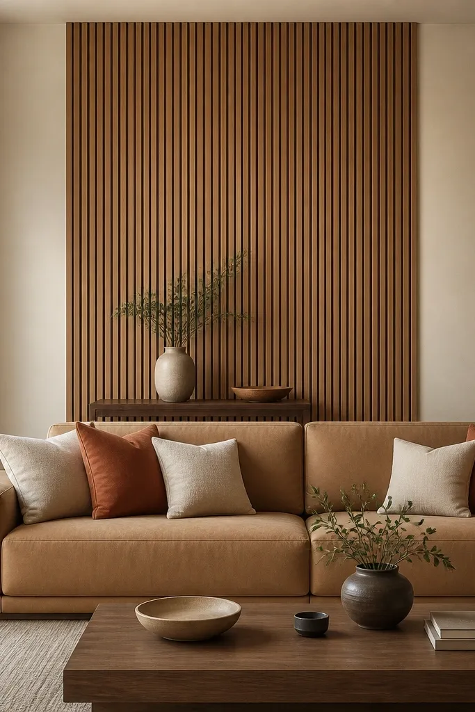
Vertical wood slats are the easiest way I’ve found to add structure without looking like a DIY experiment. By limiting the panel to half the wall width, you keep the room open and avoid that “feature wall that swallowed everything” look. Choose light oak or medium walnut depending on your flooring and coffee table tones. Slats work great with neutral sofas because the wood adds warmth and a subtle shadow line. If you have a low back sofa, this also helps the wall read taller since the slats pull the eye up.
Start by measuring the sofa width and decide the panel width at about 50-65% of that wall span. Mark the centerline, then layout slats with 1/2-inch spacing for a clean, modern look. Use a simple grid and pre-cut boards so the top edge stays straight. Mount the panel with a level, then finish with a matte clear coat if the boards are raw. Style by keeping decor low under the panel — a single vase and one small tray look better than clutter.
Test one slat section against your wall lighting first; some oaks go orange under warm bulbs.
Don’t use glossy varnish — it reflects glare and makes the slats look cheap.
4. Painted Two-Tone Band with a Center Frame
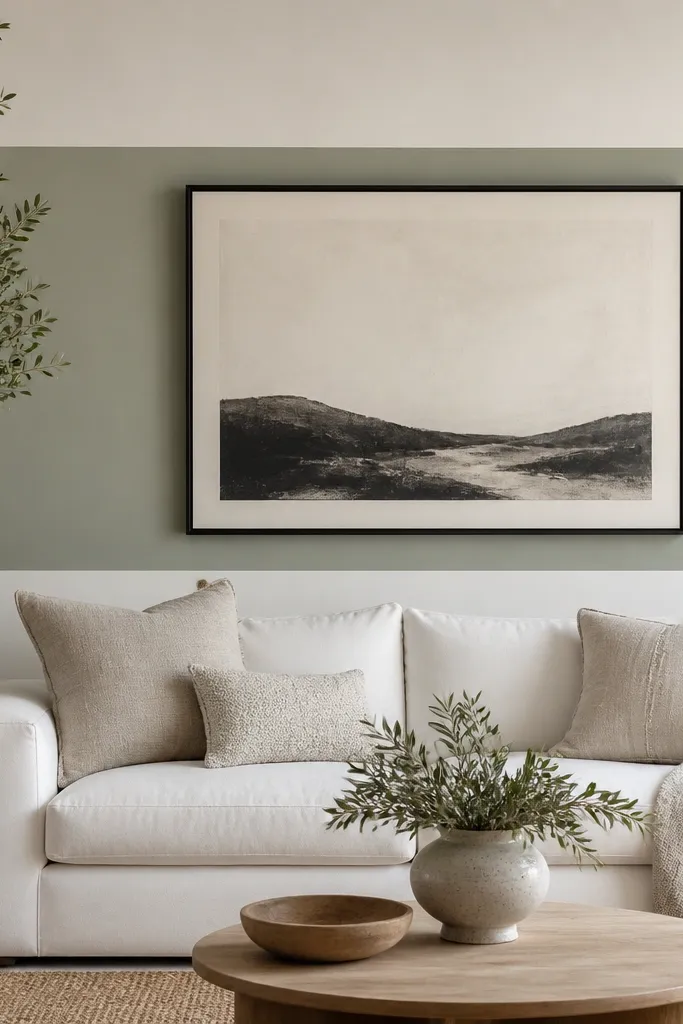
A painted band is one of those tricks that makes a plain wall look designed, even if you keep furniture simple. The band creates a visual “window” behind your sofa, and the frame anchors the center so it doesn’t feel like a random stripe. I like sage, clay, or dusty blue because they don’t fight warm wood floors. This works well with light sofas because the band adds contrast without making the room dark. If your wall is full of small decor already, this gives you one big clean area to balance it out.
Good to knowUse a satin finish for the band so the color reads smooth, especially under lamps.
Start by masking off a band that’s about 20-28 inches tall, centered behind the sofa back height. Paint the band first, then remove tape while the paint is still slightly tacky for cleaner edges. Choose a center frame width about 60-70% of the sofa width. Hang the frame so it sits in the middle of the band, not on the top edge. Style with matching cushion tones from the band — one pillow should pull a color from the paint.
AvoidDon’t paint the band too thin — under 12 inches looks like an accidental line.
5. Gallery Wall with Identical Frames and One Vertical Piece
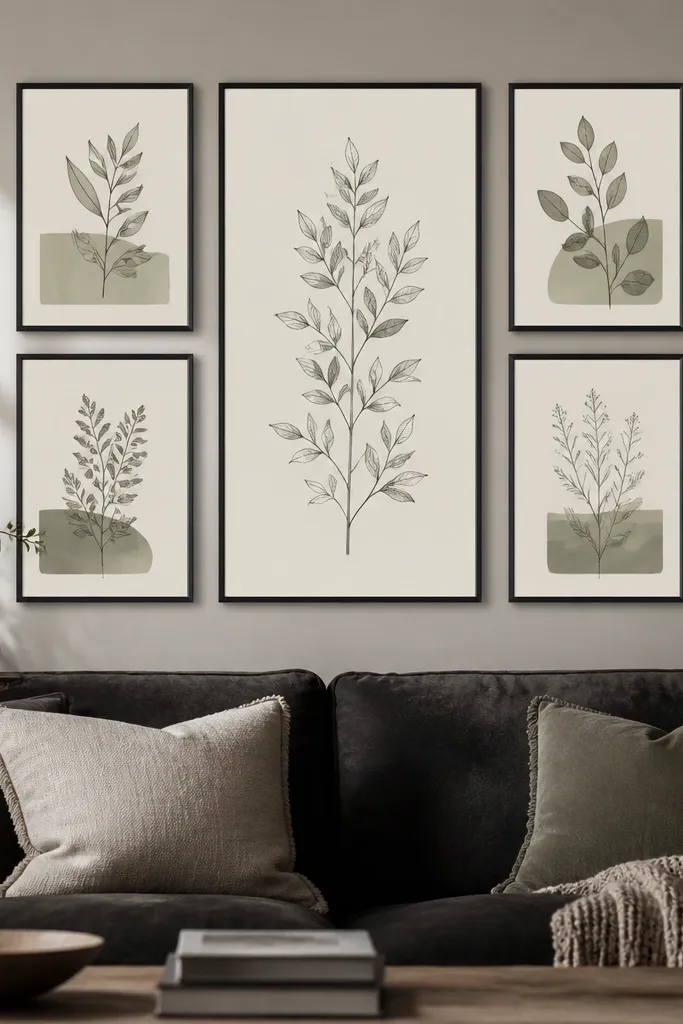
A gallery wall looks best when it follows rules you can measure. Identical frames make the wall feel calm, and the one vertical piece gives you a lift so it doesn’t turn into a flat rectangle. I’ve done this with thin black frames and botanical prints and it worked in both small apartments and larger open-plan rooms. This is flattering for people with busy living rooms because the structure keeps the wall from turning into visual noise. It also hides wall texture flaws because the frames create a uniform grid.
Good to knowUse matte prints instead of glossy — they photograph better and don’t glare from lamps.
Start by picking one frame size and sticking to it, like 12x16 inches for the main group. Lay the arrangement on the floor first and aim for a total gallery width around 70-80% of your sofa width. Include one vertical frame in the center that’s about 20-24 inches tall, so the composition stretches upward. Measure the distance between frames — keep it consistent, like 2-3 inches of gap. Hang the whole layout by marking the top center point, then use a level for each frame.
AvoidDon’t mix frame widths — mixed frames make it look like you collected random pieces.
6. Floating Shelf Run with a 12-Inch Gap to the Sofa
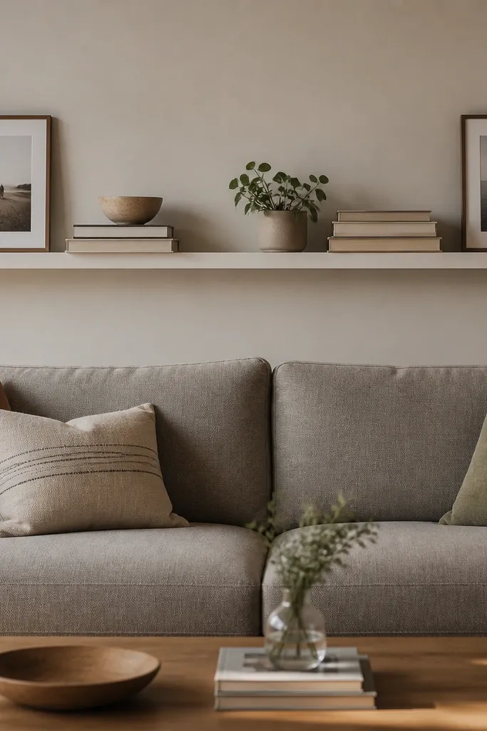
A floating shelf gives you function and a clean look, and it works even in rooms where you hate lots of hanging art. The key is spacing — if the shelf sits too low, it blocks the sofa back visually; too high and it feels disconnected. I like a shelf in warm white or light oak because it doesn’t fight most upholstery colors. This design flatters people who want a little styling space without turning the wall into a gallery. It also helps if your sofa back is tall and you need something horizontal to balance the vertical seat lines.
Start by choosing a shelf length around 80-90% of the sofa width. Mark a level line so the shelf bottom sits about 10-14 inches above the sofa back height. Install proper brackets into studs or use appropriate anchors rated for the shelf weight. Style with an odd number of items — I usually do 5: a stack of 2 books, one ceramic piece, one small plant, and two frames at the ends. Keep the tallest item centered and the ends lower.
Leave 1-2 inches of breathing space between the shelf edge and the books so it looks intentional, not packed.
Don’t overload the shelf — if you can’t see the wall behind the objects, it looks cluttered.
7. Oversized Woven Runner Hung Horizontally
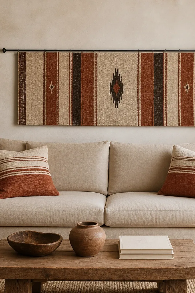
Yes, you can hang a woven runner on the wall and it looks better than framed fabric when it’s sized right. The texture adds depth without needing a bunch of frames, and the horizontal stripes calm the eye. I like this for warm-toned rooms because the fibers look cozy under lamp light. It’s also forgiving if your wall has small bumps because the weave hides imperfections. This works especially well behind sofas with simple upholstery because the runner becomes the star.
Start by picking a runner that’s about 60-75% of your sofa width. Mount it with a simple tension rod or a fabric rod, placing the bottom edge around 8-10 inches above the sofa back height. Keep the runner centered on the wall and make sure the stripes are level — use a measuring tape, not your eye. For styling, add two pillows that pull colors from the runner and skip extra wall decor so the texture stays the focus. If the runner is heavy, use wall hooks into studs or a proper mounting bar.
Use fabric spray adhesive on the back corners if the runner frays — it stops shedding and keeps edges crisp.
Don’t hang a rug that’s too small — it looks like a placemat taped to the wall.
8. Layered Mirror and Sconce Trio (Small Mirror + Two Lights)
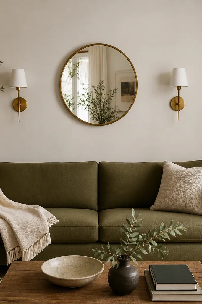
This is for when you want brightness but don’t want a huge mirror dominating the wall. The small mirror bounces light, and the two lights add a symmetrical frame around it, so the wall still feels “designed” even with minimal decor. I prefer thin gold for warmth if your room has warm metals or wood. This layout looks great with olive or charcoal sofas because the gold and brass read warm against darker fabric. It also works in narrower rooms where a big art piece would feel cramped.
Start by choosing a mirror diameter around 18-24 inches, centered on the wall. Hang it so the mirror center lands about level with the sofa back height, then mount sconces so their bulbs sit at about the same vertical height as the mirror’s center. Use two identical sconces — same shade size, same arm length. Keep the sconce spacing equal on both sides, usually 8-12 inches from the mirror edge. Style with one tall plant on a side table and keep pillows in two tones to avoid competing with the wall glow.
Dust the mirror before you hang it; smudges show up under warm bulbs more than you’d think.
Don’t mix gold and black hardware in the same tight spot — it looks messy instead of curated.
9. Peel-and-Stick Brick Panel with a Black Frame
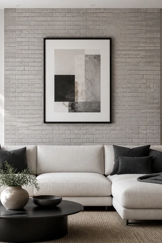
Brick texture is dramatic, but you don’t need real masonry to get the effect. Peel-and-stick brick panels give you shadow and depth, which makes a blank wall feel like it has architecture. I like light gray brick because it works with cool and warm palettes without turning the room orange. Pair it with a single bold frame so the wall doesn’t look busy. This is ideal when your sofa is light and you want a darker backdrop that still feels modern.
Start by measuring the wall and picking panel coverage that’s about 70-80% of the sofa width and centered behind it. Clean the wall thoroughly and let it dry completely before applying. Line up the first corner panel carefully; brick patterns punish sloppiness. Once applied, hang one large black frame centered on the brick section, with the bottom of the frame about 6-10 inches above the sofa back height. Style around it with two pillow colors and one throw that matches the frame — I usually keep it to black and one muted accent.
Use a plastic smoothing tool and work slowly from the center out to avoid bubbles.
Skip wallpaper paste or extra adhesives on top — it can lift the panel edges later.
10. Vertical Fabric Panels with Tension Rod Top
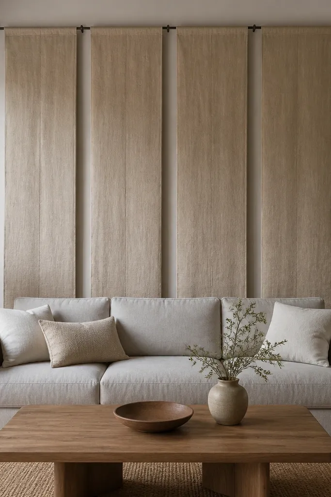
Fabric panels are the softest way to make the sofa wall feel designed, especially if you hate hard lines like shelves or frames. Hanging linen panels from a tension rod gives you an architectural look without drilling multiple holes. This works best when your sofa back is mid-height and you want the wall to feel taller. The warm beige linen also flatters most skin tones and textiles because it reads neutral and cozy. I’ve used this in rooms where the wall feels too stark and the room needs softness fast.
Start by measuring the space behind the sofa and choose panel width so you have 2-4 inches of overlap or spacing between them. Install a tension rod across the wall above the sofa back area, usually around 8-12 inches above the highest cushion line. Hang four panels so they drop to about 2-6 inches above the sofa seat, not all the way to the floor. Use curtain rings or simple grommets so the panels move smoothly. Keep styling minimal: two cushions and one throw in textured fabric to match the linen.
Steam the panels before hanging so the folds settle cleanly and don’t look wrinkled.
Don’t hang panels too low — if they hit the seat, they look accidental.
11. Chalkboard Paint Center Rectangle for a Cozy Accent

A chalkboard rectangle is a fun option that still looks intentional if you keep it tidy. The matte surface absorbs light and makes the room feel softer, and the center placement keeps it from looking like a craft project. I like chalkboard paint in a framed rectangle because it gives the wall a clean boundary. This works well if your sofa is warm-toned and you want contrast without going too dark. It also flatters people who like seasonal change — you can rewrite it for holidays without replacing decor.
Good to knowAfter you paint, rub chalk over the whole surface and erase — it helps the first writing look smoother.
Start by masking a rectangle centered behind the sofa back, usually around 24-36 inches wide and 30-42 inches tall depending on your sofa size. Paint two coats of chalkboard paint and let it cure fully according to the label. Frame it with simple wood trim or a thin metal frame and install centered at about 6-10 inches above sofa back height. Use a fine chalk line for the text and pick one color that matches your other accents, like off-white or light gray chalk. Style the sofa with one neutral throw and one accent pillow so the chalk area stays the focus.
AvoidDon’t use thick marker-like chalk lines — they look messy and cheap against the matte board.
12. Large Corner-to-Corner Mirror with Rounded Edges
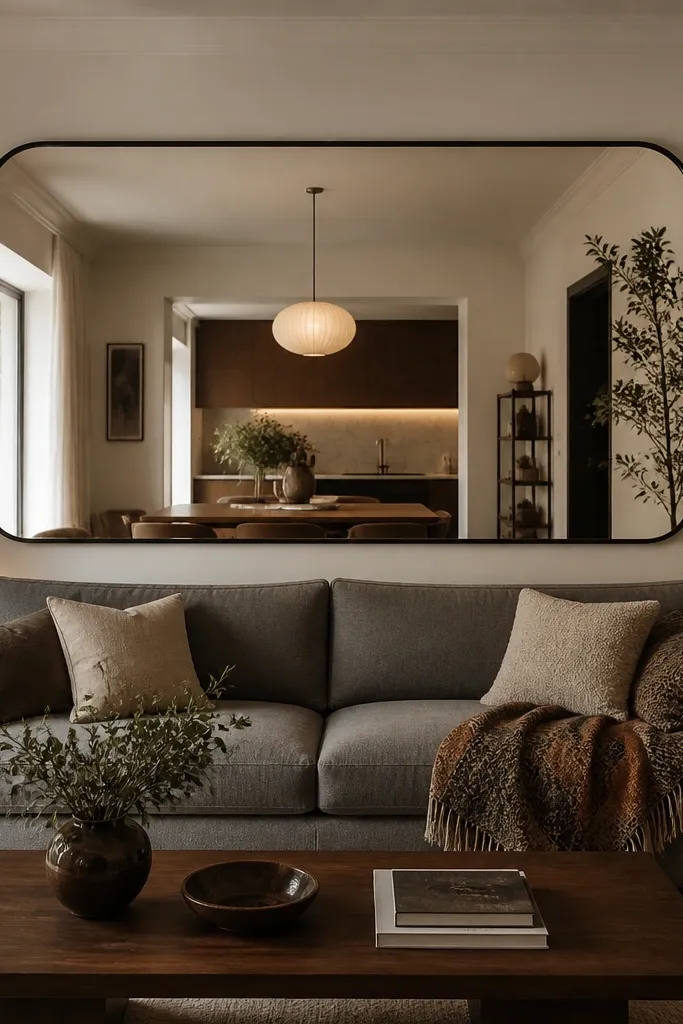
A mirror that’s wide and rounded makes your sofa wall look bigger and brighter instantly. The rounded edge softens the geometry so it doesn’t feel harsh behind cushions and pillows. I like this when your room is narrow or you have limited natural light. The mirror also helps a wall look filled without adding more clutter. This flatters almost any color sofa because the mirror is neutral and the room reflection brings in the rest of your palette.
Good to knowWipe the mirror with a microfiber cloth and glass cleaner right before final placement; fingerprints show in warm light.
Start by choosing a mirror width around 70-90% of the sofa width. Mount it centered with the bottom edge about 8-12 inches above the sofa back height so it doesn’t visually collide with pillows. Use a stud finder for heavy mirrors and install with proper wall-rated brackets. Keep side decor simple — one lamp and one small plant on the opposite side so the reflection doesn’t get busy. If your mirror frame is dark, repeat that color in the lamp base or picture frames nearby.
AvoidDon’t hang a mirror too high — if the bottom edge rises above the sofa back, it looks like it’s floating.
13. Rope Shelving with Two Plants and One Ceramic Vase
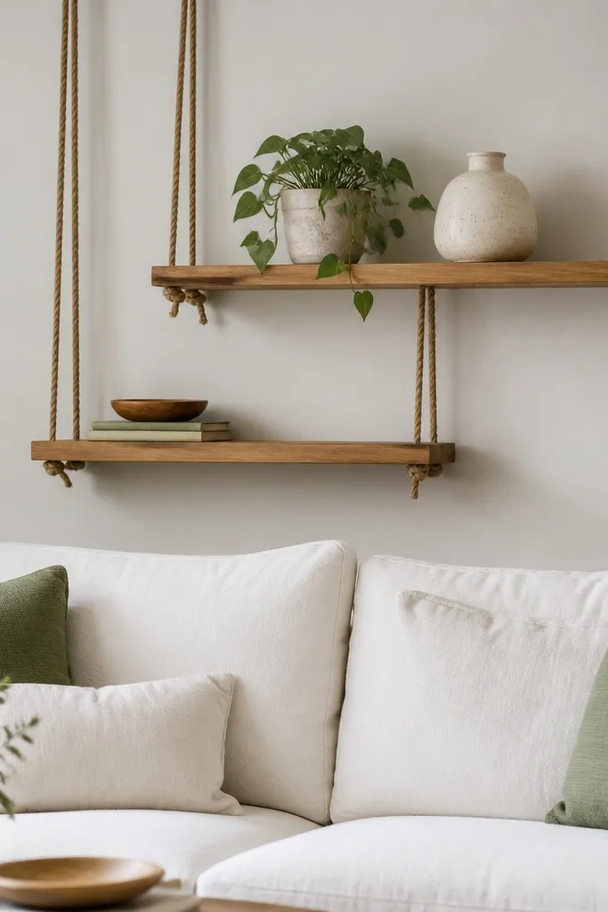
Rope shelving is my go-to for renters because it looks intentional even with a small number of items. The natural rope adds texture and keeps the wall from feeling flat, but the shelves themselves stay light visually. This works best when you want a calm, organic look that doesn’t require painting or drilling a big feature. I’ve done this behind white sofas and it looks warm and lived-in fast. It also flatters rooms with plants already, because the wall becomes a vertical garden instead of a decor dump.
Start by marking two anchor points for each shelf and making sure they land in studs if you’re placing heavier decor. Space the shelves so the top shelf sits about level with the upper part of the sofa back, and the bottom shelf sits around 8-12 inches above the sofa seat. Use small decor: a 4-6 inch pot plant, one ceramic vase no taller than 10-12 inches, and one small book or tray if you need balance. Keep the rope color consistent with your other materials — natural rope looks best with warm woods. Style the shelves so items don’t line up perfectly; stagger height for a more natural look.
Choose plants with similar leaf colors so the wall reads cohesive, like two green tones instead of green plus silver.
Don’t overload shelves — rope systems look messy when they’re packed.
14. Oversized Wall Clock with Off-Center Placement
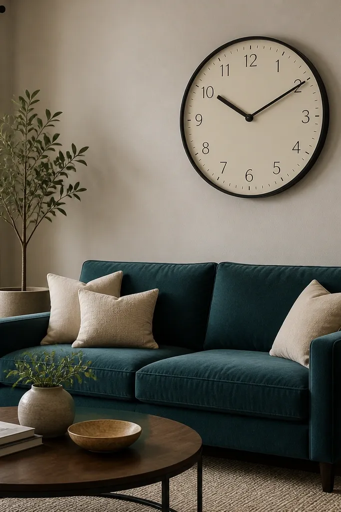
A big wall clock is a surprisingly clean solution because it adds function and a strong focal point. Off-center placement keeps it from looking like a sticker on the wall. I like off-white clock faces with black numerals because they look crisp even under lamp light. This works when your sofa wall needs one object that’s both practical and stylish. It’s also a good fit if you already have shelves or a gallery in the room and you don’t want more small items competing.
Start by picking a clock diameter around 18-24 inches so it reads from across the room. Measure the sofa width and position the clock’s center about 2-6 inches to one side of the wall centerline. Hang it so the bottom of the clock is around 6-10 inches above the sofa back height. Use the same black finish as your lamp base or picture frames so the metal ties in. Style with one throw and two pillows; keep other wall decor out so the clock stays the hero.
Use a clock with a smooth, quiet sweep if you’re sensitive to ticking — it changes the vibe at night.
Don’t choose a clock with shiny chrome — glare makes it look cheap.
15. Large Framed Fabric Panel with Nailhead Trim
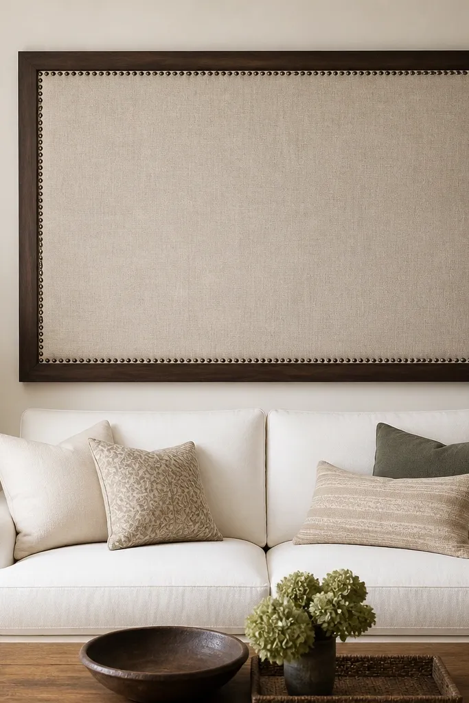
Fabric panel wall art looks expensive because it adds softness and a tailored edge. Nailhead trim gives you that structured detail you’d normally see on upholstered headboards. I like oatmeal linen because it reads neutral against both cool and warm walls. This works best when your sofa is simple and you want a more tailored, furniture-like look behind it. It also flatters rooms that feel too echo-y or too bare because the fabric absorbs some sound. The framed upholstery makes the wall feel like part of your furniture, not separate decor.
Start by choosing a panel size about 60-75% of your sofa width. Mount it centered so its bottom sits about 8-10 inches above the sofa back height. If you’re buying, look for a backing that has hanging hardware already; if you’re DIY, add D-rings and use a secure wall anchor. Keep the frame finish consistent with your wood furniture — dark wood with walnut tables, lighter wood with oak tables. Style the sofa with one matching fabric throw and one pillow that pulls the same oatmeal tone.
Pick a fabric that has visible texture, not smooth microfiber; texture shows better from a distance.
Don’t hang a panel that’s too small — it looks like a decorative placard.
16. Three-Panel Vertical Canvas Triptych
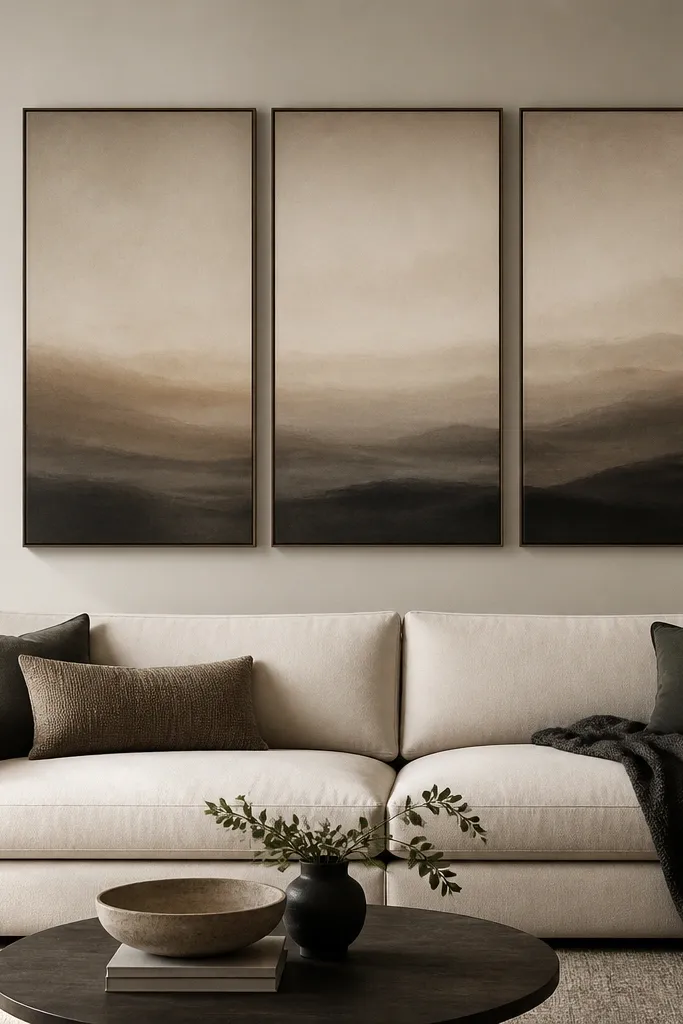
Triptychs work because they create movement without requiring multiple different items. Vertical panels add height and keep the composition from feeling flat behind a sofa back. I like muted gradients because they don’t fight your cushions, but they still add depth. This is flattering for neutral rooms because the charcoal and taupe add contrast without going loud. It also looks great when you want a modern vibe but don’t want a rigid geometry like slats.
Good to knowMatch one color from the triptych in a throw or pillow cover so the wall doesn’t feel separate.
Start by choosing a triptych where the total width is about 70-80% of your sofa width. Hang it centered so the top edge sits around 10-14 inches above the sofa back height and the bottom edge lands just above the highest cushion line. Use a level to keep the middle panel perfectly straight. If the panels are framed, keep the frame color consistent with other black or wood elements in the room. Style with one patterned pillow that repeats one of the triptych tones and keep side tables simple.
AvoidDon’t pick neon or high-contrast prints — they make neutral sofas look dated quickly.
17. Oversized Floating Cabinet Look with Two Doors
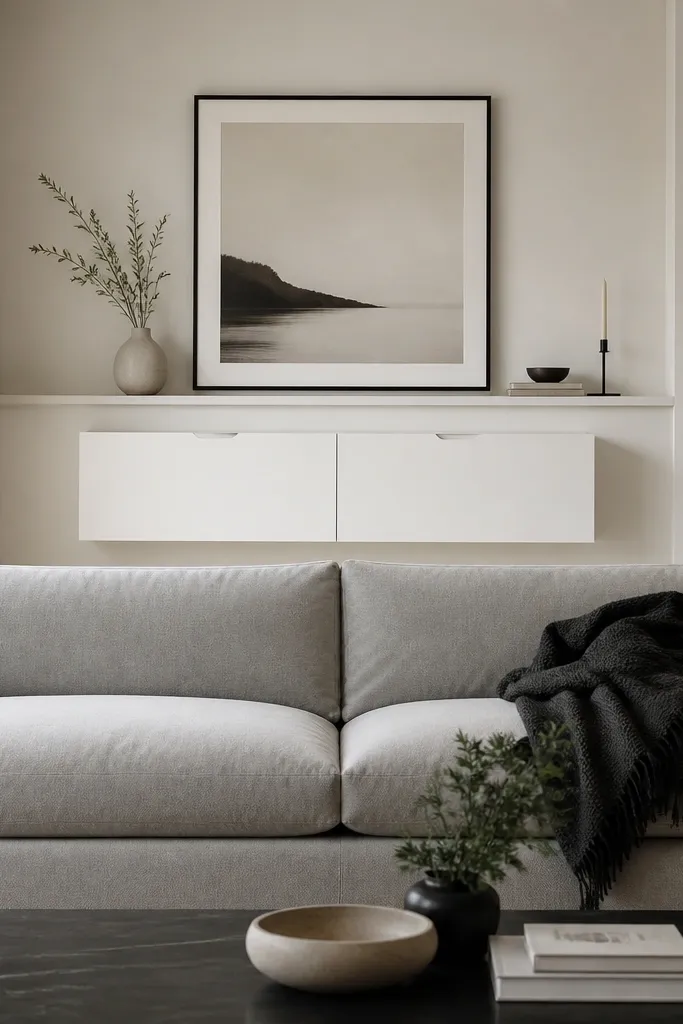
If you like clean lines, a floating cabinet look makes a sofa wall feel built-in. Recessed doors hide clutter and give you storage without cluttering the visual space. I’ve used this in living rooms where people keep remotes, candles, or board games — the wall stays tidy. Matte white reads crisp and modern, especially with warm wood floors. This design flatters families because it reduces what you see behind the sofa, which makes the whole room look calmer.
Start by selecting a cabinet width around 60-70% of the sofa width so it anchors the center without blocking side sightlines. Mount it so the top edge sits around 6-10 inches above the sofa back height, then add a large frame above it if you want more art — keep the frame width similar to the cabinet width. Install into studs and use a level bracket system; cabinet weight matters. Style the cabinet top with a single large tray and one stack of books, then keep the sides empty. Match the recessed handle color to your lamp bases for a consistent metal theme.
Leave the cabinet top mostly empty — two objects max looks more expensive than five.
Don’t hang a cabinet too low — it visually chops the sofa back and makes the wall feel heavy.
18. Large Step-Back Shadow Box Wall Art (Deep Frame)
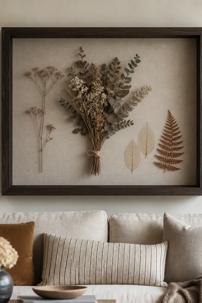
Deep shadow boxes add dimension you can’t get from flat prints. The step-back frame creates a built-in gallery feel, and the layered contents make it look like you spent time styling it. I like linen backing inside the box because it stays warm and hides small imperfections. This works well behind sofas with patterned upholstery because it adds a soft texture layer without competing with loud colors. It’s also a nice choice if you want something that looks different up close but still reads as one clean piece from across the room.
Start by choosing a shadow box frame wide enough to cover about 60-75% of the sofa width. Mount it centered so the bottom edge is about 8-10 inches above the sofa back height. Use a linen backing and keep the top layer about 2-3 inches below the glass or front lip so nothing touches and looks crowded. Place dried botanicals or flat pieces with a gentle diagonal — it prevents the arrangement from looking like a straight line. Style the sofa with one pillow that matches the dried tones (sage, tan, or muted brown).
Use dried stems that are shorter than you think; tall stems make the box look top-heavy.
Don’t overcrowd the shadow box — if it fills every inch, it looks like craft storage.
19. Large Wallpaper Panel Only Behind the Sofa Center
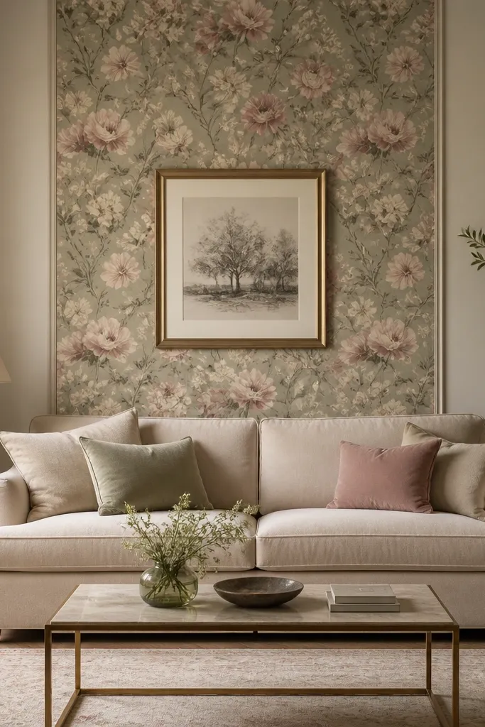
Wallpaper is powerful, but I don’t like it when it wraps the whole room. A single center panel gives you the drama where you want it and keeps the rest of the wall calm. I’ve had the best results with wallpaper that has a medium-scale pattern, not tiny repeating dots. Muted florals work because they add color without screaming, and the center framing makes the pattern feel intentional. This is flattering for neutral sofas and for rooms with solid curtains because the wallpaper becomes the visual anchor. It also makes your wall look layered even if you use minimal decor.
Start by choosing a wallpaper panel size that’s about 70-80% of the sofa width and centered behind it. Apply it carefully with a straight edge so the pattern lines up straight; trim the top and bottom edges cleanly. Hang one simple framed print or mirror centered inside the wallpaper area so it looks like a designed vignette. Keep the frame color consistent with your hardware — gold works if you have brass lamps or picture frames. Style with pillows that pull one color from the wallpaper and one neutral that matches your sofa.
If the wallpaper has a busy pattern, keep the frame simple and thin so the composition stays readable.
Don’t place the panel too low — if it sits behind the seat, the pattern looks like a skirt.
20. Framed Fabric Bow Tie Panels for a Soft Corner Effect
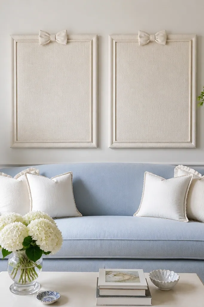
This one looks like custom upholstery work without being custom. Two framed fabric panels create a balanced, symmetrical feeling, and the bow detail gives you softness at the top so the wall doesn’t feel harsh. I like it for rooms where you want a gentle romantic tone but you don’t want full-on ruffles. It also works when your sofa back wall is narrow because two panels can fit without needing a huge single piece. The ivory fabric reads clean and works with cool-toned sofas like light blue or gray.
Start by picking frame sizes around 18x24 inches each, then center the pair so the total span is around 65-75% of your sofa width. Mount the panels with their top edges about level with the sofa back height plus 6-8 inches. Keep the bow detail facing inward so it visually “pulls” toward the center. Use a consistent frame finish, like brushed black or warm wood. Style with two pillows: one solid and one subtle texture that matches the fabric panel.
Use only two accent colors on the sofa so the fabric bow detail doesn’t compete with patterns.
Don’t hang the panels with uneven spacing — the symmetry is what makes it look intentional.