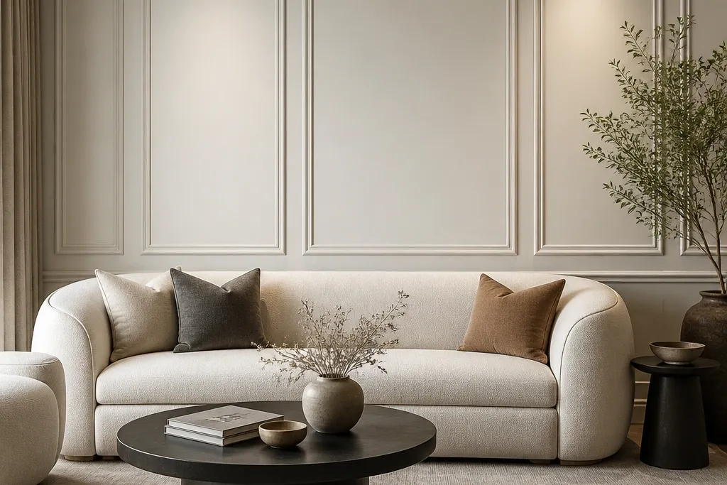
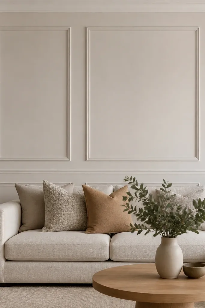
1. 2-Inch Shadow-Box Frame with Flat Center Panel
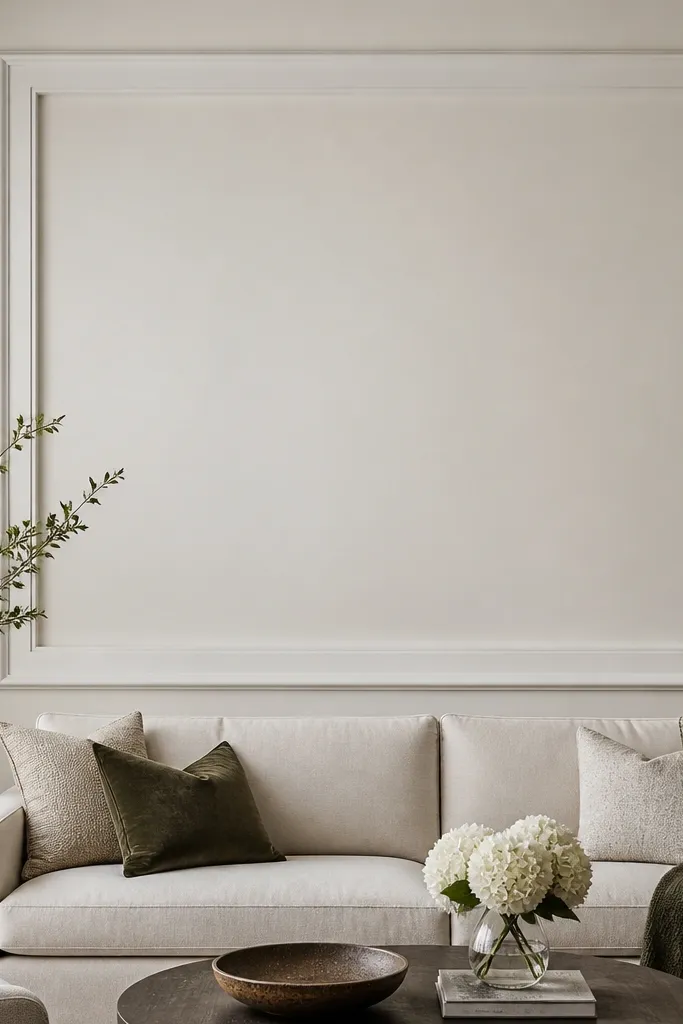
This design is my go-to when the wall behind the sofa is plain and you want structure without clutter. The outer frame has a chunky 2-inch shadow gap so the depth reads from across the room, even if the wall isn’t perfectly smooth. I pair it with a flat center panel because it stays easy to clean — no tiny grooves to trap dust. It looks best with sofas that have a clean back line, like boxy upholstery or a tailored slipcover. On warm undertones in wood floors and honey oak furniture, the crisp white frame makes the whole seating area look brighter without turning the room cold.
Start by marking a centered rectangle on the wall that matches your sofa width plus 10-14 inches total on each side. Install the outer moulding first, keeping the top edge level with your chosen height — I aim for the frame top about 8 inches below the ceiling. Then add the inner perimeter moulding to create the 2-inch shadow gap, leaving the center area flat. Fill any seam lines, sand lightly, and paint the moulding semi-gloss while the wall stays satin. Finish by styling the sofa with one large art piece centered in the panel so the frame looks intentional.
Use painter’s tape to mask the wall edge 1/8 inch inside the moulding so paint doesn’t bleed into the shadow gap.
Don’t add extra inner ledges or you’ll trade the clean look for a dust-collector.
2. Vertical Rib Moulding with One Horizontal Cap
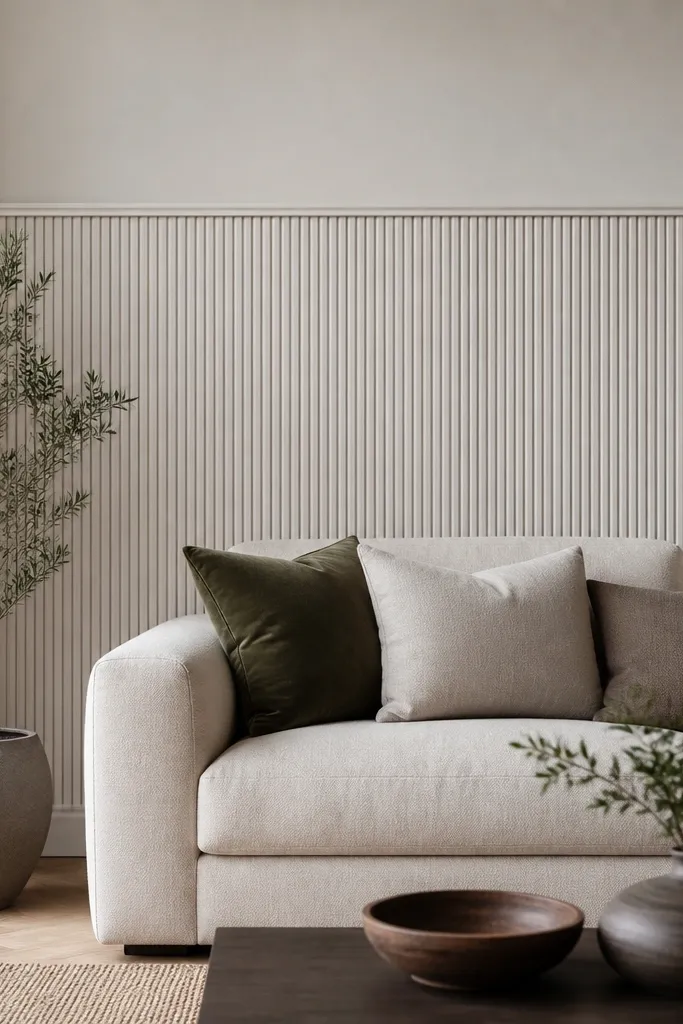
Vertical ribs make the back wall feel taller, which is a lifesaver in rooms with lower ceilings. I like this version because it uses one horizontal cap, so you get rhythm without a maze of crosspieces. The ribs should be consistent in width and spacing — think 3/4-inch wide moulding with 2-inch spacing — so it reads neat up close. This works beautifully with mid-century sofas and upholstered backs that have gentle curves, because the wall texture adds interest without fighting the furniture shape. If your skin tone runs warm and your textiles are cream, camel, or terracotta, the vertical lines make the area feel sunlit rather than stark.
Good to knowFor spacing, use a scrap strip cut to your gap width and slide it between mouldings as you nail.
Measure from the floor to the sofa top and decide where you want the ribs to start; I usually start ribs about 4-6 inches above the sofa back. Mark evenly spaced points, then install the vertical runs using a level and a chalk line for alignment. Add the horizontal cap across the full width at about 6-8 inches below the ceiling, so it visually ties the ribs together. Caulk seams sparingly, sand smooth, then paint ribs semi-gloss and the wall satin. Style by keeping pillows in two tones and adding a long, narrow mirror or slim art to echo the verticals.
AvoidSkipping consistent spacing is what makes ribs look cheap and wavy.
3. Crown-Style Top Rail with Simple Corner Blocks
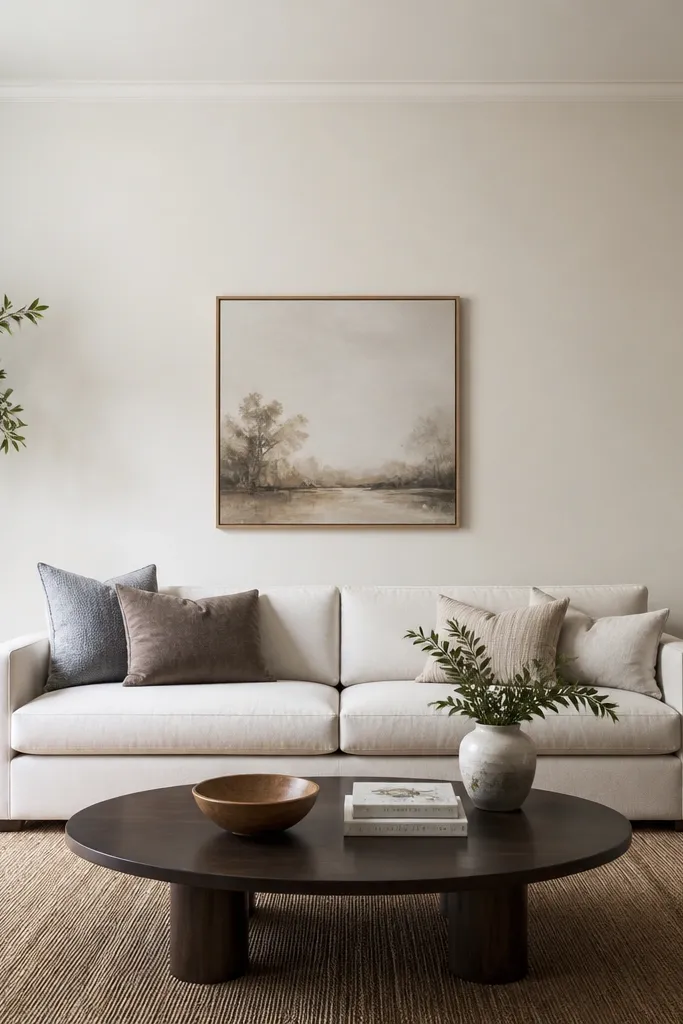
If you want a finished look but don’t want to coat a whole wall in trim, this is the smartest low maintenance option. The top rail adds height and polish, while the small corner blocks make it feel custom instead of “one strip.” I’ve used it in rental apartments where the wall has hairline cracks; the moulding hides the uneven paint edges and you don’t have to redo much. It looks great with tufted or high-back sofas because the crown line frames the silhouette. For rooms with gray walls and cool-toned furniture, a warm white rail keeps everything from looking sterile.
Good to knowUse a 2-inch foam roller for the rail paint so it stays smooth and doesn’t show brush marks.
First, find the ceiling-to-sofa relationship; I set the rail so it sits 10-12 inches below the ceiling for a gentle frame. Install the rail straight across, then place corner blocks where the rail ends — keep them symmetrical so the wall reads balanced. Use a miter saw for clean corners, and if your wall is slightly off, do small adjustments with sanding rather than forcing the cut. Caulk only the contact points, then paint the rail semi-gloss in the same color family as your trim. Style with a large piece of art centered under the rail, and keep the area around the blocks uncluttered.
AvoidDon’t hang decor so low that it covers the rail; the line needs to breathe.
4. Wainscot-Look Chair Rail with Lower Panel Moulding
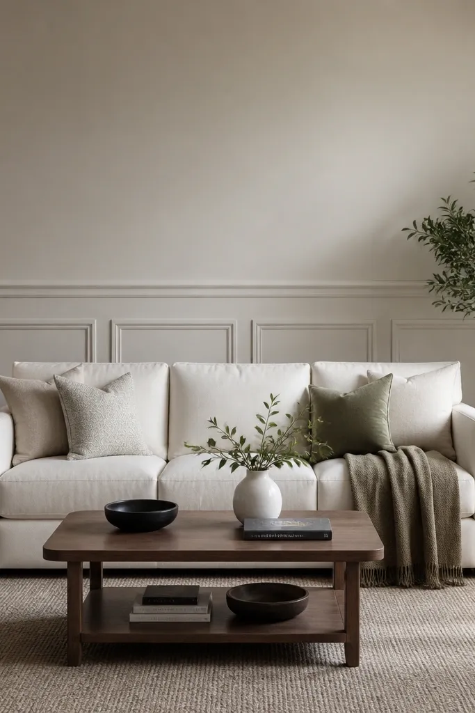
This is the moulding design I recommend when you want the sofa wall to look “designed” and you also need visual separation in open-plan rooms. The chair rail gives structure, and the lower panels add interest without reaching into complex details. I’ve installed it in homes with kids because it hides scuffs well, and the moulding surfaces clean without snagging. It flatters sofas with skirts or tailored edges because the wall and furniture line up visually. In beige or greige rooms, the classic panel rhythm makes the space feel calm instead of busy.
Mark a chair rail height about 32-36 inches from the floor, then check it against the sofa back so it feels centered, not random. Install the horizontal rail first, then build rectangular panels beneath with moulding strips that are 1/2-inch wide. Keep panel depth shallow — around 3/8-inch — so it doesn’t collect dust like deeper ledges. Caulk, sand, and paint the moulding semi-gloss; keep the wall satin for easy wipe-down. Style with two matching framed prints or one larger print centered in the panel area.
If your wall gets fingerprints, use semi-gloss moulding paint and wipe with a damp microfiber, not spray cleaner.
Don’t make the lower panels too small; tiny rectangles look fussy and show uneven caulk.
5. Single Large Arched Top Frame with Straight Sides
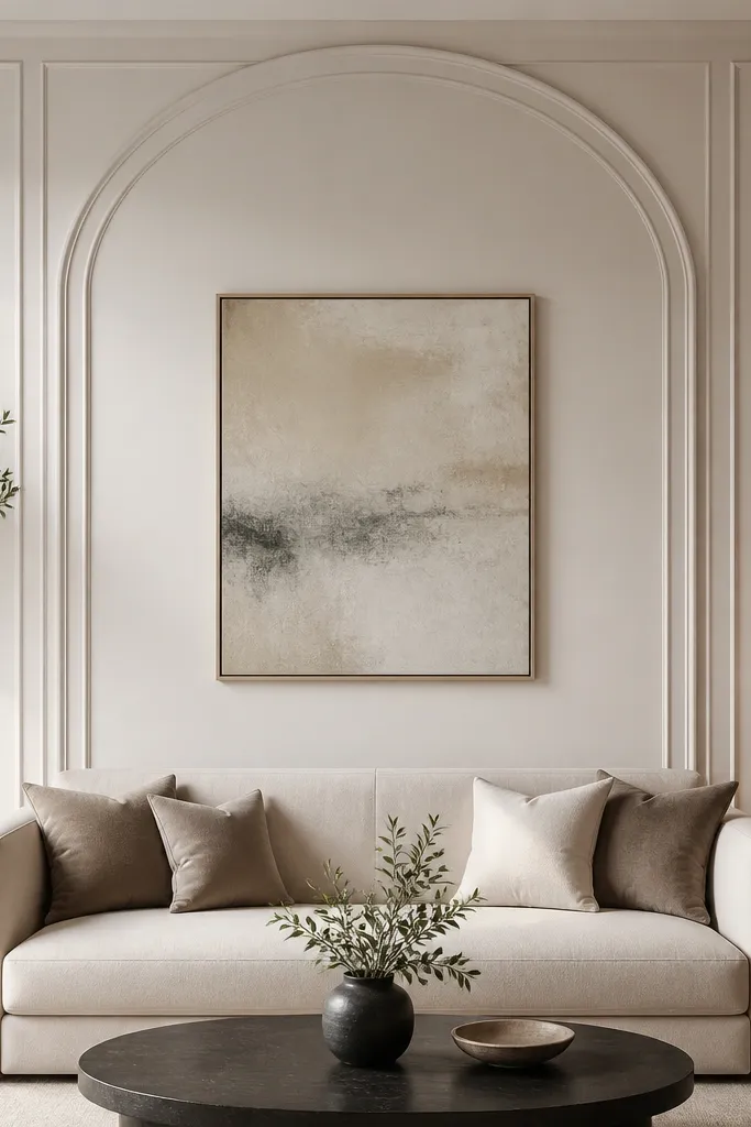
An arched top gives you softness behind a sofa, especially if your furniture has sharp angles or a low, boxy back. I like this design because it’s one big focal frame, not a bunch of small arches that create shadows you can’t clean. The moulding should project about 1/2-inch so the arch reads clearly without looking heavy. This works best with round or oval mirrors and large art pieces, because the arch echoes those shapes. In rooms with olive or sage walls, the warm white frame makes the green feel intentional, not muddy.
Start by deciding the frame width — match it to your art width plus 6-10 inches total. Mark the straight side lines first, then build the arch using a flexible contour strip or a pre-marked template on the wall. Install the arch moulding so the top highest point sits about 6-8 inches below the ceiling. Keep the center area flat and paint it the wall color, then paint the frame semi-gloss. Finish by placing a large art piece or mirror centered inside the frame so the arch looks like it’s holding it up.
Use a laser level for the arch symmetry; it’s faster than measuring from both sides repeatedly.
Don’t stack small arches under the big one; that’s when it turns into a cluttered trim wall.
6. Grid Pattern with 3/4-Inch Squares and Thin Borders
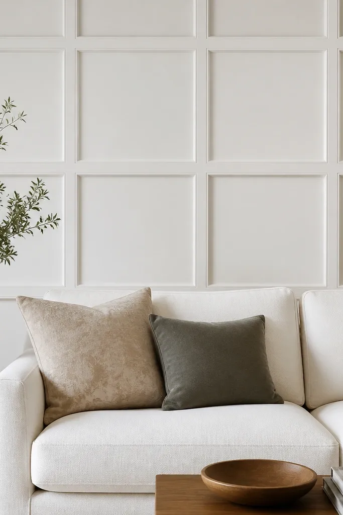
A grid gives you that built-in look without needing deep carvings or ornate profiles. The trick is scale: 3/4-inch square sections look crisp and modern, while bigger squares can feel too bold behind a sofa. This design reads clean even from a distance, and it’s low maintenance because the moulding lines are straight and continuous. It suits sofas with modern legs and clean upholstery seams, and it also works with rattan or light wood accent tables nearby. If your wall color is light gray, the white grid brings focus to the seating area without darkening the room.
Measure the wall width and choose a grid that lands evenly; I avoid odd half-squares because they look off when you stand back. Install a perimeter border first, then add horizontal and vertical strips spaced evenly to form squares. Keep the moulding width around 1/2-inch and the projection around 1/4-3/8-inch for easy wipe-down. Sand seams smooth and paint everything semi-gloss, even if the wall is matte. Style by using one oversized artwork centered so it breaks up the grid visually.
Dry-fit two strips on a scrap wall or cardboard to confirm the spacing looks right before you nail anything.
Don’t use different moulding widths in the same grid; it creates a patchwork look.
7. Picture-Frame Moulding with Wide Inner Bevel
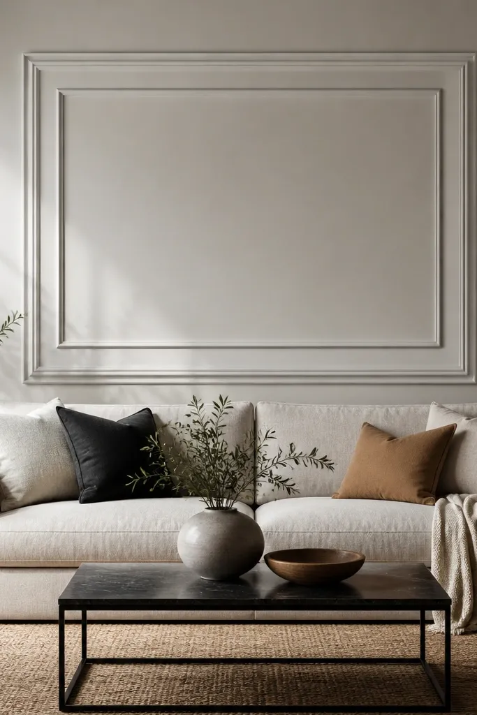
This is a “looks expensive, cleans easily” design because it uses a double visual line without deep ledges. The wide inner bevel creates a bright edge that catches light, so the wall reads dimensional even when you keep the center plain. I’ve used it in rooms where the sofa back is busy with pillows, because the moulding doesn’t add clutter — it just frames the space. It flatters almost any sofa style, but it really shines with neutral upholstery and simple silhouettes. In homes with warm cream walls, the bevel line in white adds contrast without turning the wall into a stark grid.
Start with one big frame that matches your sofa width plus 8-12 inches total. Install the outer frame first, then set the inner bevel moulding so it sits about 1/4-inch inside the outer edge. Aim for a projection around 1/2-inch maximum; deeper bevels collect dust at the lip. Fill seams, sand, and paint the frame semi-gloss, then paint the center panel satin to match the wall. Add one centered art piece or a triptych with equal spacing so the frame feels like it belongs to the artwork.
Use painter’s caulk that stays paintable and wipe excess caulk with a damp fingertip before it skins.
Don’t make the inner bevel too thin; it looks sharp but it’s harder to keep clean and straight.
8. Stacked Horizontal Bands with Hidden Shadow Line
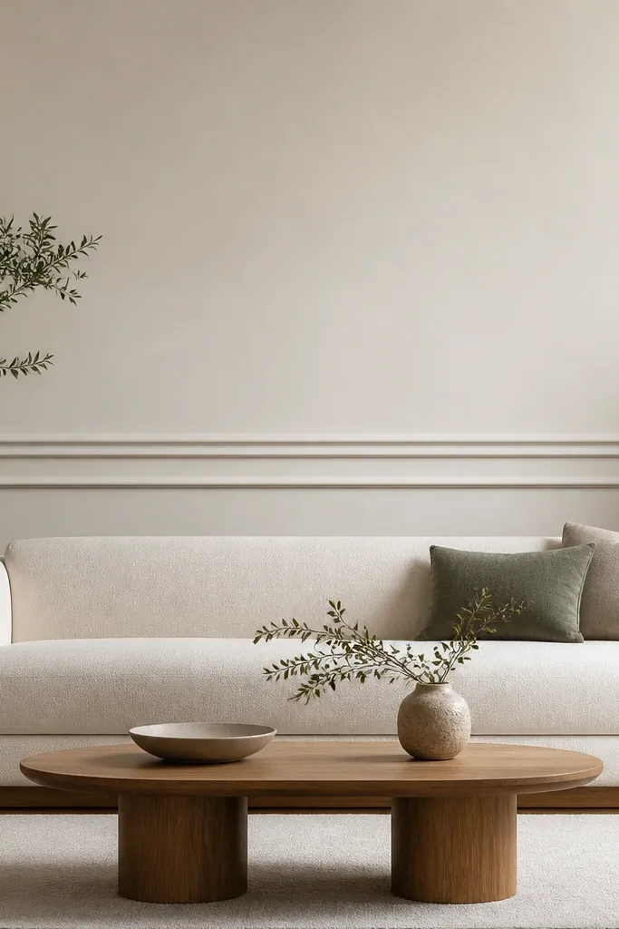
Horizontal bands make the sofa wall feel grounded, especially in rooms with tall windows or long curtains. I like stacked bands because they add structure without creating corners that trap grime. The hidden shadow line between bands is what makes it feel built-in rather than like applied trim strips. This design looks best with low-profile sofas and straight-backed chairs because the wall bands echo the horizontal lines. For darker upholstery like charcoal or deep navy, the bands in bright white keep the wall from absorbing light.
Good to knowMeasure band spacing from a single reference mark so you don’t end up with one gap that’s wider.
Mark a centerline on the wall that lines up with the top third of the sofa back, then place the bands around it. Install the first band level and straight, then add spacers to keep the shadow gap consistent — I use 1/4-inch shims. Add the second band and third band only if your wall height supports it; two bands is enough in many living rooms. Caulk lightly at the back edge, sand smooth, and paint bands semi-gloss while the wall stays satin. Style with a low, wide media console or a long runner-style rug so the horizontal theme continues.
AvoidDon’t use glossy paint on the wall around the bands; it shows unevenness when light hits.
9. Corner-to-Corner Panel Frames with Center Negative Space
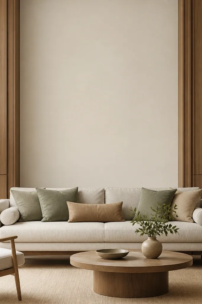
This one works when you have a wide sofa and you want the wall to feel structured without filling every inch with trim. The negative space keeps the wall calm, and the corner-to-corner frames pull your eye toward the center where your art will go. I use it in living rooms where people keep changing pillows and throws, because the moulding stays stable and the decor does the rotating. It looks great with sofas that sit close to the wall since the frames feel like architecture wrapping the seating area. In rooms with patterned wallpaper elsewhere, the negative space prevents visual competition.
Good to knowIf your corner walls aren’t perfectly square, cut the moulding to fit and sand the ends instead of forcing tight miters.
Start by dividing the wall into three sections: left frame, center negative space, and right frame. Install vertical outer moulding strips near the corners and then add inner borders to create panel frames that are about 18-24 inches wide each, depending on your wall size. Keep the center negative space flat and paint it the wall color so it visually “breathes.” Use consistent projection and keep ledges shallow — around 3/8-inch — for low dust buildup. Paint frames semi-gloss and then hang a single centered piece in the negative space area.
AvoidDon’t add a third frame in the center; it makes the wall feel busy behind a sofa.
10. French-Inspired Vertical Panels with Rounded Top Edges
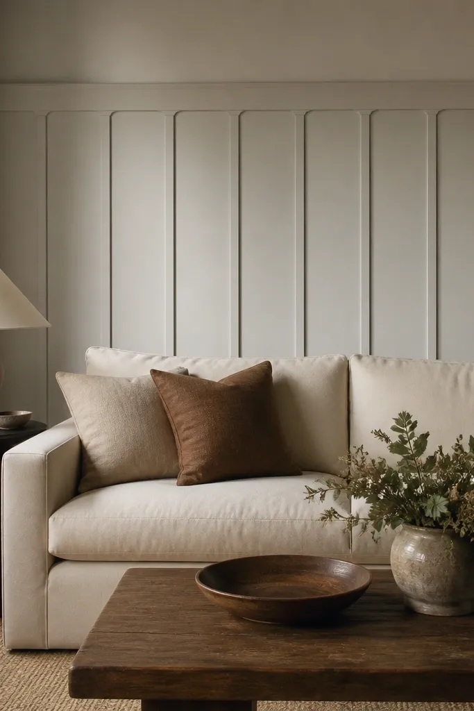
Rounded top edges soften the whole wall, which is a big deal when your sofa has straight, modern lines. This design gives you a “hotel suite” feel without doing ornate carving. I keep the profiles simple and the projection moderate so it stays easy to wipe and doesn’t collect dust in tiny curves. It flatters rooms with arched doorways or rounded hardware, since the wall and the rest of the home share a shape language. If you have a lot of brass or warm metal accents, the warm white moulding looks cohesive instead of cold.
Install a horizontal rail first at a height that sits above the sofa back by about 6-10 inches. Then mount vertical panel moulding strips that stop into the rounded top profile, with equal spacing between each panel. Use pre-formed rounded corner pieces or template-cut the radius so all tops match. Caulk seams, sand smooth, and paint moulding semi-gloss; keep the wall satin so cleaning wipes don’t leave shiny marks. Style with a pair of matching sconces or one round mirror centered under the rail for a balanced look.
Use a foam sanding block over caulk seams so you don’t sand through the factory primer edges.
Avoid deep rounded profiles; they have more surface area for dust and wipe streaks.
11. Slim Vertical Trim Columns with a Wide Center Panel
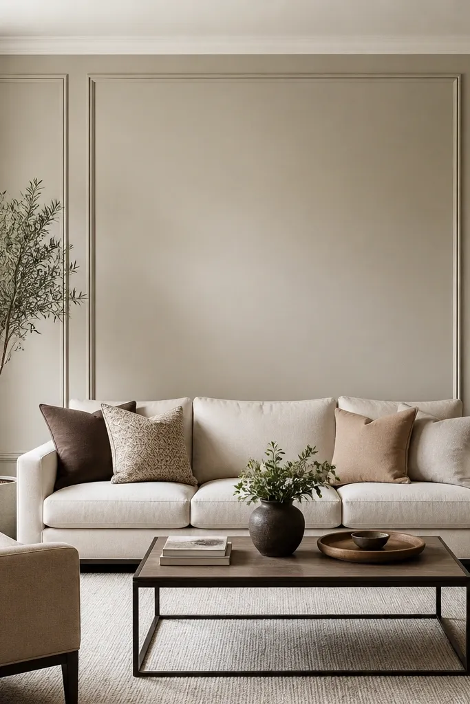
This is a clean, modern take on paneling that still looks like real millwork. The wide center panel keeps the wall light, while slim vertical columns add structure without turning the wall into a grid. It’s low maintenance because there are no small ledges or repeated corners; you’re mostly wiping flat moulding faces and edges. This works well with sofas that have tall backs or chaise layouts because the columns create a vertical “frame” that matches the height. In rooms with light wood furniture, the crisp lines make everything look intentional.
Mark the center panel width first based on your sofa — I aim for the center panel to be about 40-55% of the wall width. Install two slim columns at equal distances from center, then add a third column between them if your wall width supports it. Keep column projection around 1/4-3/8-inch so it doesn’t feel bulky behind pillows. Paint columns semi-gloss and the center panel satin in the wall color. Add a large piece of art or a wall-mounted shelf centered in the panel area.
Use a single color for moulding and trim across the room so the back wall feels like part of the same build.
Don’t widen the center panel too much; it can make the columns look like accidental trim strips.
12. Geometric Octagon Panel with Clean Border
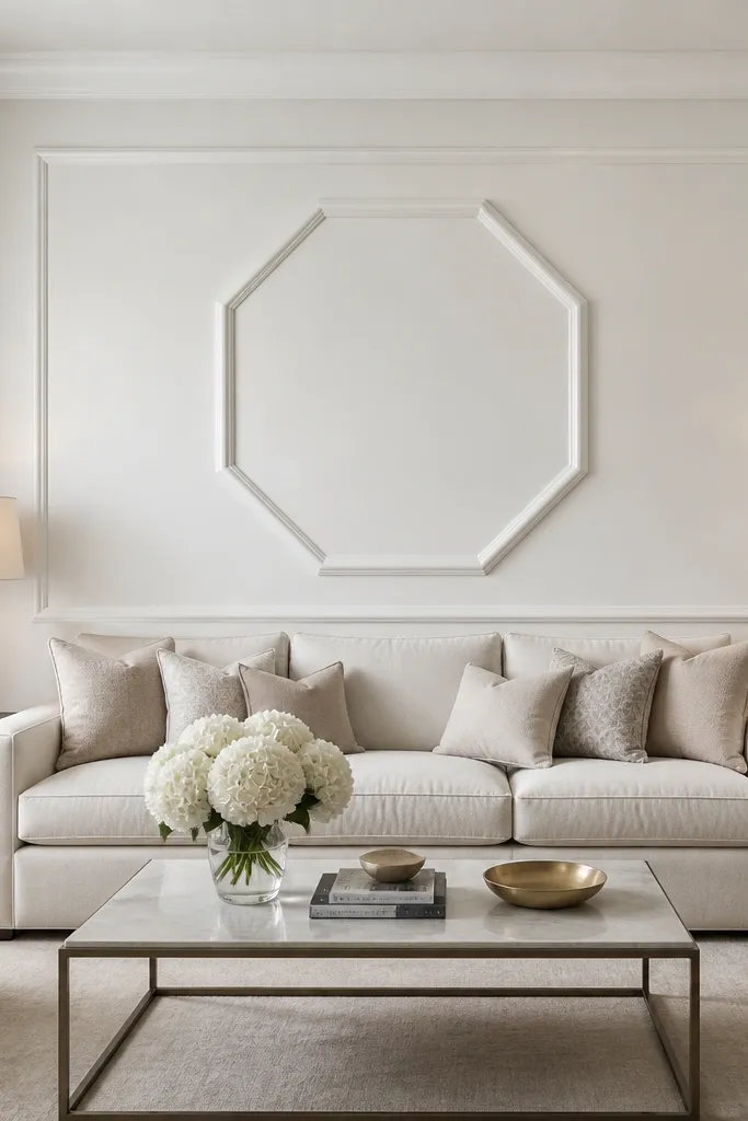
If you like a little personality but still want easy upkeep, an octagon panel does the job. The shape gives visual interest without the heavy carving of older decorative moulding, and the border keeps everything looking tidy. I’ve used this behind sofas with solid-color upholstery because the geometry adds the “pattern” the room needs. It flatters oval mirrors and rounded decor because the octagon feels like a cousin to those shapes. In rooms with neutral beige walls, the white border makes the octagon look crisp instead of floating.
Start with a rectangular outer border that matches your sofa width plus 10 inches total. Inside that border, lay out an octagon using a measured template — I mark eight equal sides so the angles stay even. Install the octagon moulding so it projects about 1/2-inch and keep the border projection the same for consistent depth. Caulk seams carefully at the angle points, then sand smooth and paint semi-gloss. Style by placing a single centered artwork or a large clock inside the octagon area so the geometry doesn’t compete with multiple objects.
Use a scrap piece of MDF template for the octagon so every angle is identical across the wall.
Skipping template layout is how the octagon ends up lopsided and looks handmade in a bad way.
13. Diagonal Corner Panels with Straight Central Strip
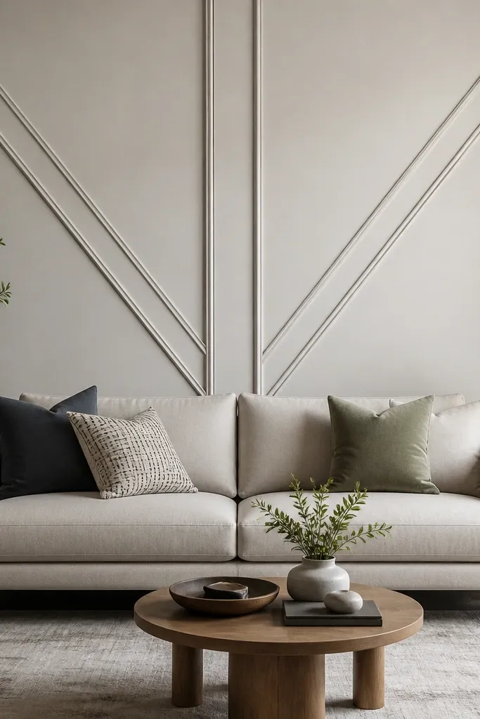
Diagonal elements add motion behind a sofa, which is great when your room layout feels too static. I like this design because it keeps diagonals only in the corners, so the center stays clean and easy to style. The moulding is low maintenance because it doesn’t create tiny horizontal ledges where dust settles. This works with contemporary sofas and with rooms that have diagonal lines elsewhere, like a slanted ceiling or patterned rug. For a cooler palette — grays and slate — the bright white diagonals make the wall feel crisp instead of flat.
Mark a straight central vertical strip that lines up with the sofa center and extends from just above the sofa back to near the chosen top height. Then install diagonal corner panels that meet the central strip cleanly, using miters at the diagonal edges. Keep the diagonal panel projection at about 3/8-inch and keep borders thin so they don’t overpower cushions. Caulk and sand seams, then paint the moulding semi-gloss. Style with a centered long art piece or a tall floor lamp to echo the diagonal energy without adding more shapes.
Do a dry layout with painter’s tape first so you can see the diagonals from the sofa before you cut moulding.
Don’t make the diagonals too steep; shallow diagonals look more intentional and hide wall imperfections better.
14. Picture Ledge Moulding That Holds One Frame Only
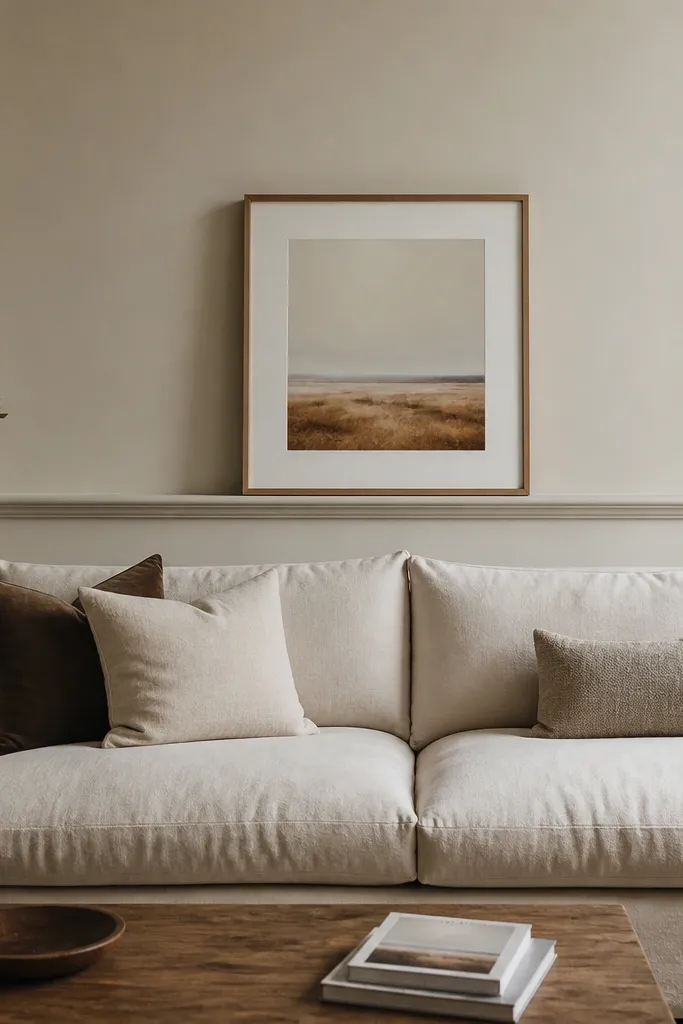
This is the one moulding design I recommend if you want function — one place for decor — without turning the wall into a dust shelf. The key is a shallow ledge, not a deep shelf. I’ve seen people add a 2-inch deep ledge and hate it because fingerprints and dust collect on the lip. This shallow version looks like architectural trim and still lets you place one frame, a small vase, or a sculptural object. It flatters sofas with neutral upholstery and simple backs because the ledge becomes the focal point. In rooms with lots of natural light, the ledge shadows add a soft glow behind the sofa.
Start by installing a horizontal picture-ledge moulding about 10-12 inches above the sofa back so the ledge doesn’t visually crowd the cushions. Choose a moulding that has a built-in lip depth around 3/4-inch or less. Add vertical side returns only if your wall width needs it; otherwise keep it as one clean horizontal feature. Fill seams, sand, and paint semi-gloss so wipe-downs don’t leave matte patches. Style with exactly one object on the ledge — one frame or one small sculpture — and keep the rest of the wall flat to avoid clutter.
Wipe the ledge with a damp microfiber every two weeks; it stays bright and prevents dust buildup.
Don’t stack multiple small items on the ledge; it turns into a permanent cleaning chore.
15. Tall Vertical Slat Backdrop with Continuous Top Rail
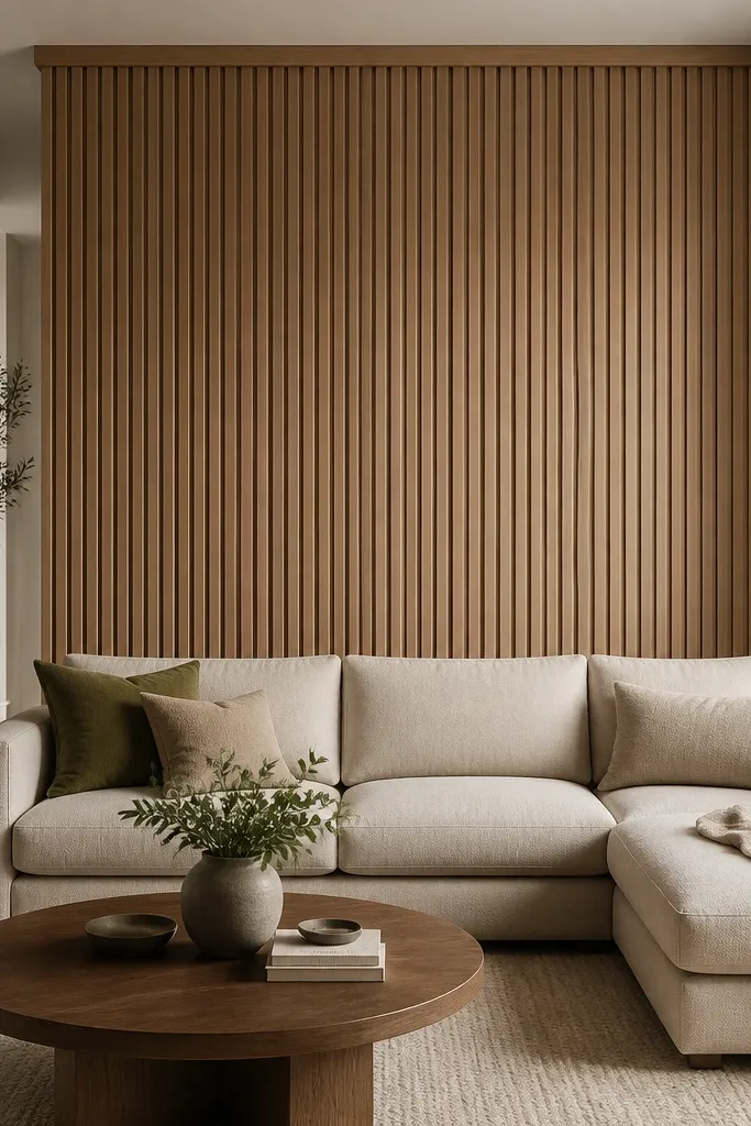
Slats make a sofa wall feel like a feature wall without wallpaper. I like this version when your sofa is low and you want the wall to rise up and balance the room. The continuous top rail matters because it makes the slats look finished at the top, which is where most DIY efforts get messy. This works best with sleek sofas and clean upholstery seams because the slats add texture. If you have medium to dark wood floors, the white slats brighten the area and make the room feel cleaner.
Good to knowUse a spacer comb made from scrap wood to keep gaps identical across every slat.
Measure from about 6 inches above the sofa back to the height you want, usually 8-10 inches below the ceiling. Install slats with equal spacing — I use 1-inch slat width and 1.5-2 inches spacing for a modern rhythm. Add a continuous top rail that runs straight across and covers the slat ends. Use polyurethane slats or moulding strips that you can paint smoothly; then caulk only the edges where slats meet the wall. Paint slats semi-gloss and the wall satin. Style with one large art piece centered between slats or a slim console table below.
AvoidAvoid mixing slat widths; it looks accidental once paint dries.
16. Two-Tone Moulding with Soft Contrast Line
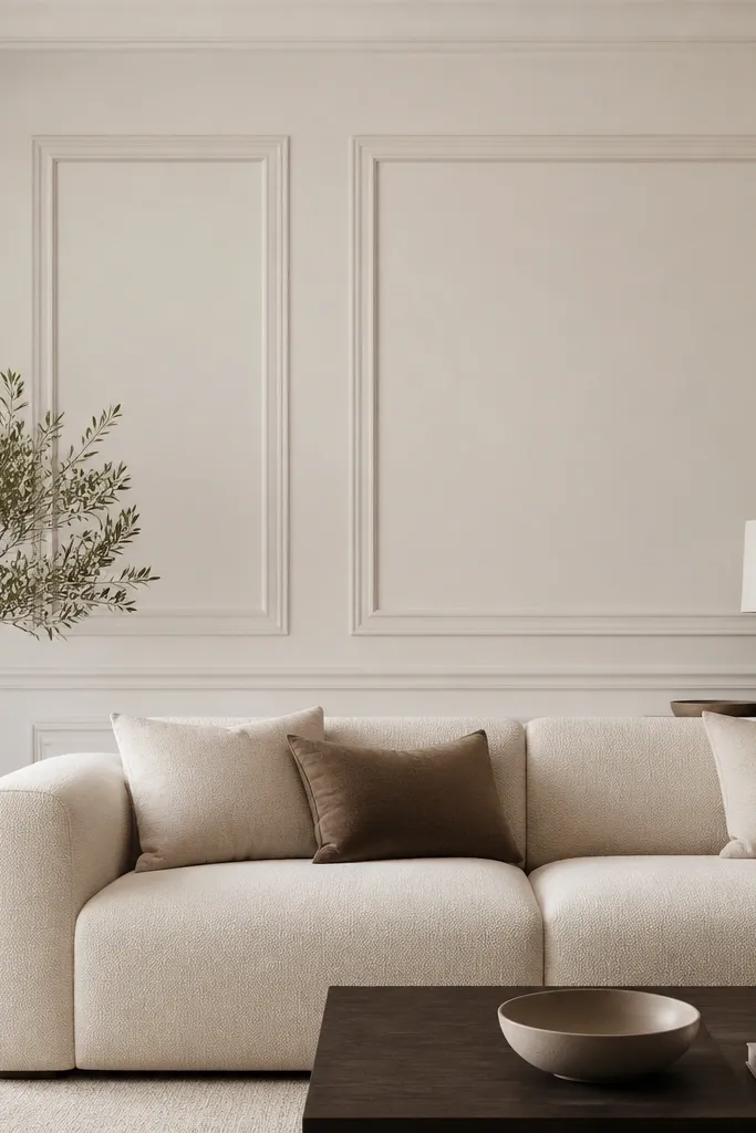
Two-tone moulding is low maintenance because you’re not relying on complicated shapes to create interest. The contrast line comes from paint, not from extra grooves, so cleaning stays simple. I use this when the room feels flat and you don’t want stark white trim. The moulding color should be just a step deeper than the wall — think warm white frame on an eggshell wall — so it reads as depth, not harsh outline. This looks great with gray-beige sofas and with rooms that have warm lighting. It also forgives small wall imperfections because the contrast is soft.
Good to knowTest both paints on the wall area behind the sofa — lighting changes the contrast quickly.
Pick a wall paint in eggshell and a moulding paint that is 1 shade darker in the same undertone family. Install a clean frame layout first, like a simple rectangle or picture-frame style, with projection around 1/2-inch. Sand and caulk seams, then prime moulding if your product isn’t already primed. Paint the wall first, then tape around moulding edges and paint the moulding with semi-gloss in the darker warm white. Remove tape while paint is slightly tacky so the edge stays crisp. Style with neutral art and warm metals so the two-tone stays the star.
AvoidAvoid high-contrast black-and-white two-tone unless your whole room is modern and very minimal.
17. Matte Wall with Semi-Gloss Moulding in One Continuous Rectangle
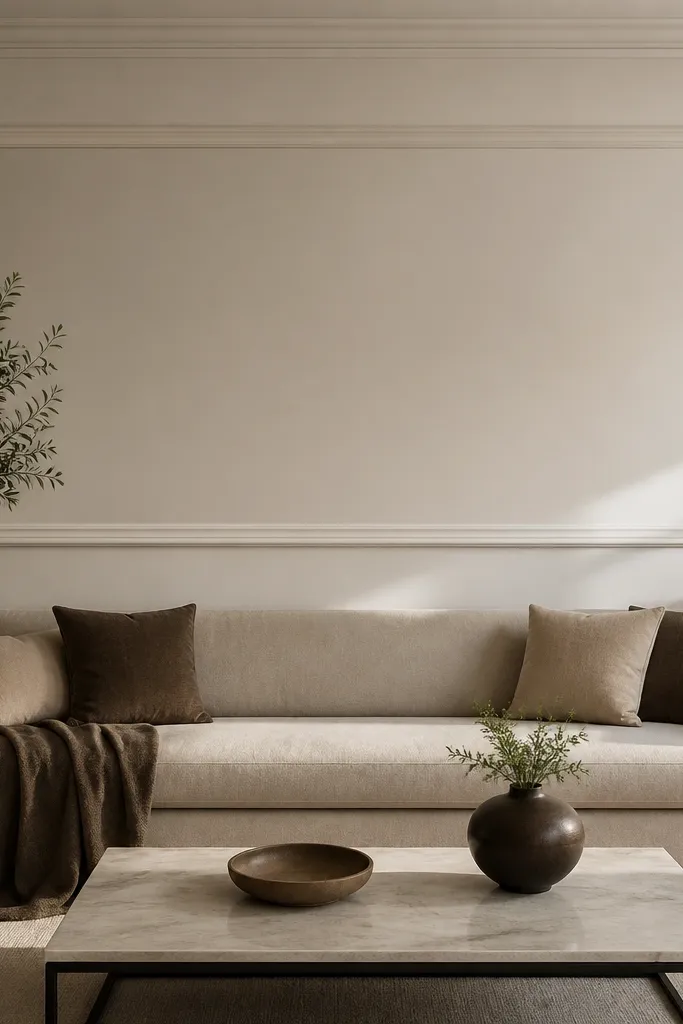
Sometimes the lowest maintenance choice is the simplest build: one continuous rectangle that frames the seating area. The matte/eggshell wall absorbs light, while the semi-gloss rectangle reflects just enough to make the wall look finished. I like this for households that don’t want to babysit details; there’s basically one moulding surface to wipe. It’s friendly for beginners because there are fewer seams and corners than panel grids. This design looks best with sofas in solid colors and with rooms that already have pattern elsewhere, since the trim stays calm. In spaces with busy rugs, it keeps the eye from bouncing around too much.
Mark a rectangle centered on the wall that aligns with your art placement, usually about 6-8 inches above the sofa back and 8-10 inches below the ceiling. Install outer moulding strips first, then add the inner border if you want a thin inner edge — keep it minimal. Use consistent projection around 1/2-inch so the shadow line is visible but not deep. Caulk the outer edges only and sand smooth. Paint the wall matte or eggshell, then paint the rectangle semi-gloss in crisp white. Hang your artwork centered inside the rectangle so it reads like a coordinated set.
Use a 2-inch angled sash brush for moulding corners so you don’t flood paint into the shadow gap.
Don’t use satin on moulding if you want easy wipe-downs; satin shows fingerprints faster.
18. Crisp V-Groove Style Panels with a Flat Center
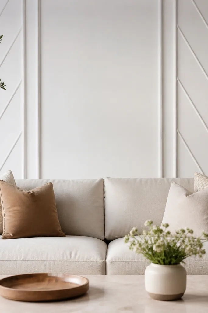
V-groove style moulding adds texture without looking like wallpaper, and it’s easier to maintain than you’d think when the grooves are shallow. I prefer V-grooves on the sides with a flat center because it gives you that high-end feel but keeps the middle easy for art or a mirror. The grooves should be shallow enough that dust doesn’t settle deep inside them. This design flatters sofas with lower backs and clean arms, because the wall texture frames the seating without competing with the cushions. If you have a lot of white in your room and you’re worried about it feeling sterile, the V-grooves bring subtle shadow warmth.
Good to knowAfter painting, run a dry microfiber along the grooves lightly to knock off any dried specks.
Install a flat center panel first, keeping it about 45-55% of the wall width. Then add V-groove moulding strips on the left and right sections, keeping the groove depth shallow and spacing consistent. Project the V-groove moulding around 1/4-3/8-inch so it stays tidy. Caulk seams with a paintable caulk and sand until the edges feel smooth to the touch. Paint grooves semi-gloss and the wall satin. Style by hanging a mirror in the center panel and keeping side decor minimal so you don’t fight the texture.
AvoidDon’t choose deep V-grooves if your wall gets dusty; they show lint and wipe streaks.
19. Roman-Column Inspired Half-Panels Over a Base Rail
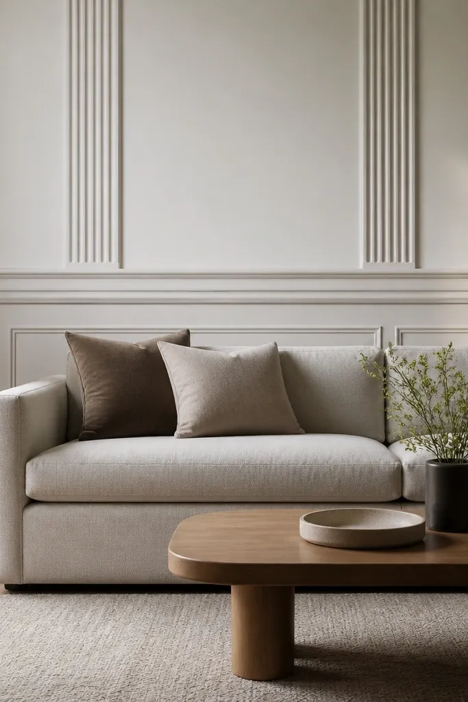
This one gives classic drama without the maintenance of heavy ornament. The half-panel look focuses texture in the middle band of the wall, and the base rail keeps the bottom edge straight and easy to clean. I use it when the sofa has a patterned fabric or tufting and the wall needs to look styled but not noisy. The column-inspired vertical details read upscale from across the room, but the design stays manageable because it’s only in one zone. It flatters traditional sofas and also works with modern furniture if your room has warm wood and brass accents. In cream and caramel rooms, the white moulding makes the whole area feel polished.
Mark a base rail height about 20-24 inches from the floor, then install the rail level. Build half-panels above the rail using vertical moulding strips that resemble columns but keep them simple — no tiny capitals. Keep the projection around 3/8-inch and leave the upper wall smooth for balance. Caulk seams, sand, and paint moulding semi-gloss. Style by placing a large sofa-back art piece centered above the half-panels and adding one tall plant or floor lamp to extend the vertical feeling.
Use a small foam roller for the panel faces so the paint stays even in the vertical lines.
Avoid tiny decorative capitals; they look good in photos but collect dust quickly.