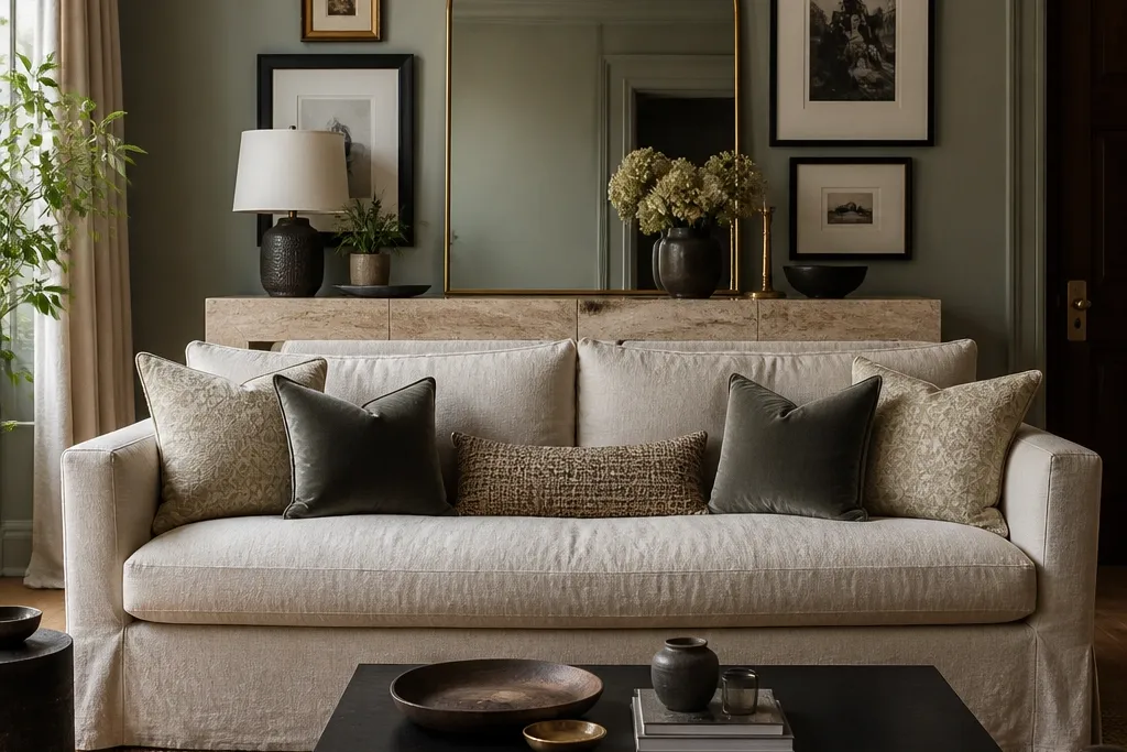

1. Oversized framed art with a gallery rail and two matching sconces
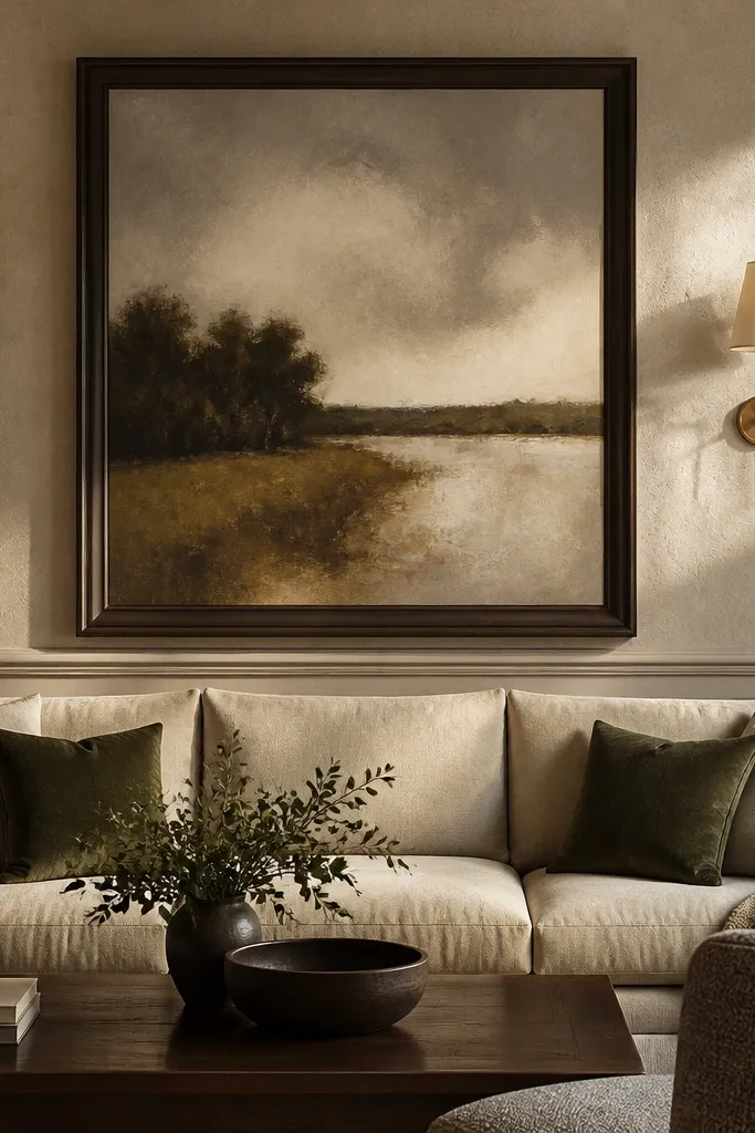
Start by finding the sofa width and centering a frame that’s about 60-75% of that width. Hang the top of the frame 2-4 inches above the sofa back height, then use a level to keep the centerline dead straight. Install two sconces so their center is roughly eye level when you’re seated, usually about 58-62 inches from the floor. If you add a gallery rail, keep it minimal: one small object per side, spaced evenly from the sconces, and keep everything within the same vertical band as the frame edges.
This setup looks expensive because the artwork fills the “decision zone” behind the sofa — from the sofa top to just above your sightline. Choose a large frame in warm black, espresso, or antique brass depending on your room’s metals. I like matte frames over glossy ones since they don’t throw harsh highlights behind the couch. The two sconces add light without visual clutter, and the symmetry makes the room feel tailored. It works especially well if your sofa is a solid color and your rug has a pattern, because the wall becomes the calm center.
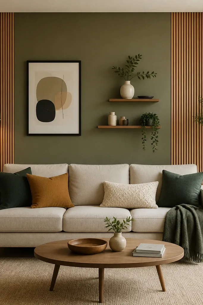
AvoidAvoid tiny art behind a full-size sofa — it makes the wall feel like an afterthought.
Good to knowUse picture wire with a test hang at dusk. If the frame looks slightly off in low light, it will bother you every night.
2. Tall arched mirror framed in warm wood
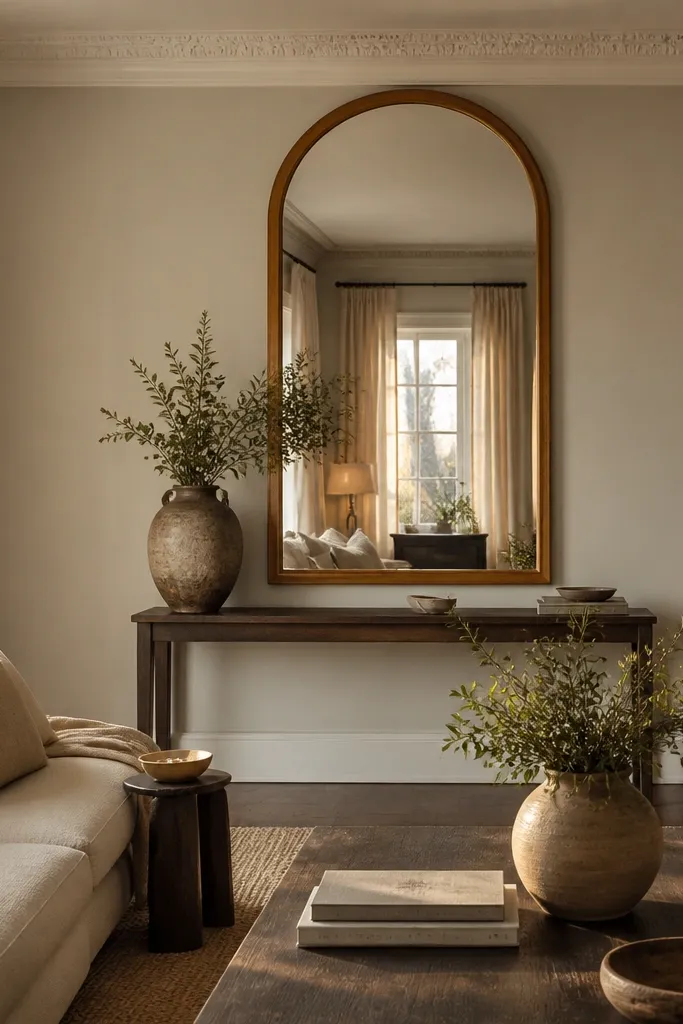
Start by choosing a mirror height so the bottom edge lands around 6-10 inches above the sofa back top, not down at the cushions. Mount it centered to the sofa, then add two small wall lights spaced evenly from the mirror edges. Keep the wall lights lower than the mirror centerline so they don’t fight the reflection. Style the console with one tall ceramic vase and one flat object like a tray — both in the same color family as the wood frame.
A tall arched mirror gives you that luxury feel because it adds height and reflects light deeper into the room. Warm wood frames look rich next to cream, camel, and oatmeal upholstery, and they also soften the look of cool-toned walls like off-white or greige. The arch shape flatters most spaces because it echoes the curve of many sofa backs and coffee table silhouettes. If your living room is narrow, the mirror’s vertical pull makes it feel longer without changing layout. I’ve used this in rooms where the window is off to one side — the mirror balances the light so the sofa wall doesn’t look dark.
AvoidSkip silver frames if your room has warm brass accents — the metals will clash and read “cheap fast.”
Good to knowWipe the mirror with a microfiber cloth and hang it after lights are on once. You’ll see streaks immediately under warm bulbs.
3. Vertical wood slat wall behind the sofa
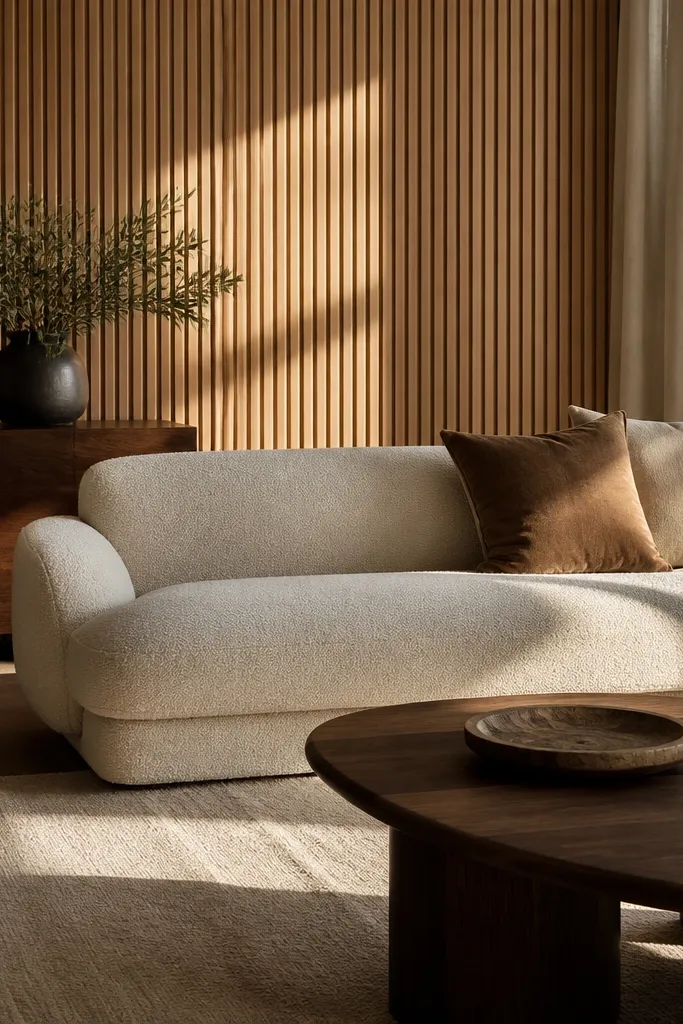
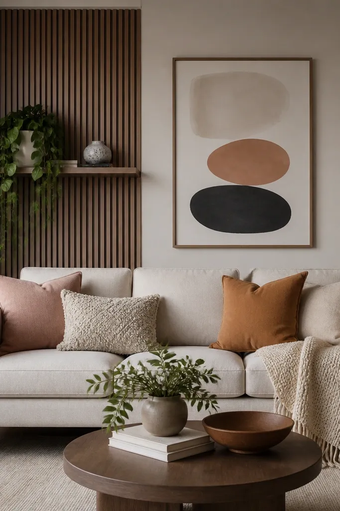
Vertical slats look high-end because they create shadow lines that change throughout the day. I prefer pale oak or warm birch because it reads modern luxury instead of cabin. The slat spacing matters: tight spacing looks tailored; wide spacing looks rustic. This setup works best when your sofa is low- to mid-profile and your room has neutral tones, like greige walls and a cream rug, because the slats add structure without loud color. It’s also a great choice if you want texture but you don’t want patterns.
Start by marking the centerline of your sofa and planning slat width so the wall looks balanced, not chopped. Install slats with consistent 1/4-inch shadow gaps using spacers as you go. Keep the slat height so it covers the sofa back area plus 8-16 inches above it, then stop cleanly at a ceiling-friendly finish line. Paint or stain the slats before install if you can, then seal with a satin clear coat so the wood doesn’t look dry.
Run a small strip of slat test on scrap and look at it at night. The shadow gap is what makes it feel expensive.
Don’t eyeball spacing — uneven gaps show instantly and ruin the luxury effect.
4. Limewash painted panel wall with a hidden shelf
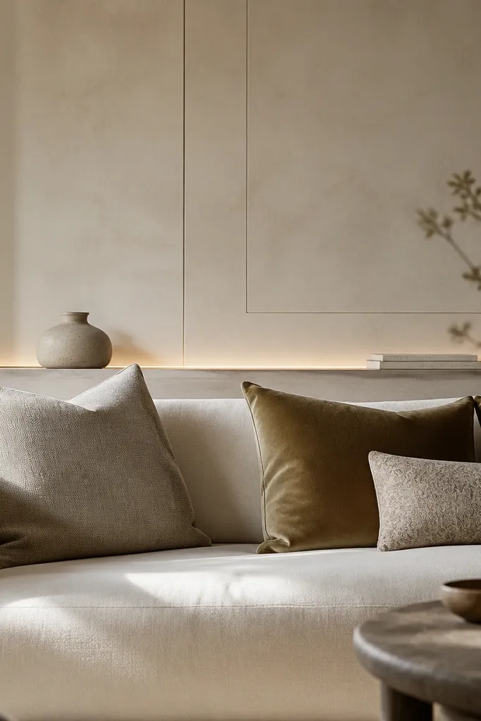
Limewash has that “real plaster” look that photographs well and looks even better in person. The secret is subtle panel outlines: they create depth without busy patterns. Choose a warm white or pale oat limewash to match cream upholstery and to keep the room airy. This wall design flatters spaces with slightly darker floors because the plaster texture lifts the whole scene. If your sofa has a lot of tailoring — crisp arms, structured back — limewash softens it and makes the room feel lived-in rather than showroom-clean.
Start by painting the entire wall with a base coat close to your limewash tone. Apply limewash in thin layers with a wide brush, then stop and adjust until you get a mottled, cloud-like finish. Add panel outlines using thin molding strips — I use 1x2 or 1/2-inch MDF strips — and keep them symmetrical around the sofa centerline. For the shelf, install it at cushion height minus a few inches so decor sits in the visual zone but doesn’t block the back of the sofa.
Practice on a spare drywall piece. Limewash shows brush marks; you want them to look intentional.
Avoid flat, dead-matte paint over the whole wall. It kills the depth that makes limewash feel upscale.
5. Stone-look tile accent wall with a centered upholstered backboard
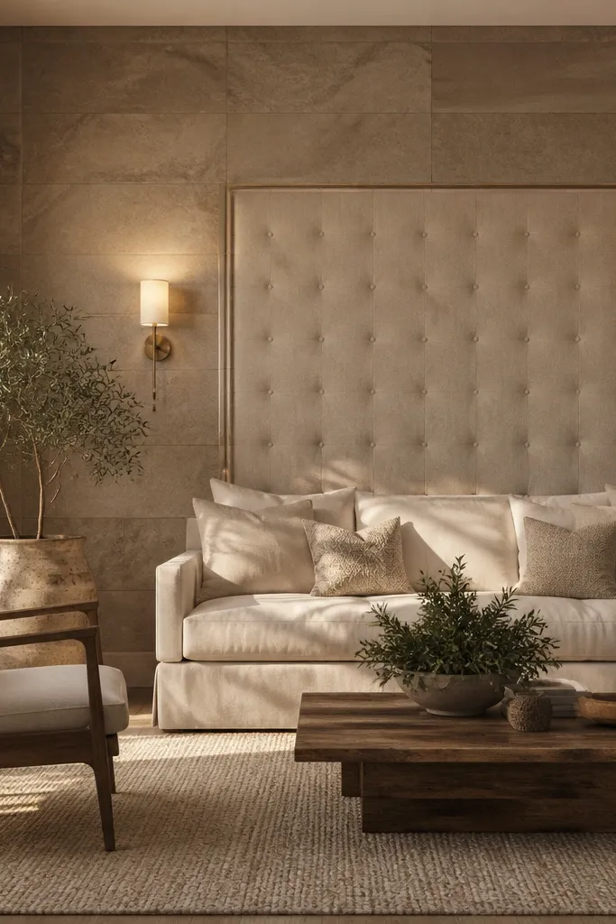
This is the closest thing to a “designer wall” you can do without remodeling the entire house. The stone-look tile brings weight and contrast, and the upholstered tufted center keeps it soft so it doesn’t feel cold. I like warm greige stone-look tiles with a matte finish, then pair the upholstery in oat, sand, or mushroom to keep everything calm. It flatters rooms with gray floors or a lot of hard surfaces because the fabric adds comfort. It also looks great if you host — the wall becomes a focal point when people sit and talk.
Start by outlining a rectangle on the wall centered to the sofa, usually about 6-10 inches wider than the sofa width. Tile that area first, then install a removable backboard panel on top of the tile with standoffs so it sits cleanly. Use tufting or a simple padded panel, but keep it centered and aligned with the sofa cushions. Finish with two sconces mounted at the same height and use warm bulbs so the stone doesn’t look gray-blue.
If you’re renting, choose peel-and-stick stone-look tiles from a reputable line and test one corner for adhesion.
Don’t pick glossy stone-look tile. It reflects light and can look cheap behind a sofa.
6. Soft fabric wall panel behind the sofa using stretch panels
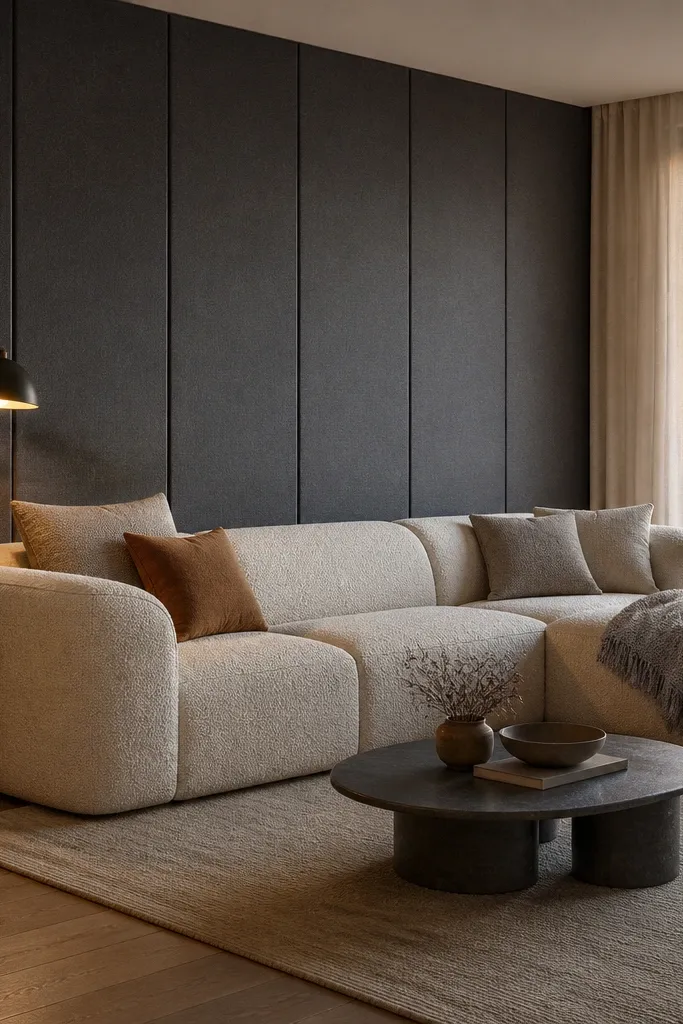
Start by measuring the wall area behind the sofa and building a simple frame or using pre-sized stretch panel kits. Stretch your fabric tight enough that you don’t see wrinkles, and keep seams aligned to the sofa centerline. Add a thin border trim so the panel looks built-in, usually in matching wood or paintable MDF. Style one piece only on the panel — a centered framed print or a wall sconce — so the fabric stays the hero.
A fabric panel is my go-to when the room needs warmth but you don’t want more furniture. It makes the wall feel padded, and that changes the acoustics — the room sounds less echoey. Choose a performance linen blend or tightly woven fabric so it holds its shape and doesn’t sag in the middle. Bouclé looks cozy but can read too casual; a smoother woven looks more luxury. This works well with sofas in leather, smooth velvet, or structured cotton because the wall adds softness without changing your style.
AvoidAvoid loose, curtain-like fabric. It droops and reads like covering, not design.
Good to knowUse a fabric with a matte finish. Glossy textiles look like they’re meant for upholstery, not wall panels.
7. Two-tone painted wall with a framed center rectangle
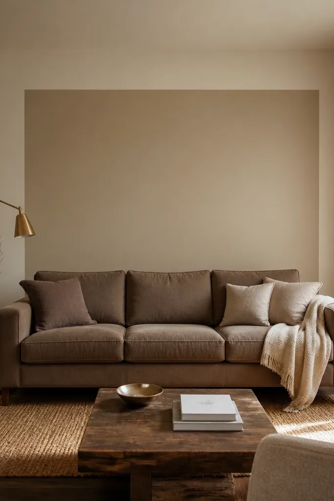
Painted framing looks luxury because it creates architecture without added materials. The contrast is subtle when you pick one warm shade and one slightly deeper warm shade, like warm off-white and taupe. This flatters nearly every sofa color because paint can be tuned to your undertones. It also helps when you have a wall with weird outlets or a window nearby — the rectangle lets you control attention. I’ve used this in long living rooms where the sofa wall needed structure and the rest of the space stayed neutral.
Start by masking a centered rectangle behind the sofa. Make it wide enough to cover the sofa back area and 6-12 inches taller than the sofa back top. Paint the rectangle with the deeper tone, then add thin trim lines around it using painter’s tape for clean edges. Finish by placing two sconces or one large artwork centered within the framed area.
Do a test patch in the exact light direction your living room gets. Undertones shift hard near windows.
Avoid high-contrast black and white framing unless your room already has strong black accents.
8. Built-in look with a slim console and framed molding above
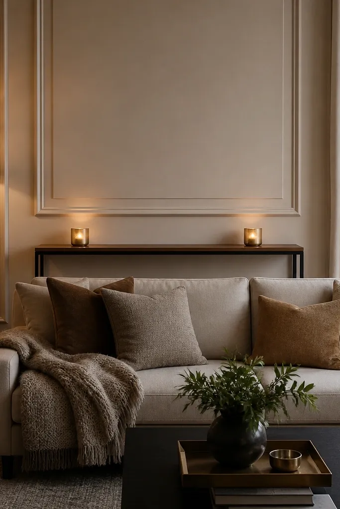
This gives you that expensive built-in look even in a normal apartment. The slim console adds a horizontal line that balances sofas, and the framed molding above gives structure at the height you actually see when seated. I like consoles that are 10-12 inches deep so they don’t fight the sofa visually. Choose a warm wood console with a honed stone tray or a matte lacquer tray to keep it grounded. This is best when you have a bit of wall width and you want the sofa back wall to feel like a home, not a blank backdrop.
Start by measuring the clear space between the sofa and the wall. Install the console at a height that brings the top roughly level with the sofa cushion height plus a little, usually 27-30 inches from the floor depending on cushion thickness. Mount framed molding above the console so the top frame aligns with the sofa back top. Style the console with a low tray centered, then two candlesticks or two small vases at equal distances from the center.
Use the same finish on the console and the frame trim. Matching finishes make it feel custom.
Avoid placing decor taller than the sofa back. It blocks sightlines and looks cluttered.
9. Wall-to-wall books with a centered art piece
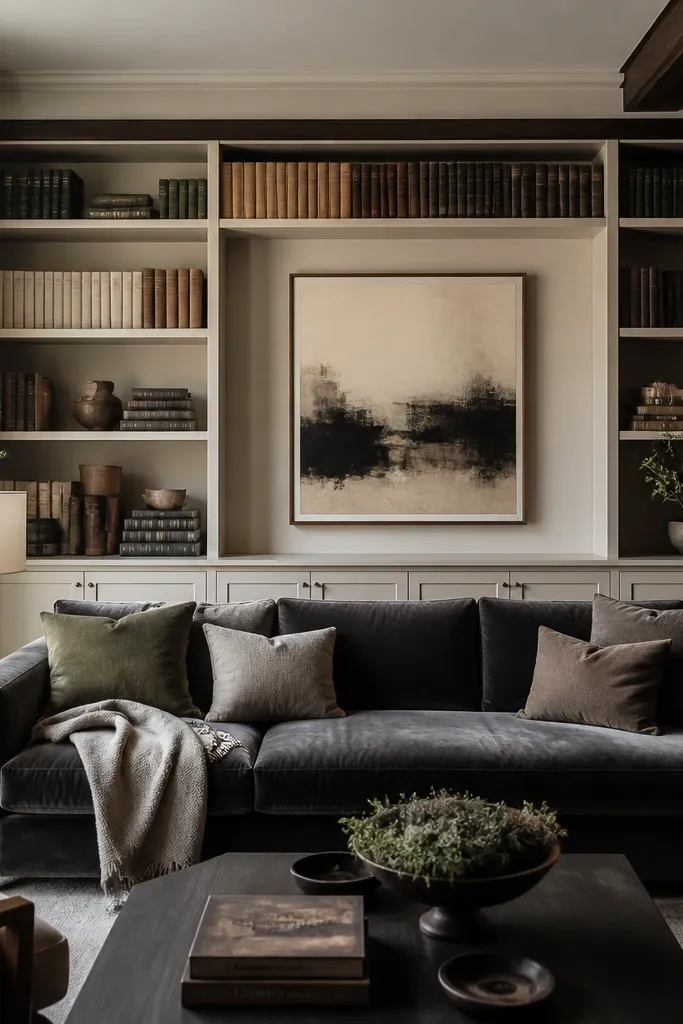
A books-and-art wall looks luxury because it mixes function and personality without random clutter. The key is color discipline: arrange books by tone, not by whatever you grab first. I prefer neutral-heavy palettes — cream, sand, muted olive, and charcoal — because they look calm behind a sofa. When you do it right, the wall reads intentional even with family books and travel guides. This setup flatters rooms with classic moldings or darker wood floors, because the books add warmth and depth.
Start by marking the shelf height so the middle shelf lands behind the sofa back area. Use book stands or slim spacers so books don’t slant forward and ruin the line. Arrange spines in blocks: warm neutrals on the outer sections and darker tones in the center or lower shelves for contrast. Add one large artwork centered above, sized so it covers about 60% of the sofa width, and keep plants to two small ones so the wall doesn’t turn into a jungle.
Buy a couple of plain covers for ugly spines. Swapping one or two books changes the whole look.
Avoid mixing wildly bright spines across the whole shelf. It reads like storage, not design.
10. Layered wainscoting with a centered oversized painting
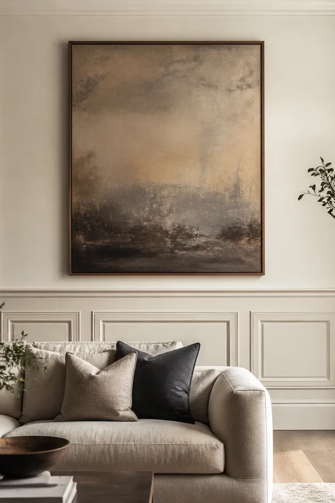
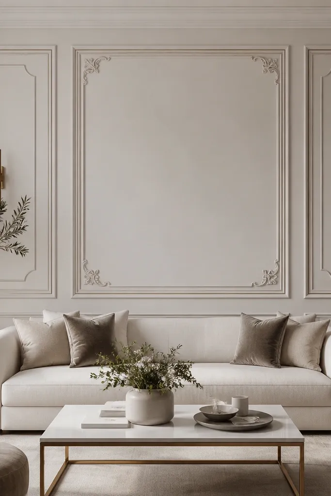
Start by marking the chair rail height, usually around 36-40 inches from the floor for standard rooms. Install panel molding below that height in evenly sized rectangles, keeping the center rectangle aligned to the sofa centerline. Paint the wall and trim in two tones with satin finish for trim so it catches light. Hang the oversized painting centered with the bottom edge just above the top panel area, so it doesn’t compete with the molding.
Wainscoting looks rich because it adds dimension you can’t get from paint alone. The luxury version is layered: panel sections plus a clean chair rail line, then a large painting centered above it so your eye has one strong focal point. Pick soft white walls with warm cream trim or a slightly darker trim tone; the contrast should be subtle, not stark. This suits sofas with traditional lines, like rolled arms or button-tufting, because the wall matches the classic vibe. It also works in rooms with high ceilings because the molding lines stretch the eye upward.
AvoidDon’t go too dark on trim if your room has low natural light. It can shrink the space.
Good to knowUse painter’s tape to map the painting placement first. Wainscoting makes the wall busy, so the art needs to be perfectly centered.
11. Mirrored wall panels behind the sofa for a glam look
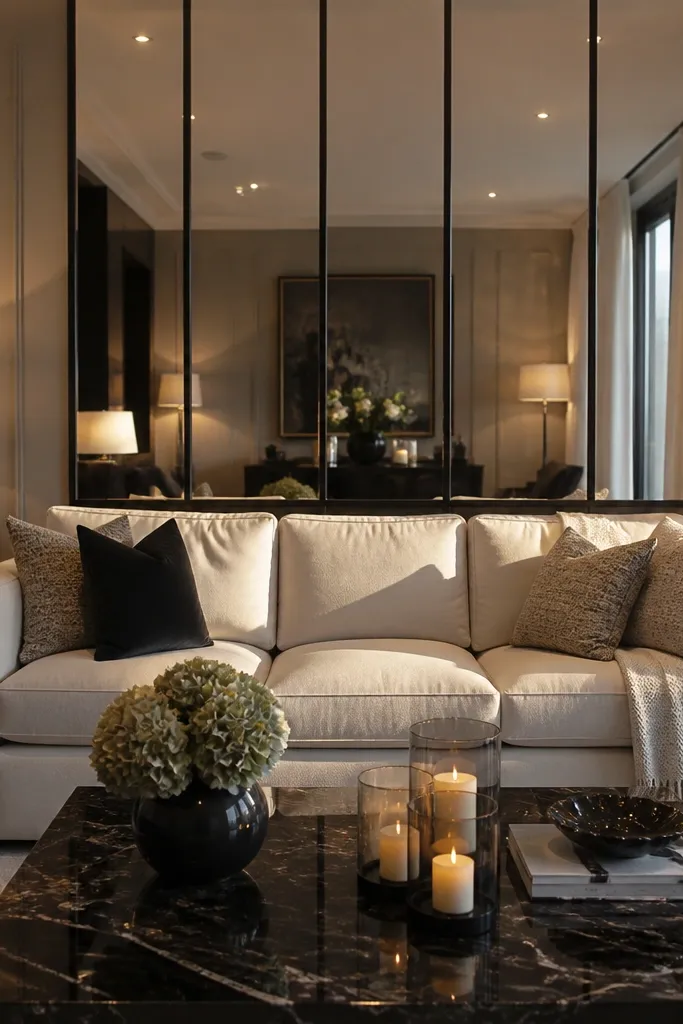
Start by choosing panel sizes that match your wall proportion. Install mirrored panels in a grid so each panel is centered to the sofa width, then keep dividers straight with a level line. Leave the top and bottom edges with a consistent margin from trim or ceiling lines. Add one warm light source nearby — a floor lamp or sconce — so the mirror has something to reflect. Style the sofa with a couple of solid cushions and one textured throw so the shine doesn’t feel too stark.
Mirrored panels create luxury because they multiply light and make the room feel bigger instantly. Slim dividers keep the look modern instead of old Hollywood, and black dividers feel crisp against cream or light gray upholstery. This is a strong option for rooms with limited daylight because the mirror catches lamp glow and keeps the sofa wall from looking flat. It also flatters sleek, modern sofas — leather, smooth velvet, or tightly tailored fabric — because the mirror adds shine and polish. If you love glam but your room is small, this is one of the fastest ways to get that effect.
AvoidAvoid using mirrored panels with thick, ornate frames. The look can tip into clutter.
Good to knowClean the mirrors the day of install and again the next morning. Smudges show more on mirrored dividers than you expect.
12. Sculptural wall niche with a faux fireplace glow
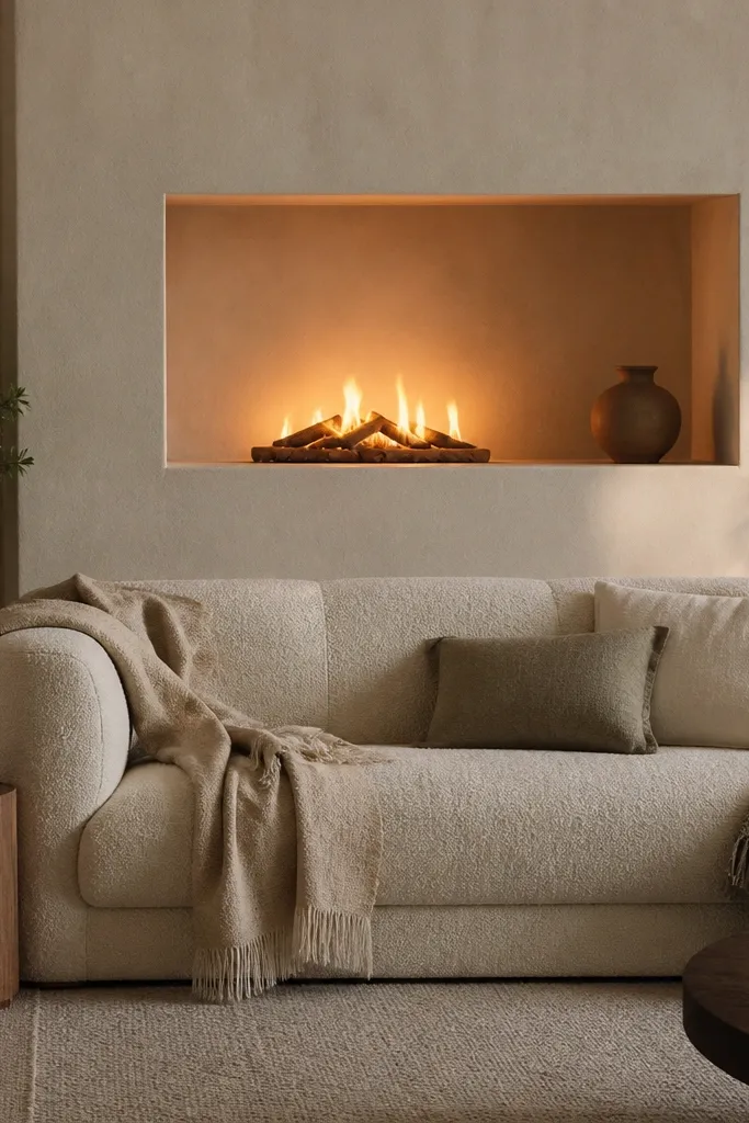
A faux fireplace-style niche looks luxury because it adds a built-in story to the wall. Even if you don’t use it as a fire, the shape creates a natural focal point at sofa height. Keep it shallow and symmetrical so it doesn’t steal space from the room. I like warm white plaster or limewash inside the niche, then a low-contrast mantel for a soft glow effect. This setup flatters rooms where the sofa is fairly plain and you want a focal point without adding a whole new piece of furniture.
Start by measuring the area behind the sofa and sketching a niche width that’s about the same width as the sofa plus 6-12 inches. Build or install a shallow frame and line the interior with a warm white finish. Add an LED strip set inside so the glow is even, not a bright line. Place a mantel shelf on top, then style with two objects spaced evenly and one photo frame centered. Keep the top of the niche slightly above sofa back height so it feels anchored.
Use warm LEDs around 2700K. Cooler LEDs make the niche look like a store display.
Avoid a deep, tall niche. It overwhelms the sofa and makes the room feel bottom-heavy.
13. Tall fabric curtains as a wall behind the sofa
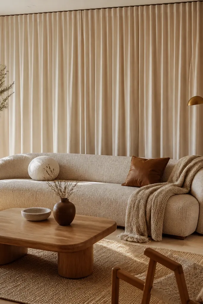
Start by extending your curtain rod 4-8 inches wider than the sofa width so the fabric wraps the edges. Hang the rod close to ceiling height, usually 2-4 inches down, so the vertical lines look tall. Choose a curtain length that lands just above the floor or lightly kisses it, not puddled. Center your sofa and pull the curtains so the folds land symmetrically on either side of the sofa back. Add one simple artwork or sconce, but keep it minimal so the curtains stay the hero.
This idea is luxury because fabric absorbs sound and softens hard sightlines — it makes the whole room feel calmer. When curtains run from ceiling to near the floor behind the sofa, you get a continuous vertical plane that makes the room look taller. Choose a medium-weight linen or linen-blend in warm white, oatmeal, or mushroom. It works best with sofas that have clean lines, because the folds add texture without clutter. I’ve used this in rooms where the wall has awkward outlets or a slightly ugly paint finish you can’t fix quickly.
AvoidAvoid thin, see-through curtains with no privacy — they look temporary and cheap in daylight.
Good to knowSteam the curtains before hanging. The difference between creased and pressed linen is huge.
14. Large sculptural wallpaper panel with a single bold frame
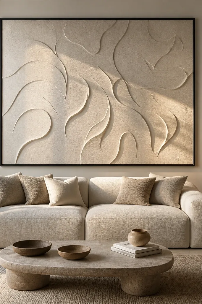
Start by taping off a rectangle behind the sofa that matches about 70-80% of the sofa width. Apply the wallpaper panel carefully, keeping the pattern centered on the sofa centerline. Use a crisp border with paintable trim or tape for a clean edge between wallpaper and paint. Hang one large frame centered above the panel, and keep the frame finish consistent with your room’s metal — black frames for black hardware, brass frames for brass lighting. Style with one textured cushion and one smooth cushion so the wall pattern doesn’t compete.
Wallpaper can look truly high-end when you treat it like architecture instead of covering the whole room. A single large panel behind the sofa gives you texture and movement, while the surrounding paint keeps the rest of the space calm. Choose a raised or embossed pattern in neutral tones so it catches light without shouting. This flatters modern sofas and leather upholstery because the wall adds softness and depth. It also works for rooms with plain decor, since the wall pattern becomes the statement without needing more accessories.
AvoidAvoid busy, colorful wallpaper behind a sofa with patterned pillows. It turns into visual noise.
Good to knowPress seams with a seam roller and wipe excess paste immediately. Raised patterns hide mistakes less than flat wallpaper.
15. Monochrome plaster wall with a single horizontal ledge
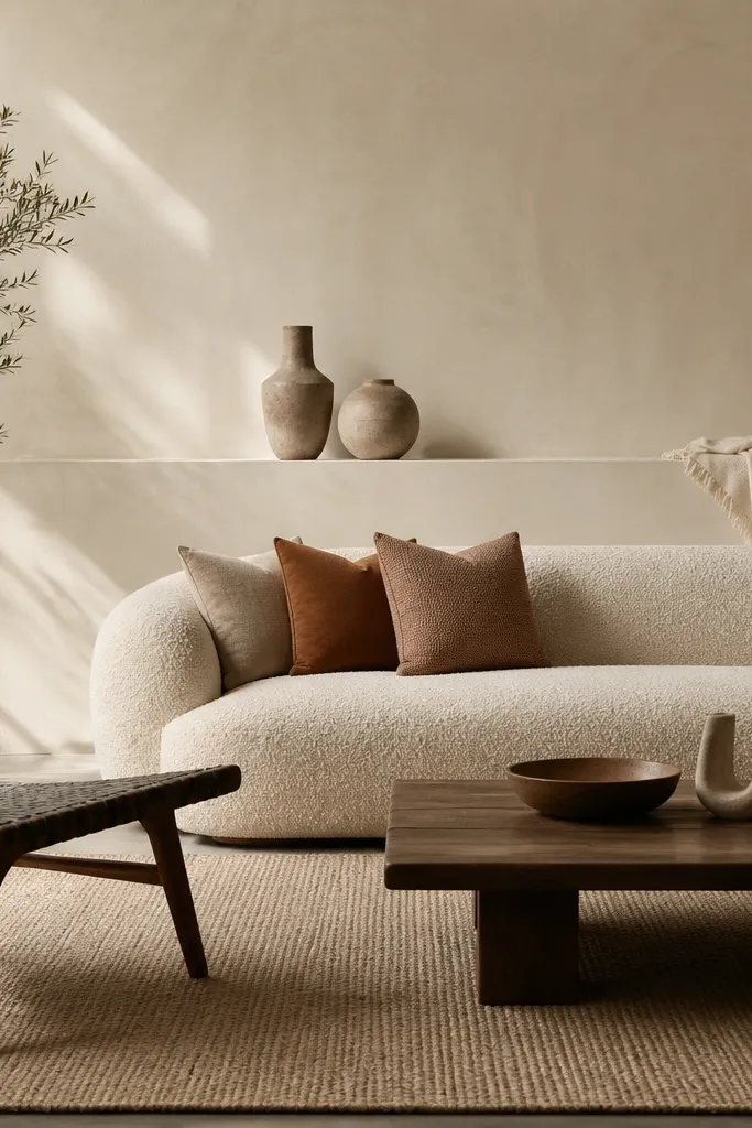
Start by choosing a plaster finish paint or a lime-plaster effect product and apply it in thin, even passes. Then install one ledge centered to the sofa and sized to match the sofa width minus 6-10 inches. Keep the ledge height around 10-14 inches above the sofa back top so objects sit in your eye comfort zone. Style with two items max, spaced far apart — one bowl or vase and one small stack of books. Add a single sconce or one frame so the wall stays balanced.
A smooth plaster wall with one horizontal ledge looks luxury because it’s clean and deliberate. The plaster finish gives subtle texture, and the ledge adds function without cluttering the wall. I like monochrome tones like warm white, pale ivory, or very light greige because they make the sofa look richer. This works best when your sofa is a strong color — deep green, navy, chocolate — because the wall stays quiet and lets the upholstery do the talking. It also flatters minimal rooms where you want calm, not decoration overload.
AvoidAvoid multiple shelves. Three ledges behind a sofa instantly looks like storage.
Good to knowUse matte ceramics and avoid glossy decor on a plaster wall. Gloss creates cheap hotspots.
16. Slim vertical picture frames like a couture gallery grid
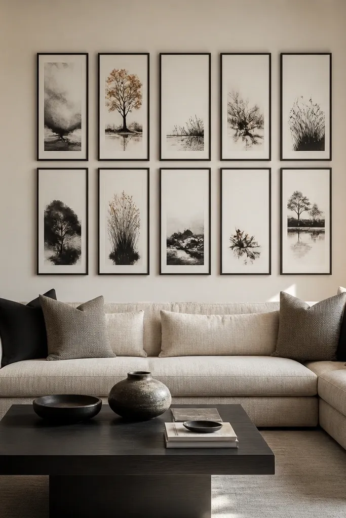
Start by picking frame widths around 1-2 inches and using the same mat color inside each one. Lay out your grid on the floor first, then mark the centerline of the sofa and hang the middle frame at eye level when seated. Keep spacing consistent, usually 2-3 inches between frames, and use a laser level or string line so the grid doesn’t drift. Choose print sizes that create a tall center and slightly shorter sides. Finally, keep all frames in one finish — either matte black or brushed brass — and avoid mixing metals.
A slim-frame grid looks luxury because it creates rhythm and precision. The trick is to keep the frames identical — same width, same finish, and same spacing — so it looks curated even when the prints are personal. I like monochrome or limited palette prints: cream paper, charcoal ink, and a touch of warm brown. This setup flatters narrow rooms because vertical frames draw the eye up. It also works when you have a sofa with a lot of texture, like velvet or bouclé, because the wall stays graphic and controlled.
AvoidAvoid mixing frame widths. Even if the prints are pretty, the wall reads chaotic.
Good to knowUse a single paper color across all prints. The variations should be in image, not mat tone.
17. Oversized woven wall hanging with a low, centered console
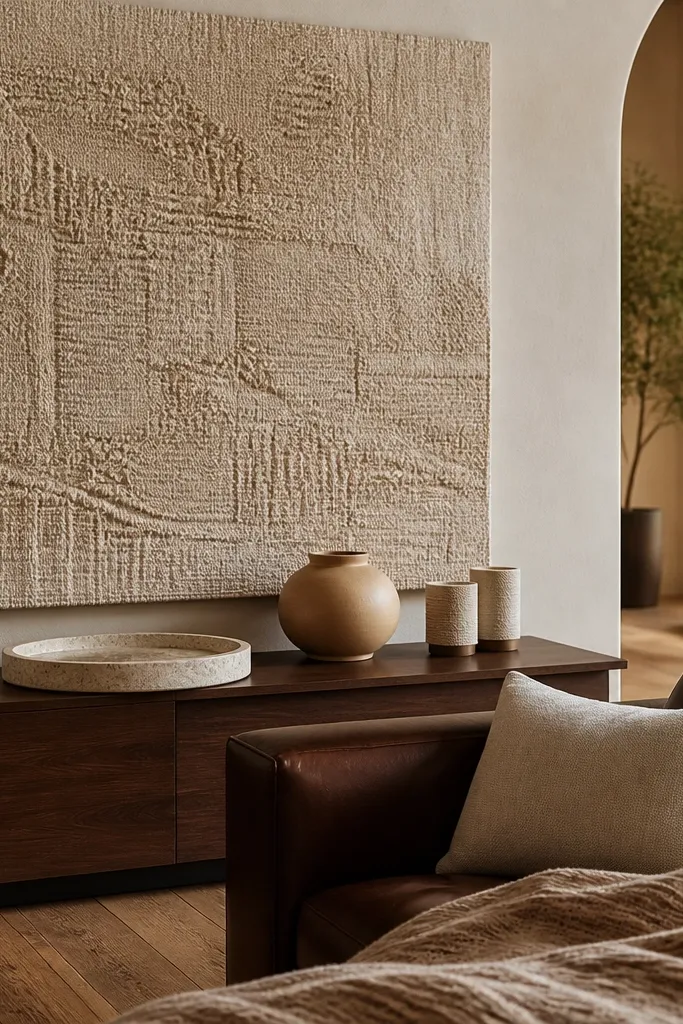
Start by choosing a hanging size that covers at least 70% of the sofa back width. Mount a simple rod or use a hidden hanging system so the top sits 2-4 inches above the sofa back top. Install a low console beneath if there’s enough space, keeping the console depth around 8-10 inches. Style with one tray and two candles, all in warm neutral tones. Keep the rest of the decor minimal so the texture stays the focus.
A big woven wall hanging adds luxury because it brings warmth and depth without needing paint or hardware complexity. Natural fibers soften the room and make leather or dark upholstery feel more inviting. Choose a woven in cream, oat, or light camel and look for a slightly raised texture so it catches light. This setup flatters people who want a cozy look but still want the wall to feel intentional. It’s especially good when you have a lot of hard surfaces — stone floors, glass coffee table — because the weaving balances the room.
AvoidAvoid ultra-thin, flat woven pieces. They look like wall decor, not design.
Good to knowSteam the hanging lightly before mounting to relax any shipping creases.
18. Two-tone molding wall with a centered mirror medallion
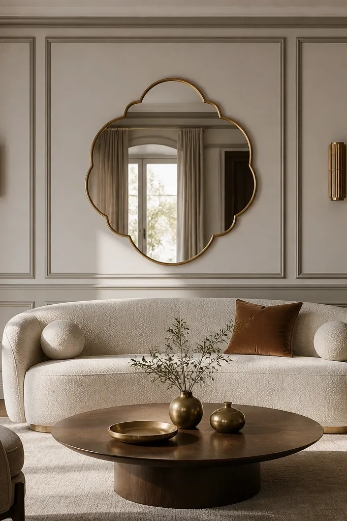
Start by planning the molding layout: a large center rectangle or square panel with smaller side panels. Paint the base wall first, then paint the molding tone slightly deeper for definition. Mount a round mirror medallion centered above the sofa back top, leaving 2-5 inches between the sofa back and the mirror bottom edge. Install two sconces at equal heights with the same metal finish as the mirror hardware. Style the sofa with cushions that match either the base wall color or the deeper molding color to tie everything together.
This is one of my favorite “luxury without clutter” setups because molding gives depth and the mirror adds light. The medallion shape is softer than a standard rectangle frame, and it flatters curved sofa arms and round coffee tables. Use two-tone paint so the molding lines are visible, but keep the colors within the same warm family. If your sofa is beige, cream, or light gray, this wall makes it look richer by adding contrast without shouting. I’ve used it in rooms with white walls that felt too sterile — the molding and mirror fix that instantly.
AvoidAvoid high-contrast molding colors like pure white against charcoal unless your room is already very dark.
Good to knowUse painter’s tape to map the molding before you buy trim. You want the center panel aligned exactly to the sofa width.
19. Matte black slat panel with warm brass sconce accents
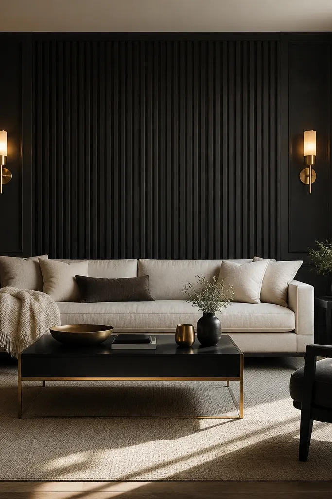
Start by installing vertical slats with consistent spacing and a 1/4-inch shadow gap. Paint the slats matte black using a finish rated for walls, then mount brass sconces so their light hits the sofa back and slat faces evenly. Choose sconce shades in warm white fabric or glass so the light stays soft. Keep the slat panel height covering the sofa back area plus 10-16 inches above it. Style with two cushions in cream and one in a deep color like chocolate or forest green, then keep throws solid so the slats stay the statement.
Black slats feel luxury when they’re matte and when the lighting is warm. The slats create a strong backdrop, and the brass sconces add glow instead of harsh light. This setup looks best with light upholstery — cream, ivory, or oatmeal — because the contrast makes the sofa look crisp and expensive. It also works for modern rooms with dark floors or black hardware, because everything reads coordinated. I’ve styled this for clients who wanted a “bold wall” without a wallpaper pattern — the slats do the work.
AvoidAvoid glossy black slats. They reflect light unevenly and can look like plastic.
Good to knowUse 2700K bulbs. Black walls make cool bulbs look blue fast.
20. Hand-painted mural strip with a linen picture frame
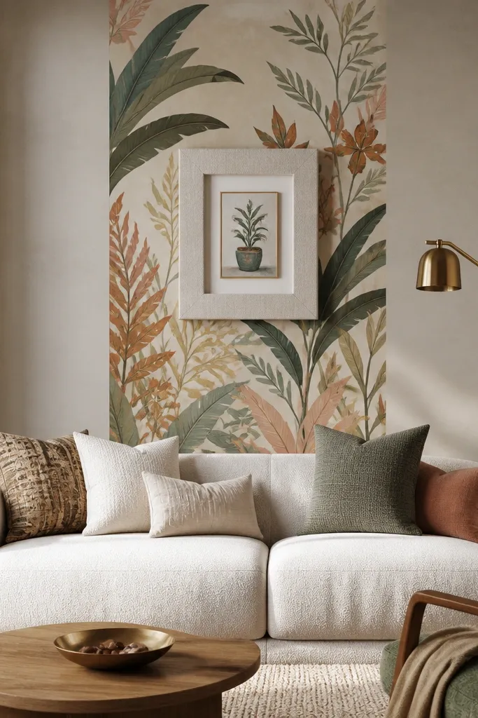
Pick your mural width first. For most sofas, a 20-28 inch strip looks right — I usually measure the sofa width, then aim for about 40-50% of it so it doesn’t feel like a poster glued to the wall. Center the strip at eye level from the sofa: the middle of the painted area should land around 56-60 inches from the floor. Choose a frame material that won’t look shiny in daylight. I use linen-wrapped MDF or canvas stretched over a rigid panel, then add a thin brass inner edge so the painted colors pick up warm light. Mount it with a french cleat or two heavy-duty wall anchors. Keep the top edge 2-4 inches above the sofa back height so the frame doesn’t look crowded when you’re seated, and use two small spotlights or picture lights aimed slightly upward to avoid glare on the linen weave. If you’re painting directly on the wall, mask a clean rectangle and seal it with a wall-safe matte clear coat. If you’re using a removable panel, paint the panel first, then mount the framed panel after the clear coat cures so you don’t scuff edges.
A narrow mural strip behind the sofa gives you the drama of art without turning the whole wall into a busy backdrop. I like keeping it vertical and centered because your sofa becomes the anchor, and the wall treatment reads intentional instead of random. The linen-wrapped frame matters because it softens the paint — you get texture in the exact spot your eye lands when you sit down. This setup also works in rentals because you can mount the frame to a french cleat and keep the paint contained to one removable panel or a single small section.
AvoidAvoid a wide mural that takes over the entire wall — it reads like you ran out of space instead of styling the sofa back.
Good to knowUse a matte clear coat on the paint and keep the lights warm — around 2700K. Glossy paint plus bright white bulbs makes the linen look dull and the mural looks flat.