
1. 2700K bedside lamp pairing for instant coziness

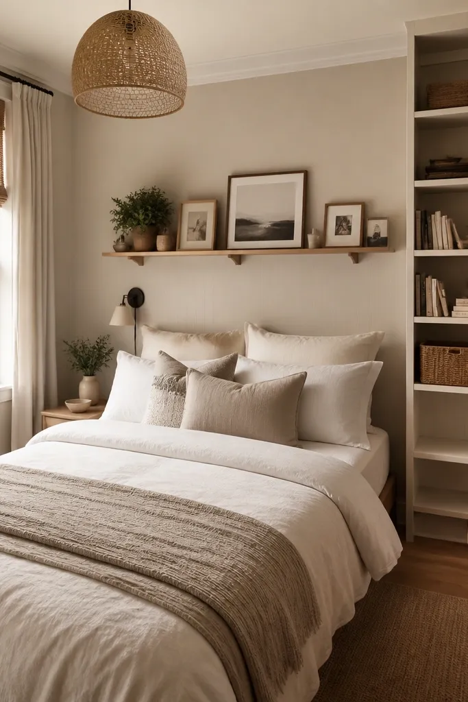
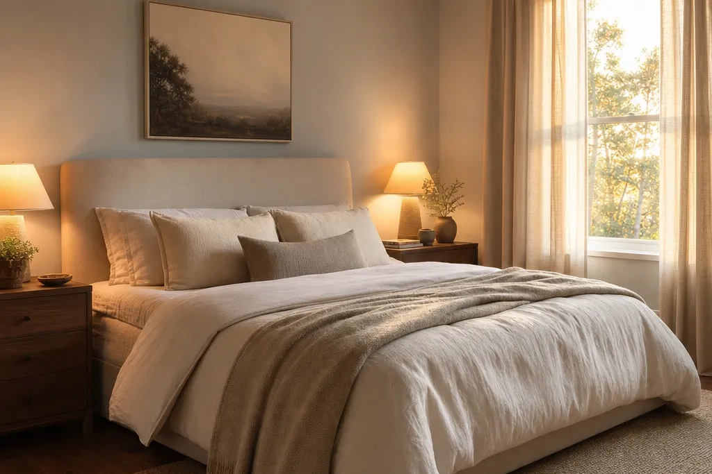
I start coziness with bedside light because it changes how every fabric looks. I use bulbs around 2700K so whites don’t turn blue and beige looks creamy instead of dusty. Oatmeal or linen lamp shades soften the glow, and that matters more than the lamp base shape. If your skin tone runs warm, this combo flatters it fast; if you’re cool-toned, it still reads soft and flattering instead of harsh. The styling principle is simple: you want warm, diffused light at eye level, not bright light from the ceiling.
Good to knowIf you have only one lamp, add a second warm light source like a small floor lamp with a linen shade so one corner doesn’t stay cold.
First, swap your bedside bulb to 2700K and test it after sunset. Then choose shades in oatmeal, flax, or taupe — avoid shiny white shades because they reflect harsh highlights. Place lamps so the shade bottom sits about level with your mattress height when you’re sitting up. Finally, keep the nightstand surface uncluttered: one lamp, one small tray or book stack, and a single texture item like a woven coaster or small ceramic dish.
AvoidAvoid cool-white bulbs (4000K+) because they make bedding look flat and the room feel sterile.
2. Bed rug grounding rule with 8-inch overlap
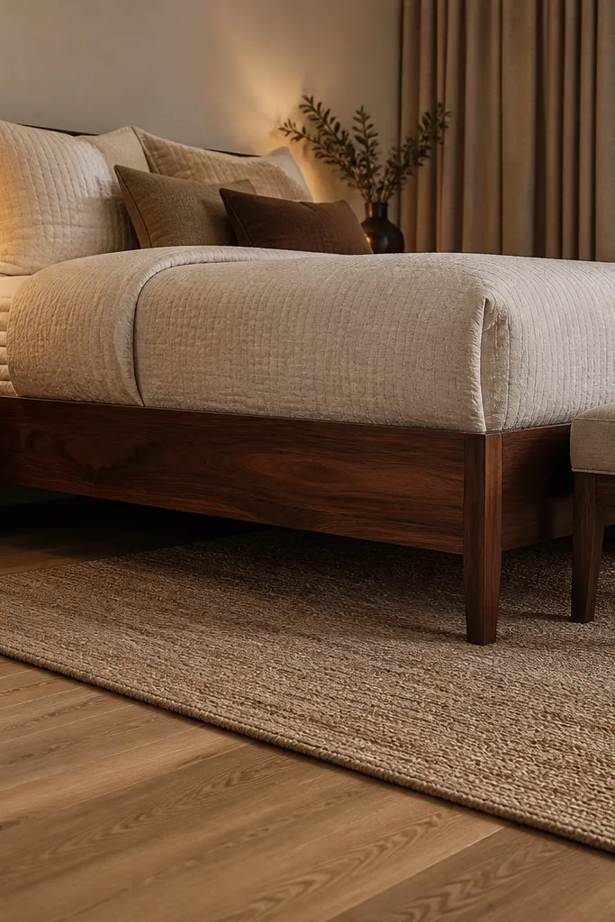
A cozy bedroom usually looks grounded because the rug ties the bed to the floor. I follow a simple rule: the rug should reach under the front legs of your bed, and you want about 8 inches of rug visible beyond the foot. That extra space gives your eye a landing spot, which makes the bed feel intentional rather than floating. This works for both small rooms and larger rooms because the bed-to-floor connection stays clear. The key is that the rug size affects how your scale reads, and scale is what people feel as “cozy.”
Good to knowIf you’re between sizes, size up. The extra border makes the room feel larger and warmer at the same time.
Start by measuring your bed footprint including the bed frame, not just the mattress. Then choose a rug size that covers at least the front legs and extends past the sides so you get a consistent border. Place the rug so it’s centered under the bed — use painter’s tape on the floor to mark edges. Finally, if the room is tight, go for a thinner rug but keep the size — a smaller rug is worse than a slightly thinner one.
AvoidAvoid a rug that stops at the mattress edge because it visually cuts the bed off from the room.
3. Bedding height trick with a duvet + 2 throw folds
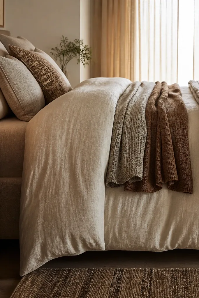
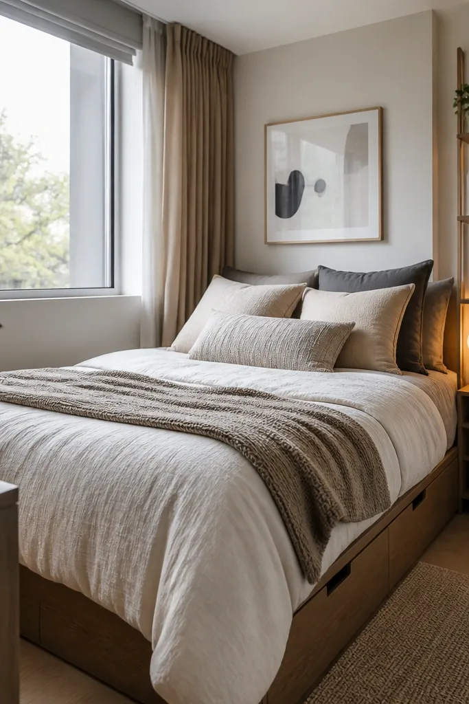
Most bedrooms look unfinished because the bedding has no height. I get height without adding bulk by using a duvet that drapes well and folding throws the same way every time. I use a duvet cover in cream or oatmeal with a bit of texture — cotton sateen or brushed cotton. Then I add one throw folded lengthwise and placed at the foot with the fold edge facing outward. Two smaller pillows — one square and one lumbar — make the bed look layered instead of flat. The principle is to create vertical and horizontal breaks your eye can rest on.
Start by making the bed with the duvet so it hangs evenly on both sides. Then fold your throw in thirds so it’s about 12-16 inches tall and place it at the foot center. Add pillows: two matching standard or queen pillows against the headboard, then a lumbar pillow in a complementary tone. Finish with a single textured square pillow on top so the top layer has a different surface, like bouclé or chunky knit.
If your duvet looks too thin, switch to a slightly heavier cotton or add a breathable quilt under it so the top layer falls with weight.
Avoid using only a single flat comforter and no throw — it reads like “laundry day,” not styled.
4. Walnut wood + cream textiles for warm contrast

Warm wood and cream textiles create a cozy contrast that doesn’t look trendy. I’ve lived with both gray furniture and warm wood, and warm wood reads better with everyday lighting. Walnut or medium oak with a honey undertone looks rich without turning dark and heavy when you pair it with cream, oatmeal, and ivory. This combo flatters warm skin tones and also keeps cool tones from looking washed out. The styling principle is contrast through undertone: warm wood needs warm neutrals, not icy whites.
Start by matching your main wood tone across the room: bed frame, dresser, or nightstands. Then pick bedding and curtains in cream, oatmeal, and ivory — look for slight texture like slub cotton or linen. Add one accent color only if you want it: terracotta, sage, or muted navy work well against walnut. Finally, keep metal finishes consistent — choose either brushed brass or matte black and stick to it on handles and lamp bases.
If your room has gray walls, bring cream in through textiles first before you repaint anything.
Avoid pairing walnut furniture with bright optic white sheets because the undertones fight under warm bulbs.
5. Curtain height upgrade: hang 4 inches above the ceiling line
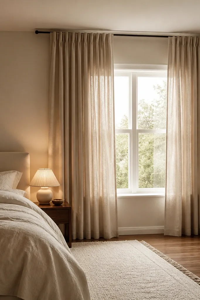
Cozy bedrooms need softness at the top edge, and curtains are the quickest fix. I hang curtains higher than the window so the room feels taller. My go-to is mounting the rod about 4 inches above the ceiling line or as high as you can go without hitting trim. Linen in sand, oat, or warm taupe makes the light look soft and flattering. If your room has low ceilings, this trick helps the whole space read bigger and calmer. The principle is vertical framing: you’re drawing the eye upward with fabric.
Good to knowIf you can’t mount higher, use a slightly lighter curtain color to keep the top from feeling heavy.
Start by measuring from where you’ll mount the rod to your floor — you want panels to kiss the floor or puddle 1-2 inches. Then choose curtain width so you get fullness: aim for 2 to 2.5 times the window width. Hang the panels so they start with a slight gap off the wall for better airflow. Finally, tie-backs should be optional and subtle — I use a fabric tie in the same color so it doesn’t look like a separate product.
AvoidAvoid curtains that end at the windowsill height — they make the room feel shorter and more cramped.
6. Oversized headboard with linen slipcover look

A headboard that’s too small makes the bed feel like it’s missing something, even if the bedding is nice. I like an upholstered headboard with a linen or linen-look slipcover because it softens sound and adds texture. A headboard that extends 2-4 inches above the pillow height helps the bed look intentional. This works especially well in rooms with simple wall colors because the headboard becomes the visual anchor. The principle is texture at the back of the bed: it gives your eye a cozy place to rest.
Good to knowIf your headboard is low, stack pillows with a lumbar behind the regular pillows so the back looks taller.
Start by checking your pillow height. Choose a headboard height so the top edge sits about 2-3 inches above the tallest pillow. If you’re buying, look for a slipcover or removable cover so you can keep it clean. Then select bedding that matches the headboard undertone — cream bedding against light linen reads calm. Add one frame or sconce behind the bed, not three items — let the headboard do the heavy lifting visually.
AvoidAvoid a bare wall behind a bed with a tiny headboard — it reads unfinished.
7. Single-pattern rule: one bold textile, everything else quiet

Cozy bedrooms don’t need a lot of patterns; they need one pattern that you can feel. I keep it simple: one bold textile — plaid, small-check, or a subtle stripe — then everything else is solid or near-solid. That prevents the room from looking like it’s trying too hard. It also makes your bedding look styled even when you’re not changing it daily. This rule flatters any body type or personal style because it doesn’t rely on “perfect” decor — it relies on balance. The principle is visual control: one pattern gives character, quiet pieces keep it calm.
Good to knowPin the throw to the foot of the bed so the pattern is visible from the doorway. That’s where the cozy impression starts.
Start by picking the boldest item you’ll use: usually a throw blanket or a pillow cover. Then keep the duvet and sheet colors solid — cream, oatmeal, or warm gray. Choose secondary accents that pull from the bold textile colors — for plaid, I match a pillow to the lighter stripe and a second pillow to the darker shade. Finally, limit frames and small decor with patterns so the bed remains the focus.
AvoidAvoid mixing three patterned bedding items at once — it starts to look busy and cheap under warm light.
8. Nightstand tray method for clean eyes
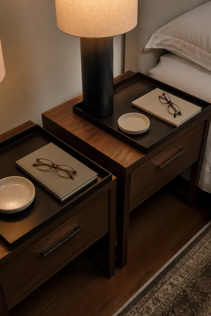
Cozy is also visual order. I use a tray on each nightstand because it stops random items from spreading out and making the room look messy. The tray should match the room’s tone — I like matte black metal trays or light wood trays with a warm stain. When everything sits inside a tray footprint, the nightstand looks styled even if you use it daily. This works for people who like skincare routines because bottles stay contained. The principle is grouping: you’re creating one “mini vignette” instead of scattered objects.
Start by clearing both nightstands completely for 10 minutes. Then place the lamp first and decide where your tray goes so it doesn’t block the lamp base. Use a tray that fits your space — about 10-12 inches wide for a narrow nightstand. Finally, add only three things on the tray: a candle or small lamp accessory, one everyday item like lotion, and one visual anchor like a ceramic dish or small book.
Swap the candle jar for a smaller refillable candle — you’ll keep the look neater and less bulky.
Avoid leaving loose items like charging cables or random skincare bottles on the bare wood.
9. Wall color swap: warm off-white with yellow undertone
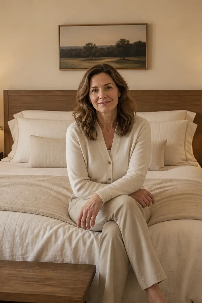
If your bedroom feels cold, the culprit is often wall undertone, not your decor. I like a warm off-white with a gentle yellow undertone because it makes wood, brass, and cream fabrics look cohesive under 2700K light. Cool off-whites can turn bedding gray and make the room feel like a waiting room. This color works well for both dark and small rooms because it adds brightness without going stark. The principle is undertone matching: warm light needs warm walls to look cozy instead of washed.
Good to knowIf you can’t paint, use warm white sheer curtains instead and add a mirror to reflect your warm lamps.
Start by looking at your wall in the morning and at night. Choose a test pot and paint a swatch at least 2 feet wide near the bed where you’ll see it daily. Then compare it against your bedding fabric — hold a pillowcase or throw fabric against the wall to judge contrast. Finally, keep trim and ceiling either the same family or slightly brighter so the room doesn’t feel boxed in.
AvoidAvoid choosing a stark white paint when your floors or furniture already run warm — it looks disconnected.
10. Mirror placement for light bounce, not clutter reflection
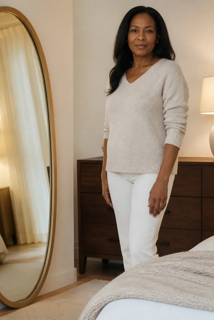
Mirrors make bedrooms feel bigger, but placement matters more than the frame style. I place my mirror so it reflects a lamp or a bright wall area, not the closet door or laundry basket. A tall oval or rounded rectangle mirror softens the room lines and adds a little “finished” feel. Under warm bulbs, the reflected light looks cozy instead of glaring. This works in narrow bedrooms where you need visual depth. The principle is controlled reflection: you’re multiplying light, not your mess.
Start by standing where you want the mirror to be seen from — usually near the foot of the bed or across from it. Then move it around the floor until it reflects warm light from your lamps. Secure it to the wall with the right hardware so it doesn’t tip. Finally, keep the dresser or console behind your mirror clean because anything reflected will show up in the same brightness level.
Use a temporary painter’s tape outline on the wall before you drill so you can live with the height for a day.
Avoid hanging a mirror directly across from a messy dresser or open hamper.
11. Chunky knit throw in one color direction
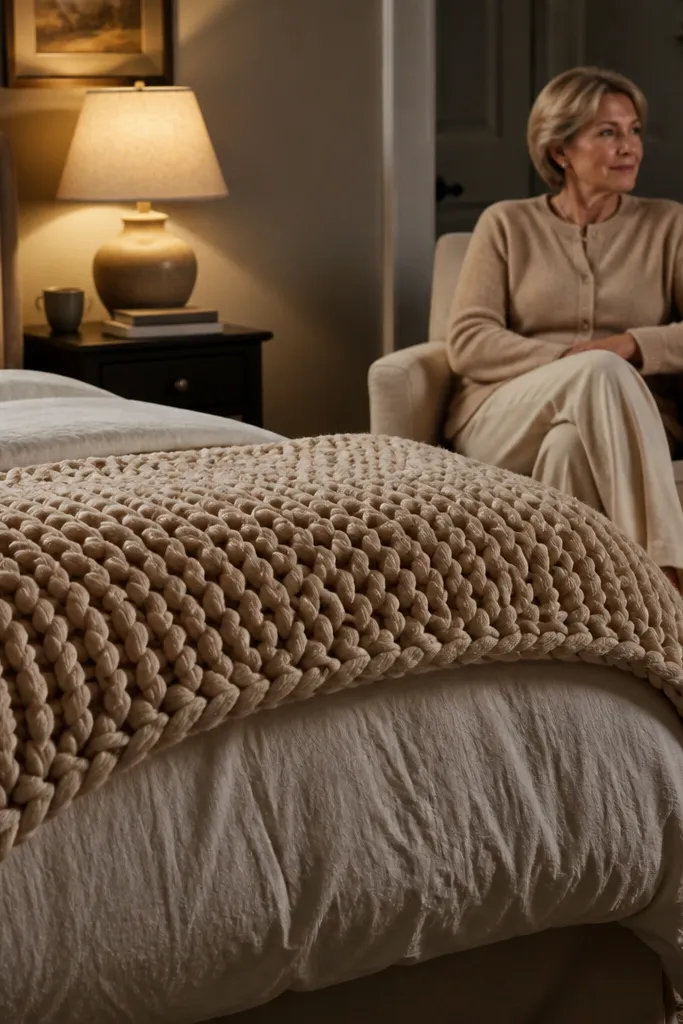
A chunky knit throw makes a bedroom feel touchable, even if you never change the decor. I choose one color direction and stick to it: warm oat, cocoa, or muted olive. The knit should be thick enough to show loops and shadows, not a thin throw that looks flat. This works for people with darker hair and deeper skin tones because the warm neutral reads clean and flattering. It also helps lighter rooms because the texture adds depth without adding color chaos. The principle is tactile contrast: smooth bedding plus a knitty layer at the side or foot.
Good to knowShake the throw out in the morning. Knits look better when the loops sit cleanly.
Start by draping the throw over the side of the bed so it hangs about 10-14 inches down. Then fold the edge once so the knit doesn’t look messy. Match the throw undertone to your bedding — warm oat with cream, cocoa with beige-gray, olive with ivory. Finally, keep pillow patterns subtle so the knit remains the texture star.
AvoidAvoid throwing a thin knit on top of smooth satin — the contrast looks cheap and uneven.
12. Woven basket system at the foot of the bed

Cozy rooms hide the clutter without looking like they’re hiding it. I use woven baskets at the foot of the bed for extra blankets and daily items like a spare throw. Woven texture looks intentional next to bedding, and it keeps things from turning into piles on the floor. This works especially well in apartments where storage is limited. The principle is functional styling: the baskets are decor because they have a clear purpose and a visible texture.
Start by choosing baskets that match your room’s vibe: seagrass, rattan, or a cotton rope weave. Then place them at the foot with the taller basket on the left and the shorter on the right so it looks balanced. Add one visible label only if you need it — I use a small cloth tag tied to the handle. Finally, keep basket contents consistent: blankets inside, not random laundry. That one rule keeps the cozy look alive.
If baskets shed, wipe them with a damp cloth and let them dry before styling so fibers don’t end up on your bedding.
Avoid using plastic bins at the foot of the bed — they kill the cozy texture.
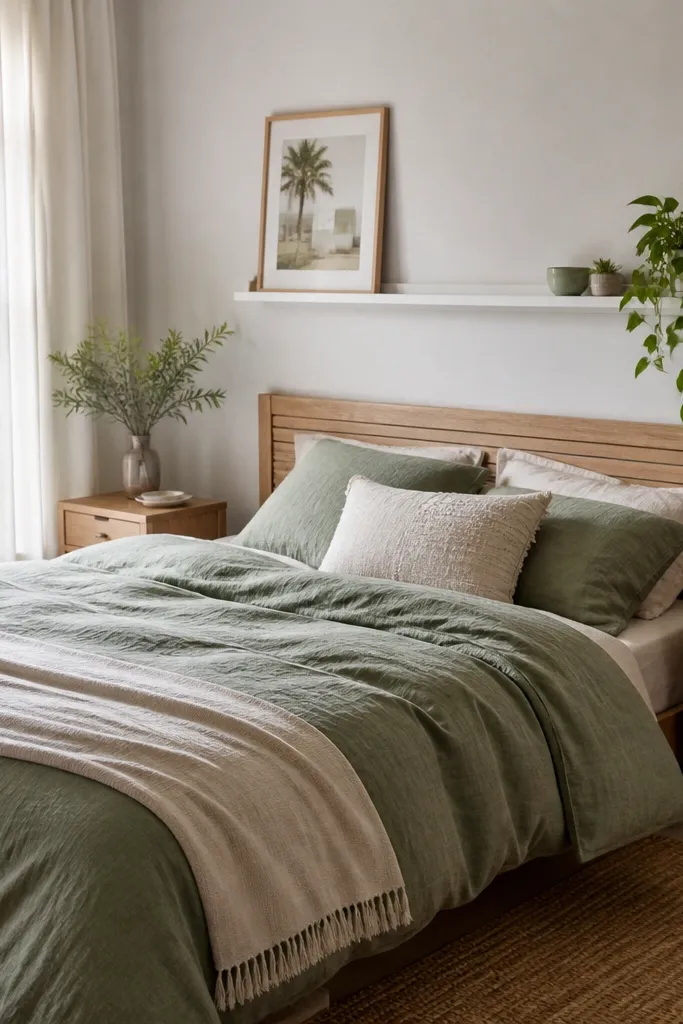
13. Sage + cream bedding with matte ceramic accents

Sage is one of the few greens that reads calming instead of “craft store.” Paired with cream bedding, it looks cozy and lived-in without turning into a themed room. I keep ceramics matte — off-white or warm gray — because glossy pieces reflect too sharply under warm bulbs. This combination works for both light and medium skin tones because it stays soft and neutral around the face. The principle is a gentle accent color: use sage in one or two items, not across everything.
Good to knowTest the sage in daylight. If it looks too gray in the morning, switch to a slightly warmer sage.
Start by choosing a sage pillow cover or a sage throw, then keep the duvet and sheets cream or oatmeal. Add one matte ceramic piece on the nightstand — a small vase or candle holder. If you want a second accent, use muted clay or brushed brass, not bright gold. Finally, keep wall art simple: a single print with cream background and sage tones.
AvoidAvoid pairing sage with icy gray furniture — the green will look dull and the room feels colder.
14. Matte black + brass mixed metals, one finish repeated

Mixed metals look cozy when one finish repeats more than the other. I use matte black as the dominant finish and brass as the supporting highlight. The black gives structure, and the brass adds warmth and softness. This combo looks good in both small and medium bedrooms because it’s grounded without being heavy. It also flatters warm lighting because brass doesn’t look too yellow and black doesn’t look too stark. The principle is repetition: you need one metal to be the “main character.”
Start by choosing one dominant metal and committing across the room: bed frame, curtain rod, or picture frame. Then add brass in smaller pieces like lamp hardware, a mirror frame edge, or a cabinet handle. Keep the brass finish consistent — brushed brass looks softer than shiny polished brass. Finally, stop at three metal items in one corner so it doesn’t look like you grabbed parts from different stores.
If you mix metals and it feels off, remove one category — either switch the curtain rod to match the lamps or simplify the frames.
Avoid random chrome finishes. Chrome makes warm lighting look dirty.
15. Entry bench styling with one tray and two hooks

Even if your bedroom is the focus, what you place near it changes how the bedroom feels when you walk in. I style a bench or narrow console in a way that supports a calm entry routine. One tray keeps small items from scattering, and two hooks prevent bags and scarves from living on chairs. Cozy is about frictionless daily habits — fewer visual piles means your room stays “styled” longer. This works for tiny apartments where the entry area is basically inside your bedroom zone. The principle is controlled storage that still looks pretty.
Good to knowUse the same color fabric for a scarf and a throw in the bedroom so the vibe feels continuous.
Start by clearing the bench surface completely. Place a tray roughly centered, sized so it leaves 2-3 inches of bench space around it. Add a small candle or essential oil dish and a keys catch dish on the tray. Then install two hooks above the bench at a reachable height. Finish with a runner rug so shoes don’t visually clutter the floor.
AvoidAvoid leaving coats on chairs near the bedroom. It makes the whole space look like a landing spot for everything.
16. Satin pillowcases for a smoother, calmer look

Satin pillowcases look cozy because they catch warm light without glare. I use them when I want the bed to look smoother and more finished, especially with warm bulbs. Choose satin in warm ivory, champagne, or light beige — avoid bright white satin. It flatters people with textured hair because the fabric feels gentle and reduces friction, and it looks neat even when you haven’t been “perfect” about tucking. The principle is finish contrast: satin next to cotton and knit reads layered and intentional.
Good to knowIf satin looks too shiny in your room, switch to a matte satin or silk-blend with a softer sheen.
Start by washing and drying pillowcases so they don’t cling. Then place satin pillowcases on your standard pillows before you add pillow covers. Keep pillow covers in linen or cotton to balance the shine. Finally, style one satin edge visible — for example, when you slightly shift pillows so the satin seam line shows subtly.
AvoidAvoid using bright white satin with warm wood — it can look stark and unfinished.
17. Bedside wall art at pillow height
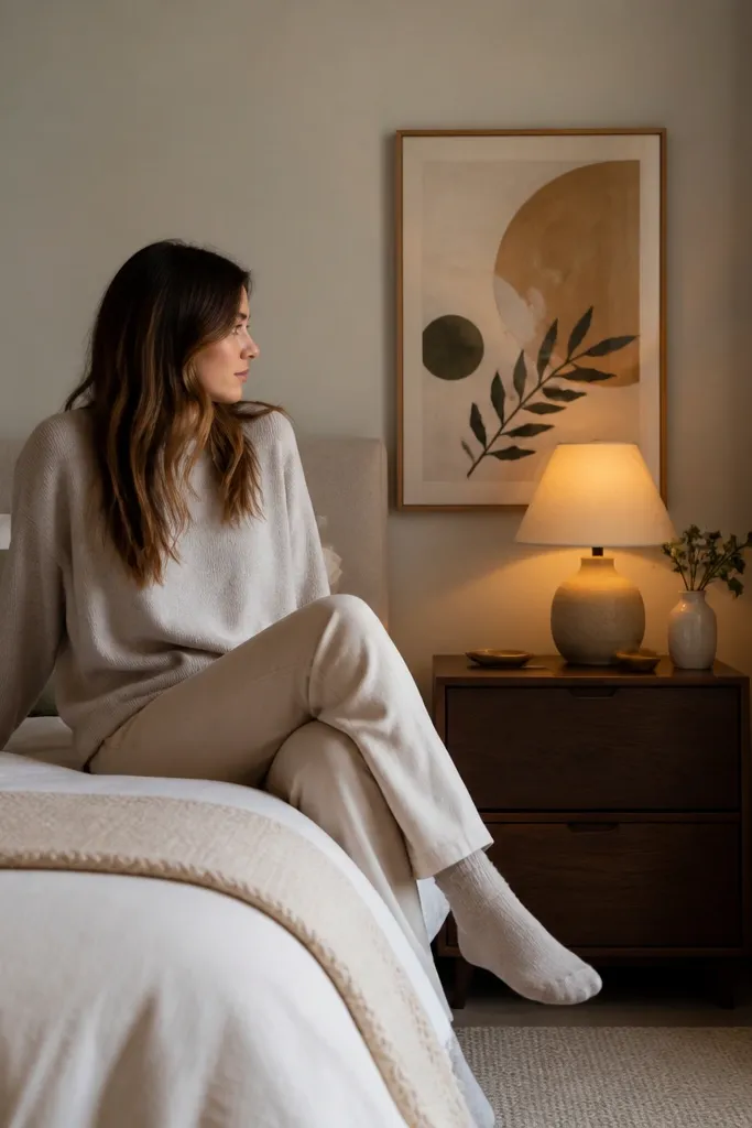
Wall art placement is one of those details people feel but can’t name. I hang art so the center sits around pillow height when you’re sitting up in bed. That means the art looks like it belongs to your eye level, not like it’s hanging for the ceiling. I like neutral prints with warm tones because they blend with bedding instead of competing. This works for almost any room size because it’s measured to your furniture, not the wall. The principle is eye-level alignment: comfort starts with how things line up when you look up.
Good to knowFor a cozy look, pick frames with a warm finish — walnut, black, or brushed brass — and use a mat in off-white.
Start by sitting on your bed and marking where your eyes land on the wall. Measure from the floor to that point, then hang the art so the center of the frame aligns with it. Use painter’s tape to test the height first. Choose a frame width about 2-3 inches narrower than the headboard so it doesn’t overpower. If you have a narrow bed, use one larger piece instead of a gallery wall.
AvoidAvoid hanging art too high above the headboard. It makes the bed feel smaller and less comfortable.
18. Rattan or cane chair for a soft corner

A bedroom feels cozy when there’s a place to sit besides the bed. I like rattan or cane chairs because they add texture without blocking light. The open weave makes the corner feel airy, which matters if your room is small. Pair it with a cushion in cream or sand and you get a soft spot that looks inviting. This works for any body type because the seat cushion shape is forgiving and the chair reads comfortable even before you sit. The principle is adding texture and a second seating zone to break up the bed-only look.
Start by placing the chair so you have a clear path from the bed to the corner. Then add a small cushion with a removable cover in linen or cotton — keep it in the same undertone family as your bedding. Position a side table next to the chair and add a warm lamp or a reading light with a fabric shade. Finish with a small woven tray or basket under the table for a throw. Keep the floor clear so the chair doesn’t feel crowded.
If your chair looks too “boho,” add one structured element like a simple black side table to balance it.
Avoid placing a bulky upholstered chair in a narrow room. It makes the space feel tight and less cozy.
19. Floor lamp with linen shade for evening glow

Ceiling light is what makes bedrooms feel like offices. I use a floor lamp with a linen shade to create a second layer of light that feels like evening. This matters more than people think because warm light bouncing off walls makes the whole room feel softer. If you have to work late, it also helps your eyes relax since the light spreads instead of blasting. This works for light and dark rooms because linen diffuses everything. The principle is light layering: bedside + corner glow beats one overhead bulb every time.
Start by picking a lamp height so the shade sits around eye level when you stand. Then place it in the corner where it can wash the wall behind it with warm light. Choose a linen shade in oat, cream, or light taupe — avoid dark shades that swallow light. Add a small table or basket nearby so the corner looks intentional, not like furniture placed randomly. If you can, use a dimmer bulb or a lamp with a pull chain dimmer so you can lower the brightness.
Angle the shade slightly toward the room center so the glow hits your bedding area.
Avoid bright white plastic shades. They look harsh and cheap under warm bulbs.
20. Textured duvet cover with slub cotton look
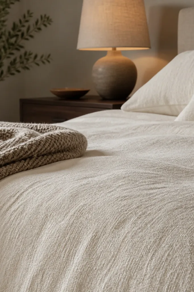
Smooth bedding can look flat in warm light. I choose slub cotton or lightly textured duvet covers because the weave creates tiny shadows that read as depth. That depth is what makes the bed look cozy even when you keep the color palette simple. It flatters everyone because the texture adds interest without needing bold patterns. The principle is micro-contrast: texture gives you visual richness that doesn’t depend on color.
Start by touching the fabric in person if you can. Look for slub cotton, brushed cotton, or a linen-cotton blend with visible weave. Then pick a color that matches your room’s undertone — warm cream for warm wood, warm beige for taupe walls. Make the bed so the duvet sits smooth at the top, then let it drape naturally on the sides. Finally, add one textured pillow cover like a cotton gauze or a ribbed knit to echo the duvet texture.
If your duvet looks too smooth online, search for “slub” or “woven” in the listing — those fabrics show texture in real life.
Avoid ultra-shiny polyester duvet covers. They grab light and look slick instead of cozy.
21. Bench-height ottoman at the foot with tray storage

Cozy bedrooms look lived-in because you can move around without stepping over piles. I use an ottoman at the foot of the bed sized like a bench so it gives you a place to sit and a place to stash. If it has a tray or hidden storage, it helps you keep the floor clear, which makes the room look cleaner day-to-day. Choose a fabric like linen blend or textured twill in oatmeal, sand, or muted gray-beige. This works well if you have a long hallway toward the bedroom and want a landing spot for shoes or bags. The principle is functional comfort: the foot of the bed becomes a usable surface, not just decoration.
Start by measuring the space around your bed so the ottoman doesn’t block walking paths. Then choose an ottoman height close to bench height — about 18-20 inches so it feels like a seat. Place it centered at the foot, leaving 2-3 inches of clearance from the bed frame. Add a throw on top folded neatly so it looks intentional. If you have storage, keep only one category inside: extra blankets, not random items.
Use the same fabric color as your curtain or throw so the ottoman feels like part of the set.
Avoid an ottoman that’s too tall. It crowds the bed and makes the room feel cramped.
22. Entry-to-bedroom runner rug in warm neutral
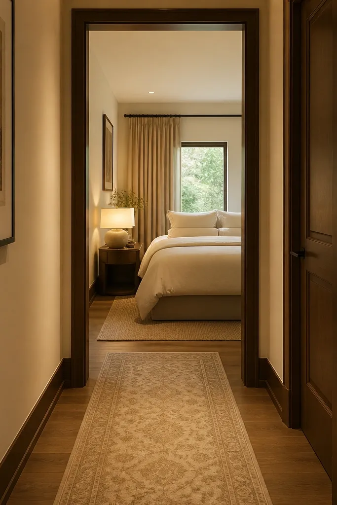
A runner rug creates a cozy transition so your bedroom doesn’t feel like it starts abruptly. I use warm neutrals like beige, camel, and soft tan because they blend with bedding and wood floors. The runner also reduces visual clutter from shoes and small bags in the entry area. In narrow spaces, it makes the whole path feel intentional and calmer. This works for apartments and houses because it’s one of the few decor items that affects how you move through the space. The principle is continuity: you’re repeating warmth from entry to bedroom so your eye doesn’t reset at the door.
Start by measuring the path length from entry to bedroom door — don’t guess. Then choose a runner width that leaves a few inches of floor showing on each side so it doesn’t feel tight. Place the runner centered in the hallway line. If the pattern is subtle, it can extend the visual calm; if it’s bold, keep the rest of the bedroom textiles solid. Finally, add a small door mat or shoe tray so the runner stays clean and cozy-looking.
If the hallway gets lots of foot traffic, pick a low pile runner — it stays neat longer.
Avoid placing a dark runner in a small entry. It makes the doorway feel like a shadow box.
23. Layered lighting with a dimmer plan (lamp + wall sconce + warm LED bulbs)

I like bedrooms that feel lit from more than one angle. One light overhead always makes the room look flat and harsh, even if the bulb is warm. With a lamp on each side plus one wall sconce, you get that low, cozy pool of light right where your eyes land when you sit up in bed. The dimmer matters because 2700K at full brightness can still feel sharp; at 20-40% it turns into that slow, evening glow you want at night.
1) Put a dimmer on the bedside lamp circuits first. Use warm LED bulbs labeled 2700K and keep the wattage around 6-9W for a steady glow (I’ve found 60W-equivalent works without looking too bright). 2) Add one wall sconce positioned so the bottom of the shade sits about 54-60 inches from the floor, then aim the light slightly downward toward the headboard, not straight into the bed. 3) If you’re wiring new fixtures, run the sconce to a separate switch so you can turn off the overhead light completely and still have a usable reading level. 4) Test dimming after dark with your actual bedding — textured cotton and slub fabrics look best when the shadows soften, not disappear.
Use the same bulb temperature in every fixture so the room color never shifts when you tap a switch.
Avoid mixing 3000K overhead bulbs with 2700K bedside lamps — the room will look two different temperatures at once.
24. Bedside privacy without curtains using a fabric screen and a slim console

If your bedroom layout makes curtains awkward, you still get privacy and softness using a fabric screen. I’ve used this when the bed is too close to a window or when radiators block curtain hardware. The screen breaks up sightlines from the doorway, so the bed feels tucked in even when the room is small. It also adds texture at eye level, which is where bedrooms usually look plain.
Good to knowI like screens with a slightly sheer fabric — you get privacy at night but still keep daylight from the window moving through the room.
1) Choose a fabric screen in a light neutral like oat, warm white, or natural linen. Keep it about 6-10 inches behind where your headboard sits so it doesn’t press against the bed when you move around. 2) Place a slim console table (around 10-14 inches deep) against the wall near the screen hinge side, not under the middle panel. 3) Style the console with one low item and one vertical item — for example a ceramic vase plus a stack of two books — so the screen stays the main visual. 4) Anchor the screen with a small weight on the base or use wall straps if your floor is uneven. When you sit in bed, you want the screen to frame the side view, not wobble.
AvoidAvoid placing the screen directly in front of the window — you’ll block light and the room will feel smaller.
25. The 'no-clutter landing' method with a floating shelf above the dresser
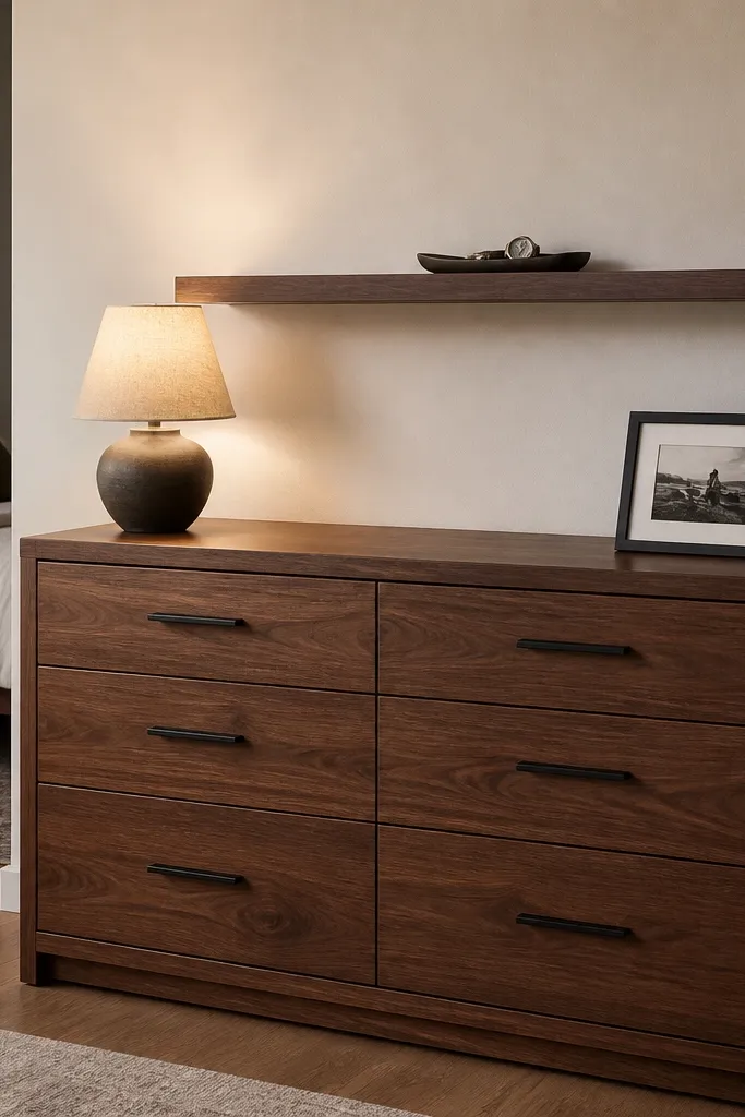
Bedrooms get messy fast because we drop things where our bodies move — the dresser top, the nightstand edge, the chair arm. A floating shelf above the dresser gives you a landing spot that’s higher than hand level, so it doesn’t turn into a junk shelf. I’ve found that when the shelf has a tray, people naturally put items in the tray instead of scattering them. This keeps the room looking calm even on weeks when you’re tired and you don’t want to straighten everything.
Good to knowKeep the tray color close to your bedding tones — cream, warm gray, or matte stone — so it blends instead of looking like a separate storage bin.
1) Install a floating shelf 6-8 inches above the dresser top, and keep it 1-2 inches narrower than the dresser so it looks intentional. Use a shelf lip or add a shallow tray so small items don’t slide forward. 2) Limit the shelf to a tray plus two supporting items — a small lamp base is fine if it’s low, but keep it off the shelf if it blocks the wall art below. 3) Create a daily drop zone by placing one catch-all tray for lip balm, a hair tie, and a small dish for keys. 4) Style the shelf once, then maintain it by putting new items straight into the tray — no “temporary” piles on the dresser. When you want it extra neat, swap the framed print for a simple object like a small bowl and keep the tray centered.
AvoidAvoid a shelf that’s too wide — it invites you to fill it, and the dresser below starts looking bare in a weird way.