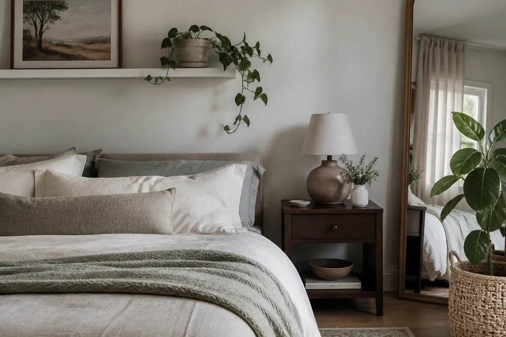
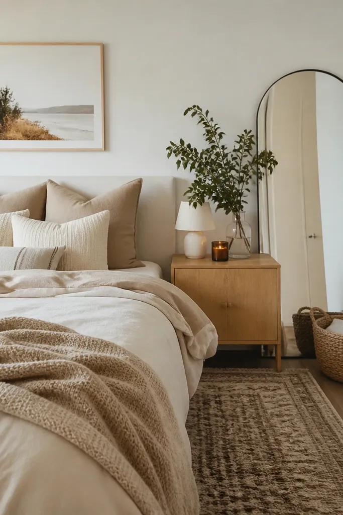
1. Bedding swap with a textured comforter in oatmeal
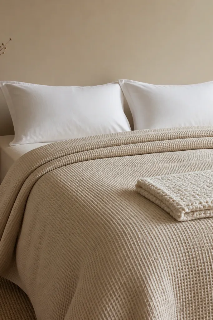
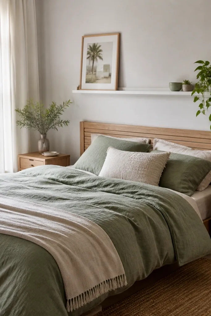
Start by pulling the fitted sheet smooth and making sure the comforter hangs evenly on both sides. Add two pillow shams in cream or white, then place a single textured throw pillow that matches your accent color. Drape the throw at the foot so it covers about one-third of the bed length. Finish by tucking the comforter corners slightly under the pillows so the whole setup looks crisp, not “thrown on.” If your budget is tight, buy the comforter first and delay decorative pillows.
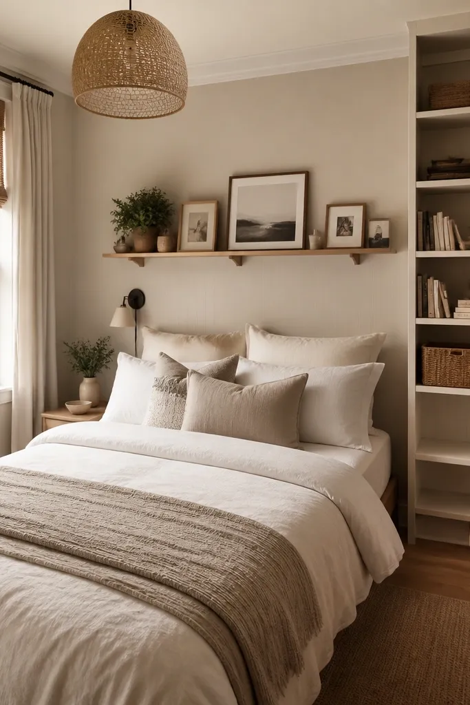
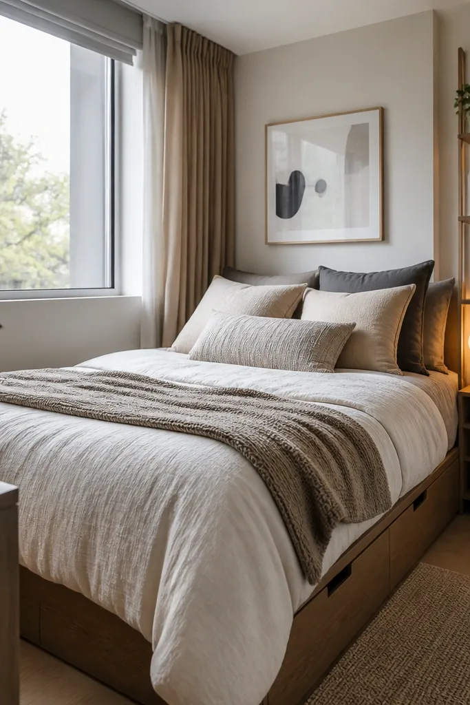
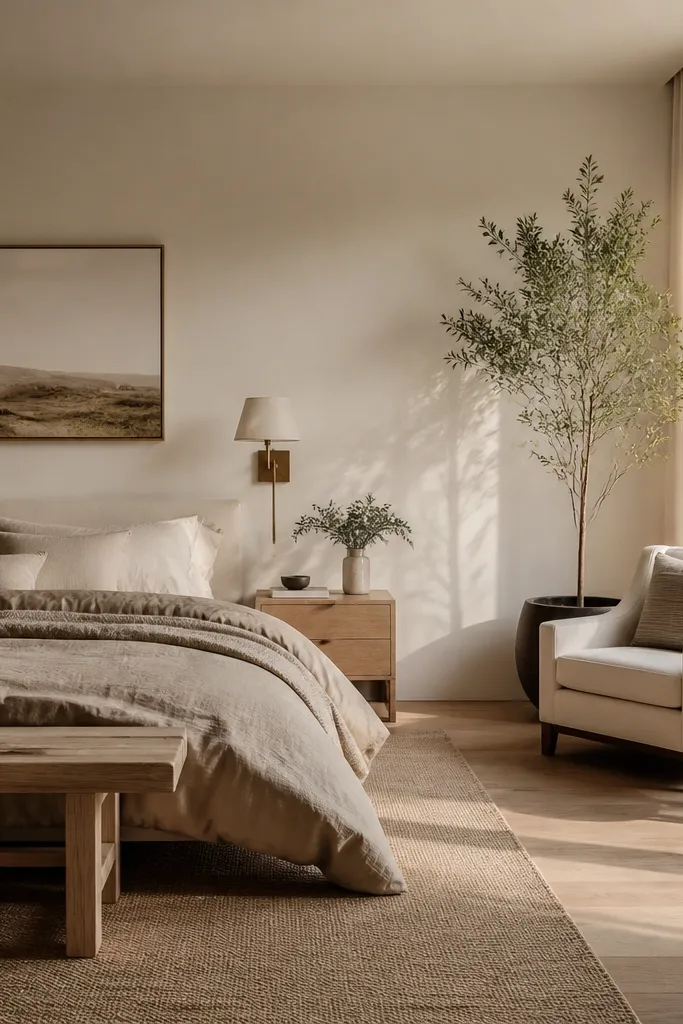
I’ve never seen a budget bedroom look more expensive than when the bed gets a real texture layer. Choose an oatmeal or cream comforter with a clear weave — waffle, dobby, or cotton slub — because flat satin looks cheap under warm light. Oatmeal flatters most skin tones because it reads warm and neutral, not gray-cold. It also makes your room feel calmer, especially if your walls are already beige or off-white. The styling principle is that your bed becomes the focal point, so everything else can stay simple.
AvoidSkip thin microfiber comforters that look shiny — they catch light in a way that screams bargain.
Good to knowBuy one comforter with a texture you can feel with your fingertips. Texture reads better in photos and in real life than fancy patterns.
2. Warm lamp + shade trick for instant cozy lighting
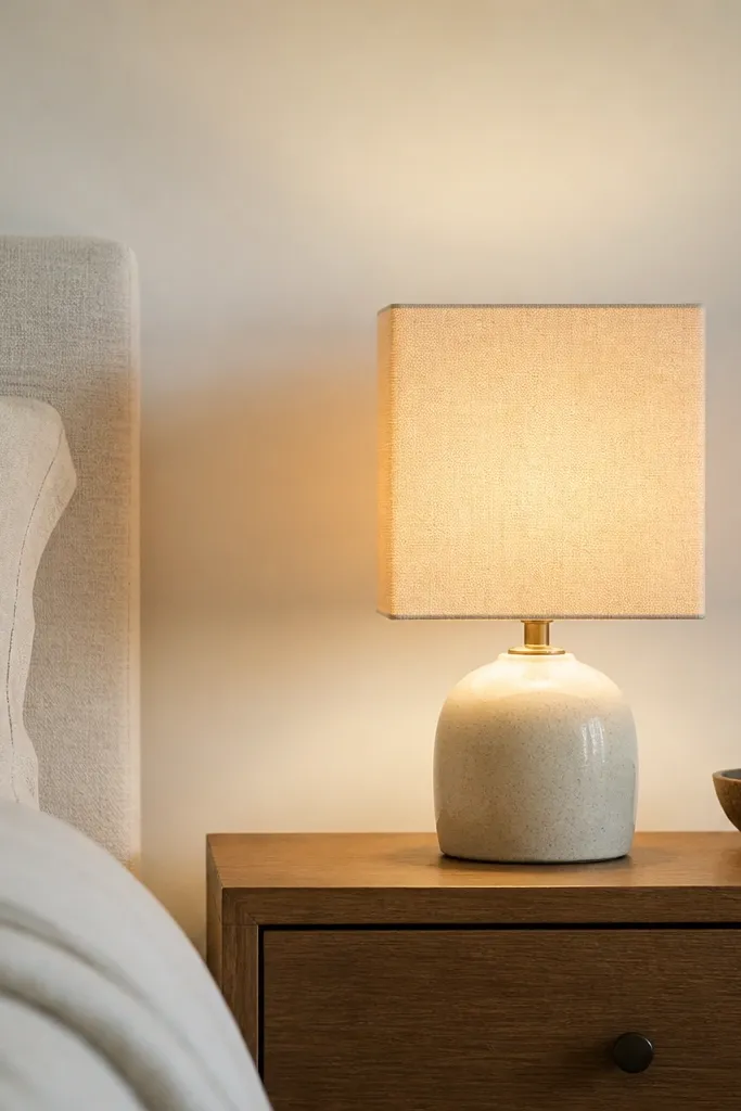
Lighting is the quickest way to make a budget bedroom look styled. I use a warm bulb around 2700K in every bedroom refresh because it smooths out wall color and makes skin tones look softer in the mirror. A light linen shade is key; it spreads light without harsh hotspots. If your room feels gray or gloomy, this fixes it without changing paint. The principle here is that warm, diffused light makes cheap materials look intentional.
Start by replacing your bulb with a 2700K warm white LED. Then choose a shade that is light-colored — white, oatmeal, or pale gray-beige — and make sure it’s wide enough to cover the bulb. Place the lamp so the light hits the wall at a slight angle, not straight down into the bed. If you only have one lamp, move it to the side of your bed where you do most of your nighttime reading.
If you already have a lamp, swap only the shade. A new shade is often cheaper than buying a whole lamp.
Avoid cool 5000K bulbs — they turn beige walls into flat gray and make bedding look dull.
3. Removable wood slat panel behind the bed
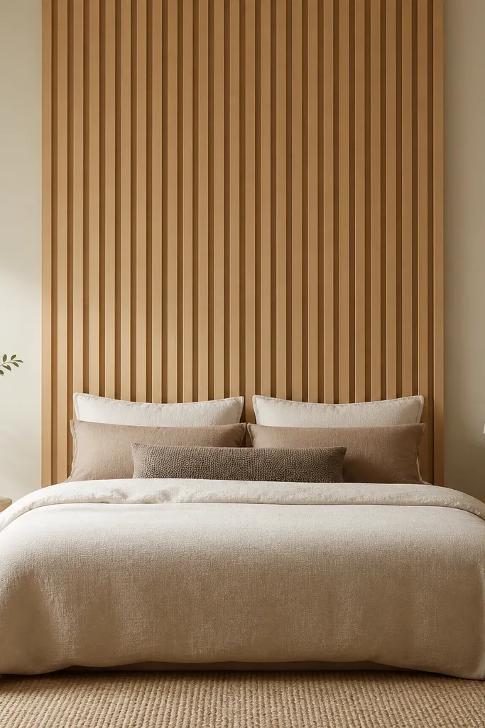
Start by measuring the top width of your bed and leaving 2-4 inches of space on each side. Lay out slat panels on the floor first so you know where seams land. Mount the removable slats using the manufacturer’s adhesive backing, pressing firmly along edges for a full bond. Finish by centering the panel so the bottom edge aligns roughly with the top of the mattress.
A centered wall texture behind the bed makes the whole room feel designed, even when the furniture is thrifted. I like removable wood slats because they add vertical lines and a warm wood tone that works with almost any bedding color. Light oak slats look airy in small rooms and don’t overpower dark accents. This also photographs well because the shadows between slats create depth. The styling principle is to place texture at the visual anchor point — the head of the bed.
AvoidDon’t cover the entire wall if your room is small — a centered panel looks intentional, full-wall slats can feel busy.
Good to knowUse painter’s tape to mark a level guide line before you stick anything. One crooked row ruins the look.
4. Gallery wall with thrift frames in one finish
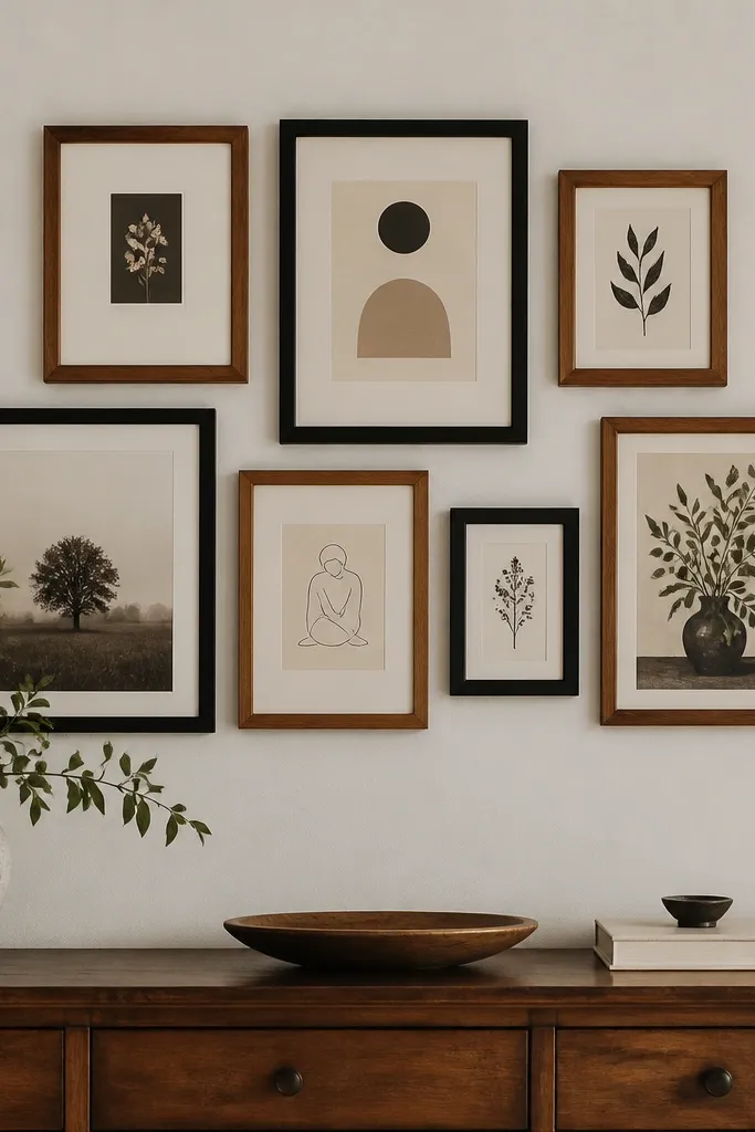
Start by laying out your frames on the floor in the exact spacing you want, then measure the total width. Use a mix of 8x10 and 5x7 for visual rhythm — don’t make them all the same size. Hang the largest piece first, then build outward using painter’s tape guides. Keep the bottom of the gallery about 57-60 inches from the floor for comfortable viewing from a bed.
A gallery wall is the fastest way to fill bedroom wall space without buying a dresser set. The trick is frame consistency, not matching art. I collect frames from thrift stores, then spray them in one finish so the wall reads cohesive. Black and warm wood finishes work with both cool and warm bedding colors. This setup looks good in rentals because you can use removable wall hooks. The principle is that a unified frame finish gives structure even when the prints vary.
AvoidSkip random spacing — if frames overlap or drift, it looks messy instead of styled.
Good to knowSwap in simple matless prints or cream mats to make cheap frames look curated.
5. Rug layering with a jute base and flatweave runner
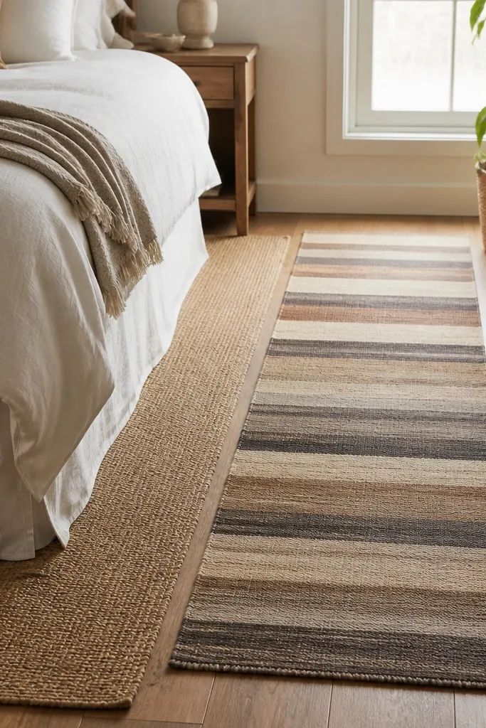
Layering rugs gives you depth for less money than buying one big designer rug. I like a jute base because it adds texture and hides small stains better than plush fibers. Then I top with a flatweave runner to create a guided path toward the bed. This works in bedrooms where the floor is visible because it frames the space. The principle is using one natural texture plus one graphic line to make the room feel intentional.
Start by placing the jute rug so it extends under the front legs of the bed by about 8-12 inches. Add a runner centered lengthwise, leaving 6-8 inches of jute visible on both sides. Use rug tape or a non-slip pad so the runner doesn’t creep. If your runner is patterned, keep bedding solids so the room doesn’t feel busy.
If your jute sheds, vacuum it once a day for a week. It calms down fast.
Don’t match rug colors perfectly to the wall — slight contrast makes the layers look real.
6. Bedside styling with a thrift tray and one tall candle
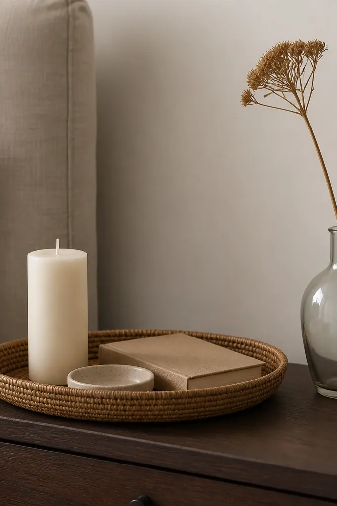
Start by clearing the nightstand completely and wiping it down so you can see the surface. Place the tray centered, then add one tall candle and one small object like a match dish or tiny ceramic cup. Add a book under the candle base if you need height, but keep the book closed. Finish with one dried stem in a small vase so you don’t introduce more colors than your bedding already has.
This is my go-to for making a simple nightstand look expensive. A tray pulls small items into one visual cluster, so the surface stops looking cluttered even when you have stuff. I use woven or wood trays because they repeat natural materials that show up in rugs and baskets. A single tall candle gives height without adding bulky decor. The principle is vertical height plus one curated cluster on each side of the bed.
AvoidAvoid scattering three or four unrelated mini items — it reads like you couldn’t decide.
Good to knowMatch the tray color to your frame finish. That one repeat makes the whole room feel coordinated.
7. Curtain upgrade with an affordable rod and linen-look panels
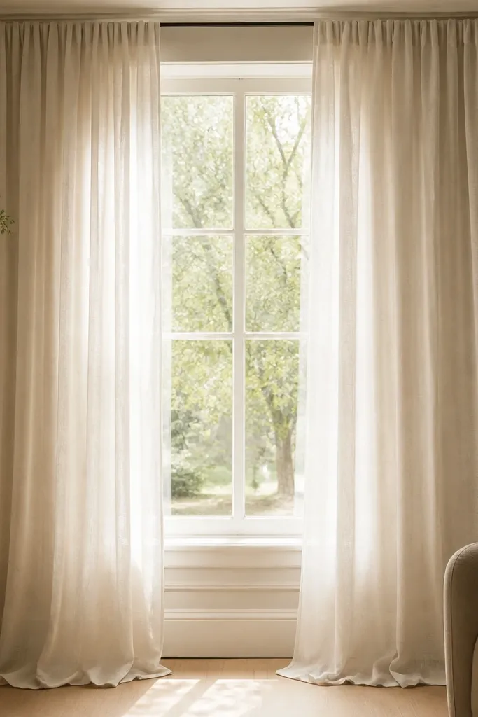
Start by measuring from where you want the rod to the floor. Mount the rod 4-6 inches above the window trim and extend it 6-10 inches beyond each side. Hang two panels so they meet in the middle with a slight overlap. If you want the “designer” look, let the panels puddle 1-2 inches on the floor.
Curtains change the shape of a bedroom more than people expect. I mount my rods near the ceiling and use linen-look panels because they make the window taller and the room brighter. Off-white panels work with almost any bedding color, and the texture makes the fabric look real even when it’s synthetic. If your bedroom is small, this trick also makes it feel less boxed in. The principle is framing the window higher and wider than the opening.
AvoidSkip short curtains. Ending at the sill looks unfinished immediately.
Good to knowUse curtain rings that glide smoothly. Cheap sliding makes the room feel cheap too.
8. Textured wall hanging with a fabric panel and dowel
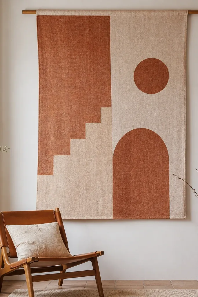
A fabric wall hanging is the quickest way to add softness when you don’t want to paint. I’ve used cotton or cotton-linen yardage, then stretched it over a dowel with a simple rod pocket so it hangs flat. Muted terracotta and cream look warm without turning the room orange. This works especially well if your bedroom is mostly neutral and you want one grounded accent. The principle is using textile texture to add depth where art might feel too small.
Start by choosing fabric with visible weave — think canvas-weight cotton or linen-blend. Cut it so you have enough width to wrap around the dowel and hang with a slight drape. Hem the sides and create a rod pocket or use clips if you want easy removal. Center it on the wall about 6-8 inches above furniture so the hanging doesn’t crowd the surface below.
Steam the fabric before hanging. Wrinkles make even good fabric look sloppy.
Don’t use thin, slippery fabric — it bunches and looks cheap against the wall.
9. DIY floating shelf with thrift books and a single plant
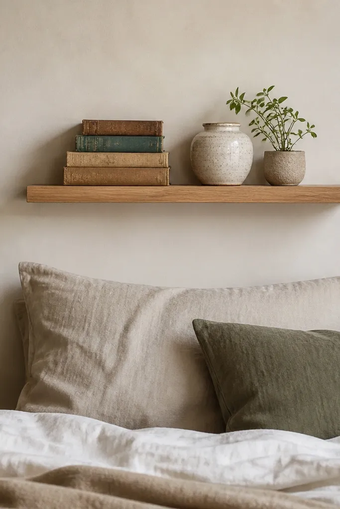
Start by marking the wall for shelf placement, then use a level and install into studs if possible. Add a small layer of shelf styling: place a ceramic jar first, then stack two or three books with spines facing outward. Put the plant last so it sits slightly higher than the books. Leave at least 2 inches of breathing space between items so the shelf looks intentional.
A shelf gives you storage and decor at the same time, which matters when your budget is tight. I keep the styling minimal: books for height, one ceramic container for texture, and one plant for life. Light wood shelves match natural materials like jute and woven baskets. This looks good in bedrooms because it draws the eye up and reduces empty wall space. The principle is vertical staging with a strict “one plant, one container” rule.
AvoidSkip overcrowding. If everything is touching, it looks cluttered, not styled.
Good to knowPaint or stain the shelf the same tone as your frames. Even one repeat makes it look planned.
10. Mirrors on a budget: one large arched thrift frame
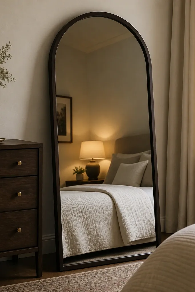
Start by choosing a mirror big enough to cover most of the empty wall area near your dresser. If you’re leaning it, use a mirror stand or wall strap — safety first. Position it so it reflects the lamp or a window, then step back and check the reflection from where you sit in bed. Keep the frame finish consistent with your lamp hardware and picture frames.
A mirror is a money-smart way to make a bedroom feel larger and brighter. I like an arched mirror because it adds a softer shape than a standard rectangle. A dark frame — black or espresso — grounds the room when your bedding and walls are light. This works well if your bedroom has a single small window because it bounces warm lamp light around. The principle is to place the mirror where it reflects your best light source, not the mess.
AvoidAvoid tiny mirrors. They look like an afterthought and don’t brighten the space.
Good to knowWipe the mirror with a microfiber cloth and a tiny bit of glass cleaner so you don’t get streaks under warm bulbs.
11. Wardrobe facelift with matching hangers and a fabric storage cube
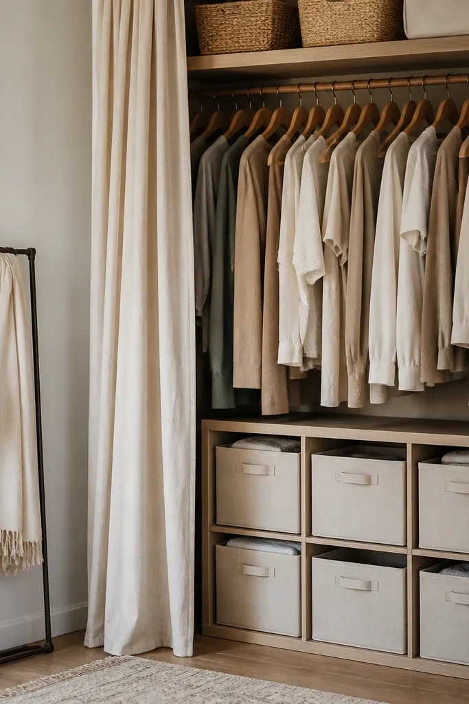
Start by pulling everything out for 20 minutes and grouping by category: tops, bottoms, and “wear often.” Replace with matching hangers so the closet silhouette looks uniform. Add one fabric cube with 3-4 bins for socks, workout gear, or seasonal items. Close the cube when you’re done so it doesn’t collect loose items.
A messy closet shows in the room even when everything else is tidy. When your hangers match and your storage is contained, the bedroom looks finished without adding decor. I use neutral fabric cubes with breathable sides because they blend into walls and don’t look plastic. This is especially good for small bedrooms where you can see the closet from the bed. The principle is visual calm: hide the clutter, repeat materials, and keep lines straight.
AvoidSkip mixed hanger colors and wire hangers. That patchwork look makes the whole room feel chaotic.
Good to knowUse sticky labels on the bins and pull them off cleanly when you rotate seasons.
12. Corner seating with a thrift chair and a throw blanket color match
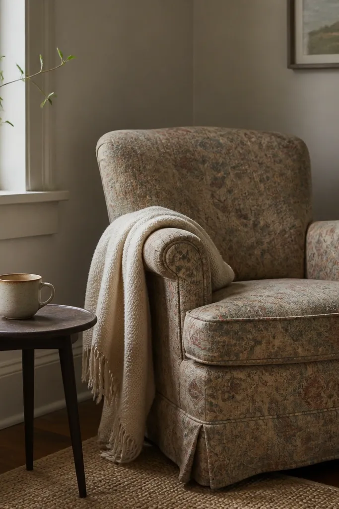
If you have even a small corner, a chair instantly makes the bedroom feel lived-in instead of temporary. I pick a chair with a bit of texture — boucle-look or a subtle weave — because it adds depth without needing new upholstery. Then I match the blanket color to one accent from your bedding. This works for almost any skin tone because the blanket color becomes the visual “warmth” around you. The principle is: one comfy seat + one coordinated textile layer.
Start by placing the chair so it faces the bed or a wall with your framed art. Drape the throw blanket so it hangs from the arm and reaches about halfway down the seat. Add one small pillow only if it matches the blanket’s accent color. Put a slim side table next to it and add a lamp or a candle holder so the corner feels functional.
Use a blanket with a visible knit or fringe so it looks styled even when you’re not sitting there.
Avoid chairs with no textile softness. A hard-looking seat plus a bare wall looks cold.
13. Color-block pillow set using one print and three solids
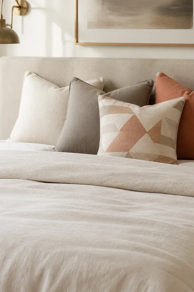
This pillow formula makes a budget bed look intentional without buying ten different items. I stick to one print pillow and three solids so the pattern doesn’t get noisy. Terracotta is my favorite accent because it warms up gray-beige rooms and looks good next to cream and oatmeal. The solids create structure, and the single print gives personality. The principle is controlled contrast: one pattern, repeated neutrals, and a warm accent tied to your wall art or rug.
Start with the comforter base, then lay two solid pillows behind the front pillows. Add one printed pillow in the center front for the focal point. Use the terracotta color on either the front pillow or the throw, not everywhere. Finish by fluffing and aligning the pillow edges so the set forms a clean rectangle across the bed.
Choose a print with only two colors. More colors usually looks like a clearance rack.
Skip random pillow sizes that don’t match your bed width — it makes the bed look lopsided.
14. Entry-style hooks and a catch-all tray for bedroom walls
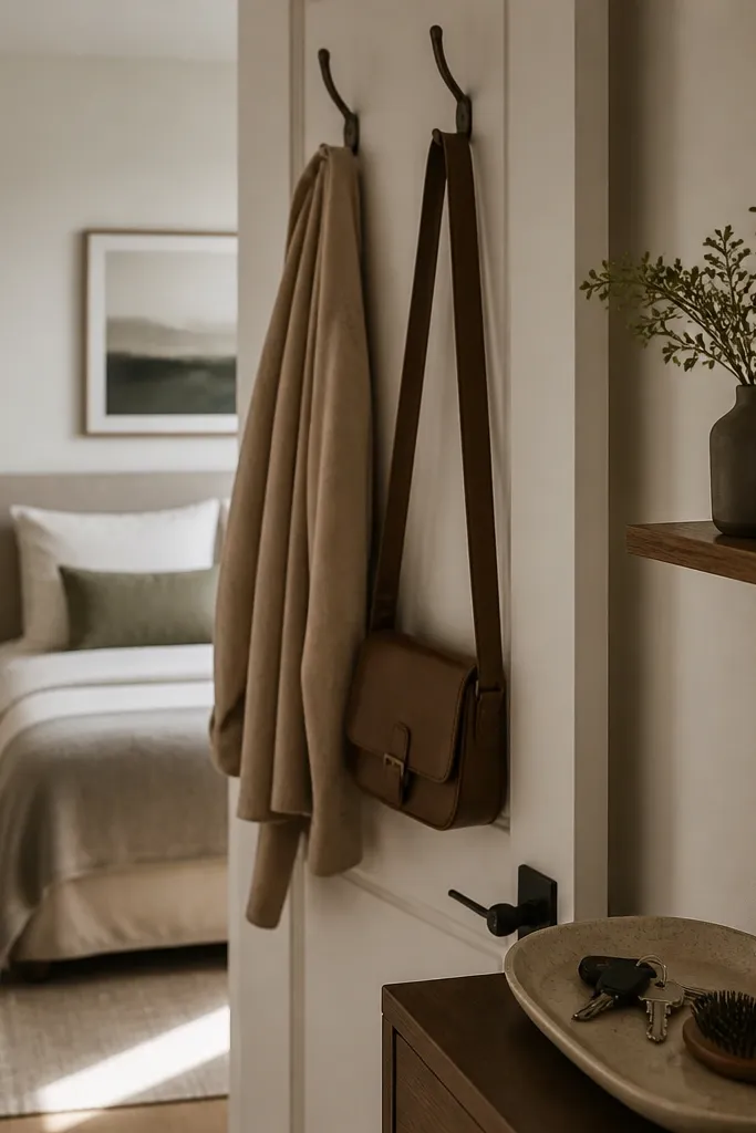
Even when your goal is bedroom decor, a clean “landing zone” keeps the room looking styled. I install a couple of hooks near the door for a robe, tote, or hoodie and add a small tray for daily items. The tray gives you one place to put things that usually end up on the bed or dresser. This is the kind of change that makes the room look better every day, not just when you finish redecorating. The principle is reducing visual mess by controlling where items go.
Start by deciding what you dump on surfaces most often — keys, a bag, a robe, a hairbrush. Mount two hooks about 58-62 inches from the floor so they’re easy to reach standing. Add a small shelf or tray at waist height for smaller items. Style the tray once: one brush, one small bottle, one folded scarf. Keep it consistent so the room looks deliberate even when you’re busy.
Use hooks in a finish that matches your mirror frame or lamp hardware — it ties the zone into the rest of the room.
Avoid placing hooks too low. Bags on the floor and jackets half-draped look messy fast.