1. Centered art that matches your bed width
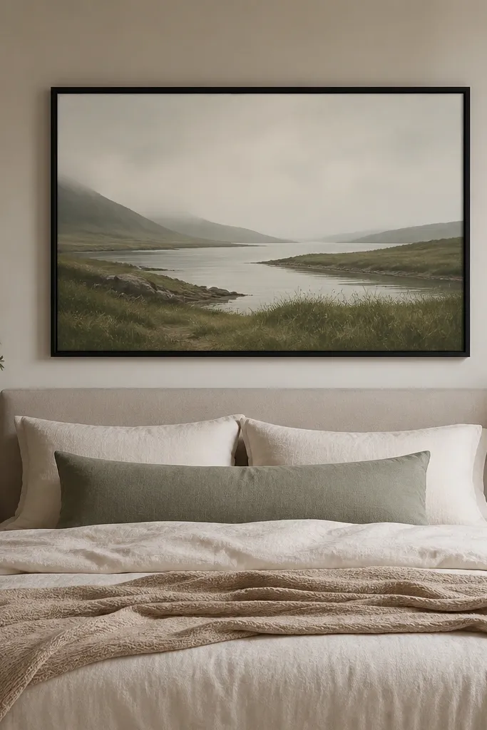
I always start above the bed because that’s where your eyes land first when you walk into the room. If you center one large piece, you avoid the “scatter” look that happens when art pieces are too small or too high. Choose a frame finish that matches a metal you already have — black frames look great with matte black lamps, and oak frames look right next to warm wood furniture. This works especially well if your room is small because the single focal point makes the space feel intentional instead of busy. Pick colors that already exist in your bedding so the wall feels like part of the set, not a separate project.
Good to knowHang the art so the bottom edge is near headboard height, not down near the pillows — it reads cleaner from the doorway.
Start by measuring your bed width and mark the center of the wall above the bed. The top of the artwork should sit about 6 to 8 inches above the headboard, then the artwork should be roughly 2/3 to 3/4 of the bed width. Use painter’s tape to test placement before you drill — move it down if you feel like your neck needs to crane upward to see it. Finally, match at least one color from the art with a pillow or throw so the palette connects. If your art is mostly neutrals, add one accent pillow in the same undertone — like sage, terracotta, or dusty blue.
AvoidAvoid tiny art above a big bed; it makes the bed look heavier and the wall look empty.
2. Two-throw bedding layering with a chunky knit edge
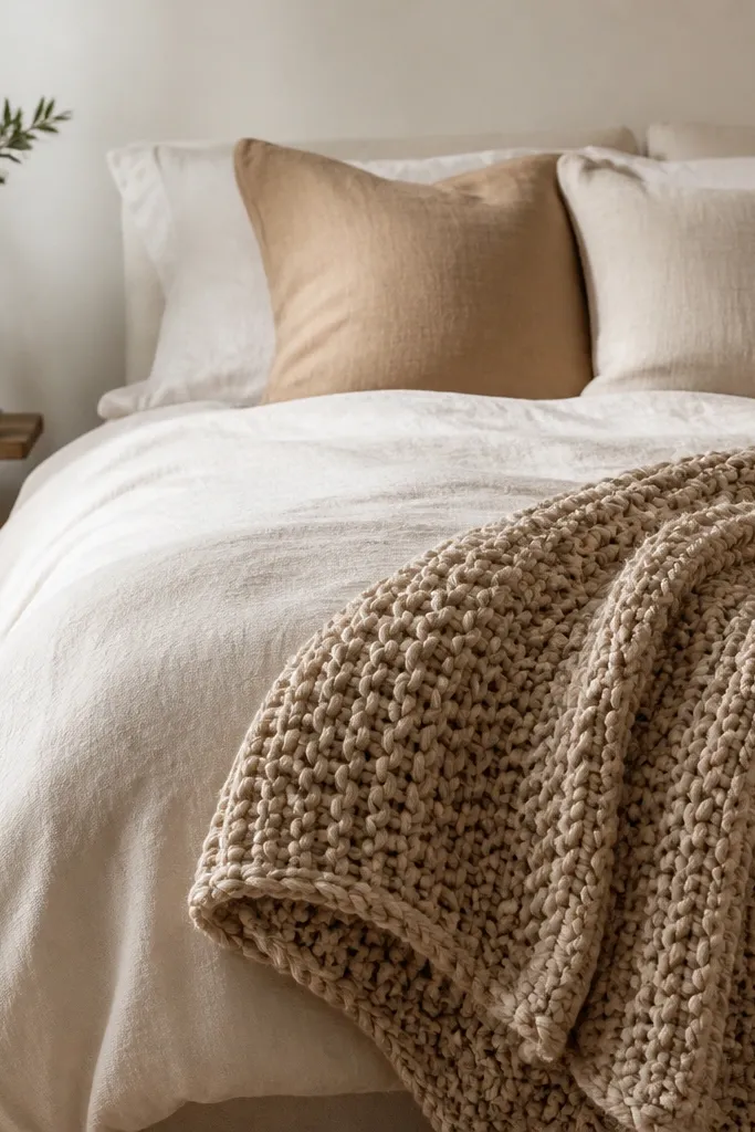
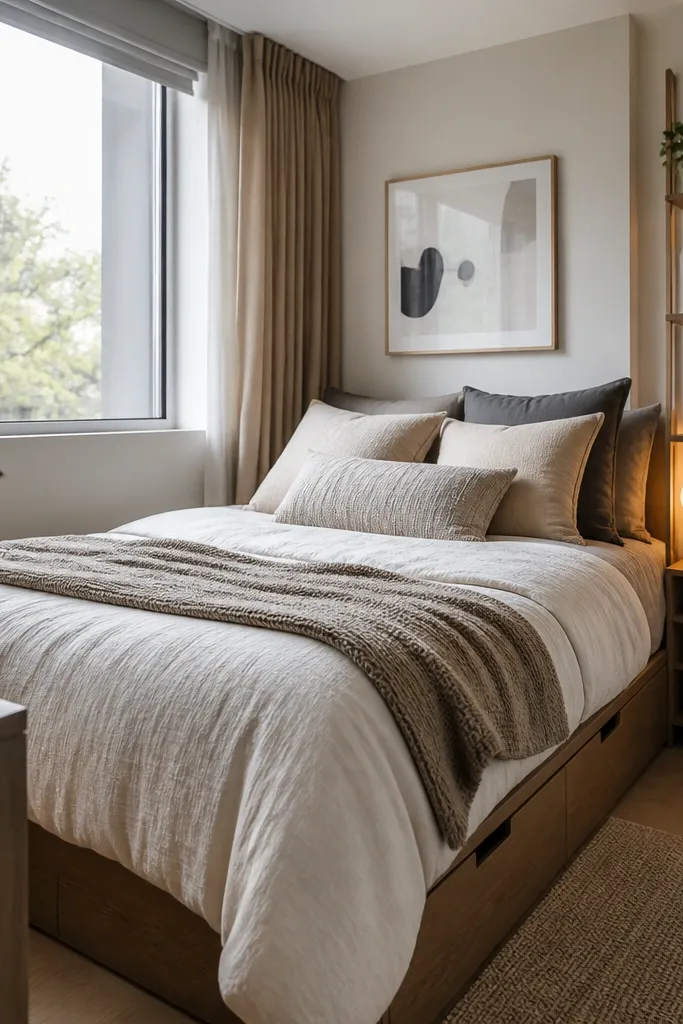
This is the fastest way I know to make a plain duvet look styled. I like using one smooth base (cotton duvet cover) and then adding texture with a chunky knit throw. The trick is placement: drape the chunky knit over the side or foot so you get shadow and depth, not a flat blanket spread across the whole bed. It flatters almost every skin tone because it adds warm texture without adding harsh color. If your bedding is cool-toned (gray, periwinkle), choose a knit in oatmeal or warm taupe to keep the room from looking icy.
Good to knowWash and dry the knit throw once before styling — it softens and looks less stiff on day one.
Start with a fitted duvet cover that fits your mattress snugly, then smooth it flat so corners don’t bunch. Add two standard pillows in one color family, then layer a smaller decorative pillow in a slightly deeper shade for contrast. Drape the chunky knit throw over the side of the bed with about 10 to 14 inches hanging down — you want it to be visible when you sit up. Finish by tucking the throw edge lightly so it doesn’t look like it fell there. If you want extra polish, add a second lighter throw only at the foot, folded once.
AvoidAvoid laying the throw perfectly flat like a tablecloth; it kills the depth that makes it look expensive.
3. Mirrors opposite a window for instant brightness
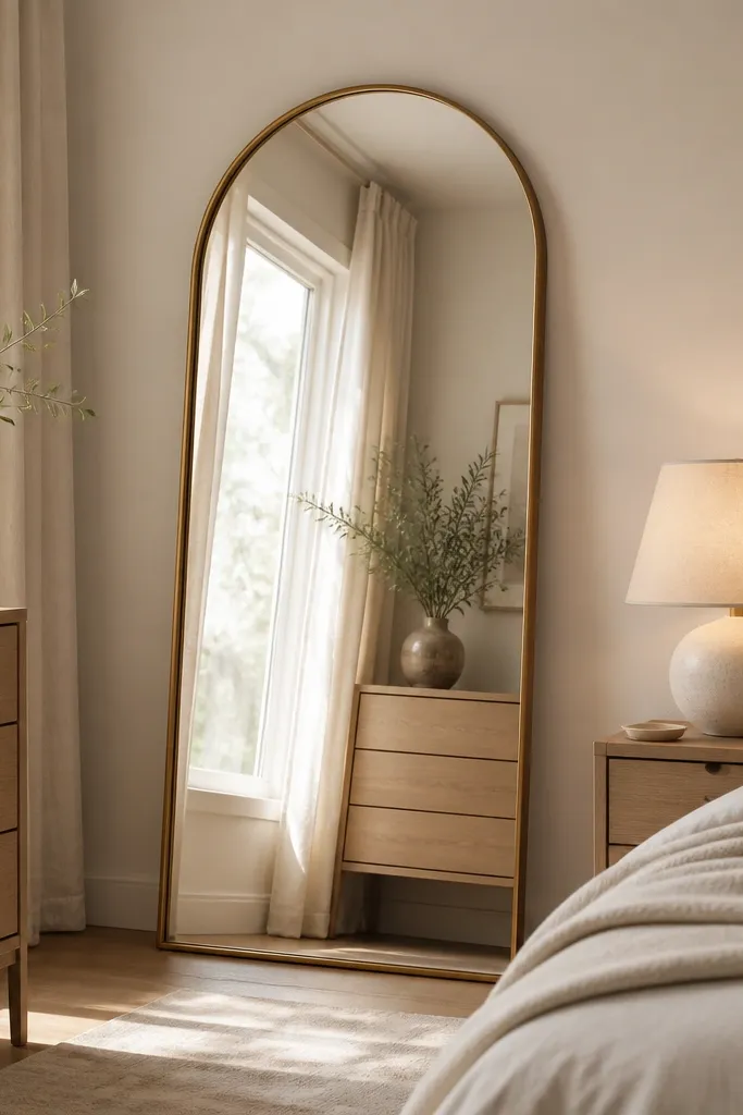
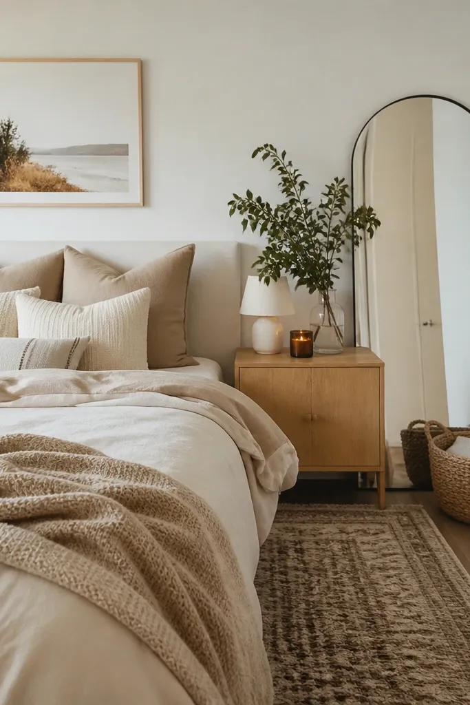
Mirrors are my go-to when a bedroom feels dim even with daylight. If you place a mirror opposite a window, it bounces light deeper into the room and makes bedding colors show their real tone. Choose a frame that matches your hardware or lamp bases; arched shapes look softer than strict rectangles. This works well for beginners because it doesn’t require complicated styling — you just need the right placement. For rooms with pale skin tones or cool undertones in your decor, the extra light helps everything look healthier and less gray.
Start by standing where you want to see the mirror effect — usually from the doorway or the foot of the bed. Place the mirror so it reflects the window or the brightest part of the room, not a dark corner. Keep the mirror height at least as tall as your headboard so it feels proportional. If it’s a leaning mirror, use a stable anti-slip pad at the base. Then style the nightstand with one lamp and one small object in the mirror’s color family to keep the look cohesive.
Wipe the mirror with glass cleaner and a microfiber cloth right before you style — smudges show up fast in morning light.
Avoid mirrors that reflect clutter; you’ll multiply the mess every time the light hits.
4. Sconce + headboard combo for a hotel-style glow
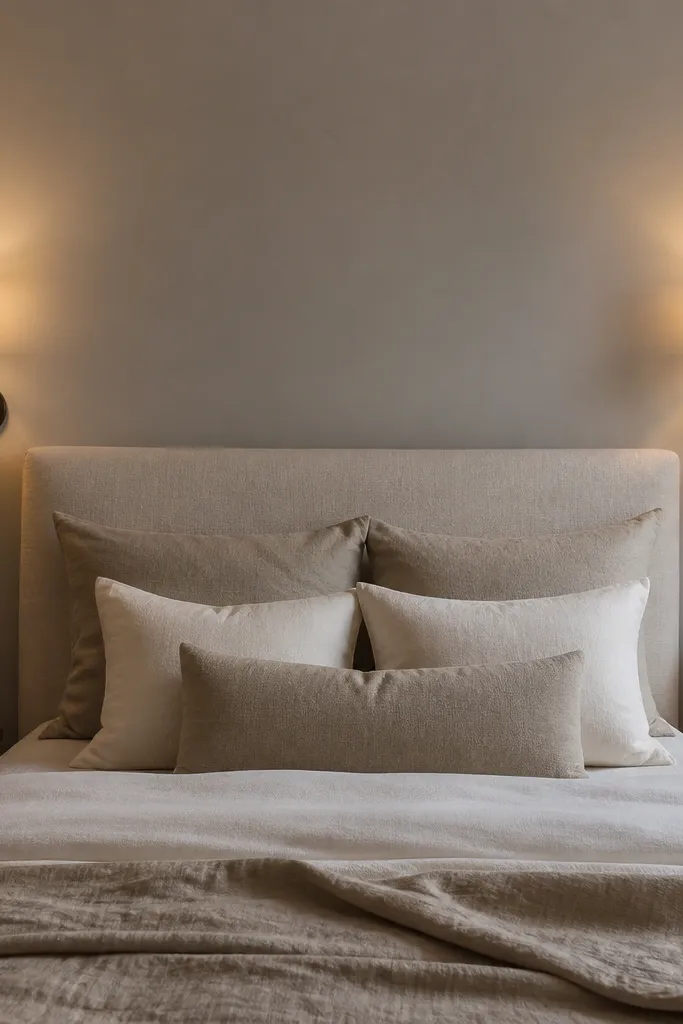
If you want your bedroom to look designed without changing the furniture, add wall lighting. Sconces make the room feel “finished” because they create a symmetrical glow around the headboard. I like pairing them with a headboard that has some height — even a simple upholstered one — because the light lands where you read and relax. Warm white bulbs make skin look better and keep white bedding from looking sterile. This is a strong option if you have limited space on your nightstands.
Start by choosing sconces with adjustable arms or shades that aim light downward at about 45 degrees. Install them so the center of each sconce aligns with the top third of your headboard. Use 2700K bulbs and avoid frosted bulbs if you want a more flattering, softer beam. Keep the bedside surfaces clear — one small tray or photo frame is enough. If wiring is a pain, use plug-in sconces but still keep symmetry and consistent height.
Match the sconce finish to your bed frame or dresser pulls — it makes the lighting feel intentional.
Avoid ceiling-only lighting when you’re trying to create a cozy look; it flattens everything at night.
5. Bedside tables in one shape, different color
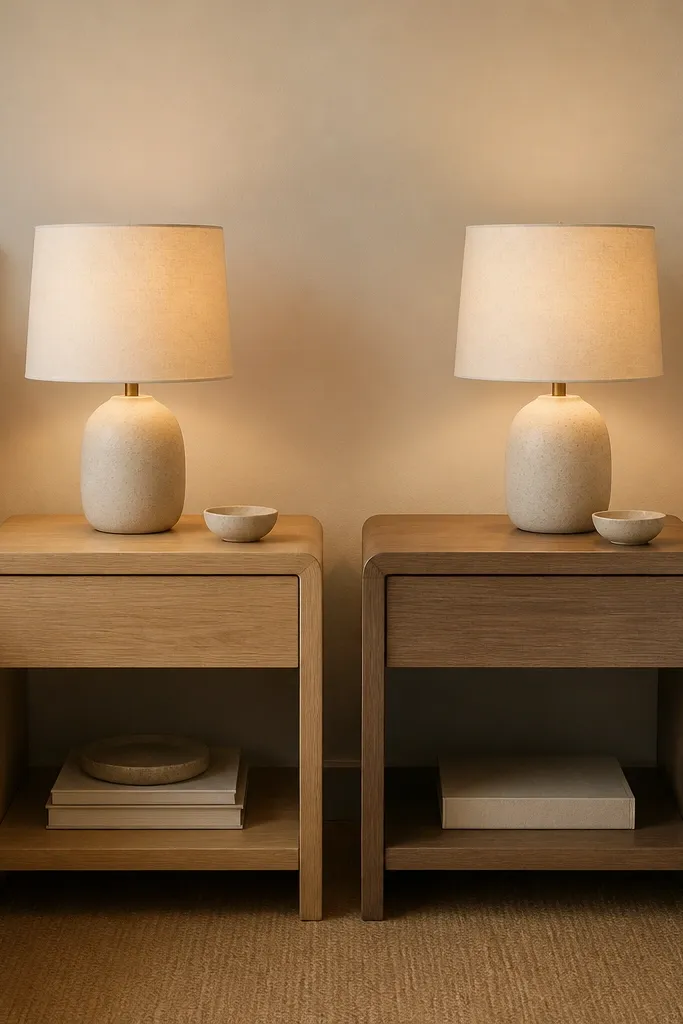
This is a subtle way to add personality without cluttering the room. Keeping the shape consistent makes the pair feel coordinated, while different woods add warmth and depth. I’ve used this trick in bedrooms with neutral bedding because the wood tones become the accent. It looks good on people with both cool and warm undertones because wood adds a gentle warmth that doesn’t fight your skin tone. If you have a lot of white in your room, this pairing prevents it from looking sterile.
Good to knowIf the tables feel too mismatched, fix it with identical lamp shades — that one shared element ties it all together.
Start by picking two bedside tables with the same silhouette — same height and drawer layout if possible. Choose one in light oak and one in a slightly deeper walnut, or go whitewashed wood plus warm oak if your furniture is already mixed. Place the lamps so their bases sit centered on the tables, not near the edge. Add a small ceramic piece or a book stack on only one side so the asymmetry looks planned. Keep the lamp shades the same color, like off-white linen.
AvoidAvoid random heights; uneven bedside table height makes the bed area look messy.
6. Rug size rule: extend 18 inches past the sides
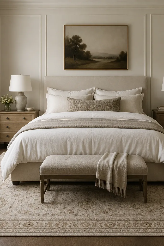
Most beginner bedrooms look unfinished because the rug is too small. When the rug extends past the sides of the bed, your room feels grounded and the bed looks like part of the space, not floating above the floor. I love a low-pile wool or wool-blend rug because it doesn’t bunch under furniture and it feels good underfoot. Neutral tones work with any bedding color, and a subtle border pattern hides everyday dust and pet hair. This looks good in real life because you don’t have to worry about the rug looking “perfect” every day.
Good to knowUse a rug pad — the correct pad stops slipping and makes the rug look thicker.
Measure your bed width and decide where your feet land when you step out — usually near the front corners. Choose a rug size that extends at least 18 inches past each side of the bed. If you can, let the rug run under the front legs of the nightstands. Place the rug so the pattern is centered with the bed, not off by a few inches. If you have a low bed, use a rug with a slightly higher pile so it still feels cushioned.
AvoidAvoid a rug that stops right at the bed’s edge; it breaks the room into two sections.
7. A three-color palette using bedding as the anchor
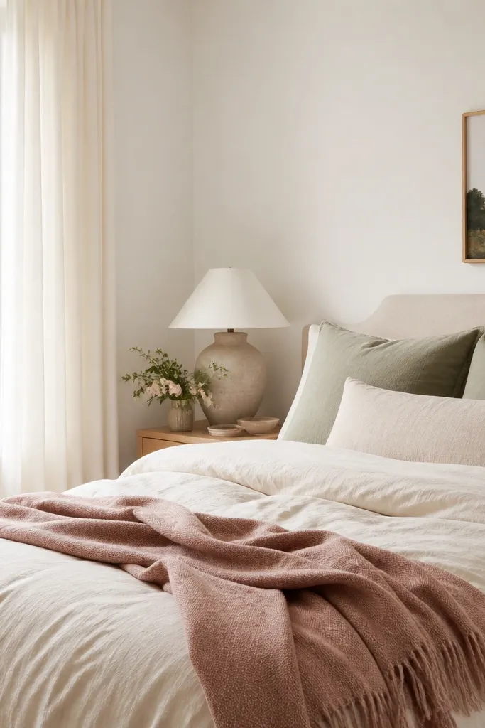
Pick your palette from what you already own, then stick to it. I anchor the whole room to the duvet color because you see it from every angle. Then I add one accent color from the pillows — like sage, terracotta, or dusty rose — and one texture color from a throw or rug. This keeps your room from looking like a pile of items from different stores. It looks flattering for most skin tones because it avoids high-contrast neon colors that can make people look washed out in photos.
Good to knowIf you’re unsure, take a photo of your bedding in daylight and pick colors that match it — not colors that look “pretty” on a screen.
Start by writing down the duvet color and undertone, like cream with warm beige or gray with blue. Choose one accent pillow color and one neutral texture — oatmeal, warm taupe, or light camel. Then limit decor additions to those three colors: one art print color, one curtain tone, and one accessory color. If you add a plant pot, pick terracotta or matte black so it fits the scheme. Keep metals consistent — either all brushed brass or all matte black.
AvoidAvoid adding a fourth color through random decor like bright teal candles or patterned socks of color.
8. Curtains that kiss the floor with a simple rod
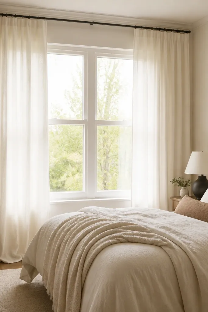
Curtains change how tall a bedroom feels, and beginners usually get this wrong by hanging them too low. When you mount the rod high and let the fabric fall to kiss the floor, the room stretches upward. I like linen-look curtains in warm white because they add softness without turning the room into a bright, cold box. This works for bedrooms with any furniture style — modern or traditional — because the fabric texture is the star. It also flatters skin tones because warm white curtains create a gentle glow near the bed.
Good to knowIf you can see the curtain rings, swap to a hidden-rod style or use a header tape that hides hardware.
Start by measuring from your planned rod height to the floor and subtract about 1 inch so the fabric just touches. Mount the rod 4 to 6 inches above the window frame and as wide as the window plus a few inches on each side. Choose panels that are full enough to gather, not stretched tight — aim for about double the window width in fabric. Hang the curtains so they fall from ceiling height visually, then steam them or use a warm iron on low to remove wrinkles. For a clean look, use rings or clips that keep the header straight.
AvoidAvoid curtains that end mid-calf; they make the window look shorter and the room feel cramped.
9. Color-blocked pillows with one patterned accent
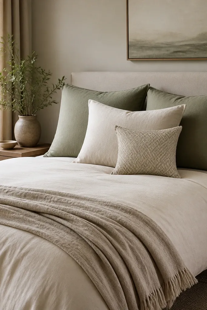
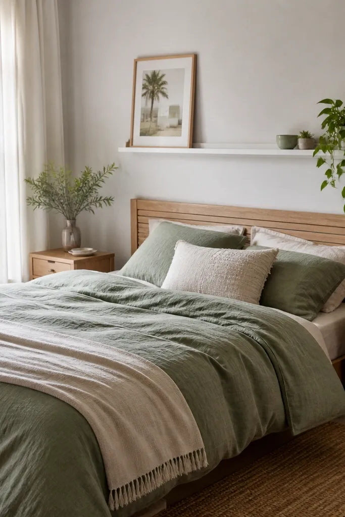
Color-blocked pillows make a bed look “designed” in minutes because you’re controlling contrast. I like using three solids in one color family and adding one patterned pillow that repeats one of the solid colors. This helps the bed look layered without needing a complicated quilt set. It flatters people in photos because the pillow colors reflect onto faces when you’re sitting up. If you have a lot of white in your room, adding sage and oat feels fresh without turning the space cold.
Good to knowIf your patterned pillow looks busy, choose a small pattern with thin lines instead of bold blocks.
Start with your duvet cover as the base, then add two standard pillows in the main secondary color, like sage. Layer one pillow in a lighter neutral, like oat or sand, to keep the look airy. Add one square accent pillow with a small-scale pattern — keep the pattern colors limited to your palette. Arrange them so the patterned pillow sits slightly forward, centered or angled 10 to 20 degrees. Finish by placing the throw so it frames the pillow stack, not covers it.
AvoidAvoid mixing two large patterns at once; it turns the bed into a jumble.
10. A low dresser styling with one tall element
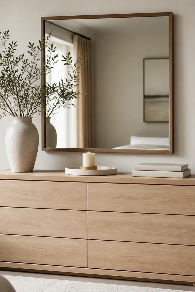
Dressers get ignored, then later you realize the whole bedroom looks blank. Styling a dresser with one tall element and one grounded tray makes the top look intentional instead of crowded. I like tall ceramic vases in matte white, cream, or stone gray because they look good from every angle. This works best in bedrooms where you need storage but don’t have much wall space. The calm shapes also flatter your bedroom photos because they don’t create visual noise around the bed.
Start by clearing the dresser top completely so you’re not working around clutter. Place a tall vase or candlestick in the center-back area first, then add a tray closer to the front edge. Put one candle on the tray and one small accessory like a photo frame or tiny plant. Keep the book stack low and aligned — two books is enough for most dresser tops. Step back and check spacing from the doorway; adjust until the items form a simple triangle.
Use felt pads under vase bottoms so they don’t slide when you dust.
Avoid filling every inch of the dresser top; full coverage looks like you tried to hide the surface.
11. Entry-style bench at the foot of the bed
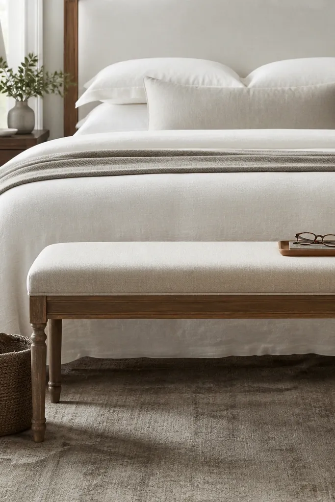
If your bedroom is also your hangout spot, add an entry-style bench at the foot. It instantly creates a “landing zone” for a throw, a bag, or a book, and it makes the room feel lived in. I like upholstered benches with a simple base because they soften the lines of a bed frame. This works for people who don’t want a lot of extra furniture because the bench gives you function and style in one piece. Choose fabric that matches your bedding texture — linen, cotton, or a soft performance weave.
Good to knowChoose a bench height that lets you sit comfortably — around 17 to 19 inches from floor to seat for most people.
Start by measuring the space at the foot of the bed so you don’t block walking paths. Place the bench centered, then leave about 18 to 24 inches clearance if you can — more if your room is narrow. Add one cushion that matches your throw color, then put a woven basket next to the bench for blankets or laundry. Keep the top surface minimal: one tray with a daily item looks cleaner than multiple small things. If you want extra polish, add a small rug runner under the bench legs.
AvoidAvoid a bench that’s too tall; it can make the bed look shorter and the room feel cramped.
12. A statement headboard pillow in velvet or suede
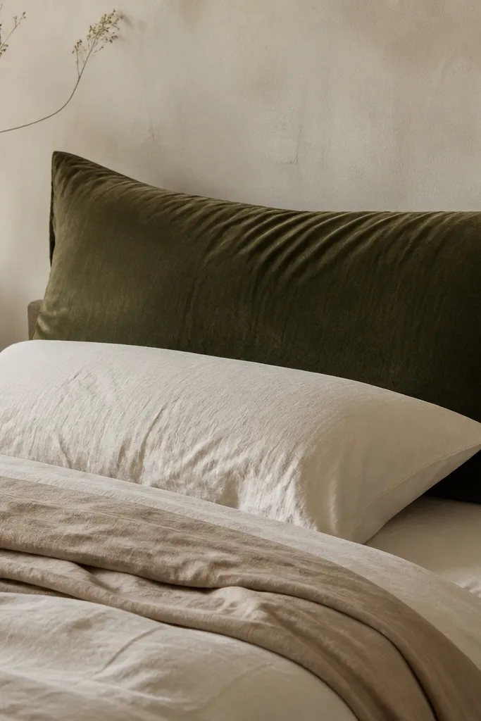
A big statement pillow against the headboard is a cheat code for bedrooms that feel plain. Velvet or suede-look fabric catches light differently than cotton, so it adds depth even when your palette is simple. I like deep olive, warm rust, or midnight navy because they look rich without needing extra decor. This works especially well if your skin tone looks better with warmth — the darker jewel fabric makes warm undertones glow. It also helps when you don’t have a headboard — you can mimic one with the pillow height.
Good to knowPress the velvet pillow cover with steam from a distance so it doesn’t look flat or wrinkled.
Start by choosing a pillow size close to the width of your headboard but not wider — usually 22x22 or 24x24 for smaller beds. Place it upright against the wall or headboard so it’s visible when you sit up. Use a neutral duvet and two simple pillows to let the velvet stand out. Add a throw in a knit or cotton texture so the velvet doesn’t look alone. Keep the pillow cover smooth — avoid heavy patterns that compete with the headboard area.
AvoidAvoid glossy satin that reflects too much light; it can look shiny in a cheap way.
13. Bedside lamp shade that matches your wall tone
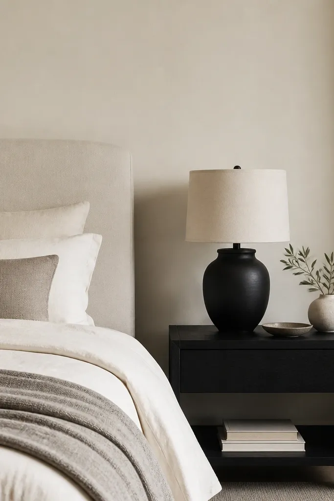
Most bedrooms have lamps, but the shade color decides whether the room looks calm or chaotic. When the shade matches your wall tone, the light feels softer and more even. I choose off-white shades with a slight warm tint because they make bedding look creamy instead of yellow-green. This is a great option for beginners because it’s cheap to swap shades, and the improvement is immediate. It also flatters skin tones because the warm light doesn’t pull your face toward blue-gray.
Good to knowHold the shade up near the wall in daylight and compare it to the paint — you want them to read similar, not contrast hard.
Start by checking your wall paint undertone in daylight — warm white looks creamy, cool white looks crisp. Choose a lamp shade in a matching warm off-white, not bright pure white. Keep the shade height around 10 to 12 inches for a typical nightstand lamp so it doesn’t block the view of the bed. Place the lamp so the light centers on the wall behind it, or aim the shade slightly toward the headboard area. Finish by adding a small lamp base tray or a single book so the nightstand doesn’t look bare.
AvoidAvoid bright white shades against warm walls; they look like a different apartment.
14. Nightstand tray for a clean, repeatable look
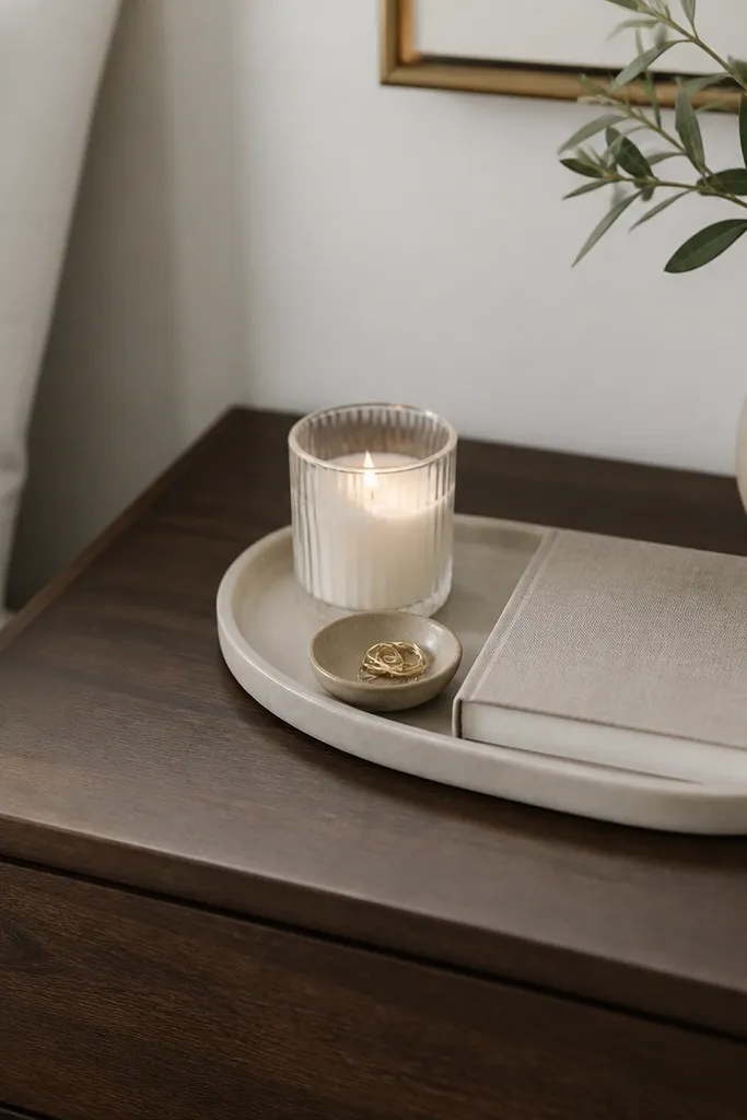
A tray is the simplest way to make a bedroom look styled every day, not just on the first day. When you keep small items corralled, your nightstand stays tidy and the room looks intentional. I like matte black trays for light wood rooms and warm brass trays for white rooms with warm metals. This works for people who juggle glasses, lotion, and a phone at night because you can move the tray together. It also makes photos look cleaner because the surface has one shape and one visual rhythm.
Good to knowUse a small felt liner inside the tray if the surfaces scratch or slide.
Start by picking a tray that fits your nightstand without hanging off the edges — usually 9 to 12 inches long for a small table. Place it centered or slightly toward the back so you still have space for a lamp. Add one candle or diffuser and one small dish for rings or lip balm. Put the book stack at the far side of the tray so it doesn’t spill out. Then keep the tray items the same week to week so the room never feels random.
AvoidAvoid scattering random items across the nightstand; even pretty things look messy when they’re not grouped.
15. Textured wall paneling look with peel-and-stick panels
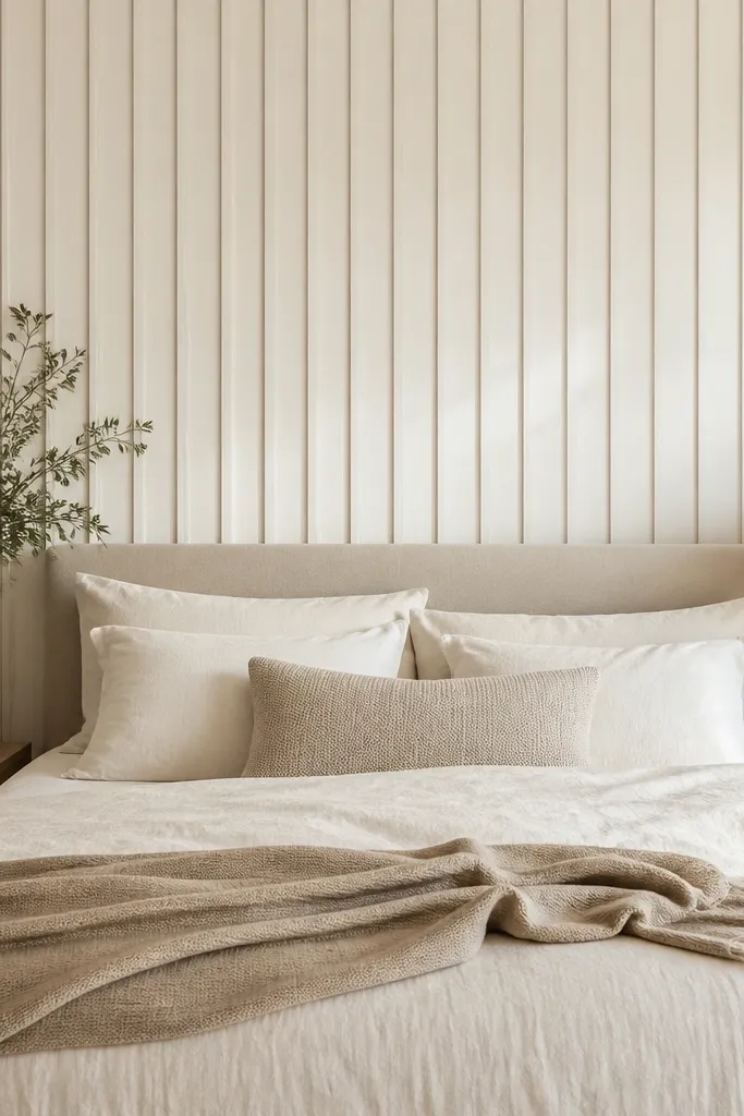
If your bedroom wall feels flat, you can add depth without painting. Peel-and-stick wall panels give you that paneling look that usually costs a lot more when done with trim. I’ve used them behind the bed because the texture shows in the morning light and makes the headboard area look custom. Choose off-white panels so they blend with your bedding instead of turning into a separate color block. This is especially flattering in rooms with neutral bedding and minimal art because texture becomes the interest.
Start with a clean, dry wall and wipe it with a gentle cleaner so adhesive sticks. Measure the wall behind the bed and plan your layout so cut pieces land near the edges. Apply panels starting from the center line so the pattern stays straight. Press firmly and use a smoothing tool to avoid bubbles. Paint is not required, but you can paint over if the panels are paintable — I like to keep them off-white to match the room’s warm neutrals.
Use painter’s tape to mark your first vertical line — it keeps the whole run straight.
Avoid applying panels over textured walls that are bumpy; the adhesive won’t seal evenly.
16. A simple gallery grid with consistent frame spacing
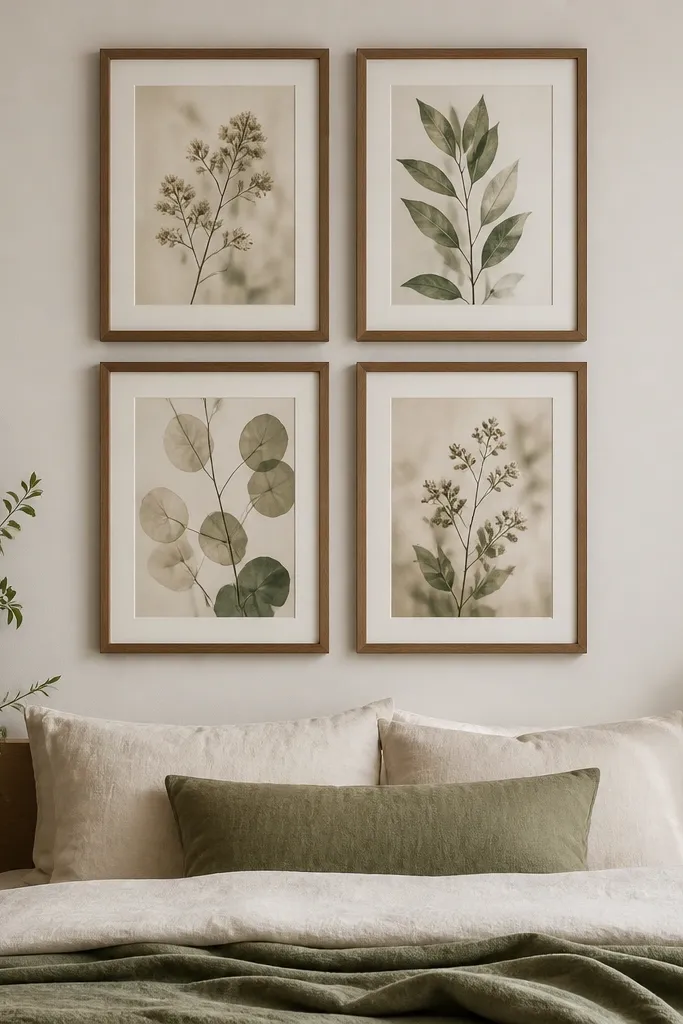
Gallery walls can look messy fast, but a small, consistent grid looks clean and intentional. I like a four-frame grid when you’re a beginner because it’s easier to measure and easier to balance. Keep all frames the same finish and aim for even spacing so the wall looks designed, not collected. This works great if you want personality without a huge single art piece. The muted botanical prints make the room feel calmer, and the consistent frame color ties it to your furniture.
Good to knowUse paper templates cut from the frame packaging — it speeds up hanging and reduces crooked frames.
Start by laying the frames on the floor and decide on a spacing that looks balanced — usually about 2 inches between frames. Measure the total grid width so it stays within the bed width range, then mark the center on the wall. Hang the top row first, then use a level to align the bottom row. Use the same hanging method for all frames so they sit at the same height. Finally, step back and adjust one frame at a time until the grid looks perfectly level from the doorway.
AvoidAvoid mixing frame sizes and finishes in a small grid; it looks random on first glance.
17. Woven basket storage beside the bed
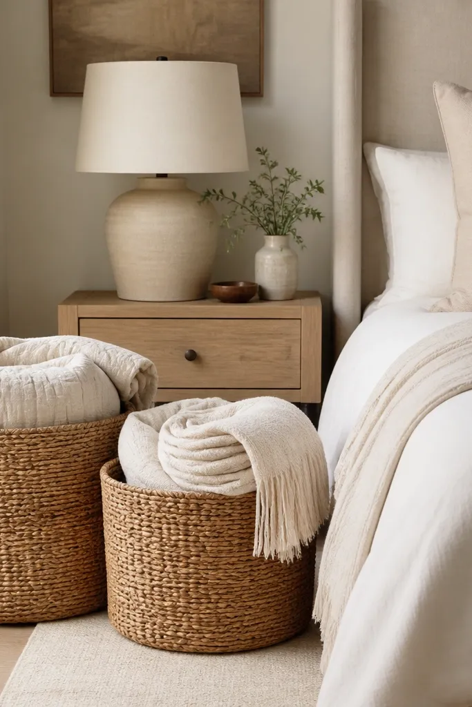
Storage can look like decor if you choose the right container. Woven baskets add texture, hide clutter, and give you a place for blankets and daily items without plastic bins showing through. Natural color baskets work with almost every bedroom palette because they sit in the middle of neutrals. I like them beside the bed because you reach for a blanket and the basket makes the habit look neat. This is great for beginners because baskets are forgiving — no exact measuring like art or rug placement.
Good to knowLine the basket with a thin cotton liner if you store textiles; it protects fabrics from rough fibers.
Start by deciding what you want to store — extra blankets, socks, or books you read at night. Choose baskets with lids if your room gets dusty, and without lids if you like easy access. Place the baskets on the floor next to the bed, leaving enough space to pull them out without bumping the nightstand. Add one blanket folded with the same color family as your throw so it looks coordinated. If you have two baskets, use different sizes so it doesn’t look like a pair of identical storage blocks.
AvoidAvoid baskets that are too small; they tip over and look like you ran out of space.
18. A layered neutral bedding set with a duvet cover upgrade
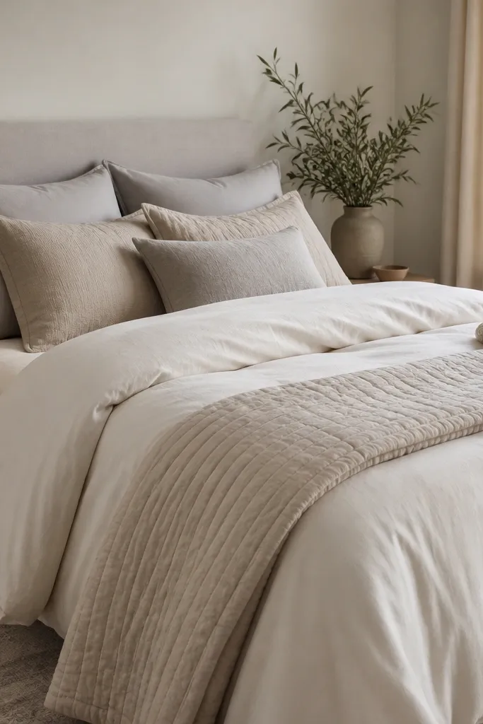
If you only change one thing in a beginner bedroom, change the duvet cover feel. A good duvet cover in cotton sateen or linen-look fabric makes the bed look smooth and tailored even if everything else is basic. Layer neutrals with different undertones — warm white duvet, oat pillows, and a warm gray throw — so the room looks layered, not flat. This works for almost anyone because neutral bedding is forgiving and easy to pair with accents later. It also photographs well because the fabric sheen stays soft, not glossy.
Good to knowIron or steam the duvet cover once before first styling; the crisp edges make the whole bed look intentional.
Start by choosing a duvet cover that fits your mattress — it should drape without pooling in weird places. Add a quilt or lightweight blanket folded at the foot so you get a second texture line. Use two pillows in the main secondary color and one lumbar pillow in a slightly deeper shade. Add a knit throw on the side with 10 to 12 inches hanging down. Smooth everything by tugging corners and flattening the duvet so creases don’t look random.
AvoidAvoid thin, shiny duvet covers; they look cheap under warm bedside lighting.
19. Bedroom plant styling with one oversized leaf
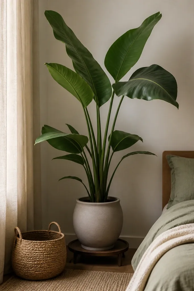
A single plant with big leaves adds life to a bedroom without turning it into a greenhouse. I like placing it in the corner where it balances the visual weight of the bed, especially if your wall is bare. Choose matte pots in cream, terracotta, or charcoal so it fits neutral palettes. This works for beginners because one plant is easier to care for than a cluster, and the oversized leaves create an instant focal point. It also softens hard edges and makes the room feel more lived-in at night.
Good to knowWipe dusty leaves with a damp microfiber cloth; clean leaves look fuller immediately.
Start by placing the plant where it gets bright indirect light — near a window but not in direct scorching sun. Use a pot with drainage holes and set it on a saucer or a tray to protect floors. Pick a ceramic pot that matches your existing decor metal or color — matte black or warm cream are common winners. Rotate the plant weekly so leaves don’t lean toward the light. Style the area with one small basket or a simple lamp nearby so the plant doesn’t look randomly dropped.
AvoidAvoid tiny plants in oversized corners; they look lost and the corner still feels empty.
20. Wall shelf above nightstand with books and one ceramic piece
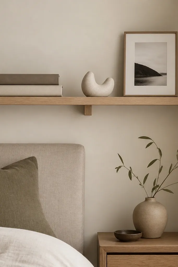
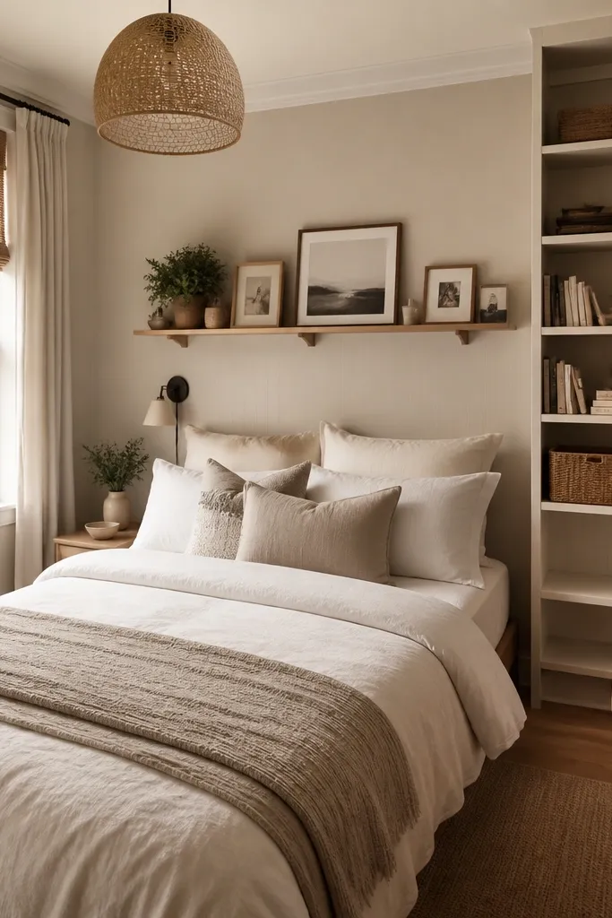
A small wall shelf solves a common beginner problem: nightstands feel too small but you don’t want a bigger dresser. When you place a shelf above the nightstand, you create vertical storage and a tidy place for decor. I like shelves that are slim and light wood because they don’t overpower the bed. This works best when your bedding palette is neutral, since the shelf items can add color without fighting the room. It also helps you keep the nightstand clear for the lamp, which improves nighttime lighting.
Good to knowUse a level app and mark bracket holes before screwing — shelf alignment shows up immediately.
Start by measuring the wall space above the nightstand and choosing a shelf length that covers about half to two-thirds of the nightstand width. Install shelf brackets level and anchor into studs if possible. Place a stack of books in the back, then add one ceramic piece in front so the arrangement has depth. Add a small framed photo only if it matches the room colors; otherwise skip it. Keep the shelf to three items max — books, one decor piece, and one small object — so it stays calm.
AvoidAvoid clutter on the shelf; too many small items makes the wall look busy.