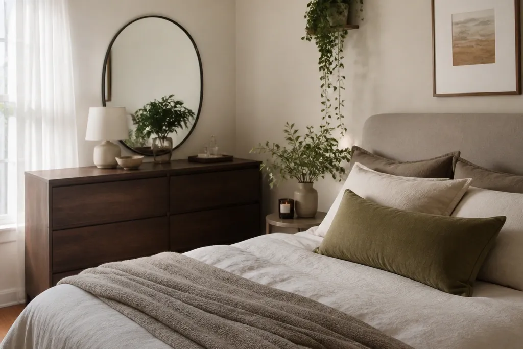
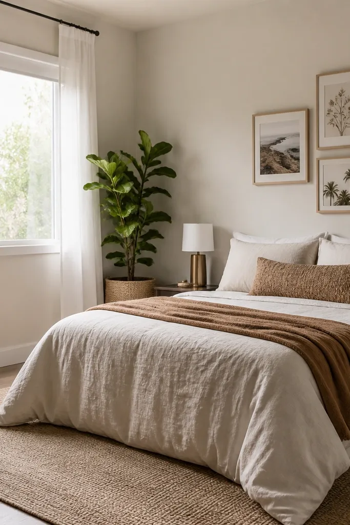
1. Gallery wall strip with poster strips and a straightedge
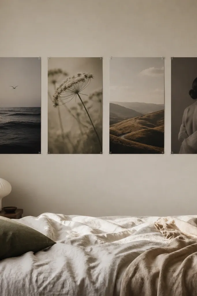
Start by placing painter’s tape rectangles on the wall where each poster will sit. Measure the poster width and leave 1/4 to 1/2 inch between them so the gaps don’t look like mistakes. Apply poster mounting strips to the back corners of each print — I place two per corner for a heavier print, one per corner for lighter paper. Press firmly for 30 seconds, then stand back and check alignment using a level against the top edge of the row. Finally, remove the tape guides once you confirm the spacing looks even from the doorway.
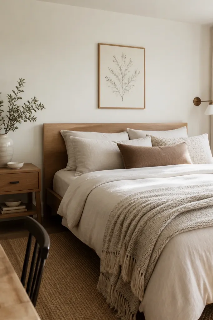
This setup is for renters who want a clean look without framing. I use it with matte art prints or heavier cardstock because poster strips grip better when the paper has some body. Keep the palette tight — think black, cream, and one accent color like terracotta — so the strip looks curated instead of random. It flatters small rooms because the prints stack upward, giving height without adding bulk. The styling principle is alignment: even spacing and a straight baseline are what make the wall look “designed” rather than taped up.
AvoidDon’t eyeball spacing; uneven gaps make the whole wall look cheap even if the prints are nice.
Good to knowUse a single straightedge reference point — like the top of your nightstand — so the whole strip visually lines up.
2. Oversized single anchor poster above the bed with removable hooks
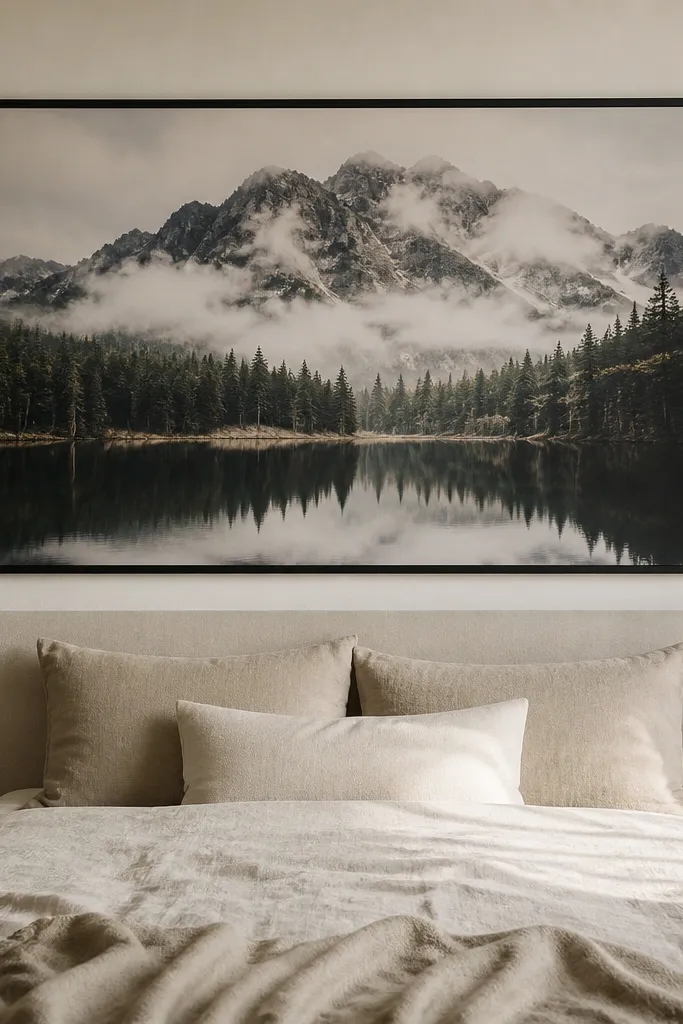
Measure the width of your bed and pick a poster that’s about 60 to 80 percent of that width. Find the center of the wall above the bed and mark it with a tiny pencil dot. Put removable hooks or adhesive strips near the top corners — keep them about 2 to 3 inches in from the poster edges. Hang the poster with the center dot aligned to your wall center mark, then adjust before the adhesive fully sets. Finish by stepping back and checking that the bottom edge sits roughly 6 to 10 inches above the top of the pillows.
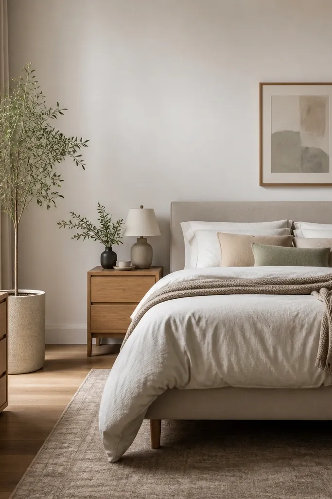
One big poster above the bed is the fastest way to make a renter wall look styled. I’ve used this with 18x24 and 24x36 prints because they fill the space without needing multiple frames. Choose a print with a clear horizon line or strong contrast so it reads clearly from across the room. Dark borders look especially good with warm wood nightstands — the eye has a place to land. The styling principle is scale: the poster should dominate the wall area the way a headboard would.
AvoidDon’t place the poster too high; if the bottom edge is above your pillow line, it looks like wall decor instead of bedroom design.
Good to knowIf your poster curls at the edges, weigh it under a hardcover book for a day before hanging.
3. Museum-style frame with no-drill adhesive picture frame hangers
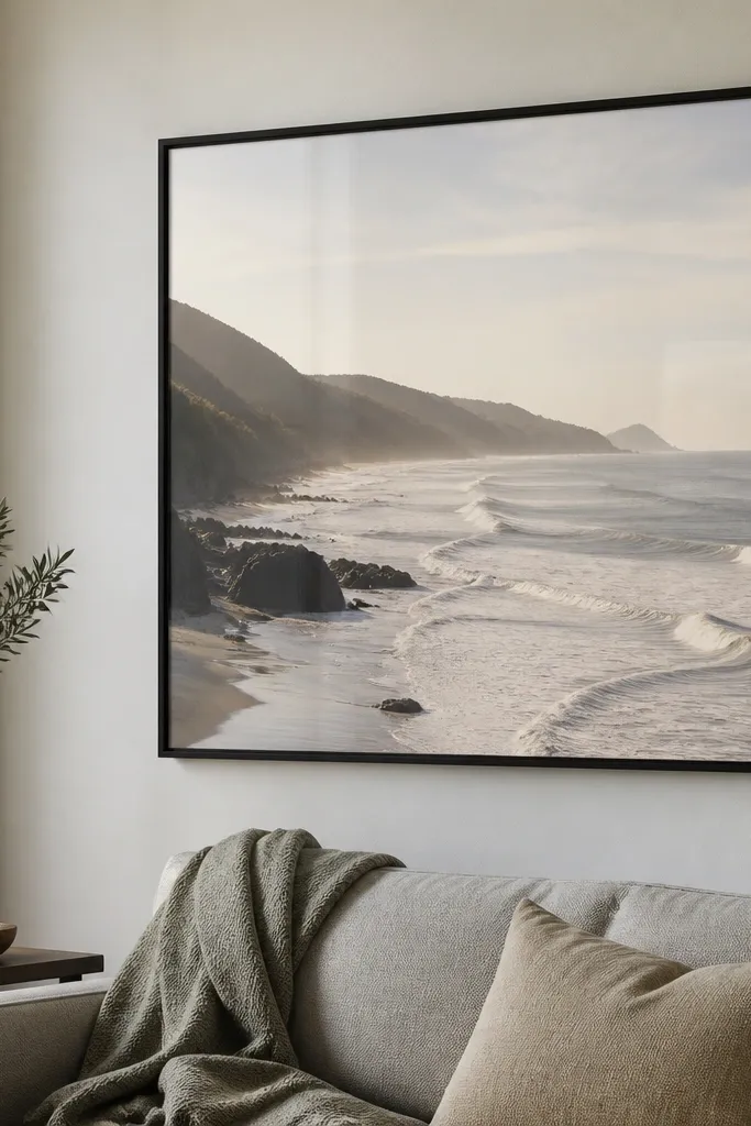
Choose a frame with a mat if your poster has lots of white space — it prevents the print from looking squished. Attach removable hangers to the back according to the weight rating on the package. Hang the frame so the center sits 57 to 63 inches from the floor, then confirm level across the top edge. Use felt pads if the frame back is rough so it doesn’t shift. Finally, adjust the frame by sliding it 1/8 inch at a time before the adhesive grips fully.
Frames make posters look intentional, and this version stays renter-friendly by using removable picture frame hangers. I like thin black or warm walnut frames because they match most bedroom hardware and don’t overpower bedding. For prints with text or fine lines, anti-glare acrylic matters — I’ve watched glossy glass reflect a ceiling fan and ruin the look at night. This setup flatters bedrooms with neutral bedding because the frame adds structure. The styling principle is “finished edges”: the frame turns a flat print into a polished focal point.
AvoidDon’t use lightweight poster strips on a heavy frame; it will sag after a few weeks.
Good to knowWipe the frame back with a dry microfiber cloth before attaching hangers; dust makes adhesives fail early.
4. Faux headboard art line using two small posters plus a rail
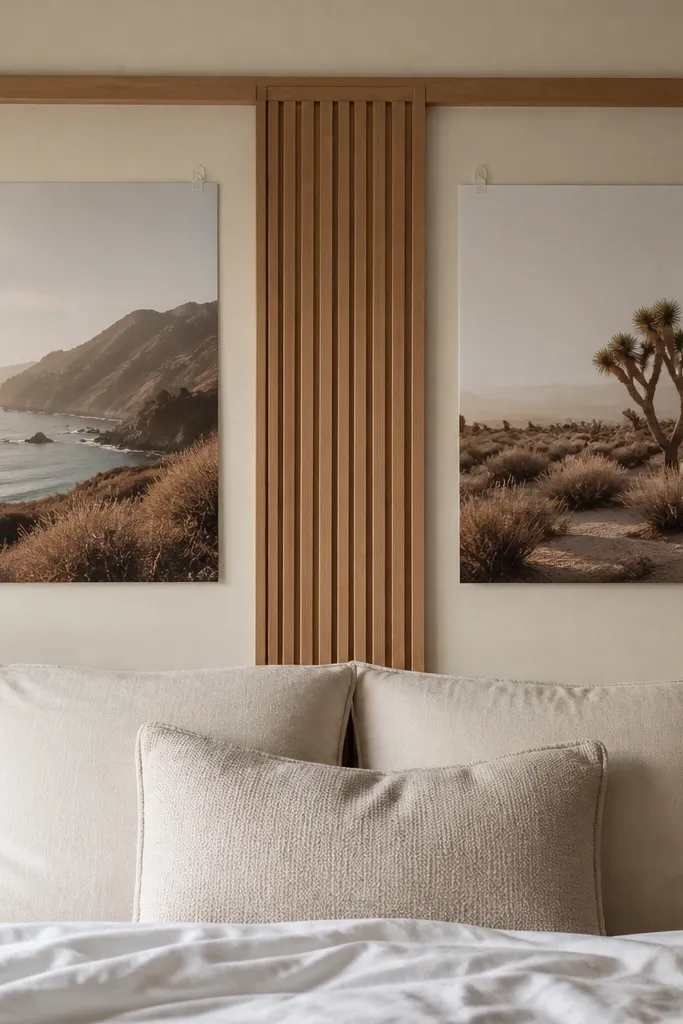
If your bed doesn’t have a headboard, this trick makes the wall feel anchored. You hang two medium square posters on either side and add a slim horizontal rail in the middle using removable standoffs or adhesive mounts. I’ve done it with 16x16 or 18x18 prints and it reads as intentional wall architecture, not random decor. This flatters small bedrooms because the rail creates a structured rectangle without extra bulk. The styling principle is visual grouping: the two posters act like “pillars” around a center bar.
Pick two posters with matching color intensity so the sides feel balanced. Mark the centerline above the bed and place the rail first at the pillow height area, about 20 to 24 inches above the floor for many beds. Mount the left and right posters so their inner edges are about 4 to 6 inches from the rail. Use removable hooks near the top corners and check that both posters align vertically with the rail. Finish by nudging the rail and posters until the whole block looks symmetrical from the doorway.
Use the same frame color for both posters and the rail to keep it from looking like three separate purchases.
Don’t mix wildly different print finishes; glossy on one side and matte on the other looks mismatched in bedroom lighting.
5. Floating shelf for mini poster sets with clip frames
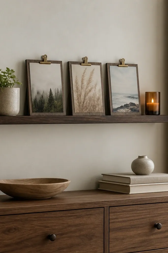
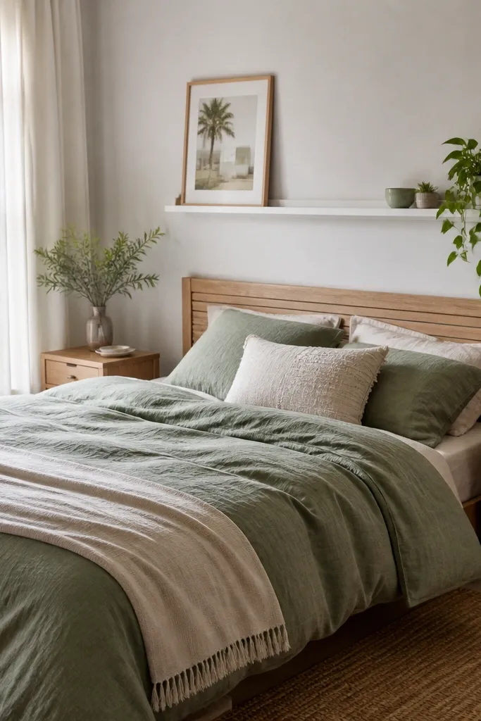
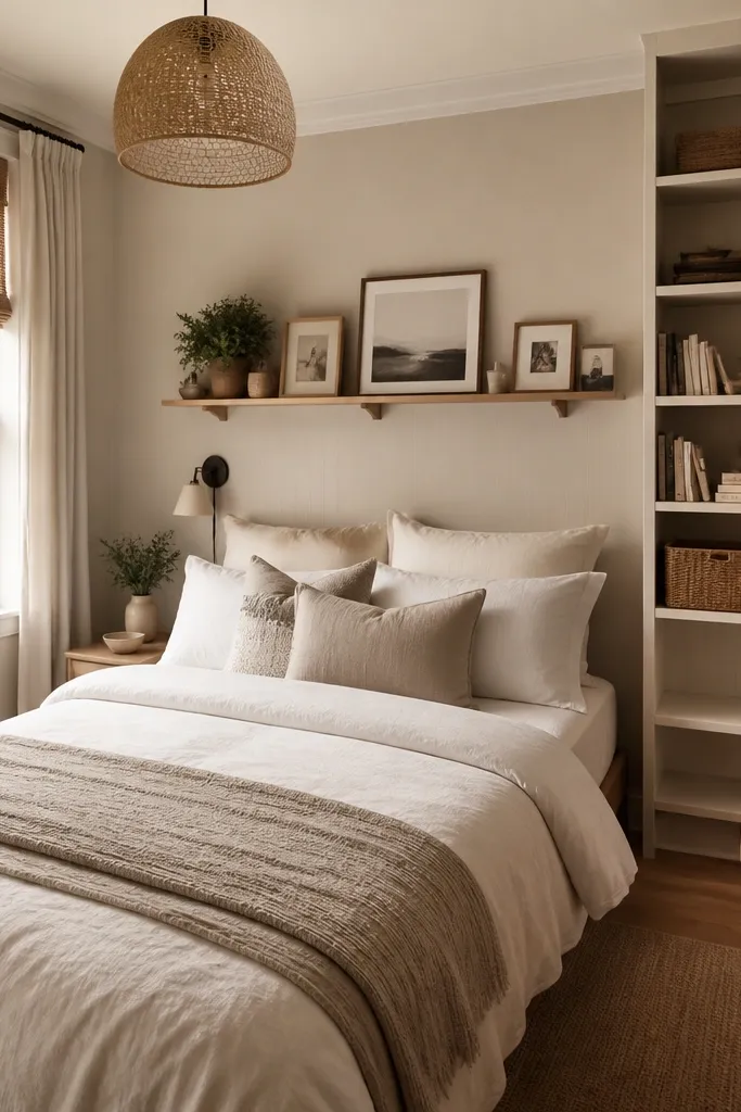
Poster decor doesn’t have to mean “on the wall.” This setup uses a shelf to create a rotating gallery that still feels bedroom-soft. I use it with 5x7 or 8x10 posters inside clip frames because they’re easy to swap when you change seasons. The shelf makes the posters look intentional because they’re at eye level and surrounded by objects with texture. This works great for renters because you avoid large adhesives over and over. The styling principle is layering height: posters sit above smaller decor so the wall area looks styled from multiple angles.
Install a picture ledge or narrow floating shelf using its included mounting method — if you truly need no drill, choose a peel-and-stick shelf rated for weight. Place the shelf so the center of the shelf is roughly at eye height when you’re standing. Clip in three posters with a consistent border color so the set looks cohesive. Style around them with one tall item (a candle or vase) and one flat item (tray or book) so the shelf doesn’t look empty. Keep the bottom edge of any decor at least 2 inches below the shelf lip to avoid cluttered shadows.
Use matte clips or black frames; shiny metal clips catch light and look cheap under lamps.
Don’t pack all three posters edge-to-edge; leave 1/2 to 1 inch between frames for a clean rhythm.
6. Fabric wall hanging with a poster behind sheer curtains
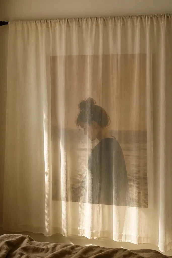
This is for people who hate the flat, paper look and want softness. You mount the poster behind a sheer panel using a tension rod, so there’s no drilling and the image looks like part of the room’s textiles. I used this with a black-and-ivory botanical poster and it looked like a print that belonged in a boutique hotel. It flatters bedrooms with warm lighting because the sheer fabric diffuses glare and makes the print feel calmer. The styling principle is diffusion: light passing through fabric makes even bold graphics feel gentle.
Hang a tension rod across the wall above your dresser or bed area, then drape a sheer curtain panel so it covers the poster area. Mount the poster on the wall with removable poster strips or a removable frame, then keep it centered behind the sheer. Choose a curtain color that matches your bedding undertone — cream sheer for warm rooms, cool white sheer for gray bedding. Pull the curtain so there’s slight slack in the fabric, not stretched flat. Step back and adjust curtain position until the poster edges look framed by the fabric evenly.
Use a poster with high contrast so it still reads through the sheer.
Don’t pick a curtain that’s too opaque; you’ll lose the whole point of the poster glow.
7. Magnetic poster board on a metal door or metal trim
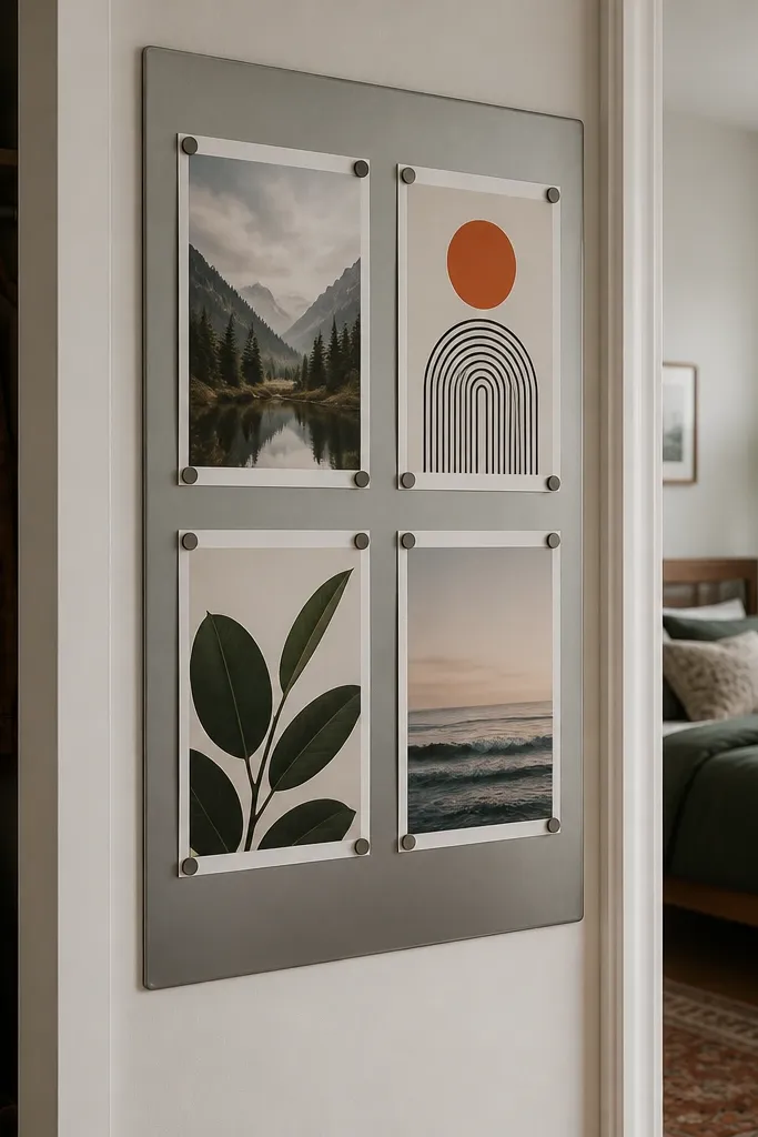
Measure the metal surface and buy a magnetic board panel that fits — I’ve used thin magnetic sheets backed onto a board for stability. Place the board centered, then attach magnets at poster corners, leaving a consistent border gap. If the poster is glossy, wipe it clean so magnets don’t slide due to dust. Arrange posters in a grid or a simple staggered row, keeping the top edges aligned for a tidy look. Finally, secure the board itself if it uses adhesive backing — press for the full time on the label.
If you have a metal door, metal closet frame, or a metal panel, this is the cleanest no-drill mounting I’ve used. Magnetic holds are secure, and you can swap posters without touching adhesive again. I like this for people who want to change the look monthly, like rotating seasonal art. It also flatters renters because it avoids wall damage entirely. The styling principle is margin control: keep equal margins around each poster so the board looks like a designed display.
AvoidDon’t use huge magnets with tiny prints; they leave marks on glossy paper and look messy.
Good to knowUse small rare-earth magnets for lighter prints and keep magnets near corners so the paper doesn’t bow.
8. Washi-tape border poster framing on matte walls
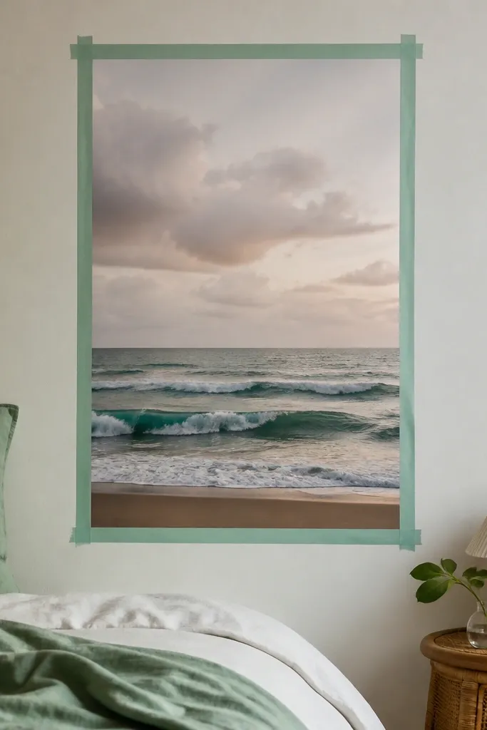
Press the poster flat first with a heavy book for a day. Position it on the wall using painter’s tape corners so it doesn’t shift. Apply wash tape strips around the poster edges, overlapping ends at the corners for crisp lines. Leave a 1/4 to 3/8 inch inner gap between tape and poster edge so it reads like a mat. If your tape is patterned, choose one solid tone and keep the rest of the room neutral so the tape doesn’t fight your bedding.
This is the low-cost route that still looks intentional if you do it like a frame. Washi tape borders work best on matte walls because tape edges don’t glare like glossy paint. I’ve used it with 8x10 and 11x14 prints and it looks best when the poster already has a clean composition. It flatters renters because you can remove it without pulling paint — just go slow and warm the tape with a hair dryer. The styling principle is “double edge”: tape creates a visual frame even without an actual frame.
AvoidDon’t use thick, textured tape on glossy posters; it creates uneven gaps that look sloppy.
Good to knowUse a metal ruler and a sharp craft knife to trim tape edges for straight corners.
9. Clear acrylic photo ledge for poster protection and no curl
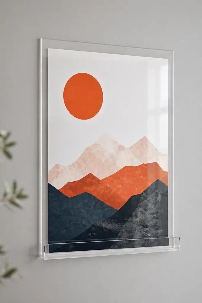
If your posters curl or you’re worried about humidity, a clear ledge keeps them flat without drilling into your print. This looks modern and clean, especially with typography prints or line-art posters. I like acrylic with a minimal frame because it lets the print colors do the work. This flatters bedrooms with sleek furniture because the ledge matches modern hardware. The styling principle is containment: the acrylic lip holds the poster in place so it can’t warp over time.
Choose an acrylic ledge system that uses removable wall anchors or adhesive mounts rated for the weight of your poster plus the ledge. Clean the wall with rubbing alcohol on a cotton pad and let it dry fully. Place the ledge so the bottom edge of the poster sits around 10 to 14 inches above the nightstand surface. Slide the poster into the ledge grooves and align the corners so they’re square with the wall. Step back and check for glare — if you see reflections, tilt the ledge slightly or swap to matte prints.
Use matte posters under acrylic so the print stays readable under lamp light.
Don’t overload the ledge with heavy textured paper; acrylic mounts have weight limits for a reason.
10. Oversized fabric frame using removable curtain rod and clip rings
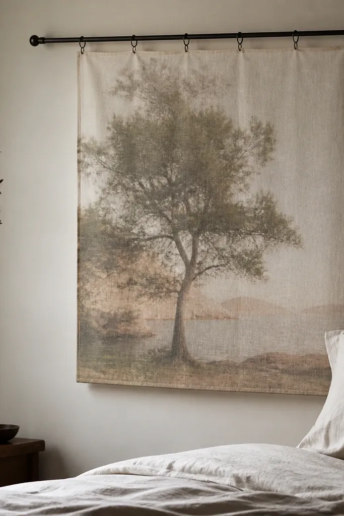
Hang a tension rod where you want the art to sit — usually above a dresser or centered above the bed. Use clip rings or small clothespins to attach a fabric sleeve or panel to the rod. Place the poster behind the fabric and center it so the fabric edges are even on all sides. Secure the poster position by tucking the corners inside the sleeve or using a tiny removable dot at each corner. Adjust the fabric drape so it sits flat and doesn’t ripple; press the fabric lightly with your hand to remove wrinkles.
This idea uses fabric as the frame so the poster looks softer and more expensive. You mount the poster normally with removable strips, then slide it into a simple fabric sleeve or behind a thin cotton panel. I like linen-look fabric in oatmeal or stone because it hides minor poster edge waves. This setup flatters people who want a cozy bedroom vibe without adding more hard furniture. The styling principle is using one material for the “frame,” so the wall feels cohesive with curtains and bedding.
AvoidDon’t pick a slippery satin fabric; it shifts and makes the poster look crooked.
Good to knowChoose fabric that matches your curtain color so the poster doesn’t look like it’s floating alone.
11. Renter-friendly poster corner clips on a removable foam board
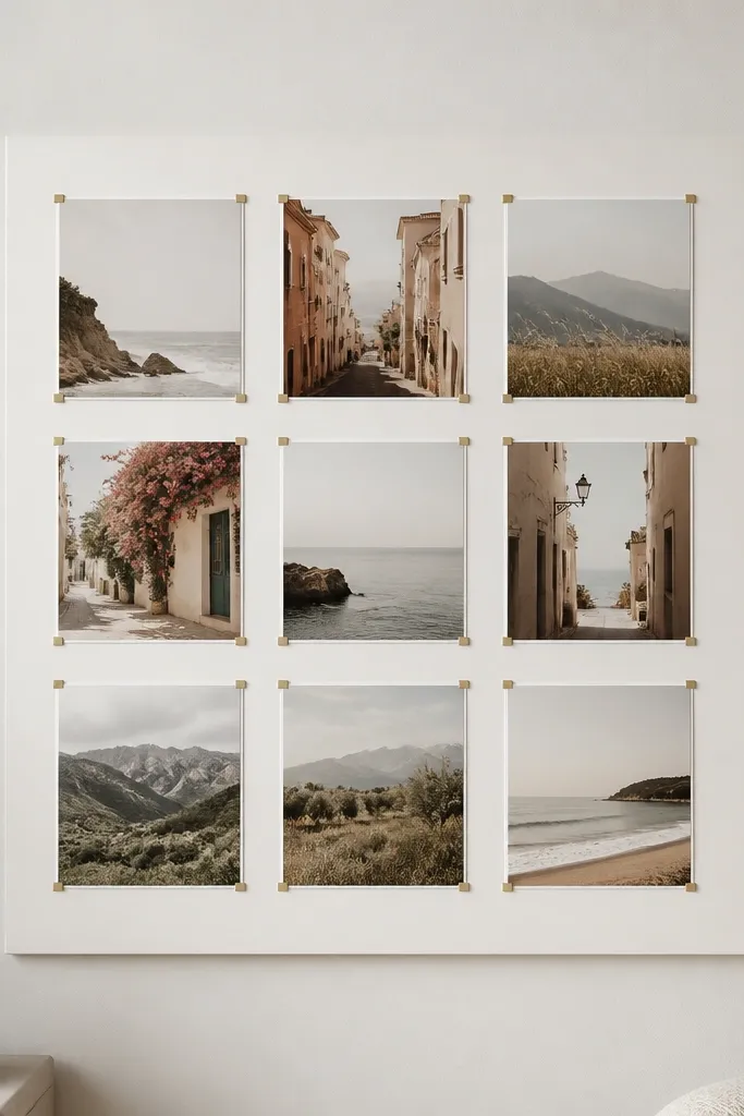
This gives you a solid backing so the poster never flops or curls. I’ve used it for travel prints and maps because the board makes the artwork feel like a finished product. Corner clips also let you swap prints without re-sticking anything to the wall. It flatters renters who want frequent changes, like moving from summer florals to winter landscapes. The styling principle is a stable surface: a board makes the poster behave.
Buy a foam board or lightweight backing panel cut slightly larger than your poster set. Mount the backing to the wall with removable adhesive strips rated for the board weight, placing strips at the corners and one in the middle. Attach corner clips to the board so the poster sits with a consistent border. Place the first poster and align it square using a ruler along the top edge. Then hang the panel and adjust until the border looks even from the doorway.
Seal foam board edges with a thin layer of matte craft sealant if your room runs humid.
Don’t use cheap clips that snag paper; they leave dents on thin prints.
12. Bedside vertical poster pairing with removable command strips
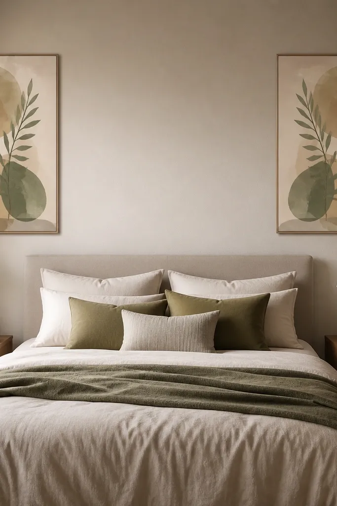
Pick two posters that are the same size and have matching visual weight, like both have a dark top element. Mark the centerline above the bed, then measure the spacing to each nightstand edge. Mount each poster with removable strips at the top corners, keeping the center of the poster at about 60 inches from the floor. Use painter’s tape to test height before adhesive goes on. Finally, adjust so the top edges line up perfectly — even 1/4 inch off looks obvious in bedroom lighting.
Two matching posters on either side of the bed makes the wall feel balanced without doing a full gallery wall. I’ve done this with vertical prints in the 11x14 to 16x20 range and it works especially well when your bed is centered and your nightstands match. It flatters bedrooms with higher ceilings because vertical art adds height without crowding. The styling principle is symmetry: the eye reads the pair as a single design unit.
AvoidDon’t mount them at different heights; one will look like an afterthought.
Good to knowChoose posters with similar contrast so one doesn’t look washed out next to the other.
13. Poster in a clip frame on a door using removable adhesive pads
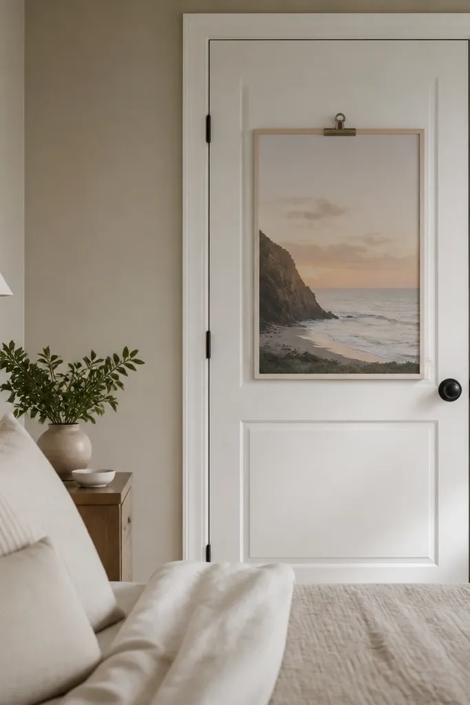
If wall space is limited, door art is a sneaky win. This works because doors are flat, and you can mount removable frames without touching the main wall. I’ve used clip frames here because you can remove the poster quickly when the landlord does inspections or when you want to swap art. It flatters small bedrooms because the visual “wall” expands into the door area. The styling principle is moving the focal point: you use a vertical surface people already see every day.
Choose a clip frame that fits your poster size and measure the door height where you want it. Clean the door surface with alcohol so adhesive pads stick. Place removable adhesive pads on the frame back, then press and hold for the full time listed on the pad label. Insert the poster into the clips and ensure it’s centered. Use a level against the frame bottom edge so the poster doesn’t slowly tilt after a few days.
Pick a poster with a strong border so it reads even when you’re walking past quickly.
Don’t use super-light adhesives on heavy frames; door vibrations make them fail.
14. Sculptural look with a poster behind a shadow box mounted no-drill
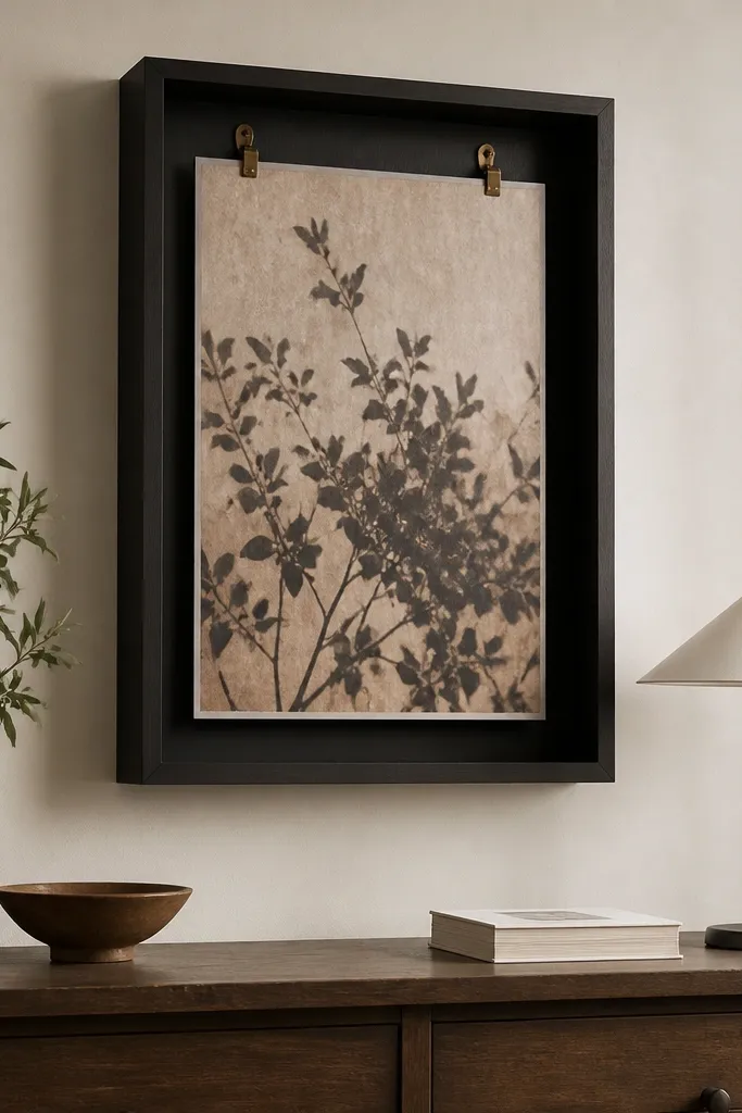
Shadow boxes make posters look like collectibles because the depth creates a real separation from the wall. I like this with layered prints, pressed-paper art, or any design that has both light and dark areas. The shadow box also hides small poster imperfections like edge waves. It flatters bedrooms with textured walls or busy bedding because the box adds structure. The styling principle is depth: even a simple print looks richer when it sits slightly forward.
Buy a shadow box frame that fits your poster size and has a backing depth of at least 1 inch. Test the fit by placing your print inside before mounting. Use removable hooks rated for the shadow box weight and attach them to the wall at the frame’s hanging points. Hang the shadow box so the center aligns with your preferred height, around 60 inches. Add small spacers if needed so the print sits evenly and doesn’t touch the glass or back panel.
Choose shadow boxes in black or natural wood so they match bed frames and nightstand finishes.
Don’t mount a heavy shadow box with the smallest hooks; sagging makes the depth look like a mistake.
15. Tension-rod photo line with mini prints (no wall adhesive)
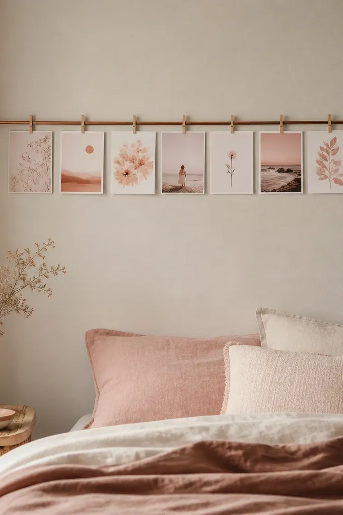
This is the best renter move when you want zero wall residue. You hang mini prints from a tension rod using clothespins or small clips, so swapping art takes seconds. I’ve used it with sets of 5x7 prints in a limited palette like sage, cream, and black. It flatters renters who want to change the look often without re-mounting anything. The styling principle is repeat: keep the number of prints consistent and use the same clip style so it looks like a planned display.
Measure the width of the wall area and choose a tension rod that spans it with enough tension to hold. Place the rod at the height you want — I like the centerline around 60 inches. Hang 6 to 10 mini prints spaced about 2 to 3 inches apart, using clothespins at the top margin of each print. Keep all prints aligned to the rod so none hang lower than others. If the rod shifts, add a rubber grip strip under the rod ends to increase friction.
Use clothespins in a single color finish; mixed metal clips look messy fast.
Don’t use tiny prints with huge spacing; it reads like a craft project instead of bedroom decor.
16. Removable wallpaper-style poster backdrop with removable peel-and-stick frame
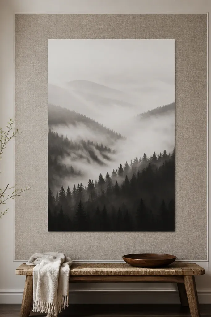
Pick a peel-and-stick border rectangle that’s about 2 to 4 inches wider and taller than your poster. Clean the wall with alcohol and let it dry completely. Apply the border first, press along the edges firmly, and then mount the poster inside using removable adhesive strips or a removable frame. Center the poster so the border gap is even on all sides. Keep the border color aligned with your room neutrals — warm cream with warm wood, cool white with gray tones.
If your wall is plain and you want the poster to feel like it has a custom background, this is the trick. Peel-and-stick borders or removable wall decals create a frame-like backdrop without drilling. I’ve paired a black-and-white poster with a subtle cream textured border so the art pops without adding more color chaos. It flatters bedrooms where the bedding is already colorful because the border adds interest without competing. The styling principle is contrast: a textured or patterned backdrop makes the poster read as the focal point.
AvoidDon’t place a busy patterned border behind a highly detailed poster; the wall becomes visually loud.
Good to knowWarm the border edges with a hair dryer if they lift at corners; pressure fixes most issues.
17. Vinyl record-style poster display in a removable frame stand
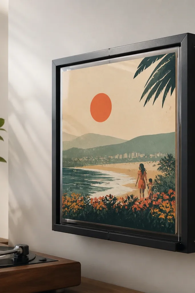
This one looks like you bought a special display, not like you taped up a print. I use it for retro posters, album-cover art, and anything with a centered graphic. The clear front protects the poster and gives it a showroom feel. It flatters people who like a little personality in their bedroom without overwhelming the space. The styling principle is “display object” energy: the poster becomes the thing you’d see in a shop window.
Choose a record-style display frame that fits your poster dimensions and has a clear cover. Mount the frame using removable wall brackets or adhesive-rated mounts, following the weight rating. Position it so the center is around 60 inches from the floor. Insert the poster and tighten any corner stops so the art sits flat behind the clear cover. Style the area with one small object that matches the poster mood — a black lamp base or a stack of books in the same color family.
If your poster has a lot of white, add a light mat inside the display so it doesn’t look washed out.
Don’t pick a display that’s too big for the poster; extra empty space around the art looks awkward.
18. Renter-friendly large fabric wall panel with poster art overlay
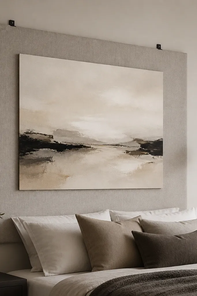
This is my favorite for bedrooms that need softness and hide wall texture. You mount a neutral fabric panel first, then attach the poster on top so the poster looks like part of the textile wall. I’ve done this with beige linen-look panels and a simple black line-art poster. It flatters anyone who has a lot of hard surfaces in their room because the fabric calms the space. The styling principle is layering: fabric base plus crisp print creates contrast without harshness.
Hang the fabric panel using removable hooks or adhesive strips at the top corners and one in the center so it doesn’t droop. Choose a panel size that covers the poster area and extends a few inches beyond it. Attach Velcro dots to the back of the poster and the fabric panel so you can remove and swap art later. Center the poster and press each Velcro dot firmly so it stays flat. Add one coordinating textile element nearby — like a throw pillow or curtain tie — to make the whole wall feel intentional.
Use hook-and-loop dots, not regular glue dots; they release cleanly and don’t peel fabric.
Don’t use a fabric that pills or sheds; the Velcro will catch fuzz and the poster won’t sit flat.
19. Two-tone frame mix with removable hangers for a styled pair wall
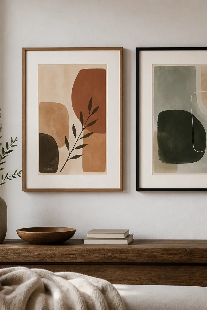
You can mix frame finishes in a bedroom as long as you repeat one element. I’ve mixed warm wood frames with matte black frames and it looks great when the posters share the same palette. Use a consistent mat width so the pair looks intentional, even with different frame colors. This flatters medium-tone rooms because the wood adds warmth and the black adds definition. The styling principle is repetition through spacing and mat size — not through identical frames.
Pick two posters with similar visual weight and choose frames in two finishes you already have in the room, like bed rails and dresser hardware. Use mats if your prints are smaller than the frame opening, and keep the mat width the same on both. Mount each frame with removable picture hangers rated for the frame weight. Hang them side-by-side with a 2 to 4 inch gap between frames and align the top edges. Center the pair above a dresser or in the middle of a blank wall section, keeping the center height around 60 inches.
Take a photo from your doorway before you peel adhesive fully; it’s the fastest way to catch uneven height.
Don’t mix three frame finishes; it reads like random thrift finds instead of a planned pair.