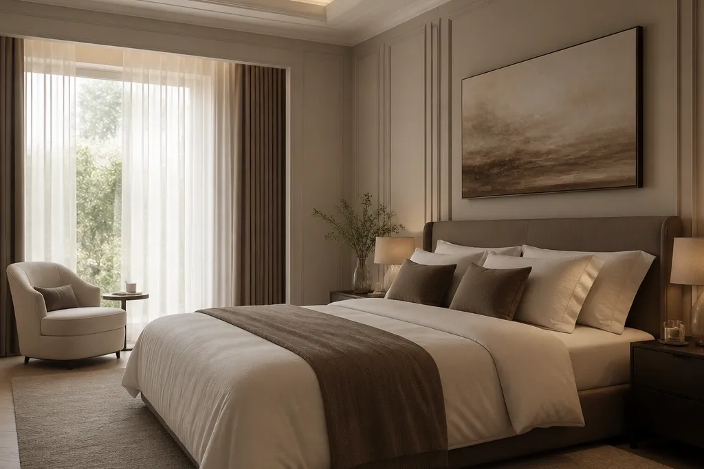
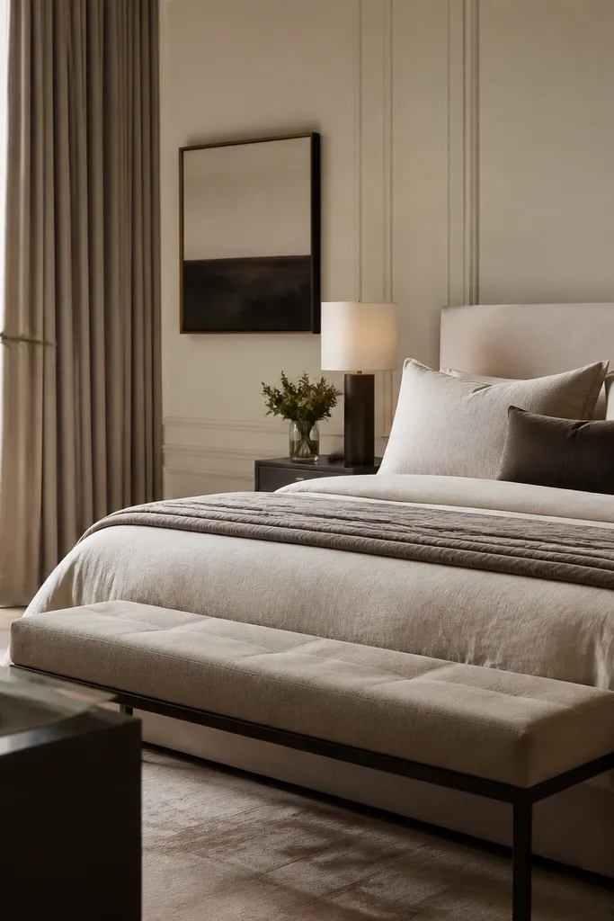
1. Curtains that hit the floor like a hotel
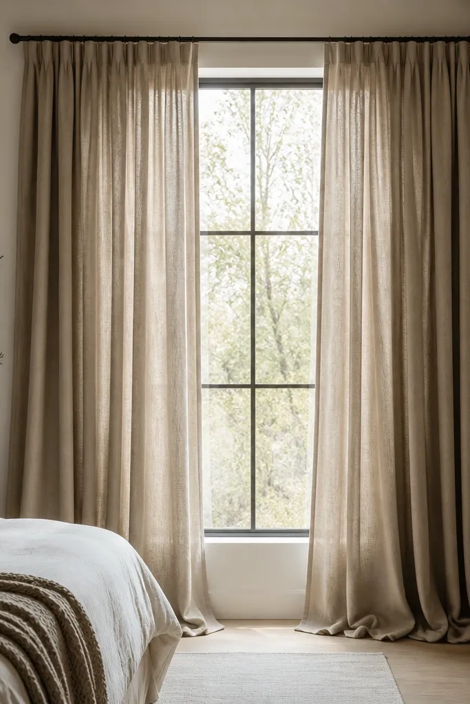
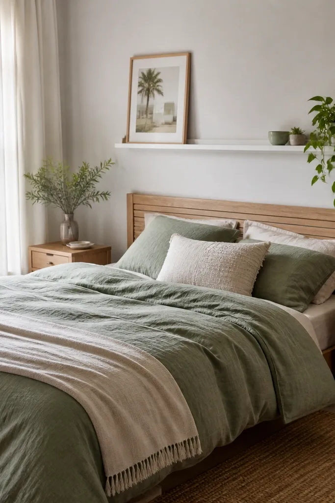
A lot of “cheap” bedroom looks come from curtains that stop too high. For a modern, expensive aesthetic, go with heavy linen or a linen-blend in warm taupe, greige, or oat. You want the fabric to hold shape so the folds look intentional instead of limp. This works especially well if your room has neutral walls because the curtain becomes a calm frame that makes everything else look sharper. If your skin reads cool under overhead light, warm linen tones also keep you from looking washed out in mirror selfies.
Start by measuring the window width and decide your curtain total width — aim for 2x the window width so the folds are full. Mount the rod 4-8 inches above the top of the window trim, then extend it 3-6 inches past each side so light doesn’t leak at the edges. Hang panels so they reach the floor with a 1-2 inch break or slight puddle. Use a rod with a clean finish like matte black or brushed nickel and keep the rings consistent. Finally, steam the panels and pull them fully closed once so the pleats set.
If you’re between sizes, go longer. A small puddle looks tailored; a short hem looks like you didn’t plan.
Don’t hang curtains right at the window trim — the height loss is what makes the room look unfinished.
2. Bedding in one tone, textured on purpose
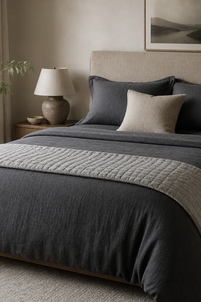
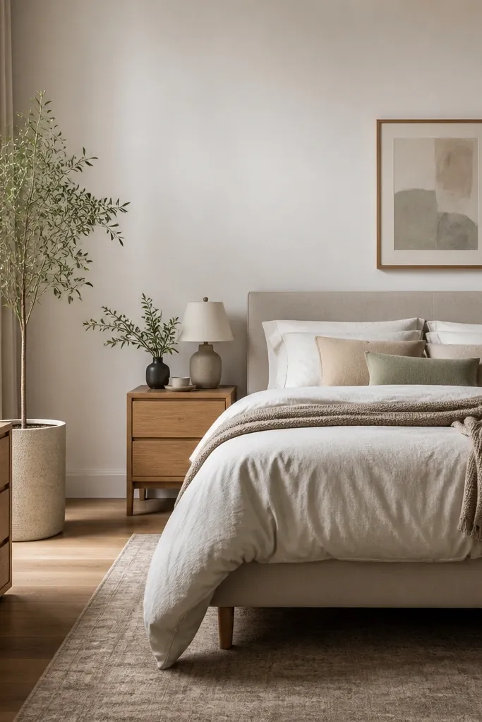
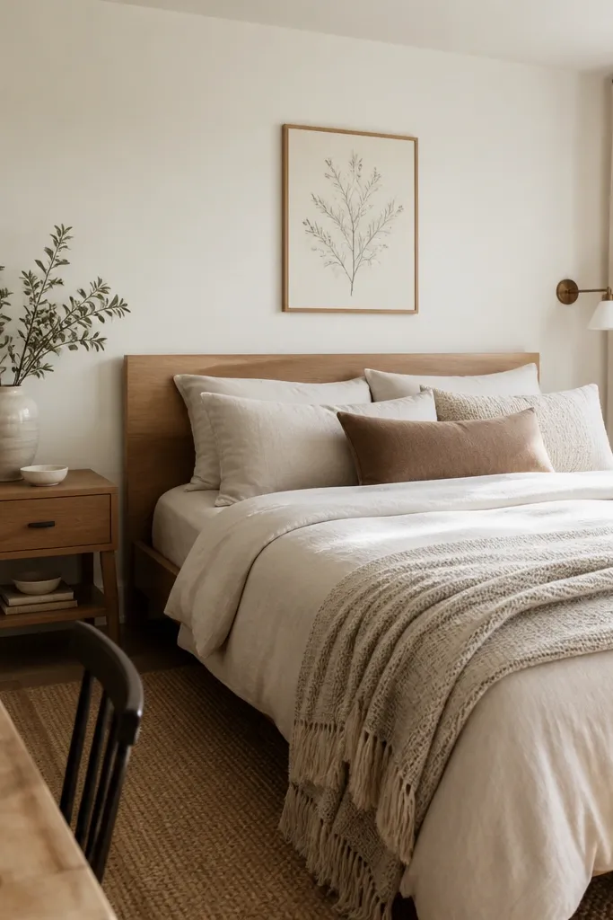
Expensive bedrooms don’t rely on patterns to look good — they rely on texture. Choose a solid duvet in charcoal, deep navy, or warm stone, then add texture with a knit throw and a woven throw pillow. Materials matter here: cotton sateen looks smooth and clean, while linen-blend and wool knits add that “hands-on” feel. This setup flatters most skin tones because the warm neutrals around the face read natural under warm lighting. It also works for different body types because the bedding layers create a neat visual block behind your head instead of pulling attention to the mattress line.
Start by buying one duvet cover as your base color and keep it solid or with a very subtle weave. Layer a throw at the foot that’s 12-18 inches wide on each side of the bed, not a thin strip. Add two pillow shams in the same color family, then place one accent pillow that’s lighter by 1-2 shades for depth. Make sure the duvet hangs evenly at the sides — you want it to cover the mattress drop by at least 6-8 inches. Finish by tucking the bottom edge slightly so the bed looks structured, not rumpled.
Pick a duvet cover with a weighty feel. If it feels flimsy in the store, it will wrinkle fast at home.
Avoid mixing three different patterns before you’ve nailed texture. Pattern overload kills the expensive look.
3. Two lamp rule with warm bulbs
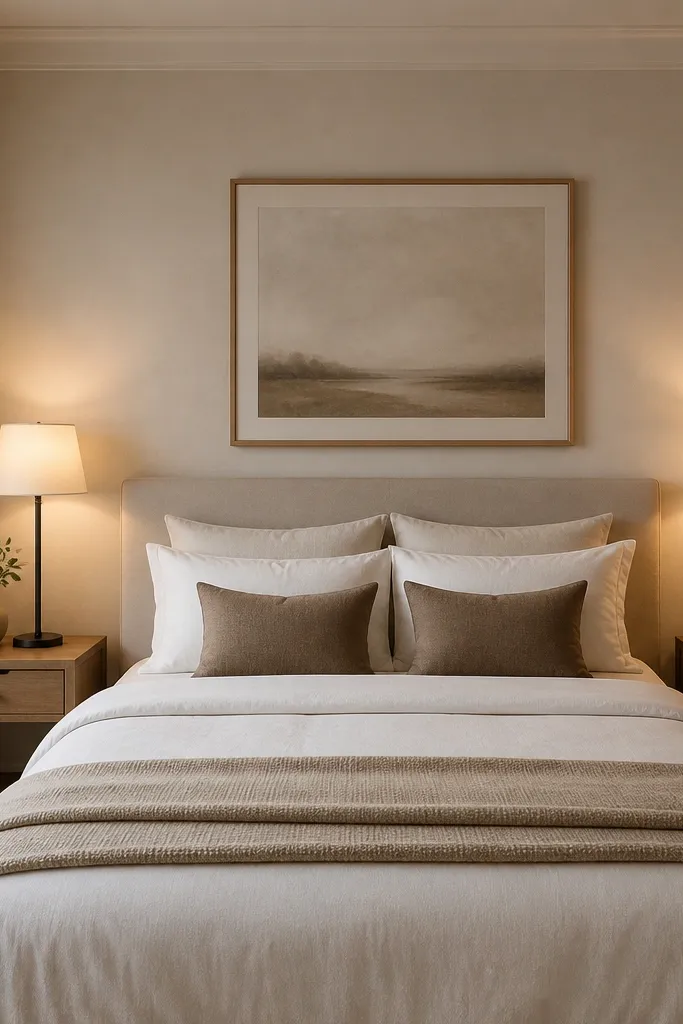
If your room relies on one overhead light, it will never look expensive. The “costly” look comes from gentle shadow control — your eyes read that as comfort and planning. I use two bedside lamps because they balance the room and make the bed feel like it belongs there. Warm bulbs around 2700K keep skin tones flattering and reduce the bluish cast that makes rooms look tired. This setup is forgiving for any bedroom size because you can choose small lamps that still throw light where you need it.
Start by swapping bulbs to 2700K (or 2400-2700K if you like it extra cozy). Place lamps so the shade bottom sits roughly 2-4 inches above the table surface and the top doesn’t hit your line of sight when you sit up. Use matching lamps — same height, similar shade shape — even if the bases are different finishes. If one table is smaller, adjust by using a slightly taller lamp there to keep the overall visual line even. Finally, dimmers are worth it — set the brightness so the bed area looks warm, not yellow.
Good to knowIf you can’t add a second lamp, add a wall sconce instead. One warm overhead light plus one directional lamp looks better than two overhead bulbs.
AvoidDon’t use daylight 5000K bulbs. That crisp blue makes the room feel like an office.
4. A mirror that repeats your metal finish
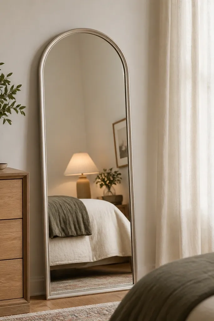
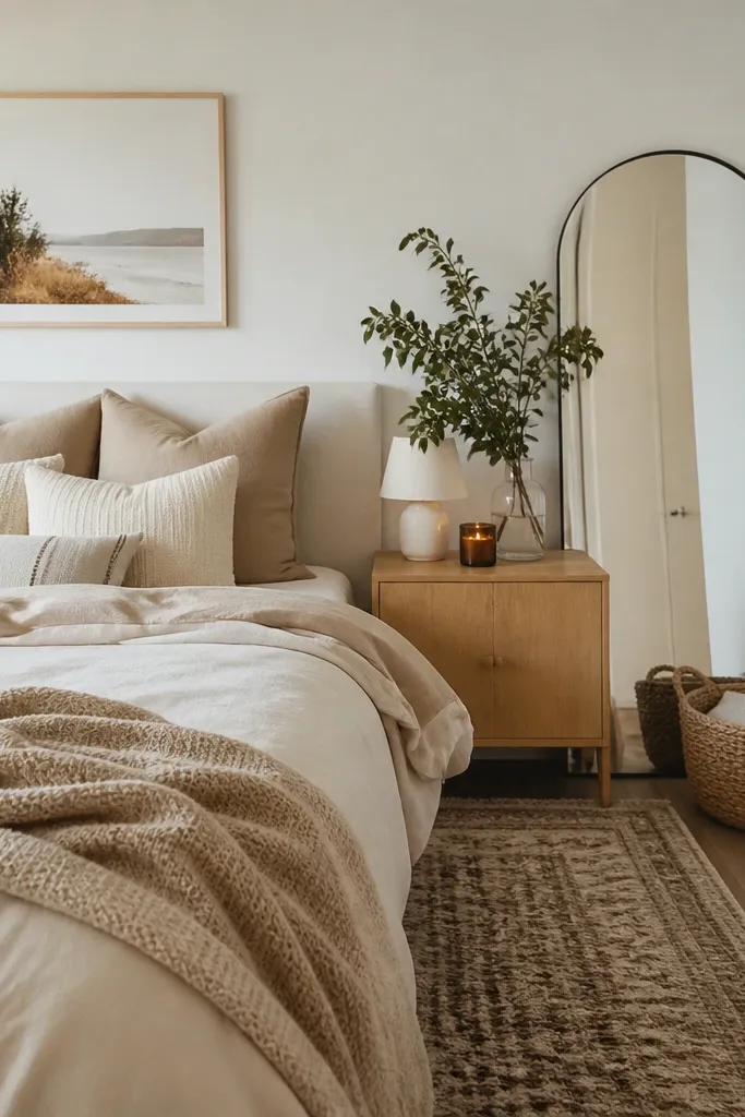
Mirrors give you that expensive depth by reflecting light and expanding the space you already have. The trick is to match the mirror frame metal to the rest of your room, so it looks like a coordinated set. Choose a tall arched or rectangular mirror with a thin frame in brushed nickel, matte black, or warm brass depending on your existing hardware. This looks best in bedrooms because it creates a vertical line that makes ceilings feel higher. It also helps if you have a darker room — the mirror pulls light across the walls and makes everything feel calmer.
Start by checking your current metal finishes — drawer pulls, belt hooks, lamp bases, or curtain rods. Pick a mirror frame in the same finish so you don’t end up with mixed metals. Hang it so the bottom edge is around 6-10 inches above the floor if it’s vertical, or keep it leaning if you’re using it as a styling piece. Place it opposite a light source, like across from a lamp or window, so it reflects brightness. Keep the mirror height tall enough that it frames your face when you stand in front of it.
Good to knowUse painter’s tape to outline the mirror on the wall first. Move it 2-3 inches left or right and watch how the reflection hits the bed.
AvoidDon’t place a wide, short mirror on a tall wall. The proportions look off and cheap.
5. Bedside tables that match the bed height
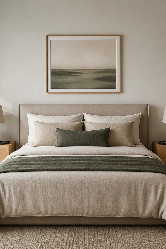
The fastest way to make a bedroom look expensive is getting the bedside geometry right. If your nightstands are too low, your lamp feels awkward and the bed looks taller than it should. If they’re too high, the room feels cramped. I aim for nightstands that land within 1-2 inches of the top of your mattress. This works for different heights because your lamp and book placement become naturally aligned with your posture when you sit up.
Start by measuring from the floor to the top of your mattress. Choose nightstands that match that height within 1-2 inches, then check lamp clearance so the shade doesn’t hit your head. Place lamps first, then add a small tray for a watch or glasses — it keeps clutter contained visually. If your nightstand has drawers, keep them closed and only style the top with one functional item. Finish by using the same wood tone on both tables or repeating the same finish with different shapes.
Good to knowIf you’re mixing sizes, keep the lamp height the same and adjust only the table surface width.
AvoidDon’t put a lamp on a table that’s significantly shorter than the bed. The visual mismatch is what reads “thrown together.”
6. One large art piece above the dresser
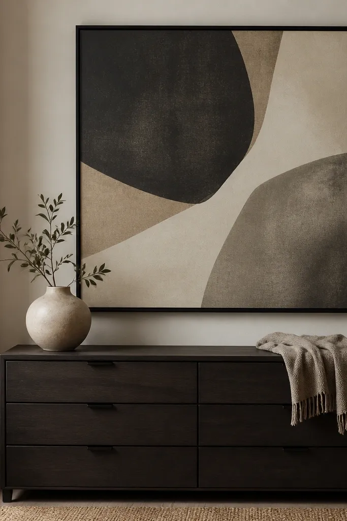
Small art above a dresser looks like you ran out of wall space. A single larger piece makes the room feel designed because it controls scale. I like matte black frames because they read modern and they match common hardware. The color palette should echo your bedding or curtain: charcoal + warm sand + one soft neutral. This works for most bedrooms because a dresser is already a horizontal anchor — big art turns it into a full focal wall. It also hides minor wall imperfections because a larger surface distracts from paint texture.
Start by measuring the width of the dresser and aim for art width that’s about 70-90% of the dresser width. Hang the center of the artwork so it sits around eye level — typically 57-60 inches from the floor for most people. Use a level and mark both corners before drilling. Keep the bottom edge of the frame about 4-8 inches above the dresser top so it doesn’t feel like it’s sitting on the furniture. Choose a frame depth that looks substantial — thin glossy frames read less expensive.
If you have a narrow dresser, use a vertical print instead of forcing a wide one. Height makes the wall feel taller.
Avoid a grid of tiny prints unless every frame is the same size. The mismatch looks like random collecting.
7. Wall-to-wall texture with a wool-look rug
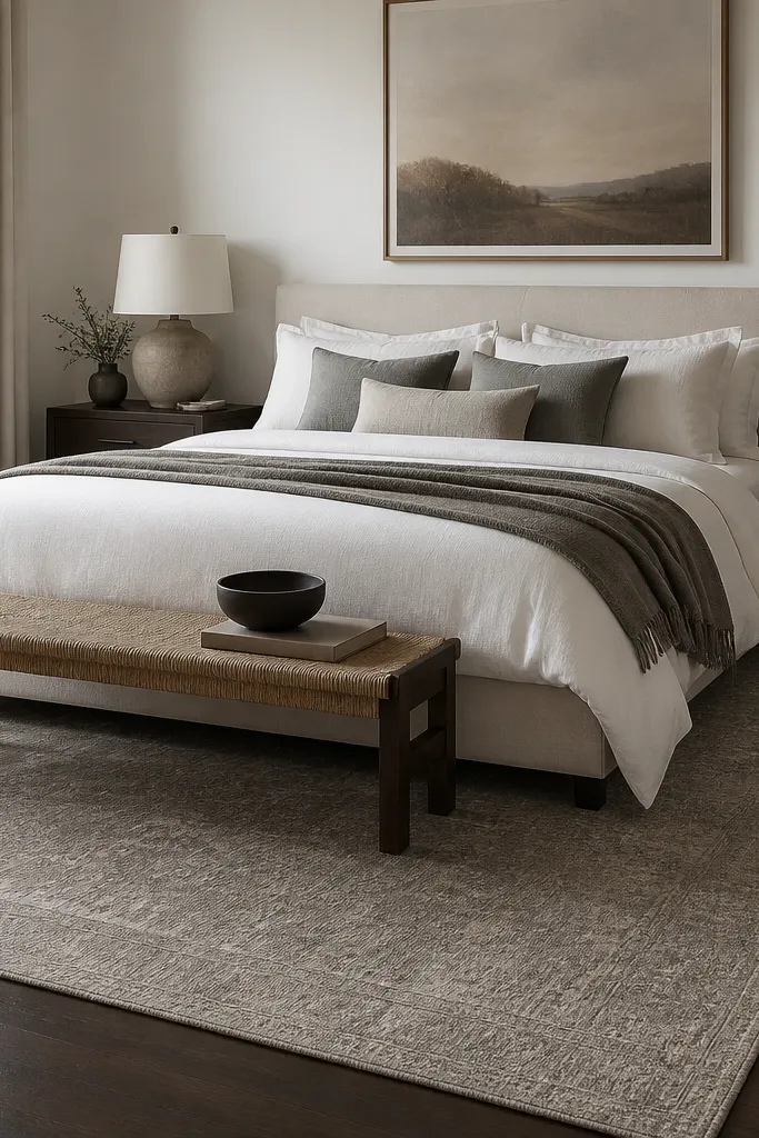
Your bedroom rug is where “expensive” shows up fast, because it changes how your floor reads. I like wool-look or low-pile rugs in warm gray, taupe, or charcoal because they hide footprints and still feel premium. The trick is size: a rug that’s too small makes the bed float and the room look temporary. This setup works in both small and large rooms because it anchors the bed and creates clear boundaries. If you have thick carpet already, swap the top layer with a runner-style rug near the foot for the same grounding effect.
Start by measuring your bed width and aim for the rug to extend at least 18-24 inches beyond each side of the bed. For length, make sure the front legs of your bed sit on the rug, not on the floor. Choose a low pile so it doesn’t bunch under furniture and looks crisp under warm lighting. Vacuum regularly and rotate the rug every 6 months if you notice fading. If your room has dark floors, pick a rug with warm undertones so it doesn’t look gray-on-gray.
Good to knowUse a rug pad that’s slightly thicker than the minimum. It stops sliding and makes the rug feel higher-end underfoot.
AvoidDon’t buy a rug that stops at the bed’s edges. That tight fit is the cheap visual tell.
8. A leather or boucle throw that actually drapes
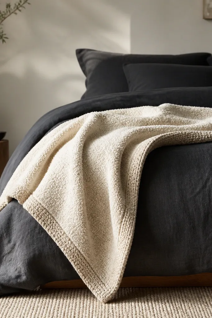
Throws are where you can add “expensive” texture without adding clutter. I prefer boucle, chunky knit, or a leather-look throw blanket with a matte finish. Boucle makes light look soft and expensive, like a coat collar. It also photographs well because the surface catches highlights instead of flattening. This works best when the throw is in a neutral that’s lighter than your bedding by at least one shade. If your walls are cool gray, go warm cream boucle so the room doesn’t feel sterile.
Start by placing the throw at the side of the bed, not folded into a tiny stack. Drape it so one edge hangs down 6-10 inches and the other edge rests against the pillows. If you’re using a boucle throw, keep it slightly off-center so the texture break looks natural. For color, choose cream, oatmeal, or sand against charcoal, navy, or deep green. Finish by smoothing the top fold with your hand so it doesn’t bunch.
Good to knowPress the throw flat for 20 minutes under a heavy book before styling. It removes shipping creases.
AvoidDon’t use a thin silky throw. It looks like a budget blanket and won’t add the texture you need.
9. A monochrome dresser styling tray
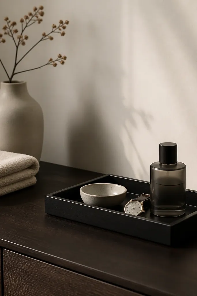
A room looks expensive when it has “edited” surfaces. A tray is the easiest way to control what people see from the doorway. Choose a tray in matte black, smoked glass, or dark wood and keep everything on it in one color family. I like a ceramic bowl in off-white and one personal item that looks intentional, like a watch or leather valet. This works for small bedrooms because it lets you style one surface without taking over the room. It also helps if you actually live in your space and you need a place for daily items.
Start by clearing the dresser top completely for one hour. Place the tray first, centered or slightly off-center depending on the dresser width. Add one tall element like a small bottle or a slim vase, then one flat element like a bowl. Put your watch or key dish in the bowl so it looks placed, not dropped. Leave at least 6-8 inches of empty space around the tray so the dresser doesn’t look crowded.
Good to knowUse the same tray material in at least one other spot, like a bedside tray or a bathroom counter tray.
AvoidDon’t scatter five small items across the dresser. Spreading clutter out reads messy even if each item is nice.
10. A statement pendant or ceiling light with warm glass
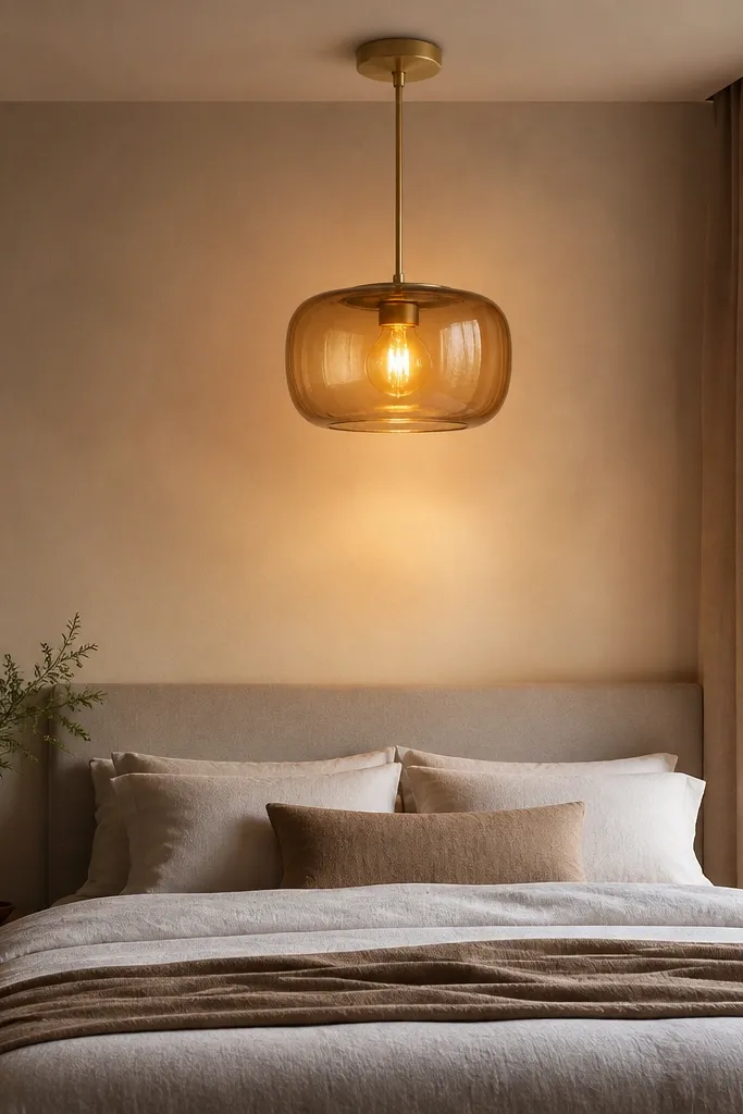
Overhead lighting can look cheap if it’s harsh or too white. A pendant or ceiling fixture with warm glass changes the whole mood because it creates a calm halo instead of a bright spot. I like amber-tinted glass or frosted glass in a brushed metal finish, with bulbs that stay under 2700K. This looks best in bedrooms with neutral walls because the light color becomes part of the palette. If you have a darker headboard, warm glass makes the bed area look cozy rather than heavy.
Start by turning off the overhead and checking what the light does to your wall color. Choose a fixture that spreads light across a wider area, not one that beams straight down. Install at a height that keeps the shade out of your line of sight when you sit — measure from your seated eye level and adjust. Use a dimmable switch if you can, then set the brightness so the room feels warm and not glaring. Finish by adding a bedside lamp so you’re not relying on only one overhead source.
Good to knowIf you hate yellow, choose frosted white glass but still keep the bulb at 2700K.
AvoidDon’t pair warm bulbs with a bare bright fixture. The exposed bulb glare is what makes it feel budget.
11. Headboard color that matches your walls, not your floor
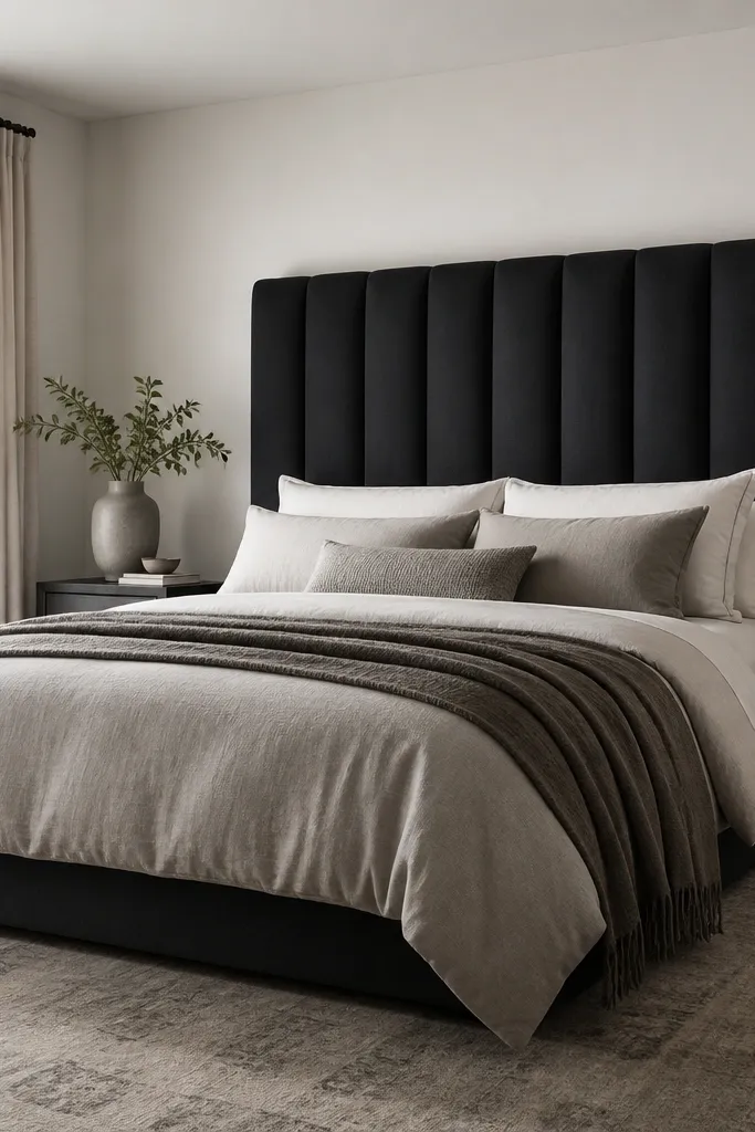
The most expensive-looking bedrooms have a headboard that ties into the wall color instead of fighting it. If your walls are off-white, choose a headboard in charcoal, deep navy, or a warm gray that sits near the wall tone. This creates a clean contrast band behind your pillows without making the room feel chopped. It also photographs well because the headboard becomes a smooth backdrop. If you have a smaller room, this strategy makes the bed look taller and more intentional.
Start by identifying your wall undertone — warm cream or cool gray. Pick a headboard fabric that matches the undertone: warm gray headboards for warm walls, charcoal or deep navy for cool walls. Place the bed so there’s an even gap on both sides of the nightstands, then center your bedding pattern alignment. Keep the headboard width close to bed width, with no big empty wall gaps. Add one matching pillow in the headboard color so the visual line stays continuous.
Good to knowIf your headboard is already there, add a slipcover in the same color family using tailored panels so the look stays cohesive.
AvoidAvoid a headboard color that matches your floor exactly. Same tone reads flat and cheap.
12. A simple ceiling-to-floor blackout shade setup
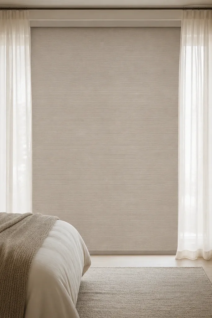
Blackout shades are the quiet upgrade that makes a bedroom feel expensive because they remove visual distractions. Pairing a roller blackout shade with soft outer curtains gives you both privacy and the tall-window look. Choose a shade in a warm white or light greige so it doesn’t look stark. This is great for bedrooms with streetlights or early sun because it improves sleep and keeps the room looking calm during the day. If you have a darker wardrobe and you want the room to feel brighter, the warm shade color helps.
Start by measuring the window inside frame width and height for the roller shade. Install it so it sits flush without gaps at the sides — gaps look unfinished. Add outer curtains on a rod that spans wider than the window, mounted 4-8 inches above the trim. Make sure curtains can fully close without bunching against the shade. Finish by pulling the curtains open in daylight so the roller shade disappears behind the fabric.
Good to knowIf your curtains are sheer, add a blackout shade anyway. The room reads finished even when the curtains are pulled back.
AvoidDon’t leave a visible gap between roller shade and trim. Light leakage at the edges reads cheap.
13. Matte black hardware repetition in small ways
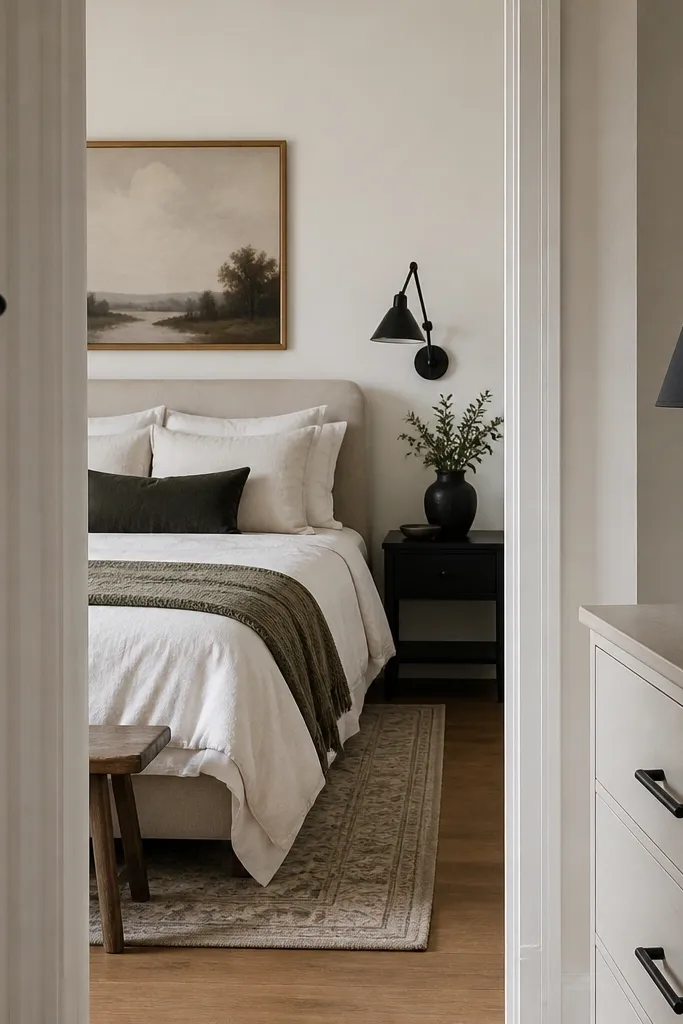
You don’t need a whole new set of furniture to get the “planned” look. Repeating one hardware finish in small objects makes the room feel intentional because your eye keeps landing on the same color. Matte black is my go-to because it looks modern with wood tones and it doesn’t reflect light harshly. This works if your room has warm neutrals and you want a grounded contrast. It also helps in bedrooms with mixed metals — you anchor the look so it doesn’t feel random.
Start by choosing one metal finish to repeat — matte black is easiest if you have dark frames or a black headboard. Swap any mismatched drawer pulls on the dresser if they’re easy to replace, or add black accessories like a matching lamp base and a black picture frame. Put a black tray on the dresser and a black hook near the entry door if you can see it from the bedroom. Keep the black accents within the same sheen — matte with matte, not glossy. Walk from the doorway and check that you see at least three black items within a single glance.
Good to knowIf you can’t change hardware, use a matte black spray paint on a cheap frame or valet tray and seal it with a clear coat.
AvoidDon’t mix matte black with shiny chrome in the same visual area. The contrast looks accidental.
14. A sculptural nightstand lamp shade shape
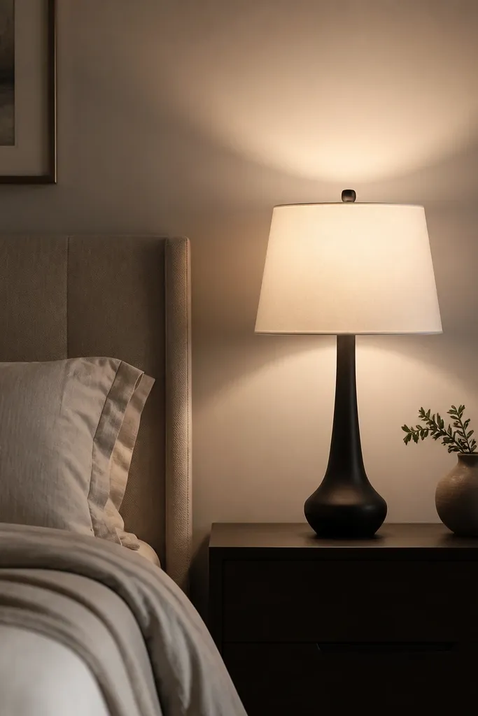
Lamp shades are where expensive bedrooms win. A tapered drum shade or a slightly curved shade top looks tailored and throws light higher, which makes walls glow instead of pooling light only on the table. Choose a warm white shade with a fabric exterior, not a glossy coated paper look. This helps if you read in bed because it reduces glare in your eyes and gives you a comfortable reading area. It also flatters the room because it adds shape without adding clutter.
Start by matching shade color to your bedding palette — warm white or oatmeal works best with charcoal and taupe. Place the lamp so the shade center lines up with your headboard center when you’re sitting. Aim for shade height so it reaches about eye level or slightly below when seated, usually around 20-24 inches total height depending on your nightstand. If your room has low ceilings, pick a shade that’s taller rather than wider to keep it from visually squatting. Finally, test the light by turning it on and checking that the wall gets a soft glow.
Use a warm bulb and keep the shade 2-3 inches above the table edge. That spacing stops the light from looking flat.
Don’t choose a shade that’s too small for the lamp base. The mismatch makes the lamp look like a set of spare parts.
15. A layered blackout headboard curtain behind the bed
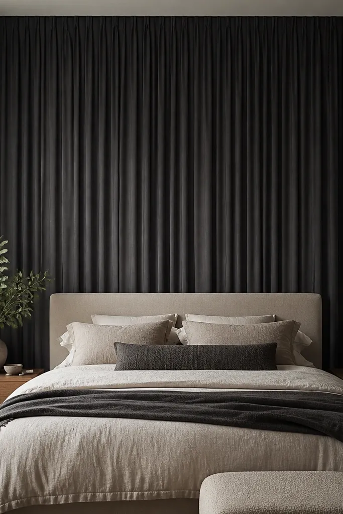
If your bedroom feels plain behind the bed, create a backdrop panel. A curtain behind the headboard makes the whole wall look styled and it hides awkward outlets or paint texture. I use a deep gray or dark navy blackout curtain because it stays flat and doesn’t flutter. This looks expensive because it creates a continuous vertical block that your eyes treat like a designed feature. It’s also forgiving if your headboard is shorter — the curtain fills the space and makes the bed feel taller.
Start by measuring the wall area behind the bed and choose a backdrop curtain that spans wider than the headboard by 6-10 inches total. Mount a second curtain rod or tension rod behind the headboard height so the curtain reaches close to the floor. Use curtain clips or hooks to keep it straight and minimize wrinkles. Keep the curtain color one shade darker than your bedding so it reads as depth, not competing color. Style the bedding so the headboard area looks continuous, with pillows that don’t extend past the curtain edge.
Steam or hang overnight. Even a good curtain looks cheap if it’s wrinkled in the center.
Don’t use a thin sheer curtain behind the bed. It makes the wall look unfinished and doesn’t create the panel effect.
16. A clean gallery wall with matching frame spacing

Gallery walls can look expensive or messy depending on spacing and frame uniformity. If you want modern and cool, use identical frames in matte black or light wood and keep the art within a tight palette. I stick to 4-6 pieces max so the wall reads intentional, not like a collage you made over years. This works for bedrooms because it gives you a focal point without cluttering the bed area. It also flatters different wall sizes because you can scale the whole grid up or down while keeping the spacing consistent.
Start by laying frames on the floor and arranging them into a balanced rectangle or a simple grid. Use spacers or painter’s tape to keep consistent gaps, usually 2-3 inches between frames. Measure the total width and hang the center of the grid at eye level, around 57-60 inches from the floor. Use a level and mark all anchor points before drilling. Choose prints with similar tones — charcoal, sand, and one soft neutral — so the wall blends with your bedding instead of fighting it.
Good to knowIf your frames don’t match yet, paint them all matte black first. Matching frames beat matching art every time.
AvoidAvoid mixed frame sizes with no spacing plan. That combo reads like a craft project.
17. Bedside books in a single vertical stack
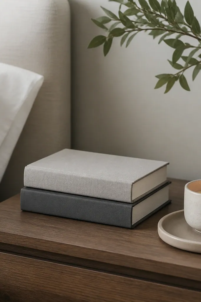
Books are the fastest way to make a bedside look lived-in and expensive at the same time. The key is how you stack them: one vertical stack with spines facing out looks intentional, while random horizontal piles look like clutter. Choose book covers in neutral tones — gray, cream, black, muted brown. This works for any bedroom style because books add color restraint and height. It also flatters your space in photos because the spines create clean lines that match the modern geometry of lamps and frames.
Start by picking 2-3 books with similar spine colors and widths. Stack them vertically and keep the tallest book on the bottom so the stack sits stable. Place the stack on a tray next to the lamp, not in the center of the table. Add one small object like a candle or a small ceramic dish so the tray looks purposeful. Keep the rest of the nightstand clear — one stack and one object is enough.
If your books are too colorful, cover the stack with a simple neutral book sleeve or wrap the top one in kraft paper and tape the edges.
Don’t leave paperback corners flopping. It looks messy even if the books are nice.
18. Matte concrete or stone-style bedside vase
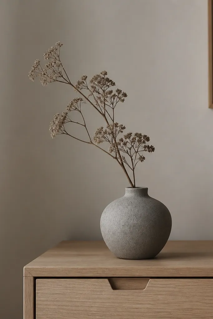
One plant-style element makes a bedroom feel finished without turning it into a jungle. I like matte concrete, stone-gray ceramic, or a textured vase because it reads architectural. Use dried branches or a small bundle of pampas-like grass in a warm beige so it doesn’t compete with your bedding. This works for men’s bedrooms because the styling feels calm and structured, not overly cute. It also photographs well because matte surfaces reduce glare and look expensive in low light.
Start by choosing a vase height around 8-10 inches for a dresser, or 6-8 inches for a nightstand. Add one stem cluster — not a full bouquet — so the shape stays sculptural. Trim stems so the highest point hits about 2-3 inches above the vase rim. Place the vase on a tray or near the dresser edge so it doesn’t float in the middle of clutter. Keep the stems in warm neutrals and avoid bright dyed colors.
Good to knowMist the dried stems with a tiny bit of hair spray before placing. It keeps loose bits from shedding onto your sheets.
AvoidDon’t use glossy glass vases with cheap fake flowers. The shine and plastic look are the giveaways.
19. Entry-to-bedroom continuity with a hook and tray
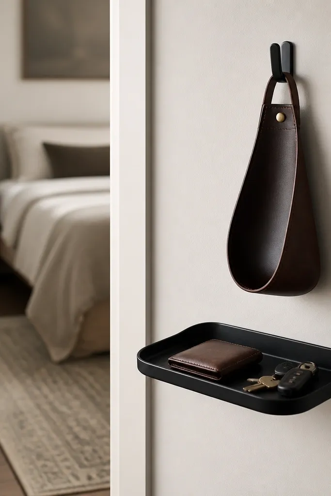
Your bedroom looks expensive when the stuff that enters it looks organized too. I’ve seen this in real life: if your keys and jacket end up on a chair, the bedroom never reads clean, even with great bedding. A simple wall hook plus a small tray keeps the “daily mess” in one spot and makes the bedroom feel intentional. Choose matte black hardware and a neutral tray so it matches the bedroom’s metal finish. This also helps if you have a narrow entry — you’re using vertical space instead of adding another piece of furniture.
Start by placing the hook 60-66 inches from the floor so coats hang without dragging. Mount the hook with a level and use wall anchors if you’re not hitting studs. Add a small tray underneath or next to it for keys and a wallet so items don’t land on the floor. Style with one leather valet and one small catch-all — keep it minimal. When you’re done, wipe the tray once a week so dust doesn’t make it look old.
Use a small fabric shoe mat or runner near the entry. It makes the floor area look planned and hides scuffs.
Don’t place a hook too low. Jackets on the floor edge makes the room look cluttered fast.
20. A low-profile bed frame with clean lines
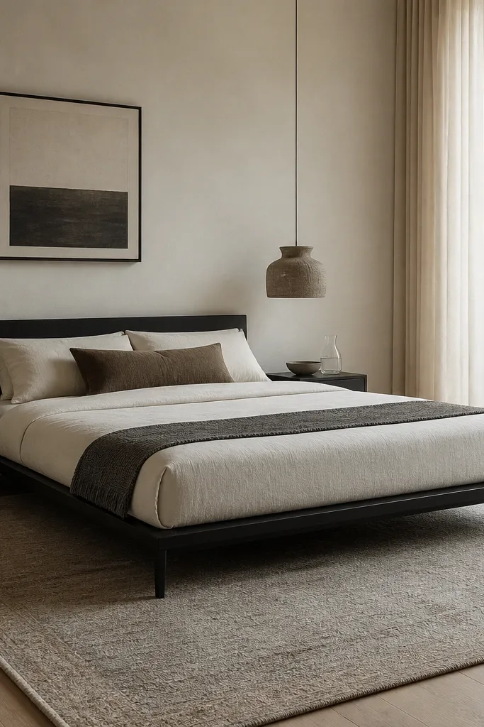
Low-profile bed frames make a modern bedroom look expensive because they reduce visual bulk. When the bed sits closer to the floor, the room feels tighter and more deliberate. I like frames with slim legs in matte black or dark wood and a simple headboard shape. This works for most body types because it doesn’t visually shorten you in the room; it actually makes the ceiling feel higher when paired with tall curtains. It also helps in smaller bedrooms because the frame doesn’t eat up the visual space.
Start by choosing a frame height that leaves enough clearance for cleaning — usually 2-5 inches from floor to base. Pair it with a rug that fits under the front legs so the bed looks grounded. Keep the headboard fabric clean and solid, not overly tufted if you want modern cool. Style bedding with sharp corners and a tucked duvet so the bed looks crisp. If you’re using a mattress topper, make sure the surface is firm enough to keep the bed looking structured.
Good to knowIf your bed is already tall, fake the low look by choosing a duvet that hangs less in front and a throw that sits high on the side.
AvoidDon’t pick a bed frame with thick, ornate posts for a modern palette. The contrast reads dated.