1. Centered fluted panel backdrop with a soft white paint
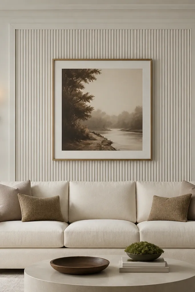
This is the wall treatment I reach for when the room feels plain but you don’t want wallpaper noise. The fluted panel gives depth without adding color, and soft white paint keeps it bright even in rooms with limited daylight. I’ve used it in rooms with beige or honey wood floors and it still looks clean because the panel reads as architectural texture, not pattern. The effect flatters sofas with higher backs because the vertical lines visually lift the silhouette. It also works well for most skin tones in the room because it doesn’t pull attention with strong undertones — it stays neutral and lets your art and cushions do the color work.
Start by marking a centered rectangle on the wall. Make the panel’s width about 60-70% of your sofa width, then set its height so it covers roughly 65-75% of the sofa back height. Install fluted wall panels or fluted trim strips (the easiest is pre-primed MDF or PVC strips) and keep the grooves aligned straight — use a level every 12 inches. Paint the wall first, then paint the panel a shade 1-2 steps deeper than the wall so the shadows show. Finally, place two identical sconces so their inner edges line up with the panel’s vertical sides, and hang one centered artwork above the sofa at eye level.
Use a satin or eggshell finish for the wall paint. It catches light on the flutes without looking glossy.
Avoid using bright white on both wall and panel — the grooves disappear and it looks flat.
2. Double-layer molding frame with a gallery rail inside
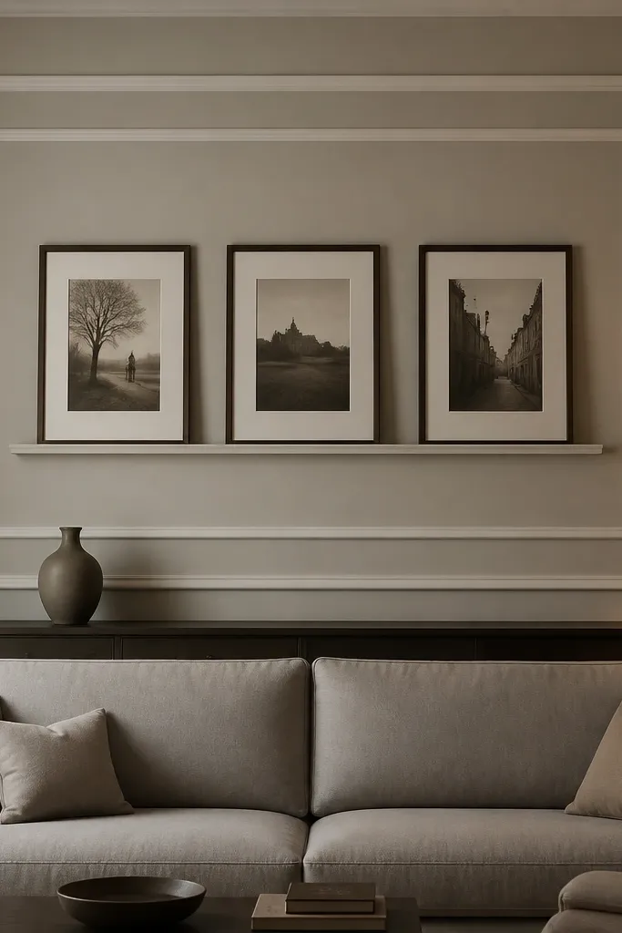
This design is for people who want the wall to stay flexible. The molding frame reads formal and finished, while the gallery rail lets you swap art without rebuilding the structure. I’ve done this in homes where the family keeps changing photos and it still looks intentional because the frames stay fixed. It flatters a mid-height sofa because the inner frame gives you a clear “stage” for art, without forcing you into oversized prints. In rooms with warm wood or brass accents, greige walls make the white molding feel crisp instead of stark.
Measure the sofa width and draw a center line on the wall. Build an outer rectangle with molding that spans about 70-80% of the sofa width, then add a second inner rectangle with molding about 6-10 inches smaller in width and height. Install a picture rail inside the inner rectangle so the hanging point stays consistent. Hang three frames so the centers align with the rail marks — keep the middle frame slightly larger if you want a calm focal point. Paint the molding and frames in a semi-gloss white, then choose art with one repeating tone (like warm neutrals) so the wall doesn’t feel busy.
Pick frames with the same profile width, even if the photos change. Consistency makes it look built-in.
Don’t hang art too low — if the bottom of the lowest frame dips near sofa back height, it starts to crowd the seating area.
3. Oversized mirror with a thin black frame and warm sconce pairing
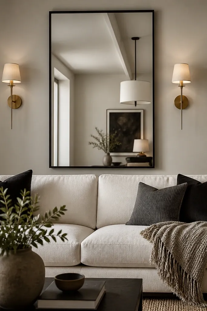
If your drawing room feels dark, a mirror solves it faster than paint. A thin black frame gives a modern edge while still reading classic next to traditional sconces. The mirror also makes the wall feel deeper, which is a big deal in narrow living rooms. I’ve used this setup with cream, oatmeal, and light gray sofas, and the black frame ties in naturally with coffee tables and hardware. It flatters rooms with warm undertones because the mirror’s reflection brings in your existing light sources instead of adding a new color. Keep the mirror tall enough to visually pull the eye upward, especially if your ceiling is around 8-9 feet.
Choose a mirror height that’s about 70-85% of your sofa back height, then center it so its middle lands near the 56-60 inch eyeline. Use wall anchors rated for the mirror’s weight and keep the mounting brackets level. Install sconces on both sides at the same height as the top third of the mirror frame, not the center. Use warm bulbs around 2700K and a dimmer if you can — it makes the black frame look velvety instead of harsh. Style with two matching pillow colors and one textured throw so the reflection shows something cohesive, not random clutter.
Good to knowWipe the mirror with a microfiber cloth right before photographing or hosting. Smudges show up as gray streaks and cheapen the look.
AvoidAvoid a wide, thick mirror frame if your sofa is already bulky — it can make the wall feel heavy.
4. Soft arched niche made from MDF panels with linen backing
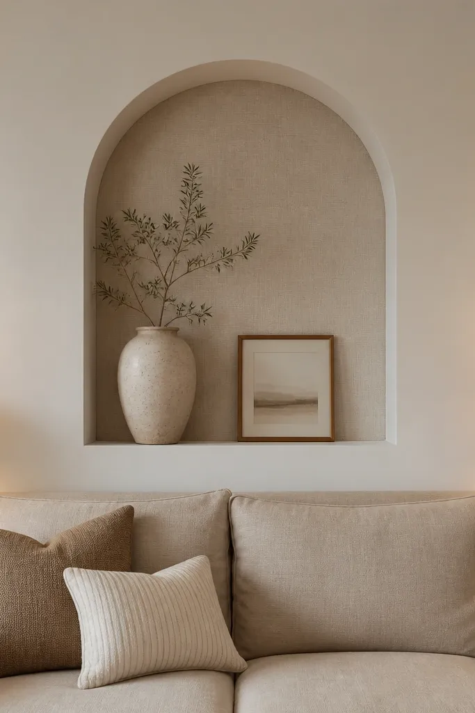
This is the “quiet luxury” wall idea that looks expensive without shouting. The arch shape adds softness to straight lines in most living rooms, and linen backing brings texture that looks good in daylight and at night. I’ve installed this in rooms with simple sofas and plain walls where the owner wanted a focal point that didn’t require constant art swapping. It flatters neutral palettes and looks great against wood floors because linen echoes the natural fibers. If your sofa has rolled arms or a curved back, the arch repeats those curves and makes the whole scene feel more coordinated.
Start by sketching the arch size on the wall. Make the niche opening about 50-60% of the sofa width and position it so the arch crown sits around 6-12 inches above the sofa back top. Build the niche using MDF sheets and cut an arch with a template, then test-fit before sanding. Line the interior with stretched linen fabric — staple it cleanly at the back and trim the edges tight. Paint the exterior in warm white and leave a 1-2 inch reveal so the linen texture shows. Finish by placing one tall object inside (ceramic vase or sculptural candle holder) so the niche stays styled even when you change decor.
Use a linen fabric with a visible weave, not a smooth faux silk. The weave shows depth in raking light.
Don’t skip a reveal gap — if the fabric touches the paint edge, it looks like a temporary cover.
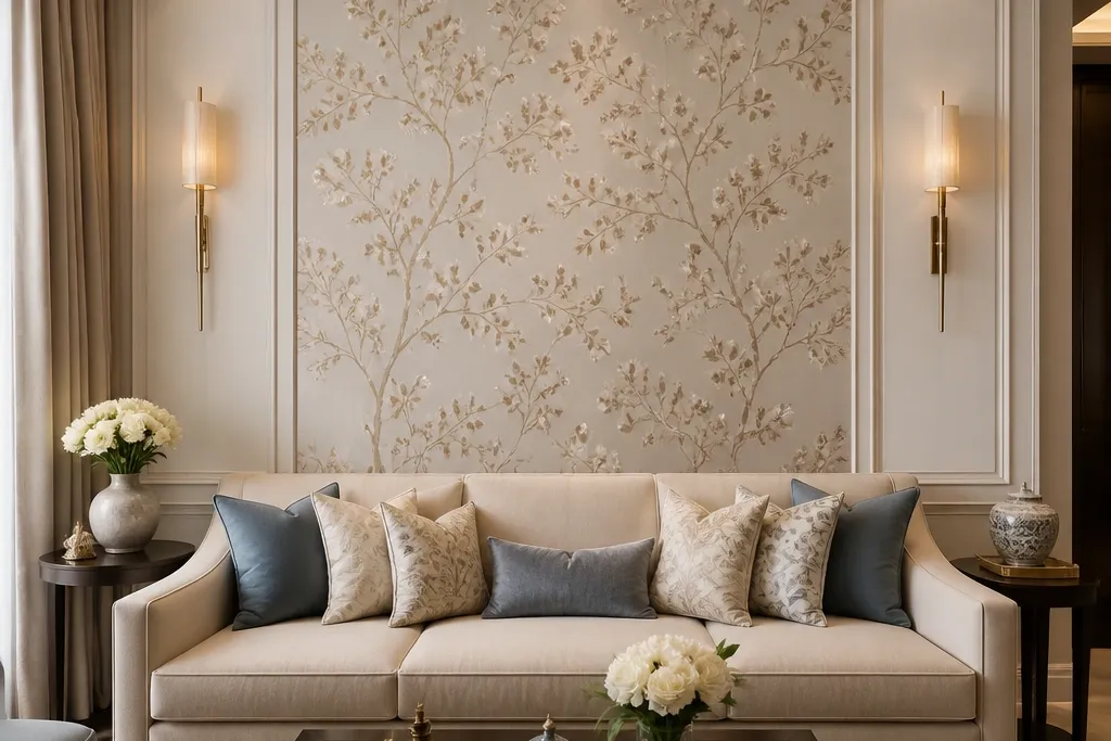
5. Bold wallpaper panel centered behind the sofa with a trim border
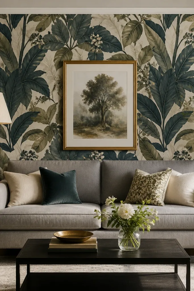
Wallpaper works best when you treat it like a painting, not a wallpapered whole room. A centered panel behind the sofa gives you drama without making the entire room look busy. I’ve had the most success with large-scale patterns paired with muted paint around the panel, especially in drawing rooms where people want a “wow” moment but still need calm to sit and talk. The border trim makes the wallpaper feel intentional and custom. This flatters sofas in solid neutrals, because the pattern becomes the star. It also works across skin tones in photos and real life since the base colors are grounded — teal, olive, cream — not neon.
Pick a wallpaper with a dominant color and two supporting tones, then decide on a panel size. Make the panel width about 65-75% of your sofa width and keep the panel height so it covers 60-75% of the sofa back height. Paint the surrounding wall first and let it cure fully. Apply the wallpaper to a smooth surface — I sand minor wall texture so the pattern doesn’t bubble. Add trim border after the wallpaper sets (lightly caulk the seams) so the edges look crisp. Hang one artwork above the sofa centered on the wallpaper panel and choose a frame color that repeats wallpaper accents, like brushed gold or dark walnut.
Good to knowBefore you glue, dry-lay the pattern strips on the floor and confirm the motif lands where you want it centered.
AvoidDon’t choose a tiny busy pattern for a big sofa wall. It makes the room feel like it’s shrinking.
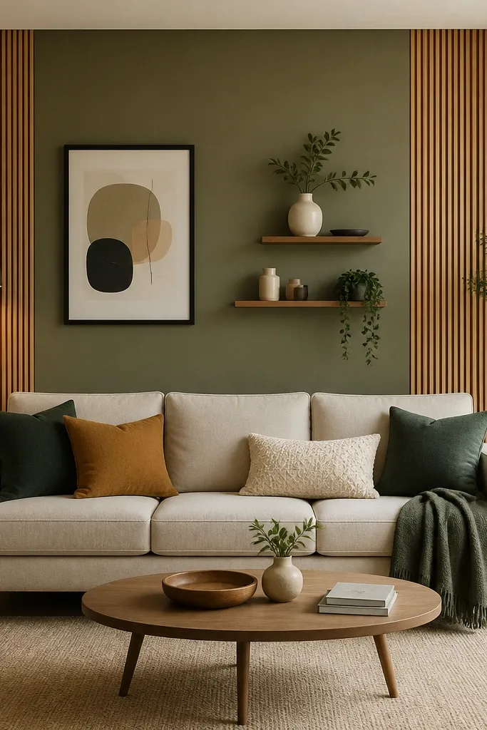
6. Vertical wood slats with a shallow ledge for styling
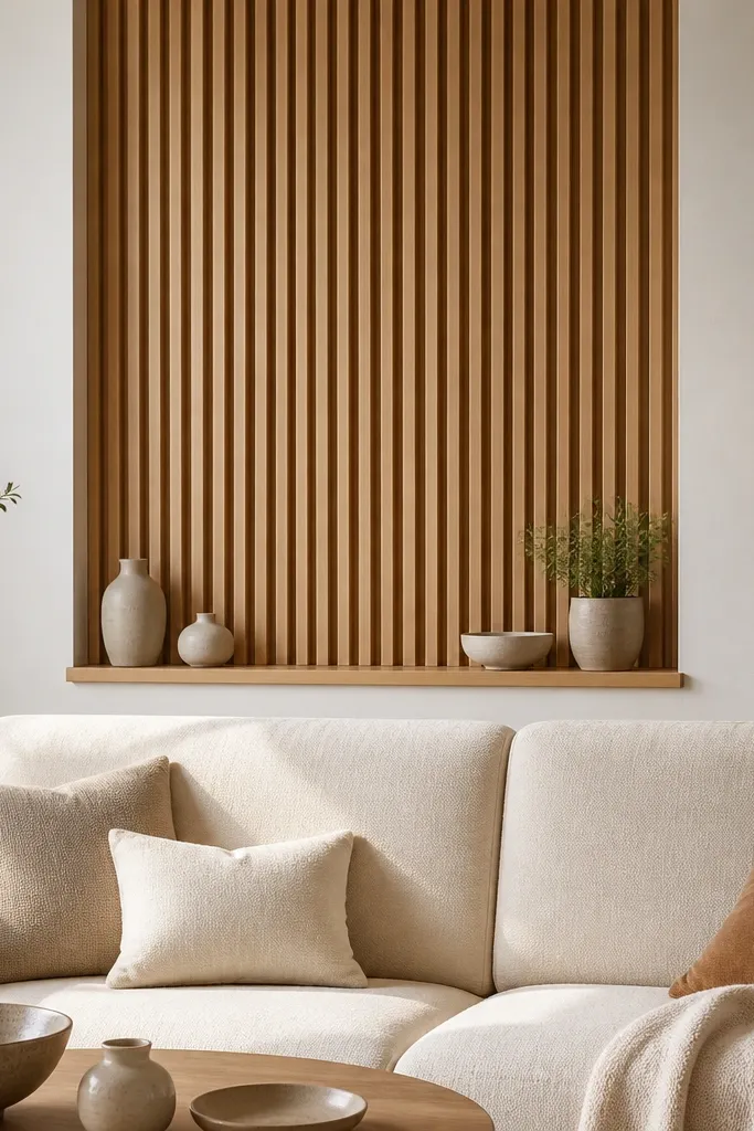
Vertical slats are my go-to when you want warmth and structure without wallpaper. The slat shadows make the wall look dimensional, and the light oak finish keeps it bright even in darker rooms. I’ve done this in narrow living rooms where people feel boxed in — the vertical lines pull the eye up and make the space feel taller. It flatters sofas with clean lines because the slats add texture without competing with upholstery details. If your throw pillows are in oatmeal, sand, or soft charcoal, wood slats tie them together instantly. The wall also photographs well because the slat shadows are consistent and not shiny.
Measure the slat section width — keep it about 70% of the sofa width. Install a flat backing board or straight rail system first, then mount slats with equal spacing (I like 1/2 inch gaps for a clean rhythm). Keep the slats height so the bottom starts about 2-4 inches above the sofa top cushion line. Build a shallow ledge shelf at the bottom using a thin wood board, then sand and finish it to match. Style the ledge with two items max: one tall (plant or vase) and one low (tray or candle holder) so the wall stays calm.
Use a matte wood finish or a hardwax oil. Gloss turns slat shadows into glare.
Don’t go with random spacing. Uneven gaps make it look like DIY clutter.
7. Linen drape wall treatment with a hidden curtain track
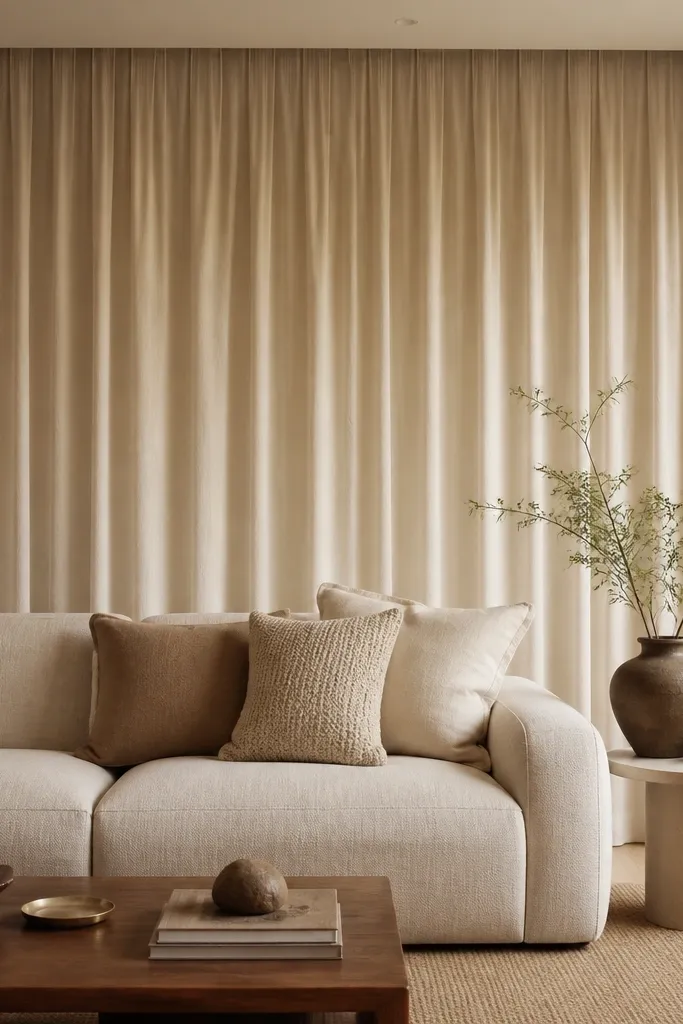
Drapes on a back wall are the fastest way to soften a formal drawing room without adding patterns. The linen fabric adds movement and texture, and the hidden track makes the top look clean. I’ve used this when the room has a large window nearby or an open layout — the drapes create a “frame” for the seating zone. It flatters sofas with strong shapes because the folds calm the visual weight. If your decor palette is mostly warm neutrals, linen drapes make everything look more cohesive and less staged.
Choose linen with enough weight to hold folds, not a thin sheerer. Mount a curtain track high — as close to the ceiling as you can without hitting crown molding. Set the drape width so each side overlaps by about 4-6 inches when closed, then hang full-length panels that cover from near the ceiling down to just above the sofa back cushion line. Use curtain rings or a track system that lets the fabric glide smoothly. Steam the linen before installing so it drops in even pleats. Style with two or three cushion textures: one smooth, one woven, one plush, so the drape doesn’t become the only texture.
Steam the fabric flat and let it dry fully before you hang it. Wrinkles lock in and ruin the fold rhythm.
Avoid hanging drapes at mid-wall height — short curtains make the room feel unfinished.
8. Two-tone paint wall with a centered vertical stripe and molding caps
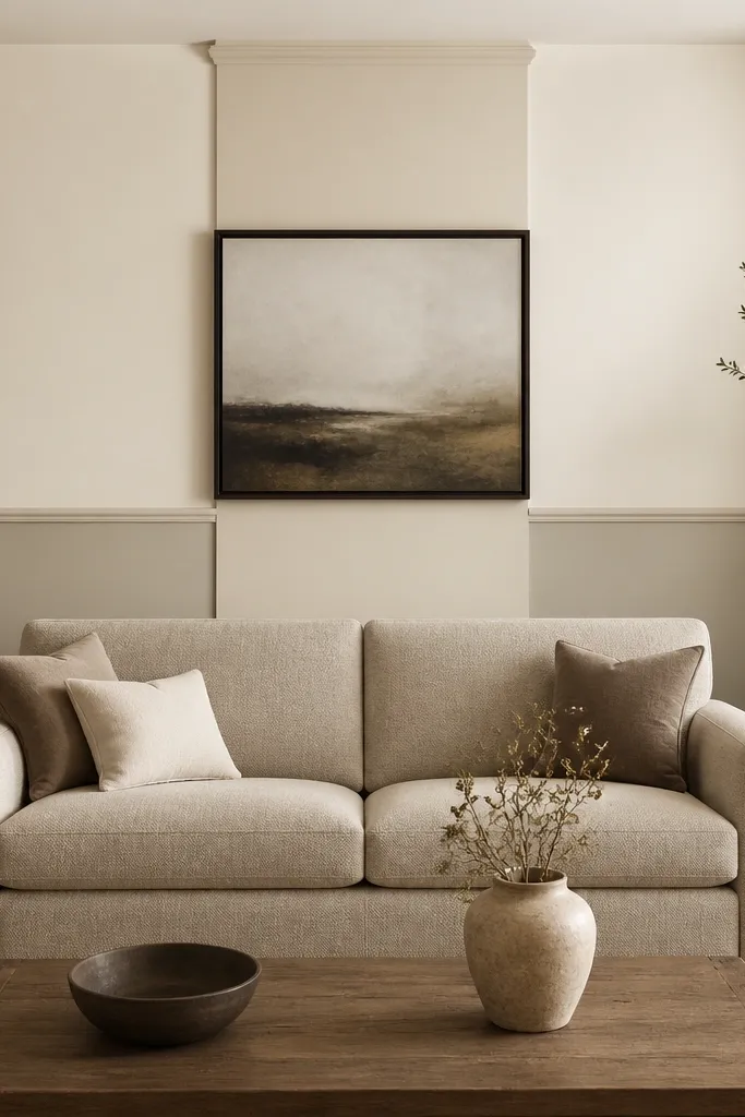
Paint can look tailored when you treat it like architecture. The centered stripe gives you focal direction, while the two-tone split adds structure and hides wall imperfections. I’ve done this in older apartments with slightly wavy plaster, and the molding caps make the design feel crisp instead of accidental. It flatters neutral sofas and rooms with simple decor because the wall becomes the design, not the accessories. The color pairing matters: choose one undertone family so the greige and cream don’t clash. In a drawing room, this kind of wall reads elegant because it’s controlled and measured.
Pick your two paint colors first and test them on the wall with sample swatches at night and morning light. Tape a horizontal line for the split at about 40-45 inches from the floor, adjusting based on how tall your sofa is. Then tape a centered vertical stripe behind the sofa that’s about 18-24 inches wide for most standard sofas (wider only if your sofa is over 90 inches). Paint the stripe in the slightly deeper tone and apply caulk at tape edges for sharp lines. Add simple molding caps at the top and bottom of the stripe using pre-cut trim pieces. Finish with a centered artwork that has a frame color that matches one paint tone — I like dark walnut or matte black.
Use a 2-inch angled brush for the stripe edges so you don’t get paint creep under tape.
Avoid mixing warm and cool undertones. The stripe will look dirty, not tailored.
9. Floating art grid with a slim ledge and mirrored accents
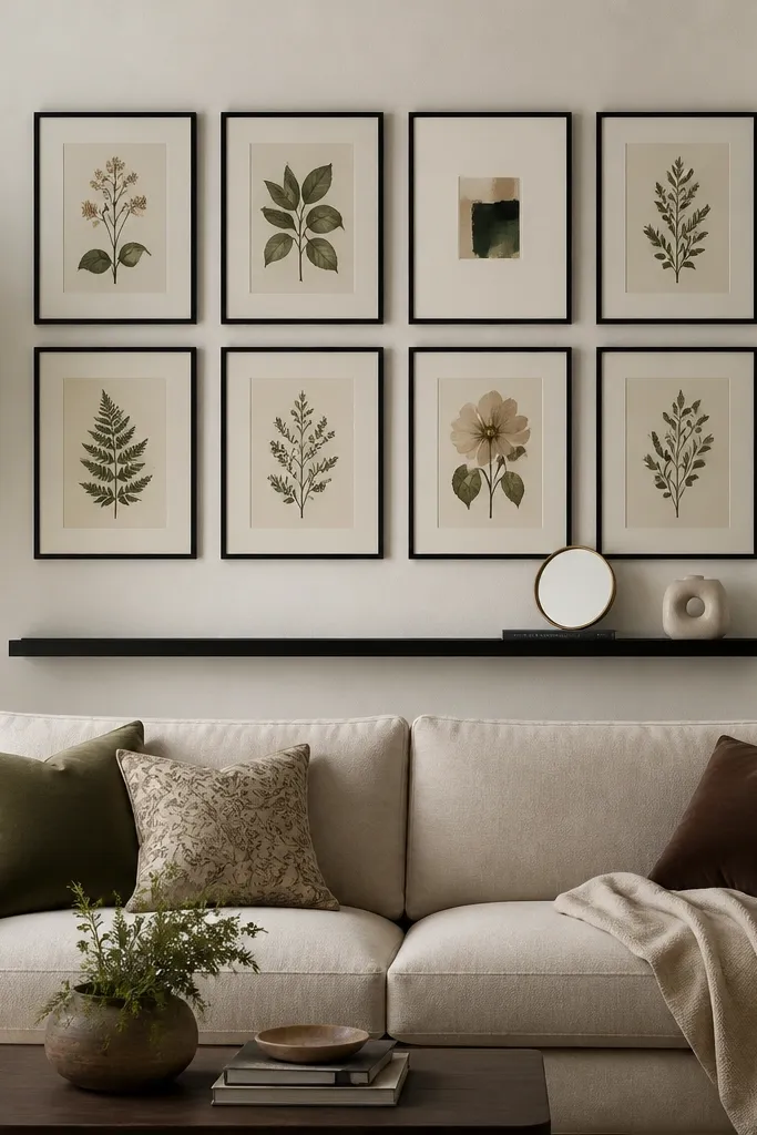
This is the option for people who love art but hate the “random collage” look. A grid gives order, and the slim black frames keep it modern without feeling cold. The narrow shelf adds a second styling layer so the wall isn’t just flat paper behind the sofa. I’ve used this in drawing rooms with patterned rugs where a full wallpaper wall would fight the floor. It flatters sofas with neutral upholstery because the grid becomes the personality. It also works for different skin tones because the art palette controls the color temperature of the whole scene.
Pick a grid size that matches your sofa width — aim for the grid to be about 55-70% of the sofa width. Use consistent frame sizes for a true grid look, or keep mat sizes uniform even if frame widths vary. Hang the grid so its center aligns around 58-60 inches from the floor. Install a slim floating ledge below the grid — about 8-10 inches under the bottom row of frames. Style the shelf with a small round mirror, one book stacked, and one small sculptural piece. Keep your shelf items within the same color family as the art so it looks like one intentional set.
Good to knowLay the frames on the floor first and measure the full grid width before you drill anything. It’s the fastest way to avoid crooked spacing.
AvoidAvoid mixing frame metals in the same grid. It reads messy even when the art is good.
10. Stone-look panel wall with a warm plaster wash
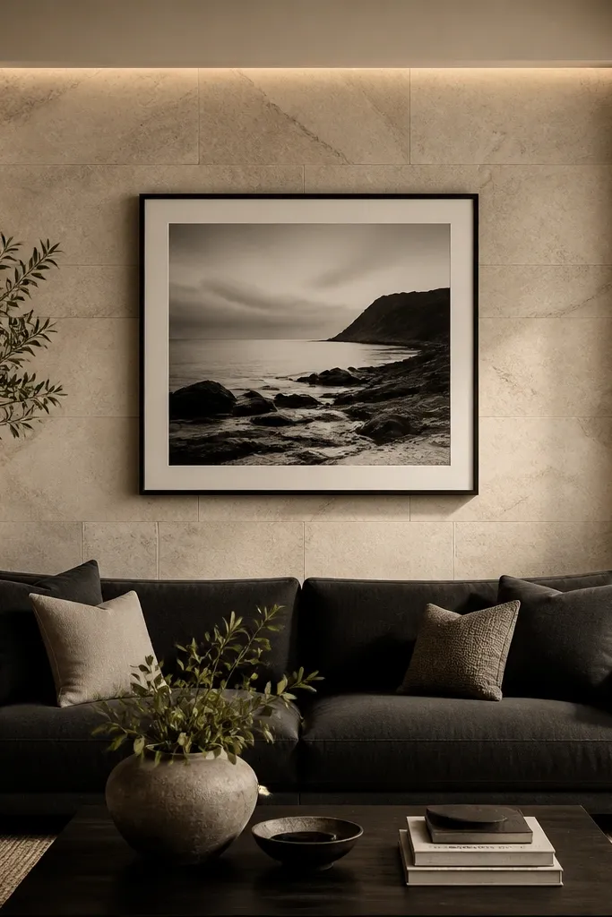
Stone-look panels create instant depth and formality, and they hide wall flaws better than paint alone. The warm plaster wash around the stone section keeps it from feeling like a cold commercial lobby. I’ve used this when the room has a darker sofa and you want a grounded backdrop without heavy wallpaper. It flatters dark upholstery because the stone’s light tones balance the contrast. In rooms with brass or brushed nickel, this panel style looks expensive because the texture catches light in a soft way. The overall look is calm and architectural, not loud.
Choose stone-look panels in light limestone tones with subtle gray veining. Cut and mount the panels on a flat backing board or directly to the wall if it’s smooth. Keep the stone section width around 60-75% of the sofa width and set the top so it covers about 70% of the sofa back height. Paint the surrounding wall in a warm off-white and frame the stone with simple trim or a painted edge with caulk for clean lines. Center a single large photograph above the sofa — wide enough that it doesn’t feel like it’s floating. Finish with warm wall lighting or a nearby floor lamp aimed slightly upward to make the stone veining show.
Use a matte sealer on panels if they feel too absorbent or dusty. It makes cleaning easier and keeps the surface consistent.
Avoid high-gloss stone finishes. They look plastic under warm bulbs.
11. Oversized fabric wall paneling with nailhead trim
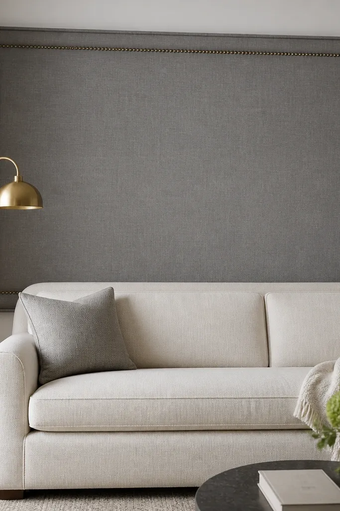
Upholstered wall panels are the comfort choice that still looks formal. The nailhead trim gives a tailored edge, and linen keeps it breathable-looking instead of shiny. I’ve installed this look in drawing rooms where people sit for long conversations, and the wall’s soft texture makes the whole space feel calmer. It flatters sofas with structured backs because the panel mirrors that formality. If your skin tones in the room lean warm, the linen’s beige-gray undertone works without turning everything pink or orange. It also reduces the “echo” feeling in rooms with hard floors.
Start with a panel width about 65-80% of the sofa width. Make the panel height cover about 70-80% of the sofa back height so the top doesn’t feel cut off. Use a frame backing (MDF or plywood) so the fabric stays tight and doesn’t sag. Stretch linen over batting lightly so it has shape but doesn’t look puffy, then install nailhead trim along the perimeter. Mount the panel with hidden brackets or French cleats so it sits flat. Style by keeping pillows and throws in two neutrals plus one metal — brushed brass works best with gray linen. Hang one slim artwork above, or skip art if the panel border already reads as the focal point.
Good to knowStretch the fabric tight enough that you see no ripples in raking light. That’s where the expensive look comes from.
AvoidAvoid cheap upholstery fabric that pills or shines. It looks tired fast.
12. Vertical wallpaper stripe on a painted wall for a tall-slim effect
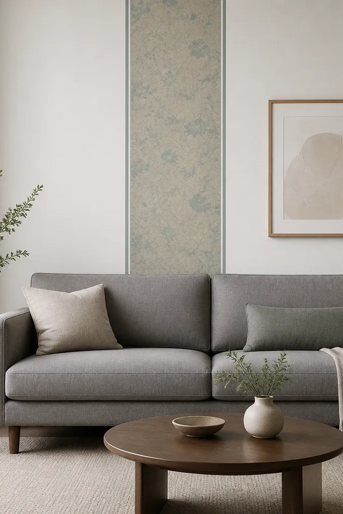
When you want elegance but you don’t want a big patterned wall, a single vertical stripe is the cleanest move. The stripe changes the room’s geometry, making the wall feel taller and more structured. I’ve used this in rooms with low ceilings where full wallpaper panels would make everything feel cramped. It flatters sofas with medium height backs because the stripe visually extends the height without overwhelming the seating area. The muted teal and beige tones give you color interest without screaming, so it works with warm skin tones and neutral decor palettes. It’s also easier to live with day-to-day than bold wallpaper covering every inch.
Pick one wallpaper stripe pattern that has a clear vertical motif. Tape the stripe placement so it sits centered and covers about 18-24 inches in width for most sofas. Apply the wallpaper strip to the wall, then add thin painted lines or trim edges on both sides so it looks framed. Keep the top of the stripe about 8-12 inches above the sofa back top and let it run close to the ceiling — don’t stop it mid-wall. Paint the rest of the wall in a warm white with eggshell finish. Hang one artwork above with a neutral frame and keep the palette limited to the stripe colors.
Good to knowUse wallpaper paste evenly and smooth with a plastic tool, not a cloth — cloth can smear pattern edges.
AvoidAvoid placing the stripe too low. If it starts at sofa height, it looks like a patch, not a design.
13. Built-in media wall look with open shelving and closed base cabinets
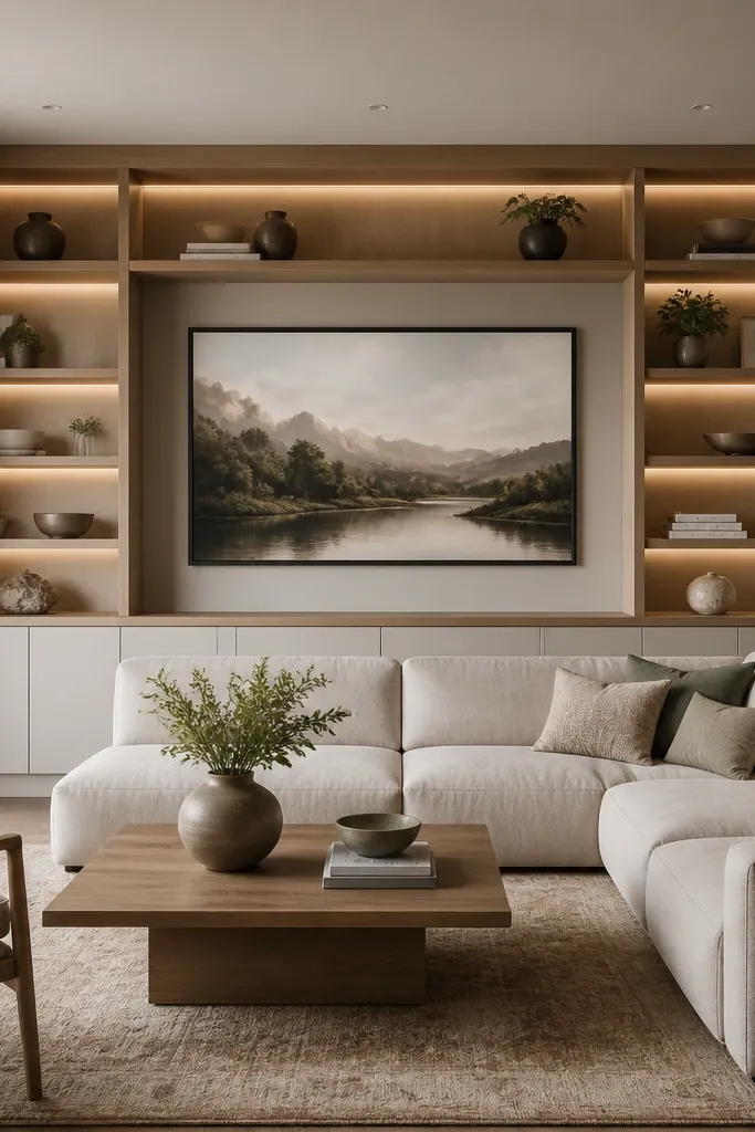
This is the “drawing room” version of a media wall. It gives you storage, display space, and a clean architectural backdrop, even if you don’t mount a TV. The open shelves add visual rhythm, while the closed base keeps clutter away from the main sightline behind the sofa. I’ve done this in living rooms that double as work areas, and it instantly makes the space feel more pulled together. It flatters sofas of any height because the wall is proportioned with a central niche. It also looks great with brass lamps and warm wood because the materials repeat across the room.
Plan the layout to match your sofa width — the center niche should align with the sofa center. Build or install cabinets with a total width around 80-90% of the sofa width, leaving small margins on both sides. Keep shelf depth shallow, around 8-10 inches, so it doesn’t feel bulky. Use recessed LED strip lights inside shelves and choose 2700K warm light. Place a large framed piece or decorative panel in the center niche so the wall has a focal point even when shelves are lightly styled. Style shelves with matching heights: one tall vase, one medium book stack, and one low tray on each side.
Use slim shelf back panels in a lighter wood or off-white. It makes items look sharper and reduces shadows.
Avoid deep shelves with thick backs. They make the wall look heavy and reduce the elegant look of the display.
14. Layered gallery with two mirrors and one statement painting
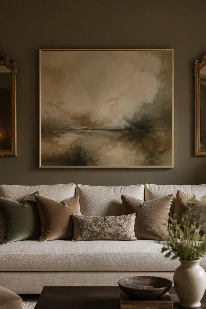
This setup gives you the “collected over time” look without looking random. The central statement painting anchors the composition, while the mirrors add light and make the wall feel bigger than it is. I like it in drawing rooms because it feels formal but still personal. It flatters neutral sofas and rooms with warm lighting because the mirrors reflect the same warm tones, keeping everything cohesive. If your painting has a mix of earthy colors, the mirrors help soften contrast and prevent the wall from looking flat. It’s also forgiving when you have imperfect wall space — mirrors hide small placement issues by reflecting the room around them.
Pick one statement painting that is about 60-70% of the sofa width and center it above the sofa. Hang it so the painting center lands around 58-60 inches from the floor. Place the two mirrors on either side and keep their top edges about 2-4 inches above the painting’s top — this creates a stacked, intentional look. Choose mirror frames in one finish only, like oxidized brass or matte black. Paint the wall in a deep warm greige or charcoal-gray to make the painting and mirrors pop without needing bright colors. Style the sofa with pillows that pull one color from the painting and one neutral that matches the sofa fabric.
Measure the mirror heights and keep them within 1 inch of each other. That symmetry is what makes it elegant.
Avoid mixing mirror shapes with no plan. Two different shapes can look eclectic in a hallway, but here it reads accidental.
15. Ceiling-to-sofa wall paneling with stepped trim for extra height
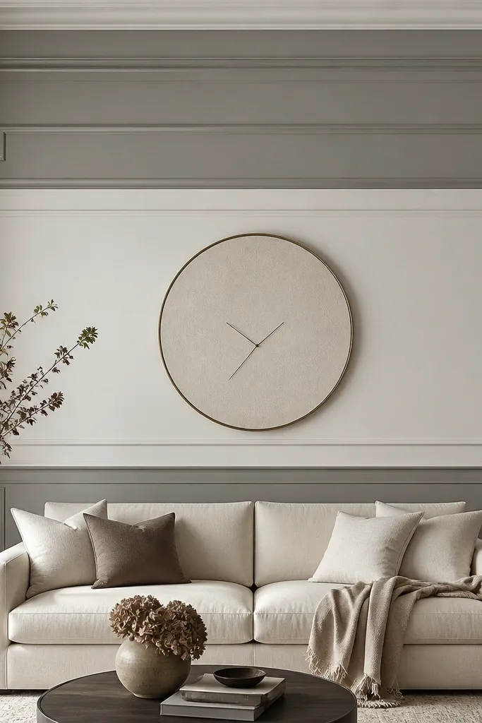
If your ceiling is higher and you want a drawing room feel, stepped trim adds height and order. The trick is that the steps are horizontal, so they create a “stair” effect that feels classic and composed. I’ve used this in rooms where plain walls made the space feel unfinished above the sofa. It flatters sofas with tufted backs or rolled arms because the trim adds structure behind the softness. The darker top band also frames the upper wall area, so the whole seating zone looks intentional. It works across neutral decor palettes and doesn’t demand a specific color scheme.
Start by choosing two paint tones: a lighter base and a slightly deeper tone for the top and bottom bands. Mark a horizontal line for the first band about 48-52 inches from the floor, then a second band line about 10-14 inches above the sofa back top. Install stepped trim using pre-cut molding — the step height should be consistent, around 1.5-2 inches. Paint the deeper bands first, then paint the panels and trim in the lighter tone for contrast. Keep trim spacing even across the wall — measure from the sofa center line outward. Hang one centered piece above the sofa or use a clock-like round art to break up the long horizontal lines.
Good to knowUse painter’s caulk at every trim seam and sand lightly after it dries. Smooth seams read expensive.
AvoidAvoid random band heights. If the steps don’t match your sofa scale, it looks like decorative clutter.