1. Tall Framed Mirror Centered Over a Low Console
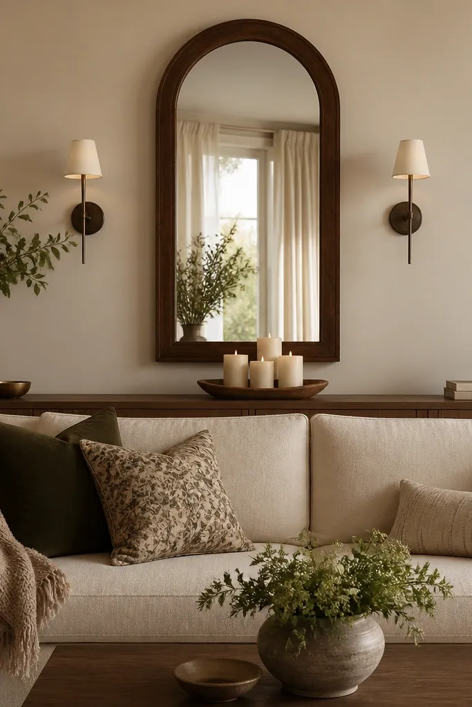
This layout works when you want the room to look bigger without adding visual clutter. I like a tall arched mirror because it pulls the eye upward and softens the straight lines of a sofa. Use a low console in the same wood tone as your mirror frame so the wall looks anchored, not floating. It flatters most living rooms because the reflective surface brightens darker corners and makes patterned rugs look more intentional. For color, I stick to warm woods with either black or bronze accents — it looks cozy in winter and clean in summer.
Start by finding your sofa back top edge, then center the mirror so its midpoint sits roughly 3-4 inches above that height line. Place the console 2-4 inches behind the sofa seat depth so it doesn’t feel cramped, then leave at least 6 inches of open wall space on both ends for balance. Style the console with one long tray, two candle heights that differ by about 4-5 inches, and one small plant or ceramic vase. Finally, swap the mirror styling each season: in winter, add a thick linen runner under the tray; in summer, use a thinner cotton runner and a lighter-colored vase.
Good to knowPut a dimmable bulb in the sconces. The mirror reflection looks dreamy at night without changing anything else.
AvoidAvoid hanging the mirror too low — if the bottom edge sits below your sofa back midpoint, it makes the sofa look squat.
2. Bookcase-Style Wall Shelves With a Warm Oak Runner
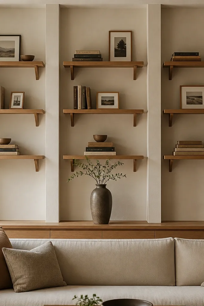
Shelves are my go-to when the room needs texture and you want something that still looks good when you change pillow colors. The bookcase look gives vertical rhythm behind the sofa, which balances taller sofa backs and makes the wall feel layered. Warm oak shelves look especially good with cream or oatmeal upholstery, and they soften gray or charcoal sofas. This design flatters rooms with neutral walls because the wood becomes the color anchor. It also gives you an easy seasonal swap: you can switch book spines and small decor without touching your big furniture.
Install the shelves in a vertical set: top shelf at about eye level when you’re seated, middle shelf 8-10 inches below, and bottom shelf close to the console height or the sofa base line. Keep the spacing between shelves consistent so it reads like one unit, not separate boards. Style each shelf with a repeated pattern: one stack of books, one frame or small art object, then a gap for breathing room. Finish by adding a long runner board or narrow ledge along the lower portion of the wall and place one tall vase centered with two shorter pieces flanking it.
Use book heights like you’d use picture frames: alternate tall-thin with short-wide so the shelf doesn’t look like a stack of identical blocks.
Don’t cram every inch. If every shelf is full, it stops looking intentional and starts looking like storage.
3. White Limewash Panels With Woven Wall Baskets
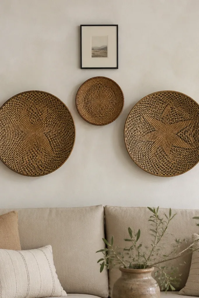
If your goal is cozy and airy, limewash-style paneling plus woven baskets is the most forgiving combo I’ve installed. The matte, slightly uneven look of limewash makes bright colors like sage or terracotta feel softer. Woven baskets add texture without looking heavy, and they keep the wall from feeling flat when your sofa is smooth or leather. This works great for people who want a dreamy vibe but don’t want more frames and glass. It also flatters warm undertones in skin tones in photos because the wall has that creamy, light-scattering quality.
Start by applying a limewash finish or using faux limewash panels on the back wall section behind the sofa. Hang the largest baskets first: place them so their bottoms sit around the same height as the sofa back lower third. Center a smaller basket above, leaving 6-8 inches between basket edges for breathing room. Add one small thin-framed print between or below the basket group, then style the sofa with one woven throw and a single textured pillow cover in natural jute or oatmeal.
Pick one basket color family — natural tan or dark brown — and keep it consistent across all sizes to avoid a mismatched look.
Avoid glossy paint finishes here. Gloss makes the baskets look dusty and kills the soft, dreamy feel.
4. Gallery Grid Above the Sofa With One Oversized Piece
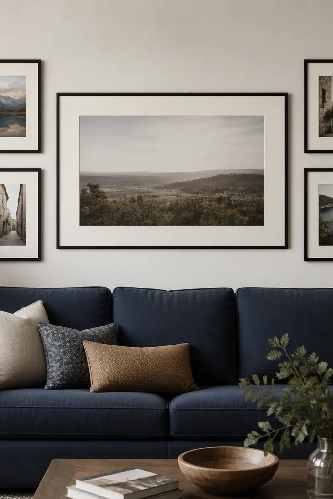
A gallery grid looks dreamy when you control the spacing and you include one oversized anchor. I like matte black frames with off-white mats because they read crisp without feeling harsh next to fabric. The oversized center piece keeps the wall from looking like a random photo wall. This layout flatters sofas in darker colors because the frames create contrast, and it also works with lighter sofas if you choose art with a warm palette. It’s especially good for people who love art but hate clutter — the grid gives order.
Measure the width of your sofa, then aim for the grid width to be about 70-85% of that measurement so it feels proportional. Mark the center of the wall, then place the oversized piece first at a height where its bottom aligns with the top third of the sofa back. Build the rest of the grid with equal gaps — I use 2 inches between frame edges as a starting point. Finally, keep all frame sizes in the same line style: same mat thickness and same frame finish, then style the sofa with two pillows that pull colors from the central artwork.
Good to knowLay the frames on the floor in a mock-up before you hang anything. I’ve gotten perfect alignment this way within one tape mark.
AvoidDon’t mix frame finishes. Black and brass together can look intentional, but random mixes look like you collected frames over time.
5. Floating Panelled Accent Wall Behind the Sofa
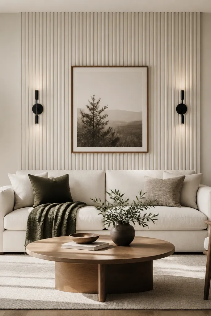
Paneling instantly makes a sofa back wall feel designed, especially when the rest of your room is simple. Vertical fluting adds height and shadows, which reads dreamy even with minimal decor. I prefer warm white panels because they don’t fight with wood flooring or brass light fixtures. This works beautifully if your sofa is a solid color and you want the wall to bring texture. It also flatters people who hate crowded walls — you get interest from the surface itself.
Use panels that are either pre-primed or easy to paint, and cover only the width of the sofa plus 8-12 inches on each side. Install so the top of the fluted panel area sits about level with the sofa back top edge. Center your framed print so it sits 2-3 inches above the sofa back midpoint. Add two matching sconces at equal distances from the center line, then keep the sofa styling minimal: one throw in a textured fabric like waffle knit and two pillows in solid tones.
Paint the panel seams the same exact finish as the panel face. A slightly glossier seam shows and ruins the softness.
Avoid dark panel paint in small rooms. The shadows get heavy fast behind a sofa.
6. Narrow Console + Stacked Candles and One Oversized Vase
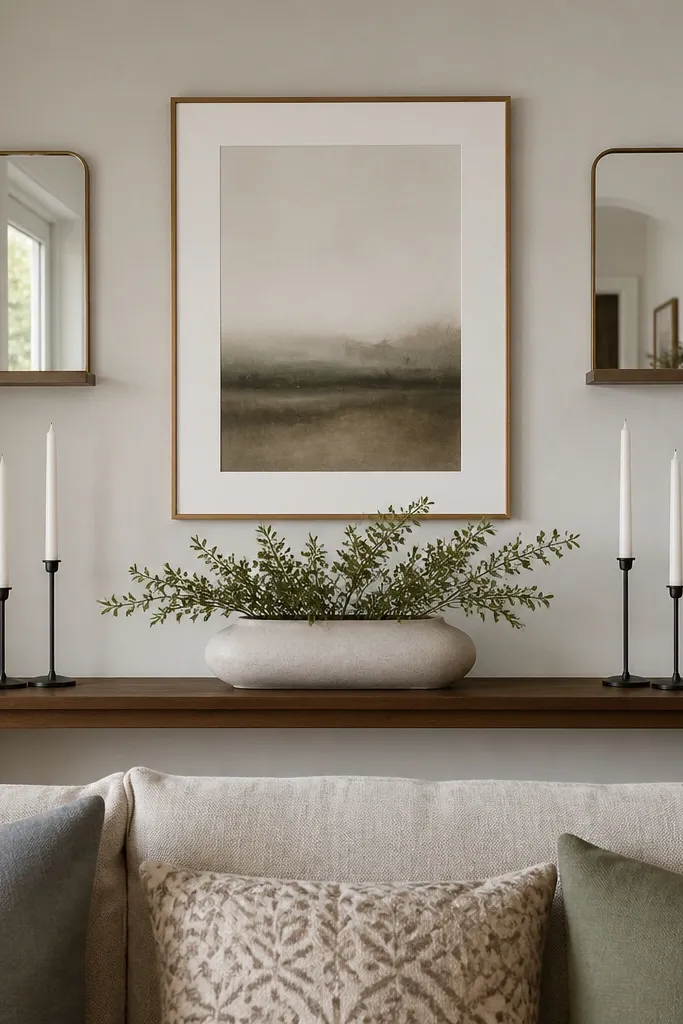
This is the “quiet luxury” version of a sofa back wall, and it’s one of my favorites for all-year styling. The trick is using fewer objects but giving them height and spacing. A narrow console prevents the wall from feeling blocked, and candles give a warm glow that looks dreamy in fall and winter. Pair it with a single centered art piece so the wall doesn’t compete with patterns in pillows or rugs. This layout flatters rooms with busy textiles because it keeps the background clean.
Pick a console depth of about 8-10 inches so it doesn’t feel chunky behind a sofa. Center a single vase on the console and choose a height that reaches just above the sofa back top edge. Place two candle holders on either side about 6-8 inches shorter than the vase height, then center your artwork above at least 3 inches above the sofa back midpoint. For seasonal swaps, switch the vase liner or floral stems: dried wheat and pine in winter, eucalyptus and light cotton stems in spring.
Good to knowUse candle holders in the same metal finish as your lamp bases. It ties the whole room together without adding more items.
AvoidAvoid mixing too many small decor pieces. The wall looks messy when everything is short and crowded.
7. Two Symmetry Sconces With a Center Floating Shelf
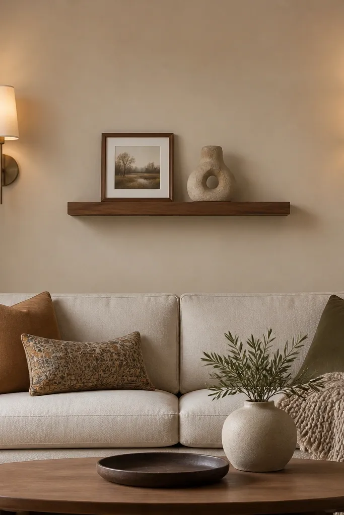
Symmetry makes a sofa back wall look calm and intentional, even if your decor changes. I love two matching sconces because they create a clear lighting focal point and they look good in every season without swapping much. The center floating shelf gives you a place for small seasonal items — a tiny wreath in winter, a ceramic bud vase in summer. This layout flatters people who want a dreamy look but don’t want big art installations. It also works well if your room has limited wall width since the shelf is narrow.
Mark the center of the wall and install sconces so their inner edges sit about 12-16 inches from the center line. Hang the floating shelf centered, with the shelf bottom about level with the sofa back midpoint. Keep the shelf items small: one framed photo or small art piece and one sculpture no taller than the frame. Style the sofa with a throw that echoes the sconce finish and add one seasonal color pillow to match the ceramics on the shelf.
Good to knowIf you can, choose sconces with warm bulbs around 2700K. The wall glow makes everything look cozy instantly.
AvoidAvoid mismatched sconce heights. One side higher makes the symmetry look accidental.
8. Oversized Woven Wall Hanging With a Skinny Picture Ledge
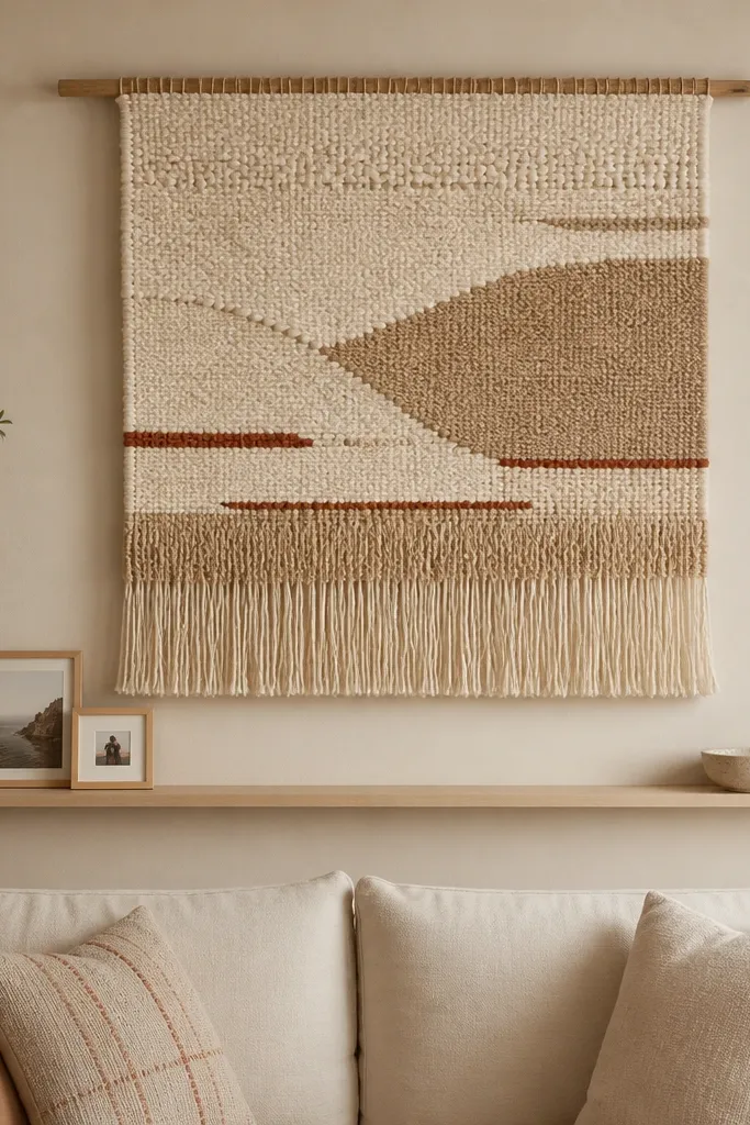
A woven wall hanging is one of the fastest ways to get dreamy texture without glass reflections. I like an oversized piece because it fills the wall behind the sofa and makes the whole room feel styled, even with minimal furniture. The skinny picture ledge below keeps the wall from feeling empty and gives you a place for small, changeable decor. This works best if your sofa is solid color and your wall is light enough to make the weaving pop. It also flatters warm skin tones and golden lighting because the fibers catch light softly.
Hang the woven piece so its bottom sits around the top third of the sofa back, not down near the seat cushions. Use a centered placement with enough width that the edges fall within the sofa’s arm-to-arm visual span. Install a narrow ledge 6-8 inches below the woven hanging so you can place small frames without crowding. On the ledge, place two frames with one vertical and one horizontal orientation, then style a small bowl or tray with one seasonal item.
Good to knowSteam the woven hanging lightly before hanging. It relaxes the fibers and makes the pattern look crisp.
AvoidAvoid hanging it too high. If the bottom edge sits above the sofa back top, it reads disconnected.
9. Large Textured Canvas Diptych for a Soft Back Wall
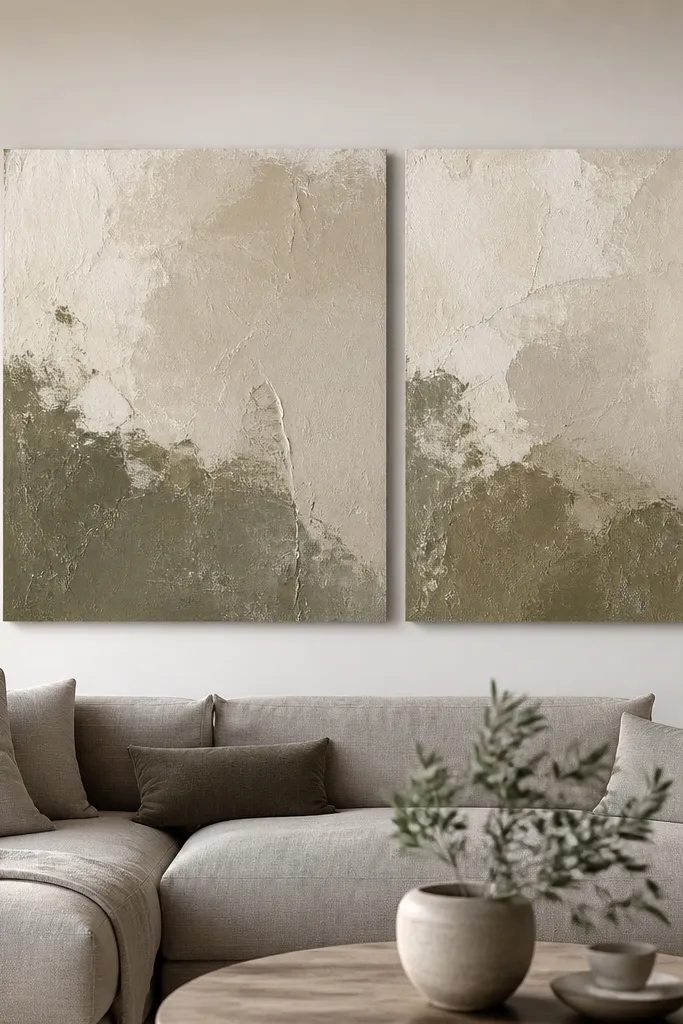
Texture reads dreamy even when the colors are calm. A diptych gives you a big visual statement without the busy feel of multiple frames. I like thick, sculptural canvas because it catches shadows from lamps, which changes the look from day to night. This layout flatters modern sofas with straight lines and it also works with traditional rooms because the texture is the star. If you pick muted olive and oat tones, it looks good all year with both spring florals and winter throws.
Choose two canvases that together span about 60-75% of the sofa width. Hang them so the combined center line is exactly centered on the wall and the top of the pair sits 3-5 inches above the sofa back top edge. Keep the gap between canvases small, around 2-3 inches. Style the sofa with one textured throw in a similar neutral and use pillows that repeat one color from the canvas, like oat or muted olive. For seasonal changes, swap only the throw pattern — knit in winter, linen weave in summer.
Wipe the canvas surface with a dry microfiber cloth before hanging. Dust makes textured paint look dull.
Avoid glossy canvases. The glare kills the shadow play that makes this look dreamy.
10. Wall-Mounted Media Shelf With Plant Ladder
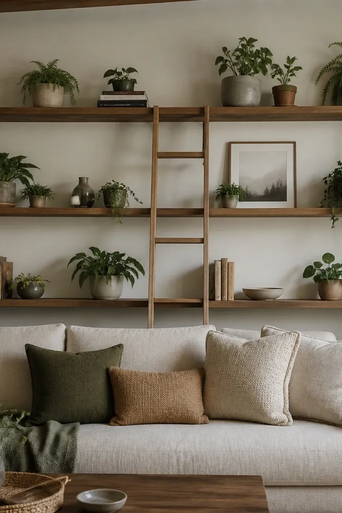
If you want your sofa back wall to feel alive year-round, build it like a plant ladder. This gives you height and movement without adding a lot of small items. I’ve used this in rooms where the sofa is the only big piece and the wall needs personality. Plants also help the wall feel fresh in spring and more grounded in winter when you swap to fuller, darker greens. It flatters neutral rooms because the greenery adds color without clashing.
Plan shelves at three heights: one just above the sofa back midpoint, one close to the sofa back top edge, and one higher near eye level. Space each shelf so pots have room to breathe — about 6 inches minimum between pot rims and the shelf edges. Center the shelf system behind the sofa, then place taller plants on the top tier and shorter ones on the lower tier. Style with books stacked flat and one framed print near the center to stop the decor from looking like it’s only plants. Swap seasonal plants: brighter chartreuse accents in spring, deeper olive and burgundy tones in fall.
Use self-watering planters inside decorative pots. Your plants will look full even when you travel.
Avoid tiny pots on the top shelf. They look like afterthoughts at that height.
11. Matte Black Peg Rail With Hanging Art and Lamps
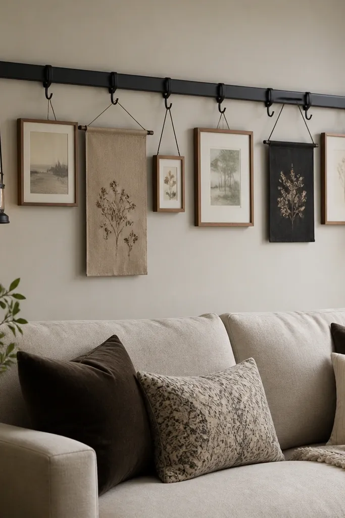
This is the “I want to change it often” design, and it looks dreamy because it has built-in flexibility. The peg rail creates a structured grid behind the sofa, so even when you swap artwork, it stays organized. Matte black works with most upholstery colors, and the hanging pieces cast gentle shadows. This layout flatters people who like a rotating gallery, like seasonal prints or themed art. It also helps rooms with odd wall dimensions because you can adjust placement without patching holes.
Install the peg rail centered behind your sofa, with the rail’s bottom about 4-6 inches above the sofa back midpoint. Hang two lantern-style lamps or small light fixtures symmetrically if you have power nearby, then add your art with hooks so the top edges line up. Use frames with thin profiles so they don’t look bulky against the rail. For styling, keep one fabric piece and one photo on each side, then place one small tray or candle on the sofa side table to balance the wall’s weight.
Good to knowUse the same frame color for every piece you hang on the peg rail. The rail already gives structure; the frames should look like they belong together.
AvoidAvoid mixing heavy wood frames with lightweight fabrics. The wall looks uneven and careless.
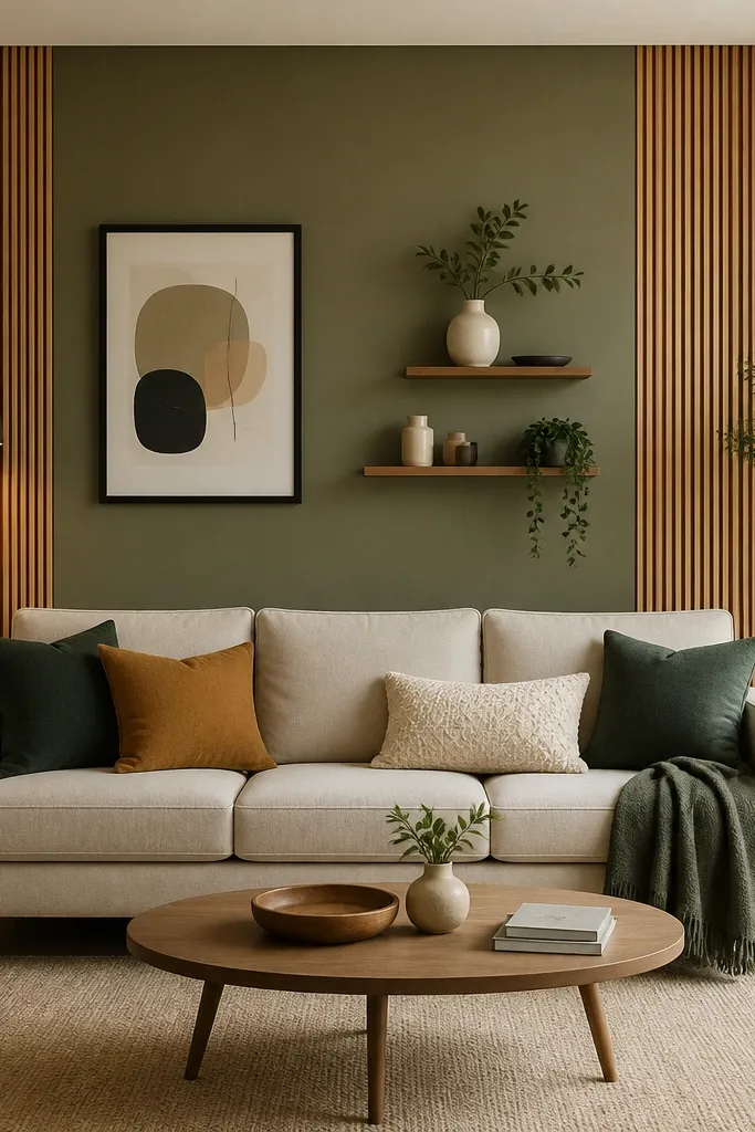
12. Painted Color Block Panel in Soft Sage With One Big Frame
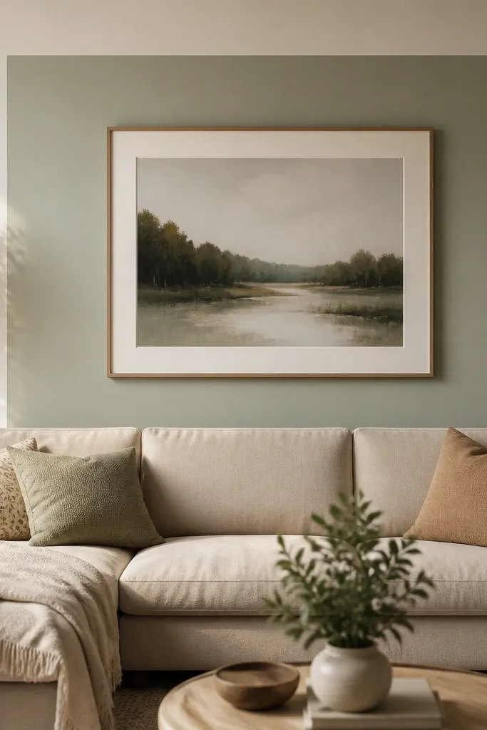
Color blocks make the whole room feel finished fast, and they’re easy to keep dreamy all year by changing the one thing inside the block. Soft sage is my favorite because it looks calm in winter and fresh in summer. The single large frame keeps the design from turning into clutter, and the contrast between the sage panel and the warm wall makes the art pop. This works best with neutral sofas and light floors because the color block becomes the star. It also flatters rooms with limited wall space since you’re focusing on one clean rectangle.
Tape off a rectangle behind the sofa center, aiming for a width about 65-75% of the sofa width. Paint it soft sage, then let it dry fully before removing tape so edges stay crisp. Hang one large frame centered in the block, with the bottom of the frame about aligned with the sofa back top third. Keep the frame finish consistent with your room accents — I like black or warm wood. Style the sofa with two pillows: one solid that matches the sage undertone and one in a cream or oatmeal texture, plus a throw in a neutral that ties to your floor rug.
Use a semi-matte paint for the panel. It catches light without showing every brush mark.
Avoid dark, saturated color blocks if your room gets little daylight. The wall can feel heavy instead of dreamy.
13. Three-Panel Wall Art Roll-Up Look With Fabric Swatches
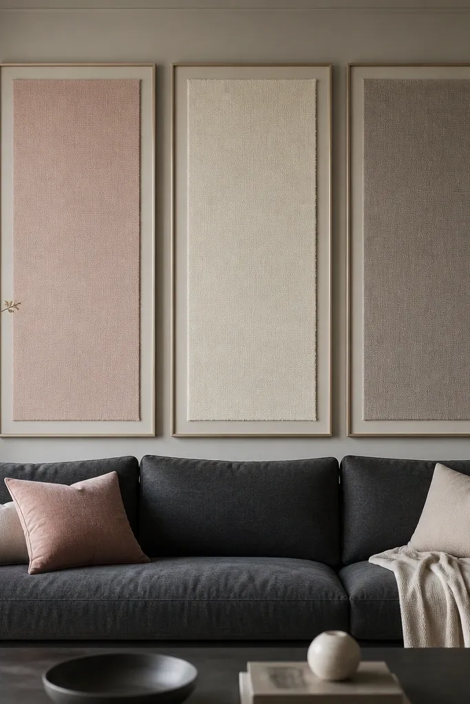
This layout is for when you want a dreamy wall that looks soft up close. The triptych fabric panels add warmth and hide the “blank wall” problem without relying on glossy art. I like using fabric swatches because you can match your existing throw and pillow textures exactly. Charcoal sofas look especially good with blush and warm gray tones because it gives contrast without going loud. This also flatters homes where you don’t want more frames — the panels look like one artwork piece.
Pick three panels that match in size, with the total width about 60-70% of your sofa width. Mount them so the center panel is exactly centered, and keep equal gaps between panels around 2-3 inches. Choose fabric colors that repeat from your textiles — for example, blush from a pillow cover and warm gray from a throw. Frame them in simple matte finishes so the fabric texture stays the focus. Style the sofa with pillows that match the fabric tones and add one solid throw to prevent the wall from competing with patterns.
Use ironed fabric before mounting so you don’t trap wrinkles in the frame.
Avoid using shiny fabrics like satin in the panels. They reflect light and look less soft.
14. Shiplap-Inspired Faux Plank Wall With Linen Wreath
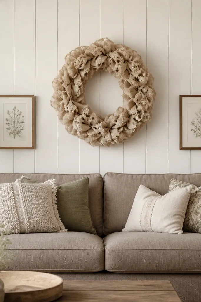
Faux plank walls bring cottage warmth without needing a full renovation. The off-white planks create shadow lines that feel dreamy even when you keep decor simple. A linen wreath adds softness and works across seasons because you’re not locked into one flower color. This layout flatters neutral sofas and rooms with wood floors because the planks match the natural warmth. It’s also a good choice for people who want texture but hate too many shelves.
Cover only the section behind the sofa so the planks don’t visually squeeze the room. Install faux planks vertically or with shiplap-inspired lines, then paint them off-white with a matte finish. Hang the linen wreath centered, with its bottom about level with the sofa back midpoint. Add two small framed prints lower on either side, leaving 6-8 inches between the wreath and the frames. Swap the wreath insert: in winter, add dried eucalyptus stems; in summer, use lighter dried grasses or a simple fabric bow in a muted color.
Good to knowUse a wreath hook rated for the wreath weight plus the door thickness if you’re mounting on drywall.
AvoidAvoid planks painted bright white. It can look sterile next to warm upholstery.
15. Floating Gallery Ledge With Layered Leaning Frames
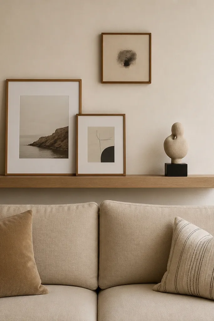
A floating gallery ledge is a sneaky way to add depth without installing a full console. I like it because it creates a “styled shelf” look that still feels open, and it’s easy to adjust for seasons. Leaning frames add casual charm, while the small centered artwork above keeps it from looking messy. This works best for sofas with low arms or lighter colors because the ledge adds the visual weight. It also flatters rooms where you want dreamy texture but limited floor space.
Mount the floating ledge so its top sits around the sofa back midpoint, then leave enough clearance so the ledge doesn’t block sightlines to your window. Center the small artwork above the ledge, with the bottom of the artwork about 4 inches above the ledge. On the ledge, place two leaning frames with a small gap between them, then add one sculpture or vase in the center. Keep frame finishes matching. For seasonal swaps, change the leaning frames' prints or swap the small vase — use dried florals in winter and airy stems in summer.
Good to knowUse museum putty or small frame stands so the leaning frames don’t slide when you dust.
AvoidAvoid ledges that are too deep. If it’s bulky, the wall looks crowded and heavy.
16. Mirrored Wall Panel Behind the Sofa With Brass Trim
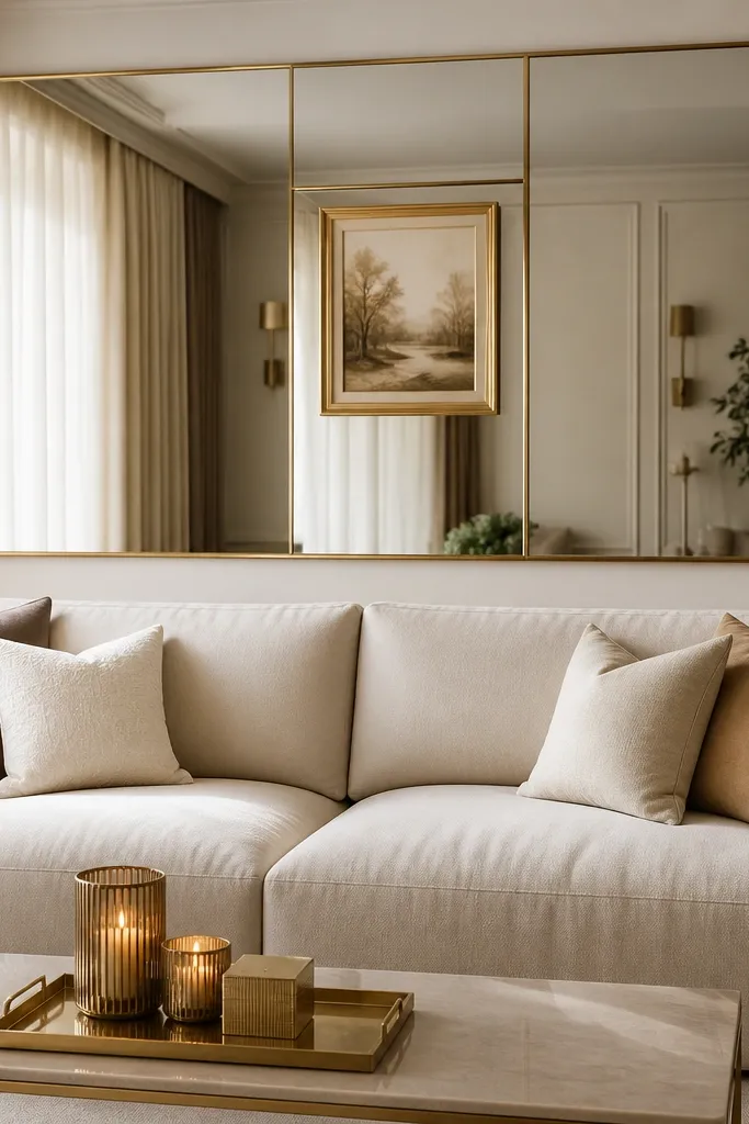
Mirrors behind a sofa are dramatic, but the dreamy version is controlled: one large mirrored panel with thin trim and minimal objects. I’ve used this in rooms that feel dark because the mirror multiplies light and makes the wall feel deeper. Brass trim adds warmth so it doesn’t look cold. This layout flatters sleek sofas and modern interiors, and it also makes patterned rugs look crisp. If you keep styling minimal, it stays dreamy instead of flashy.
Choose a mirrored panel width that covers about 70-80% of the sofa back area and install it centered. Add thin brass trim around the edges or use a mirror with built-in trim for a clean look. Place one centered framed piece or a small wall art object within the mirror area, keeping it small enough that the mirror still does the work. Style the low surface with one tray, two candle heights, and a single ceramic vessel. Swap seasonal decor by changing the candle color holders and one small floral stem arrangement, not the core layout.
Good to knowWipe the mirror with a microfiber cloth and a little glass cleaner before styling. Fingerprints show fast on brass-trim mirrors.
AvoidAvoid placing too many small decor items on mirrored surfaces. It turns into visual noise.
17. Vertical Picture Rail With Mix-and-Match Frames
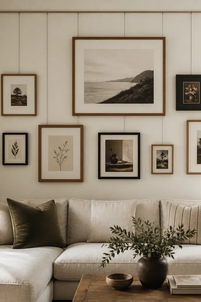
A picture rail is the most practical way to keep a dreamy sofa back wall changing all year without re-measuring. I use it when clients want seasonal updates but hate drilling new holes. The vertical rail creates an organized “system” so the frames look curated even when the content changes. This layout flatters eclectic art tastes because you can mix sizes and still keep spacing consistent. It also works in rental homes since you can remove the frames later and patch tiny holes.
Install the picture rail so it sits about 2-3 inches above the sofa back top edge. Hang a large print first at the top center, then add smaller frames around it using the same rail points for spacing. Keep the distance between frames at about 2 inches so the wall looks planned. For seasonal swaps, rotate prints every few months: winter landscapes or warm abstracts in cold months, lighter florals or airy neutrals in spring. Style the sofa with pillows that echo one color from the dominant frame so the wall and seating feel connected.
Take a quick photo after you hang it. When you rotate prints later, you can match the spacing fast.
Avoid hanging frames with different depth and glass types. The reflections can make the wall look uneven.
18. Oversized Wall Clock With Two Small Mirrors
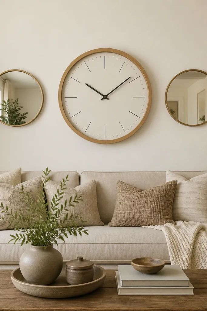
This design is dreamy because it mixes function and softness. A large clock gives you a clear focal point that stays steady all year, so you don’t have to keep replacing art. The two small mirrors add sparkle and help the wall feel lighter, especially in rooms with overhead lighting. I recommend a light wood clock frame if your room has warm floors or wood furniture. This works beautifully for families because the wall has a practical anchor and it still looks styled. It also flatters sofas with neutral upholstery because the clock brings warmth and contrast.
Choose a clock diameter that spans about 25-35% of the sofa width, then center it on the wall. Hang the clock so its center sits around the sofa back top edge height. Place two small round mirrors symmetrically at equal distances from the clock center line, with the mirrors' centers slightly below the clock’s center by about 6-8 inches. Keep mirror frames in the same finish as the clock frame for cohesion. Style the sofa with one patterned pillow and one solid pillow that matches the clock frame tone.
Good to knowUse a clock with a quiet mechanism if you sit close to it. A ticking sound can ruin the cozy vibe at night.
AvoidAvoid mixing mirror frames in different metals. It makes the wall feel careless.
19. Hanging Fabric Panels on a Track Above the Sofa
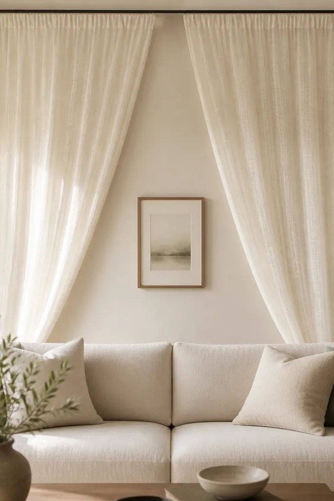
Hanging fabric is dreamy in a way photos don’t capture: it softens light and makes the wall feel like it has movement. I’ve used this in rooms where the wall is bare and the sofa is sleek, like leather or smooth velvet. Choose sheer or semi-sheer fabric so the light from a nearby lamp glows through it. This layout flatters compact living rooms because it adds softness without adding bulky objects. It’s also one of the easiest ways to do all-year style — swap fabric weights and colors by season.
Install a ceiling track centered above the sofa, with the track length slightly wider than the sofa back width. Hang two panels so they fall to about the top third of the sofa back, not down near the cushions. Use fabric in a neutral tone: ivory in winter, slightly warmer cream or light linen in summer. Add one small centered framed print or a narrow wall art piece below the fabric midpoint so the wall still has a defined anchor. Style the sofa with two pillows that match the fabric tone and add one textured throw for contrast.
Good to knowUse a light steamer on the fabric after hanging. Crisp fabric lines look expensive.
AvoidAvoid heavy blackout fabrics behind a sofa unless your room is large. It can make the space feel closed in.
20. Wall-Hung Rattan Screen With a Center Art Piece
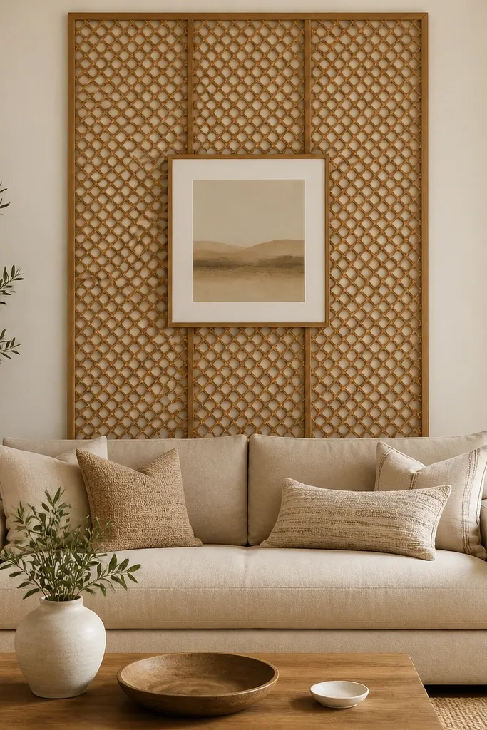
A wall-hung rattan screen gives you texture plus a built-in backdrop that stays interesting from every angle. I like it behind a sofa because it frames the seating area without taking up floor space. The open lattice makes the wall feel airy, and it pairs well with both warm and cool color palettes. This design flatters people who want a dreamy vibe but don’t want to style shelves. It also makes your seasonal decor easier because the screen already provides a natural pattern that works with florals and greenery.
Hang the rattan screen centered behind the sofa, with its bottom edge around the sofa back lower third. Keep the screen width close to the sofa width so it reads like part of the architecture. Add one centered framed art piece above the screen or slightly overlapping the top edge, keeping it simple with a thin frame. Style the sofa with one rattan or woven accessory on a nearby side table if you have one. For seasonal changes, swap the art print and add one small greenery arrangement that doesn’t hide the lattice pattern.
If the screen is slightly wavy, gently steam it and let it dry flat before mounting.
Avoid screens that are too dark. Dark rattan can swallow light and make the wall feel heavy.
21. Shadow-Box Wall With Seasonal Inserts
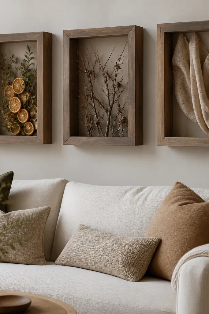
Shadow boxes make the whole wall feel like it changes with the seasons, but you only do the work once per season. I like three boxes because they create a simple rhythm without looking like a random collection. The deep frames hide mess and protect delicate decor. This is dreamy for people who like seasonal styling but hate replacing big art pieces. It also works well with light sofas and neutral walls because the inserts add color from inside the frame.
Mount three shadow boxes centered behind the sofa, with the middle box at about sofa back midpoint height and the top and bottom boxes staggered by 6-8 inches. Keep box widths consistent so the grid looks intentional. Insert seasonal items in a neutral base color: dried botanicals for winter, light florals for spring, and small natural objects like shells or seed pods for summer. Use clear mounting tape or museum gel dots on the back panel so items don’t shift. Style the sofa with pillows that match one insert color and keep everything else plain.
Good to knowPut the same ribbon or fabric strip color inside every box. It keeps the wall cohesive even when the insert changes.
AvoidAvoid bulky inserts that touch the glass. They can look cramped and create uneven reflections.
22. Layered Wall Panels With a Center Statement Artwork
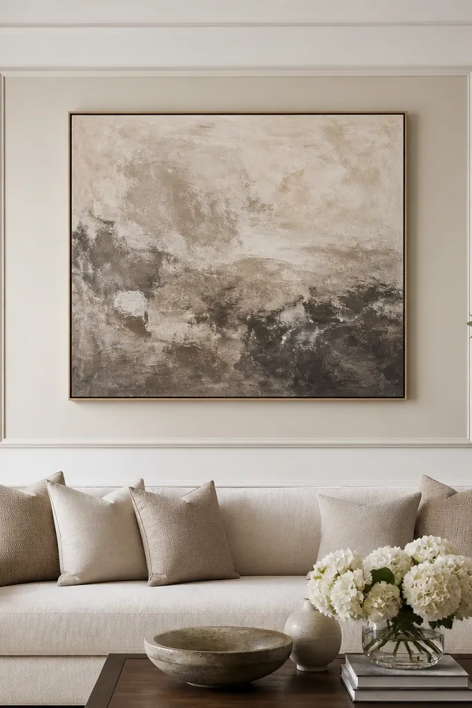
This is the “architectural” look without building a full built-in. Layered panels create depth and shadow so even plain decor looks dreamy. I like off-white on off-white because it’s soft and it works with almost any sofa color. The center statement artwork stays the focus, and the layered frame makes it feel like it belongs to the wall. This flatters living rooms with simple furniture because the wall brings the detail. It also looks good in photos because the depth catches light from different angles.
Create a two-layer panel system using picture frame molding or foam molding: mount the outer rectangle first so it spans about 70% of the sofa width. Add an inner raised frame rectangle centered inside the outer one, leaving a consistent gap around the inner border. Paint both layers the same off-white family but different tones — one slightly warmer and one slightly cooler. Hang your statement artwork centered inside the inner frame, with the artwork top about level with the sofa back top edge. Style the sofa with two pillows in neutral tones and one accent pillow that matches a color from the artwork.
Good to knowUse a level and measure from the sofa center line, not from the wall edges. Walls are rarely perfectly square.
AvoidAvoid thick, chunky molding in small rooms. It can feel heavy behind a sofa.
23. Monochrome Textured Wallpaper Stripe Behind the Sofa Center
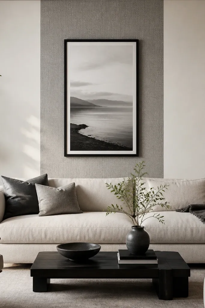
A single textured stripe keeps your wall interesting without turning the whole space into a pattern fight. I like monochrome gray textures because they add depth while staying calm next to any pillow colors. The stripe behind the sofa center acts like a spotlight, making your sofa look like the main attraction. This flatters modern and traditional rooms because texture is timeless, and it gives dreamy contrast against smooth walls. It also works when you don’t want to commit to a full accent wall.
Choose a textured wallpaper stripe width around 18-24 inches for most living rooms. Apply it centered behind the sofa, so it aligns with the sofa’s center. Hang one large framed print centered above the stripe, with the bottom edge around the sofa back top third. Keep frame finish consistent with your room accents, like black or warm wood. For seasonal styling, change pillow covers and keep the wall stripe and frame the same — in winter use thicker knits and in summer switch to linen or cotton.
Good to knowPress seams carefully with a wallpaper roller so the texture stays crisp and doesn’t peel at edges.
AvoidAvoid choosing a stripe with a loud contrast pattern. Subtle texture looks dreamy; bold pattern can feel busy.