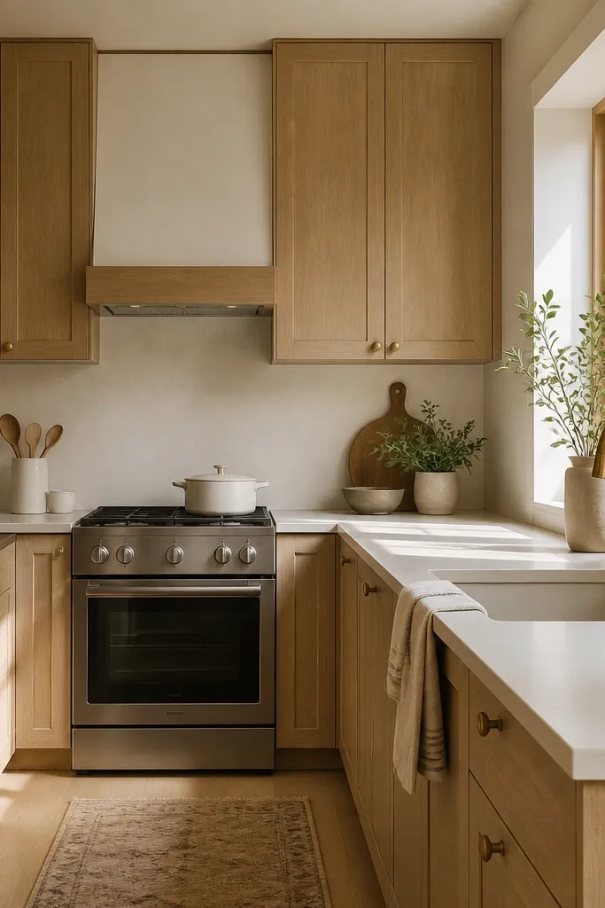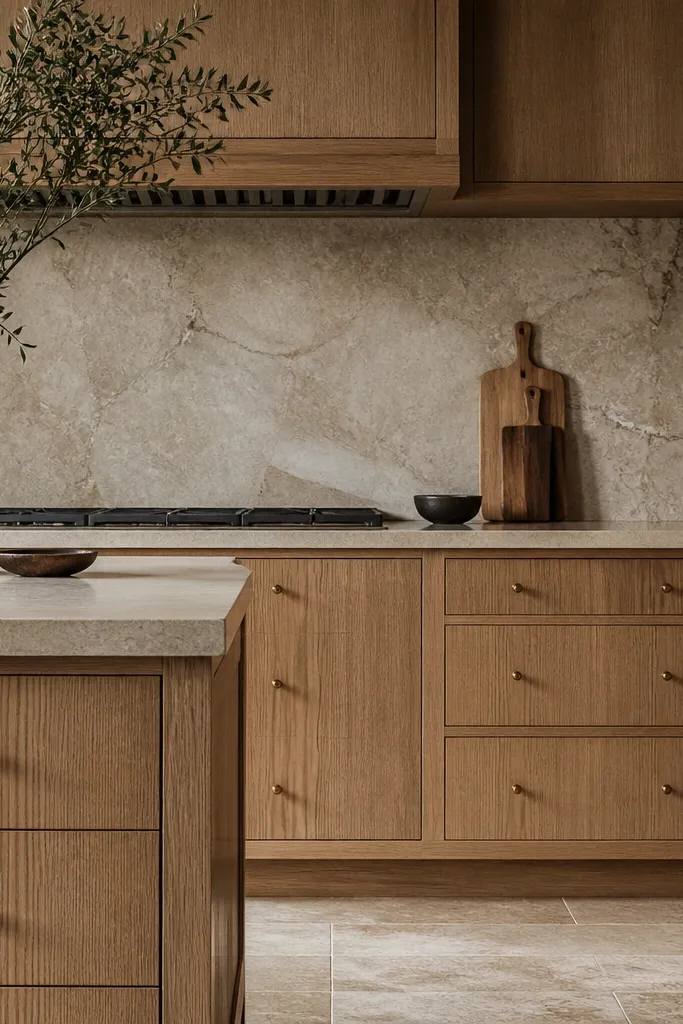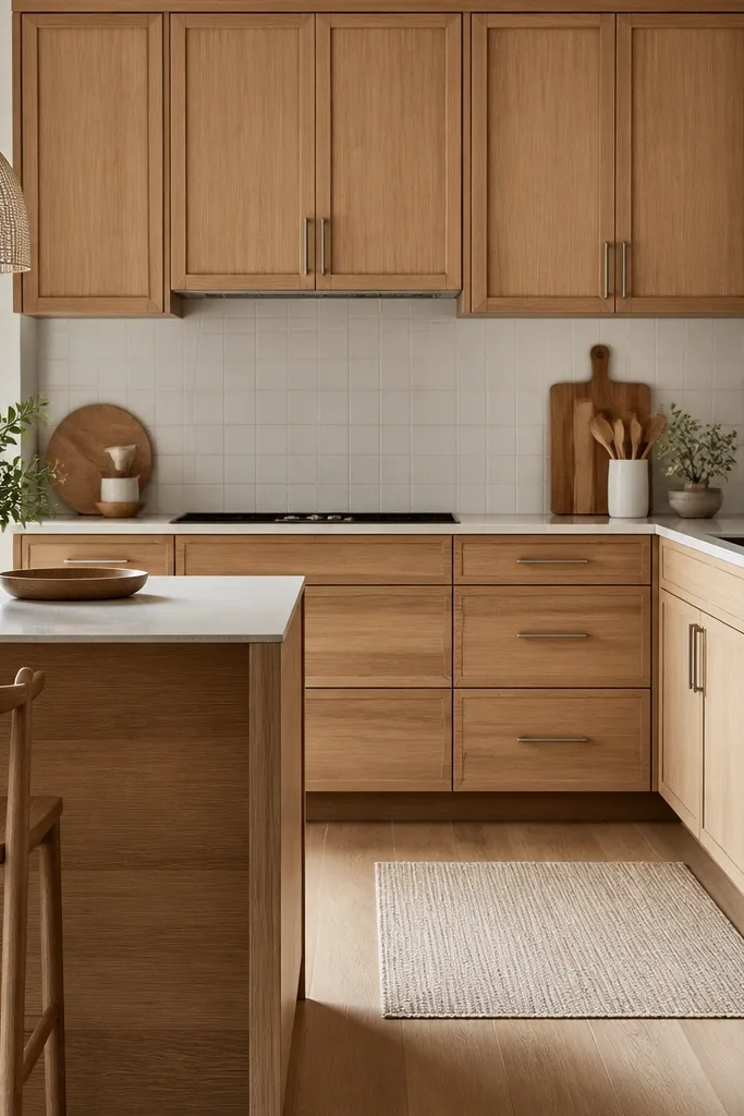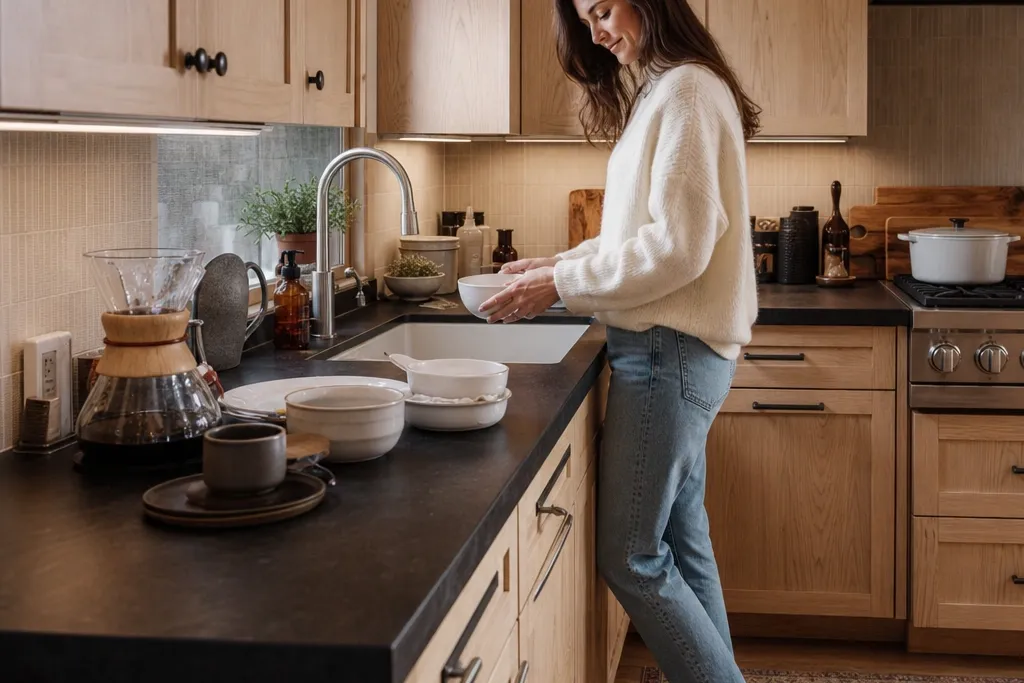

1. Satin white oak cabinets with espresso quartz and black pulls
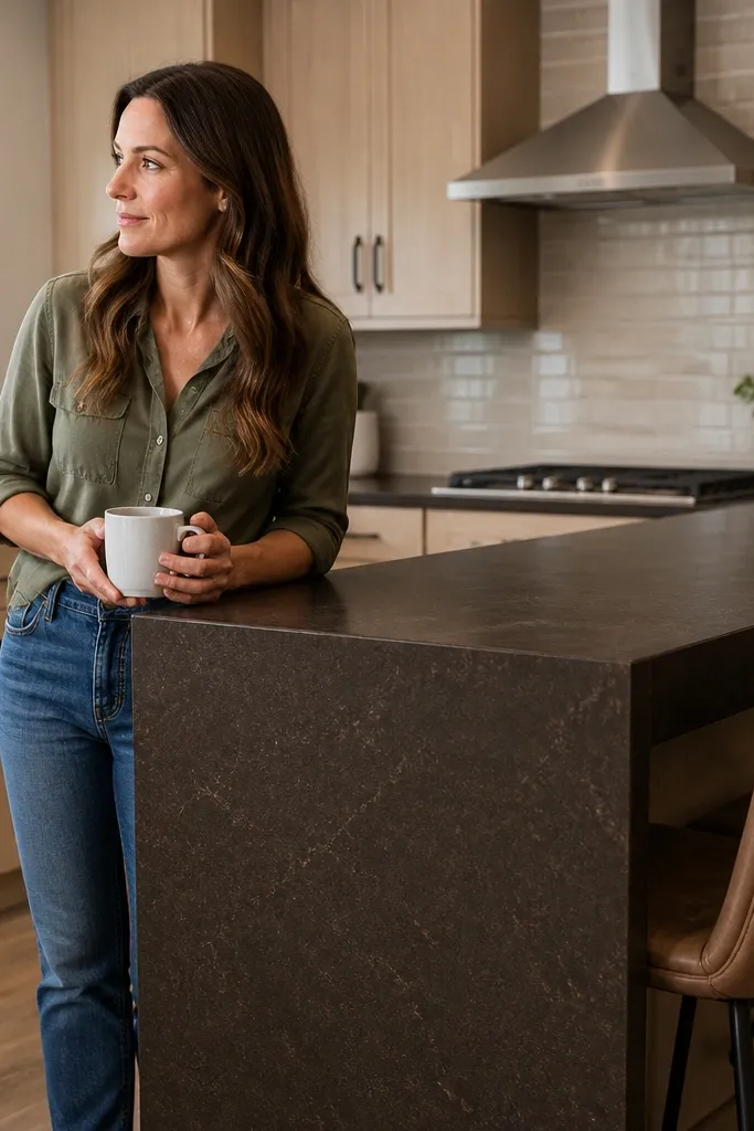
This combo is the one I reach for when the kitchen needs contrast but still feels warm. The satin white oak keeps the grain visible, and the espresso quartz reads deep without going icy. Black hardware ties the dark surface together and gives the room a clean, graphic line. It flatters most skin tones and finishes because the warmth of the oak pulls the scheme toward tan and caramel, not gray. For lighting, it holds up well under typical overhead fixtures because the satin sheen doesn’t throw harsh reflections.
Start by ordering cabinet doors in a satin or low-sheen matte topcoat — ask for a finish that reads “satin” in person if you can. Choose an espresso quartz slab with subtle veining so the cabinet grain stays the hero. Install black pulls with centers aligned to your drawer faces so the hardware looks crisp, not crooked. Finish the look with a white backsplash that has warm grout, then use 2700K bulbs so the espresso doesn’t turn bluish under cooler light.
Wipe a small section of your countertop with mineral oil-free cleaner before you decide on hardware. If the sheen looks too mirror-like next to the oak, switch to matte black pulls to calm it down.
Avoid high-gloss oak next to glossy black hardware — it reads slick and cheap when fingerprints show.
2. White oak shaker doors with smoked-stone counters and brushed brass hardware
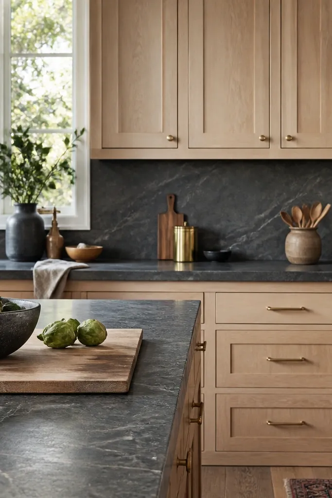
Shaker doors already bring structure, and white oak makes that structure feel softer than painted cabinetry. Smoked-stone counters add depth, but brushed brass keeps the room from feeling like a showroom. The brass also brightens the scheme in a way that feels more lived-in than chrome. This pairing is especially flattering when you have warm-toned flooring or natural wood accents, because the brass echoes those colors. It works well for family kitchens and busy weekdays since the brass patina hides tiny scuffs better than polished metal.
Start by choosing shaker frames with a consistent grain direction — I prefer doors where the grain runs horizontally on the stiles and rails so it looks intentional. Pick a dark counter with gray-brown movement, not a straight uniform black. Install brushed brass pulls that are slightly oversized for the scale of the drawers — for example, 5-inch pulls on 30-inch-wide drawers looks right. Add a cream backsplash with a little texture, then hang warm pendant lights centered over the sink or island.
Good to knowHold a brass sample next to your counter slab in the same lighting you’ll use at night. If the brass looks too yellow, swap to satin brass; if it looks dull, go slightly brighter.
AvoidAvoid pairing smoked counters with cool chrome hardware — the oak turns gray under that mix.
3. Flat-panel white oak cabinets with charcoal quartz and matte black sink faucet

Flat-panel doors make the kitchen feel modern, and white oak keeps it from looking sterile. Charcoal quartz gives a dark anchor without the heavy look of espresso. With matte black fixtures, the whole scheme stays cohesive, and the counters don’t feel like a separate material. This works well in kitchens that have clean lines in the dining area too — the eye likes continuity. It’s also forgiving for people who hate busy patterns; the charcoal texture is subtle next to the straight lines of the cabinets.
Start by selecting flat-panel doors with a consistent flat finish, then choose a white oak stain that reads light warm, not pale yellow. Pick charcoal quartz with a gentle mottled look, and avoid slabs with bold white streaks. Install a matte black faucet with a single-hole or centered mount so it lines up with your sink. Use a large-format off-white backsplash slab tile with thin grout lines to keep the visual noise low.
If your kitchen gets strong afternoon sun, choose a charcoal quartz with low glare. Glossy slabs can make the counters look uneven next to the matte cabinet finish.
Avoid busy backsplash patterns when you use flat-panel oak. The room starts competing for attention.
4. White oak cabinets with dark walnut-stain counters and oil-rubbed bronze accents
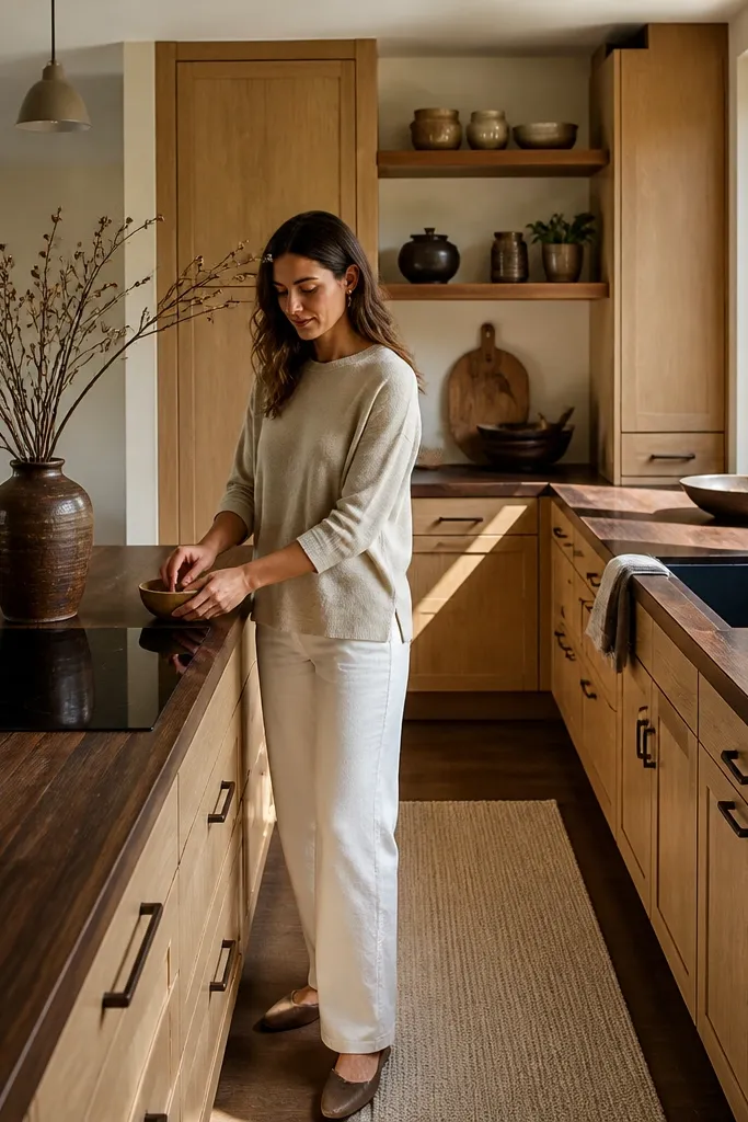
This is a warm, wood-on-wood approach that still reads upscale because the oak and the dark counters share similar undertones. Dark walnut counters add a slightly softer look than stone; they feel more grounded and less sharp. Oil-rubbed bronze brings depth without going as stark as black. I’ve used this in kitchens where the homeowners wanted “cozy” more than “sleek,” and it delivered. It flatters spaces with warm wall paint and natural textiles, like linen curtains or a woven rug.
Start by staining or selecting white oak that’s clearly warm — think wheat, not beige-gray. Choose dark walnut-stain counters that have movement, then keep the counter edges clean and not overly glossy. Install oil-rubbed bronze knobs and pulls in a consistent size across doors and drawers. Add a white backsplash with a warm speckle so the bronze doesn’t look too heavy, and finish with warm 2700K under-cabinet lighting.
Good to knowTest your under-cabinet bulbs by turning them on at night before you commit. Bronze can look flat under cool LEDs but rich under warm light.
AvoidAvoid pairing walnut-stain counters with bright white, blue-tinged grout. It makes the wood look sickly.
5. Two-tone wall: white oak uppers with dark counters and white lower cabinets
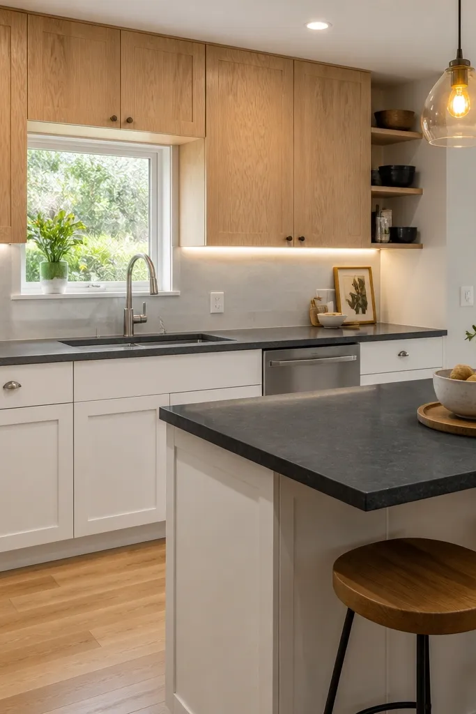
This layout gives you the best of both worlds: the warmth and texture of white oak where your eye lands first, and brightness on the lower level so the room doesn’t feel heavy. The dark counters still anchor the work area, but the white lowers keep the kitchen from feeling like a cave. It’s great if your dining space opens to the kitchen and you want visual separation. I’ve done this in homes with smaller footprints because it keeps sightlines lighter. It also works well for people who want contrast but don’t want all the weight on the cabinetry.
Start by choosing white oak for uppers only, ideally with glass doors that show light-colored dishware. Select dark counters that coordinate with the oak undertone — espresso or charcoal with brown. Paint the lower cabinets a true warm white, not a blue-white. Use brushed nickel or brushed steel on the lower hardware, then keep the upper hardware simpler so it doesn’t compete with the glass. Finish with a backsplash that sits between warm white and cream.
Put your most-used plates and bowls in the glass uppers so the warmth shows up even when the kitchen is messy.
Avoid mixing three metal finishes in one kitchen. If you use brass on uppers, keep lowers to one other finish only.
6. White oak cabinets with dark granite counters and a light gray veined backsplash
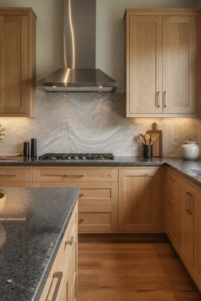
Granite with speckling is forgiving, and it works beautifully with white oak because the oak grain stays warm while the counters add movement. The light gray veined backsplash bridges the two tones so the room doesn’t look like it’s split into separate materials. Brushed steel hardware and a stainless hood keep the kitchen feeling clean without stealing attention from the wood. This scheme flatters people who like neutral interiors and want a “soft modern” look rather than high contrast. It’s also practical: speckled surfaces hide minor everyday mess better than solid dark slabs.
Start by picking a granite that has gray-brown speckling instead of big dramatic white veining. Choose satin white oak so it doesn’t fight the granite’s texture. Install brushed steel pulls that match the range hood finish — keep them consistent in size across drawers and doors. Use a light gray backsplash with thin veining and grout that matches the lightest tile tone. Add a pale runner or chair upholstery in warm gray so the whole dining area stays in the same family.
Bring your backsplash sample to the counter fabricator and hold it next to the slab. If the backsplash veining feels too cool, switch to a warmer gray tile with beige flecks.
Avoid black backsplash tiles with granite that already has heavy dark movement. The whole wall turns visually heavy.
7. White oak cabinets with dark quartz counters and a white ceramic tile backsplash with warm grout
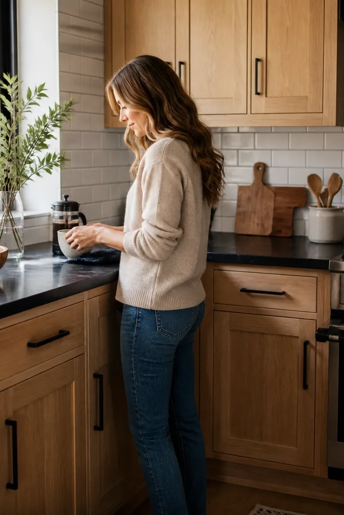
This is the “clean and cozy” pairing I use when the homeowner wants contrast but hates the look of dark backsplashes. White ceramic tile gives you a crisp, bright backdrop, and the warm grout keeps it from reading stark. The near-black quartz makes the oak pop, and matte black hardware ties the surfaces together without going glossy. The look flatters kitchens where you have light flooring or pale walls because the backsplash keeps the room airy. It also hides small grout stains better than you’d think, because warm grout shows less stark discoloration than bright white.
Start with matte or low-sheen oak doors so the cabinet face doesn’t reflect the backsplash glare. Choose near-black quartz with subtle warmth — avoid slabs that read blue. Install matte black hardware and a dark faucet with a similar finish so the lines match. Lay subway tile with a staggered pattern, and use warm beige grout (not bright white). Keep the countertop edge simple — a standard eased edge makes the dark stone look intentional next to the tile.
Good to knowWhen you pick grout, do a small test board with your exact tile and cabinet sample. Warm grout can look golden in daylight and beige at night.
AvoidAvoid bright white grout with warm oak and near-black counters. It can make the kitchen feel washed out.
8. White oak cabinets with dark counters and a brass rail along the backsplash
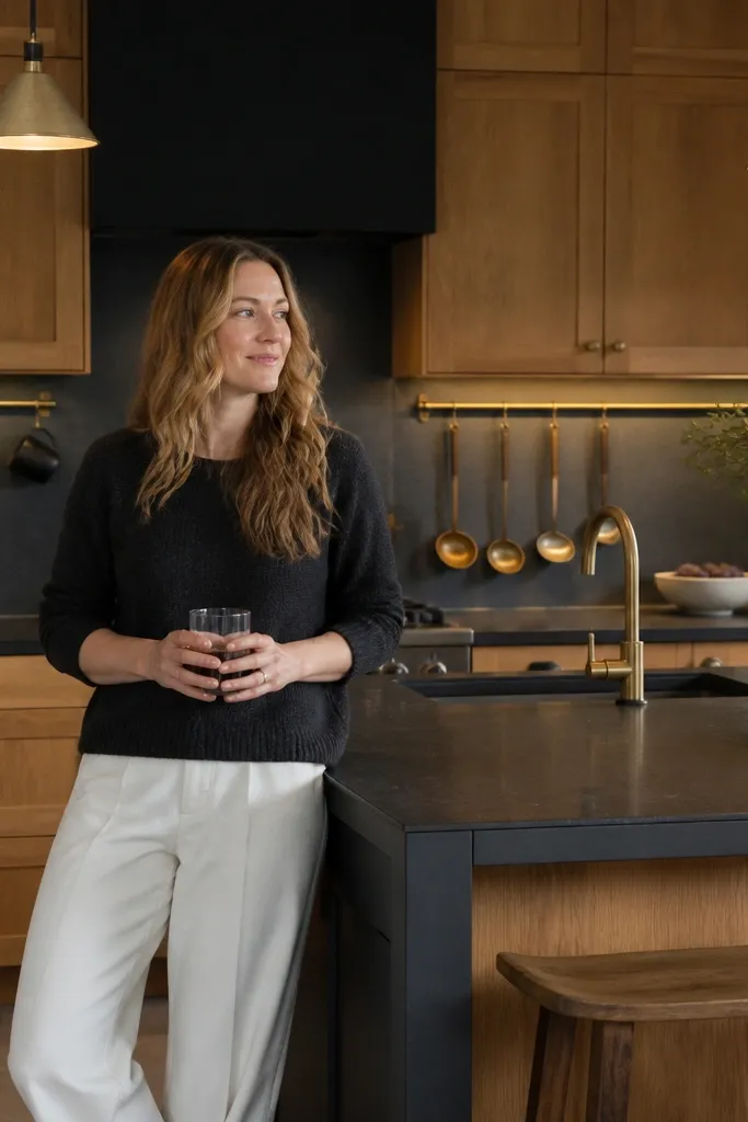
This look adds a focal line without adding clutter. The brass rail pulls warmth from the oak and gives your kitchen a functional detail — you can actually hang mugs, ladles, and small utensils. Dark counters ground everything, while the brass keeps the room from going too heavy. It’s flattering in kitchens with pendant lighting because the rail creates a second highlight line across the wall. I like it for people who entertain, since guests notice the mugs and the kitchen feels “done” even when it’s lived in.
Start with satin white oak and choose dark counters in charcoal or espresso with gentle veining. Install a brass rail at backsplash height that lines up visually with the cabinet handle line — about 2 to 4 inches above the counter surface. Add matching brushed brass pulls so the rail and hardware look like one system. Use a creamy backsplash tile so the brass doesn’t clash with cool whites. Hang mugs in a mix of one color and one wood-handled option so the wall has texture.
Level the rail with a laser line. A rail that’s off by even 1/8 inch shows up instantly next to dark counters.
Avoid hanging too many items. Five mugs look intentional; twelve looks like a storage problem.
9. White oak cabinets with dark counters and a matte black statement range hood
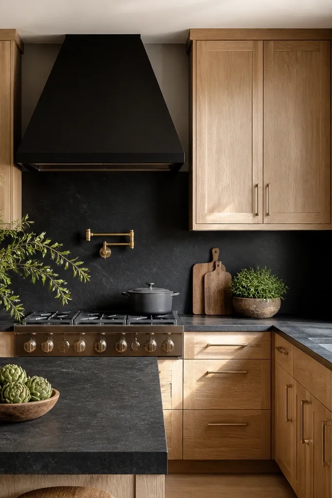
When you have a matte black range hood, you can push the contrast harder because the hood anchors the look. White oak keeps the kitchen warm, so the black hood doesn’t feel like a void. Dark counters add the same visual weight, and the matte textures across hood, hardware, and counters make the room feel cohesive instead of patchy. This works especially well for kitchens with open shelving near the dining area; the hood becomes the “top” focal point while the oak stays the “middle” texture. It’s a strong choice if you cook often and want the kitchen to feel designed, not temporary.
Start by choosing oak doors with a low-sheen matte topcoat and clean edges on the frames. Pick deep espresso counters with a finish that isn’t mirror-gloss. Install black bar pulls and match the hood finish — matte black is key. Keep the backsplash bright and large-format so it doesn’t compete with the hood shape. Place under-cabinet lights so the cabinet face stays evenly lit; uneven light makes matte black look dusty.
If your hood is stainless on the inside, ask for a matte black exterior finish. The interior reflection can make the counters look shinier than you want.
Avoid glossy black accents with matte oak. The shine mismatch looks like different product lines.
10. White oak cabinets with dark counters and a pale oak open shelf moment
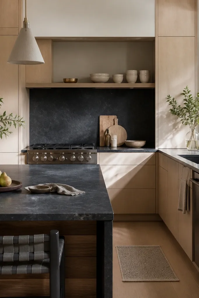
Open shelves break up the visual mass of cabinets, and using a lighter shade of oak gives you a second wood tone that looks intentional. The dark counters keep the kitchen grounded, while the open shelf adds breathing room above the work zone. This is a great approach for kitchens where the peninsula or island feels heavy — the shelves give the eye a place to land. It flatters warm interiors and works well with off-white or cream walls because it keeps everything in the same warmth family. I like it for homeowners who enjoy displaying a few pieces — one board, a stack of bowls, a small jar of utensils.
Start by selecting white oak cabinet doors in a satin or matte finish so the grain looks consistent. Choose dark counters that are espresso or charcoal with warm undertones. Install one open shelf run about 12 to 18 inches wide with a visible thickness that matches the cabinet depth visually. Style with 3 to 5 items max — two bowls and one cutting board is enough. Keep the backsplash light and textured, like a subtle handmade-look tile, so the open shelf feels connected to the wall.
Use the same wood color for shelf brackets and shelf face. Mismatched brackets show instantly next to dark counters.
Avoid filling shelves with mixed metals. It makes the whole kitchen look crowded.
11. White oak cabinets with dark counters and a warm white farmhouse sink
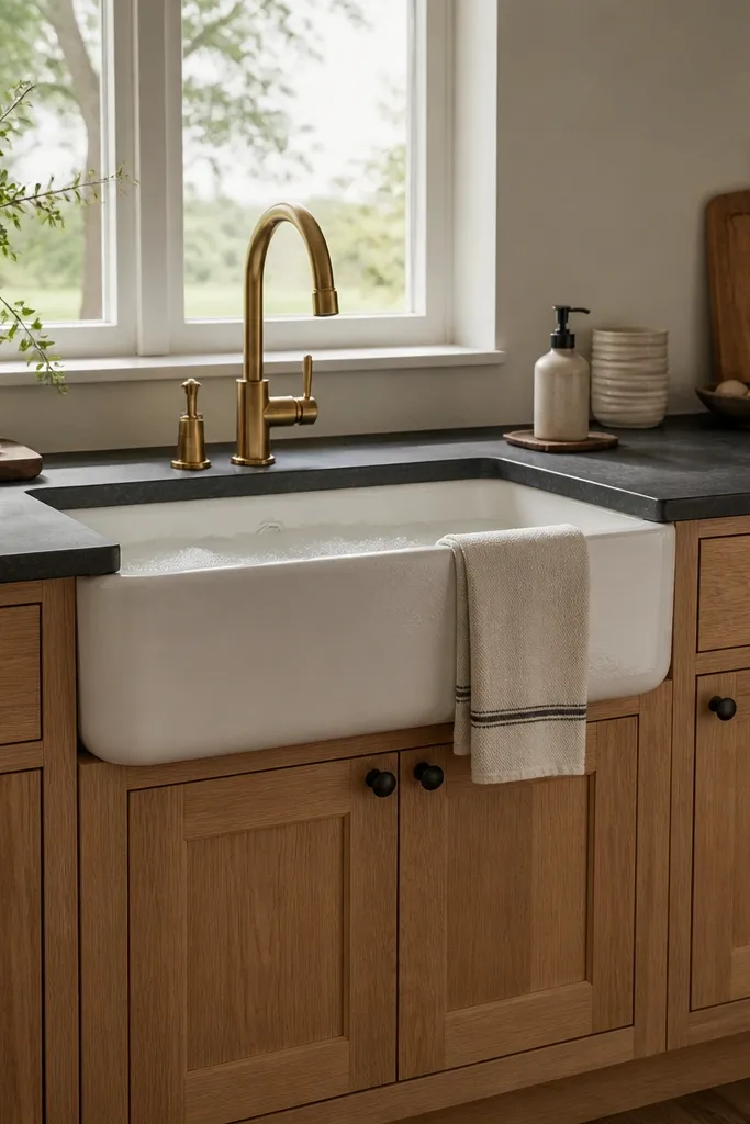
A warm white farmhouse sink is a sneaky way to make dark counters feel softer. The sink adds a curved, bright surface that balances the straight cabinet lines and the darker stone. With white oak, the warm white doesn’t clash — it reads creamy and cozy. I’ve used this in older homes where the homeowners wanted a farmhouse vibe without the heavy, orange-brown look. It also helps in kitchens where the backsplash is minimal because the sink becomes the visual highlight.
Start by choosing a white oak finish that leans warm and not gray. Pick dark counters in charcoal with subtle movement so they don’t look flat. Install a warm white farmhouse sink and match the faucet finish to your hardware — matte black works well here. Choose white tile backsplash with warm grout so the sink and backsplash feel like one continuous light surface. Keep the countertop edge simple and use a cutting board in a wood tone that matches the oak grain.
Before ordering the sink, check the cabinet reveal around the sink — farmhouse aprons sometimes need extra clearance for the faucet and soap shelf.
Avoid bright optic white sinks with warm oak and near-black counters. The temperature mismatch looks off in photos.
12. White oak cabinets with dark counters and a light stone backsplash with warm veining
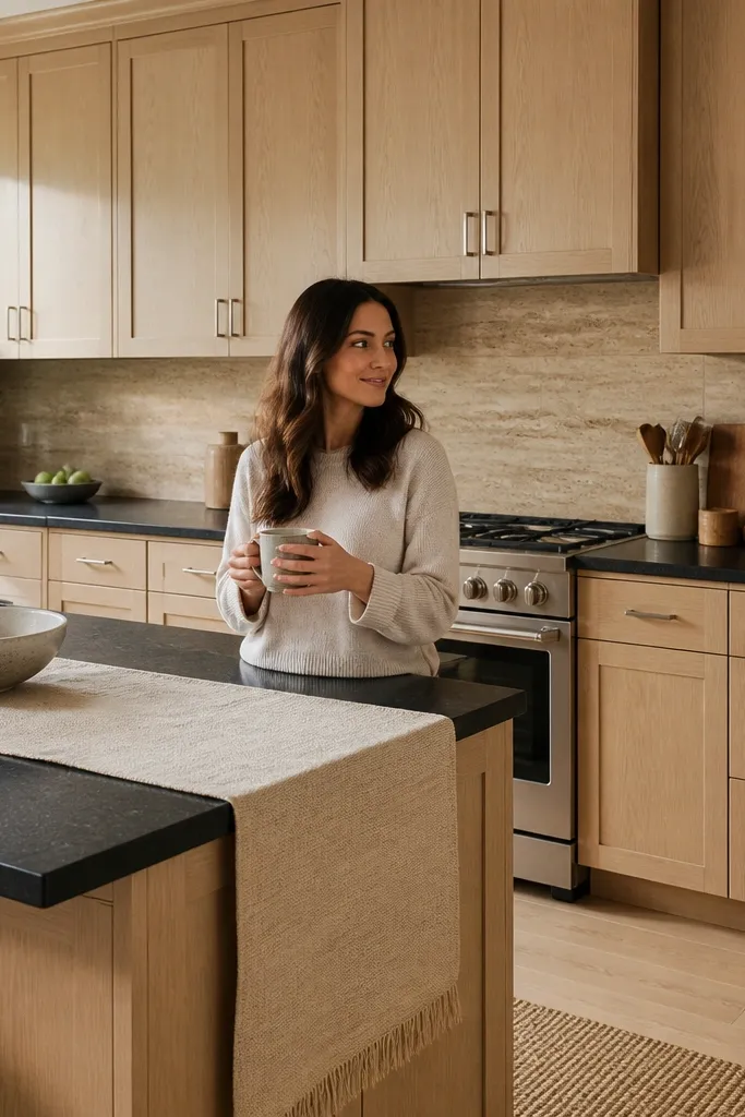
When your backsplash has warm veining, it stops the kitchen from looking like two materials stuck together. The dark counters still anchor the room, but the light stone behind them adds a gentle echo of color in the oak. Brushed nickel gives a bit of coolness to balance the warmth, so the kitchen doesn’t feel too monochrome. This setup flatters people who want a more “architect” feel without going cold or gray. It also works well if you have stainless appliances because the nickel and stainless can align cleanly.
Start with white oak cabinets in satin finish so the grain looks calm. Choose espresso counters with minimal dramatic white veining. Select a light stone-look backsplash with beige or warm cream veining and thin grout lines. Keep hardware in brushed nickel and match it to any stainless trim pieces you already have. Turn on under-cabinet lights and check how the veining reads — you want the backsplash to glow, not look gray.
Ask your tile supplier for a sample under warm LED lighting. Some warm-leaning tiles turn muddy when the light is cool.
Avoid backsplash tiles with obvious blue undertones. Next to warm oak, the whole wall can look stained.
13. White oak cabinets with dark counters and a black-framed glass door cabinet
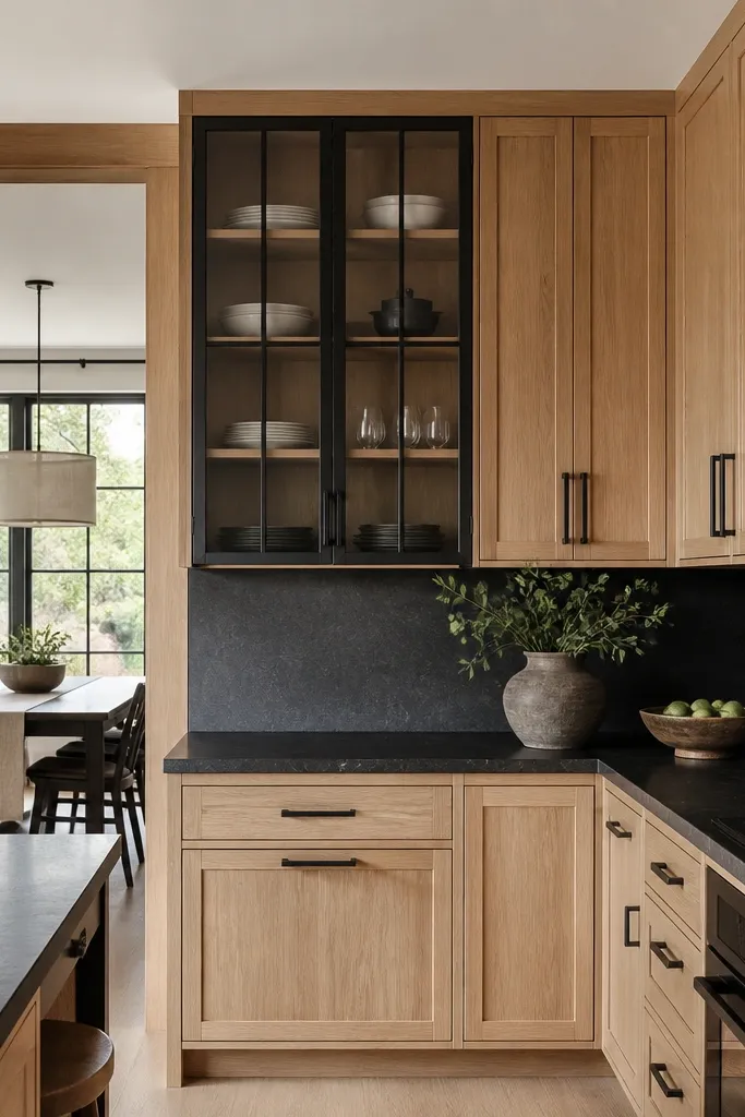
Black-framed glass doors add depth and display space without turning the kitchen into a cluttered open-shelf look. The black frame ties directly into dark counters and matte black hardware, while white oak keeps the whole thing warm. I like this when the kitchen has a dining area that’s visible from the kitchen, because the glass cabinet creates a calm “vignette” of plates and jars. This combo flatters small kitchens because glass visually reduces cabinet bulk. It also helps people who want to show off dishware but don’t want open shelves dusting every day.
Start by selecting white oak cabinets with satin finish and install a tall glass-front cabinet section. Choose black frames that match your counter-adjacent hardware finish — matte black looks best. Pick dark counters in charcoal with a soft texture so the glass doesn’t reflect harshly. Style the inside with a limited palette: white plates, one clear jar, and a small stack of napkins. Add a light cream backsplash so the glass reads bright rather than gray.
Use shelf liners inside the glass cabinet in a warm tone. Clear liners can create a cold glare that makes the oak look gray.
Avoid putting dark dishes inside the glass with charcoal counters. The cabinet turns into a dark box.
14. White oak cabinets with dark counters and a textured limewash wall
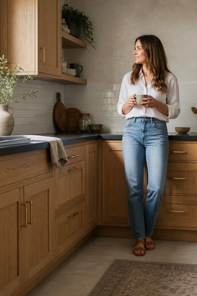
This is the version that makes the whole kitchen feel soft and lived-in, even with dark counters. Textured limewash walls add micro-contrast that makes the oak grain look deeper and the counters look less stark. Brushed brass hardware again keeps the warmth consistent, and the simple backsplash prevents the wall texture from getting busy. I used this in a kitchen where the homeowners hated glossy surfaces and wanted a “quiet” look. It flatters people who like warmer colors in their home and want the kitchen to feel like it belongs, not like it was staged.
Start by painting or selecting a warm off-white limewash wall behind the cabinets. Choose white oak cabinets with satin or matte finish so the texture and wood grain work together. Pick dark counters in espresso or charcoal with warm undertones and a finish that isn’t too glossy. Use brushed brass hardware and a few brass accents like a paper towel holder or faucet accessories. Keep the backsplash minimal and light — simple white tile with warm grout — so the wall texture stays the star.
Good to knowIf you do limewash yourself, protect the area above counters with a wipeable sealer rated for splatter. Texture looks great, but you need cleanability.
AvoidAvoid flat, chalky paint right behind the sink if you can’t seal it. Water spots will show fast.
15. White oak cabinets with dark counters and a white oak island with matching edge detail
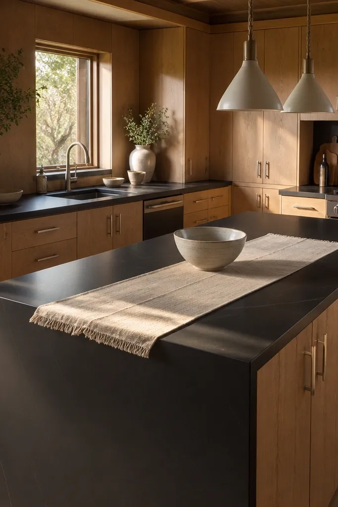
This look is about making the kitchen read as one continuous set, not separate pieces. When the island edge detail matches the counter edge profile on the perimeter, the dark counters look intentional instead of added later. White oak on both cabinet runs keeps the warmth consistent, and the waterfall edge makes the dark surface feel like it belongs in the architecture. It’s a strong choice for open-plan homes because it gives you a clear visual boundary between kitchen and living area. I like it for families who need a practical island — the waterfall edge is easier on the eye when you’re wiping down the counter daily.
Start by choosing matching white oak cabinet finishes for perimeter and island. Pick dark counters and decide on the edge profile early — a simple beveled or eased edge looks clean next to oak grain. If you do a waterfall edge, wrap the dark slab down to a consistent height and keep it centered over the island base. Install brushed steel hardware to keep the scheme from turning too dark. Style the island with two bar stools that have warm neutrals or black frames, and keep the backsplash light to maintain contrast.
Good to knowMeasure the waterfall reveal at the design stage. If the overhang is too tight, the dark edge looks cramped and cheap.
AvoidAvoid mixing different edge profiles between island and perimeter. The kitchen starts looking assembled.