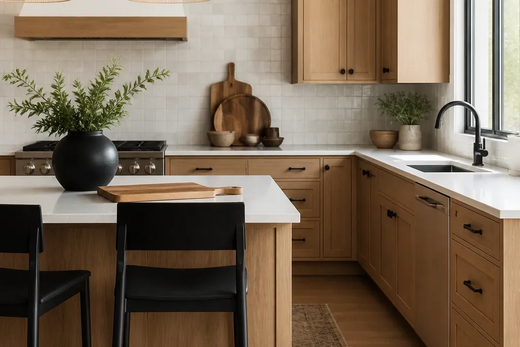
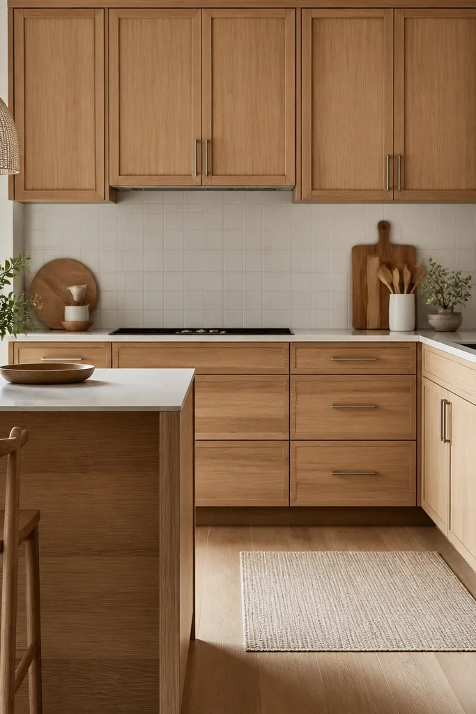
1. Creamy white oak + warm white walls + matte black pulls
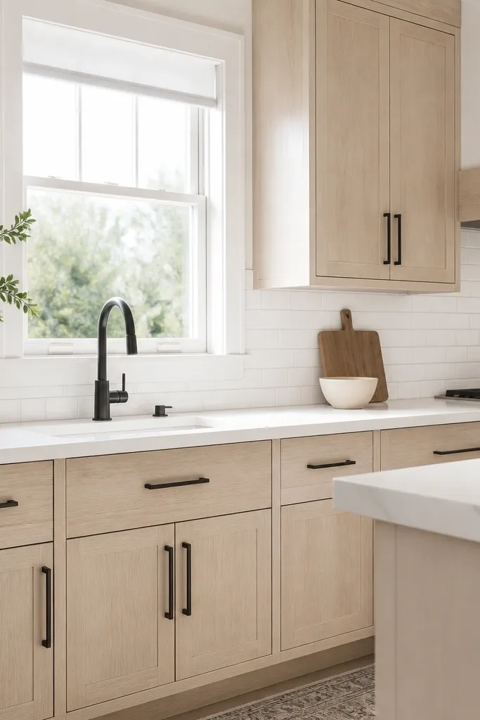
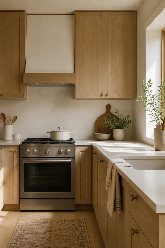
This combo works because the oak stays warm and the walls stay clean without drifting into blue-gray. I used it in a narrow kitchen where the natural light hit in the afternoon, and the cabinets never looked washed out. Matte black hardware adds a crisp line along the wood grain, so the kitchen looks sharper even when you’re on a budget. It also photographs well since black pulls don’t blur the edges the way shiny chrome can.
Start by matching your cabinet stain to a warm white paint sample on the wall. Then choose matte black pulls in a consistent length, like 5 inches for drawers and 9 inches for doors, and place them centered so the spacing looks even at a glance. Install a backsplash that stays bright, like white subway tile, and use light gray or warm gray grout so it doesn’t turn the kitchen cold. Finish with a white quartz countertop (or a very light solid surface) and add one wood tone element on the dining side, like a light oak table runner.
If your kitchen has 2700K bulbs, pick a creamy oak stain and keep grout light — the warmth stays balanced.
Avoid pairing warm oak with cool gray walls and shiny chrome hardware — it makes the whole room look mismatched and older fast.
2. Toasted white oak + off-white paint + aged brass knobs
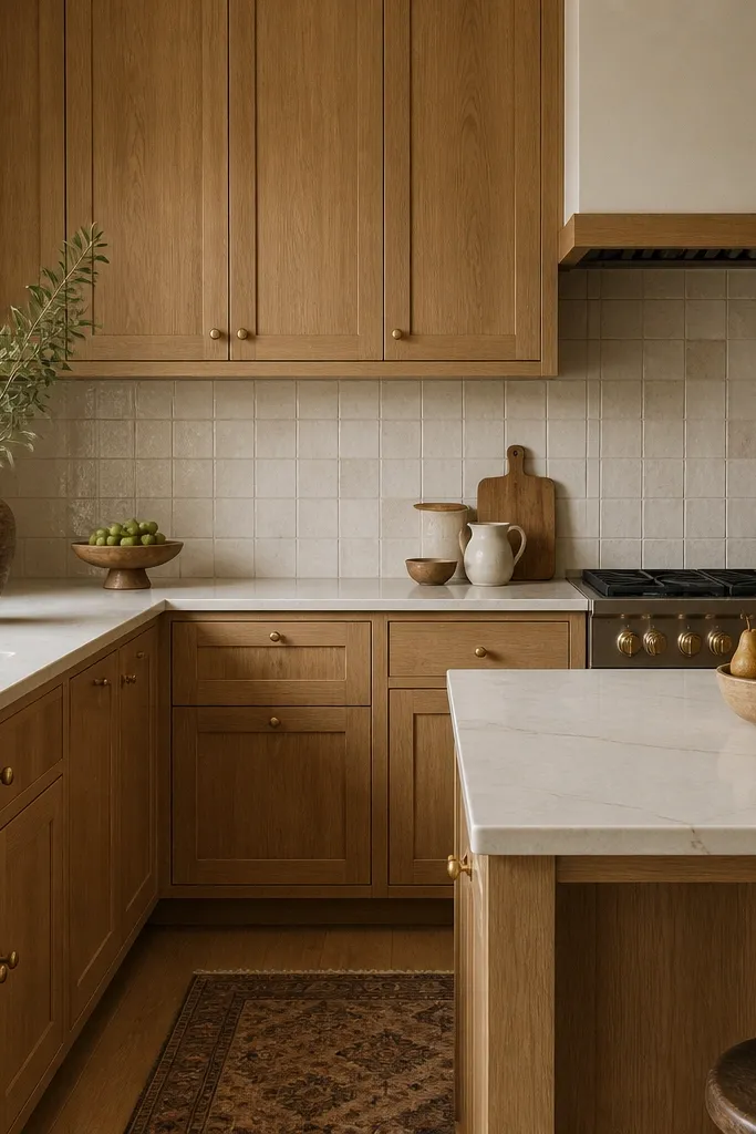
Toasted white oak adds depth to a budget kitchen because the grain looks richer without needing expensive marble. Aged brass knobs warm up the look and make the wood feel intentional, especially in kitchens that get mostly warm evening light. This pairing flatters people who like a softer, lived-in look and it also hides minor scuffs better than ultra-gloss finishes. I’ve used this in homes where the dining area opens to the kitchen — the warm metal and wood tones keep the whole space from feeling sterile.
Start by painting the walls an off-white with a warm undertone, not a bright white that can look stark next to toasted oak. Then choose cabinet hardware in aged brass and keep the finish consistent across knobs and pulls — I stick to one brand line so the undertones match. Pick a backsplash with warm cream tones and gentle variation so it doesn’t compete with the cabinet grain. Finish with a light warm quartz countertop and add a brass-toned faucet so the metal reads as one cohesive family.
Hold your brass sample next to the oak stain under your kitchen lighting before you order hardware.
Don’t use bright yellow brass with toasted oak — it can look brassy and cheap against the wood.
3. White oak cabinets + white marble-look quartz + satin nickel pulls
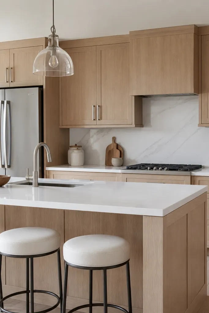
Start with a neutral white oak stain that isn’t too creamy, then pick a marble-look quartz that has thin gray veining rather than heavy beige swirls. Choose satin nickel pulls with a simple rectangular shape, and mount them at the same height across doors and drawers. Use a backsplash with either large-format white tile or thin-line pattern so your eye doesn’t get busy. Finish with stainless appliances and keep window treatments in light white linen or plain cotton for a consistent, airy feel.
This idea is for when you want the kitchen to feel crisp and bright without losing warmth. White marble-look quartz brings movement and a slightly upscale feel, and satin nickel keeps it from getting too cold. I’ve done this in kitchens with lots of white open shelving where the room needed structure, and it delivered that “kept clean” look even with everyday clutter. It also suits people with cooler-toned neutrals in their home since satin nickel doesn’t fight the undertone of bright quartz.
AvoidAvoid glossy nickel or high-shine finishes — they show fingerprints and make the kitchen look busy.
Good to knowIf your marble-look quartz has heavy beige, switch to warmer brass or matte black pulls — otherwise the gray will clash with the oak.
4. Two-tone budget island: white oak base + painted uppers in warm white
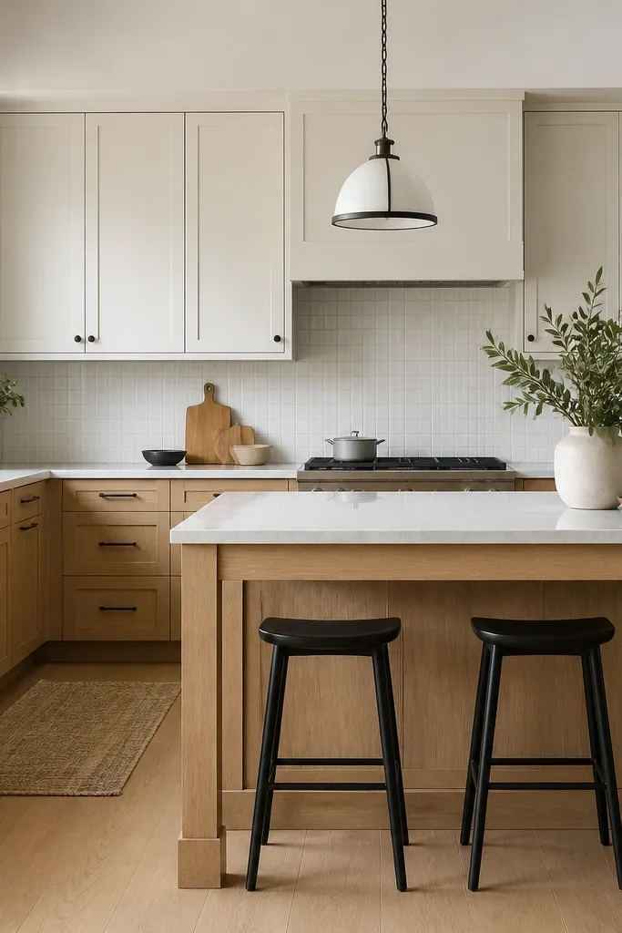
Two-tone kitchens look expensive because your eye has two separate “materials” to read: wood at the bottom and paint up top. I’ve used this layout in budget makeovers where the owners wanted a bright upper kitchen but couldn’t justify full custom cabinetry. Warm white painted uppers keep the room light, and the white oak base anchors it so the kitchen doesn’t float. It’s especially flattering in rooms with lower ceilings because the bright uppers visually lift the space.
Start by keeping the oak consistent on the lower cabinets and island, then paint the uppers in a warm white with a soft undertone. Choose hardware in matte black and mount it the same way on both cabinet types so the rhythm stays clean. Pick a backsplash that ties both finishes together, like white subway tile with warm gray grout. If you’re adding an island, keep the island countertop material the same as the perimeter for a cohesive look.
Use the same door style for uppers and lowers — matching profiles make two-tone look intentional instead of patchy.
Don’t pick a yellow off-white for the uppers next to neutral white oak — the mismatch shows up in photos.
5. White oak cabinets + light greige backsplash + brushed brass accents
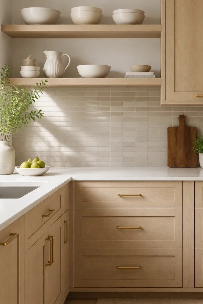
Greige backsplash tile sounds risky, but it works when it’s light and when your oak has a neutral undertone. The brushed brass accents tie the warmth together without going fully golden like aged brass can. This is a good pick if you want a softer look than matte black but you still want structure in the kitchen. I’ve seen this combination calm down overly bright kitchens where white walls and white countertops made everything feel stark.
Start by selecting a greige tile that has warm specks or a creamy base, then match your grout to that base so it doesn’t look gray. Choose brushed brass pulls and faucet in the same finish family, like a satin-brushed look rather than shiny polished. Install countertops in a light cream quartz so the backsplash doesn’t overpower the wood. Style the open shelving with one repeating color, like white ceramics, and add one texture like a woven tray.
If the greige tile looks too gray in daylight, swap to a warmer tile or change grout — grout color controls a lot.
Avoid pairing greige with very cool oak stain — the backsplash will look muddy.
6. Shaker doors with glass uppers: white oak + clear glass + black frames
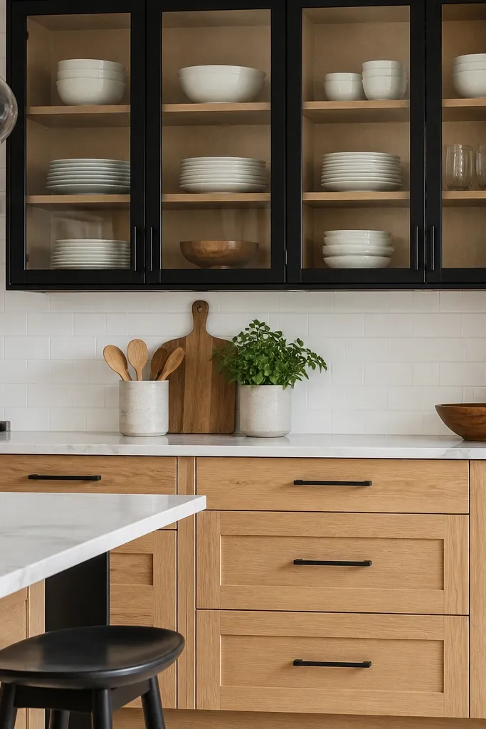
Glass uppers add personality without adding clutter when you keep the interior styling tight. The clear glass lets the white oak grain show through and the matte black framing matches the hardware so the glass doesn’t look random. I did this in a kitchen where the dining nook sat right next to the kitchen, and the glass doors made the whole area feel more curated. It also flatters small kitchens because it lightens the upper visual weight.
Start by choosing shaker cabinet doors for the solid uppers and lowers, then swap only the upper cabinet doors to clear glass with black frames. Use matte black pulls on the solid doors and keep the same black tone on the glass framing. Arrange plates vertically in sets, not mixed stacks, so the contents look intentional from across the room. Choose a white brick or subway backsplash with simple grout and keep countertops light so the glass reads clean.
Use shelf liners in a light tone inside glass cabinets so fingerprints wipe cleaner and the interior stays uniform.
Avoid putting mismatched colored dishes in glass uppers — it turns the glass into visual noise.
7. White oak cabinets + deep green accents + antique brass pulls
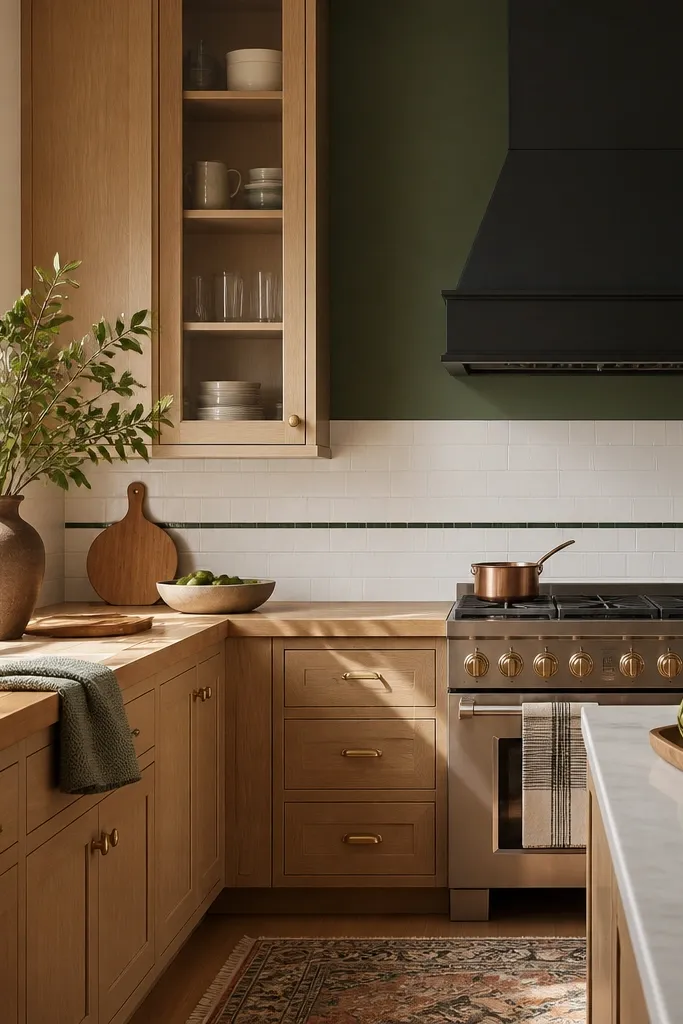
Deep green makes white oak look richer because it creates a strong color anchor behind the warm wood. Antique brass pulls keep the kitchen from feeling too dark by adding a muted golden reflection. This idea is for kitchens that need mood and personality, not just brightness. It also works well if your dining chairs or curtains already have green in them — it ties the room together fast.
Start by painting only one wall or the area behind the hood in a deep green, like an evergreen tone, and keep the rest of the kitchen light. Choose antique brass pulls and a brass faucet so the metal repeats. Use a mostly white backsplash with a subtle green detail so the green doesn’t overwhelm the oak grain. Add a wood element like a butcher block or a wooden cutting board display and keep textiles in cream or natural linen.
Test the green paint sample at night with your cabinet lights on — green can shift toward blue under warm bulbs.
Avoid pairing deep green with cool gray countertops — it makes the green look dirty.
8. White oak cabinets + black countertop + white walls for high-contrast budget modern
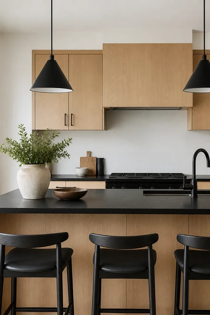
Start by keeping the wall color bright white so the black countertop doesn’t shrink the room. Choose white oak in a neutral-to-warm finish and mount matte black hardware so the metal repeats with the countertop. Use a backsplash that stays simple, like large-format white tile, and keep grout light. Style the island with one height variation — a single black tray plus a tall vase or utensil crock — then keep the rest minimal.
High contrast makes a budget kitchen look intentional because it creates clear lines and strong focal points. Black countertops add weight and drama, and white oak keeps it from looking too harsh. I like this when the room has big windows and you want the kitchen to feel modern instead of farmhouse. It also flatters people who like clean styling — fewer colors means easier decisions for everyday mess.
AvoidAvoid glossy black finishes with matte hardware — the shine mismatch looks messy.
Good to knowIf the black countertop shows smudges easily, wipe with a microfiber cloth right after cooking — it stays sharp.
9. White oak cabinets + light limestone-look tile + bronze hardware
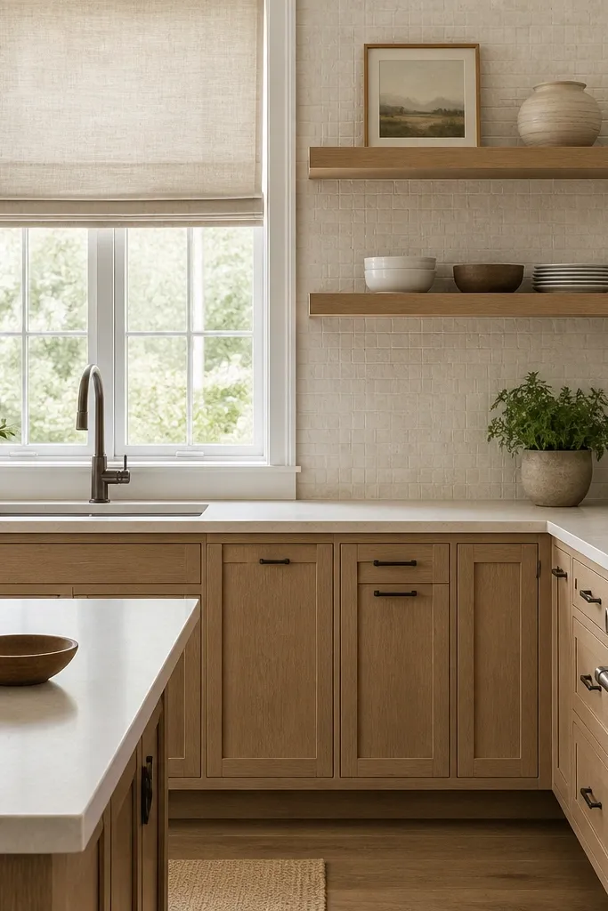
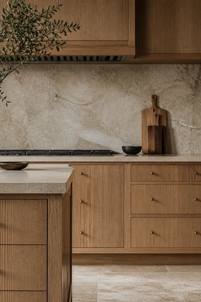
Limestone-look tile gives your kitchen texture without the price tag of real stone. When you pair that with white oak, the room feels warm and grounded, like it belongs in a home with natural materials. Satin bronze hardware looks softer than black and less yellow than brass, so it flatters medium skin tones and warm wood tones alike. This works in kitchens where you want a calm, cozy look that still feels clean.
Start by selecting limestone-look tile that has pale cream and faint taupe, not heavy brown. Choose bronze hardware in a satin finish and keep all metal fixtures in the same family, including the faucet. Pick a countertop in light beige quartz with subtle movement so it doesn’t fight the backsplash texture. Add natural linen window treatments and a woven basket on the counter for a functional texture that still looks styled.
Use grout that matches the lighter tile tone, not the darker specks, so the backsplash reads airy instead of heavy.
Avoid very dark bronze next to pale limestone-look tile — it can make the backsplash look grungy.
10. White oak cabinets + white and oak open shelving + rattan bar stools
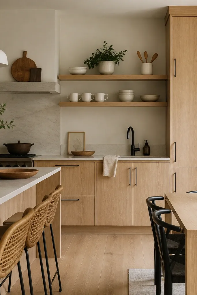
Open shelving makes the kitchen feel lived-in, but it only looks good when the styling is tight and the materials repeat. White oak cabinets give you the wood continuity, and rattan or woven seating adds texture without adding color chaos. I used this in a small kitchen where the owners didn’t want upper cabinets, and it kept the space from feeling boxed in. It also flatters people who love warm neutrals and natural textures in the rest of their home.
Start by choosing open shelves in the same white oak finish or a matching light wood so the tone doesn’t shift. Style with a limited palette: white mugs, a few white plates, and one small plant in a neutral pot. Keep your cabinet hardware matte black to create a consistent visual line with the shelving brackets. Add rattan bar stools and a light cream runner or woven placemats to tie the texture together.
Put your most-used mugs at eye level and store the rest on a lower shelf or in drawers so the look stays tidy.
Avoid mixing too many colors on open shelves — two neutrals plus one wood tone looks right.
11. White oak cabinets + white shaker panels + brass pendant light over island
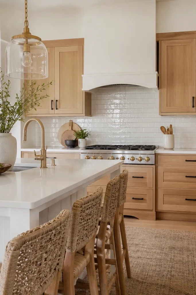
This is a budget trick for making the island look custom: you add a panel detail or painted side panel so the island reads like built-in cabinetry instead of a store-bought block. White shaker panels echo the cabinet door style, and the warm brass pendant ties the warm tones together. I like this in kitchens where the island is the main gathering spot because lighting and paneling frame the space. It also looks flattering for people who want a clean look but still want warmth.
Start by keeping the cabinet doors white oak and choose a white shaker panel finish for the island side, matching your wall paint undertone. Use matte black pulls on the wood and keep the same black tone on any island hardware. Install a brass pendant directly over the island center and pick a shade that doesn’t cast heavy shadows. Keep backsplash and countertop bright and light so the panel detail stands out instead of getting swallowed by busy surfaces.
Hang the pendant so the bottom of the glass is about 30-32 inches above the countertop for a crisp, not-too-low look.
Avoid a pendant that’s too large or too low — it makes the kitchen feel cramped and dated.
12. White oak cabinets + subtle vertical grain + smoked glass display niche
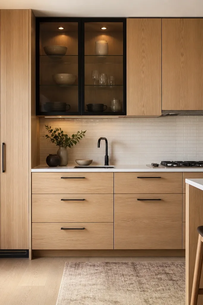
Start by selecting white oak doors with a visible grain pattern and place them on one feature run, not across the whole kitchen. Add smoked glass to one cabinet niche — keep the number of items inside low, like 3-5 matching pieces. Use minimal black hardware so the niche becomes the star. Choose a neutral backsplash and light countertop so the wood grain and glass contrast are the only strong visual elements.
Vertical grain doors and a smoked glass niche create a custom-feeling focal point without doing a full high-end remodel. Smoked glass makes the display area look intentional and hides clutter like extra cutting boards or mismatched canisters. I used this in a kitchen where the owners wanted “one wow” moment but didn’t want to spend on stone slab everywhere. It flatters kitchens with higher traffic because you can keep the niche styled and leave the rest simpler.
AvoidAvoid overloading the niche — smoked glass hides dust less than you think.
Good to knowUse warm spotlights inside the niche so the wood stays golden, not gray.
13. White oak cabinets + soft white countertops + warm taupe walls for calm farmhouse modern
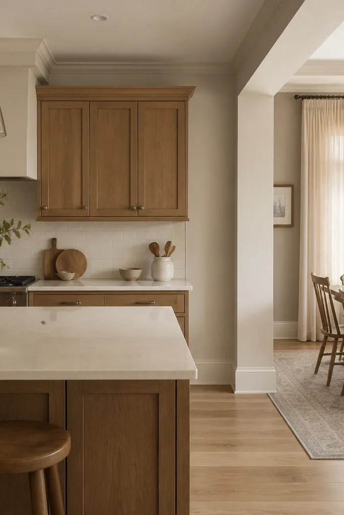
Start by choosing a warm taupe paint that has no obvious pink or gray shift, then paint the whole kitchen so the undertone stays consistent. Select soft white countertops with creamy movement rather than bright white. Use brushed nickel pulls and faucet so the metal is neutral. Keep backsplash in a light ceramic with subtle variation, then add dining textiles in cream linen and natural wood accessories to keep the look cohesive.
Warm taupe walls stop white oak from looking too “yellow cafeteria” and too “yellow beach” at the same time. The cabinet color stays the hero, and brushed nickel keeps the hardware from looking too stark. This is a great option if you want farmhouse comfort without the heavy distressing and dark finishes. I’ve done this in homes with warm flooring, and the cabinets blended instead of looking like a separate project.
AvoidAvoid bright white paint with warm taupe floors — the contrast can look accidental.
Good to knowBring your paint swatch to the countertop store and compare them under daylight and under your kitchen bulb color.
14. White oak cabinets + subway backsplash in white + light blue-gray grout for cool-clean edge
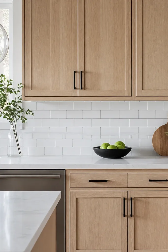
Start by choosing a white subway tile and a grout that reads light blue-gray, not dark slate. Then select a white oak stain that is neutral enough to avoid turning orange under cooler lighting. Mount matte black pulls at consistent heights and use a matte black faucet if you can. Keep the countertop in a white with faint gray movement so the grout doesn’t look random. Style the counter with one gray-neutral item, like a stoneware utensil crock, and the rest in white.
This idea gives you a cool-clean edge without sacrificing the warmth of the oak. The light blue-gray grout lines frame the subway tile and make the backsplash look crisp and newer, which is helpful in budget kitchens where you can’t change everything. I used it in a kitchen that already had cool lighting and gray accents in the flooring, and the grout helped bridge the tones. It looks sharp and modern, especially when you keep hardware matte black.
AvoidAvoid warm gray grout with cool lighting — it can make the backsplash look dirty.
Good to knowIf your LEDs are 4000K or higher, this grout choice helps the whole kitchen look intentional instead of washed out.
15. White oak cabinets + patterned tile floor + keep cabinet finish satin and hardware simple
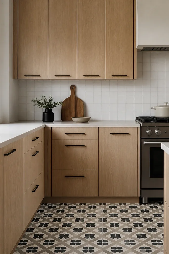
Start by choosing satin-finished white oak cabinet doors and avoid glossy finishes that reflect the floor pattern back into the room. Keep hardware minimal, like straight bar pulls in matte black, and place them consistently so the cabinet lines stay clean. Use a simple backsplash, like plain white subway or a large white tile, so the floor pattern stays the main visual texture. Choose countertops in a light quartz with minimal veining so the floor pattern remains readable. Style the open areas with solid-color accessories, like white canisters and a black utensil holder.
Patterned floors can steal the show, so this setup keeps the cabinets calm and lets the floor do the talking. Satin white oak hides minor surface marks better than high-gloss, and simple matte black hardware doesn’t compete with the tile pattern. I’ve done this in apartments and older homes where the floor already had character, and the kitchen instantly looked designed once the cabinets stopped fighting the pattern. It’s great for people who want a bold floor but don’t want a complicated cabinet styling routine.
AvoidAvoid adding more patterns in backsplash or curtains — it turns the room into visual clutter.
Good to knowUse felt pads under decorative items on the counter and keep a microfiber cloth for quick wipe-downs — satin hides better than glossy, but it still shows smears.