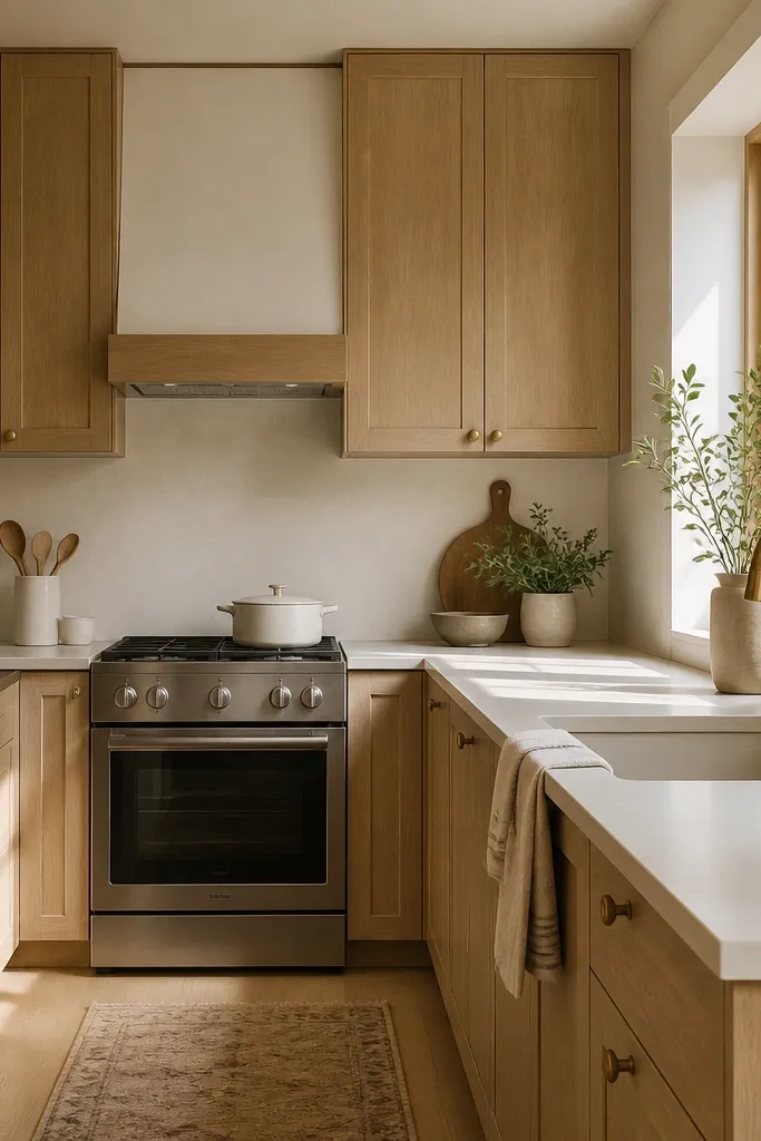
1. Bright white counters with clear-coat quarter sawn oak
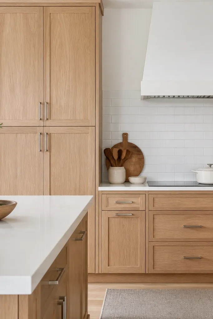
This look works because the cabinets stay the hero without turning orange. The clear, neutral finish on quarter sawn white oak keeps the grain’s ribbon figure visible while letting white counters and walls do the heavy lifting for brightness. I prefer it for kitchens with north-facing light or rooms where you want airy dining vibes instead of a brown-on-brown scheme. It flatters cool undertones in paint and tile, and it also looks clean on warm skin tones when you stage shelves with white dishes and glassware.
Start by choosing a clear coat sample and view it in morning and afternoon light. Then pair it with bright white quartz or solid-surface that has cool veining, not creamy beige veining. Install brushed nickel pulls and knobs at a consistent size, like 3-1/2 inch centers on drawers and 5 inch pulls on doors. Finish the backsplash with white subway tile and grout in a soft gray that stays light. Finally, add under-cabinet LED strips so the grain catches light from the front, not only from above.
Good to knowBring home two cabinet finish samples and hold them against your countertop slab in the same lighting as your kitchen.
AvoidAvoid warm honey stains with white counters — the two yellows fight and the whole kitchen looks dated.
2. Soft greige walls and satin oak for a calm dining kitchen
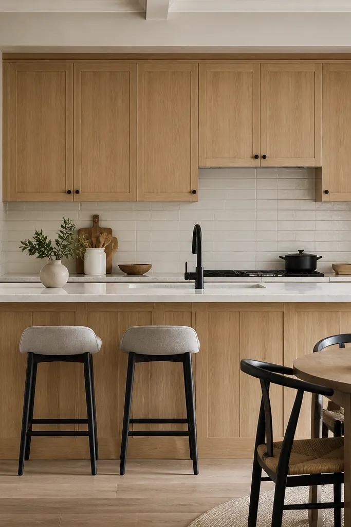
Greige is where quarter sawn oak gets its “grown-up” look. With a satin clear coat, the grain reads crisp and architectural, but the overall palette stays gentle because the walls aren’t stark white. I use this combo when the kitchen opens into a dining area and you want it to feel calm instead of showroom-bright. It flatters warm and neutral skin tones well during evening gatherings because matte surfaces absorb glare while satin cabinets still show figure. The black hardware adds definition without making the room feel heavy.
Paint the walls a true soft greige, not a beige that leans red. Then keep the oak finish satin so the grain lines stay visible without reflecting light harshly. Choose matte black hardware in a slim profile, like 1/2 inch bar pulls, so it doesn’t visually bulk up the doors. Use a warm white backsplash tile with a light texture, then grout in light gray to keep the lines clean. Style the open shelf or glass-front section with one neutral ceramic set and a couple of clear glass tumblers to repeat the calm tone.
Good to knowIf your greige pulls too yellow, switch to a slightly cooler greige and keep the cabinet finish neutral — the oak will still look warm.
AvoidSkip high-gloss lacquer on oak if your walls are already reflective — it makes the kitchen look shiny and tired.
3. Muted sage walls and oak with brushed brass hardware
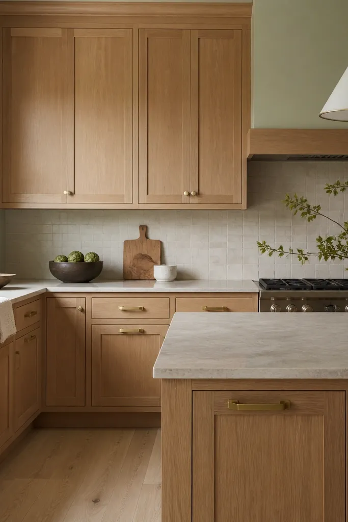
Sage plus quarter sawn white oak is a pairing I’ve loved in homes where people want color without going bold. The muted green cools the oak just enough that the grain looks creamy, not orange. Brushed brass brings warmth in a controlled way, and it looks especially good against the tight cathedral lines of quarter sawn boards. This combo flatters people who like earth tones but still want their kitchen to feel bright for weekday breakfasts and evening dinner prep. The result feels intentional and lived-in, not farmhouse costume.
Choose a sage paint with gray in it so it doesn’t turn mint or neon. Keep the oak finish clear and neutral, then select brushed brass hardware with a warm undertone that isn’t too yellow. Install brass in multiple places: cabinet pulls plus a faucet or lighting trim. Use a cream backsplash tile and keep grout light to avoid muddying the green. Style your counter with simple items in off-white and pale wood, and add one small green plant so the sage doesn’t feel random.
Good to knowHold a brass hardware sample next to the cabinet sample under your kitchen bulbs — the undertone match matters more than the brand.
AvoidDon’t pair sage with heavily smoked oak — the green turns dull and the cabinets look dirty.
4. Matte black accents with oak shaker doors
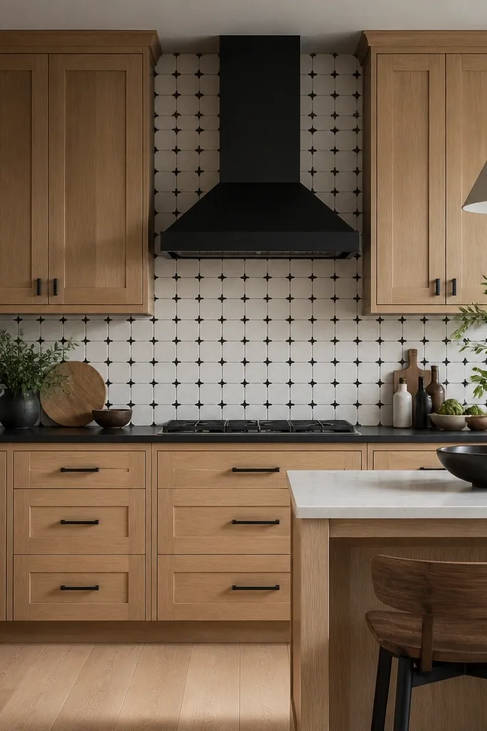
This is the “graphic” version of the quarter sawn white oak cabinets aesthetic. The oak’s grain adds texture, while matte black adds structure. I like it when your counters and backsplash already have pattern or contrast, because the oak keeps the look warm and practical. It also photographs well for dining spaces because the black lines frame the grain instead of hiding it. If your style leans modern or you have a sleek dining table, this pairing keeps the room cohesive.
Pick shaker doors with crisp edges so the grain’s cathedral lines stay readable. Choose a neutral clear coat on the oak and use matte black pulls with a simple shape, like flat bar or round knobs with a small diameter. Add a matte black faucet and a black hood or vent cover so the accents repeat. Keep the backsplash high-contrast but not busy, such as black-and-white tile with straightforward lines. Finish the styling with white plates and one black tray so your eye lands on contrast, not clutter.
Good to knowUse one black finish family — matte black next to matte black — so you don’t get a “two different blacks” look.
AvoidAvoid mixing shiny chrome with matte black in the same kitchen — it makes the oak finish look warmer than you intended.
5. Large-format off-white tile backsplash to highlight oak grain
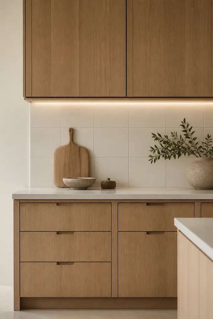
When you use large-format tile, you give the cabinets room to breathe. Quarter sawn white oak already has visual movement in the grain, so busy mosaics can steal attention and make the whole kitchen feel noisy. This look is clean and dining-friendly, especially if your kitchen opens to a table where you want calm sightlines. The under-cabinet lighting matters here because it makes the grain figure shimmer without adding extra pattern. It flatters most wall colors because the grout stays subtle and the tile reads like a soft backdrop.
Choose an off-white backsplash tile with a light warm-gray undertone, then keep grout very light, close to 1 shade darker than the tile. Select simple cabinet hardware, or go with long pulls that visually “stretch” the doors. Keep your oak finish satin so it doesn’t reflect the tile and create glare. Place LED tape under the top cabinets with a diffuser so the light washes the face of the doors. Style the counter with a single-height item group: one utensil crock, a cutting board, and a bowl, all in off-white or light wood.
Good to knowIf you have low ceilings, keep the tile grout lines thin — thick lines visually lower the space.
AvoidSkip tiny subway mosaics when you want the oak to look premium — the texture pile-up makes the grain feel less special.
6. Two-tone dining kitchen: oak base, white uppers
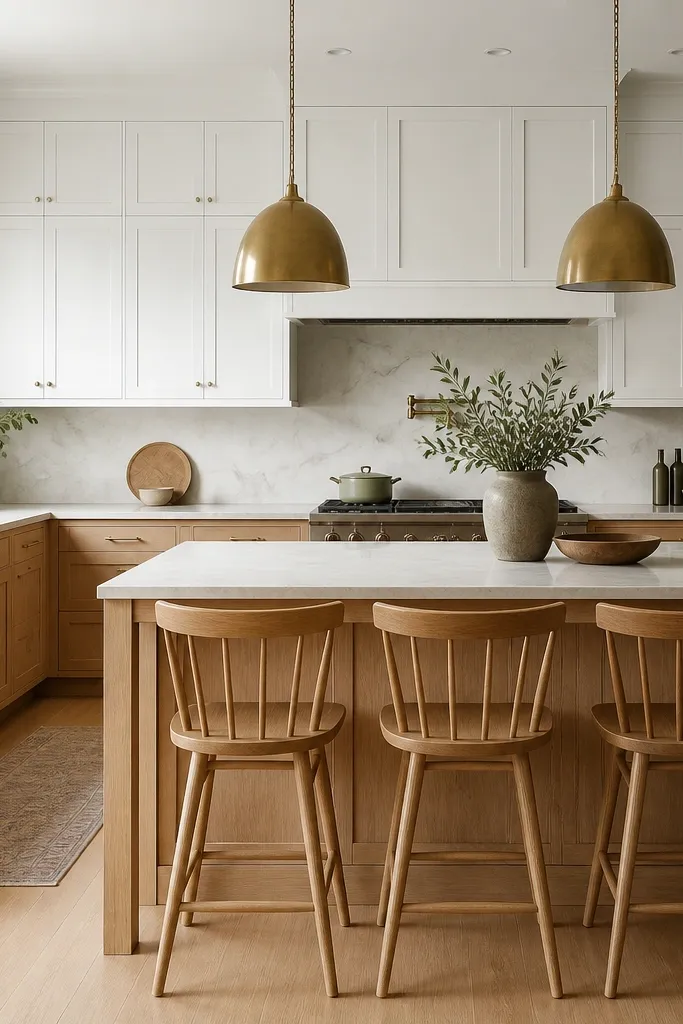
Two-tone kitchens are where quarter sawn white oak cabinets aesthetic really earns its keep. The oak bases ground the room, and the white uppers keep the sightline light above the countertop. I’ve done this in kitchens where people worried oak would darken the space — the white uppers solve that instantly. The brass pendants add warmth and pull the oak and white together. This works in open-concept dining areas because it creates a clear visual boundary between kitchen prep and where people actually sit.
Start by picking a white upper cabinet finish that matches your trim, not a different white tone. Then keep the oak bases clear and neutral with satin sheen. Use the same oak on the island and any lower pantry doors so the grain feels intentional. Install long brass pendants over the island so the color shows near the upper white cabinets. For hardware, use brass on both oak and white cabinets to unify the look. Style the dining side with a runner in warm white or light linen and one wood serving board that matches the oak.
Good to knowTape paper samples for the white uppers next to your oak sample — white undertones shift hard under warm bulbs.
AvoidDon’t use a warm stained oak base with cool blue-white uppers — it looks mismatched and cheap in daylight.
7. Quarter sawn oak with a light driftwood stain
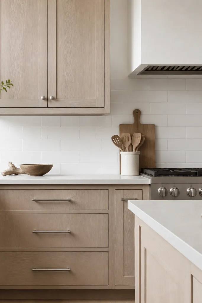
This is the option for people who love oak but don’t want the “golden” look at all. A light driftwood stain keeps the quarter sawn grain figure, but it shifts the overall tone cooler and softer. I like it in kitchens with lots of white, chrome, or stone that leans gray. It flatters guests with cooler undertones in clothing because the cabinet tone doesn’t pull yellow under evening lighting. The grain looks more subtle than clear-coat oak, which helps if your kitchen has strong patterns already.
Choose a driftwood stain that reads pale in a sample door, not medium. Finish it with a satin topcoat so the tone stays muted and doesn’t go chalky. Use brushed nickel hardware to support the cooler direction. Pair with white backsplash tile and a countertop with light gray flecks or a crisp white with subtle movement. Add warm textiles like oatmeal linen curtains or a woven runner to keep the room from feeling too cold. Place a few wood cutting boards and ceramic bowls so the gray-brown doesn’t feel sterile.
Test your stain sample next to your floor — if your floor is warm, go slightly less gray on the stain.
Avoid dark driftwood stains — they hide the quarter sawn figure and make the grain look muddy.
8. Natural oak cabinets with linen shades and warm lighting
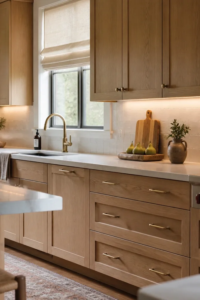
Cabinets are only half the look. This one is about how the oak feels in real daylight and evening light. Quarter sawn white oak cabinets aesthetic becomes extra flattering when you soften the kitchen with linen textures and warm color temperature lighting. I’ve seen this combination make small kitchens feel bigger because the linen shades reduce glare and let the cabinets show their grain without harsh reflections. It also looks good when you host — the warm lighting makes the oak look inviting instead of “finished wood” cold.
Pick a neutral natural finish for the oak and keep it satin. Install under-cabinet lighting with warm bulbs around 2700K so the grain reads creamy. Choose linen roman shades in oatmeal or natural flax and mount them so they don’t block cabinet trim. Keep the backsplash soft white with slight texture and light grout. Add a warm-toned runner or placemats in woven neutrals, then use clear glass and off-white ceramics on open shelving.
Good to knowIf you’re using recessed lighting, aim some fixtures away from the cabinet faces to prevent glare on the satin topcoat.
AvoidSkip cool 4000K bulbs — they make oak look flat and a little yellow.
9. Glass-front upper cabinets with quarter sawn oak mullions
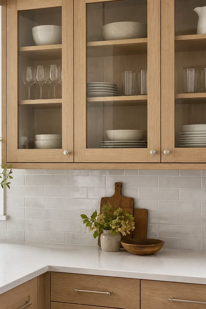
Glass-front cabinets turn the quarter sawn white oak cabinets aesthetic into something you can actually see from across the room. The oak mullions frame the grain and make it feel intentional, not random. I like clear glass when you have pretty dishware or you’re willing to keep the shelves tidy. If you prefer a lived-in look, use clear glass with a simple shelf arrangement and keep the visible items consistent in color — white, cream, and light gray work best. This style flatters dining setups because the glass reflects light and makes the space feel taller.
Choose glass-front frames in quarter sawn oak and keep the doors satin or semi-gloss, not high gloss. Use brushed nickel pulls and small knobs so the metal doesn’t compete with the glass. Behind the glass, add shelves with a repeating pattern: same-height stacks of plates, then two matching bowls, then a small vase. Set a neutral backer panel behind the glass if the cabinet interior is unfinished wood. Pair with light countertops and a soft gray backsplash so the oak grain is the main warmth. Add a small set of stemless wine glasses on one shelf for sparkle.
Good to knowUse a consistent height for dishes so the grain and the dish silhouettes line up visually.
AvoidAvoid cluttered mixed-color dish stacks — glass makes mess look louder.
10. Shaker cabinets with a soft white glaze over quarter sawn oak
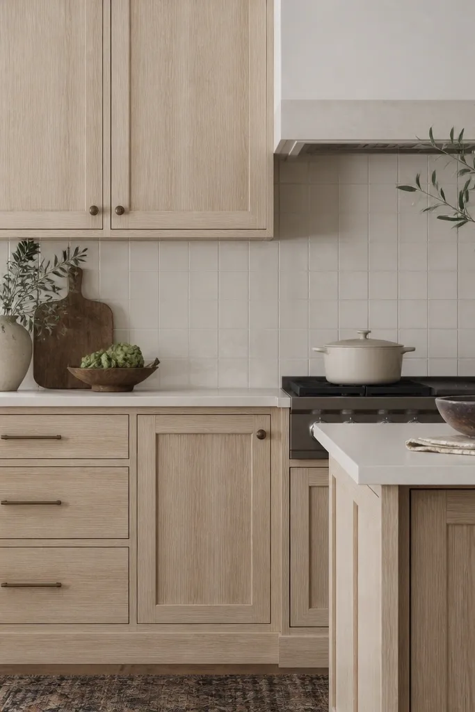
A soft white glaze is the “old-world but clean” move for quarter sawn oak cabinets aesthetic. The glaze sits in the grain and highlights the figure, so the cathedral lines look deeper without you going dark on the whole cabinet. I like this when the rest of the kitchen is warm white and you want a little depth for depth’s sake. It flatters people who want character but don’t want heavy distressing. Aged bronze hardware adds a vintage note that still reads refined because the oak grain stays crisp.
Start with quarter sawn white oak doors and apply a white glaze that’s light enough to keep the base tone neutral. Use a satin topcoat after glazing so the cabinet doesn’t look like painted plastic. Choose aged bronze hardware with a slightly textured finish so it matches the glaze’s lived-in feel. Pair with warm white backsplash tile and creamy grout so the glaze doesn’t clash. Keep counters in off-white or light stone with subtle flecks. Style open shelving with simple wood boards and cream ceramics — let the cabinet do the decorative work.
Good to knowWipe a small glaze test patch and watch it dry fully — glaze looks different once it’s cured.
AvoidAvoid heavy distressing on glaze finishes — it can make the oak look patchy instead of dimensional.
11. Very light stained oak with matte black pulls and a white subway backsplash
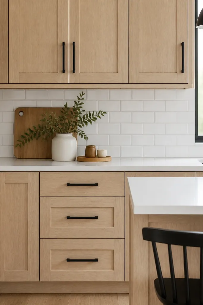
When you want the quarter sawn white oak cabinets aesthetic but your kitchen is already bold with black appliances or lighting, go very light on the stain. This keeps the oak from competing with the matte black hardware and gives you a crisp, layered look. I’ve used this in kitchens with white subway tile because the classic tile pulls the room together while the oak adds warmth. It flatters a clean, modern dining space because it looks intentional and not rustic. The grain lines still show, but they stay subtle enough for a busy household.
Pick a light stain that lands between blonde and pale beige, then finish with a matte or satin topcoat. Install matte black pulls that are slim and consistent in length, like 3-3/4 inch on drawers. Use a bright white solid surface countertop and keep the backsplash classic with white subway tile. Use light grout, close to soft gray, to keep lines sharp. Add a black faucet or black lighting trim so the matte black reads cohesive. Style counters with white ceramic canisters and a single black tray for daily items.
Good to knowIf your black pulls look shiny in photos, swap to a true matte finish — it keeps the oak tone from looking washed.
AvoidAvoid medium stains with white subway tile — it usually turns orange-brown against the bright grout.
12. Oak cabinets with a warm white ceiling and layered pendant lighting
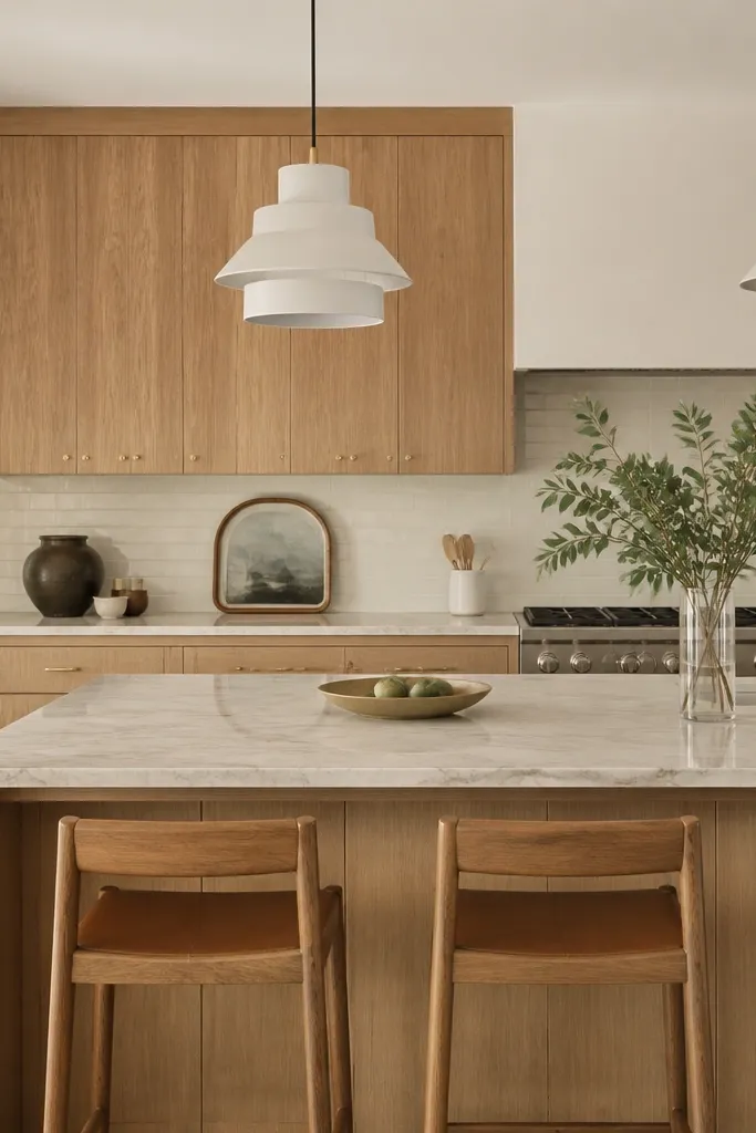
Ceiling color and lighting temperature change how quarter sawn white oak reads in a big way. I’ve found that warm white ceilings (not cool white) keep the oak grain from looking yellow at night. Layered pendants add depth so the cabinet faces catch light at different angles, which makes the grain figure feel more dimensional. This look fits people who like to dine under warm lighting and want the kitchen to feel inviting, not sterile. It also flatters darker countertops because the oak adds warmth without turning the room heavy.
Paint the ceiling warm white, then keep the cabinet finish clear and satin. Choose pendant lights with warm bulb options around 2700K and aim some light toward the cabinets via shade angles. Use a warm white backsplash with a creamy tone and grout that stays light. Install hardware in brushed nickel or satin brass depending on your faucet finish. Keep the countertops in a compatible tone, either bright white or a light stone with warm undertones. Place a runner on the island with a woven texture so it ties into the oak’s natural feel.
Good to knowTurn on the pendants and under-cabinet lights together before you commit to a finish — that combo is where oak either looks perfect or too yellow.
AvoidDon’t rely on overhead-only lighting — oak grain looks flat without side-wash light.
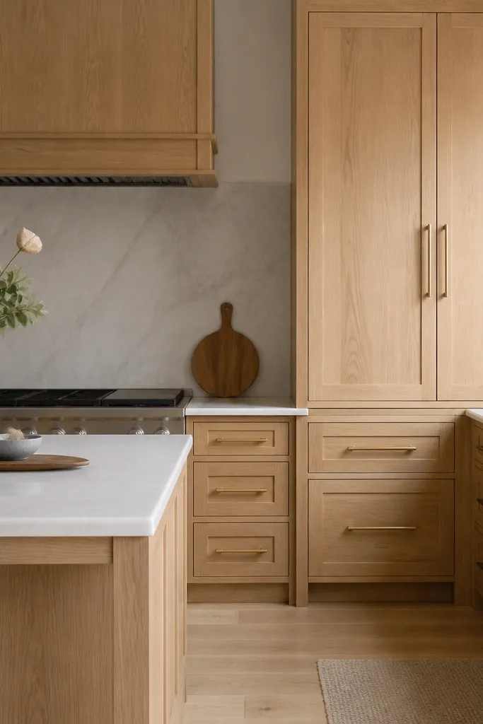
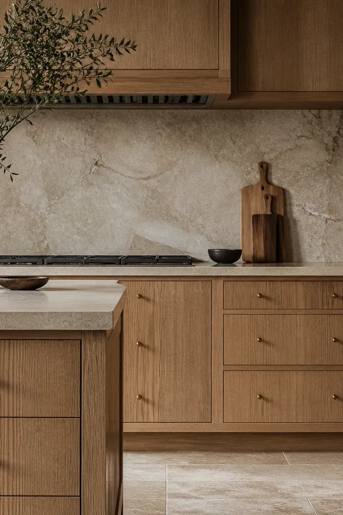
13. Quarter sawn oak with a light stone hood surround
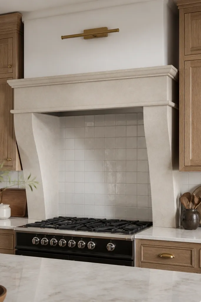
This look makes the oak feel built-in and architectural because you give it a “frame” above the cooking zone. Quarter sawn white oak cabinets aesthetic looks especially good when the hood surround repeats the oak’s tone and the stone around it is light and clean. I like it for kitchens where the hood is a focal point and you want it to feel finished, not like a separate appliance. The stone keeps the palette bright, and the oak adds texture. It flatters people who prefer a soft, high-end feel over stark modern minimalism.
Use quarter sawn oak for the hood trim pieces and match the cabinet face finish exactly. Choose a light stone surround in white with subtle warm-gray veining, then keep the rest of the backsplash simple. Install satin brass hardware and keep the faucet in the same finish family. Add under-cabinet lighting and keep it consistent across the run, so the oak figure doesn’t change tone by section. Style the area around the hood with a small tray of neutral ceramics and a single plant. Keep the rest of the backsplash free of bold patterns so the oak hood trim reads clearly.
Match the cabinet and hood trim finish in sheen too — satin trim next to semi-gloss doors looks off.
Avoid dark hood surrounds with light oak — it makes the cabinets look washed out by comparison.
14. Oak cabinets with a pale blue dining palette and brass accents
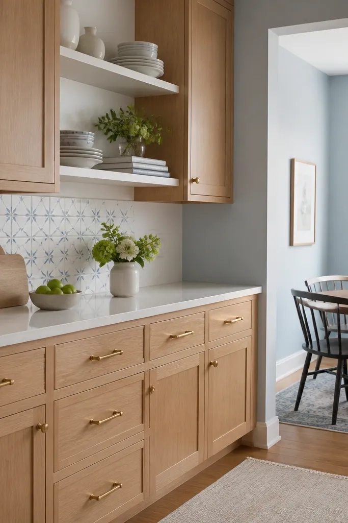
Pale blue is a sneaky partner for quarter sawn white oak cabinets aesthetic. It cools the oak without making it look gray, and it gives the dining area a soft, airy mood. Brass accents bring warmth so the whole palette stays inviting instead of coastal-cold. I’ve used this in kitchens where the dining chairs are upholstered in light blue or where people already own blue dinnerware. It flatters both warm and cool undertones because the oak provides warmth and the blue provides lift. The grain remains visible and dimensional, not drowned by color.
Paint the dining-adjacent wall a pale blue with a gray undertone so it doesn’t go baby-bright. Keep the oak finish clear and neutral, then use satin brass pulls and knobs to tie into the warm wood tone. Choose a white backsplash tile and grout that stays light, then add one or two small blue accents in decor, like a vase or a jar label. Style open shelving with white ceramics and a few light wood pieces. Add a linen runner in cream or oatmeal so the blue doesn’t take over the table. Keep countertop clutter low, because blue walls make mess look more obvious.
Good to knowHold your blue paint sample against the oak door finish under your kitchen bulbs. If the blue turns too green, change to a more gray-blue.
AvoidAvoid bright periwinkle with oak — it makes the oak read yellow-orange.
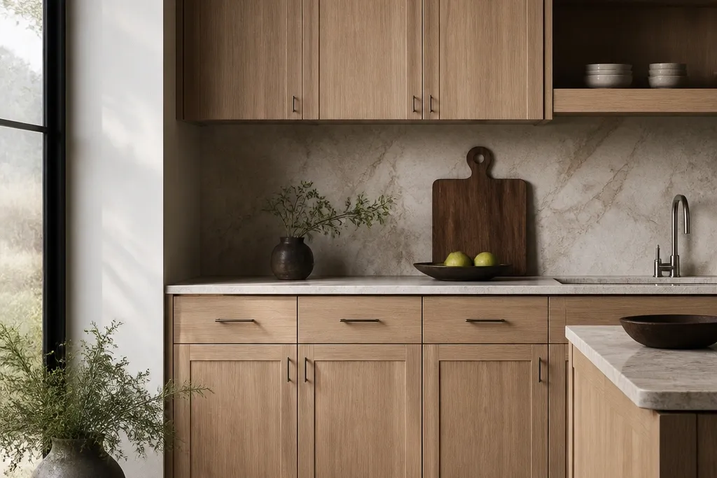
15. Quarter sawn oak perimeter with an oak-and-stone dining island
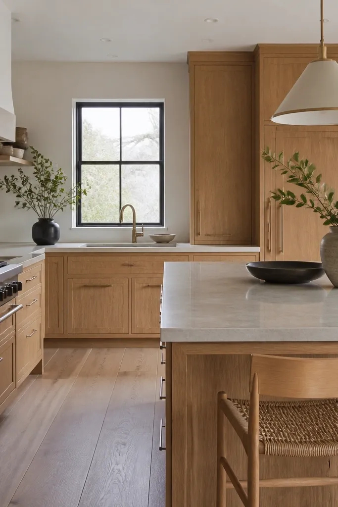
Matching the oak perimeter to an island that uses both oak and stone gives you a cohesive dining-kitchen flow. The quarter sawn grain carries visual continuity across the room, while the stone top keeps the surface clean and practical for meals. I like this setup in homes where the dining area is connected to the kitchen by sightlines, because it makes the space feel planned instead of pieced together. It flatters people who like hosting because the island becomes the staging point: drinks, platters, and everyday prep all look good against light stone. The oak also hides small scuffs better when you keep the finish satin.
Keep the perimeter cabinet finish and sheen identical to the island cabinet panels. Choose a light stone countertop with subtle movement and avoid heavy brown veining. Install the same hardware across perimeter and island so the pulls line up visually. Add toe-kick or under-island lighting so the oak base looks warm at night. Style the island with a neutral runner, a single wood cutting board, and a shallow bowl for fruit — keep items low and centered. For dining chairs, pick upholstery in cream, light gray, or soft tan so the oak can stay the warm anchor.
Good to knowWhen you order hardware, measure from drawer center to center and keep the spacing consistent between island and perimeter.
AvoidAvoid mixing stone tones that lean too warm with clear-coat oak — it can push the oak toward orange.