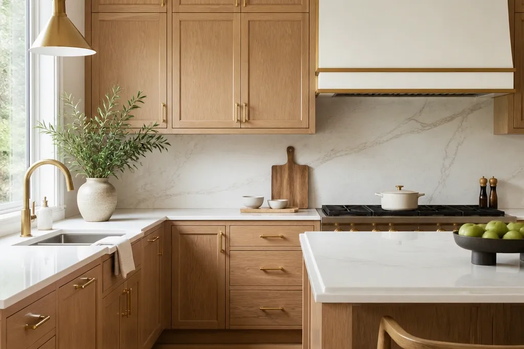
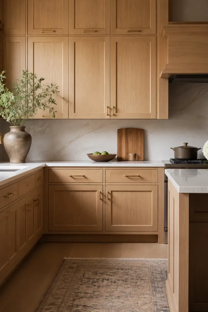
1. Champagne brushed gold on warm white oak shaker
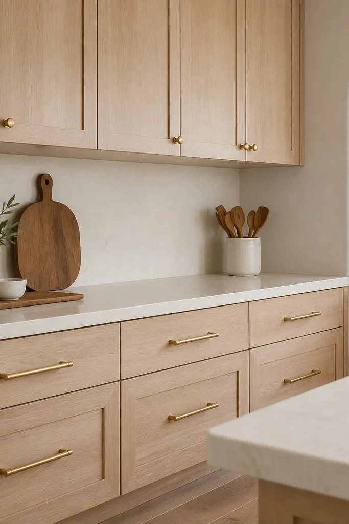
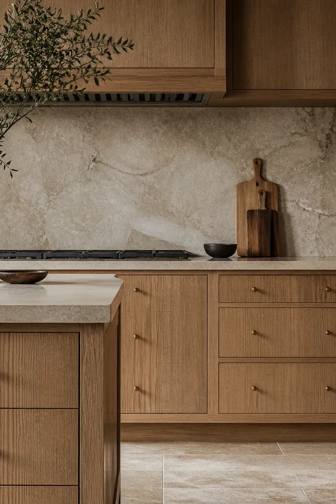
Start with your cabinet doors and check the grain under your kitchen bulbs — if the oak looks beige, choose champagne brushed gold pulls and knobs. Install long bar pulls on drawers so they span the drawer face without touching the ends; keep a consistent gap from each side, roughly 1/2 inch. For uppers, switch to knobs centered on the door panels so the eye breaks up the horizontal lines. Finally, match the gold in one other place you can see from the doorway — I usually pick the faucet trim or a cabinet light lens frame.
This look works when your white oak reads creamy, almost honeyed. The champagne brushed gold has a muted yellow that sits closer to the oak’s warm grain, so you don’t get that brassy clash. I’ve used this pairing in kitchens with warm white walls and wood floors, and it makes everything feel cohesive even if the appliances are stainless. It also flatters kitchens that feel small because the brushed finish doesn’t glare; it looks calm up close.
AvoidDon’t use bright polished brass next to creamy white oak — it often turns orange against the grain.
Good to knowIf you’re unsure, buy a small sample pack of gold finishes and hold them against the oak door edge in the afternoon light.
2. Satin brass on cool white oak with gray undertones
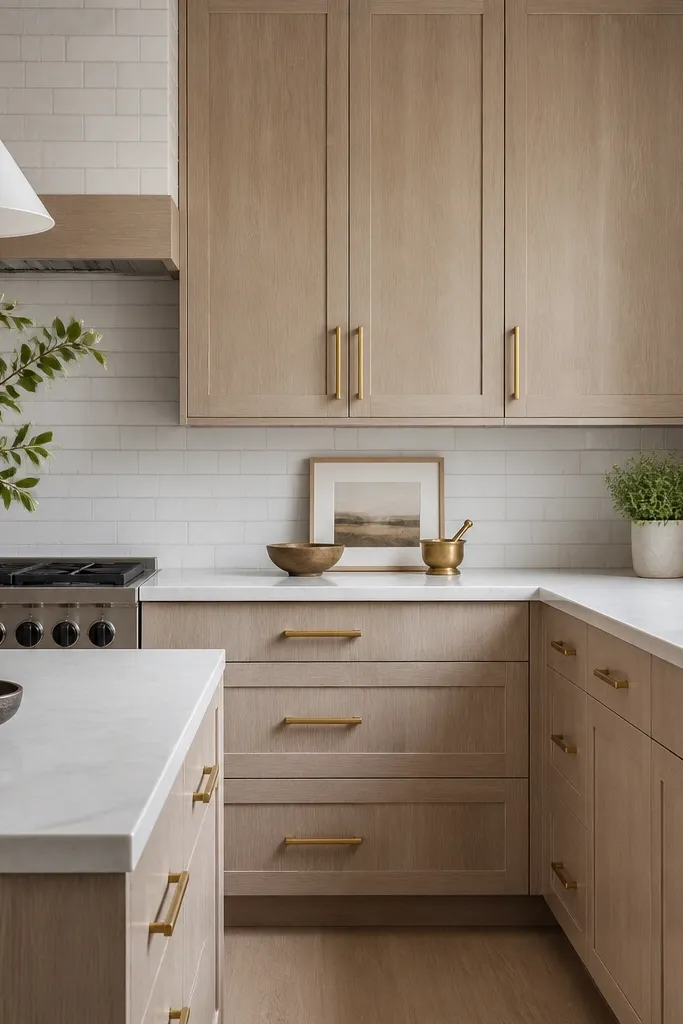
Begin by setting your hardware finish to satin brass for the whole cabinet run — same tone for knobs and pulls. Measure each drawer front and select pull lengths that leave equal clearance on both sides; aim for the pull to feel centered, not swallowed by the drawer. Mount bar pulls at the drawer centerline and keep the height consistent across all drawers, so your eye reads order. For doors, place pulls at standard height — I use about 2 inches below the midpoint of the door panel when there’s no center rail.
Cool white oak needs gold that looks clean, not rose-y. Satin brass has a neutral warmth that supports the oak’s gray highlights without turning the whole kitchen yellow. I’ve seen this pairing make gray countertops look less sterile, especially with a crisp tile backsplash. It flatters modern shaker doors because the hardware’s restrained sheen matches the straight grain and clean geometry.
AvoidAvoid antique gold on cool oak — the darker undertone makes the cabinets look dingy.
Good to knowTake a photo in your kitchen after installing one drawer and one door pull; the lighting will tell you if the brass is too warm.
3. Polished gold linear pulls for an airy high-contrast look
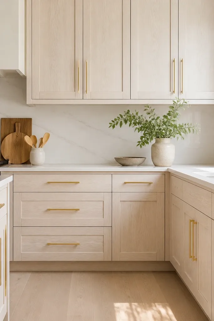
Polished gold is for kitchens that already have lots of light and you want the hardware to feel like jewelry. When your white oak is light and the grain is subtle, polished gold adds crisp contrast without overpowering the wood. I used this in a kitchen with large windows and the result looked expensive because the pulls caught daylight rather than harsh overhead glare. It flatters sleek, minimal hardware layouts and makes open shelving feel intentional.
Choose polished gold pulls that are straight and slim so they don’t look chunky against shaker panels. Install the longest pulls you can fit comfortably on drawers, keeping clearance from the drawer edges consistent; 1/2 inch to 3/4 inch per side is a good starting point. For doors, use either matching pulls centered on the rail or knobs if you want a lighter touch — I prefer pulls for a cleaner line. Finish the look by matching the gold in cabinet lighting trims or a gold faucet — even one visible repeat makes the shine feel planned.
Clean your polished hardware with a microfiber cloth before taking photos; fingerprints show up faster than you think.
Don’t choose polished gold if your kitchen lighting is dim or yellow — it can make the whole kitchen feel heavy.
4. Antique gold patina pulls to warm up heavy oak grain
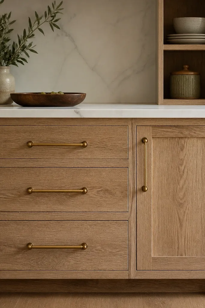
Pick antique gold pulls that have a darker tone in the recesses and rounded edges so they don’t look too sharp. Align pulls to the same height across the entire run; I mark a level line from my first drawer and measure from that. Mount bar pulls on drawers centered on the face, then place door pulls so they sit at the same distance from the top rail across all doors. If you have a backsplash with warm undertones, repeat the warm gold tone with the same finish in one more item like cabinet light trim.
When your white oak grain is strong and a little dramatic, antique gold looks right because it echoes the wood’s depth. The patina adds shadow and keeps the metal from looking flat against textured grain. I’ve installed this in kitchens with thicker countertop overhangs and darker floors, and it made the cabinets feel grounded rather than pale. It flatters traditional-leaning shaker doors and also works in modern spaces when you keep the rest of the room simple.
AvoidAvoid satin nickel or chrome anywhere near the cabinet hardware if you’re doing antique gold — the mismatch reads accidental.
Good to knowBefore committing, compare antique gold against your oak door edge in both bright and cloudy daylight — patina can shift based on light.
5. Matte brushed gold knobs and cup pulls on upper cabinets
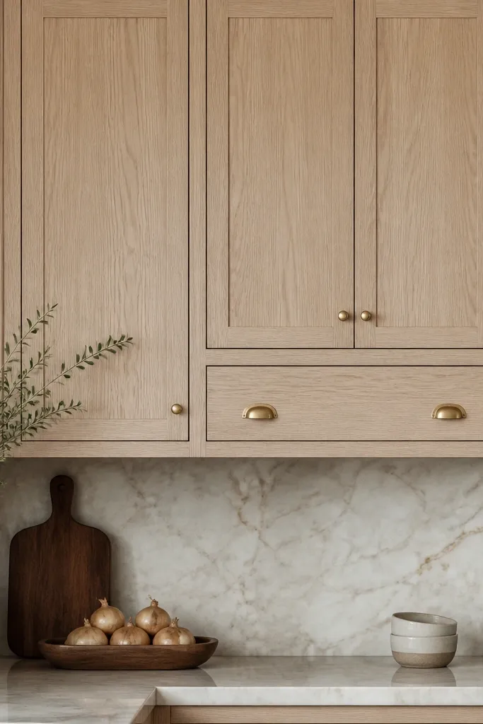
Start by assigning knobs to the smaller upper doors and cup pulls to the wider doors so the hardware size matches the door width. Keep the knob centered vertically in the door panel and mount cup pulls so the lip catches your hand naturally, usually around the lower third of the panel. Use a consistent brushed direction across all pieces if your hardware offers it; that keeps the finish from looking patchy. Finally, keep lower cabinets on bar pulls so the visual weight balances between upper and lower storage.
Matte brushed gold is the friendliest gold finish when you want warmth without shine. Cup pulls on upper cabinets are a practical choice because they’re easy to grab, and they add visual texture without looking loud. I’ve done this combo in kitchens where people open uppers constantly — it stays classy even after fingerprints and daily use. It flatters kitchens with farmhouse touches because the matte metal looks grounded instead of flashy.
AvoidDon’t mix matte brushed gold with polished gold in the same cabinet run — it looks like you bought hardware in two trips.
Good to knowIf you’re replacing existing knobs, measure the hole spacing first — many cup pulls are not forgiving with old drill patterns.
6. Two-tone gold layering with satin brass and champagne accents
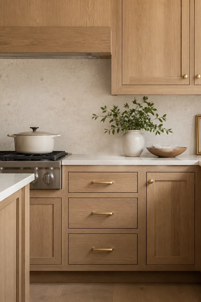
This is how you get depth without chaos: one gold finish leads, the other supports. Satin brass on drawers gives you a slightly cleaner, modern tone; champagne knobs soften the transitions on doors. I’ve used this in kitchens where the hardware needs to work with both a warm faucet and a slightly cooler light fixture trim. It flatters people who like a layered look but still want the cabinets to feel coordinated.
Pick a primary gold finish for the biggest surfaces — I use satin brass on drawer pulls because drawers are visually dominant. Then choose a secondary tone that’s close in warmth for the smaller hardware like knobs, usually champagne gold. Keep spacing and alignment identical between pieces; the difference you want is finish, not placement. After you install one section, step back and check it from the kitchen doorway — if the two gold tones read like separate metals, swap one finish so they match more closely.
Use the same brand for both finishes if you can; different brands age differently and can drift in tone.
Avoid using two-tone gold if your oak finish is hard to read (too gray in one light, too beige in another) — it magnifies the confusion.
7. Slim finger pulls on a handle-free look with gold accents
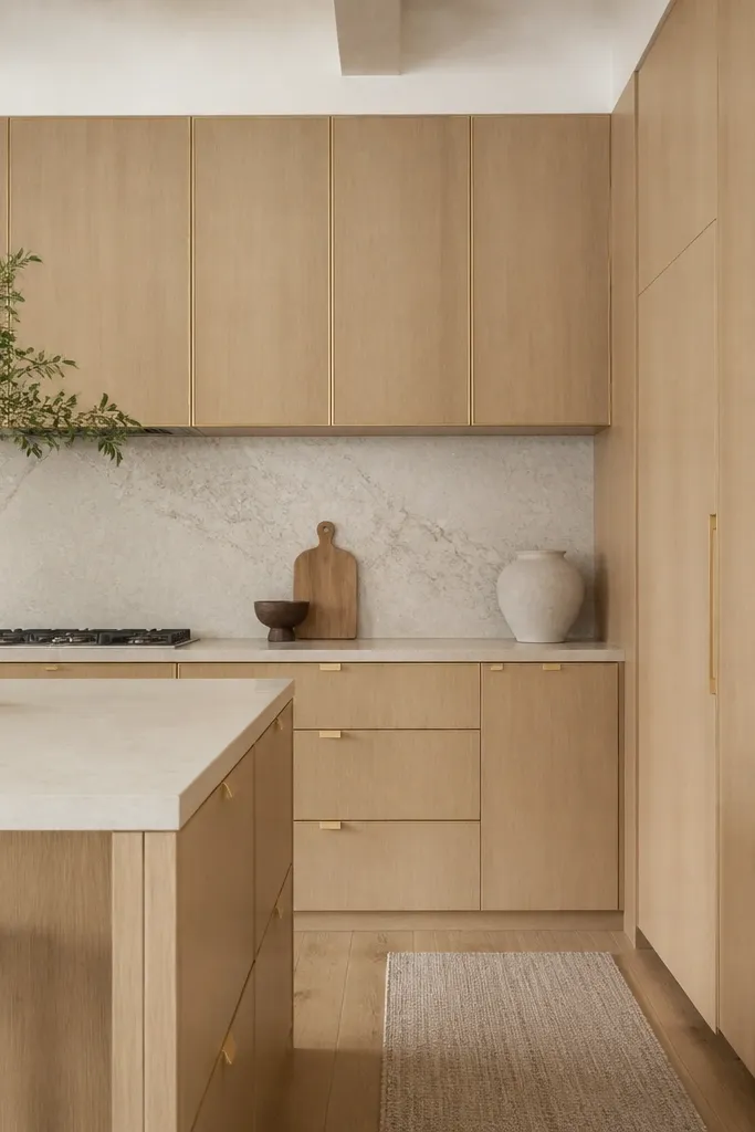
Choose finger pull profiles that match your cabinet thickness and mounting depth so they sit flush. Start by dry-fitting one door and checking the reveal gap so the pull doesn’t snag when you open. Install drawer pulls first, then align finger pulls using a template so the vertical placement stays consistent across the run. Keep the gold finish consistent with your faucet trim — finger pulls are small, and mismatched metals show immediately.
If you hate bulky hardware, slim finger pulls give you function without breaking the cabinet silhouette. Gold accents in these recessed pulls look intentional because they sit in the shadow lines of the door. I installed this style in a kitchen where the cabinets were the star and the counters were busy. It flatters modern white oak because the cabinetry stays sleek and the gold reads as a detail instead of a focal point.
AvoidDon’t pick finger pulls that are too tall; they ruin the handle-free illusion on shaker doors.
Good to knowPractice opening the door after install; if your hand catches the edge, adjust placement before you move on.
8. Gold bar pulls with a brushed finish and rounded edges
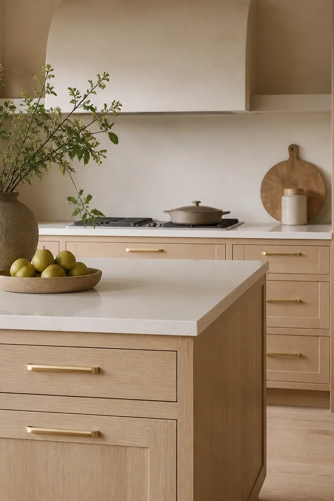
Select bar pulls that match the scale of your cabinet faces: if your drawers are narrow, go with shorter pulls so the ends don’t crowd the corners. Mount drawers first at the centerline, then use a level to keep all door pulls aligned to the same height. For doors, place pulls at a consistent distance below the rail, and keep the spacing uniform across the run. Pair with warm white countertops and a backsplash that has beige or cream tones so the brushed gold looks like it belongs.
Rounded bar pulls soften the look of white oak. The brushed finish hides micro-scratches from daily use, and the rounded ends keep the hardware from feeling too industrial. I’ve found this combination looks great in families' kitchens because it stays friendly-looking even when the metal gets handled constantly. It flatters people who want gold hardware but don’t want it to look sharp or aggressive.
AvoidAvoid sharp, angular pulls with rounded oak grain — the contrast can feel harsh.
Good to knowIf your cabinets have deep drawers, use longer pulls than you think — the rounded ends look better when they’re actually proportionate.
9. Gold knobs on upper doors with long drawer pulls for eye balance
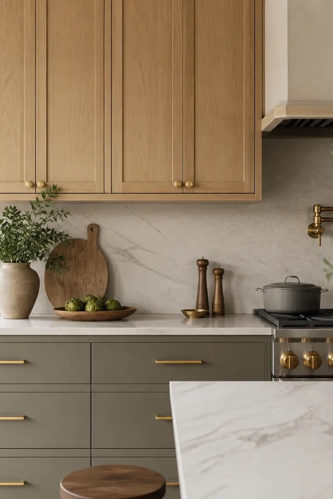
Choose one satin gold finish for everything. Install knobs centered on upper door panels, keeping them at a consistent height — I line up the centers across all uppers so they feel “built.” Then install drawer pulls centered on each drawer, using the same pull length for drawers of the same width. If you have a tall pantry, run a horizontal line of pull placement so the hardware looks aligned with the cabinet’s vertical proportions.
This is the cleanest way I know to keep a white oak kitchen from looking over-handled. Knobs on uppers make the visual field lighter, and long drawer pulls anchor the lower cabinets so the room looks stable. I’ve used this layout in kitchens with mixed cabinet sizes, and it still looks orderly because your eye has a rhythm to follow. It flatters most door styles, especially shaker, because it respects the geometry without adding clutter.
AvoidDon’t put knobs on large doors and then use tiny pulls on drawers — it creates a lopsided look.
Good to knowWhen you pick knob size, match it to the door scale: small doors need smaller knobs or the hardware looks oversized.
10. Gold pulls on a two-tone cabinet wall with white oak lowers
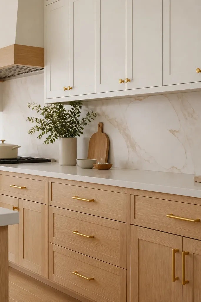
Two-tone kitchens need hardware to act like the glue. When the lowers are white oak and the uppers are painted, consistent gold hardware makes the whole wall feel designed instead of patched together. I’ve done this setup in homes where the homeowners wanted “warm wood but clean paint,” and the gold hardware stopped the two finishes from fighting. It flatters rooms with neutral walls and makes the oak read intentional rather than accidental.
Pick one gold finish for the whole wall — satin gold is the safest choice. Install bar pulls on the white oak drawers and keep the same pull length on matching drawer widths, even across the painted uppers if you have drawers there too. Put knobs on painted upper doors at the center of the door panel, then match the knob style to the oak side so the gold looks uniform. Finish by matching the gold in the faucet trim or a single pendant light’s metal so the wall feels tied together.
If your painted uppers are more cool-gray, test the gold finish against the paint edge too — undertone matters.
Avoid using antique gold on the painted side if the paint is crisp white; it can make the wall look aged.
11. Gold hardware with brass-toned faucet and matching light trim
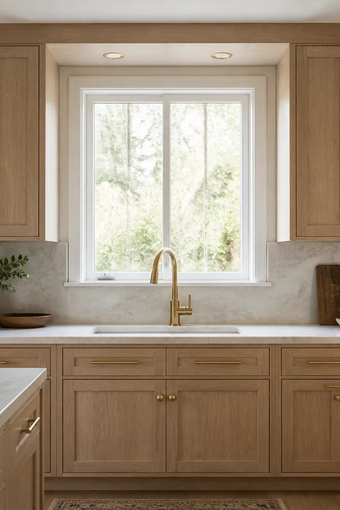
Start by choosing your cabinet hardware finish first, then buy the faucet trim in that same gold tone. Install cabinet pulls and knobs, keeping all placement lines consistent with your door and drawer centers. Next, check the cabinet light trim finish — match it to the same gold level (matte to matte, satin to satin). Finally, adjust your backsplash grout or caulk color so it doesn’t reflect light and make the metals look mismatched in photos.
When gold hardware is repeated in the faucet and lighting trim, the whole kitchen reads finished. I’ve learned this after too many installs where the cabinets had perfect gold pulls but the faucet was chrome and the lighting trim was nickel — it turns into a weird tug-of-war. With a warm-toned faucet and gold-trim lights, the hardware looks like it belongs to the same design language as the rest of the kitchen. It flatters kitchens where you can see the sink area and cabinet pulls in the same glance.
AvoidDon’t rely on “close enough” metals if you have bright overhead lighting — small tone differences show up fast.
Good to knowHold the faucet trim next to the cabinet pulls before you order; the tone difference is easier to spot in person than online.
12. Gold bar pulls on vertical-grain oak with a modern edge
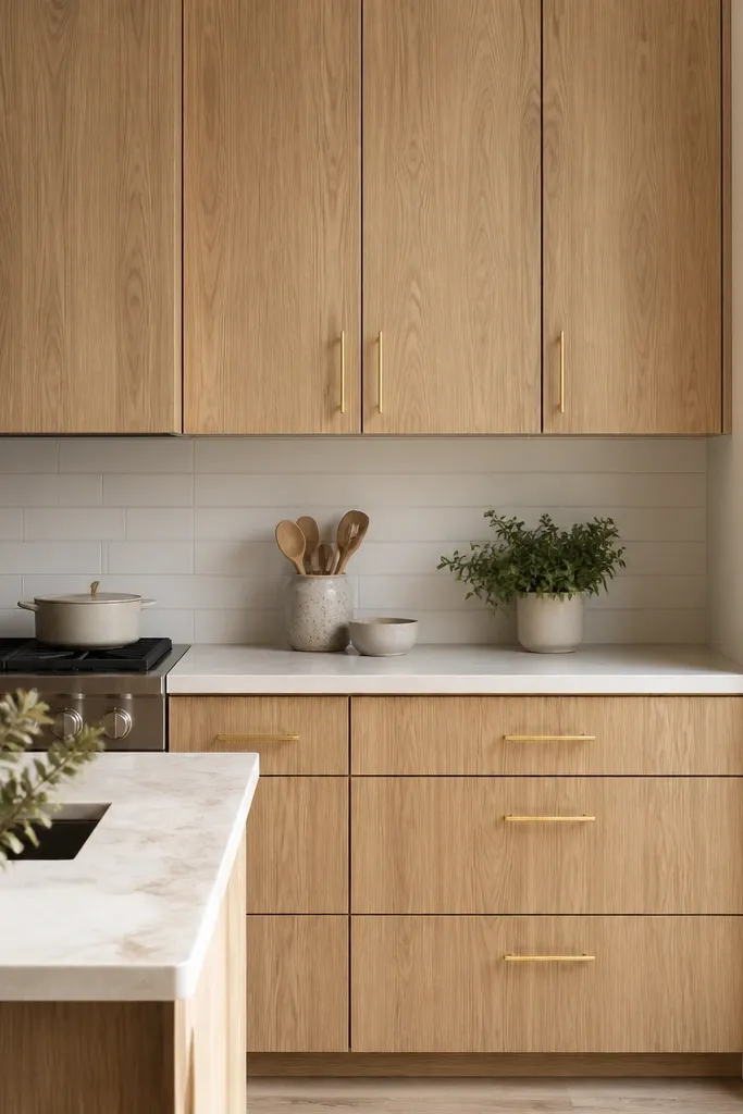
Pick satin gold bar pulls that are straight and not overly ornate. Measure drawer fronts and choose a pull length that matches the drawer width in a consistent ratio — if you go too small, the pull looks lost; too big and it crowds the frame. Install pulls on drawers first, then use the same center height for door pulls across the run. Keep the rest of the hardware simple: no mixed knobs unless you use the same finish and style for both.
Vertical-grain white oak already has movement, so you want hardware that adds line without extra texture. Satin gold bar pulls with clean edges keep the design modern and let the wood grain do the talking. I like this setup for kitchens with minimal backsplash patterns because the hardware becomes the controlled accent. It flatters people who like a crisp look and want the cabinets to feel taller and more structured.
AvoidAvoid decorative gold pulls with vertical grain — the combined detail can feel busy.
Good to knowUse painter’s tape to mark pull locations before drilling; vertical-grain cabinets show alignment errors more than flat-grain ones.
13. Gold hardware on a white oak island with seating contrast
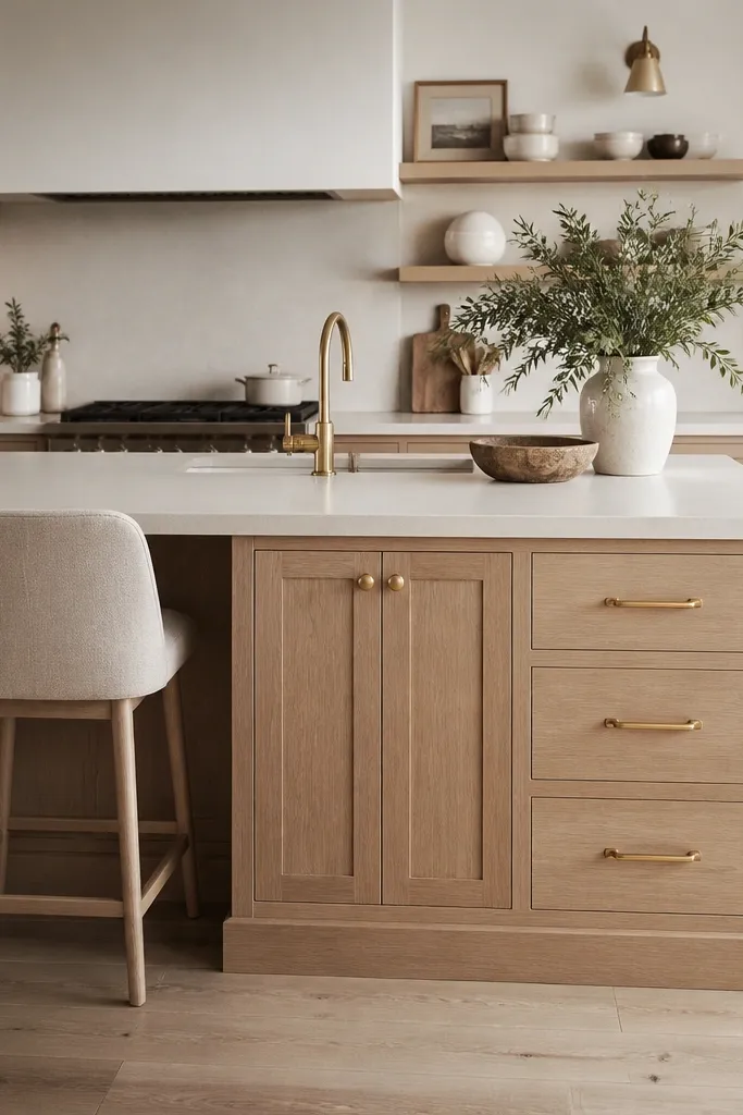
Use brushed satin gold bar pulls on all island drawers and matching knobs on the doors. Keep pull lengths consistent across drawers and mount them centered on each drawer face, with equal clearance from the edges. For the island doors, align knobs to the same vertical position as the door pulls elsewhere, so the island doesn’t look “different.” Then match your stool metal base or hardware accents to the gold tone so the island seating feels cohesive.
Islands get handled constantly, so hardware needs to look good after daily use. Gold hardware in a brushed satin finish holds up visually better than high-polish in a busy household. In my kitchen refresh, this pairing made the island feel like the focal point without making the whole room shiny. It flatters kitchens where stools, rug, and wall color are warm neutrals, because the brushed gold ties the textures together.
AvoidAvoid tiny knobs on island doors — they look fussy and people grip them awkwardly.
Good to knowWipe hardware with a slightly damp microfiber after cooking spills; brushed gold hides streaks better than you’d think.
14. Oversized gold pulls for a dramatic shaker look
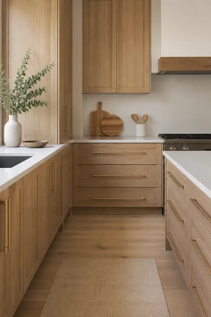
Choose pulls that are long enough to feel proportional to the drawer width, not just longer for the sake of it. Aim for the pull to leave a comfortable edge gap so it doesn’t look bolted-on; about 1/2 inch to 3/4 inch per side is the zone I like. Install drawer pulls first, then set door pull height to visually match the drawer pulls, keeping the line consistent across upper and lower cabinets. Finish the look by keeping the gold finish uniform and avoiding other mixed metal accents on nearby trims.
Oversized pulls look dramatic because they create a stronger line across the cabinet face. This works best when your shaker doors have clean spacing and your white oak finish isn’t too dark — you need contrast without clutter. I used oversized pulls in a kitchen with simple quartz and a plain tile backsplash, and the cabinets looked like the design was planned from day one. It flatters homeowners who want a statement hardware moment and don’t mind a more “designer” look.
AvoidAvoid oversized pulls on small doors — they make the cabinet fronts look cramped and cheap.
Good to knowIf you’re going oversized, test grip comfort by mimicking hand placement at the planned height before drilling.
15. Gold hardware with a soft matte finish to hide fingerprints
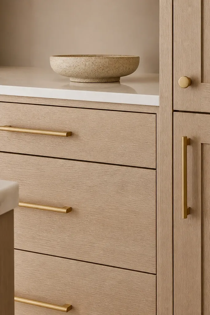
Select matte gold pulls and knobs that match in tone and sheen — matte gold should look the same across pieces. Mount bar pulls on drawers centered and aligned to a reference line you measure from the top cabinet face. For doors, use knobs centered on the panel or short pulls if the doors are wider; keep the placement consistent. Pair with a matte faucet finish or a brushed gold lighting trim so the metals don’t fight each other visually.
Matte gold is a practical choice when you have kids, frequent cooking, or you hate seeing fingerprints on metal. The low sheen doesn’t glare under under-cabinet lights, so the kitchen looks smooth and intentional. I’ve installed matte finishes in real family kitchens and they stay visually clean longer than polished gold. It flatters kitchens with warm neutrals because matte gold blends instead of reflecting every light source.
AvoidAvoid matte gold that looks slightly metallic-blue in the light — it reads off against white oak undertones.
Good to knowUse a mild soap and damp microfiber for cleaning; harsh cleaners can dull matte finishes unevenly.