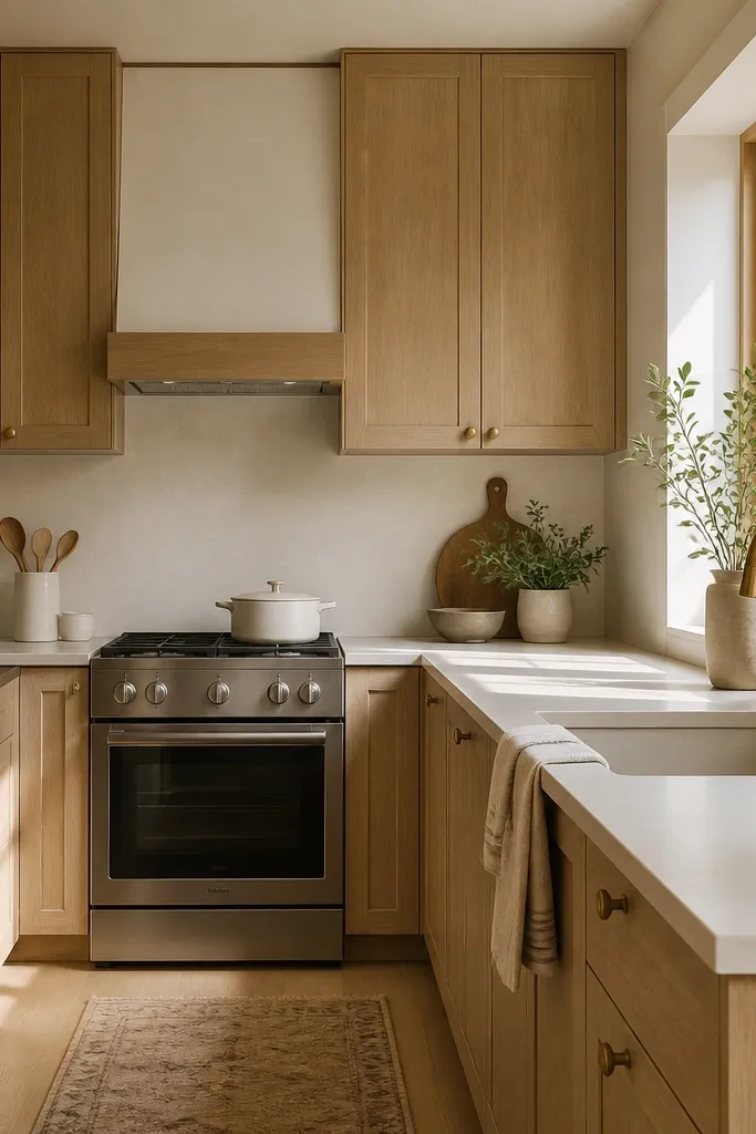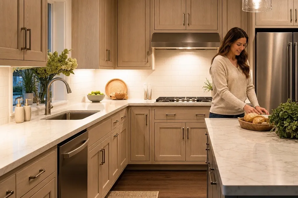

1. Warm white oak cabinets with brushed nickel bar pulls
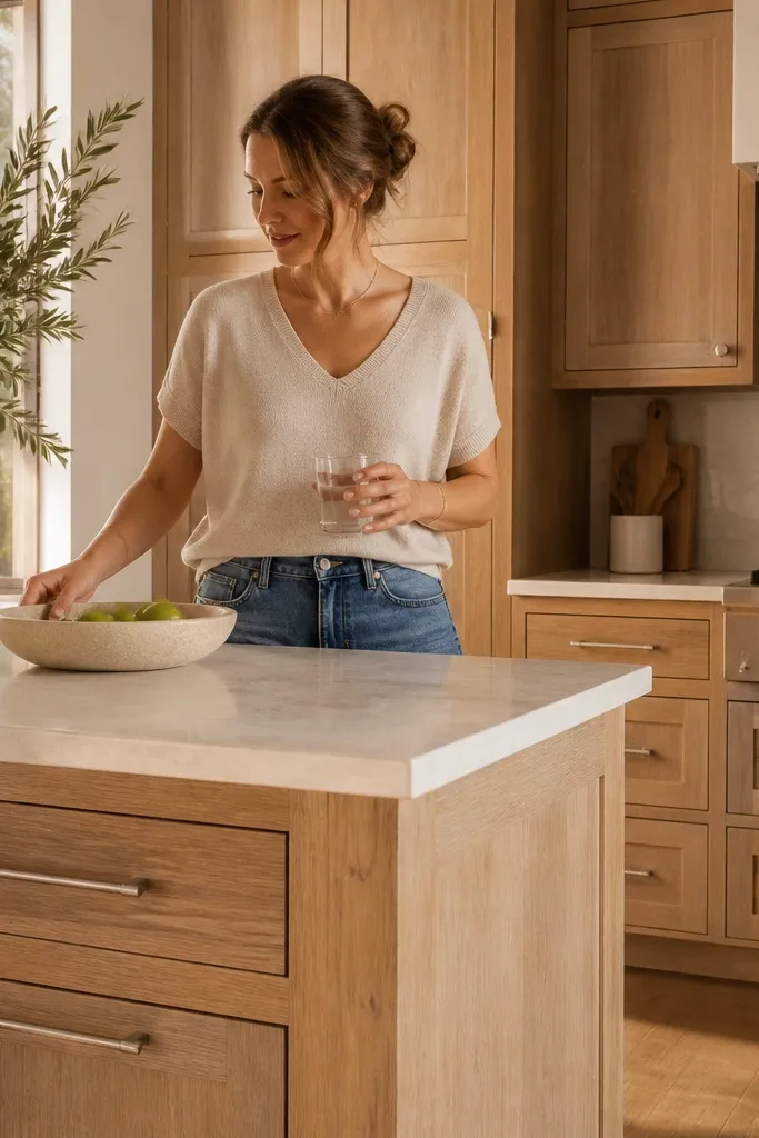
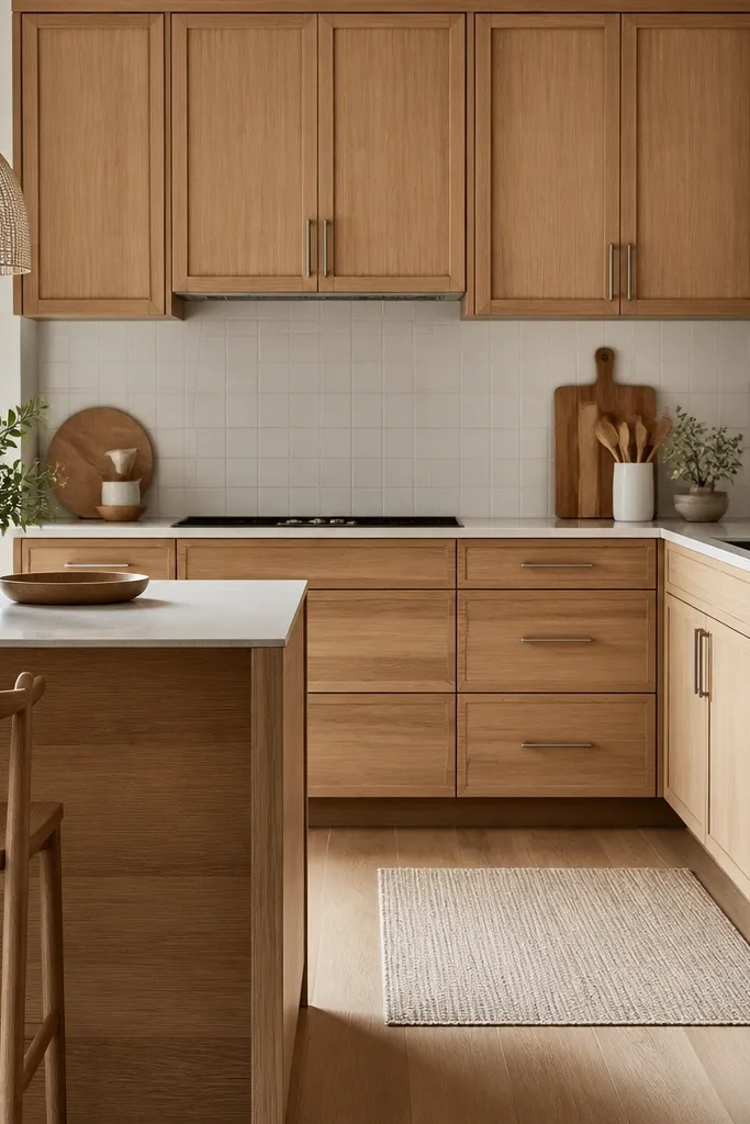
This look works because warm white oak has a creamy base, and brushed nickel keeps it from reading too yellow. I did this combo in a kitchen with oak-leaning floors, and the cabinets ended up looking coordinated instead of “two different woods.” The off-white quartz softens the warmth without turning the kitchen into a cool showroom. If your skin tone runs warm or neutral, this scheme feels friendly and natural in photos because the oak doesn’t clash with warm undertones in people’s lighting.
Start by choosing a white oak stain described as “light warm” or “natural” with a matte or satin topcoat, then order one sample and view it under your kitchen bulbs. Swap hardware to brushed nickel bar pulls — for shaker/flat-panel doors, use 5-inch or 6-inch spacing so the pull line sits centered on the stile. Pick an off-white quartz with subtle veining, not heavy gray movement. Finish with white square tile backsplash and warm gray grout, keeping grout coverage even so the pattern looks crisp rather than patchy. If you have open shelves, style them with white ceramic and one small tray in light wood to echo the grain.
Change bulbs to 3000K if your oak samples look too bright in daylight — it usually fixes the “orange flash” effect.
Don’t pair warm white oak with polished chrome hardware — it makes the grain look brassy in warm light.
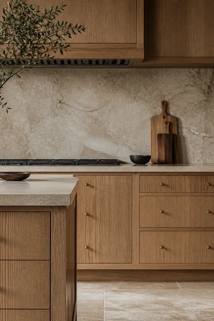
2. Natural white oak cabinets with matte black cup pulls
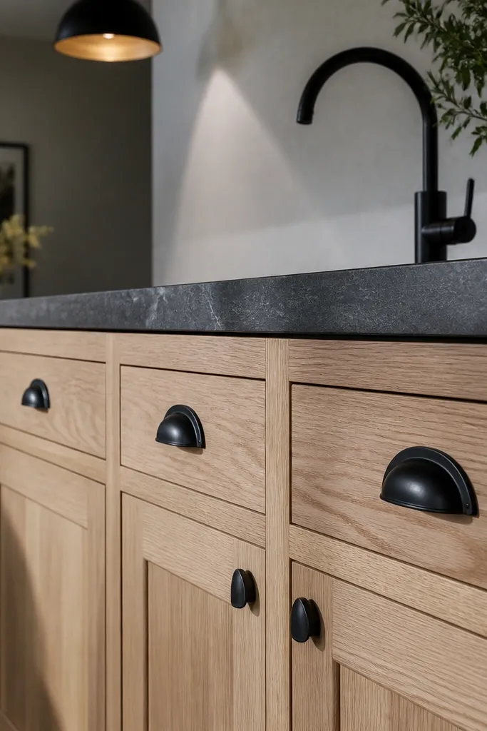
Natural white oak plus matte black reads modern without feeling cold. The black hardware gives the grain a dark frame, so you see the oak figure even when the kitchen is dim. I used this in a client’s dining-adjacent kitchen where the room felt too bright and airy; the black brought focus back to the cabinets. This combo is especially flattering if your space has light stone or beige floors because the black ties everything together without fighting the warmth.
Good to knowIf your oak looks too pale, add a slightly warmer grout tone and stay with warm LED under-cabinet lighting.
Choose a clear or very lightly tinted white oak finish so the grain stays pale — aim for a satin sheen, not high gloss. Install matte black cup pulls that match your drawer width; for 24-inch drawers, use a pull centered and sized so the ends don’t crowd the edges. Keep the countertop in a warm white or creamy quartz with minimal gray streaks. Use a subway tile backsplash in cream/white with light grout so the cabinet hardware stays the main contrast point. Add one matte black detail like a faucet or a black framed mirror above the coffee nook.
AvoidSkip high-contrast white grout with natural oak — it can make the backsplash look harsh and cheap.
3. White oak cabinets with a two-tone island and matching oak toe-kick
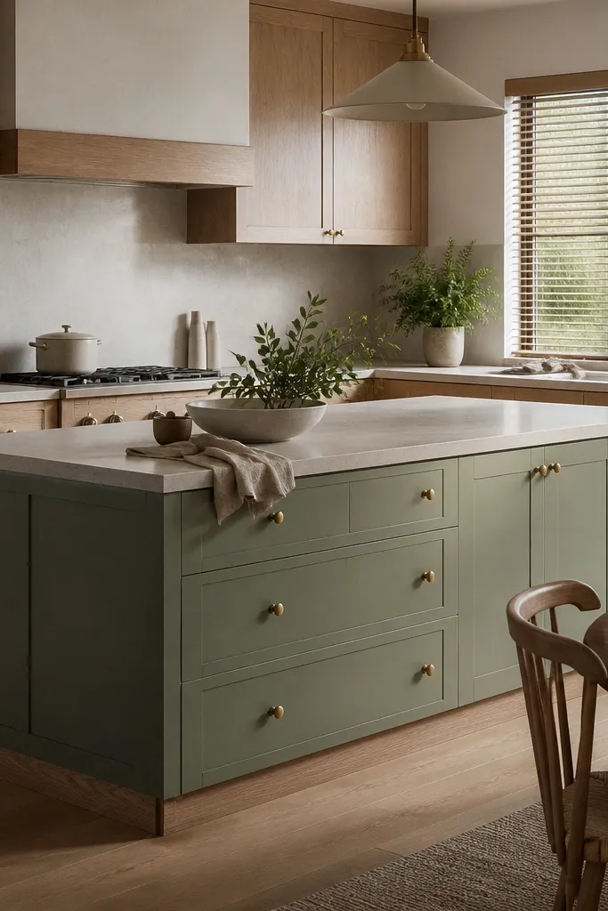
This is the before/after trick I use when the cabinets are the hero but the room needs personality. Keeping the toe-kick in white oak makes the whole kitchen feel intentional and grounded, even when the island is painted. The sage island color gives you a softer, more lived-in look than gray, and brass knobs add warmth at the exact spot your eye lands on the island. I’ve seen this work best in kitchens with open dining areas because the island color pulls the whole space together.
Start with white oak cabinets for the perimeter, then pick an island paint in a muted sage or gray-green with a satin finish. Keep the toe-kick consistent — use the same oak finish and sheen as the cabinet bottom rail so the transition looks seamless. Install brass knobs on the island drawers and matching brass pulls on the perimeter to keep metals consistent. Choose a backsplash with movement that isn’t too gray — look for warm white stone-look porcelain with tan veining. Style the top with a ceramic canister set and a cutting board in the same oak tone.
Paint the island before you finalize cabinet hardware so you can adjust pull spacing around the painted door thickness.
Don’t paint the toe-kick — it breaks the line and makes the kitchen look assembled from mismatched parts.
4. White oak cabinets with white quartz waterfall and simple pulls
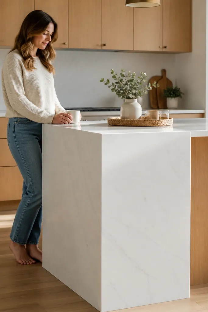
Waterfall edges make white oak feel more architectural because they add a continuous line of bright material. The trick is keeping the hardware minimal so the waterfall doesn’t compete for attention. In my own kitchen update, this combo made the oak look cleaner and less “craft” because the white stone reads crisp. This layout suits people who want a modern dining feel and don’t want busy countertop patterns fighting the cabinet grain.
Choose a white quartz with subtle gray movement and a honed or low-gloss finish so it doesn’t glare. Order a waterfall edge on the island so the quartz wraps down the front — keep the waterfall width consistent with your island design, usually around 12 inches. Use simple pulls in brushed nickel or satin stainless, centered on drawers and doors. Install a white herringbone backsplash with consistent grout lines so the wall stays calm. If you have a coffee bar, use a tall narrow shelf with white mugs and one oak tray.
Ask for a slightly warm white quartz, not a blue-white, to avoid making oak look yellow.
Avoid glossy quartz with warm oak — the glare makes fingerprints and cabinet reflections look messy.
5. White oak cabinets with smoked glass uppers and brass frames
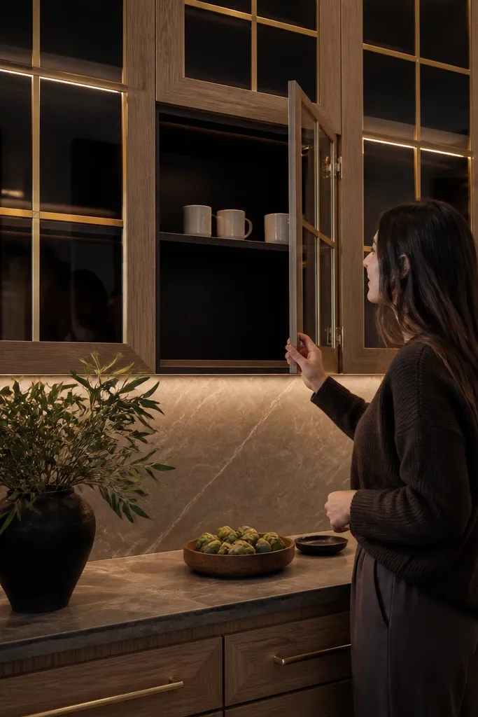
Smoked glass uppers are one of the fastest ways to make white oak feel expensive without changing the whole kitchen. The dark glass hides clutter and makes the oak look more dramatic, especially at night. Brass frames add warmth and echo the oak without turning the kitchen into a “gold everywhere” situation. This works great for people who cook a lot and need storage that doesn’t look chaotic.
Pick a white oak finish with a satin topcoat so it doesn’t look too shiny next to smoked glass. Choose glass doors with clear spacing and install smoked panels, not fully black — you want them dark enough to hide, but still allow plate shapes to show. Use warm brass frames and hardware that match in tone. Keep the backsplash light and linear — thin grout lines and neutral tile keep the glass from looking busy. Style the glass with a consistent set: all white plates, one row of bowls, and leave the bottom shelf mostly empty for breathing room.
Use plate stands or risers so items don’t sit flat — the display looks cleaner through the glass.
Don’t put mismatched colored dishes behind smoked glass — the dark background makes colors look dull and messy.
6. White oak cabinets with painted linen uppers and oak lowers
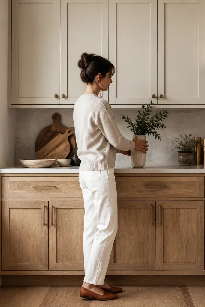
This two-finish approach gives you the look of a designer kitchen while still letting the oak be the star. Oak lowers anchor the room, and the painted uppers lighten the vertical space so the kitchen doesn’t feel heavy. Linen paint has a creamy undertone that sits nicely next to white oak grain without going stark. I used this setup for a smaller kitchen where people needed storage but didn’t want dark cabinets swallowing the walls.
Start with white oak for the base cabinets, then pick a linen-white paint for uppers and the island if you have one. Use satin paint finish for durability around cooking splashes. Install matte black hardware across both finishes so everything reads cohesive. Choose a backsplash in warm beige or soft cream with a subtle pattern, and keep grout in a matching warm tone. Add one oak element on open shelving, like a small cutting board or a narrow tray, so the oak doesn’t feel isolated.
Order a paint sample and check it next to the oak sample in the same lighting — linen whites vary a lot.
Don’t use bright cool white paint — it makes oak look yellow and the two finishes look like separate eras.
7. White oak cabinets with classic shaker doors and antique brass knobs
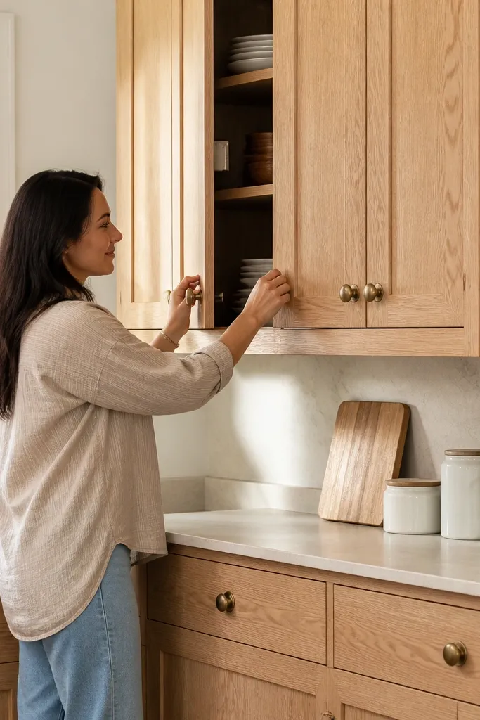
Shaker doors + antique brass is a style pairing that looks “collected” instead of trendy. The oak grain gives you warmth, while the antique brass brings a slightly aged tone that matches the traditional cut of shaker. In the before/after I did for a friend, this combination made the kitchen feel calmer because everything had the same visual age — nothing looked too new or too glossy. It’s especially flattering if your home has warm-toned floors or wood trim already.
Use shaker cabinet doors in white oak with a satin finish, not high gloss. Pick antique brass knobs with a warmer gold-brown tone, and keep pulls consistent across the kitchen so the hardware line feels intentional. Choose a marble-look backsplash with thin gray or beige veining and warm grout. Keep the countertop light so the brass doesn’t overpower the oak. Style with simple woven baskets and white glass canisters that let the hardware and cabinet grain stay visible.
If your brass looks too orange, switch to a slightly brushed antique brass rather than shiny brass.
8. White oak cabinets with full-height pantry and vertical grain direction
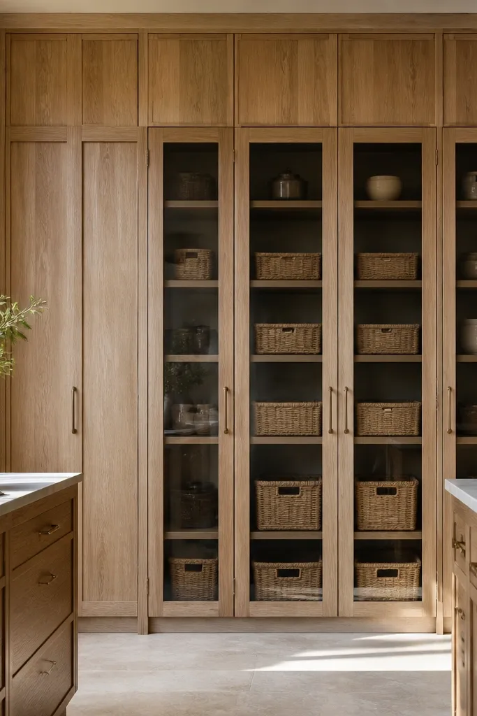
Full-height pantry doors make white oak look intentional because the grain direction and door height create a clean vertical rhythm. I like this look in kitchens where people run out of storage and end up with mismatched bins on countertops. When the pantry is full-height, you can keep the rest of the counters clear and the oak stays the only warm texture in the room. This is a great choice if you have a tall ceiling and want the cabinets to “reach” without getting visually heavy.
Good to knowPlan pantry lighting early — a simple LED strip inside the pantry makes the oak look richer at night.
Choose a cabinet system with full-height pantry options and make sure the door panels are tall enough — aim for at least 90 inches if your ceiling allows. Order white oak with a finish that doesn’t go too amber; satin is your friend here. Use brushed nickel hardware and keep it centered and consistent. Install a simple backsplash so the pantry wall stays the focal point. Add interior organizers so the pantry looks tidy — pull-out shelves and clear bins reduce the need for counter storage.
AvoidDon’t crowd the pantry entrance with decor — the tall doors need visual breathing room.
9. White oak cabinets with under-cabinet lighting and frosted glass task window
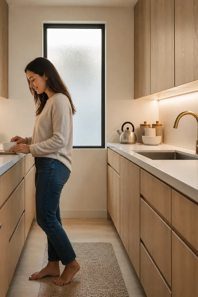
Lighting changes how white oak reads more than people expect. Under-cabinet LEDs make the grain look smooth and even, and they reduce the “orange flash” that happens when light comes only from overhead fixtures. I did a before/after in a narrow galley kitchen where the cabinet tops always looked shadowy — once we added LED strips, the whole room looked bigger. If you have a task area near the sink, frosted glass or a textured panel adds privacy without making the backsplash feel busy.
Good to knowTurn on the LEDs at night and check for hotspots on the cabinet doors — adjust the channel placement if you see glare lines.
Install 3000K under-cabinet LED strips with an aluminum channel so the light spreads evenly across the cabinet face. Use a cabinet finish in satin so it reflects the light softly. Choose hardware in brushed nickel or satin stainless, and keep the pull shapes simple. Pair with a white backsplash that has texture — like a lightly tumbled tile or a micro-rib pattern — so the LEDs give it depth. Style the counter with one height variation item, like a tall vase, and keep everything else low and uniform.
AvoidAvoid cool 4000K LEDs with warm white oak — the cabinets look yellow and the kitchen feels harsh.
10. White oak cabinets with blackened bronze pulls and matte white subway backsplash
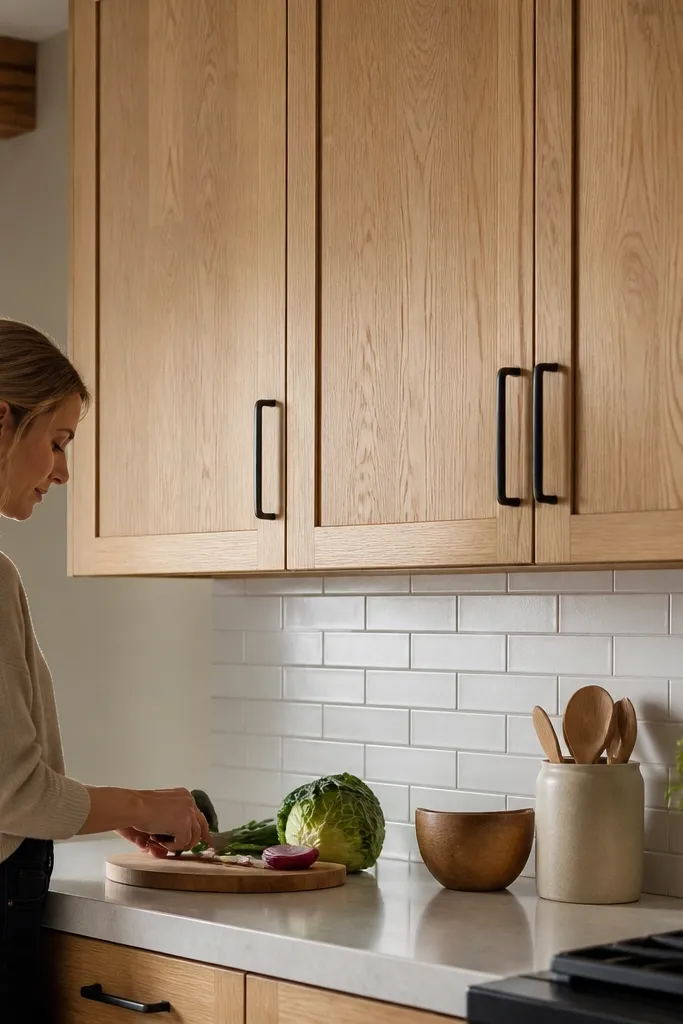
Blackened bronze sits in a sweet spot between warm brass and pure black. It gives your oak cabinets a darker frame without the starkness that matte black can bring. The matte white subway backsplash also helps because it doesn’t reflect light hard, so the oak grain stays the focus. I’ve done this in kitchens where the homeowners wanted “dark accents” but didn’t want the room to feel like a warehouse. It looks great with creamy counters and warm beige walls.
Pick white oak with a natural-to-light warm finish and keep sheen satin. Install blackened bronze pulls sized to your door width — for 18-inch doors, keep pull length around 5 inches so it doesn’t look oversized. Choose matte white subway tile and use light gray grout for clean lines. Pair with a countertop in creamy quartz or a light stone-look porcelain with minimal contrast. Add bronze pendant lights above the island and keep any other metals in bronze so it feels planned.
Test a bronze sample under your kitchen lights; some bronze finishes read red and fight warm oak.
Skip glossy backsplash tile — it throws bright reflections that make the hardware look smudged.
11. White oak cabinets with linen-glaze glaze effect on oak for a softer grain
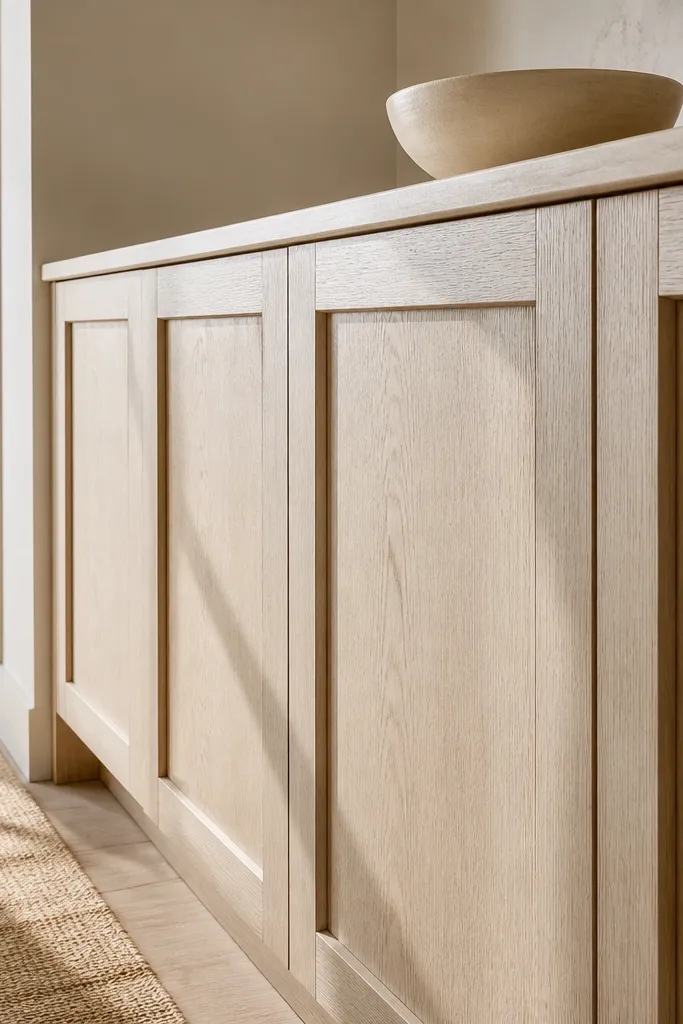
A glaze effect on white oak makes the grain look more dimensional and less “flat photo.” The key is keeping the glaze subtle so it doesn’t turn the wood into a dark stain. In a before/after I did for a client with very light walls, the glazed oak looked warmer and more textured, while still reading bright. This works well if your kitchen has lots of white surfaces because the glaze gives you depth without adding a new color.
Choose a white oak finish system that includes a glaze step, and ask for a sample on your actual door profile. Keep the glaze tone one shade deeper than the base, then seal it with a satin topcoat for wipeability. Use brushed nickel hardware to keep the look clean. Pair with a warm white backsplash and grout that matches the countertop undertone. Style with neutral ceramics and one textured item like a linen runner on the dining table.
If you’re DIY-ing touch-ups, test glaze on a scrap first; glaze can soak unevenly and show patches.
Don’t go heavy on glaze — dark grain lines make the kitchen feel older than you want.
12. White oak cabinets with two-tone backsplash and matching oak floating shelf
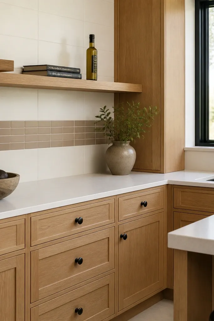
This idea makes your kitchen look designed because it repeats the oak material in a second place. The floating oak shelf is small, but it changes the whole vibe by giving the eye a place to rest. The two-tone backsplash adds structure without turning into a busy pattern, and matte black knobs keep the contrast sharp. I’ve seen this work especially well in kitchens where there’s a blank wall over the range and no room for large decor.
Good to knowUse a level and measure from the countertop, not the cabinet ceiling line; floors often sit slightly off.
Install white oak cabinets with a satin finish and simple knobs or short pulls. Create a backsplash plan with two tones: keep the perimeter tile white and use a centered band in warm gray — keep grout light to avoid harsh lines. Add a floating oak shelf directly above the range at about 18 to 20 inches from the cooktop, depending on your hood height. Use matte black hardware and match the shelf brackets to the same finish. On the shelf, keep items to three groups: a tall utensil crock, one small plant, and one ceramic container.
AvoidDon’t overload the shelf — five items turns it into clutter and kills the clean look.
13. White oak cabinets with full-height upper cabinets and open lower shelves
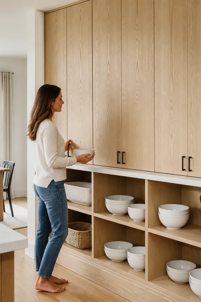
Open lower shelves can make white oak feel airy, but only if the shelves are clean and styled with a plan. I used this layout in a breakfast nook-adjacent kitchen where the dining area needed light. The full-height uppers keep storage hidden and give you that built-in wall feel, while open shelves add texture and make daily dishes look intentional. This is flattering for smaller spaces because it reduces the visual weight at counter height.
Start by planning your uppers to reach close to the ceiling — leave a small consistent gap for a finished look. Use white oak for the upper cabinets with satin finish and simple hardware. For the lower open shelves, keep shelf depth around 10 to 12 inches so plates don’t look cramped. Style with consistent sets: stack plates by size, use matching bowls, and add one oak cutting board to echo the cabinets. Keep the backsplash neutral so the open shelves don’t compete with wall pattern.
Use glass-front storage bins on the shelf for items you don’t want fully visible.
Skip mixed dish patterns — open shelving makes everything more noticeable.
14. White oak cabinets with quartzite-look countertop and warm gray grout backsplash
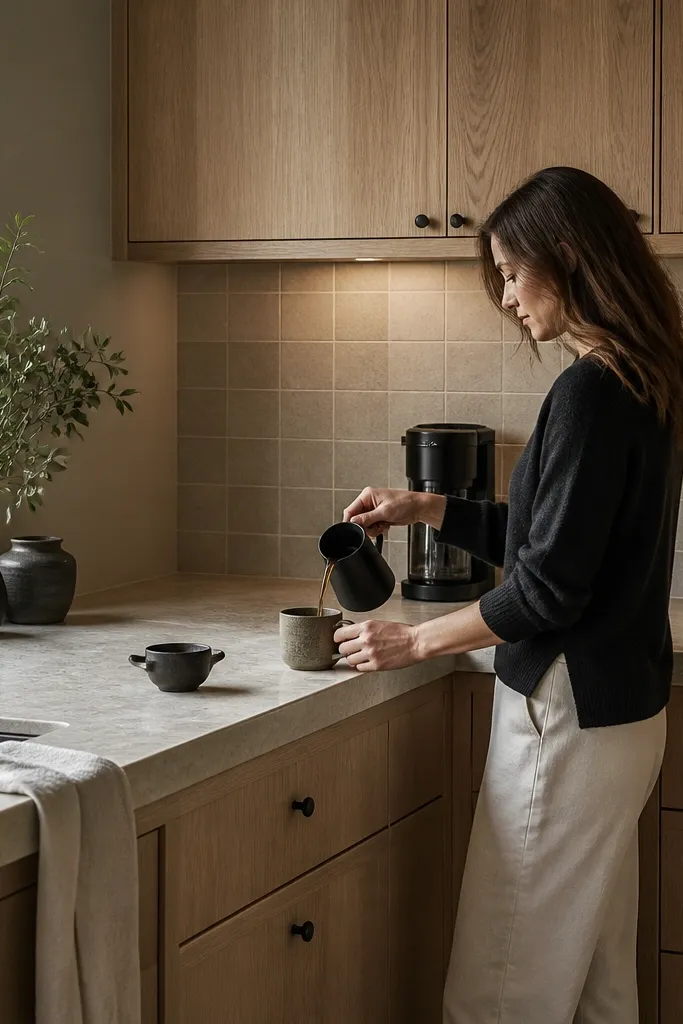
If your goal is calm and expensive-looking without going all-white, this combo nails it. Quartzite-look stone has warmth and variation, which pairs beautifully with white oak grain. Warm gray grout keeps the backsplash from turning too cool next to oak. I’ve used this in kitchens where homeowners hated the look of stark white everything; the result feels grounded but still bright.
Choose a quartzite-look countertop with tan-beige movement and soft gray lines, then match your backsplash grout to that warm gray rather than a blue-gray. Install white oak cabinets with a natural satin finish. Use brushed nickel pulls so the metals don’t fight the stone. Pick a larger-format backsplash tile so grout lines stay minimal — fewer lines look more custom. Style with neutral wood bowls and simple white glassware so the stone and oak stay the main texture.
Bring a grout sample to the slab yard — grout undertones change how the countertop reads.
15. White oak cabinets with deep drawers and integrated rail pulls
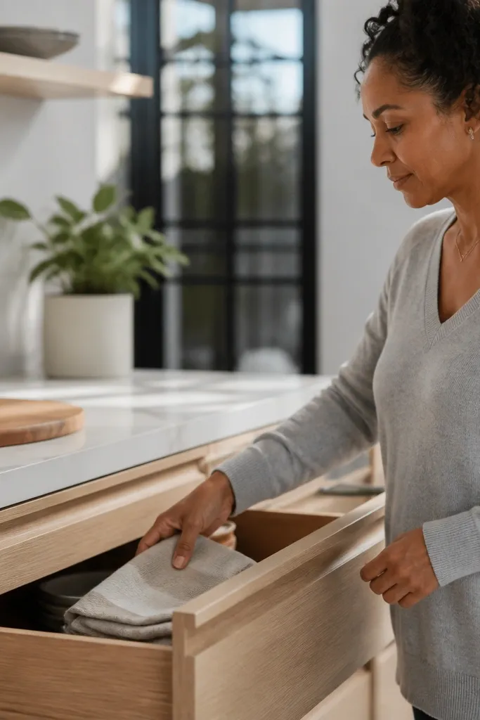
Integrated rail pulls make white oak look sleek because there’s no hardware interruption. Deep drawers also change how the kitchen feels in daily use; you stop seeing random items stacked on the counter. I’ve done this in kitchens where the homeowner cooked constantly and needed storage that stayed organized. The rail pulls also help if you’re worried about hardware color — satin stainless sits neutral against oak and doesn’t turn orange.
Order cabinet doors with no knobs and drawers with integrated rails. Use deep drawer boxes so the rails sit on a sturdy face — aim for at least 6-inch tall drawer fronts for smooth access. Pair with light gray quartz that has warm undertones so it doesn’t clash with oak. Keep backsplash simple and light because the hardware is already minimal. On the inside, install dividers — I like adjustable ones for pans and sheet trays so the drawers stay clean.
If your drawers squeak, adjust the soft-close hardware first; squeaks ruin the “high-end” feel fast.
Don’t use glossy countertops with integrated rails — reflections make the drawer faces look uneven.
16. White oak cabinets with matte white walls and a patterned tile behind the range
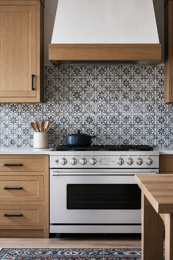
This is the one I recommend when you want personality without painting cabinets. White oak gives you warmth, and the patterned tile behind the range creates the focal point that makes the oak look richer. Matte black hardware ties the pattern together and keeps the look grounded. I’ve watched this combo work in kitchens that feel too plain with plain tile — the pattern gives depth, and the oak makes it feel less trendy and more “kept.”
Start with white oak cabinets in satin finish and matte black hardware. Keep the rest of the backsplash minimal — plain white tile with consistent grout so the range tile stands out. Choose an encaustic-style tile with a limited palette (cream, tan, muted blue) so it doesn’t fight the oak’s warmth. Use a countertop in light quartz with minimal gray movement. Style the range area with a small utensil crock and a wood-handled tool set that matches the oak tone.
Use grout color that matches the tile’s lightest base so the pattern reads clean instead of speckled.
Don’t add more patterns elsewhere — patterned range tile plus patterned curtains looks chaotic fast.
17. White oak cabinets with black stone-look backsplash and warm under-cabinet lighting
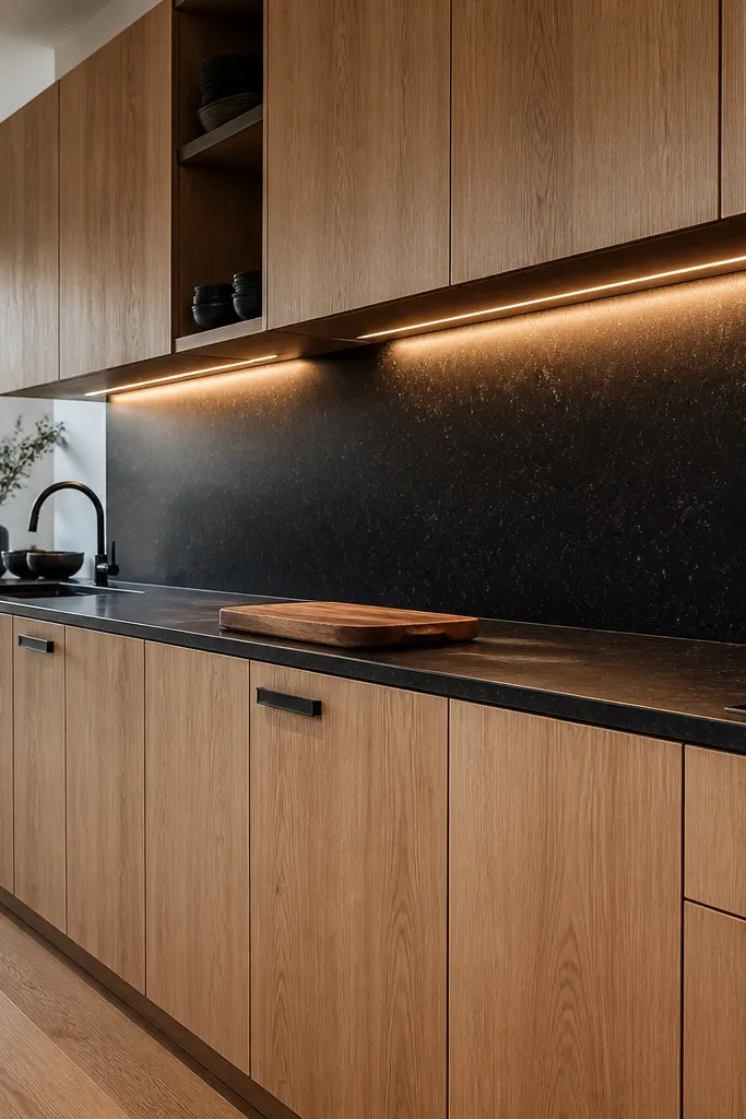
High-contrast kitchens can still feel warm when white oak is the mid-tone. The black stone-look backsplash makes the oak grain pop, and warm under-cabinet lighting prevents the black from turning flat and chalky. I love this for kitchens with big windows because the contrast looks crisp in daylight. If your kitchen gets a lot of sun, this can look stunning without making the room feel heavy.
Choose a white oak finish in satin and keep it on the lighter side so it doesn’t fight the black. Install bronze or matte black hardware and match it to your faucet finish. Use a countertop in white with warm veining so it bridges between oak and black. Select a stone-look backsplash in charcoal with realistic texture, and use warm gray grout instead of pure black grout for a cleaner line. Add under-cabinet LEDs at 3000K and position them so light hits the backsplash surface, not the cabinet face.
If the black backsplash looks too flat, adjust the LED channel angle to bring out the texture.
Skip cool white lighting with black backsplash — it makes the black look washed and the oak look yellow.
18. White oak cabinets with off-white shaker style and brass pendant over island
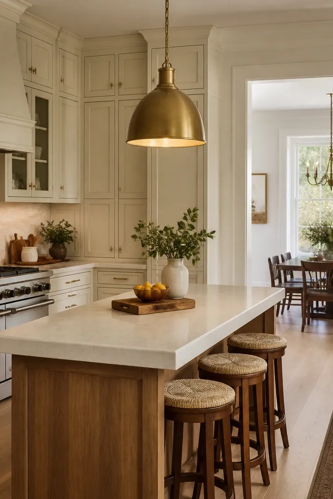
This look is simple but it photographs well because the warm metals and creamy walls keep everything cohesive. The brass pendant adds warmth at a height people naturally look at, so the cabinets feel connected to the dining area. I used this combo in a home with lots of natural light and light floors; the oak looked golden in the best way. It’s a good match for people who want a cozy dining vibe without going full rustic.
Good to knowHold the brass hardware sample next to your pendant sample; undertones should match closely.
Install white oak shaker cabinets with a satin finish. Choose small brass knobs or pulls with a brushed finish so they don’t glare. Paint walls in an off-white with warm undertones, not gray-based white. Use a white tile backsplash with light grout and keep the pattern uniform. Add a brass pendant with a warm glass shade above the island and match it to the hardware. Style a single centerpiece on the island, like a ceramic bowl in cream and one oak handled utensil canister.
19. White oak cabinets with white and gray veined countertop and chrome-free faucet
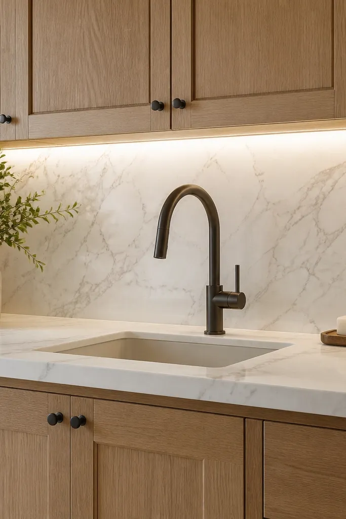
This is the clean “neutral modern” pairing that keeps oak from feeling too rustic. The countertop’s light gray veining gives you a cool counterpoint that stops the oak from reading overly warm. I did this in a kitchen where the floors were gray-toned, and the before/after looked instantly more balanced. It’s especially flattering if you like crisp, bright kitchens and want the cabinets to look fresh instead of honeyed.
Good to knowIf your oak looks too warm, swap to 4000K bulbs temporarily just to judge; then settle on 3000K once you pick the right finish.
Choose a white oak finish with a neutral undertone rather than heavily warm, and keep it satin. Install brushed nickel hardware and a brushed nickel or satin stainless faucet — skip chrome. Pick a countertop with a white base and medium-fine gray veining, not thick bold movement. Keep backsplash in white tile with soft gray grout so it doesn’t add another strong color. Style with white dishware and one small accent in light oak, like a trivet or cutting board.
20. White oak cabinets with textured linen backsplash and soft black hardware
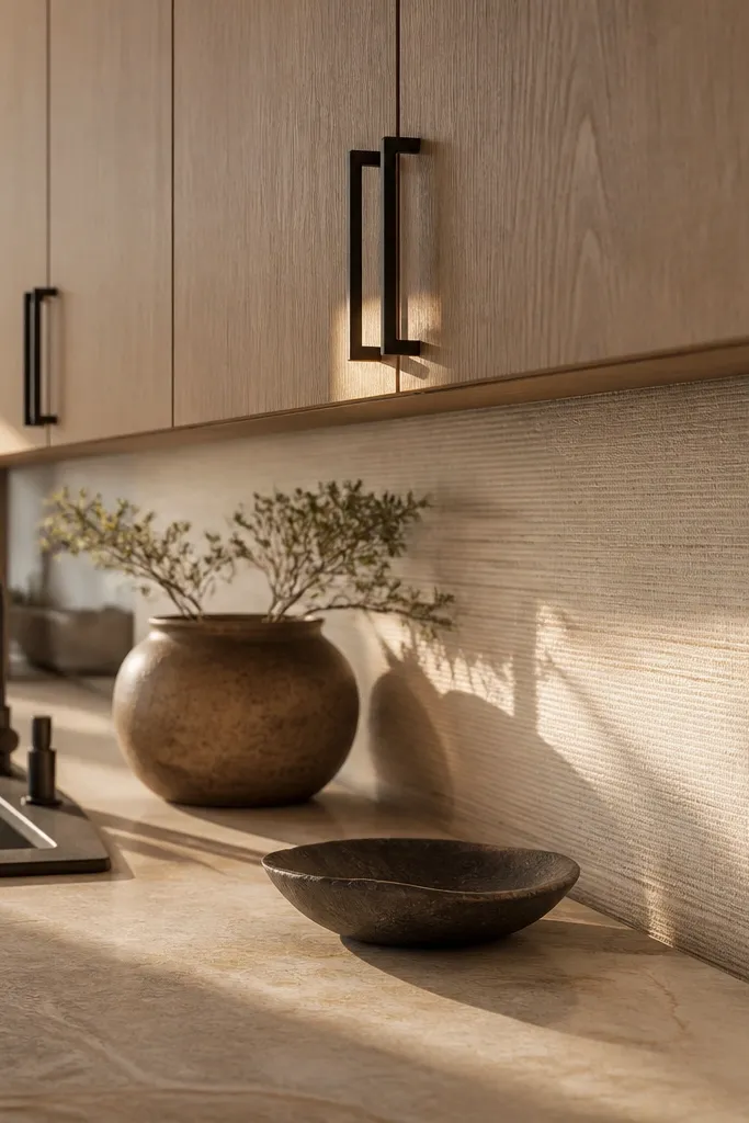
Textured backsplash is a cheat code for making white oak look more dimensional. The linen-like surface catches light in tiny waves, so the cabinets feel richer even when the color palette stays neutral. Soft black hardware keeps the contrast gentle, which looks better in everyday kitchens than pure black. I used this idea in a kitchen with plain white paint and the result felt cozy and designed without adding a dramatic pattern.
Good to knowWipe a small test area with water after grouting — texture tiles can trap residue that makes them look dull.
Select a backsplash tile with a linen texture in cream or warm off-white. Use white oak cabinets with flat-panel doors and a satin finish so the cabinet face doesn’t look glossy next to the texture. Install soft matte black pulls and knobs, keeping sizes consistent across doors and drawers. Choose a warm white countertop and avoid heavy gray veining so the backsplash texture stays the main visual interest. Style the counter with neutral woven items and keep the rest minimal so the texture reads clean.