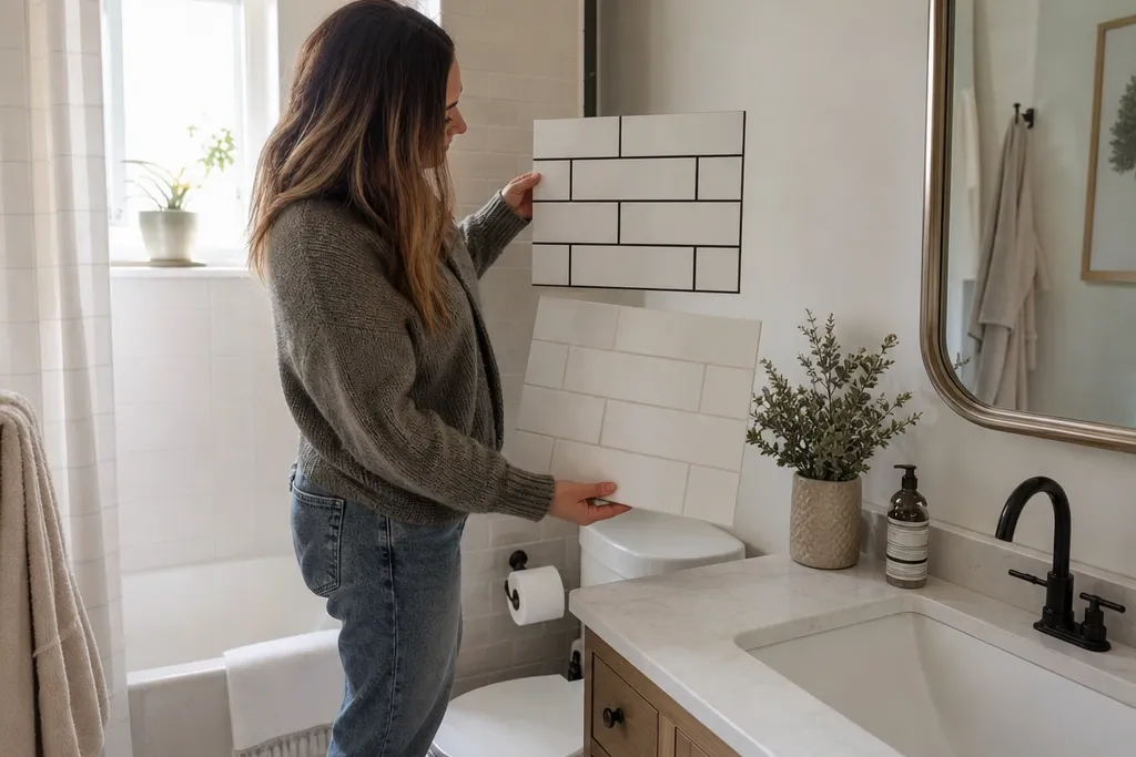

1. 12x24 Vertical Wall Tiles with Light Greige Grout

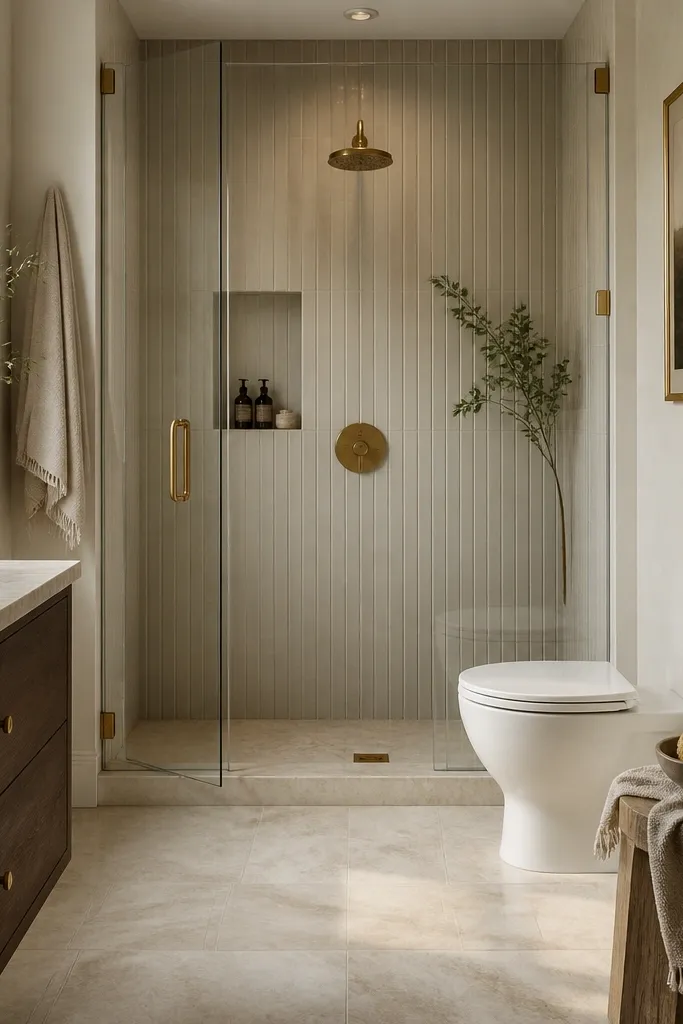
This layout makes the wall read taller because the tile rectangles run vertical like a set of long lines. I like light greige grout with this because it softens the grid and keeps the wall from looking like it’s been outlined with marker. Choose a wall tile with a subtle variation or a gentle matte glaze, not a high-shine mirror effect, because shine can exaggerate uneven drywall shadows in small rooms. This works especially well in bathrooms with warm lighting and beige or oak-toned vanities. It also flatters cooler skin tones on the mirror side because the grout tone stays neutral instead of throwing stark white reflections.
Start by dry-fitting the first row on the wall you’ll see most from the doorway. Use a level and mark your starting line so you avoid a tiny sliver tile near the edges; aim for cuts on the least-seen sides. Set the tiles vertically with a 1/8 inch grout joint so the lines stay quiet; use spacers consistently to keep the pattern straight. Keep the same orientation through the shower surround if you have one, so the eye doesn’t “reset” at the corner. Finish by sealing grout if your tile manufacturer recommends it, especially for darker grout or honed finishes.
If your ceiling is under 8 feet, keep the wall tile going to the ceiling instead of stopping at a chair rail — it adds height without extra decor.
Avoid tiny 2x2 mosaics on the main wall — the dense grid makes the room feel busy and smaller.
2. 24x24 Floor Porcelain with a Soft Marble Look
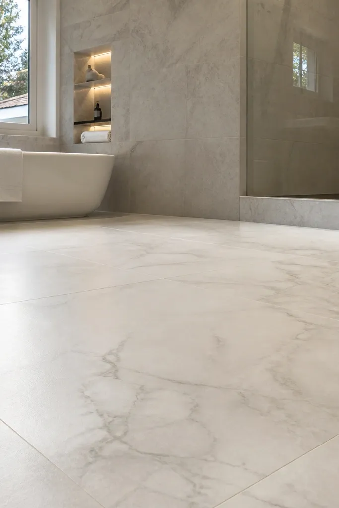
Large-format flooring reduces the number of grout lines you have to look at, and in a small full bathroom that matters. I pick a soft marble look because it creates movement without the high-contrast drama that can make a tiny room feel loud. Porcelain holds up better around tubs and wet zones, and it cleans faster than real stone on a busy schedule. This choice looks great under white vanities and brushed nickel fixtures, and it also plays nicely with darker skin tones in the mirror lighting because the floor stays bright without turning gray. If you’re worried about slip, choose a tile with a textured or matte surface rating suitable for floors.
Start by confirming your tile is rated for floor use and check the slip rating if you have kids or older adults using the bathroom. Lay the 24x24 tiles in a straight grid, not diagonal, so the cuts stay manageable and lines stay clean. Use a medium-bed thinset if the tile has slight lippage risk, and back-butter tiles if your floor needs extra coverage. Keep grout color very close to the tile base — light greige or warm white — so the floor reads as one surface. Seal only if the manufacturer says it’s needed; porcelain usually doesn’t need sealing.
Bring a sample into the bathroom and look at it under your actual vanity light — marble-look tiles can shift warmer or cooler fast.
Avoid grout that’s much darker than the tile base — it creates a “checkerboard” effect that visually shrinks the room.
3. Tiled Shower Surround in the Same Vertical Direction as the Main Wall
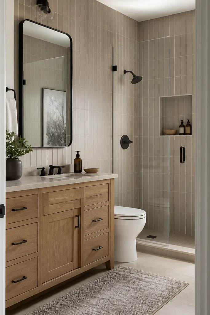
When the shower surround and the main wall share the same tile direction, the room feels more continuous and less chopped up. I’ve seen bathrooms look cramped when the shower tile runs horizontally and the vanity wall runs vertically — the eye keeps bouncing between different “systems.” Vertical tiles inside the shower also help the back wall feel farther away, which is what you want in a small full bathroom. Use a glazed tile that reflects enough light to brighten the shower area, but not so much that it looks wet all the time. This style looks especially good with a white tub surround edge and a simple chrome or matte black shower trim.
Start by deciding where the pattern “origin” is at the shower corner and keep it consistent on both sides of the glass. Measure the shower width and plan the layout so you don’t end up with a tiny cut at the niche edge. Set the vertical tiles with spacers and keep grout joints uniform; corners should line up with the main wall grid. Use the same grout color across both areas so you don’t get a visible line where the shower ends. If you have a niche, center it on the tile grid so the niche opening doesn’t look off-balance.
Good to knowIf your shower has a built-in niche, plan the tile cuts so the niche frame looks even, not squeezed.
AvoidAvoid mixing horizontal wall tiles with vertical shower tiles — it makes the room feel segmented.
4. 2x8 Subway Tiles with a Narrow 1/16-Inch Grout Line
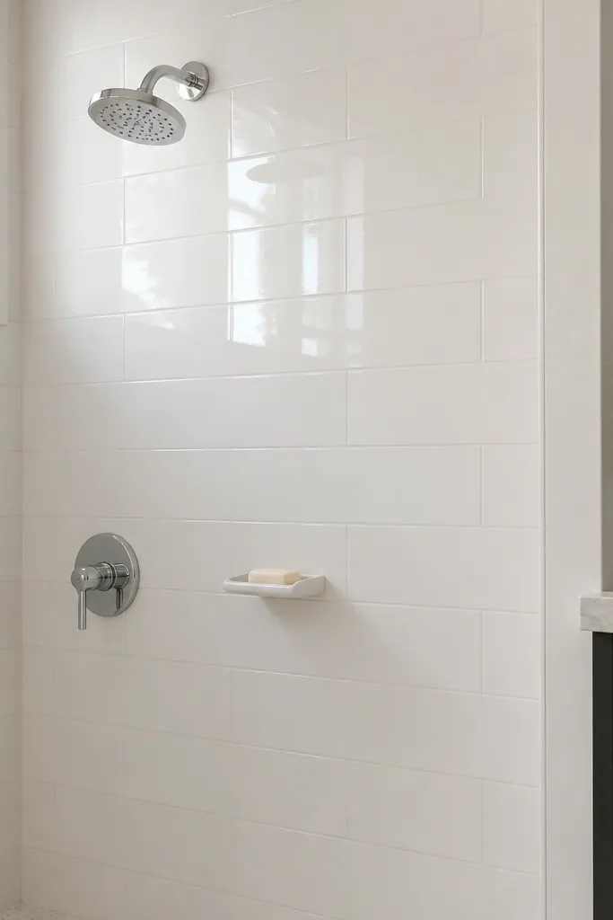
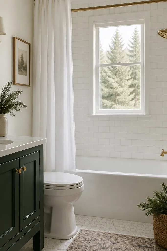
A 2x8 subway tile feels classic but still modern when you control the grout width. I like this size because it’s long enough to elongate the wall without looking stretched like some skinny tiles do. Narrow grout lines keep the brick pattern from looking busy in small spaces. Choose a tile with a smooth glazed surface that isn’t too glossy, because high shine can show every smudge and water spot on tight walls. This works well with white vanities, and it looks clean next to brushed brass or brushed nickel hardware. If your bathroom gets a lot of daylight, the glazed finish keeps it crisp without turning cold.
Start by dry-laying a few rows on the wall to confirm your brick offset lands where you want it; keep the offset consistent across the room. Use a grout joint closer to 1/16 inch when possible — it looks tighter and the pattern reads cleaner. Set tiles with a notched trowel and check flatness often; subway tiles show lippage more than you expect. Work from a level line around the vanity area and cut tiles last at edges. Finish by caulking the changes of plane — tub edge and corners — so grout doesn’t crack.
Good to knowWhen you buy grout, pick one that matches the tile base tone, not one that’s “brightest white.”
AvoidAvoid wide grout joints with subway tiles — it turns a tidy pattern into a chunky grid.
5. Herringbone Wall Tiles in 6x24 for a Longer, Not Busier, Look
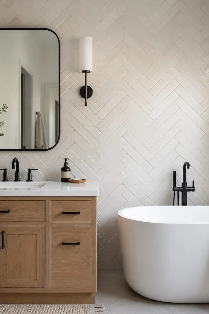
Herringbone can look amazing in a small bathroom if you use long planks instead of tiny pieces. The 6x24 format gives you movement without turning into a dense mosaic. I choose a warm white tile with gray undertones because it plays well with common small-bath finishes like black faucets and light oak vanities. The chevron pattern also draws the eye across the wall, which helps the room feel wider. If you have a vanity mirror that sits off-center, herringbone helps visually balance it because the pattern creates a natural focal rhythm.
Start by marking a centerline for the wall and dry-lay a small section to confirm the chevron angle looks right from the doorway. Use a tile cutter to keep the cut edges clean; sloppy cuts show more in herringbone than in straight layouts. Keep grout joints consistent and use a grout that matches the tile base, then wipe haze while it’s still fresh. Install from the center outward so both sides mirror each other. If you have a window, align the chevron so the pattern points don’t land awkwardly under the trim.
Take a photo after the first two rows and check alignment from the mirror height, not just from eye level.
Avoid tiny herringbone tiles — they create too many lines for a full bathroom that’s already tight.
6. Oversized 3x12 Wall Tiles with a Straight Lay
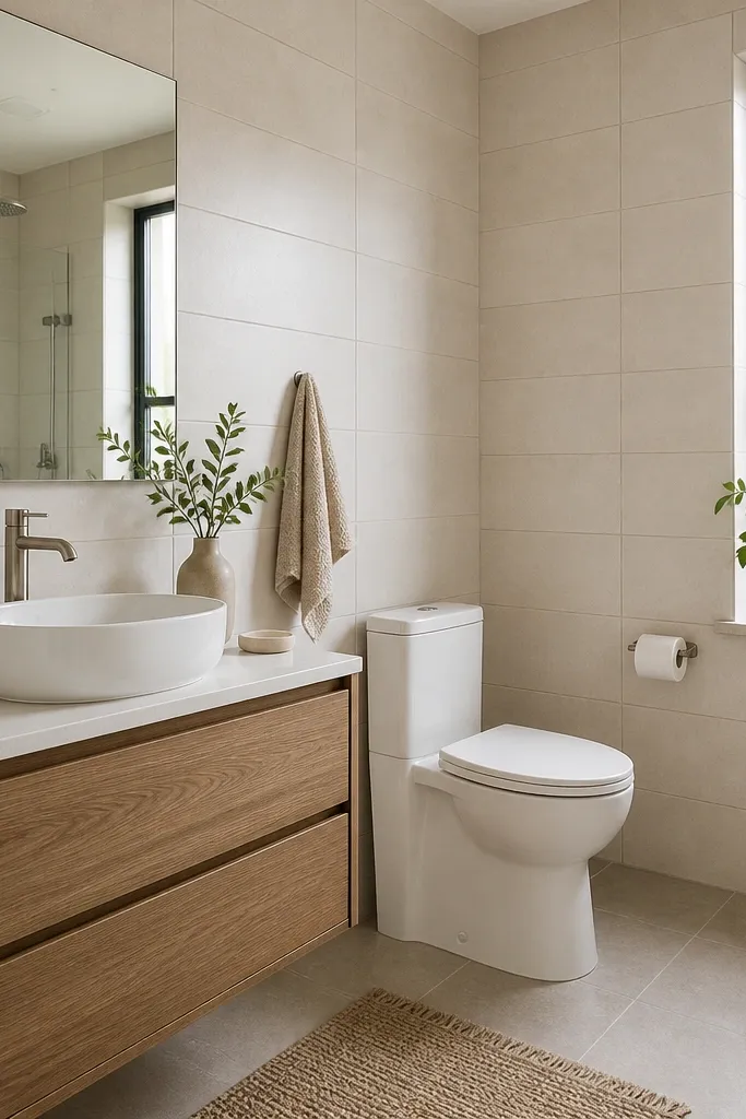
A 3x12 tile laid straight gives you a calm, architectural look that works when you want “quiet” more than “pattern.” The key is the proportions: 3x12 feels long enough to stretch the wall, but it doesn’t create the busy zigzag effect you get with tiny formats. Matte tiles hide minor wall imperfections better than glossy ones, which is a lifesaver in older apartments. Pair this with a simple, flat vanity and one metal finish so the room doesn’t look like it has too many competing styles. This is flattering on cooler skin tones because the creamy white base doesn’t cast icy reflections like pure white can.
Start by measuring the wall height and dividing it by the tile height plus grout joints so you can plan for a full tile at eye level. Use a laser level if you have one, and keep your first row perfectly straight — everything depends on it. Lay tiles in a straight grid with a consistent 1/8 inch grout joint, and keep cuts at corners or behind the vanity if possible. Choose a wall tile with a slight variation so straight lines don’t look overly uniform. Finish by sealing any grout that requires it and caulk around the tub edge.
If your bathroom is narrow, keep the tiles on the main wall and shower surround going in the same direction to avoid visual stops.
Avoid mixing straight-laid wall tiles with a patterned floor — it can make the room feel chaotic.
7. Floor-to-Ceiling Same-Tone Hexagon in 1.5-Inch Size
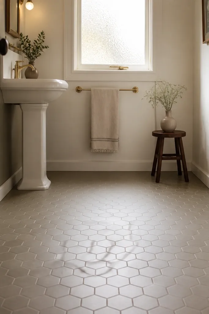
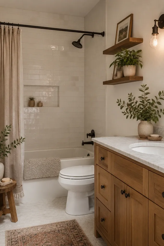
Hexagon tiles can go wrong fast in small bathrooms if they’re too small and high-contrast. A 1.5-inch hex in a single tone keeps the shape from multiplying visually. I like this look because it adds texture and a bit of vintage charm without turning into a patchwork quilt. Going floor-to-ceiling in the same tone keeps the room from looking like it has a “tile boundary,” which is what many small bathrooms need to avoid. This works great with white fixtures and a warm wood vanity, and it also flatters a variety of skin tones since the palette stays neutral and forgiving.
Start by choosing a hex tile with a matte or honed surface so the grout catches light softly. Plan your layout so the hex points don’t create awkward slivers around the vanity edges; dry-fit first. Use a grout color close to the tile tone — light greige with warm white hex works well — so the lines feel like texture, not a pattern. Install starting from a center reference line and work outward to keep symmetry. Caulk at wet seams and seal grout if your tile and grout manufacturer recommends it.
If you worry about grout maintenance, use a grout color that hides small stains, like warm greige instead of bright white.
Avoid high-contrast hex tiles with dark grout — it makes the room feel like it’s covered in tiny cells.
8. Large-Format Slate-Look Tile with a Light Grout Wash
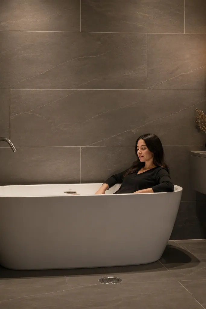
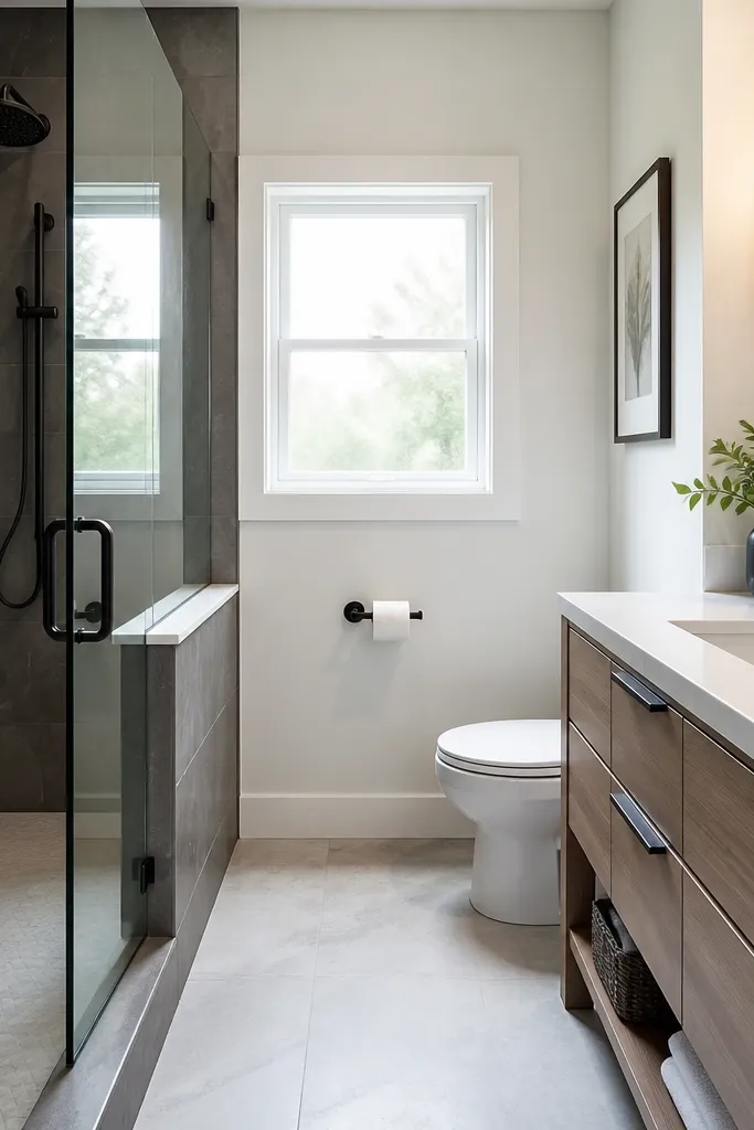
Slate-look tiles can make a bathroom feel grounded, but the trick in a small space is keeping the undertone light. I use large-format slate-look porcelain because big pieces reduce the number of grout lines and keep the room from feeling like it’s shrinking into texture. A light grout wash — meaning grout close to the tile base, not stark white — keeps the floor from looking like a grid. This look pairs beautifully with matte black hardware and a light countertop because the contrast stays controlled. It also photographs well because slate-look tiles have natural variation that hides minor installation imperfections.
Start by choosing a tile with a consistent base tone; look for slate-look with gray that leans warm, not blue. Lay the 24x24 or 18x36 pieces in a straight grid to keep it clean, or use a 50% offset only if the tile pattern is designed for it. Use spacers and check for lippage with a straightedge before the thinset sets. Select grout that matches the base tone and do a careful final haze removal so the grout doesn’t look patchy. If your bathroom sees a lot of moisture, consider a grout sealer and a mop-friendly tile cleaner.
Bring two samples home and hold them next to your vanity wood — slate-look can go too cool if your wood is warm.
Avoid dark slate tiles with white grout — it reads like a loud checkerboard in small bathrooms.
9. Shower Niche as a Tile Feature with a Different Finish
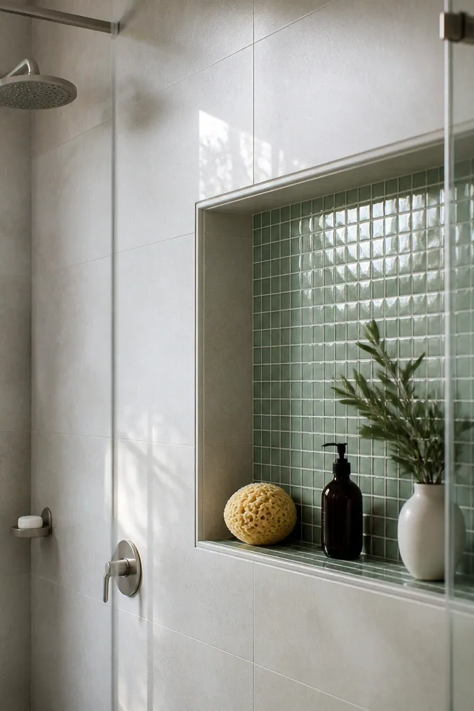
A niche is a built-in opportunity to add visual interest without covering the whole bathroom in extra pattern. I like using a slightly different finish inside the niche — for example, glossy mini tiles or a smooth mosaic — while keeping the main surround calm. The contrast makes the niche look intentional, not like a random cutout. In a small full bathroom, that’s how you get “designer” without clutter. Pair glossy niche tile with matte surround tile so reflections don’t glare at eye level. This works with almost any vanity style because the niche is contained and the rest of the room stays consistent.
Start by installing the main surround tile first, leaving the niche opening ready for cladding. Measure the niche face and depth and dry-fit the niche tile so the grout lines land evenly around the opening. Use a small-format tile only inside the niche, and keep grout color consistent with the surround for cohesion. Frame the niche edges with straight cuts and a clean caulk line if you don’t use trim pieces. Install the niche tile with thinset appropriate for the tile type and wipe excess thinset from grout lines before it cures.
Good to knowIf you use glossy niche tile, wipe it once after grouting — haze on gloss shows up fast under bright bathroom lights.
AvoidAvoid making the entire shower a different pattern — it steals focus from the room and makes it feel smaller.
10. Calm Vertical Lines with 4-Inch Porcelain Wall Planks

If you want height without a busy pattern, wide planks are the answer. A 4-inch wall plank creates a clean vertical rhythm that reads taller, especially when you keep the grout line narrow. I choose porcelain planks with a subtle texture because they look expensive in close-up but don’t show every fingerprint like glossy tiles can. This look is great with a simple vanity and a large mirror, because the mirror already adds width — the tiles add height. It also works well for bathrooms with limited natural light since the tile color stays bright and the plank width keeps the surface looking smooth.
Start by finding a layout that keeps a full plank centered on the wall you see most. Use a ledger board if you need to start above the floor line cleanly and make sure it’s level. Set planks with spacers that keep grout joints consistent, and check alignment every few tiles to prevent drift. Keep the same direction on any adjacent wall sections — even a short return — so the vertical lines don’t break. Finish with grout that’s one shade lighter than the plank’s undertone to keep the lines from looking harsh.
Good to knowMake sure your mirror is wide enough to visually “hold” the vertical planks — a tiny mirror makes the tile height feel extreme.
AvoidAvoid alternating tile widths in the same wall section — drift looks messy in small bathrooms.
11. Large Carrara-Style Tile with a Matching Grout for a Clean Marble Effect
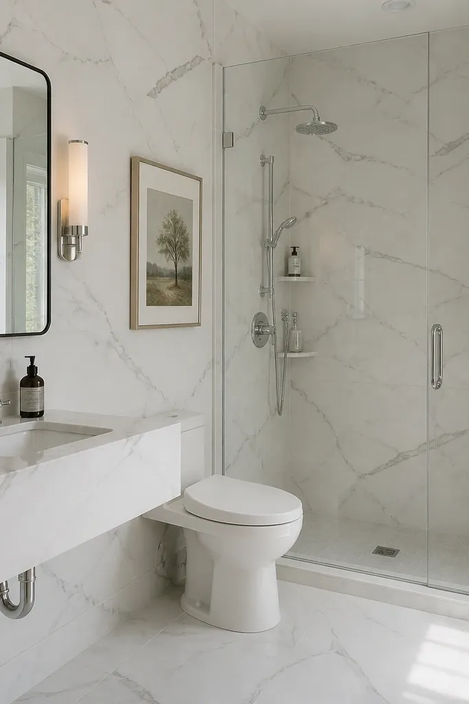
Carrara-style tile reads luxe, and you can still keep it small-bath friendly if you match grout and avoid heavy contrast. I’ve done this in a tight full bath where the walls looked instantly brighter because the tile veining was subtle and the grout disappeared visually. Use larger tiles so the veining doesn’t fragment into a patchwork. This looks best with brushed nickel or chrome fixtures and a white or light gray vanity top. For people with darker hair and warm undertones, the marble whites look flattering in mirror light without turning the room icy.
Start by selecting a tile with low-contrast veining and enough white space to keep the room airy. Dry-lay a few pieces and choose an arrangement that keeps veining from creating random dark blocks near the vanity. Use a grout color that matches the grout base recommended by the tile brand; don’t “guess” with bright white. Install with straight joints and keep spacing consistent to maintain the marble look. After grouting, seal if recommended and remove haze thoroughly so the glossy or satin finish looks clean.
If your tile has veining direction marks, follow them — random orientation breaks the marble illusion.
Avoid dark grout on marble-look tiles — it turns veining into a grid.
12. Mono-Chrome Color Block: Two-Tone Tile Where the Upper Half is Lighter
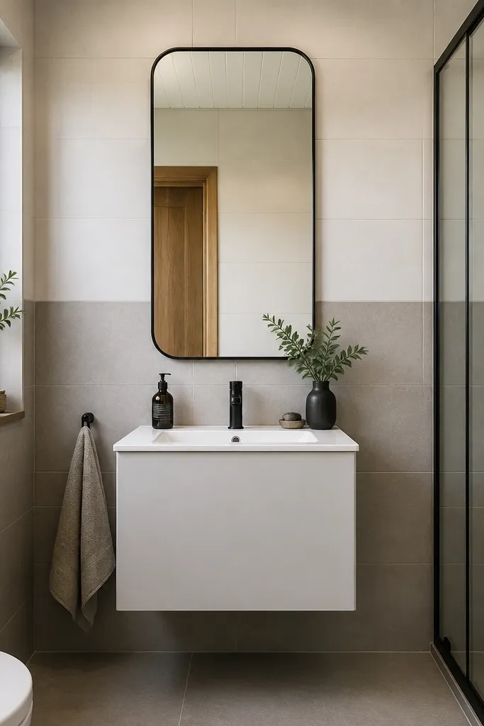
Color blocking works in small bathrooms when the split line is intentional and the upper tile is lighter. I use a lighter upper half to push light upward and make the ceiling feel higher, while the darker lower half hides scuffs and water marks. Choose two tiles with similar undertones so the transition looks smooth, not like two different rooms. This design looks great with a white vanity and a towel warmer or simple black accents. It’s especially good if you have a tub that gets splashed often and you want the lower area to hide wear.
Start by choosing your split height — I like around 48 inches for many full bathrooms, but measure your vanity mirror and keep the line above the vanity top. Then pick tiles that share similar undertones: warm white above, warm greige or taupe below. Dry-lay to confirm the split lands on a full tile, not a cut edge. Install the upper tile first, let it set, then install the lower section from a level line. Use caulk at the tub edge and keep grout color consistent across both tiles for a clean transition.
Use the same tile size in both halves so the room looks intentional and not patchy.
Avoid a split that hits right at eye level on the toilet or mirror — it draws attention to awkward proportions.
13. Patterned Floor Tile with Solid Wall Tile in Matching Undertones
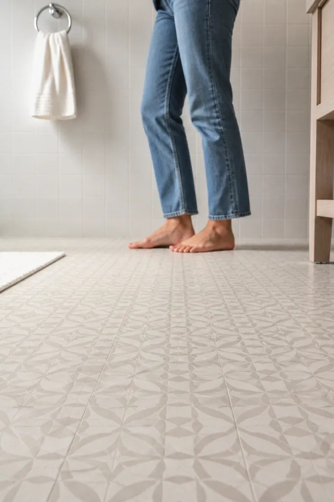
If you want personality in a small full bathroom, put the pattern on the floor and keep the walls calm. I like a soft geometric floor in light neutrals because it adds interest you can see when you’re standing, without turning the whole room into a print. The walls stay solid so the eye has a place to rest. This works with almost any vanity color, especially white, cream, and light oak, because the floor pattern pulls from the same palette. It also hides minor dirt better than bright solid floors because the design breaks up small spots.
Start by selecting a patterned floor tile with a dominant light base and limited high-contrast colors. Lay it straight if you want the room to feel stable; diagonal can make cuts harder and can feel busier. Choose a simple wall tile in a matching undertone — warm white if the floor has warm beige, cool white if the floor leans gray. Keep grout color consistent with the wall tile base so the walls don’t fight the floor. Seal grout if the tile is porous and clean carefully after installation to avoid grout haze in the pattern.
Before you commit, tape a sample square on the floor and stand at the vanity — if the pattern feels too loud, choose a softer base.
Avoid patterned walls and patterned floors together — the room gets visually crowded fast.
14. Small Bathroom "Ceiling Lift" with Tile up to the Top of the Mirror
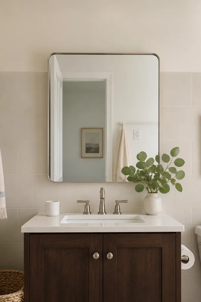
Stopping tile at the top of the mirror can make a small full bathroom feel intentional instead of unfinished, and it can also help the mirror look bigger. I like this approach when the rest of the wall is paint and you want an easy budget win. The key is keeping the tile light and the grout quiet so the eye reads the wall as one clean block. This works with a mirror that sits centered over the vanity; if the mirror is off-center, align the tile stopping line with the mirror edges so it looks planned. With warm paint colors, the tile stays bright and doesn’t turn the whole wall yellow.
Start by marking a level line at the top edge of the mirror frame, then add a thin trim strip if your tile height needs a neat stop. Lay the tile from the floor up, keeping grout joints consistent and avoiding tiny slivers above the vanity. Use a waterproof paint or cement board behind the tile where needed, especially around tubs and splashes. Caulk the tile edges at changes of plane and use a matching caulk color with your grout. After installation, paint the upper wall with a bathroom-rated satin finish so it wipes clean.
Good to knowUse a white or light greige caulk at the tile edge so the stop line looks crisp and not like a patch.
AvoidAvoid stopping tile mid-height with a random grout line — it makes the proportions look cut up.
15. Mosaic Accent Strip Only on the Back Wall Behind the Vanity
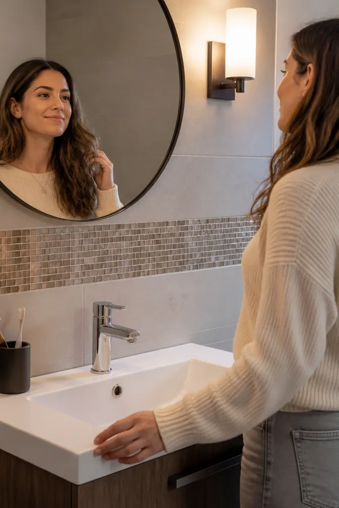
Mosaic accents are great when you keep them small and controlled. I use a mosaic strip behind the vanity because it’s where the eye lands when you brush teeth and fix hair. The strip adds sparkle and texture without covering the whole room in grout lines. Pick a mosaic in one base color with tiny variation — like warm white with light gray — so it feels cohesive with your main tile. This looks especially good with a simple faucet and a mirror with thin framing, because the mosaic becomes the only “statement.”
Start by choosing your mosaic strip height — I like 2 to 3 inches tall so it reads like a band, not a patch. Install the large-format wall tiles first and then build the mosaic strip on top, keeping alignment with the grout lines below. Dry-fit a few tiles to make sure the band doesn’t end up with a thin slice at the edge of the wall. Use a matching grout color for the mosaic so it blends with the main tile, and grout carefully to avoid smearing on textured pieces. Seal the mosaic grout if the manufacturer recommends it.
Good to knowKeep the mosaic undertone the same as your floor grout so everything looks like one plan.
AvoidAvoid mosaics on the entire shower wall — the grout lines make small bathrooms feel busy.
16. Quarter-Round Floor-to-Wall Transition with Same-Tone Grout
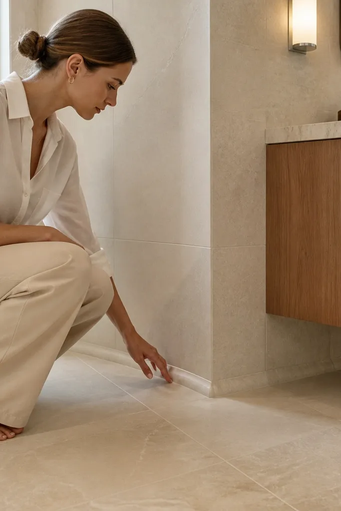
A neat transition detail can make small bathrooms feel more finished than any extra decor. I like a quarter-round tile trim or a curved profile where wall tile meets the floor, especially around the vanity and main wall. When the floor and wall tiles are similar undertones and the grout is close in color, the curve disappears visually and the room looks smoother. This is ideal for older bathrooms where corners aren’t perfectly square. The result looks clean with both modern and traditional fixtures, and it helps the bathroom feel less “boxy.”
Start by selecting a floor tile and wall tile that share a similar base tone — warm white with warm white, greige with greige. Install wall tile leaving a small gap for the trim, then set the quarter-round profile carefully so it sits flush at the curve. Use the same grout color on both sides of the trim and keep joints tight. If you’re using cement board or waterproof backer, make sure the substrate is solid so the trim doesn’t crack at the edge. Finish with caulk at wet edges and grout cleanup right after it sets.
Good to knowDry-fit the trim pieces along the most visible corner first — that’s where small gaps show up most.
AvoidAvoid sharp, grout-only corners at the floor — they look unfinished and collect grime.
17. Tub Deck with Tile Band and a Minimal Edge Detail

A small full bathroom often has one “busy zone” where water hits — the tub deck. You can make it look designed by adding a tile band that frames the tub edge without turning it into a thick border. I like a single horizontal band just above the tub rim, using a tile that matches the main tile color family but has a different texture or finish. This keeps attention on the tub line instead of the mess that splash creates. It looks great with simple shower glass and a clean faucet. The subtle texture also hides minor stains better than a perfectly glossy finish.
Start by choosing your band tile: a slightly darker matte or a satin tile with a soft variation. Install the main wall tile first, then measure where the tub rim sits so the band lands evenly around the tub. Use a level to mark the band line and cut tiles around corners so the band doesn’t wobble. Keep grout joints consistent across both the main wall and the band; don’t switch to a totally different grout tone. Caulk the band edges at the tub seam and wipe clean before grout haze sets.
Good to knowIf you can, pick a band tile that is the same thickness as your main tile so the change is subtle, not stepped.
AvoidAvoid thick decorative borders on tub edges — they overpower the room and make it feel smaller.
18. Matte Floor Tile with a Subtle Raked Finish for Less Visual Noise
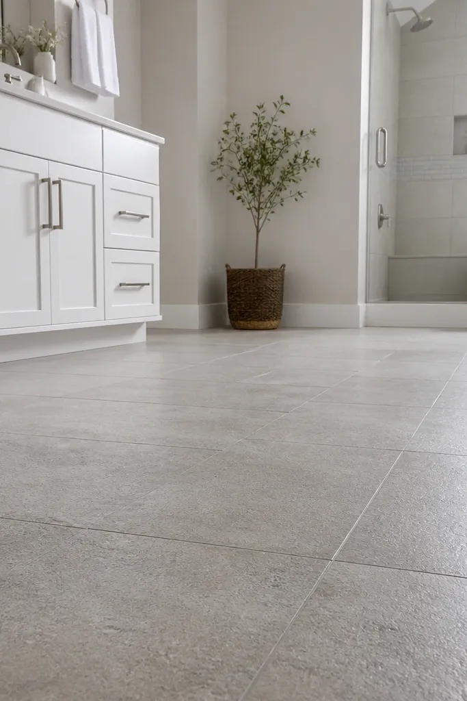
Texture can be your friend in small bathrooms because it breaks up reflections and makes the floor feel less stark. I’ve used matte tiles with a subtle raked texture in full bathrooms where overhead lighting made glossy floors look greasy. The texture also helps hide hairline scratches and small water spots. Choose a light neutral base so the room stays bright and the texture doesn’t darken the space. This works well with white walls and simple hardware, and it looks good with both warm and cool paint colors because the undertone stays neutral. It’s also easier to keep looking clean because fingerprints and smears show less than on polished tile.
Start by picking a floor tile with a matte or honed surface and a slip rating appropriate for wet use. Lay tiles in a straight grid with a grout color close to the tile base, like warm greige for a beige tile. Use enough thinset to prevent hollow spots, and check lippage with a straightedge. Grout in smaller batches so you can clean haze before it dries hard into the texture. After cure, seal grout only if the grout type or manufacturer says you need it.
Do a quick water test on a sample — some matte textures resist spotting better than others.
Avoid glossy floors in small bathrooms with bright overhead lights — glare makes the room look harsh and smaller.
19. Warm White Wall Tile with a Soft Taupe Grout for a Quiet Grid

Pure white grout can look sharp in a small full bathroom, and sharp lines make walls feel segmented. I prefer warm white tile with soft taupe grout because it keeps the grid visible without screaming. This combo makes the bathroom feel calmer, and it also hides tiny installation imperfections that show up with high-contrast grout. It’s a strong choice if your vanity has beige undertones or your hardware is brushed bronze or brass. The warmth also flatters the face area in mirror light, because the bathroom doesn’t cast a cool, clinical tone.
Start by choosing a warm white tile with a creamy base, not blue-white. Match grout to the tile base tone — soft taupe or light greige — and test a small sample board if possible. Install tiles with a consistent joint width, usually 1/8 inch for rectangular tiles, and keep lines straight using a level and spacers. Work from a level line around the vanity and cut tiles at edges so the center stays clean. Clean grout haze carefully after it sets, since warm grout can look blotchy if you scrub too aggressively too late.
Good to knowIf you’re using a white vanity, pick grout that’s one shade warmer than the vanity finish so the tones don’t fight.
AvoidAvoid bright white grout with warm white tile — it can look like the lines are floating.
20. Tile-to-Ceiling Brick Pattern in a Tight Grid for a Full Bathroom That Feels Taller
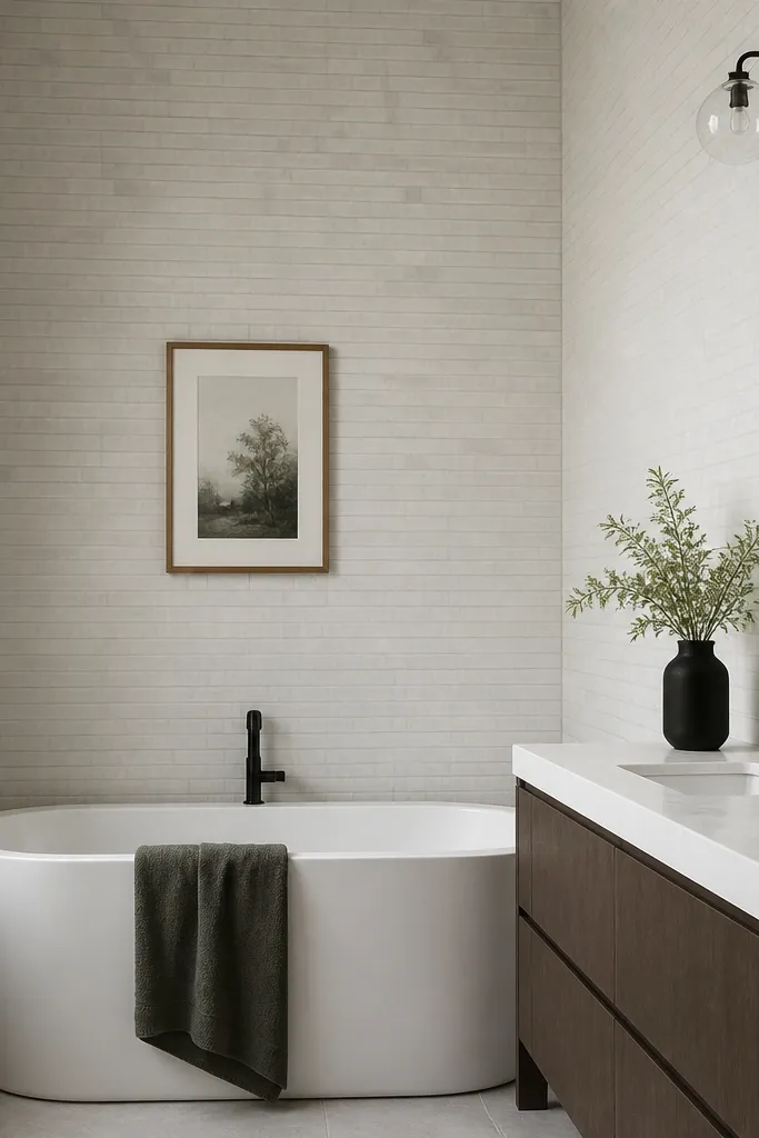
This is the brick look, but scaled down so it reads like a neat grid instead of a busy stagger. In a small full bathroom, the tight offset keeps your eye moving in short hops, which makes the room feel more orderly and taller. I did this in a 5x8 bath where the ceiling felt low, and the tile reaching the ceiling made the vertical lines feel intentional even without long planks. Glossy cream tile also brightens the space because it bounces light off the surface, not just off the grout.
Pick a small-format “brick” tile around 2x8 or 3x12 and keep the stagger tight at about one-third offset, not a half offset. Order extra for cuts because tight brick patterns create more edge pieces along the vanity and corners.,Use a warm light-taupe grout that is close to the tile color, then keep the grout joints consistent at about 1/16 inch. Dry-fit a row from the floor to the ceiling around the mirror first so you can confirm the pattern doesn’t land on awkward fractions at eye level.,Tile to the ceiling in one continuous run before you start any trim. When you hit soffits or vent covers, stop the pattern cleanly and frame the edges with full cuts where possible.
Before you commit, tape a full-size paper grid on the wall and mark the mirror centerline. If the stagger lines hit the mirror corners, adjust your starting row by a few inches so the pattern looks planned, not accidental.
Skip a half-offset brick pattern in a tiny bath — it turns into motion blur and makes the ceiling feel lower.