1. Two-Row Oak Ladder Look
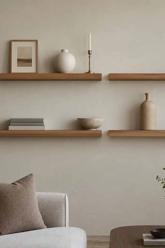
This layout works because the staggered rows create a ladder effect without needing fancy wall molding. I’ve used warm oak shelves with a matte finish in rooms with beige walls and light gray sofas, and the wood tone ties the whole space together instead of fighting your furniture. Keep the top row lighter — one small frame, one vase, one candle — so the wall doesn’t feel heavy above your seating. This is also beginner-friendly because you only need to center one anchor point and mirror the spacing across the two rows.
Start by marking the wall centerline with painter’s tape and measure out from there so the shelves land symmetrically. Install the bottom pair first at a height that leaves about 16 inches between the sofa cushion top and the lowest shelf. Place the top pair so there’s 7-9 inches between the shelf lines. Style the bottom shelves with one larger item per shelf (a bowl or tall bottle) and then add a stack of two or three books to create height. Finish each shelf with one small object that’s under 4 inches tall, like a candle holder or mini frame.
Use painter’s tape templates for your shelf positions, then step back and check alignment before you drill.
Don’t line up every object perfectly — tiny height differences make it look intentional instead of staged.
2. White Shelves With Black Serif Frames
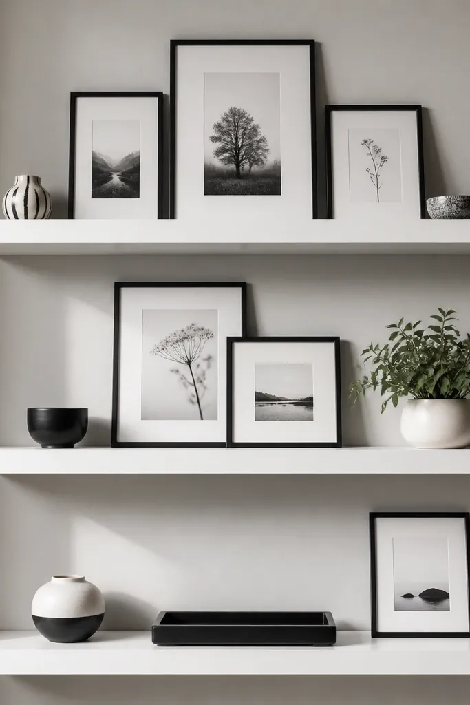
White shelves against a light gray wall give you that clean “catalog” look, and black frames make it feel crisp instead of empty. This setup flatters living rooms with neutral upholstery because the contrast adds structure. I’ve done this in small spaces where you can’t spare a lot of furniture — the shelves add vertical interest without taking floor space. The styling principle here is visual repetition: keep frame size consistent, then vary placement slightly for a natural rhythm.
Choose three shelves with a matte white finish and a depth around 6 inches so frames sit flat without looking cramped. Install the bottom shelf first so it lands about 15-17 inches above the sofa cushion top. Use 8 inches between shelf lines so frames have room to breathe. On the top shelf, place two frames centered with a tiny gap — about the width of your thumb — between them. On the middle shelf, add one larger frame plus a small plant pot on the right. On the bottom shelf, use a black tray and stack two books underneath a single frame to create a base.
Good to knowMix frame sizes by keeping the same frame color and mat color, not by mixing random finishes.
AvoidAvoid glossy shelves with matte frames — the shine mismatch can look cheap under warm lighting.
3. Walnut + Terracotta Spheres
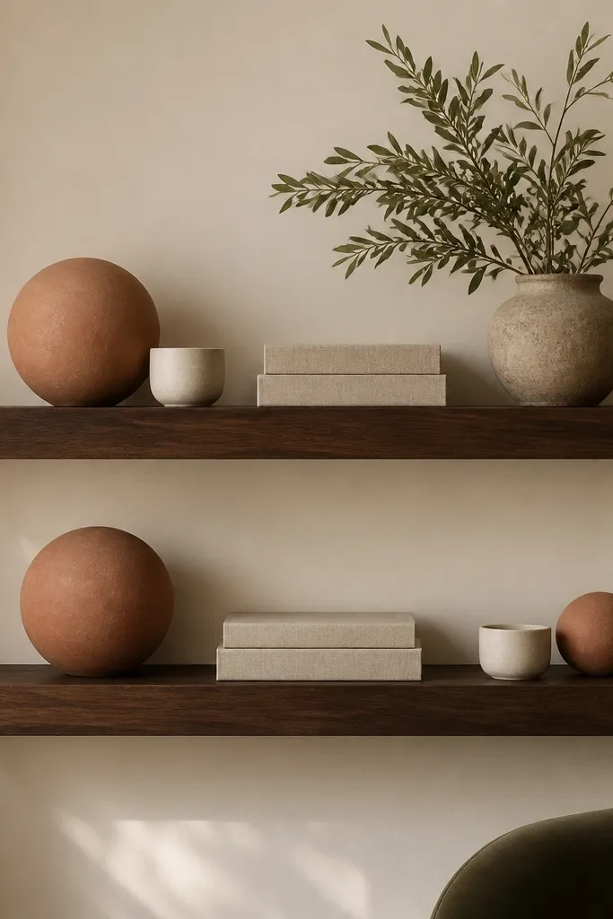
Walnut shelves with terracotta spheres look grounded and cozy, especially in rooms that already have warm undertones — think cream walls, oatmeal curtains, and brass lamps. The terracotta adds color without going loud, and the spheres reflect light softly, so the wall looks calm. This is flattering for people who like warm neutrals and want decor that doesn’t feel too “modern.” The styling principle is texture contrast: smooth spheres paired with linen books and a matte plant pot.
Install two shelves at a 10-inch vertical spacing, with the bottom shelf about 16 inches above the sofa cushion top. Keep shelf depth around 7 inches so the spheres don’t hang off the edge. Style the bottom shelf with one terracotta sphere left, a linen-wrapped book stack centered, and a small white cup on the right. On the top shelf, place the larger olive plant in a matte pot toward the left, then add a smaller terracotta sphere near center and a flat candle holder on the right. Leave at least 3 inches of empty space between objects so the spheres don’t visually collide.
Good to knowDust terracotta decor with a dry microfiber cloth before styling — it holds onto powdery residue.
AvoidDon’t cram three textured items together on one side; it reads busy fast.
4. Floating Shelf + Long Coffee Table Tray Copycat
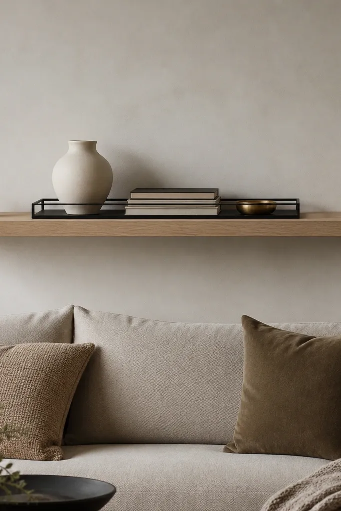
One long shelf is the easiest way to make a living room look finished when you don’t want to measure multiple levels. I’ve used this exact trick with clients who had awkward wall width — the long shelf spans the problem and anchors the whole vignette. The black metal tray makes the decor feel intentional, like everything belongs together. This flatters rooms with strong horizontal furniture lines, like a low coffee table or a long media console, because the tray repeats that shape.
Pick a shelf length that covers at least 70 percent of the wall width above the sofa, usually 48-72 inches for standard living rooms. Mount it so the bottom edge ends up around 17 inches above the sofa cushion top. Use a tray that’s about 2-3 inches shorter than the shelf length so you see a little wood on both ends. Place the tallest item (the cream vase) in the tray center, then stack three books with covers facing out. Add the small brass dish on top of the books or next to the vase. Finish with two glass candles at each end of the shelf, not inside the tray.
Good to knowChoose tray corners that match your room hardware — black tray with matte black lamp bases looks like one set.
AvoidAvoid putting everything inside the tray with no height variation; it flattens the look.
5. Three Shelves, One Color Story
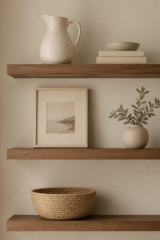
A strict color story makes floating shelves look designer even when you have limited decor. I’ve seen this work in rentals where you can’t replace furniture, because the shelves blend with what’s already there. The warm neutrals also photograph well under daylight and evening lamp light. This layout flatters people who like calm rooms — it doesn’t demand attention, it just makes the wall look styled. The styling principle is limiting the palette to 3 close shades and repeating finishes, like ceramic plus woven.
Install three shelves with 8 inches between shelf lines. Keep the bottom shelf about 15-16 inches above the sofa cushion top. On the top shelf, place one larger cream ceramic pitcher and one small oat candle holder on the opposite side. On the middle shelf, center a framed photo with a thin mat, then add a small greenery pot on the right. On the bottom shelf, place a woven basket slightly off-center to the left and rest a stack of books beside it. Leave 4 inches of empty space between the basket and the books so the basket doesn’t feel crowded.
Good to knowUse one fabric texture like linen or jute across shelves so the color story feels connected.
AvoidAvoid mixing cool grays with warm oat tones — your shelves will look like mismatched purchases.
6. Mix of Heights With White Plaster Pots
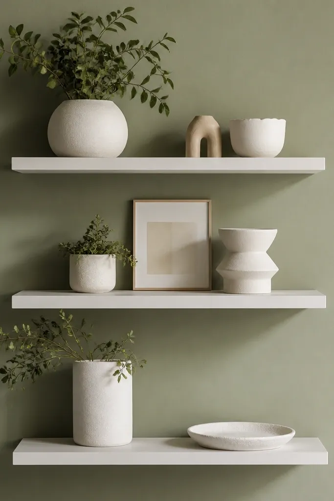
Sage walls need decor that has softness, and white plaster-look pots do that job without looking stark. This is the kind of shelf styling I do when a room has patterned curtains or a textured rug — the white decor calms the space. It flatters a wide range of skin tones in the sense that the room reads warm and friendly, not washed out. The principle is height stacking: you place tall objects at the ends and shorter objects toward the center to create a gentle slope.
Mount the shelves so the bottom shelf is around 14-16 inches above the sofa cushion top, then set the next two shelves with 7-9 inches between. Keep shelf depth around 6 inches so the pots sit securely without looking like they’re teetering. On the top shelf, place the tallest plaster pot on the left corner and a small framed print centered. Add one low sculptural dish on the right. On the middle shelf, use two pots — one medium on the left and one small on the right — then leave a gap in the center for a book edge or a single frame. On the bottom shelf, place one flat tray plus one small pot.
Good to knowIf your pots are glossy, wipe them with a dry cloth — fingerprints show up fast under warm bulbs.
AvoidAvoid placing tall items in the center; it makes the whole wall feel top-heavy.
7. Black Steel Shelves With Minimal Decor
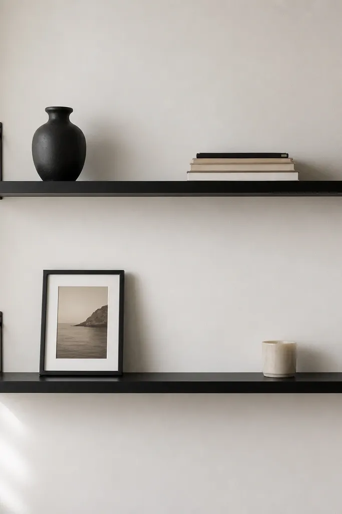
Thin black shelves with minimal decor look sharp in modern living rooms and they also forgive messy rooms. I like this when the rest of the wall has art, a TV, or a busy window, because the shelves don’t add extra visual clutter. The black metal lines help your eyes move across the wall instead of getting lost. This layout flatters people who want a clean look but don’t want to commit to lots of styling pieces. The principle is negative space — you’re intentionally leaving wall visible.
Choose shelves with a slim profile and keep the depth under 6 inches. Install the bottom shelf about 16 inches above sofa cushion top, then put the top shelf 10 inches above that shelf line. Place one main object per shelf: a black vase on the left for the bottom shelf and a framed photo centered on the top shelf. Add only one supporting item, like a small book stack or candle holder, and keep it within 8 inches of the main object. Leave at least 4 inches of empty wall space around each item so the shelf reads clean.
Good to knowUse one book color family across shelves, like oatmeal and cream, so the minimal styling still looks cohesive.
AvoidAvoid filling every inch of shelf surface. Minimal shelves look best when they’re slightly under-filled.
8. Corner Wrap Shelves for Small Rooms
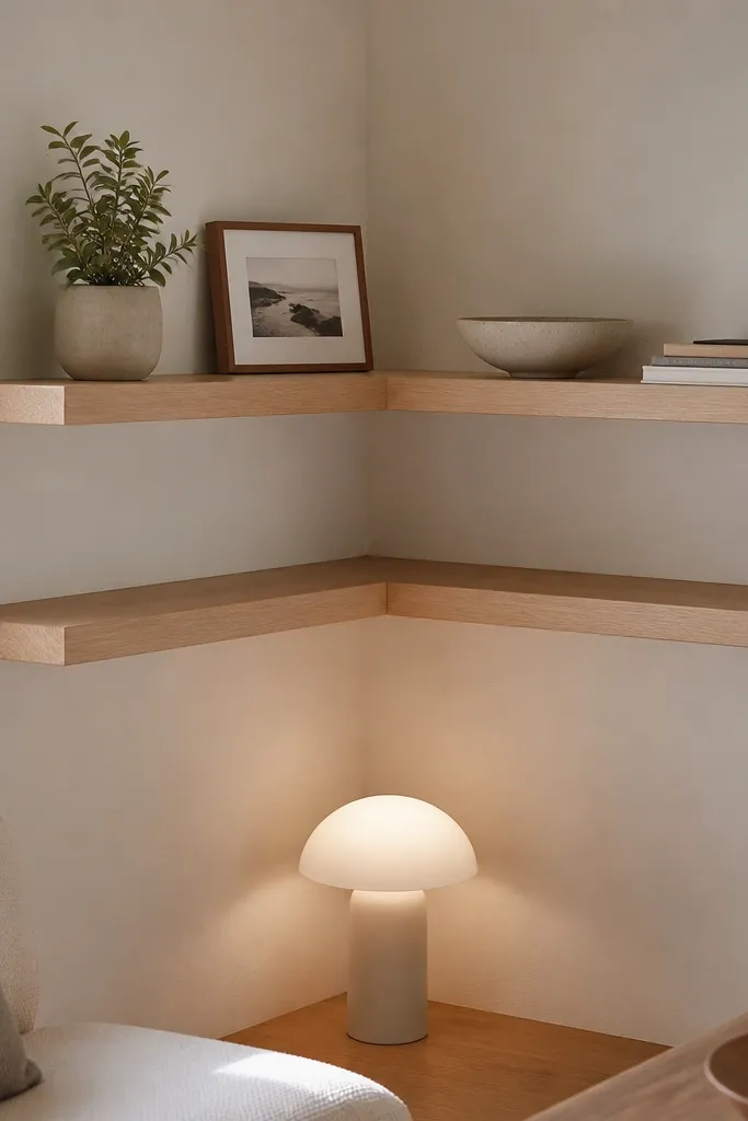
Corner shelving is how you get storage and style in small living rooms without taking up floor space. The wrap-around effect makes the corner feel intentional, not awkward. I’ve used this in narrow apartments where a single wall shelf looks too lonely, and the corner makes it feel anchored. The principle is alignment: you keep the items near the corner seam so the visual weight stays balanced. It works with any decor style, but it really shines with plants and ceramics because they have organic shapes.
Pick shelves that can be installed cleanly into the corner — 90-degree positioning matters more than the exact shelf length. Install the bottom shelf first, placing it about 15-17 inches above the top of the floor seating or sofa cushion. Put the second shelf 8-10 inches above the first. On the left side of the corner, place a small plant in a matte pot and a small framed photo next to it. On the right side, add a ceramic bowl and a short stack of books. Keep the tallest item within 6 inches of the corner seam so it doesn’t spill into the open wall space.
Use a level and a corner square tool. Even a 1/4-inch mismatch in a corner shows up immediately.
Don’t mirror items exactly on both walls. Vary size, but keep the same spacing from the corner.
9. Beige Marble Look Shelf With Gold Accents
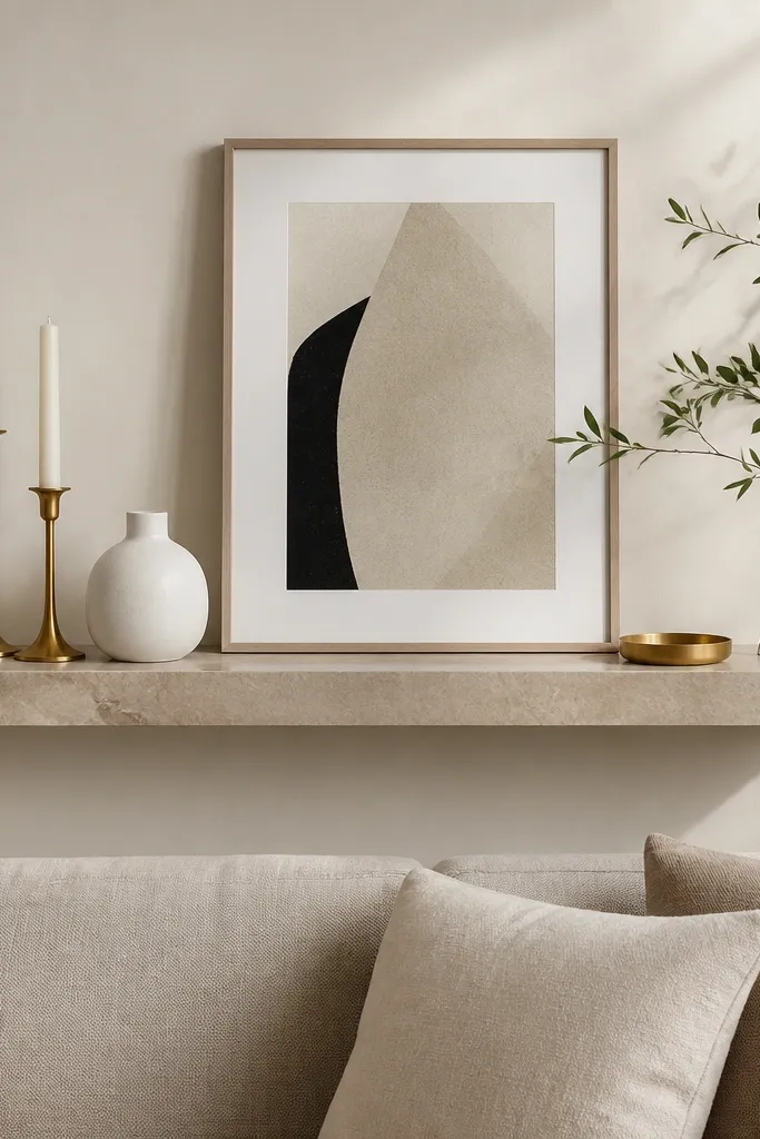
Marble-look shelves add pattern without needing wallpaper, and gold accents make the wall feel warm instead of cold. I’ve installed marble-look planks in rooms with beige walls and cream curtains, and the effect is that the shelf becomes the “statement” while your decor stays simple. This is flattering for living rooms that already have gold lamp bases or gold picture frames because it ties the finishes together. The principle is using gold in small doses — two candlesticks and a tray are enough to make the whole arrangement feel cohesive.
Mount one main shelf (not multiple levels) so the wall doesn’t feel busy. Place the bottom edge about 16-18 inches above the sofa cushion top. Use a center anchor: the framed print or a large white vase. Add a small tray near the bottom edge of the shelf and keep it parallel to the shelf front. Put the two gold candlesticks on opposite sides of the anchor, leaving 3-4 inches between them and the center item. Finish with one greenery branch in a small pot on the right, angled slightly toward the center.
Good to knowWipe gold items with a dry cloth before placing them — fingerprints show as dull spots quickly.
AvoidAvoid mixing gold with heavy silver pieces on the same shelf. The mismatch reads like a clearance bin.
10. Recess-Style Gallery Frames on Three Levels
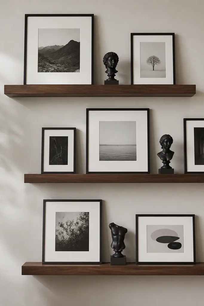
This is the floating-shelf version of a gallery wall, and it looks good even if you don’t own lots of decor. It works because frames give you built-in structure and the shelf depth keeps everything from looking like it’s floating randomly. I like it in living rooms with a lot of open wall space where you want impact without covering the wall in art paper. The principle is consistent mat color and consistent frame finish, then you vary the frame size like a real exhibition.
Install three shelves with 9 inches between shelf lines. Set the bottom shelf about 15-17 inches above the sofa cushion top. Start styling from the middle shelf: center one medium frame and add a smaller frame on the left, then one small sculpture on the right. On the top shelf, place two frames — left larger, right smaller — and leave a 2-3 inch gap between them. On the bottom shelf, repeat the pattern with one larger frame centered and two smaller pieces at the sides. Keep all frames within the center 60 percent of the shelf width so edges don’t look empty.
Good to knowUse the same off-white mat color across frames. It’s the easiest way to make mismatched prints look planned.
AvoidAvoid mixing frame colors more than twice. Too many finishes makes it look like a yard sale wall.
11. Long Narrow Shelves Over a Low Media Console
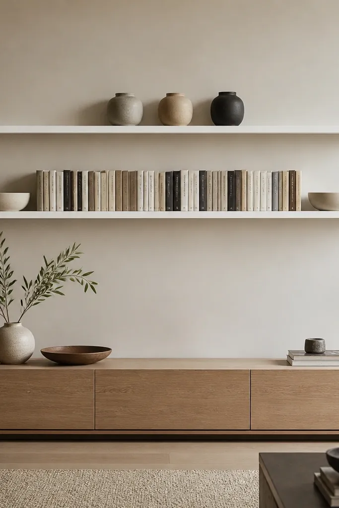
If you have a low media console, shelves can visually “lift” the room and make the wall feel taller. Long narrow shelves look clean because they echo the horizontal lines of your console, TV, or window trim. I’ve done this in living rooms with low ceilings where people thought they needed vertical art, and shelves fixed it without shrinking the space. The principle is alignment: straight lines for books and vases, then one break item like a bowl to keep it interesting.
Use shelves that are narrow in depth, around 5-6 inches, so the wall stays light. Mount the bottom shelf so it’s about 14-16 inches above the sofa cushion top, and place the top shelf 9-10 inches above. On the bottom shelf, line up book spines with covers facing out, then place a ceramic bowl at the far left and far right. On the top shelf, create a row of three small vases — left and right slightly shorter than the middle. Keep the gap between vases around 3 inches so the row reads intentional. Center everything to your media console, not to the wall.
Measure the gaps between objects with a ruler. Matching gaps make it look “built,” not arranged.
Avoid random placement. If you can’t measure gaps, you’ll end up with a cluttered line.
12. Color-Blocked Shelves With Fabric Book Covers
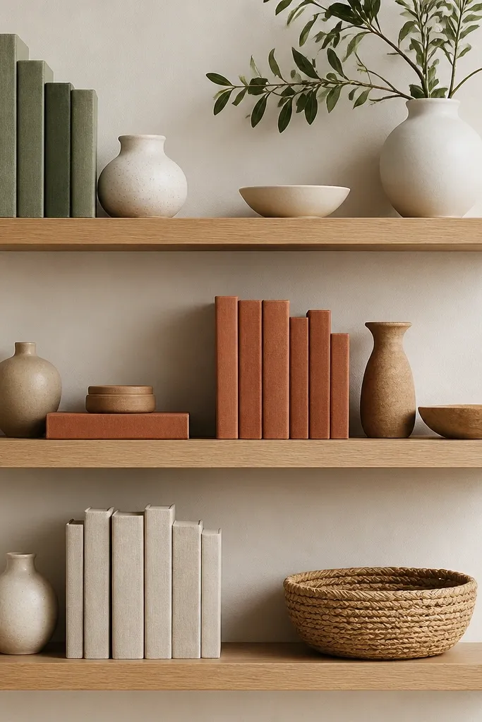
Fabric-covered books are a cheat code because they look soft and intentional even when you’re not using a lot of decor. I’ve used this in living rooms where the rest of the furniture is plain, and the shelves become the color story. It flatters people who like cozy, lived-in spaces but hate clutter, because the books create structure. The principle is grouping by color and repeating one small object across shelves, like a tiny ceramic vessel, so it feels designed instead of accidental.
Pick three shelf levels with 8 inches between them. Install the bottom shelf 16 inches above the sofa cushion top. Start with books: stack two fabric-covered books per shelf so the spines face out, then choose one color per shelf. On the top shelf, place the sage stack and add a white ceramic vessel on the left, plus a small framed photo on the right. On the middle shelf, use clay books and add a tan candle holder and a small pottery bowl. On the bottom shelf, place oatmeal books and a woven basket that sits flat. Keep each shelf’s main color block within the center 70 percent of the shelf width.
Good to knowUse one repeating size for the ceramic vessel (about 4-5 inches tall) so the whole set looks coordinated.
AvoidAvoid mixing hard-gloss ceramics with matte fabric books. The finish clash makes it look thrown together.
13. Shadow-Box Look With Backer Panels
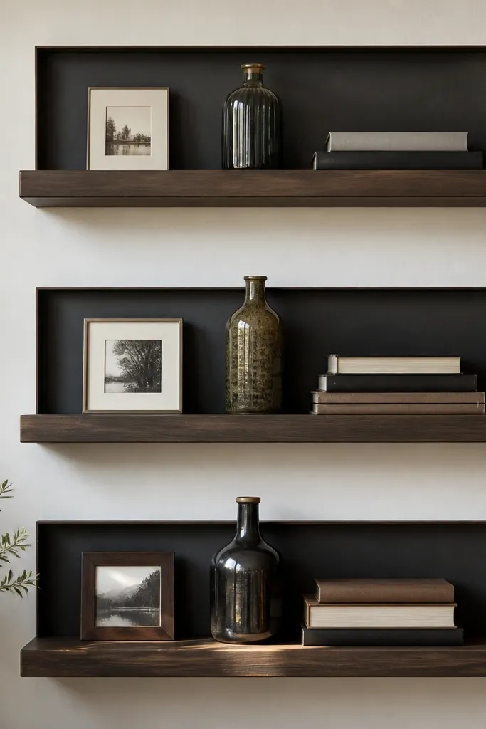
This is the trick I use when shelves look “flat” because the wall is too bright or your decor is mostly neutral. Adding a thin backer panel behind the shelves — even just a painted strip or pre-made backing board — creates depth so objects look like they’re framed. It flatters minimal decor styles because it gives contrast without adding more items. The principle is creating a visual background gradient: the wall becomes the backdrop instead of competing with your objects.
Before mounting, decide how wide the backing will be. I usually cut backing boards to match the shelf width plus about 1 inch on each side, then paint them the same color as your accents (charcoal or deep olive). Mount the shelves, then install the backing so it sits behind the shelf surface. Place the first anchor item centered — a tall bottle or large framed print. Add supporting decor on the left and right, keeping 3-4 inches between items and the shelf edge. For beginners, keep only 2 items per shelf until you’re confident with spacing.
Good to knowUse matte paint on the backing. Gloss creates glare spots that make photos and real life look messy.
AvoidDon’t use a bright white backing if your room already has bright white walls — it flattens everything.
14. Shelf Styling With a Single Tall Plant
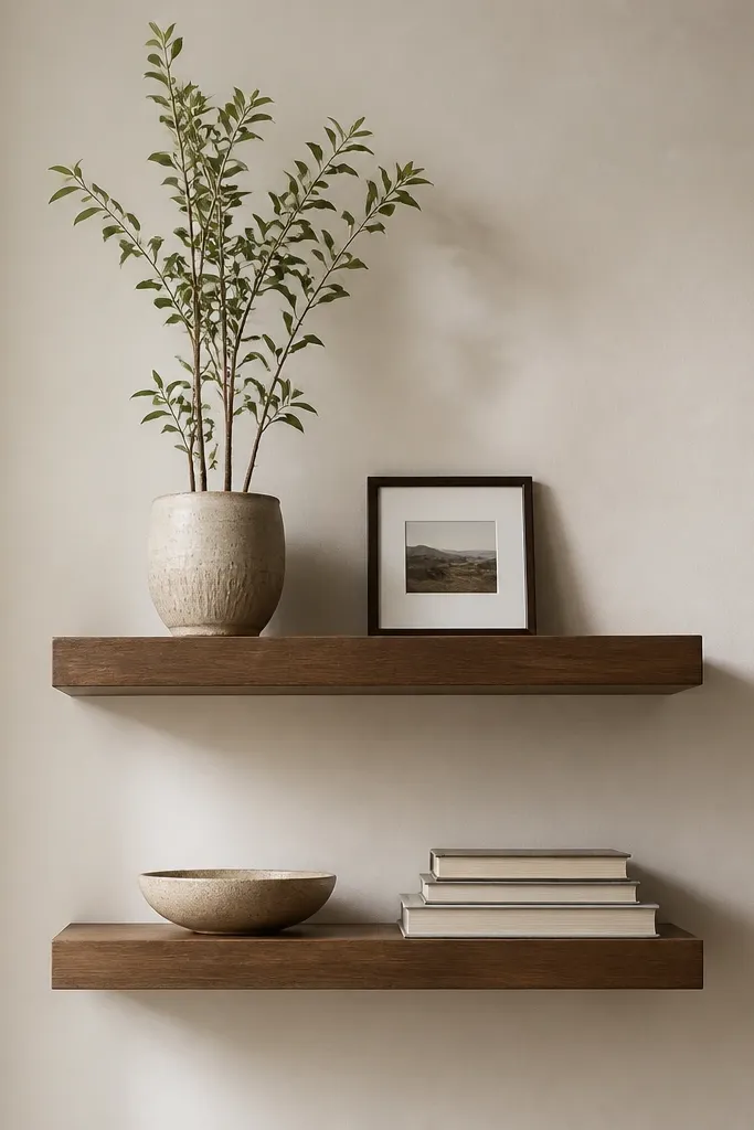
A single tall plant makes the whole arrangement feel intentional, because plants naturally create movement and height. I like this look when your living room has a lot of horizontal furniture and you want a vertical line without buying a tall floor lamp. It also flatters people who want the wall to look alive but don’t want to dust a dozen small items. The principle is one hero — one tall element — then keep the rest low and simple.
Install two shelves with 9 inches between shelf levels. Position the bottom shelf about 15-17 inches above the sofa cushion top. On the top shelf, place the plant pot first and center it slightly left or right, not dead center. Add one small framed photo on the opposite side so the shelf balances. On the bottom shelf, place a low bowl near the center and add a stack of two books beside it. Leave at least 4 inches of open space around the books so the bottom shelf doesn’t look crowded.
Good to knowRotate the plant pot every two weeks so it doesn’t lean to one side and ruin the symmetry.
AvoidAvoid tiny plants on top shelves. They look lost unless the pot is at least 9-10 inches tall.
15. Slim Shelves With Layered Linen Textiles
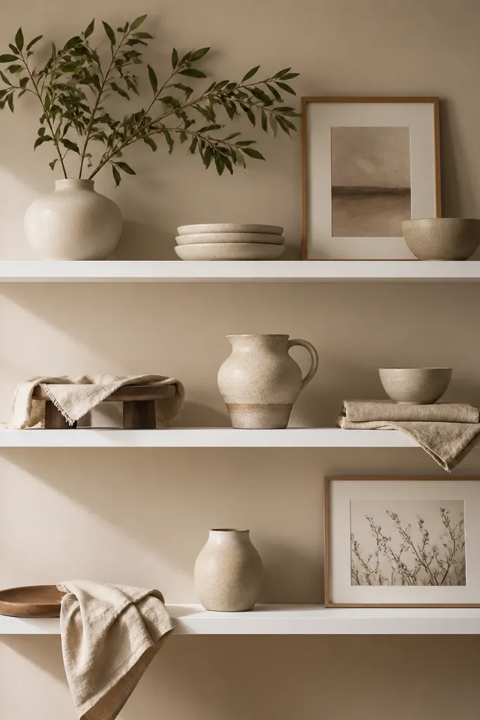
Linen textiles on shelves make them feel soft and lived-in instead of decorative-only. This works especially well if your living room has hard surfaces like glass, polished wood floors, or a sleek leather sofa. I’ve used linen drapes with neutral ceramics to make a room feel calmer, not staged. The principle is layering: a textile on a small riser creates depth, and it breaks up the “everything is ceramic” vibe.
Use slim shelves about 5 inches deep so the linen sits neatly without spilling. Install three shelves with 7-8 inches between them, and keep the bottom shelf 16 inches above the sofa cushion top. On the top shelf, place a ceramic pitcher centered and drape a folded linen strip over a small riser at the front edge. On the middle shelf, place one framed print and add a second linen fold to one side. On the bottom shelf, use a low tray and lay linen napkins partially inside the tray so it looks intentional. Keep the linen colors consistent — oatmeal and cream look best together.
Good to knowIron or steam the linen first. Wrinkles look natural, but random creases look like laundry.
AvoidAvoid bright patterned textiles. It competes with frames and makes the shelf look busy.
16. Staggered Hexagon Planter Group
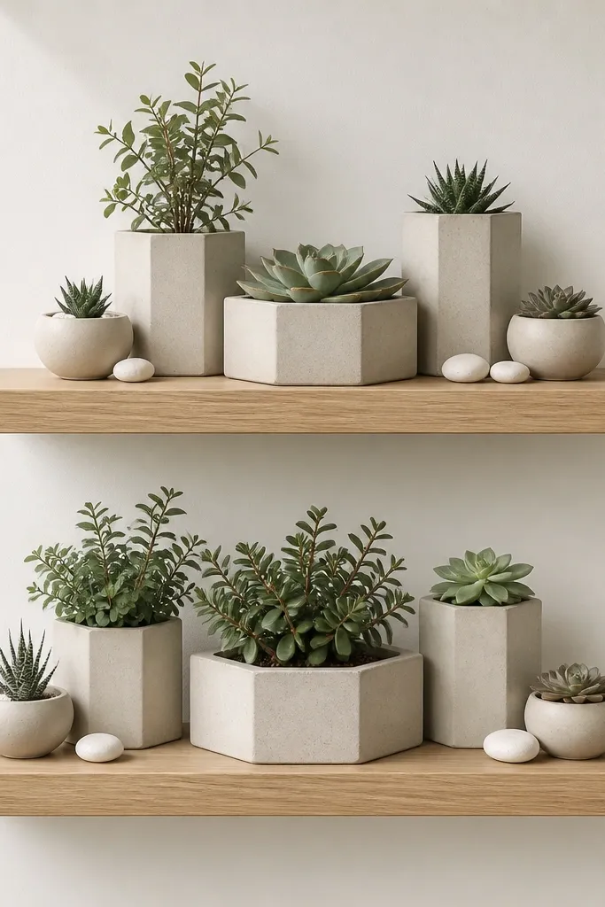
A clustered planter arrangement makes your shelves look like a curated plant shelf, not a storage shelf. This is great for beginners because you can repeat the same shapes — round pots — and still get a designer look. It works best in living rooms with natural light because the planters cast soft shadows and the stones add sparkle. The principle is creating a compact center and letting smaller items sit around it, so your eye knows where to land.
Install two shelves with 10 inches between them, and mount the bottom shelf about 15-16 inches above the sofa cushion top. Use shelf depth around 7 inches so pots fit without hanging. On the top shelf, place the largest planter in the center, then add two medium planters angled slightly toward the center on the left and right. Add small round pots at the back corners. On the bottom shelf, repeat the cluster but swap stones for a small tray of pebbles so the look stays cohesive. Keep every planter within a rough 10-12 inch diameter so it reads as one group.
Use the same pot material finish across all sizes — matte ceramic looks best together.
Avoid mixing glossy and matte planters in the same cluster. The shine difference makes it look messy.
17. Monochrome Book Spine Library
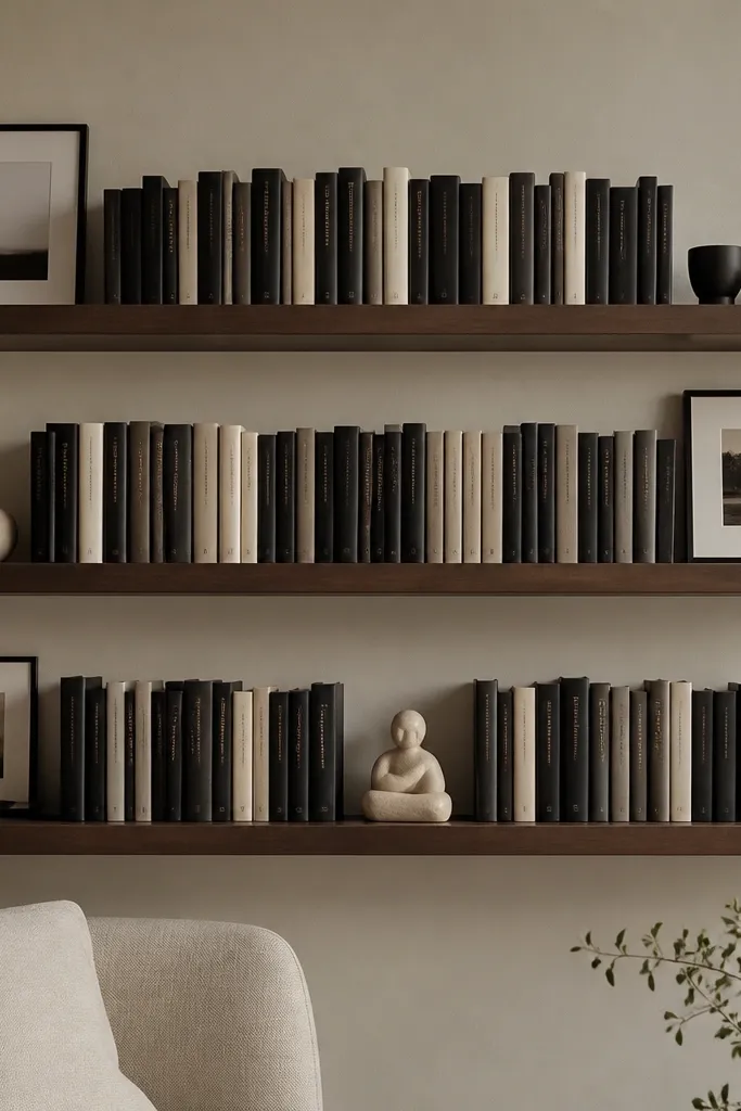
This is the shelf look I reach for when I don’t want to buy decor yet. Monochrome book spines give you color control and it looks intentional even if the books are random. It flatters people who like modern interiors because the lines are clean and the shelf reads like a library. The principle is keeping book spine thickness consistent and adding only one non-book item per shelf so the display doesn’t turn into a yard sale.
Choose three shelves in a dark walnut or espresso finish and install them with 8-9 inches between shelf lines. Put the bottom shelf about 15-17 inches above the sofa cushion top. Arrange books horizontally in stacks of two or three, with spines facing out. On the top shelf, place one centered book stack and add a small minimal frame on the left. On the middle shelf, do two stacks — left and right — then put one tiny sculpture in the center. On the bottom shelf, create a longer stack and add one larger framed art piece leaning upright at the back. Keep all frames and sculptures under 8 inches tall so the books stay the hero.
Good to knowIf your book spines are too mixed, group them by shade and hide the worst ones behind the front stack.
AvoidAvoid stacking books too tall. Tall stacks look unstable and cheap when shelves are shallow.
18. Pastel Porcelain With Curved White Shelves
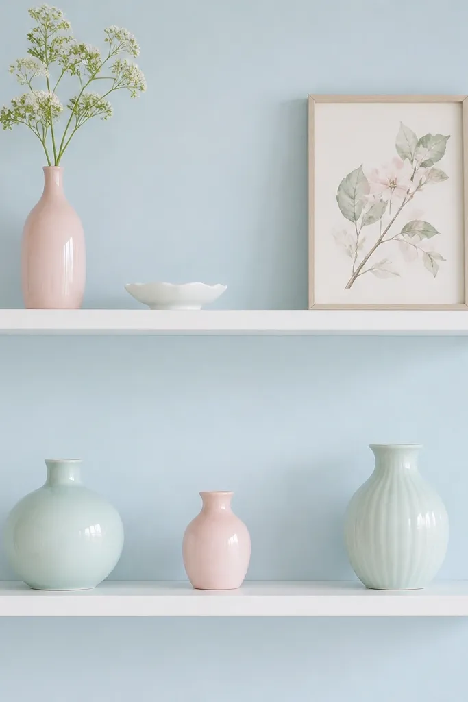
Rounded-front shelves soften the whole display, and pastel porcelain makes the room feel gentle instead of formal. I’ve used this in living rooms with pale blue or soft gray walls where people want a lighter, friendlier vibe. It flatters people who don’t want heavy wood tones and prefer airiness. The principle is soft contrast: pale wall + white shelf + pastel decor creates a calm visual temperature.
Mount the shelves so the bottom edge is 16-18 inches above the sofa cushion top and keep 9 inches between levels. Use two or three pastel pieces per shelf, not more. On the top shelf, place a mint vase on the left and a pastel pink vase on the right, then add a small white dish centered between them. On the bottom shelf, place a framed botanical print at the back and a small curved ceramic piece in front. Keep each pastel item at least 3 inches away from the shelf edge so it doesn’t look like it’s about to slide.
Use one shade as the dominant pastel (like mint) and keep the other shade lighter so it looks intentional.
Avoid mixing too many pastel colors at once. Two shades plus white looks styled; four shades looks like Easter.
19. Two Shelves, One Oversized Art Piece
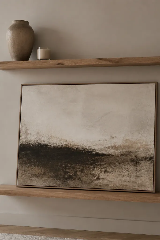
An oversized art piece on the bottom shelf makes your shelves feel like part of your wall decor, not separate decoration. I’ve done this when the living room already has a lot of small items and the wall needs a calmer anchor. Natural wood shelves keep the art from looking too stark, especially with off-white mats. This layout flatters people who want a minimal look but still want personality. The principle is scale: one big anchor item beats five small ones.
Install two shelves with 10 inches between shelf lines. Place the bottom shelf so its top surface sits about 2-3 inches below eye level for standing viewing — usually 58-62 inches from the floor, depending on your sofa height. Lean the large framed art piece at the back of the bottom shelf and use a small non-slip pad under the bottom edge. Add one tall vase on the top shelf, centered, and a candle holder near the corner. Keep the top shelf to two items max. Leave at least 5 inches of empty space around the vase so the wall stays breathable.
Use a clear rubber museum gel pad under frames so they don’t slide when you bump the shelf.
Avoid putting the oversized art too far forward. It makes the shelf look like a ledge instead of a display.
20. Sculptural Ceramic Set With a Stone Tray
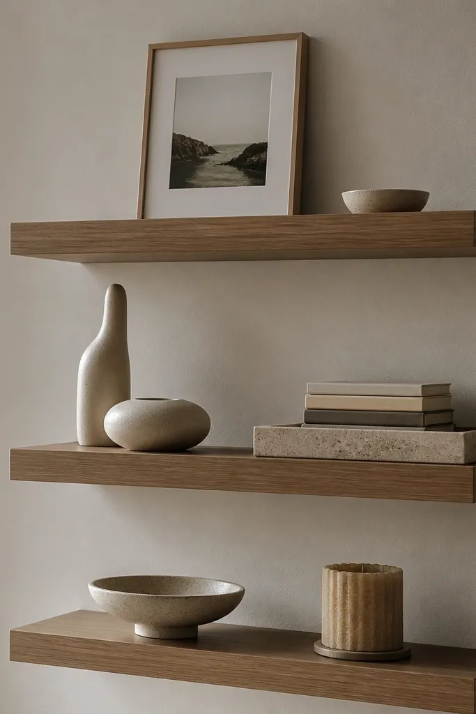
A stone tray grounds the decor and makes the shelves look like they belong to the same scene. I’ve used this setup in living rooms where the wall is plain and the furniture is neutral, and it instantly adds a “collected” feel. The sculptural ceramics catch light from overhead and look different from day to night, which is why people keep noticing the shelves after they’re installed. The principle is using one grounding base per shelf, then placing one tall piece and one low piece around it.
Install three shelves with 8 inches between levels. Mount the bottom shelf about 15-17 inches above the sofa cushion top. On the middle shelf, place the stone tray centered, then put a tall ceramic form in the back left and a low ceramic piece in the front right. Add a small book stack behind the low piece so it doesn’t look floating. On the top shelf, place a framed photo centered and add one small dish on the side. On the bottom shelf, add a low bowl centered and a textured candle near the left edge. Keep everything within the center 65 percent of the shelf width for a tight, styled look.
Match the stone tray color to your metal finishes — warm stone with brass, cooler stone with matte black.
Avoid mixing too many small ceramic shapes. Too many curves on one shelf starts to look chaotic.