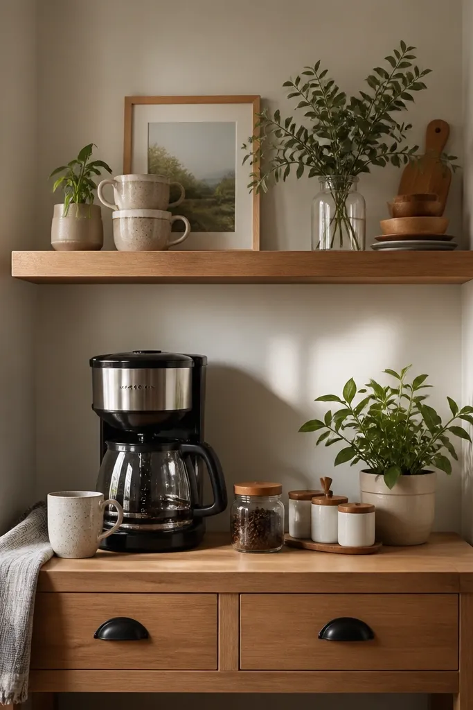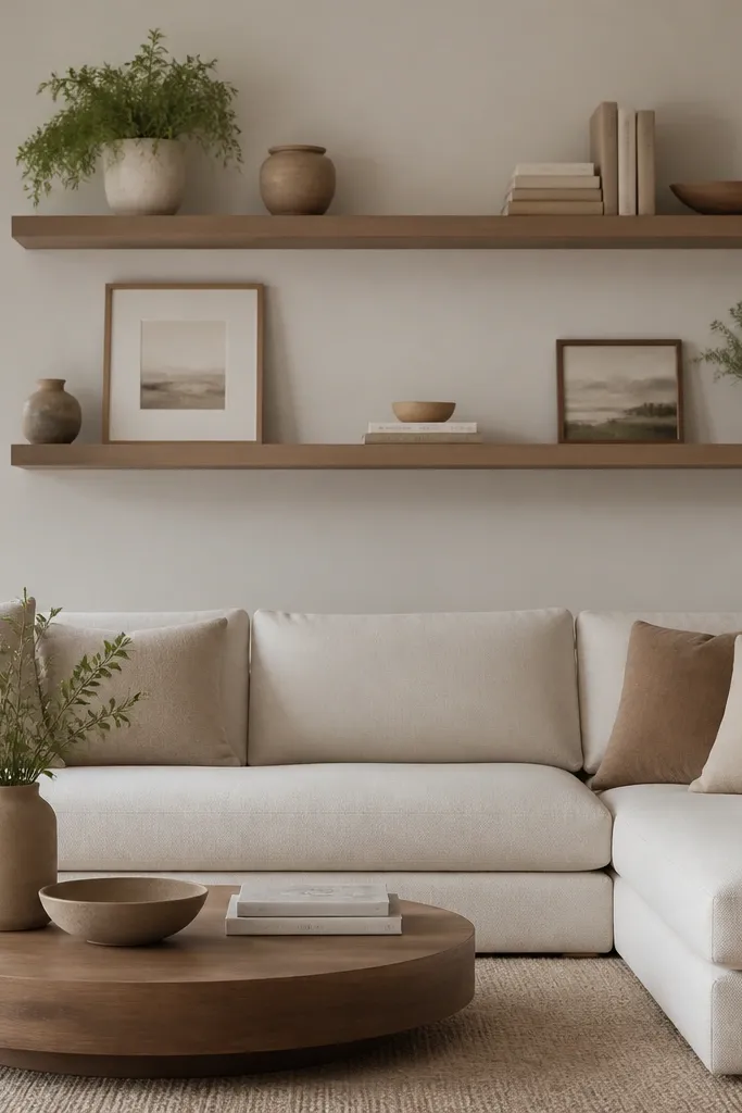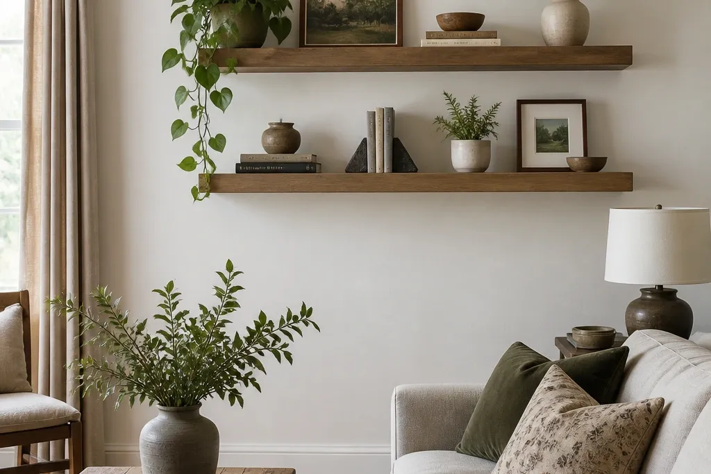
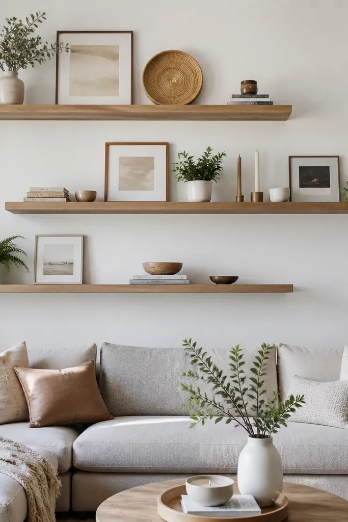
1. Matte White with Dark-Silver Hidden Brackets
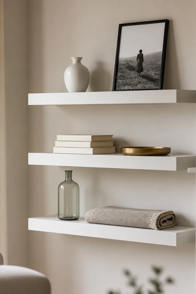
This look works because the matte white shelf reads crisp against warm walls, and the hidden brackets stay invisible once the inside edge is coated the same color as the shelf. I used matte wall paint mixed with a bonding primer on the wood, then sealed with a matte clear coat. It flatters rooms with warm lighting because the finish doesn’t glare when lamps kick on. On the decor side, the dark-silver accents in the brass and black frames create contrast without needing heavy black shelves. If your living room furniture is mostly light wood or cream fabric, this setup makes the whole wall feel pulled together.
Start by cutting your boards to 48 inches for the longest run and 24 inches for the two smaller shelves. Sand to 180 grit, then prime all sides including the underside edge so no raw wood shows. Paint two coats of matte white, let it cure overnight, then mount using hidden rail brackets spaced every 16-24 inches. Style in this order: tallest piece on the back corner, then a horizontal stack (books or a folded board), then a small tray or bowl in front. Keep the front edges aligned so the shelf line looks intentional from across the room.
Wipe your decor pieces with a microfiber cloth before styling so the matte finish doesn’t catch dust and look “cheap.”
Don’t use glossy paint on shelves — it shows fingerprints and looks plastic under overhead lights.
2. Walnut Stain + Clear Matte Topcoat (No Red Tones)
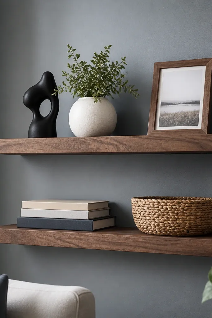
This is the “expensive wood” look without paying for pre-finished shelving. I chose a walnut stain that stays more neutral (less red) and finished it with a matte clear topcoat so the grain shows but doesn’t shine. It flatters living rooms with gray, blue, or green walls because the warm brown adds comfort without turning orange. For decor, the key is to keep your objects mostly in whites, black, and one muted color like olive or clay. When your shelf and your decor share undertones, the whole wall looks designed.
Start by testing your stain on a scrap board, because walnut stain can go red fast depending on the wood. Apply stain with a rag in the same direction as the grain, then wipe off within 3-5 minutes to control depth. After it dries, brush or wipe on a matte clear topcoat in thin coats, sanding lightly with 220 grit between coats. Mount the shelves with hidden brackets and paint the bracket metal black or match the underside color so you never see it. Style with a back-row anchor (frame or sculpture), then one book stack, then one natural texture piece like a small woven basket.
If your wall is cool-toned, add one warm element (brass, amber glass, or a honey wood frame) so the walnut doesn’t feel cold.
Skip heavy, dark stain if you plan to place light decor — it can make the shelf look muddy.
3. Oak Shelves with White Backer Strip
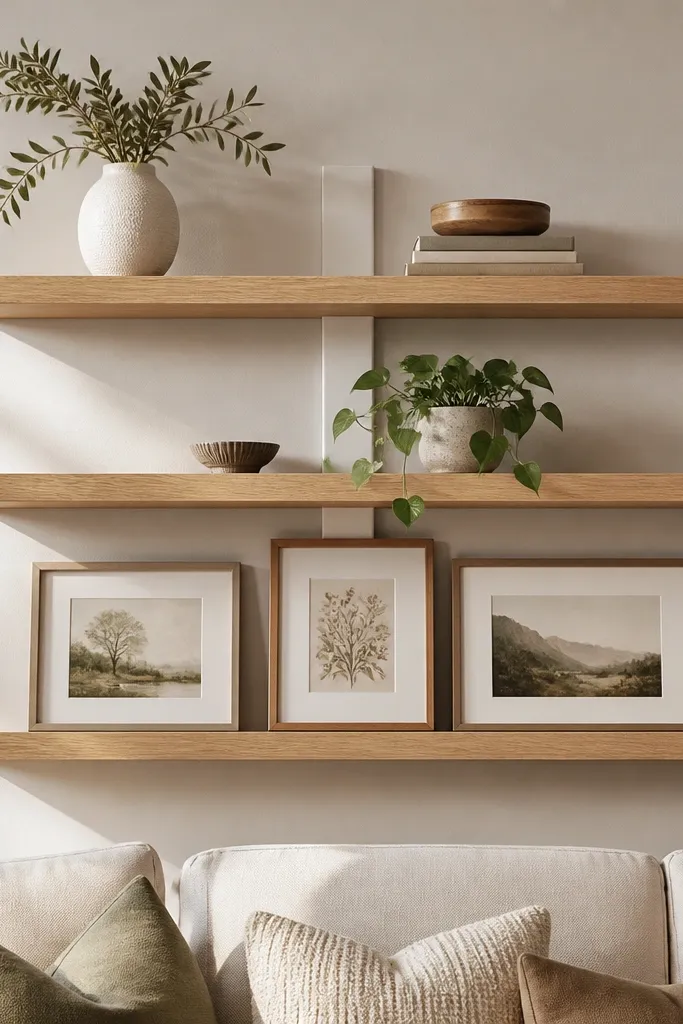
This look adds a “built-in” feel on a budget by giving your shelves a clean background. The oak stays bright, while the narrow white backer strip creates a visual frame that makes the decor pop. I’ve used it in living rooms where the wall is patterned or busy, because the white strip calms everything down. It flatters people who want a lighter, airy vibe without going all-white everywhere. If your furniture is oak-toned or your floors are warm light wood, this setup makes the wall look like it belongs with your existing finishes.
Start by choosing oak-colored shelves or using light wood boards and staining them a honey oak shade. Cut a thin strip of white board (about 1/4 inch thick) and mount it behind the shelf area so it’s visible only between shelf levels. Paint the backer strip matte white, then mount shelves on hidden brackets so the bracket line disappears behind the strip. Space the shelves 11-12 inches apart if you plan to display frames. Style with one plant pot on the left, one vase in the center, and keep the right side slightly emptier so the wall breathes.
Good to knowUse picture frames with white mats — they tie into the backer strip and make everything look sharper.
AvoidDon’t make the backer strip too thick — it turns into a chunky backsplash instead of a subtle built-in effect.
4. Black Shelves with Brass + Linen Decor
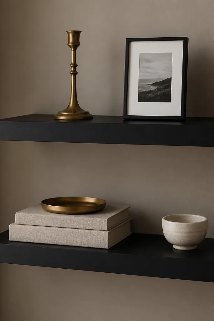
Black shelves look expensive when they’re matte and when you pair them with warm metals instead of shiny chrome. I used a furniture-grade matte black finish so the edges don’t look like spray paint. Brass and linen keep the palette soft, so the black doesn’t feel heavy. This setup flatters living rooms with beige, taupe, or greige walls because the contrast is crisp without being harsh. It also works well for people who want a modern look but don’t want the decor to feel cold.
Start by sanding and priming your wood, then spray or brush matte black in two even coats. Let it cure fully before mounting so you don’t chip the finish when you handle brackets. Install hidden brackets and use black screws so nothing flashes through the shelf line. Style by placing the brass tray slightly off-center, then stack books with their spines facing out, then add one framed photo leaning against the back. Add a linen-wrapped piece or folded fabric to bring softness and texture.
Choose brass with a warm tone (more yellow than gold) so it matches most lighting temperatures.
Avoid mixing black shelves with cool silver decor — it makes the wall look mismatched and less intentional.
5. Greige Shelves with Tonal Ceramic Accents
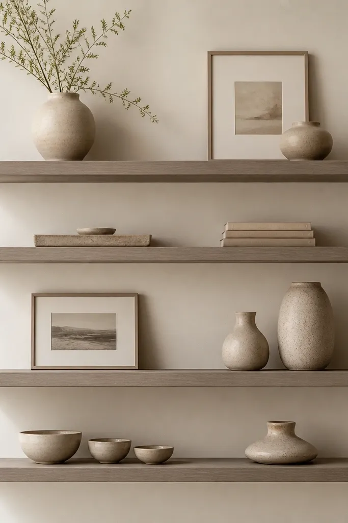
Tonal styling is what makes this look feel high-end instead of boring. Greige shelves sit between warm wood and neutral paint, so they blend with almost any sofa fabric. I used a light stain over pine and then toned it with a greige matte glaze so the grain stays visible. This setup flatters people who have mixed materials — wood floors, painted trim, and a mix of textiles. It also works when you want your decor to feel calm and cohesive, like for a reading nook or a quieter living room.
Start by staining your shelves a light brown, then add a thin greige glaze (wipe on, wipe off) so it mutes the warmth. Seal with matte clear coat. Mount shelves with hidden brackets and keep shelf depths around 6 inches if you’re mostly displaying ceramics and frames. Style each shelf with one ceramic group in the back (2-3 pieces), then a single book stack in front. Leave a small empty space near one end so the shelf doesn’t look crowded from the doorway.
Good to knowPick one frame mat color (greige or warm white) and use it across all shelves for a consistent look.
AvoidDon’t use bright white decor against greige shelves — it can look like it doesn’t belong.
6. Two-Tone Shelves with Dark Edge Band
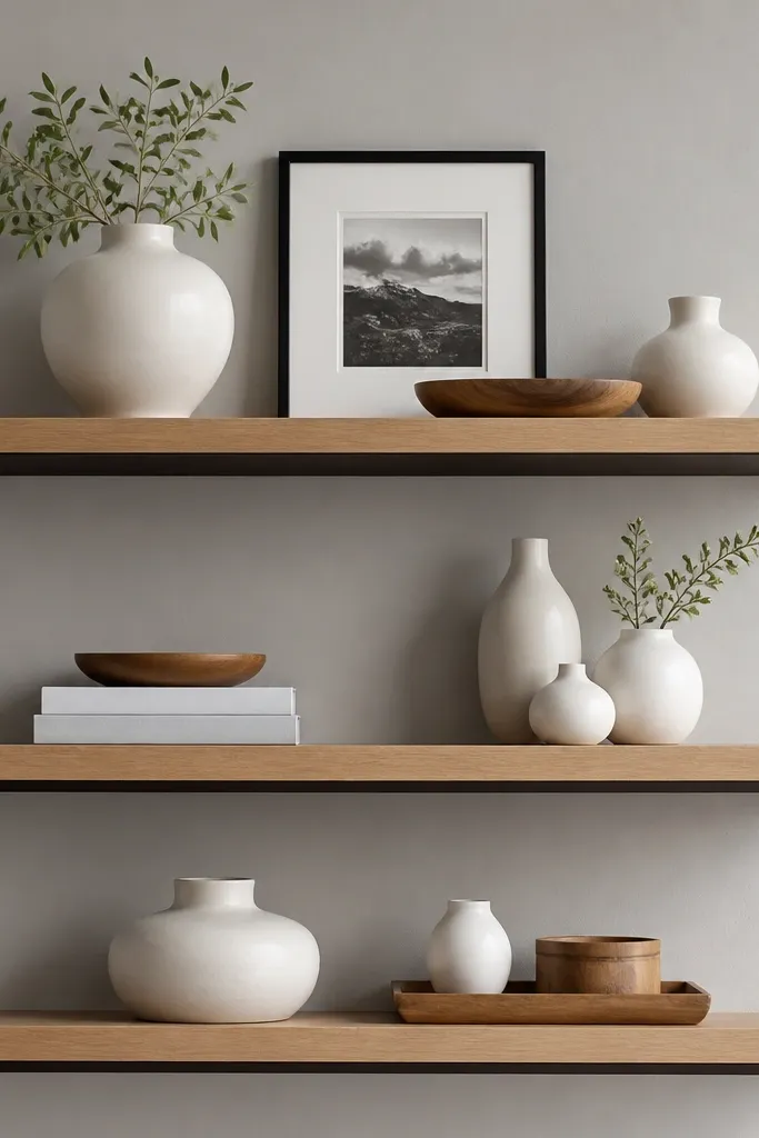
Two-tone shelving looks designer because the eye reads depth and finishing details. The trick is to paint only the edge band (underside front) in a deep espresso color, while keeping the top face light wood. I’ve done this on a budget with masking tape and a steady hand, and it instantly makes the shelves look custom. It flatters living rooms with light walls and darker furniture legs because the espresso band ties the tones together. If you like a modern, tailored look, this is the cleanest version.
Start with light oak shelves or stained boards, then seal the top face with matte clear. Mask the underside front edge with painter’s tape so you only expose a 1/2 inch strip, then paint that strip espresso brown and let it dry before removing tape. Mount with hidden brackets and paint the bracket edges to match the espresso band so nothing peeks through. Style with a repeating rhythm: one tall item (vase or bottle), one flat item (tray), then a small frame. Keep the front row items the same height so the shelf edge band stays the star.
Use a foam roller for the edge band so you get a smooth coat without brush marks.
Skip rushed taping — jagged tape lines show up immediately on two-tone finishes.
7. Reclaimed-Look Pine with Limewash Finish
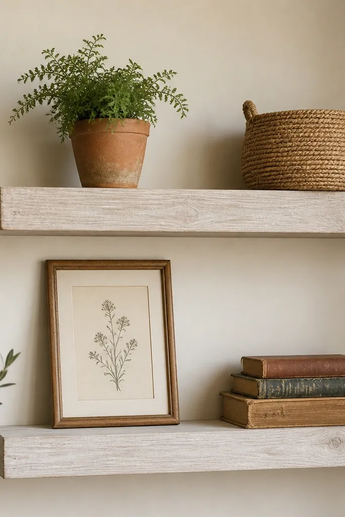
Reclaimed-look shelves get expensive-looking when the finish is actually textured, not just “stained dark.” I used pine boards, distressed them lightly with sandpaper on the corners, then applied limewash in thin layers so the grain and brush strokes show. It flatters cottages, farmhouse-adjacent rooms, and any space with natural fibers like jute or linen. Terracotta and muted greens sit beautifully on limewashed shelves because the shelf color looks soft and lived-in rather than harsh. This style also hides minor imperfections, which is helpful if you’re working with budget boards.
Start by sanding edges lightly, then use a wire brush on the face for subtle grain texture. Apply limewash with a wide brush in thin coats, then wipe back to keep it uneven in a natural way. Seal with a matte protective wax or clear matte topcoat so the finish doesn’t rub off. Mount with hidden brackets and keep shelf depth around 5-6 inches so the weathered look doesn’t overpower the wall. Style with one terracotta piece, one woven texture item, and one framed print that leans slightly for a casual feel.
Use small-scale decor — a big sculpture on limewash shelves can look heavy instead of airy.
Don’t over-distress every corner — leave a few clean edges so it still looks intentional.
8. Stained Birch with Clear Oil Finish
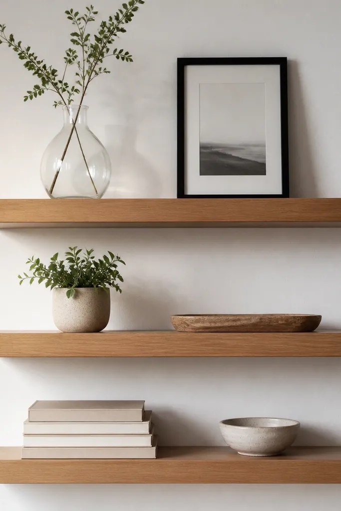
Birch has a tight grain that looks premium when you finish it with an oil-style satin rather than a thick varnish. I stained it a warm mid tone, then used a clear oil finish that keeps the wood looking smooth and natural. This setup flatters living rooms with cool walls and modern furniture because it adds warmth without going dark. It also looks great in daylight because the grain catches soft highlights. If you like clean, Scandinavian-ish styling but want it to feel warmer, this is the one.
Start by sanding birch to 220 grit so the oil finish lays down smoothly. Apply stain evenly with a rag, then wipe off excess so you don’t get blotches. After drying, rub in a clear oil finish with a cloth, let it cure, then buff lightly. Mount with hidden brackets and use matching screws painted the same wood tone. Style with one glass or metal item (for sparkle), one plant, and one tray that holds smaller objects. Keep the shelf spacing around 10-12 inches so the wall doesn’t look like a storage grid.
Oil finishes look best when you wipe them once a week with a dry microfiber cloth — it keeps them from looking dull.
Skip thick varnish — it can make birch look plastic and hide the grain.
9. Slim 5-Inch Shelves for Frame-Led Styling
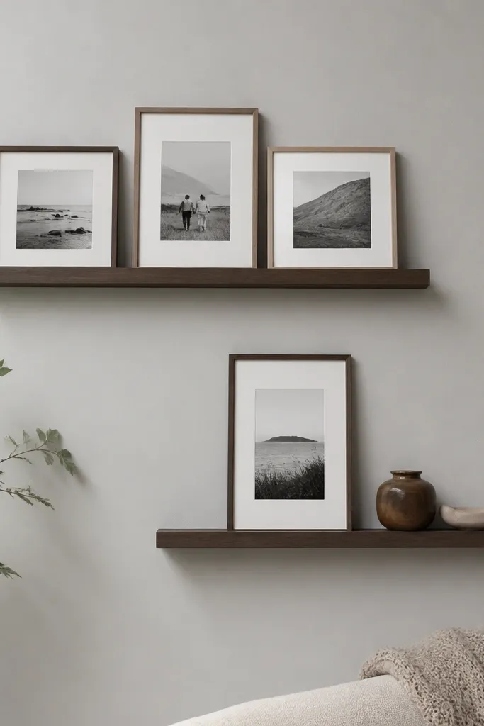
Slim shelves look expensive when you commit to a frame-led layout. A 5-inch depth forces you to keep items tight to the wall, which makes the whole thing look clean and curated instead of cluttered. I mounted slim shelves for a client who had a small living room, and the wall felt taller immediately because the shelves didn’t project outward. This style flatters narrow spaces and people who hate dusting deep shelves. It also keeps the focus on wall art, not storage.
Start by choosing shelf boards around 5 inches deep and 30-48 inches long depending on wall width. Use hidden brackets so the support line stays invisible, then mount so the top shelf lines up with the center of your main sofa artwork or TV. Style by placing frames first, then add one small object per frame cluster. Keep the front edge clear — let only thin items sit near the edge. If you’re using books, stack them flat and keep them under 3 inches tall.
Use photo frames with the same width and mat color so slim shelves don’t look mismatched.
Don’t put bulky decor on slim shelves — it overhangs and looks sloppy in photos.
10. Deep 9-Inch Shelves for Book + Tray Styling
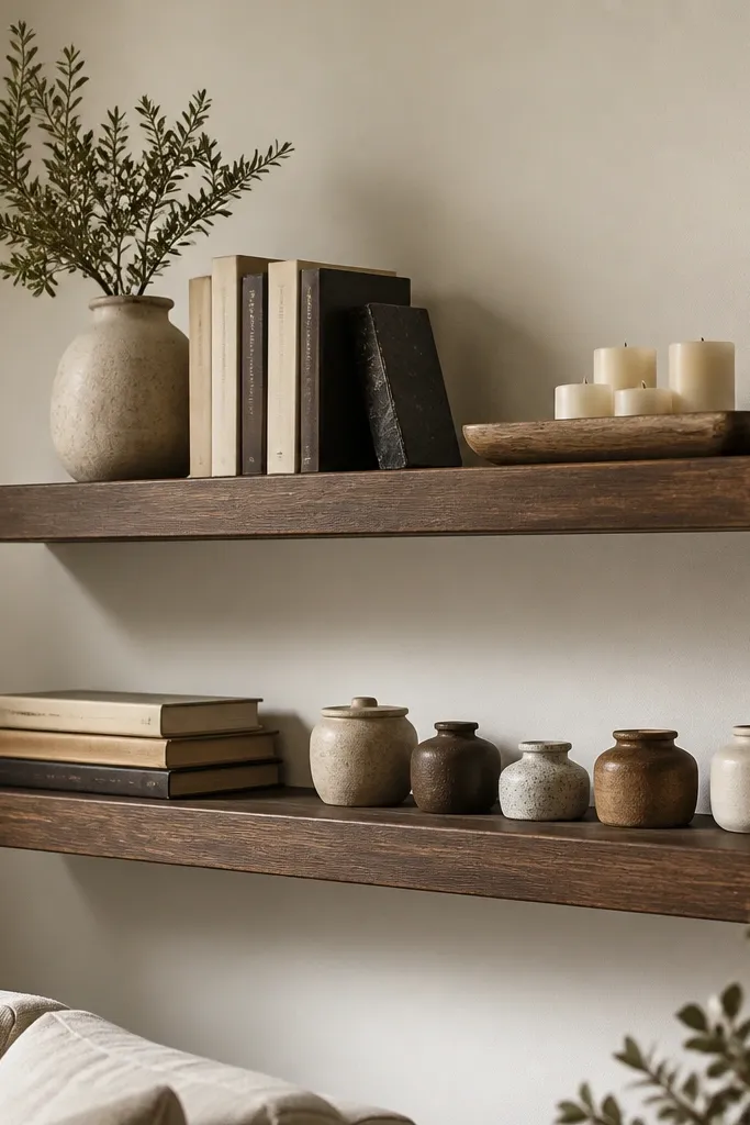
Deep shelves look expensive when you use them like surfaces, not just ledges. A 9-inch depth gives you room for a tray, stacked books, and a candle group without everything falling off the edge. I did this on a budget using thicker boards and it made the shelves feel like furniture — the shadows alone look high-end. This style flatters living rooms where you want a cozy library vibe. It also works well if your decor includes baskets, candles, or larger ceramics that need space.
Start with 9-inch deep shelves, and mount them with hidden brackets that can handle weight — don’t guess. Space shelves about 12-14 inches apart if you’re stacking books or using tall trays. Style in layers: back row gets the tallest candle or sculpture, middle gets book stacks, front gets a long tray with two candles and one small jar. Keep the tray centered and use one color family across items (cream, walnut, black). Leave 2-3 inches of empty space on one end so the shelf doesn’t feel like a storage dump.
Good to knowUse felt pads under trays — they stop sliding and keep the shelf from getting scuffed.
AvoidAvoid mixing too many small items — deep shelves make clutter look louder.
11. Floating Shelves with Built-In LED Strip (Warm White)
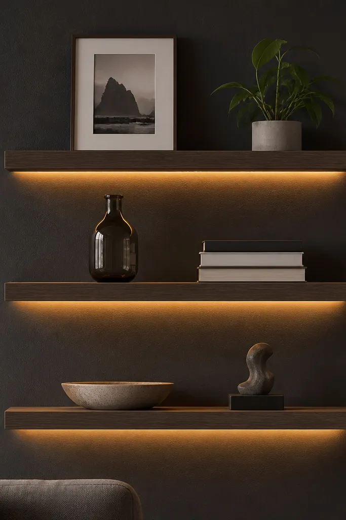
LED under-shelf lighting makes budget shelves look like they came from a showroom because it adds a second light source and hides visual mess. I used warm white (2700K) LED strips and mounted them inside a shallow channel so the light washes the wall, not your eyes. This is especially good in darker living rooms where overhead lighting is harsh. The warm glow flatters wood finishes and makes ceramics look richer. If you’re the kind of person who likes evening ambiance, this is worth doing even on a tight budget.
Start by buying LED strips rated for low voltage and a channel that fits under your shelf lip. Build or buy shelves with a slight underside recess so the LED sits hidden, then test the lighting before final mounting. Install the brackets, mount shelves, then run the LED wire through the wall channel or along the edge cover. Stick the LED strip carefully, press firmly along the entire length, and connect with the dimmer if you want control. Style with fewer items since the light already creates emphasis: one frame, one plant, one tray per shelf.
Good to knowChoose 2700K warm white, not cool 4000K — cool light makes wood look gray and cheap.
AvoidDon’t place reflective objects right under the LED — they create glare spots.
12. Round-Edge Shelves with Soft Gray Hardware
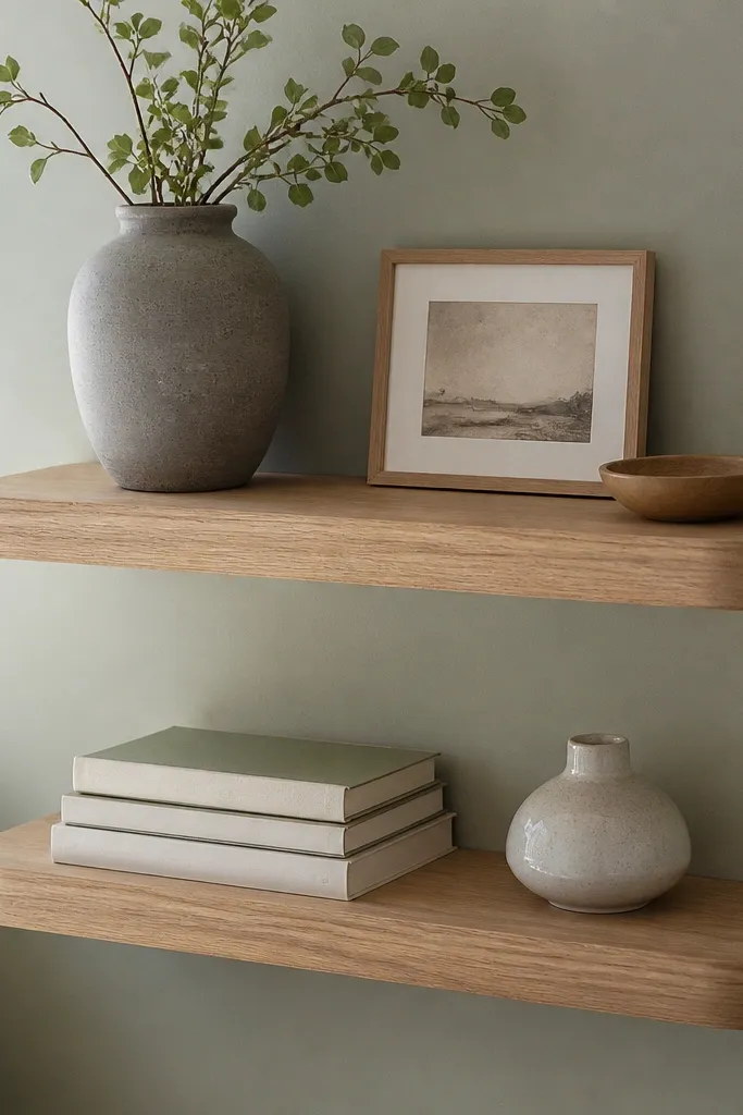
Rounded-edge shelves look more expensive because the finish reads smooth and furniture-like. I used a board with a pre-finished round-over edge or I routed and sanded the edges by hand, then sealed it matte. It flatters anyone with lots of sharp lines in their living room — modern media consoles, square picture frames, or angular rugs. The softness also makes gray decor feel cozier instead of stark. If your goal is calm and refined, this is the fastest way to get there without changing your whole room.
Start by selecting shelves with a gentle round-over on the front edge, then sand the sides to 220 grit so the curve feels silky. Apply a matte clear coat so the rounded edge doesn’t look glossy. Mount with hidden brackets painted soft gray to blend with the wall. Keep shelf depth around 6 inches for decor and books, not heavy storage. Style with a single vase centered, one frame leaning at a slight angle, and one book stack tucked toward the other end.
Good to knowUse ceramic pieces with a matte glaze — gloss ceramics fight the matte shelf finish and look mismatched.
AvoidSkip sharp, unsealed edges on budget boards — they chip and look rough fast.
13. Black Walnut Shelves with White Minimal Decor Grid
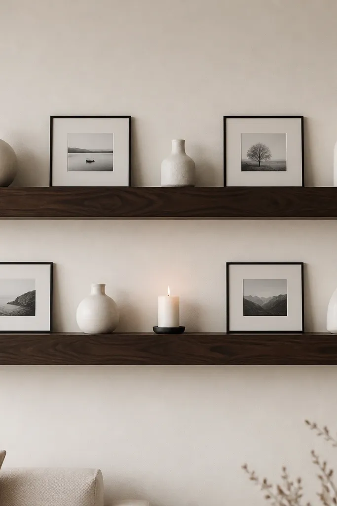
This look feels expensive because it uses restraint and spacing, not because the wood is super dark. Black walnut stain gives depth, and the white decor grid creates a clean visual pattern. I’ve used this in living rooms with busy upholstery because minimal styling stops the wall from competing with the sofa. It flatters people who like modern farmhouse or Scandinavian minimal — the contrast looks intentional. If you’re worried your shelves will look cluttered, this is the safest plan.
Start with long shelves — 54 inches if you have the wall width — and keep depth around 7 inches. Apply black walnut stain in thin coats so it doesn’t go black-black, then seal with matte topcoat. Mount hidden brackets and use black screws so hardware never shows. Style by laying out your photo grid on the floor first, then place frames starting at the left end with equal gaps. Add one white vase per shelf and keep candles or small objects to one per shelf so the spacing stays crisp.
Measure the gaps between frames with a ruler before you hang anything — small spacing differences look sloppy.
Don’t mix in lots of colors — the dark wood makes extra colors look like you’re trying to hide clutter.
14. Sandstone Finish with Terracotta and Greenery
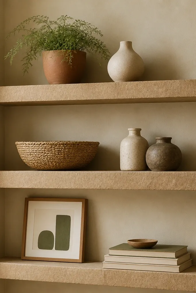
A sandstone finish makes shelves look softer and more architectural because it sits between paint and stone. I used a chalky matte finish in a warm beige-sand tone, then sealed lightly so it’s still wipeable. Terracotta and greenery look especially good on this shade because the palette feels natural and warm. This setup flatters living rooms with warm beige walls, light oak furniture, or woven rugs. It also hides minor scuffs better than glossy finishes, which matters if you have kids or pets.
Start by prepping your boards with sanding and a bonding primer so the chalky finish sticks. Apply the sandstone paint in two thin coats, then add a matte clear sealer once the paint cures. Mount with hidden brackets, but paint the bracket edges to match the shelf color so they don’t show through any gaps. Style with one terracotta pot on the left, one cream vase on the right, and a small greenery piece in the middle shelf. Add a woven basket as a textural anchor, then stack books with neutral covers under it.
Wipe greenery leaves before placing them — water spots show up on matte, chalky finishes.
Avoid bright white paint on the wall behind these shelves — the sandstone can look yellow.
15. Charcoal Shelves with Floating Gallery Frames
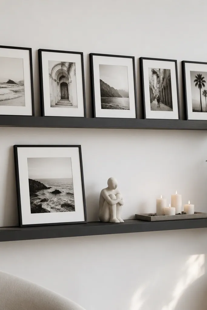
Charcoal shelves look expensive because they create a gallery wall feel without needing wallpaper or extra wall art. I mounted the shelves level, then treated the frames like a gallery grid — same mat color, same frame width, and consistent spacing. This flatters living rooms with white walls and black accents like light fixtures or TV stands. It also looks crisp in the evening because the matte charcoal absorbs glare. If you want a clean “designed wall” look and you already like black-and-white art, this is the easiest win.
Start with charcoal shelves in a matte finish, depth around 6-7 inches for frames and small decor. Mount hidden brackets at stud locations and confirm level with a long level before tightening. Style top shelf first: place frames across the shelf with equal gaps, then step back and check alignment from the doorway. Bottom shelf gets one larger piece leaning against the back, then a narrow tray in front with two small candles. Keep the tray centered and leave the far corners slightly emptier so the wall stays airy.
Use museum glass frames if you can — they reduce glare and keep the art looking sharp under lamps.
Don’t mix frame widths — it reads chaotic and cheap on a dark matte shelf.