1. Walnut sleigh bed with two-tone bedding rhythm
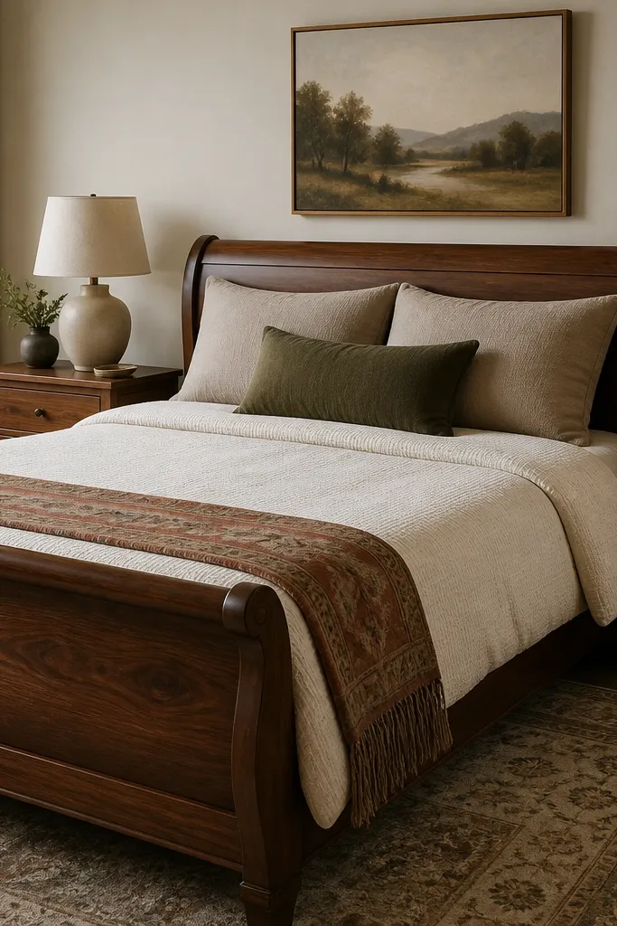
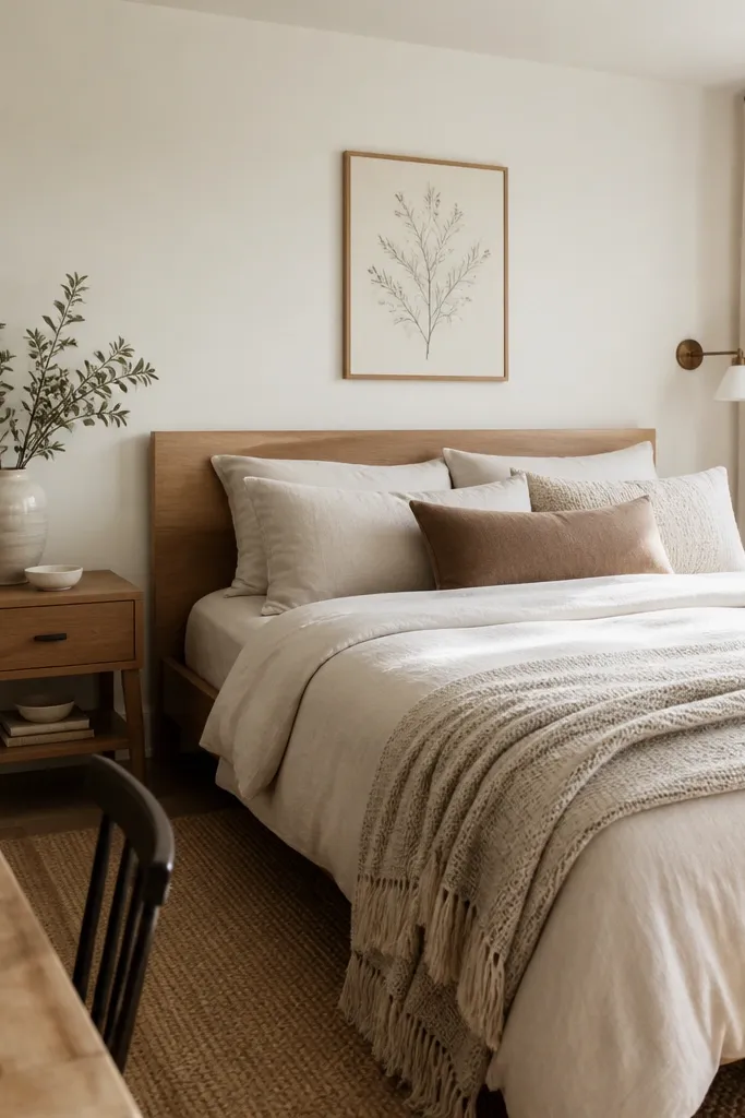
A walnut sleigh bed gives you height and shadow lines even when your bedding changes. I keep the duvet creamy because it reflects light softly and makes skin tones look warmer without turning the room orange. The two-tone pillow setup — taupe shams plus a deep olive lumbar — creates a rhythm that looks designed from across the room. This works especially well if your room has north-facing light or cooler walls, because the warm wood + creamy textiles balance the chill. Styling principle: keep one base color steady and rotate only the accent texture and one accent color each season.
Start by choosing a duvet cover in off-white with a visible texture (waffle or micro-rib). Place two standard shams in taupe, then add a lumbar pillow in deep olive centered under your main pillow stack. Finish with a throw folded lengthwise at the foot so it shows about 10 to 14 inches of fabric. If your bed is wider than 60 inches, use a 50x70 throw; if it’s a queen (60 inches wide), a 55x75 throw looks fuller. Top it off with a linen-shaded lamp so the light doesn’t look harsh on the sleigh’s curves.
When you swap seasons, keep the duvet color the same and change only the throw fabric weight — cotton percale in spring, heavier knit in winter.
Avoid using a flat, glossy duvet with a textured sleigh frame; the contrast makes everything look mismatched.
2. Low platform bed with a high-contrast rug grounding trick
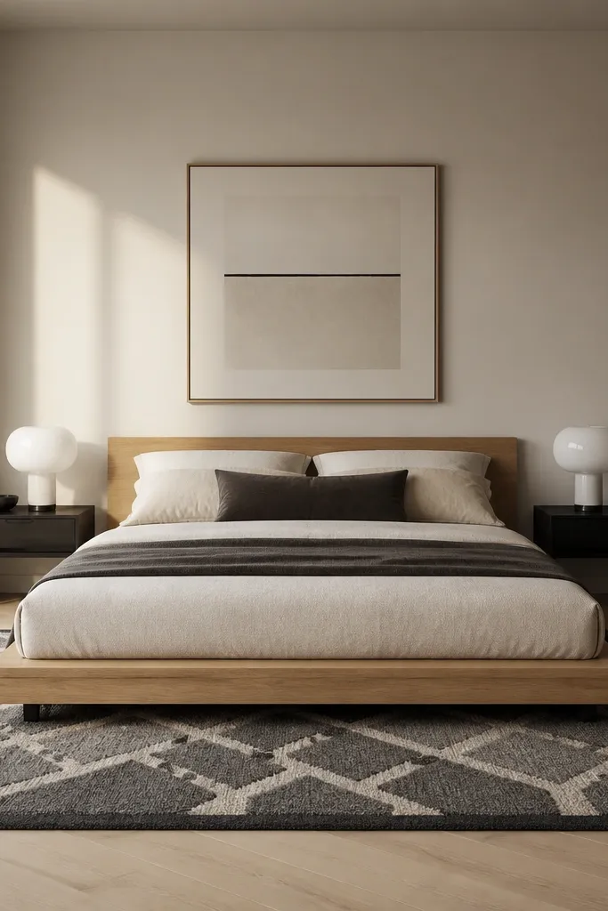
A low platform bed can look unfinished if the rug stops too close. I ground it with a rug that goes wide enough that your eye reads the bed as part of the floor plan, not floating on it. Charcoal-and-cream works year round because it hides dust and still feels bright against light wood. This look flatters light skin tones and cool undertones because the cream pushes warmth while charcoal keeps the room from turning yellow. Styling principle: make the rug the “furniture” that defines the zone around the bed.
Measure your bed width and add at least 16 to 20 inches of rug beyond each side. Center the bed on the rug so the pattern lines line up with the bed’s edges — I check this by standing back and aligning the geometric border visually. Choose a rug pad about 1/4 inch thick so the rug doesn’t feel thin underfoot. Keep bedding simple: white or bone sheets, a textured duvet, and two pillows in one neutral plus one accent. Finish with lamps that have matte bases so the rug’s contrast stays the star.
Good to knowIf your room is small, go for a rug with a lighter center and darker border; it makes the space feel bigger without losing grounding.
AvoidDon’t let the rug end at the bed’s side — it reads like a misfit and makes the bed look lower than it is.
3. Rattan headboard with crisp white bedding and one warm accent
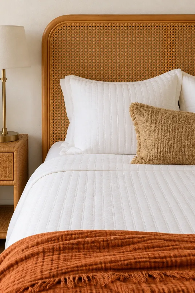
A rattan headboard brings texture without needing loud patterns, which is why it’s great for year round room interior bedroom decor. I pair it with crisp white bedding because it makes the rattan look intentional and not beachy. Add one warm accent — burnt orange or terracotta — so the room doesn’t feel cold in winter. This combo is forgiving for most skin tones and flattering for both warm and neutral undertones because the orange tone warms the contrast. Styling principle: keep the bedding color family tight and use one accent color to “talk” to the natural material.
Start with a white duvet cover in a fabric that has structure (cotton percale or a crisp linen blend). Add two white shams, then place a small woven accent pillow that matches the rattan’s undertone (tan, not gray-beige). Fold a burnt-orange throw at the foot so it covers about one-third of the bed length. Choose a nightstand with similar natural texture and a brass lamp base to tie the warm metals together. Keep wall art minimal — one framed print in off-white matting to avoid competing textures.
Good to knowIn winter, swap the throw to a chunky knit in the same orange hue so the headboard’s texture still shows through.
AvoidAvoid adding too many patterns next to rattan; it turns the room busy fast.
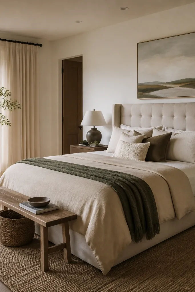
4. Oversized linen headboard with layered neutrals
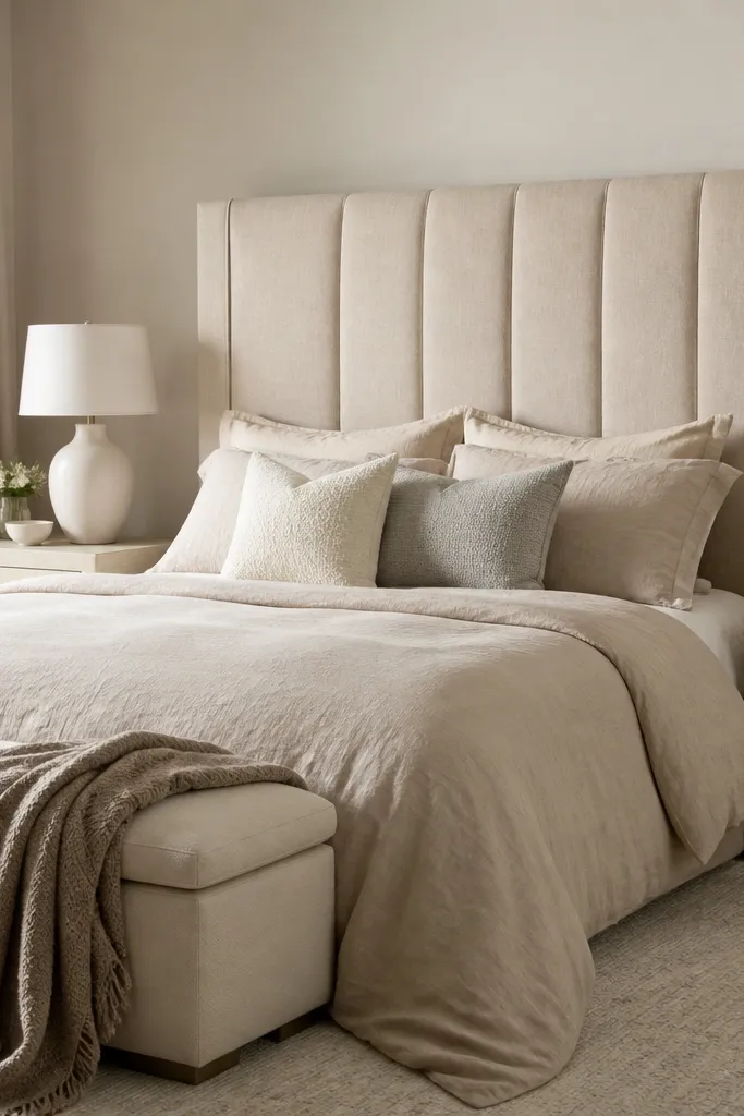
An oversized linen headboard is a cheat code for year round decor because it absorbs light and makes everything around it look calmer. I like oat-beige because it’s warmer than true beige and it doesn’t look gray in daylight. Layer neutrals by texture instead of by color: cream, sand, and light gray in different weaves keep the bed interesting without turning it into a patchwork. This works well if you have darker hair and want the room to brighten your face; the oat tone gives a soft contrast. Styling principle: use one main neutral and vary the weave, not the shade.
Pick a duvet in oat or oatmeal and choose shams with a slightly different texture (one smooth, one slub). Add a cream pillow with a subtle welt or piping, then a light gray pillow in a different fabric like bouclé or faux shearling. Drape the taupe throw so its edge lines up with the bench height at the foot, about 10 to 12 inches above the floor. Keep nightstands in the same material family as the headboard’s legs, and use lamps with warm-white bulbs. If you have low ceilings, hang wall art slightly higher so the headboard height doesn’t make the room feel bottom-heavy.
Good to knowWash and dry your linen bedding before styling; it settles and looks better than freshly bought fabric that still stands up.
AvoidDon’t add a high-gloss satin pillowcase with linen; the shine looks out of place.
5. Bedside gallery: mirrored nightstands and a single sculptural lamp
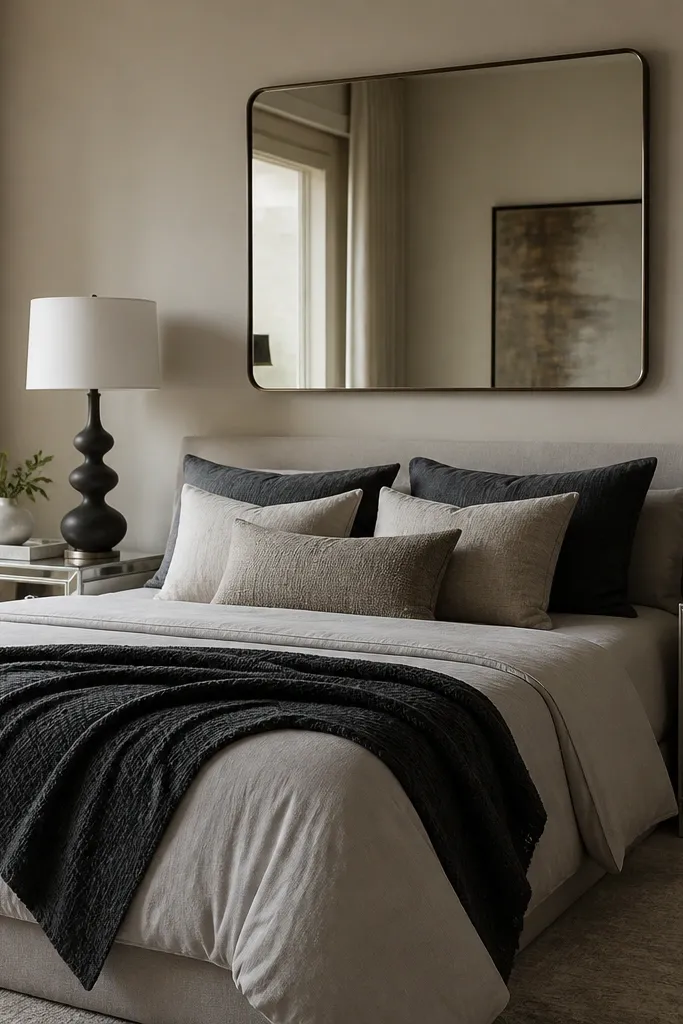
Mirrored nightstands look polished in every season because they reflect whatever you put near them — lamp glow in winter, brighter daylight in summer. I keep the rest of the bed palette simple so the mirrors don’t feel like a disco ball. A sculptural lamp with a thick shade gives vertical interest and stops the room from looking flat. This works for medium to darker skin tones because the light bounce makes the bed area look brighter without needing harsh white paint. Styling principle: use reflective surfaces only in pairs and keep the bed textiles low-contrast.
Choose mirrored nightstands with straight edges so they read clean. Place a glass or ceramic tray on each so your styling stays repeatable: tray, lamp, one small object (like a candle cloche or a small ceramic vase). Dress the bed in light gray sheets and add a charcoal throw that matches the lamp’s base tone. Hang a single large mirror above the headboard area, centered, with the bottom edge about 6 to 8 inches above the headboard. Use warm-white bulbs (2700K) so reflections look soft, not blue.
Use felt pads under small decor pieces on mirrored surfaces — they scratch if you slide them even once.
Don’t mix mirrored nightstands with busy patterned upholstery; reflections multiply visual noise.
6. Dark wood spindle bed with a patchwork throw strategy
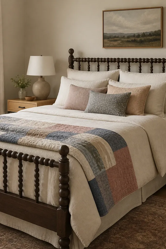
Dark wood spindles bring a lot of visual detail, so the trick is to let the bed textiles carry warmth without adding more busy shapes. I use a plain cream duvet so the spindles look crisp, then add a patchwork throw that introduces color through texture and small pattern. Dusty rose and muted blues are gentle year round because they don’t scream a specific season. This looks flattering if you wear warmer makeup or have warm undertones; the rose in the quilt makes the overall palette feel cohesive. Styling principle: keep one big textile solid and use patchwork only in one place.
Start with a cream duvet and smooth sheets in a slightly warm tone, not icy white. Drape the quilt throw over the foot so one corner hangs down about 8 to 10 inches. Add two pillows in oatmeal or cream, then one smaller accent pillow that repeats a color from the quilt (dusty rose or slate blue). Keep nightstands simple and use one basket for throws or scarves so the room stays tidy. Finish with a reading chair or ottoman that has a solid fabric — that way the quilt stays the only pattern focus.
If your quilt has multiple colors, pick just one color to repeat in a lamp base or small frame so it feels intentional.
Avoid adding patterned curtains when the quilt already has pattern; it makes the spindle bed feel crowded.
7. Two-tone dresser as a nightstand swap for small bedrooms
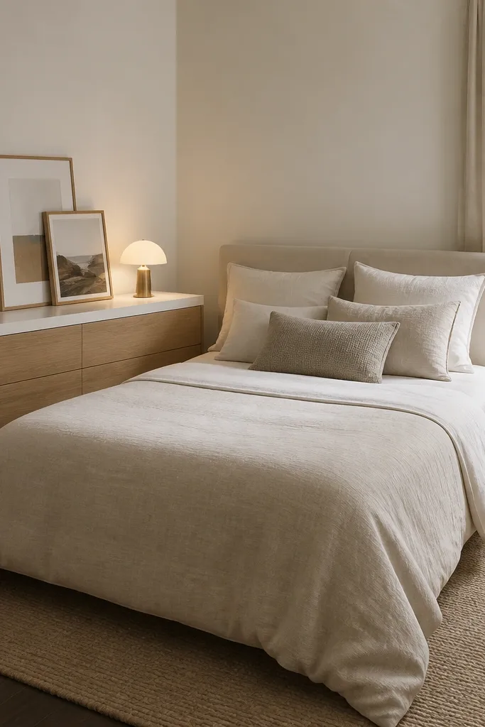
When space is tight, a full-size nightstand pair can make the room feel squeezed. I replace one nightstand with a low two-tone dresser so you get drawer storage and a wider styling surface for year round room interior bedroom decor. The two-tone look keeps the dresser from feeling heavy, especially against a bed frame in wood or metal. This works well for anyone who needs practical storage — remote controls, extra chargers, and a spare throw — without adding clutter. Styling principle: use furniture height and surface width to balance the room, not just symmetry.
Pick a dresser that’s about the same height as the top of your mattress or slightly lower (within 1 to 3 inches). Place the lamp on the dresser side and keep it centered on the surface so the light doesn’t look off-balance. Use a small tray for daily items and add one framed print leaning against the wall behind the tray. On the other side, use a narrow nightstand so the bed still feels anchored. Dress the bed with a duvet that matches the dresser’s lighter tone, then add one accent pillow that matches the wood body color.
Good to knowUse drawer liners in a neutral color — they make the dresser feel finished even when you pull a drawer out.
AvoidDon’t cram three tall decor items on the dresser; one lamp and one grouping is enough.
8. Floating nightstands with wall sconces for a lighter feel
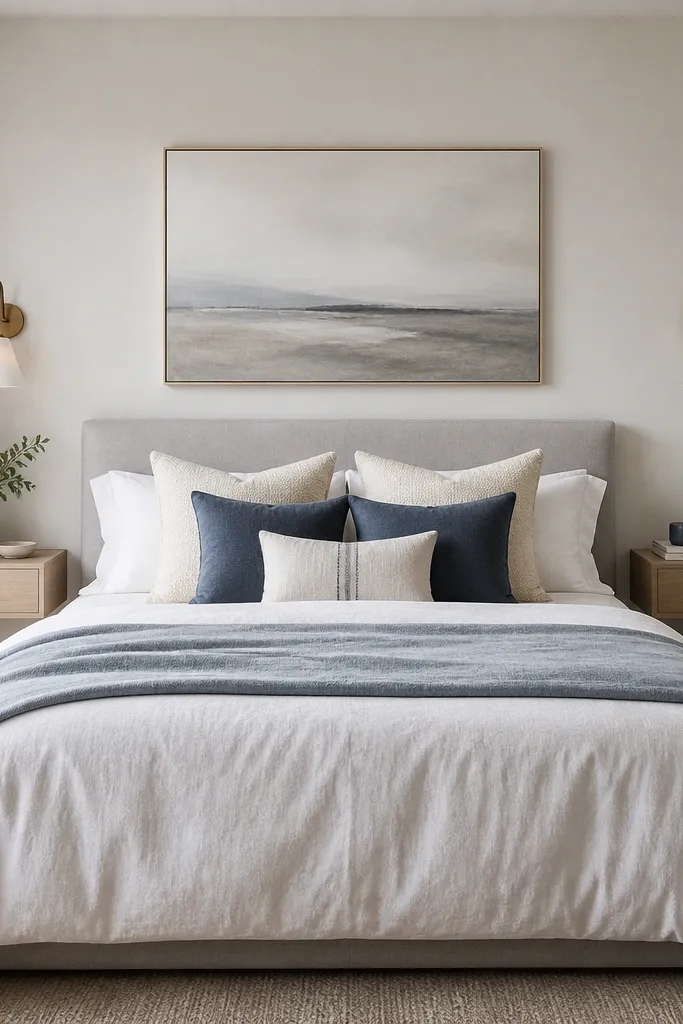
Floating nightstands and wall sconces keep the floor visually open, which makes a bedroom feel bigger in every season. I like this setup with a light headboard and a pale, cool bedding palette because the wall lighting gives a gentle glow without adding extra table clutter. Soft navy and pale blue feel calm in winter and still fresh in summer. This combo is flattering if you like crisp linens and you want your room to look tidy even when you’re not styling it daily. Styling principle: move vertical lighting to the wall so surfaces stay clear.
Mount floating nightstands so their top sits about level with your pillow height when you’re lying down. Install sconces so the light source sits roughly 8 to 12 inches above the nightstand surface. Keep the bed bedding simple: white duvet, two cream pillows, and one pale blue lumbar pillow. Add a throw in soft navy or pale blue at the foot, folded so it looks deliberate. Use warm bulbs and keep the sconce covers clean — fingerprints on glass show up fast.
If you can, choose sconces with dimmers. One room, different moods, and you still keep the furniture arrangement the same.
Avoid sconces placed too low; they cast awkward shadows on the pillows.
9. Corner reading nook chair with a throw that matches your rug
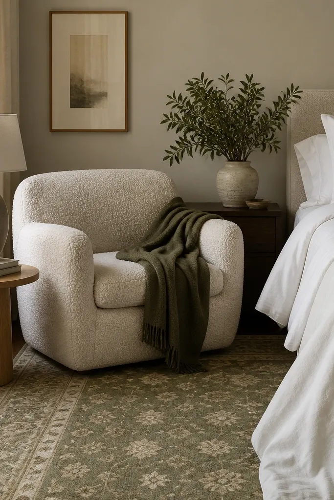
A reading chair makes a bedroom feel lived-in, and that matters year round because it gives you a second “anchor” besides the bed. I match the chair throw to the rug’s muted color so the whole room reads as one set, not separate zones. Bouclé looks cozy in winter, but it doesn’t feel heavy when paired with cream and olive — the colors stay gentle. This works well for most people because the chair brings softness around the edges of the room and balances hard materials like metal bed frames. Styling principle: tie the chair’s textile to the rug so your eye moves smoothly around the room.
Place the chair so there’s about 24 to 30 inches between it and the bed for comfortable movement. Choose a throw that matches the rug’s dominant secondary color (olive, not a bright green). Drape it over the chair arm so it hangs naturally and shows texture up close. Put a side table next to the chair with a lamp that has a shade wider than the lamp base by about 2 inches. Keep the bed pillows restrained: one patterned pillow that repeats a rug color and the rest in solids. That balance makes the nook feel intentional instead of added later.
Use a small tray on the side table. It lets you set a cup and book without clutter making the chair look messy.
Don’t pick a chair fabric that clashes with your rug fibers; bouclé next to a shiny rug pile can look off.
10. Bench at the foot with a storage cover in the same fabric family

A bench at the foot gives you a built-in styling surface, and it’s useful year round because it hides extra throws and keeps the bed from looking empty. I always match the bench upholstery fabric family to the headboard or nearby large textile so the room feels stitched together. Oat linen looks warm in sunlight and forgiving in darker months. This flatters people who like a neat, put-together look because it creates a “finished” line at the foot of the bed. Styling principle: match fabric families at two anchors so seasonal changes look like part of the same design.
Choose a bench length that’s about 80 to 90 percent of the bed width so it looks proportional. Position it centered at the foot with about 2 to 4 inches of gap to the bed frame if you have molding or trim. Use a storage cover or removable cushion in the same color family as your headboard or duvet. Style the top with a single folded throw and one small tray or candle, not a full decorative stack. On the bed, keep pillow sizes consistent: two standard shams, one lumbar, then one small accent. That makes the bench look like it belongs, not like extra furniture.
Good to knowIf you have kids or pets, buy the bench cover in a washable performance fabric and keep it on a spare zipper track.
AvoidAvoid a bench fabric that’s too shiny; it makes linen bedding look cheaper by comparison.
11. Tall wardrobe panel color-matched to your wall paint
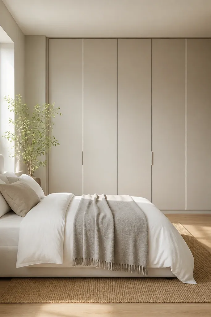
A tall wardrobe can overwhelm a bedroom, so color-matching it to the wall is the fastest way to make it disappear in daylight and still look clean in evening. I do this when I want year round room interior bedroom decor to feel calm and uncluttered. When the wardrobe blends, your attention goes to bedding texture and lighting instead of furniture bulk. This style is flattering for smaller rooms and for anyone who likes a minimal look without feeling bare. Styling principle: reduce visual contrast between storage and walls so textiles become the focal point.
Pick a wardrobe finish that matches your wall paint undertone — warm beige walls need warm beige wardrobe panels, not gray. Place the wardrobe so the door handles align with a visual line like a window trim, then center the bed so it feels balanced. Keep the rug warm and mid-toned so it doesn’t fight the wardrobe. Dress the bed in white or cream and add a throw in light gray or soft black. Use one mirror to bounce light, ideally across from a window or near a lamp. Keep bedside decor minimal: one lamp, one small tray, and one framed print.
Good to knowTake a small paint chip to the store and compare it to the wardrobe sample under both daylight and warm lamp light.
AvoidDon’t match wardrobe to wall with a too-cool gray; it creates a hard edge that makes the room look smaller.
12. Patterned curtains with a simple bed frame, not the other way around
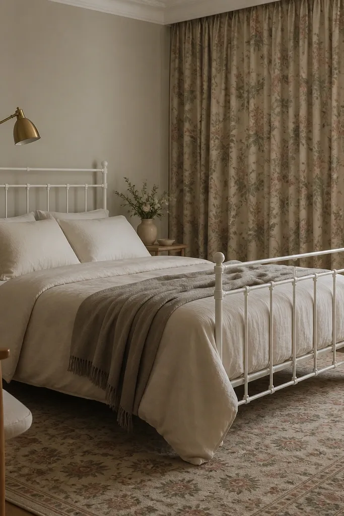
If you want year round room interior bedroom decor to look styled without constant swapping, let curtains do the talking. I pick patterned curtains first, then keep the bed frame and bedding solids so the pattern doesn’t get loud. Muted florals in sage and dusty rose stay wearable in every season because they read as soft color, not holiday. This works well if you have a lot of daylight, because the pattern moves slightly with light and feels alive without being busy. Styling principle: anchor the visual interest in one big textile and keep everything else calm.
Hang curtains so the rod sits about 4 to 6 inches above the window trim and the curtains touch the floor with a slight break. Use a curtain fabric that has a dense weave so it holds shape and doesn’t look see-through at night. Choose bedding in oat or cream with at most one accent pillow that repeats a curtain color. Add a rug that echoes the curtain palette but stays less patterned — a subtle border or small geometric works better than another busy print. Place a brass lamp near the bed so the warm metal ties sage and rose together. Keep wall art simple: one framed print with an off-white mat.
Good to knowSteam curtains before styling — wrinkles change the way patterns land and can look messy in photos.
AvoidAvoid a patterned duvet when your curtains are patterned; it turns the room into one big print.
13. Black metal bed with warm white textiles and a caramel leather accent
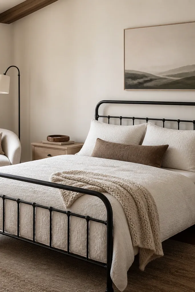
Black metal frames can feel harsh if you dress them in cool whites, so I counter with warm white and creamy textures. Add one leather accent in caramel because it reads warm and aged — it looks good in both summer and winter. The goal is to keep the palette simple: black for structure, warm white for softness, one warm accent for depth. This looks flattering on a wide range of skin tones because warm whites and caramel tones bring balance to the contrast. Styling principle: when you have a hard material (metal), soften with texture and one warm natural element.
Choose a warm white duvet cover with texture, like waffle or slub, and keep sheets in the same temperature (avoid icy white). Add two cream pillows and one throw in a knit that matches the leather tone (caramel, not bright tan). Place the leather accent on a tray on the nightstand or on a small side table so it’s close to the light source. Add a linen-shaded lamp and keep the bulb warm. If you use wall art, choose matte frames in black or walnut so the textures match the metal and wood. Keep the rug neutral with a warm undertone so the black frame doesn’t look floating.
Good to knowUse a lint roller on knit throws before you style — fibers show up against black frames.
AvoidAvoid pairing black metal with gray bedding; the room can look cold and flat.
14. Light gray upholstered bed with a dusty rose throw for year-round warmth
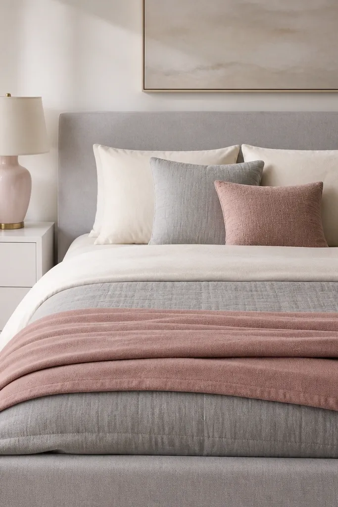
A light gray upholstered bed gives you a soft backdrop that works with almost any accent color, but dusty rose is my favorite for year-round room interior bedroom decor. It adds warmth without turning the room into a pink theme. The key is to use dusty rose as a textile accent, not a wall color, so you can swap it when you want a new mood. This looks great if your wardrobe leans neutral and you want the bedroom to feel calmer but not sterile. Styling principle: use one “warm blush” accent in a textured fabric to warm up cool neutrals.
Start with a light gray upholstered headboard and choose cream sheets or an off-white duvet. Add two cream pillows and one light gray pillow, then place a dusty rose pillow with a subtle texture like micro-velvet or woven jacquard. Fold the dusty rose throw at the foot so it covers about a third of the bed width. Choose a lamp with a warm ceramic tone (blush, oatmeal, or warm white) and keep the shade off-white. If you have a mirror, choose a thin frame in bronze or warm metal so it matches the rose. Keep wall art in neutrals with one rose detail.
Good to knowWash dusty rose throws separately the first time to avoid tint transfer to lighter pillowcases.
AvoidDon’t use bright magenta with gray; it looks harsh and reads as seasonal in a bad way.
15. Monochrome bedding with one metallic nightstand tray
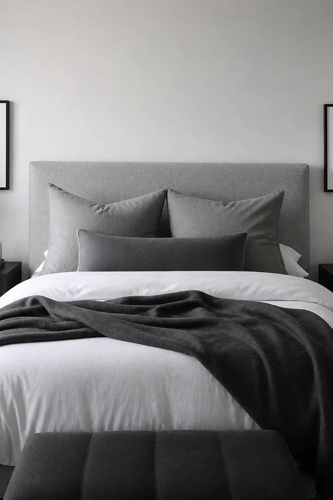
Monochrome bedding looks expensive when you add one metallic note in the right place. I like using a brushed gold tray because it gives warm reflection without screaming “holiday decor.” Keep the bed colors in a tight range — white, gray, charcoal — and let texture do the work. This flatters people who prefer clean lines and want the room to feel cohesive even when they throw laundry in a hamper. Styling principle: keep the palette monochrome and add one controlled sparkle in a tray or hardware detail.
Choose bedding in white and gray with a charcoal throw, making sure at least one item has texture like cable knit or a waffle weave. Place a brushed gold tray on each nightstand and keep decor items small: one candle, one bottle, or one folded linen hand towel. Hang one piece of wall art centered above the bed, in black frame with white matting. Use warm bulbs and avoid cool LED lighting because it makes gray look dirty. If you have a dresser, style it with a single tray and one height item like a short vase. Keep everything at different heights but within the same color family.
Good to knowDust metallic trays with a microfiber cloth before you style; fingerprints show up instantly under warm lamps.
AvoidAvoid mixing silver and gold in the same bedroom; it makes the metallic accents look accidental.
16. Convertible daybed for guest-ready year round styling
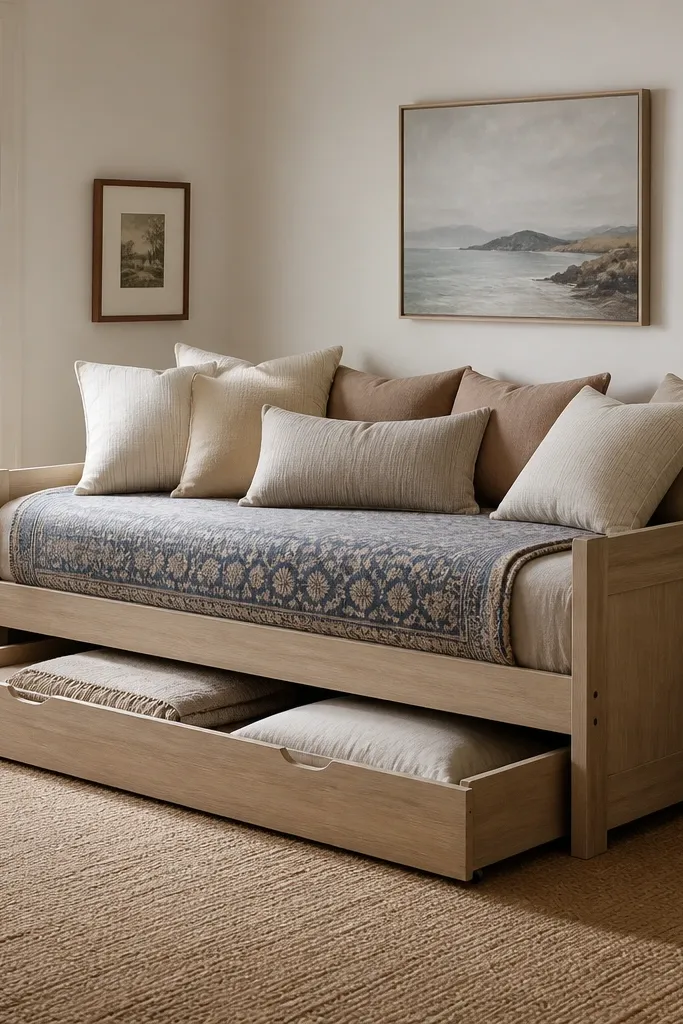
A daybed is the most practical furniture move I’ve made for year round room interior bedroom decor when friends or family stay over. You can dress it like a lounge in daily life, then pull out the trundle bedding without changing the whole room. I style the top layer like a sofa — layered pillows with one accent pattern — because it reads intentional even in a bedroom corner. This works for small spaces and for people who hate the look of a full guest bed “waiting” all year. Styling principle: make your guest-ready furniture look like it belongs even when it’s not being used.
Pick a daybed with a trundle if you can; the look is cleaner because you pull out matching bedding. Dress the daybed with a duvet and a top sheet that matches your main palette, then add two large pillows and one smaller lumbar in an accent color. Fold the throw over one arm area of the daybed so it looks like casual styling, not a bed blanket. When you set up for guests, pull the trundle out first and add the guest pillows under the main pillow stack so nothing looks lumpy. Keep the trundle blanket in the same fabric family as your throw so the textures match. Use a rug that ties the daybed to the rest of the room — a medium pile in a warm neutral hides the trundle seam better.
Good to knowStore the guest pillowcases inside a zippered cotton bag under the daybed so you don’t hunt for them when someone texts you the day before.
AvoidAvoid using mismatched sheets for the trundle; the seam looks messy and cheap.
17. Bedroom entry-style console behind the bed with a tray system
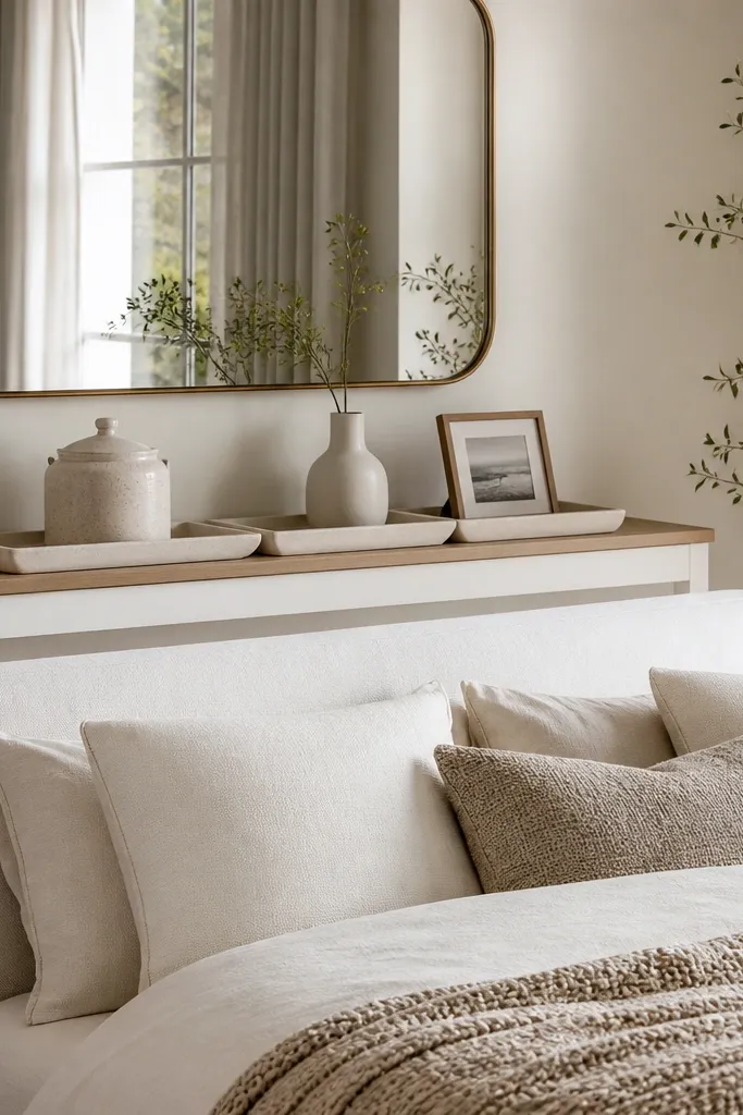
Placing a narrow console behind the bed is a trick I use when my wall behind the headboard is blank or when I want an entry feel without adding another room. It gives you a styling “station” where you can keep small items organized year round, which keeps the bedroom looking pulled together. I like consoles with a light finish because the bed is already visually heavy; the console adds function without weighing the room down. This setup flatters bedrooms with deeper shadows because the mirror and light console brighten the area behind the bed. Styling principle: create one organized surface behind the bed so the rest of the room can stay simple.
Choose a console that’s no wider than about 10 to 12 inches so it doesn’t feel cramped behind the headboard. Place a large mirror above it, centered, with the mirror height so its bottom edge sits around headboard mid-height. Use a tray system: one lidded jar for remotes, one small vase for fresh or faux stems, and one picture frame. Keep the bed bedding solid in cream and oatmeal, then add a throw that matches the console top’s wood tone. Add one lamp on a side table, not multiple tall items, so the console stays the second focal point. If you have pets, choose a console top that wipes clean fast, like sealed wood or laminate.
Good to knowUse felt under the tray and jar so the console doesn’t get tiny scratches that dull the finish.
AvoidAvoid cluttering the console with tall decor; behind a bed, vertical clutter looks messy fast.
18. Curtain panels + sheer layer for instant year-round softness
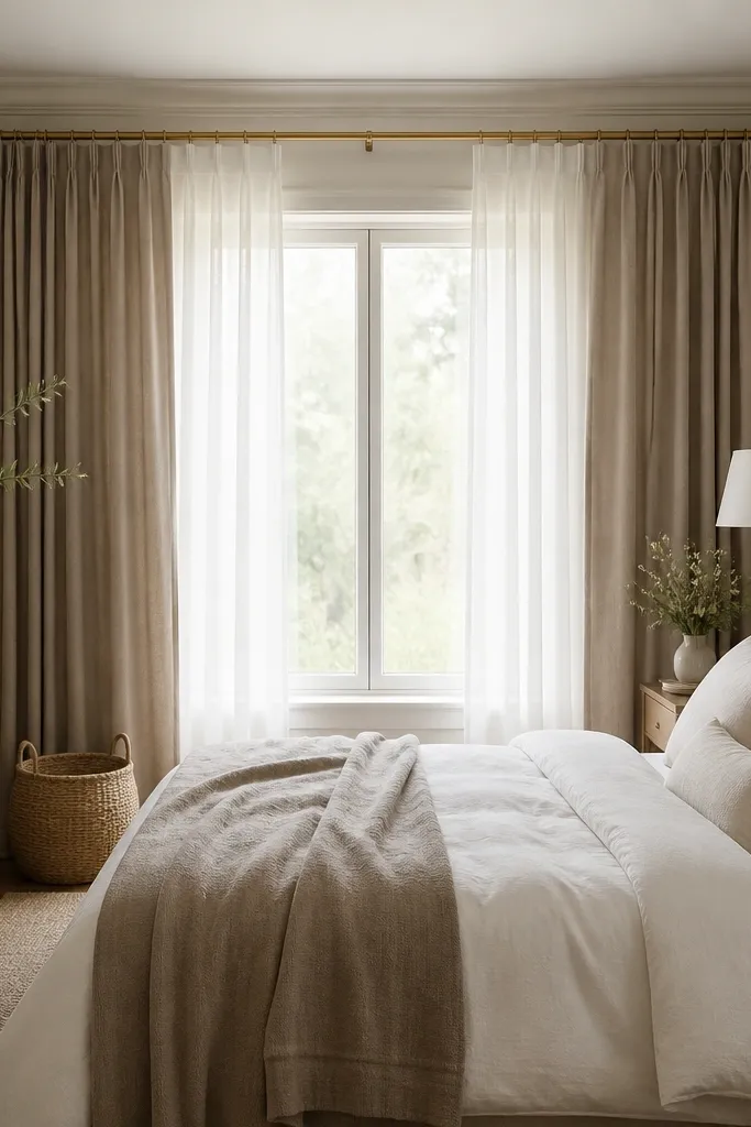
Window layering is the simplest way to make year round room interior bedroom decor feel softer in every season because it changes how light hits the bed. I always do a sheer underlayer for daytime glow, then heavier panels for evening privacy and sound dampening. Taupe drapes are my go-to because they look warm against both white bedding and wood furniture. This works well for anyone dealing with harsh sunlight or glare, since the sheer diffuses it and the room stops feeling “too bright.” Styling principle: use light control as an aesthetic tool; your lighting changes the bedroom more than you think.
Hang the sheer curtains first so they sit evenly across the window width and float without twisting. Add heavier panels with the same rod and keep the drapes touching the floor with a small break. Choose taupe drapes with a matte finish so they don’t look shiny at night. Tie the window tiebacks to match your lamp metal — brass or black. Style the bed with warm white sheets and a taupe throw so the window and bedding feel like one palette. Finish with a small basket near the window for extra linens so the softness stays practical.
Good to knowSteam both layers before installing tiebacks. Wrinkles make the whole window look neglected even if the bed is perfect.
AvoidAvoid sheers that are too sheer and flimsy; they wrinkle and look cheap under daylight.
19. Headboard wall treatment with removable panels and matching bedding tones
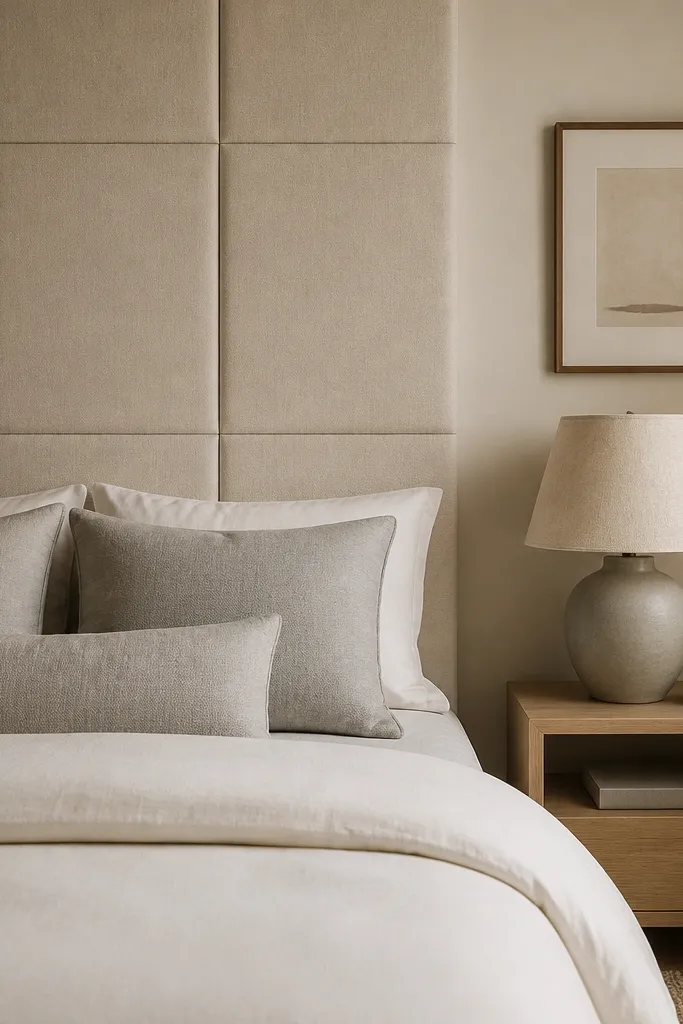
A textured headboard wall makes the bed look finished even when you rotate bedding for seasons. I use removable panels when I don’t want to commit to paint or permanent wallpaper, and the texture stays consistent year round. Warm beige panels make a bedroom feel cozy without leaning yellow, especially when your bedding is cream and your accent is soft gray. This is flattering if you want a calm backdrop for photos or if your room has plain walls that show every shadow. Styling principle: treat the wall behind the bed as part of the furniture — texture gives you depth when textiles change.
Measure the wall area behind your headboard and add a 2-inch margin on each side so the texture frames the bed. Install removable panels following the manufacturer’s alignment — I use a level and mark the first row lightly with pencil. Choose panel fabric in warm beige or oatmeal so it matches your duvet tone. Dress the bed with cream and light gray pillows, then add one seasonal throw that matches a small detail from the panel fabric (slightly darker beige or taupe). Keep nightstands simple and repeat the lamp shade color — off-white linen. If you hang art, place it to the side of the textured wall so the texture remains the main backdrop.
If your panels shed lint, vacuum the wall lightly with a soft brush before you style the bed area.
Avoid covering the entire wall with high-contrast texture; keep it behind the bed so the room doesn’t feel busy.