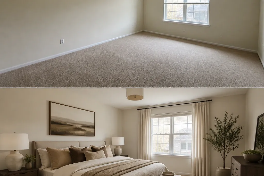
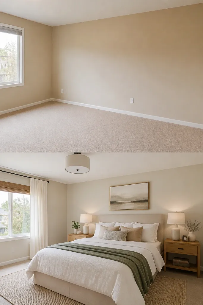
1. Warm bedside lamps with 2700K bulbs
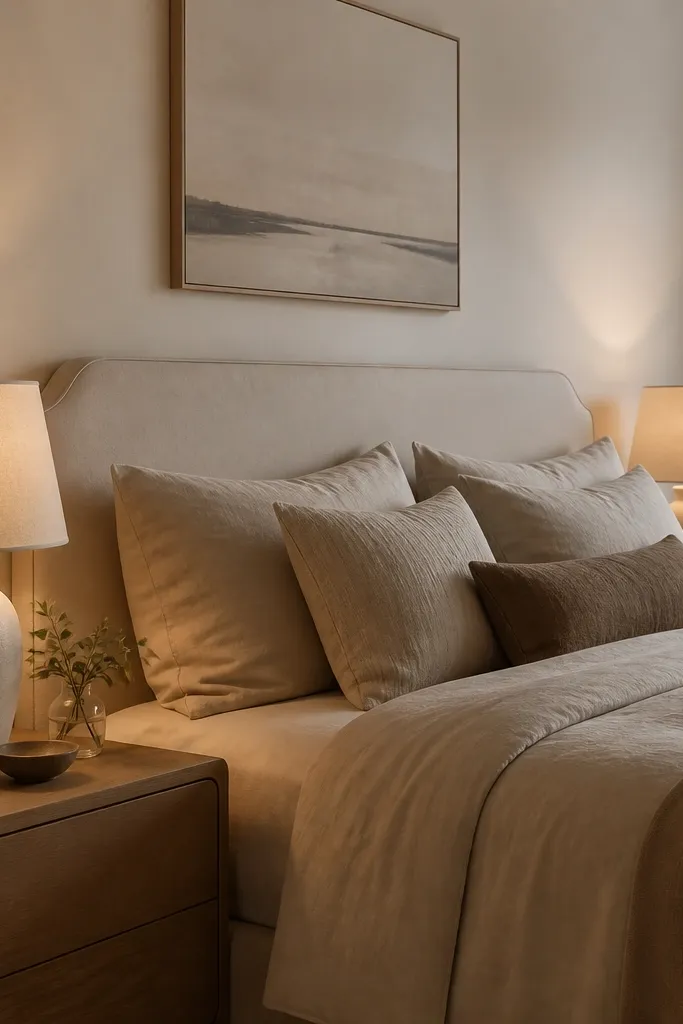
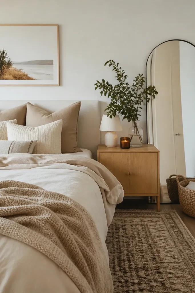
My favorite “before and after” jump comes from swapping harsh white bulbs for warm 2700K and raising the light source so it hits wall height. In rentals, overhead lighting is usually too high and too blue, which makes skin look gray and bedding look dull. A linen-shaded lamp softens the light, so your duvet texture shows instead of flattening. This looks best with warm neutrals like oatmeal, sand, and cream, and it flatters most undertones because it brings warmth back into the room. Pair it with matte finishes — brass or black — so the glow feels cozy, not glossy.
Start by buying bulbs labeled 2700K (not 3000K) and screw them into any bedside fixtures you already have. Then position the lamps so the shade bottom sits about level with your seated eye line — roughly 22-26 inches from the floor, depending on nightstand height. Choose shades that are off-white or natural linen, not bright white, and keep both lamps the same height so the bed area looks symmetrical. Finally, turn off overhead lights for photos and adjust lamp placement until the wall behind the bed looks evenly lit, not spotty.
If your nightstand is short, use a taller base lamp instead of stacking decor. Shadows ruin the look faster than missing decor.
Avoid 4000K “daylight” bulbs — they make every bedroom look like a waiting room.
2. Rug that actually reaches the bed
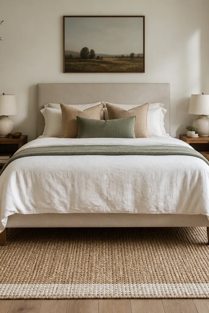
A rug that stops too early is the fastest way I’ve seen a bedroom look unfinished. When the rug extends 18-24 inches past the bed sides, it frames the bed like furniture in a showroom. The woven pattern adds texture you can’t fake with paint, especially when your walls are neutral. I like jute, flatweave wool, or low-pile Moroccan-style rugs because they don’t look plasticky under lamp light. This works in both small rooms and larger ones because it creates a defined zone without crowding the floor plan. It also flatters darker floors by adding contrast and softening the harshness.
Measure your bed width first. For a queen bed (60 inches wide), aim for a rug about 8x10 or close to it, then confirm it gives you 18-24 inches past each side. Center the rug under the bed so you see equal border on both sides from the doorway. Place the front legs on the rug, then add a thin rug pad so it stays flat and doesn’t bunch near the bed frame. Once it’s down, pull the bed slightly so the rug edge doesn’t peek out behind the nightstands.
Good to knowIf you’re between sizes, go bigger. A bigger rug hides uneven floors and makes the room feel calmer.
AvoidAvoid a rug that only fits under the mattress — it reads like a temporary mat.
3. Bedding stack with a duvet that hangs 6-10 inches

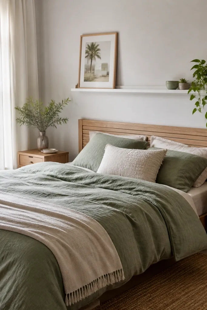
In every Airbnb I’ve turned around, the bedding finish is where guests notice “done” versus “messy.” A duvet that hangs 6-10 inches past the mattress edge looks tailored and makes the bed look heavier and more grounded. I usually choose cotton percale, linen-blend, or a soft sateen in cream, oatmeal, or light greige because lamp light shows the weave. The pillow stack matters too: Euro shams behind standard pillows gives height without looking overstuffed. This styling flatters most body types in photos because it creates clean, vertical lines and a crisp headboard area. If your room is small, the right stack makes it feel taller.
Start by measuring your mattress height and choosing a duvet size that covers it with enough drop. Place the duvet centered, then fold the top edge back so it lands evenly, then smooth out corners so the drape looks consistent. Layer: first two Euro shams, then two standard pillows, then add one throw pillow if you want a deeper accent color like olive or cocoa. Finish by folding a textured throw at the foot — about 1/3 of the bed width — so it looks styled, not tossed. Finally, tug the duvet so it falls the same amount on both sides.
Good to knowUse a duvet cover with a subtle texture (slub, waffle, or light stripe). It reads expensive even when the room is budget.
AvoidAvoid short comforters that stop at the mattress edge — they make the whole bed look temporary.
4. One deep color accent wall panel behind the bed
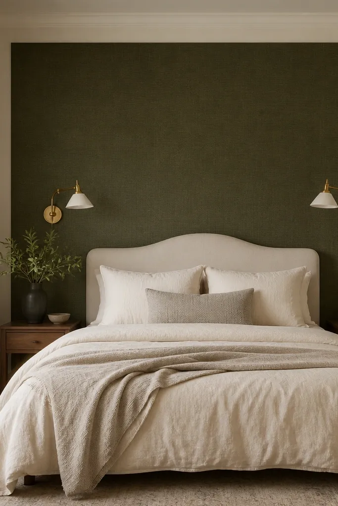
If your bedroom feels flat, paint or wallpaper behind the bed gives you instant depth without changing furniture. I’ve had the best results with dark olive, warm charcoal, or deep ink — colors that look moody in daylight but cozy at night. A panel of textured wallpaper or fabric-backed peel-and-stick makes the wall feel dimensional, especially when the lamps are warm. This works for rooms with light floors and neutral bedding because the contrast creates a focal point. It also flatters people who prefer calming spaces, since the dark color absorbs glare and makes the bed area feel like a retreat. Keep the rest of the room lighter so the accent stays intentional.
Pick your accent color and test it with a swatch on the wall using two lamp settings: daylight and warm bedside. Measure the bed width and center the accent so it sits behind the headboard area — usually 60-72 inches wide for a queen, extending up to about 48-60 inches height depending on headboard height. Apply wallpaper panels straight and use a seam roller to press edges flat. If using fabric paneling, attach it to a simple board first for crisp lines. Finish by keeping the nightstands and curtains in warm neutrals so the accent stays the star.
Good to knowUse warm light (2700K) with deep colors. Cool bulbs make dark walls look harsh.
AvoidAvoid covering the entire room in dark color when you only need the bed focus.
5. Two matching nightstands, not random tables
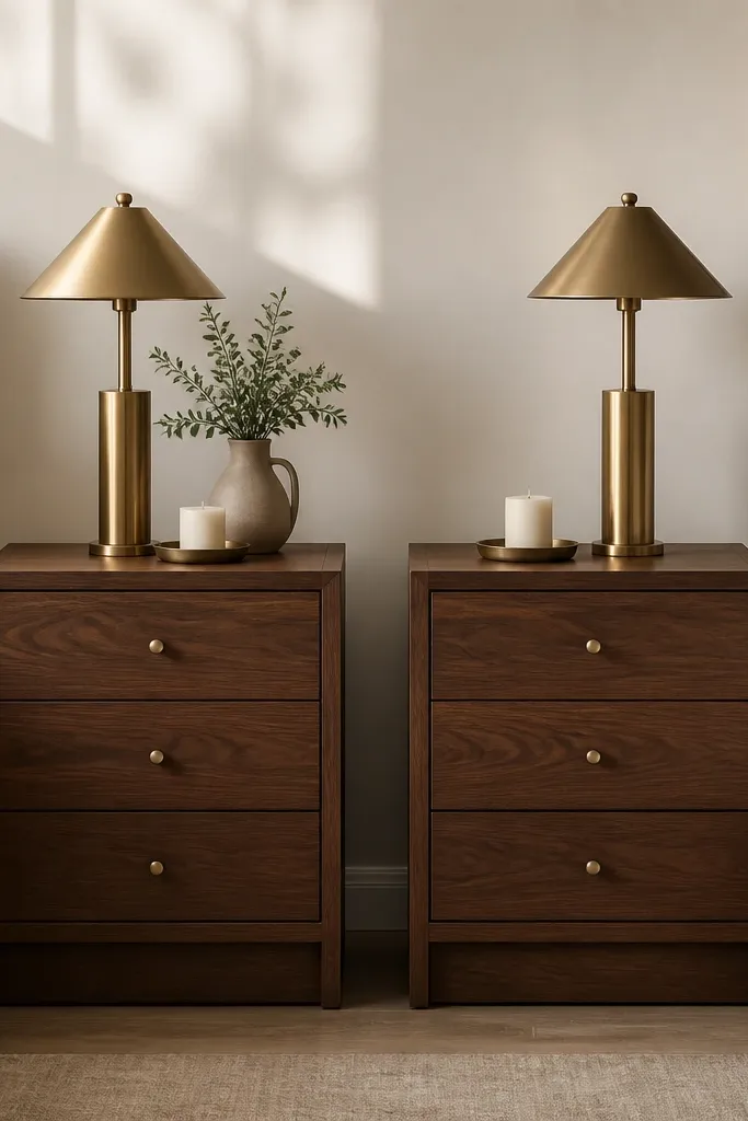
Random tables make a bedroom feel like it’s still in transit. When nightstands match in height and finish, the bed area reads finished even if the rest of the room is sparse. I prefer walnut, oak, or matte black because they handle warm light well and don’t reflect as much as glossy lacquer. Matching nightstands also give you a predictable “visual rhythm” on both sides of the bed. This looks great in small rooms because it keeps the eye from searching around for mismatched shapes. It also flatters guests in photos because the lamp placement and symmetry frame the headboard.
Measure from the floor to the top of your mattress and subtract about 2-3 inches — that’s your nightstand height target. Choose nightstands with similar drawer pulls or clean handles so the visual weight matches. Place them so the bed has about 2-3 inches of clearance from the nightstand edge to the bed frame. Add one tray on each nightstand for small items so the surface stays tidy. Keep the lamp shades the same size and align lamp bases so the top of the shades reads level across both sides.
Good to knowIf you can’t replace both, replace the one that’s taller and match the finish with a peel-and-stick veneer film.
AvoidAvoid mixing tall and short nightstands — the bed looks lopsided.
6. Curtains that kiss the floor (no puddles)
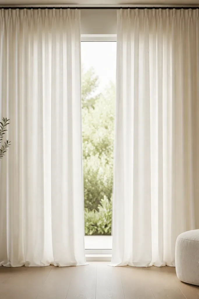
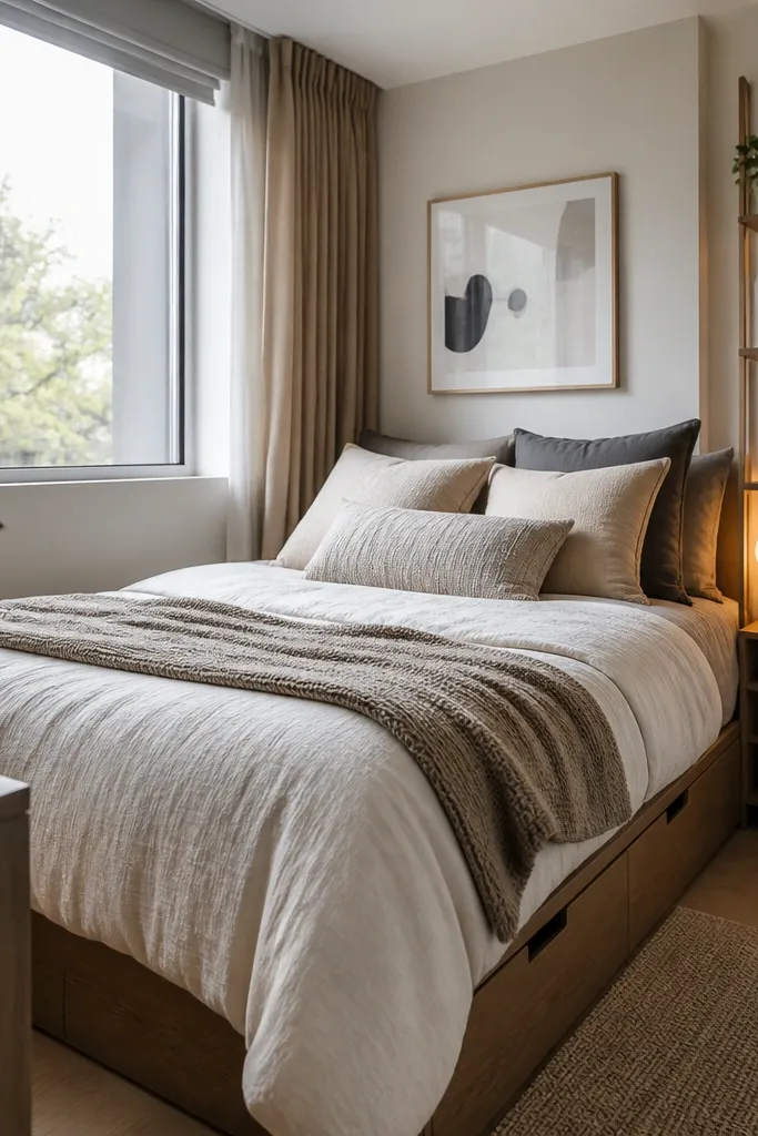
Short curtains are the fastest way to make a bedroom look unfinished. When curtains hang from ceiling or high wall mounts and fall to the floor with a slight break, the room gains height and softness instantly. I like linen or linen-look because it drapes naturally and doesn’t shine under lamps. Warm white or oatmeal curtains keep the palette cozy, especially with cream bedding. This works in both bright and dark rooms because the fabric diffuses light and reduces glare. If you have wide windows, ceiling mounting creates that hotel feel.
Measure window width and decide fullness: aim for 2-2.5 times the rod width so the panels don’t look tight. Mount the rod 4-6 inches above the window frame and as close to the ceiling as you can without hitting trim. Choose curtain length so the hem lands just above the floor or lightly touches — about 1/2 inch off the ground if you don’t want puddling. Hang panels so they meet in the center with a small gap when closed. Steam or iron creases after hanging, then adjust tiebacks so the fabric looks intentional.
Use curtain rings that slide easily so you can open/close without tugging the fabric. Smooth movement looks expensive.
Avoid hanging the rod at window height — the room will look shorter.
7. Bedside wall art at eye level with consistent spacing
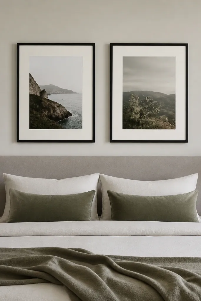
Wall art placement changes how “put together” the whole room looks. I’ve learned to hang artwork at eye level for standing adults, not at the height of the bed. Flanking the bed with two matching frames is cleaner than one large piece when you want a balanced look. Choose matte black, walnut, or brass-toned frames and keep mats off-white so they don’t compete with bedding. This works well in bedrooms with strong headboards because the art echoes the bed’s structure. It also flatters guests by making photos look centered and calm.
Start by finding the centerline of the bed headboard. For two frames, keep equal spacing from the bed sides and align the top edges of both frames. Hang the center of the artwork so it lands about 57-60 inches from the floor — then adjust if your headboard is unusually tall. Use a level and painter’s tape to mark, then hang with wall anchors matched to your wall type. Keep frame sizes consistent so the pair looks deliberate. Step back and check from the doorway — the art should sit centered, not drifting left or right.
Use an off-white mat even with neutral prints. It separates art from the wall and makes it read high-end.
Avoid mismatched frame heights — it makes the bed area look chaotic.
8. Textured throw blanket in the same tone family
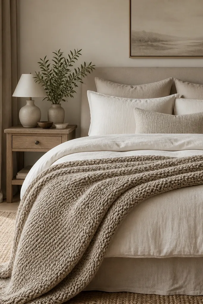
A bedroom needs texture contrast, not more colors. I always add one throw with a visible weave or knit, like chunky cotton, bouclé, or a waffle blanket in oatmeal or sand. This makes the bed look lived-in but still styled, and it catches warm lamp light in a way smooth fabrics can’t. If your bedding is crisp cotton percale, the knit throw adds softness. This works for almost every skin tone in photos because the warm neutrals don’t pull attention in a weird way. Keep the throw in the same tone family as the duvet so it looks intentional, not random.
Pick a throw that’s thick enough to hold shape when folded. Fold it in thirds and place it at the foot of the bed so it covers about 1/3 to 1/2 of the bed width. Make sure the throw edge lines up with the bottom of the duvet fold, then tuck one corner slightly to anchor it. If you want a deeper accent, add a smaller knit pillow in olive or cocoa, not another throw color everywhere. Fluff the throw by hand so the knit looks airy, not flat.
Choose fabric with a matte finish. Matte textures look cozy under warm bulbs.
Avoid thin, smooth throws that look like they came from a grocery store aisle.
9. Mirrors on the wall opposite the window
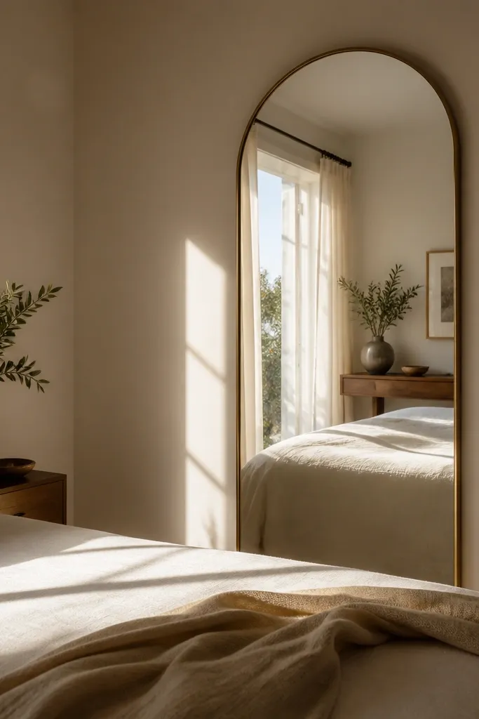
A mirror can make a bedroom feel brighter without changing the lighting fixtures. When you place it opposite the window, it bounces daylight into the bed zone and reduces that “dark corner by the dresser” problem. I like arched mirrors with thin brass or matte black frames because they don’t look bulky. The reflection also adds depth, which makes small bedrooms feel larger. This works best when the mirror reflects something calm — like a blank wall, a curtain, or a neatly styled bed — not clutter. If your room has warm neutrals, the mirror frame metal should match your lamp hardware so it looks like one plan.
Stand where you sleep and look toward the window. Choose a wall where the mirror will reflect the window light, not the back of a door. Measure the mirror height so the bottom sits around 8-12 inches above the floor for an arched look. Use a stud finder and mount with proper anchors — mirrors are heavy and you want it secure. Angle it slightly so the reflection lands on the bed area, then test by opening curtains and watching for glare spots. Keep the mirror frame finish consistent with at least one other metal in the room.
If glare is an issue, hang the mirror slightly higher and angle it so it reflects the curtain fabric, not the bare window.
Avoid mirrors that reflect piles of laundry or a messy dresser — guests notice.
10. A dresser styling tray and 3-item limit
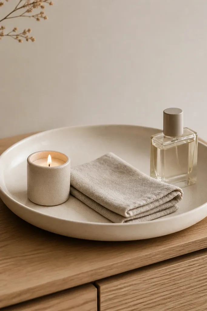
Clutter is the enemy of “after” photos. When you style your dresser like a small still-life, you make the room look intentional even if storage underneath is a mess. I use one large tray — ceramic, wood, or stone — and keep it to three visible items. The tray gives you a boundary so everything looks curated instead of random. This works for bedrooms of any size because it reduces visual noise and keeps the eye focused. It also helps guests find what they need, like where to set keys or a phone, without a cluttered surface.
Start by clearing the dresser completely and wiping it down so it looks fresh. Place one tray centered on the top surface and choose items that repeat materials from the room: a candle in a matte glass jar, a linen towel folded neatly, and one bottle with a simple silhouette. Keep the tallest item in the back of the tray and shorter items in front so it looks layered. Leave at least 4-6 inches of empty space around the tray edges. If you have a lamp on the dresser, keep the tray items away from the lamp base so the top doesn’t look crowded. Take a photo from the doorway to check balance.
Use a tray even if you think you don’t need one. Empty space looks messy without a visual boundary.
Avoid stacking multiple small decor objects across the whole dresser — it looks like you ran out of time.
11. Matte black or brass hardware repeat

Metal mismatch makes bedrooms look “collected,” not designed. When you repeat one metal finish in at least three places, the room feels cohesive even with simple furniture. I’ve done this with matte black and with warm brass; both work, but you have to keep the finish consistent. Brass looks warmer with cream bedding and natural wood, while black looks crisp against light walls. This matters in Airbnb because guests judge the room quickly — the first impression is about harmony. It also flatters the bed area because the lamp glow and frame lines look intentional.
Pick your metal first: matte black or warm brass. Swap one obvious item to start — usually lamp bases, picture frame frames, or a curtain rod finial. Then choose two more spots to repeat it: a small wall hook set near the entry, a mirror frame, or dresser pulls. Keep the metals the same finish, not “almost the same,” because warm brass and cool silver clash under lamp light. Place items so the metal appears in both the upper and lower halves of the room — frames up top, lamp hardware down low. Finally, check photos in both daylight and lamp light to confirm the undertone matches.
Good to knowIf you already have silver hardware, switch to black frames and black lamps to visually unify without repainting furniture.
AvoidAvoid mixing shiny chrome with matte black — it reads like a hardware store mix.
12. Layered wall sconce light for a hotel feel
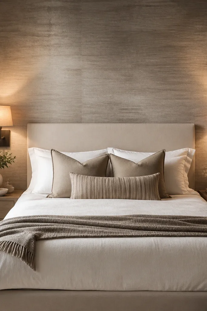
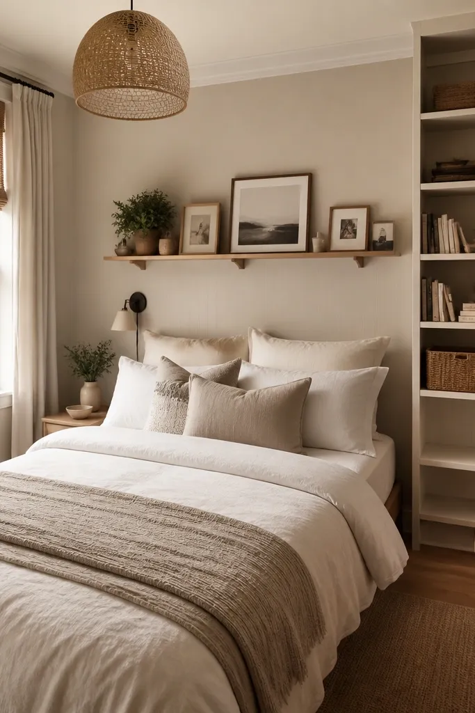
If you want that “I sleep in a boutique hotel” vibe, wall sconces do it better than floor lamps. They sit at the right height for reading and they wash the wall behind the bed, which makes the headboard area feel anchored. I like plug-in sconces for rentals because you can mount without rewiring, and you can remove them later. Choose fabric shades or diffusers so the light is soft, not a harsh spot. This looks great with neutral bedding because the wall wash highlights texture. It also flatters the room in photos because shadows under the pillows disappear.
Measure from the floor to the top of your mattress and mark where your seated eye line sits. Mount sconces so the light source is around that height, usually 52-60 inches from the floor depending on bed height. If you’re using plug-in sconces, run the cord along the wall edge behind a nightstand so it’s hidden. Use matching sconces on both sides for symmetry and to make the bed look centered. Turn on overhead lights off and test the glow on the accent wall; adjust shade angle if needed. Finish by keeping the bulb wattage consistent across both fixtures so brightness matches.
Use 2700K bulbs in sconces too. Guests notice when one side looks cooler than the other.
Avoid bare bulbs or exposed LED chips — they look harsh and cheap on camera.
13. Entry-style bench at the foot of the bed
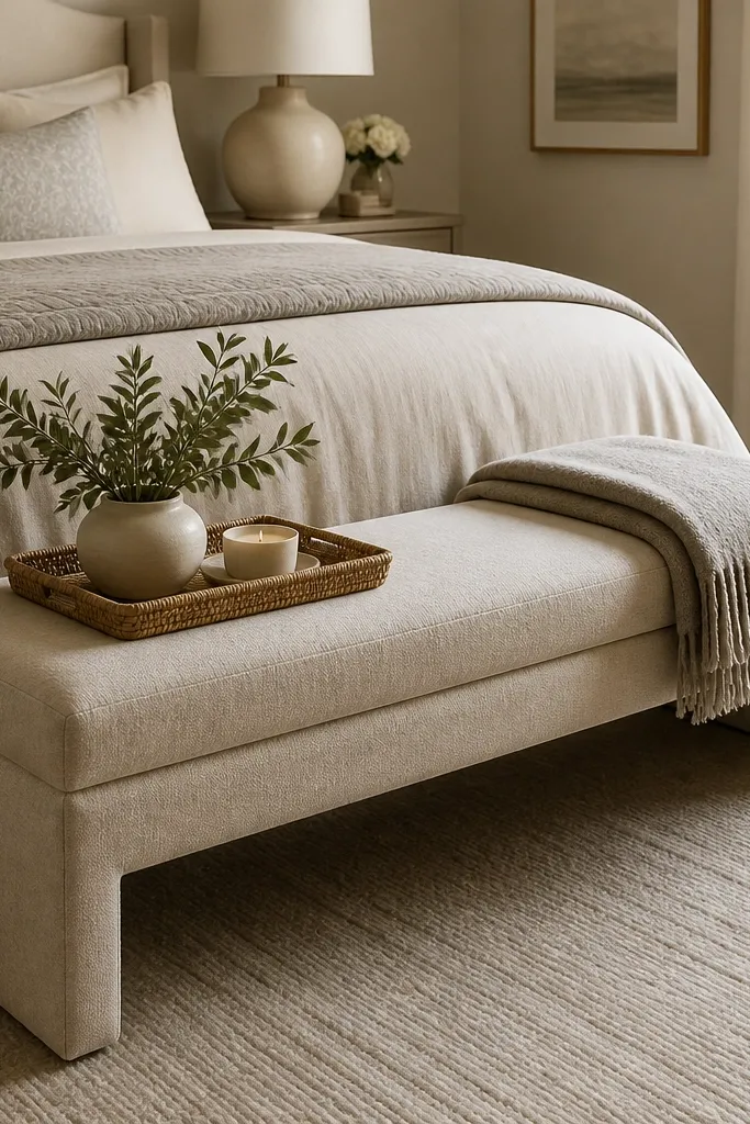
A bench at the foot of the bed makes the room feel like it has an entry flow, even when it’s just a bedroom. I’ve used this trick in small spaces where there’s no separate seating area. Choose a narrow bench with tapered legs in wood or black metal so it doesn’t crowd the room. Upholstery in oatmeal, taupe, or light gray adds comfort and softens the hard edges of a bed frame. This works especially well for people who like to fold throws and grab a robe — it gives a place for it. In photos, the bench creates a clear “scene” instead of leaving the foot of the bed empty.
Measure the space between the bed and any nearby walls so you can leave a clear walkway. Place the bench centered at the foot with about 8-12 inches of clearance from the bed sides so you can pull it out slightly. Style the top with one folded throw (same tone as bedding) and a small tray or a single candle. Keep the bench upholstery matte and avoid shiny velvet unless your room is already very warm. If you have a patterned duvet, keep the bench fabric solid. If your bedding is solid, a subtle texture like linen or boucle on the bench looks great.
Good to knowUse a bench that’s 12-18 inches deep for most bedrooms. Deeper benches eat the walkway.
AvoidAvoid a bench that’s too wide — you’ll feel it every time you walk past.
14. Ceiling-mounted rod to pull curtains higher
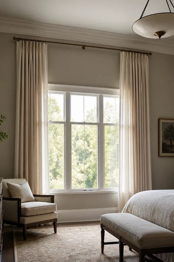
Mounting curtains near the ceiling changes the whole room height in a way paint can’t. When the rod is high and the panels fall straight, the eye reads vertical lines and the room feels taller instantly. I use this even when the window is small, because the ceiling mount creates a bigger curtain “frame.” Choose linen-look panels in warm white or oat to keep it soft. This works great in bedrooms with low ceilings and it also makes tall headboards feel more balanced. Under warm lamp light, the fabric looks cozy, not flat.
Find the ceiling studs or use proper anchors if you’re in drywall only. Mount the rod 4-6 inches above the window frame or as close to the ceiling as possible. Use curtain panels wide enough for fullness — aim for 2 times the rod width. Hang the curtains so they break lightly at the floor, not so they pool. Steam the panels after hanging, then adjust the folds so they fall in even waves. If you’re using tiebacks, set them so the curtain gathers look symmetrical from the bed.
Good to knowIf your rod is visible, paint it the same color as the wall. It disappears and the curtains look taller.
AvoidAvoid mounting the rod inside the window frame — it kills the height effect.
15. A headboard that reads intentional (cover or add panels)
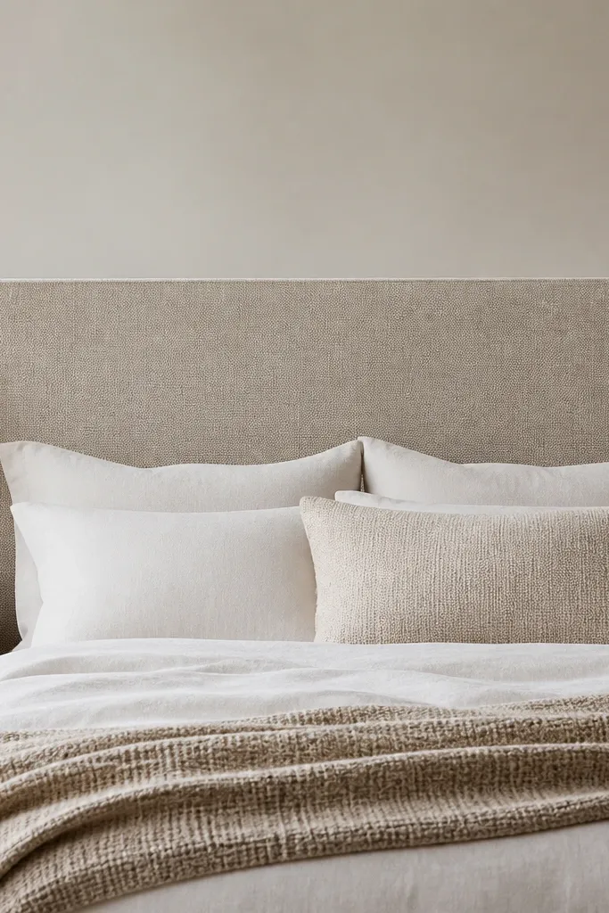
A headboard is where the bedroom “story” starts. If you have a bare wall behind the bed or a thin metal headboard, the room looks unfinished even with pretty bedding. I’ve upgraded many rentals by adding a removable upholstered headboard cover or attaching fabric panels to a simple board behind the bed. The oatmeal fabric tone keeps it warm and hides minor wall imperfections. This works for people with scuffed walls or mismatched paint because fabric softens the surface. It also photographs well because you get a clean backdrop for pillows and wall art.
Measure the width of your bed and the height from the mattress top to where you want the headboard to end, usually 22-26 inches above the mattress for a queen. If you’re using a removable cover, choose one with ties or adjustable straps that hold firmly against the existing headboard or frame. For fabric panels, build a board to the exact width and wrap it in upholstery fabric, then attach it to the wall studs using two mounting points. Keep the fabric taut and align edges so corners look crisp. Add a slim foam layer under the fabric if you want a softer look. Finish by styling pillows so the tallest Euro shams sit centered against the headboard.
Good to knowUse upholstery fabric with a matte finish and slight texture so it doesn’t glare under lamps.
AvoidAvoid thin fabric that sags — it looks like a temporary sheet.
16. Ceiling-to-bed mirror wardrobe styling
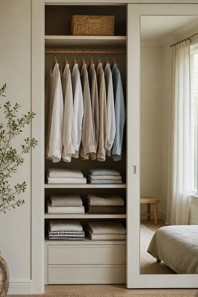
Even if you don’t have a full dressing area, the closet zone affects how the whole bedroom feels. When the visible part of a wardrobe looks organized and the mirror reflects the bed area, the room reads bigger and calmer. I like using a tall mirror panel or a mirrored cabinet door because it doubles the bed’s styling in reflections. This works best when you keep the top shelf minimal: one basket, one folded linen stack, nothing scattered. Under warm light, mirrored surfaces feel soft, not harsh, especially if you avoid high-gloss frames. This is a practical transformation because it fixes the “hidden mess” problem guests always notice.
Start by removing everything from the visible closet area and wipe shelves so it looks fresh. Fold linens into consistent sizes and stack them upright so the edges look uniform. Add one large basket for items that don’t look pretty, then keep the basket hidden behind the mirror or inside the closet bay. If you’re adding a mirror, mount it securely at a height where it reflects the bed headboard and not the floor. Style the top shelf with one neutral basket or a small stack of books with spines facing forward. Step back and check from the bed and from the door to ensure the reflection is clean and the lines match.
Good to knowUse matching hangers — white or natural wood — because the hanger color shows in reflections.
AvoidAvoid leaving random hangers and mixed fabric piles visible in the mirror.
17. Matte wall paint in warm greige with one linen shade
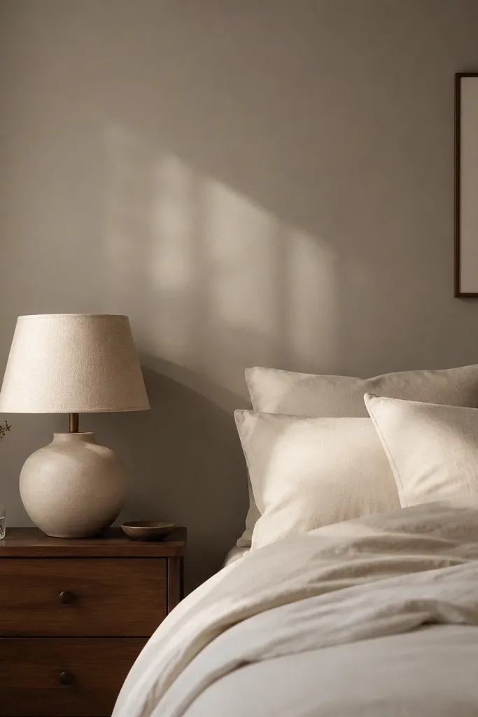
When a bedroom looks “off,” the paint finish is often the culprit. Flat or matte paint in a warm greige reduces glare and makes neutrals look richer without adding more color. I’ve found that satin paint can create little hot spots under bedside lamps, which makes the room feel uneven. Warm greige also works with both brass and black hardware, so it’s an easy base for styling. Pair it with one linen shade — lamp or pendant — so the light has a soft edge. This is especially helpful if your room has textured walls or small dents because matte paint hides imperfections better than gloss.
Choose a warm greige and test it on a section of wall near your bed where lamps hit it. Paint with a matte finish and at least two coats, letting it dry fully before judging color under warm bulb light. Keep your trim in a crisp white so the wall reads clean. Then choose one linen shade in off-white and match it to other textiles like throw or curtain fabric. Style the bed with cream bedding and one deeper accent color pillow. Finally, take a photo with lights on and compare to daylight — adjust if the greige pulls too yellow or too gray.
If you can’t repaint, use a large removable wall decal or framed fabric panel in the same warm neutral to mimic the matte effect.
Avoid glossy paint in a bedroom corner with lamps — it makes the wall look shiny and cheap.
18. Floating shelf for books, but only on one side
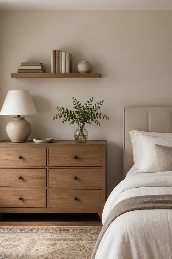
A bedroom needs some display, but too much makes it look like a store. One floating shelf above the dresser adds height and gives you a place for books without crowding the floor. I keep it only on one side of the room because it balances the bed visually and avoids clutter symmetry overload. Choose a shelf in the same wood tone as your nightstand or dresser, and keep decor in 3 groups: books, one object, one texture item. This looks good in rooms that already have a lot going on — patterned curtains or a dark accent wall — because the shelf gives structure without adding more color. It also photographs well because the shelf creates a clean line across the upper third of the room.
Measure the space above the dresser and choose a shelf length that fits without hanging over the edges — usually 18-36 inches. Use a stud finder and mount with level marks so the shelf doesn’t tilt. Style by stacking books first: 2-4 books with spines facing out, then one horizontal stack for contrast. Add one ceramic vase or a small plant, then finish with a folded linen or a small woven basket to add texture. Keep the shelf items in a tight band so they don’t spread wide. Step back and check from the doorway so the shelf doesn’t compete with wall art above the bed.
If you use a plant, pick one with matte leaves like faux eucalyptus — glossy leaves look fake under lamp light.
Avoid filling the shelf edge-to-edge. Empty space makes the decor look intentional.
19. Curtain + rug material match for texture continuity

A bedroom looks expensive when your textures talk to each other. I’ve done transformations where the only “new” thing was a curtain fabric that matched the rug material family, and the room instantly looked cohesive. When you pair linen curtains with a woven rug in jute, wool, or flatweave patterns, the light interacts with both surfaces in a similar way. That reduces the cheap look you get when one texture is glossy and the other is matte. This works especially well in bedrooms with neutral walls because texture becomes the color. It also flatters anyone in photos because it softens harsh edges and creates a gentle background.
Choose your base texture first. If your rug is jute or flatweave, pick curtains in linen-look or linen blend in oatmeal or warm white. Keep the curtain color close to the rug — within one shade family. Hang curtains high for height, then steam so the weave looks consistent. Place the rug correctly under the bed first so the texture scale makes sense. Finally, add a throw blanket in a similar weave direction — knit or waffle works great — so the bed styling matches the floor and window.
Bring the rug or a rug photo to the curtain store and match by undertone, not by name like “greige.”
Avoid pairing a shiny curtain fabric with a rough woven rug — the mismatch looks accidental.
20. Dresser mirror with a simple frame
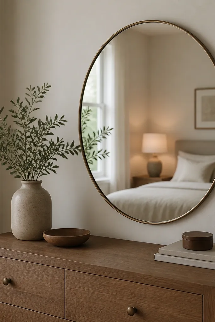
A mirror above the dresser is one of those changes that feels small but reads huge. It adds depth and gives you a second source of visual light without changing the wiring. I prefer simple frames — thin black metal or warm brass — because ornate frames can look out of place with modern bedding. The mirror also helps balance the bed’s visual weight when your headboard is low or minimal. This works well for bedrooms where the bed is the main focal point and the dresser needs a “stop” so it doesn’t feel like a random piece. In photos, it makes the room feel styled from more angles.
Measure the dresser width and choose a mirror that’s about 60-75% of that width so it doesn’t look tiny. Hang the mirror so the bottom edge sits around 60-65 inches from the floor for most bedrooms, then adjust based on your height and dresser height. Use a level and mount into studs if possible. Choose a frame finish that matches your lamp hardware or picture frames. Style the dresser below with a tray and keep small items tucked so the mirror reflection doesn’t show clutter. Check that the mirror reflects the bed area, not a messy closet door.
Good to knowIf your room is narrow, use an oval mirror instead of a tall rectangle so it doesn’t distort the bed lines.
AvoidAvoid a mirror that’s too small — it looks like decoration, not design.