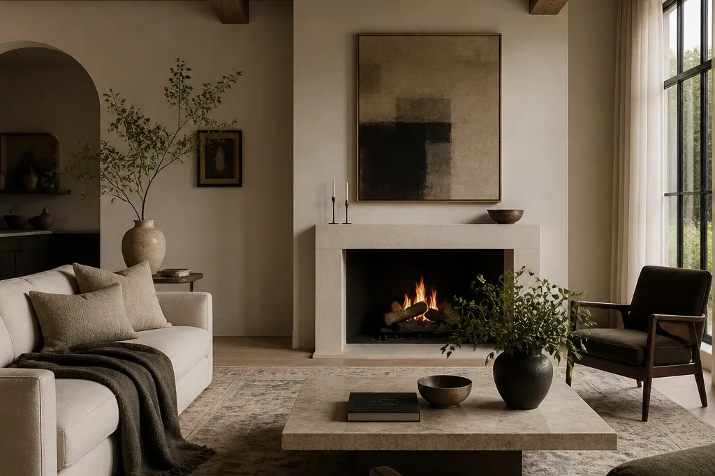
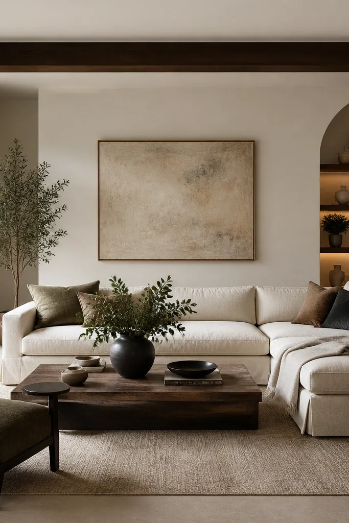
1. Boucle sofa with two cushion sizes and a single deep accent
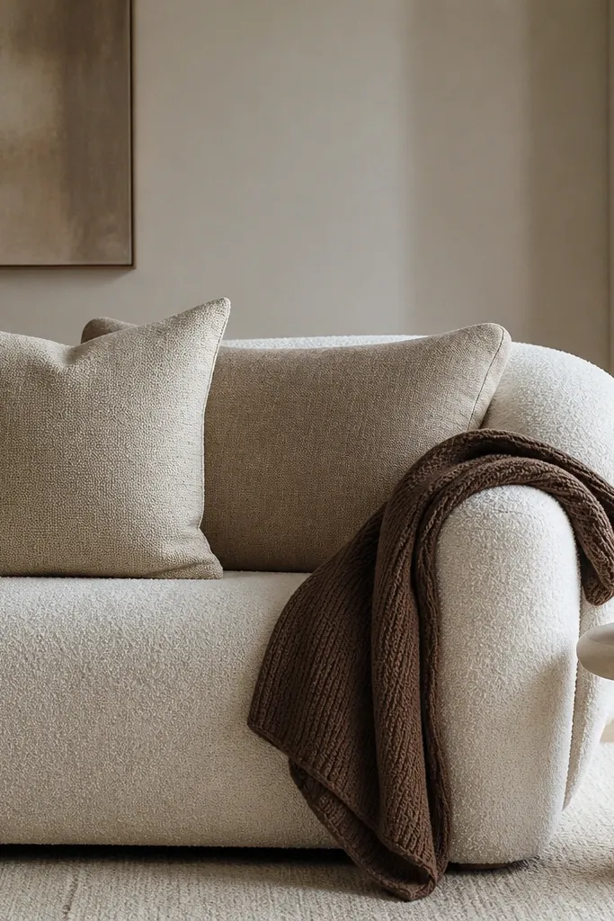
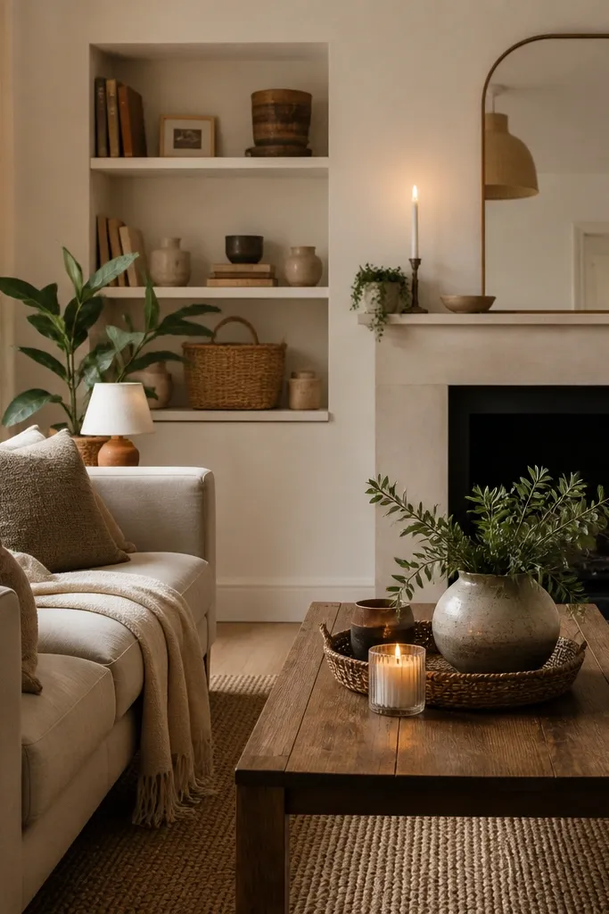
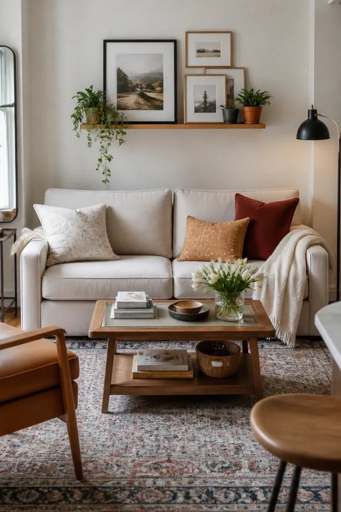
I reach for boucle when I want cosy that looks expensive because the texture catches light softly and hides minor imperfections. Go for a cream or oatmeal base so your room stays bright, then add two cushion sizes to create that styled-but-lived-in look. The trick is keeping the palette tight: warm taupe + oatmeal + one deeper coffee shade. This combo suits most skin tones because warm neutrals look good next to both cool and warm undertones. It also works for small rooms since the rounded sofa shape visually softens edges.
Start by centering the sofa in your rug area and fluff the cushions so they look full, not flat. Place the back cushions first — one larger square and one slightly smaller square — then add the front cushion stack with the deeper coffee cushion either tucked to the side or centered depending on your sofa width. Drape the knit throw over one arm so it falls in a clean curve, not a straight fold. Finish with a tray in warm metal on the nearest table so there’s a reflective point near eye level.
Buy one cushion cover in a fabric you can’t see through — thick cotton twill or a woven linen blend — because thin covers crease and look cheap fast.
Avoid using only one size of cushion — it makes the sofa look like it came with random throw pillows.
2. Linen blend curtains hung 20 cm above the trim
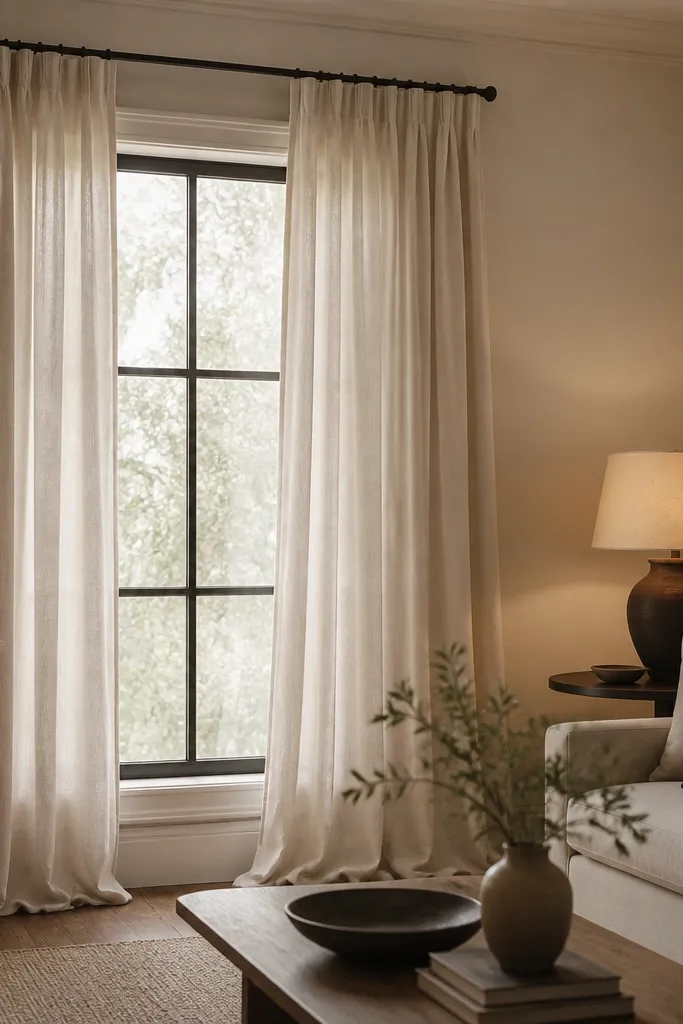
Curtains are the fastest “expensive-looking” upgrade because they change the perceived height of your room. Linen blend in warm ivory makes the space feel cosy without turning grey or yellow. Hanging them higher and letting them reach the floor gives you that tall, tailored line you see in better interior photos. This works especially well if your ceiling feels low or your windows sit too close to the trim. The slight pooling at the hem adds softness without looking sloppy.
Measure from the floor to where you want the rod — I aim for 20 cm above the window trim — then add enough length so the hem just touches or lightly pools on the floor. Use curtain rings or clips that let the fabric hang naturally, not stretched. Choose a rod that matches your room hardware — black for modern, warm brass for softer traditional. After hanging, step back and adjust the folds so the top looks evenly gathered across the width.
Press the curtains once before hanging. Even a light steam makes the folds look crisp.
Don’t buy curtains that stop 5-10 cm above the floor — they always read cheap.
3. Oversized wool rug under the front legs
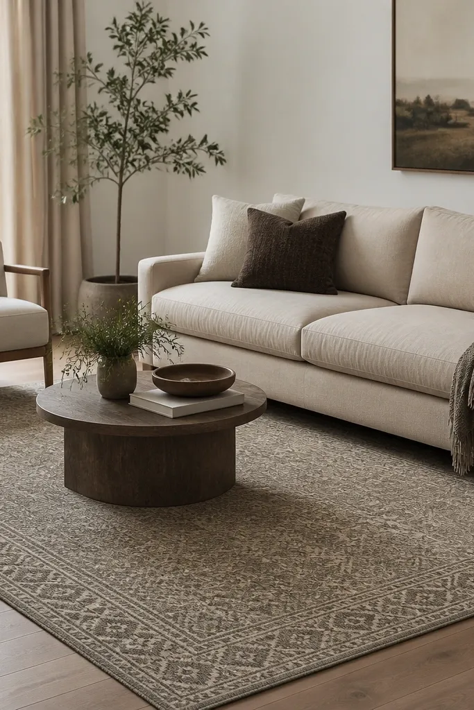
A rug is where cosy becomes expensive-looking because it visually anchors everything. I use low pile or short pile wool blends because they feel lush and don’t look flat like thin synthetic rugs. The colour should be warm and slightly varied — greige with beige undertones — so it doesn’t fight your sofa. When the rug reaches under the front legs, the seating area looks planned, like it belongs together. This is a lifesaver in open-plan rooms where furniture drifts and looks random.
Good to knowIf your rug pattern is subtle, pair it with a textured throw or boucle cushions so you get depth without extra colours.
Start by pulling your sofa forward just enough to place the rug. Leave at least 10-15 cm of rug showing in front of the coffee table area and make sure the front legs of the sofa and at least one chair sit on the rug. Choose a rug size that feels generous — if it looks too big, it’s probably right. Finally, add a rug pad for grip and a slightly thicker feel so it doesn’t look thin and papery.
AvoidAvoid centering a small rug in the room. It makes the whole setup look temporary.
4. Warm brass floor lamp with a fabric shade
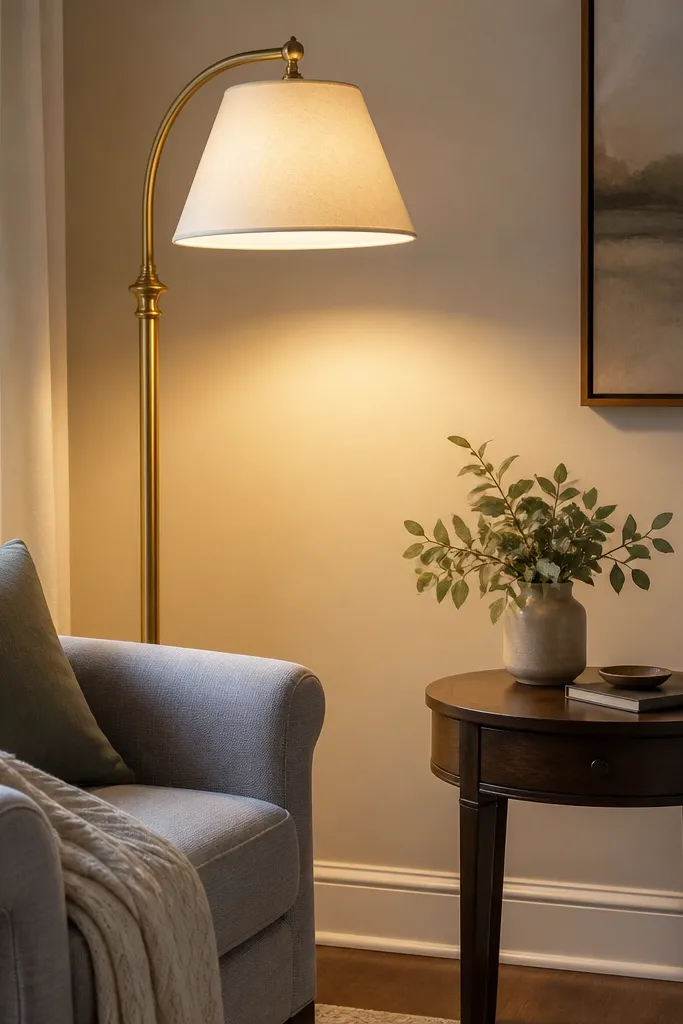
The room looks expensive when light looks soft and intentional. A warm brass lamp adds that “collected” feel while the fabric shade spreads light instead of creating harsh hotspots. Use 2700K bulbs so the whites in your cushions and curtains read warm, not blue. This setup is great when you have one ceiling light that blasts everything. It also flatters dark corners — the wall wash makes the space feel larger.
Good to knowMatch metals sparingly: one warm metal finish in the room is enough. If you add brass, keep frames and hardware in the same family.
Place the lamp 30-45 cm from the armchair so the light lands where you sit. Choose a shade diameter that’s big enough to diffuse — roughly 25-35 cm — and keep the lamp height so the shade bottom sits around eye level. Use a dimmer if you can, or swap to a bulb that reads warm and not yellowy-green. Turn it on and check if it lights the wall behind your seating, not just the floor.
AvoidAvoid LED bulbs with a cool 4000K tone — your “cozy” will look grey.
5. Coffee table styling with one tray, three objects, no clutter
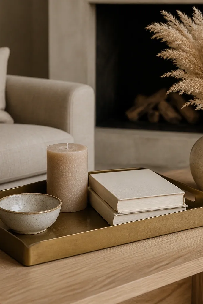
Expensive-looking rooms feel edited. The easiest way I’ve found is using one tray as a boundary so everything looks intentional. A sand or cream candle adds warmth, while ceramic and aged brass keep the look grounded. Keep the tray objects at different heights — one low bowl, one candle, one book stack. This styling works for most living room sizes because it gives you structure without taking over the table. It also looks good in photos because the tray creates a clean rectangle the eye can follow.
Start by wiping the table and placing the tray centered on the table or slightly toward the seating. Put the lowest item first — the ceramic bowl — then stack books next to it, and place the candle last so it stands tallest. Add one dried arrangement or a single vase on the table edge, keeping it outside the tray so you get one clear focal point. Leave a small empty space on one side of the tray for breathing room.
Choose candle glass that’s matte, not shiny. Matte glass looks softer next to textiles.
Avoid mixing too many materials — glass + chrome + bright white ceramics together always looks random.
6. Big knit throw with a tucked corner on the chaise or arm
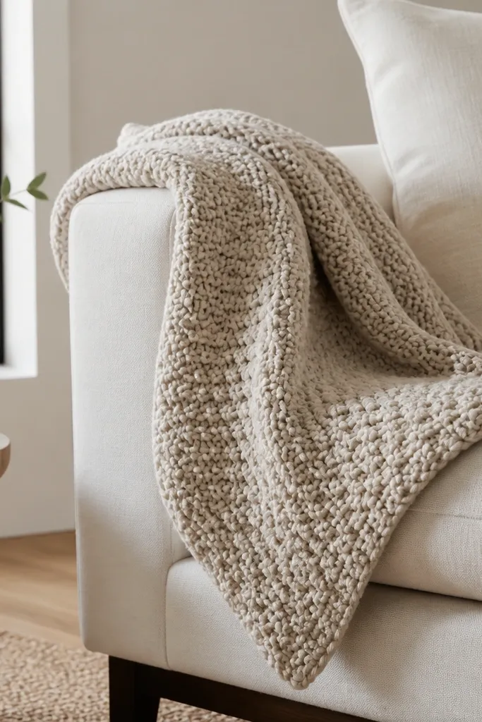
A real knit throw makes a room feel cosy because your eyes read texture before colour. The key is scale: choose a throw that looks thick and heavy when you lift it, not thin like a summer blanket. Oatmeal or warm cream keeps it modern and expensive-looking next to linen or boucle. Tucking one corner gives shape so it doesn’t look like it was thrown on in a hurry. This is flattering in rooms with modern lines because the knit adds softness without changing the furniture style.
Drape the throw over the arm or chaise so the bulk sits closer to the seat and the end hangs naturally. Lift one corner and tuck it under the fabric fold to create a controlled diagonal line. Smooth the knit so the loops face outward — you want visible texture, not a flattened blob. If your sofa is patterned, keep the throw plain. If your sofa is plain, you can go slightly more textured in the throw.
Shake the throw once before styling. Knits settle differently and look better after a quick fluff.
Avoid throws that are too small — the end should reach far enough to create a satisfying drape.
7. Two-tone wall with warm paint and one darker side panel
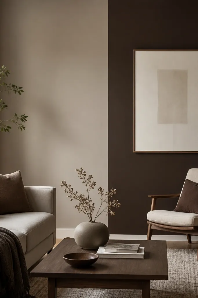
Colour blocking can make a room look expensive when it’s subtle and placed intentionally. I like a warm greige base because it plays nicely with wood and cream textiles, then add one deeper side panel to create depth behind seating. The contrast makes furniture look more “placed” and less floating. This works beautifully with modern cosy because it keeps the room calm while adding a grounded backdrop. It also flatters both warm and cool flooring tones since greige bridges them.
Good to knowTest the greige on the wall and watch it at night. If it turns pink, pick a greige with less red undertone.
Choose your base paint first: a warm greige with a slight beige undertone, not a grey-grey. Paint one wall or a defined vertical section behind a chair in a deeper coffee or charcoal-brown. Use painter’s tape to keep the line crisp, then roll with a 9-12 mm roller for a smooth texture. After painting, style the chair with cream cushions so the darker wall doesn’t swallow the sofa.
AvoidAvoid two colours that are both too neutral. If they don’t contrast, you just get two beige walls.
8. Gallery wall in matching frames with warm matting
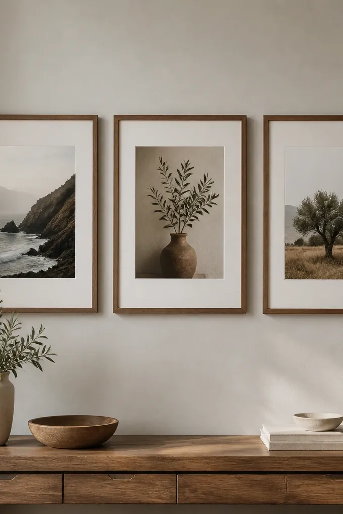
A gallery wall looks expensive when the frames match and the matting is warm. I’ve done this with identical frames in light oak and off-white mats so every piece feels curated, not random. The key is spacing: consistent gaps make the wall read like one composition. This works in modern cosy living rooms because the frames add structure while the art content adds personality. It also helps hide awkward wall space because you’re using the wall as a design element, not a blank background.
Start by picking frame size — common is 30x40 cm or 40x50 cm — and buy multiples so the look stays uniform. Choose mats in off-white or cream, not bright white. Layout on the floor first, then measure the total width and center it above the console or sofa. Hang with a single level line so the top row stays straight, and keep the art at a consistent height range from the floor.
Use one simple print style — all line drawings or all soft photos — so the wall looks cohesive.
Avoid mixing black and silver frames in the same group. It reads messy unless you’re going for an intentional eclectic look.
9. Sofa slipcover in warm ivory with tailored seams
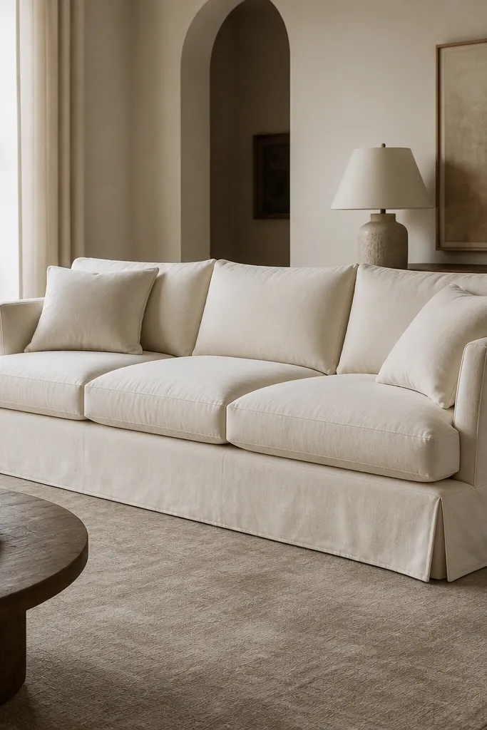
A slipcover gives you that pulled-together look because the fit is clean and the colour stays uniform. Warm ivory works better than stark white because it blends with wood and brass instead of looking clinical. Tailored seams are what make it look expensive; the fabric should hang in smooth lines, not bunch. This works especially well if you have a sofa that’s worn or mismatched — the slipcover refreshes everything without changing furniture. It’s also a good choice for households with kids or pets because you can swap or wash covers.
Good to knowIf the slipcover is slightly loose at the arms, tuck excess fabric underneath the arm line so it doesn’t show wrinkles.
Measure your sofa seat depth and arm width, then choose a slipcover that matches your style — tailored for structured sofas, more relaxed for slipcovered casual shapes. Pull the cover tight at the back so cushions sit evenly, then smooth the skirt so it doesn’t twist. Add cushions in two tones: warm ivory and oatmeal, then finish with one deeper coffee cushion. Keep the throw knit or woven, not silky, so the texture stays cosy.
AvoidAvoid slipcovers that are too short — a small gap between skirt and rug makes the sofa look like it’s wearing clothes two sizes too small.
10. Layered seating with one oversized armchair and a footstool
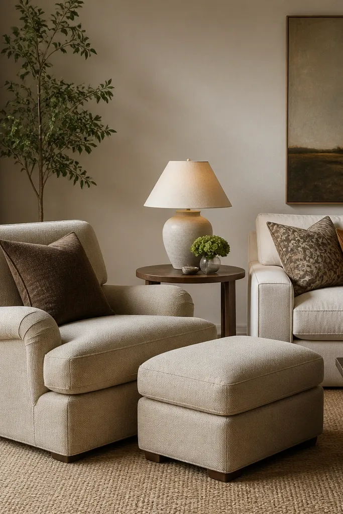
Expensive cosy rooms feel like you can sink into them. The combination of an oversized armchair and a footstool creates that “hang out” zone without needing extra chairs. Choose a chair fabric in oat, camel, or warm grey, and keep legs in wood or a warm metal so it reads cohesive. This layout flatters small spaces because it uses one statement chair instead of multiple smaller pieces that crowd the room. It also makes corners usable since an angled chair creates movement.
Place the armchair so it faces the sofa at a slight angle — about 15-30 degrees. Put the footstool close enough that your feet reach comfortably while still leaving a walking gap behind. Add one small side table with a lamp so the chair has its own light source. Style with two cushions in matching tones and one textured lumbar cushion to fill the visual gap between chair back and seat.
If you’re tight on space, choose a chair with exposed legs so the floor still shows and the room doesn’t feel heavy.
Avoid mixing chair fabrics that are too different in sheen. Velvet + shiny synthetics looks off together.
11. Carpeted look without wall-to-wall: layered rug with jute underlay
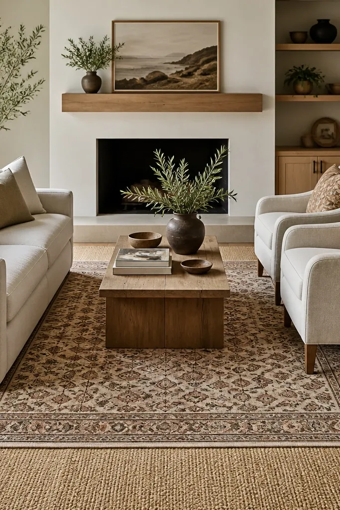
You get that expensive “carpeted” warmth when you layer textures. Jute or jute-look underlay adds a grounded, handmade feel, while a wool top rug brings softness underfoot. I use this in living rooms that need warmth but can’t handle a wall-to-wall carpet cost. The jute tone should be warm — honey or natural — so it doesn’t turn the room yellow. Layering also helps if you have a lot of hard surfaces like tile or polished wood.
Start by placing the larger base rug first, making sure it’s centered under the seating area. Then lay the top rug on top, leaving a visible border on two or more sides so it looks intentional. Use a rug pad under the top rug to stop sliding. Keep the top rug pattern subdued — small geometric or muted stripes — so the room reads calm.
Vacuum both rugs carefully around edges. Loose fibres on jute-look rugs shed until they settle.
Avoid layering two rugs with loud patterns. You’ll get visual noise instead of cosy.
12. Corner shelf with books, a ceramic sculptural vase, and one plant
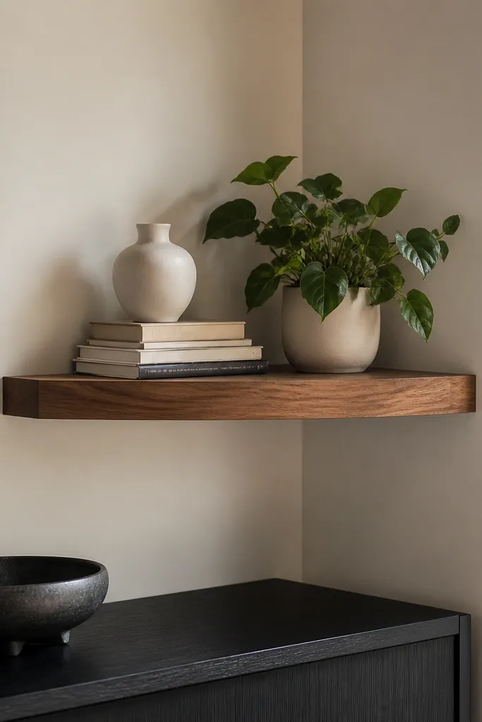
Shelving makes a room look designed because it adds vertical rhythm. In a cosy living room, I keep shelf styling minimal: books for height, one sculptural ceramic piece for softness, and one plant to add life. Warm white ceramics and terracotta pots look great with modern woods and neutral upholstery. This setup is ideal for awkward corners that feel empty or too narrow for full decor. It also gives you a place to put everyday items like coasters without clutter.
Mount the shelf at about 150-170 cm from the floor so it sits at eye level from the sofa. Stack books in two heights, then place the ceramic vase on the taller stack side. Add a small plant in a pot no bigger than 12-15 cm so it doesn’t dominate. Keep all shelf items in warm tones: cream, oatmeal, terracotta, and one dark accent like espresso brown.
Wrap one book spine with a plain paper cover if the colours clash. You want the spines to read as a block.
Avoid filling shelves with lots of small trinkets. Empty space is what makes the rest look expensive.
13. Textured accent wall paneling in off-white behind the sofa
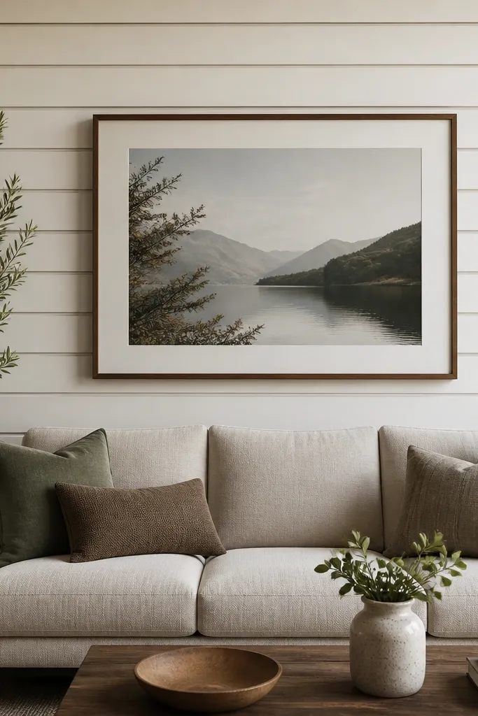
Texture on a wall makes everything look higher-end because it creates shadow and depth even when the room is dim. Off-white paneling keeps it modern cosy instead of farmhouse. I’ve used this in rentals by sticking to low-profile peel-and-stick panels, then topping it with a big print so the wall doesn’t look busy. The shadow lines make the sofa look more grounded and less like it’s floating in front of flat paint. It also helps hide small wall imperfections.
Pick a panel style with shallow grooves so it doesn’t look too heavy. Apply panels centered behind the sofa, leaving a clean border around the edges if your wall is narrow. Paint or choose panels in off-white, then hang a large piece of art centered at eye level — roughly 145-155 cm from the floor to the art center. Style the sofa with one warm throw and cushions in two tones so the textured wall stays the hero.
Turn off overhead lights and check the wall texture at night. If you can see the shadow lines, it’s the right depth.
Avoid deep, glossy paneling. Gloss fights with warm textiles and looks plastic.
14. Layered window styling with Roman shade plus sheer
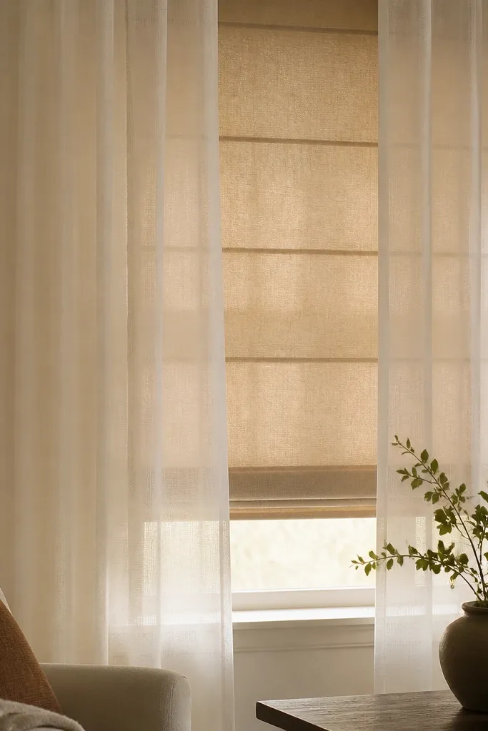
Layering window treatments gives you control and softness, which is why this reads expensive. A Roman shade adds structure when you want privacy, and a sheer adds that cosy glow in the daytime. Choose warm beige for the Roman shade and cream sheer so the light stays flattering on skin tones and fabrics. This works in rooms where you need both daytime brightness and evening privacy. It’s also great if your windows face harsh sun and you get glare.
Install the Roman shade inside the window frame or just slightly outside, then hang sheer curtains on a separate rod so they can move independently. Keep the sheers long enough to skim the floor. When styling, bunch the Roman shade slightly at the bottom so it looks tailored, not stretched. Finish with a warm lamp near the window so you get layered lighting even after dark.
Use matching curtain hooks or rings so the sheer falls in consistent folds.
Avoid sheers that are too white and too thin. They look cheap and make the room feel cold.
15. Modern cosy shelving entertainment unit with closed cabinets and open edges
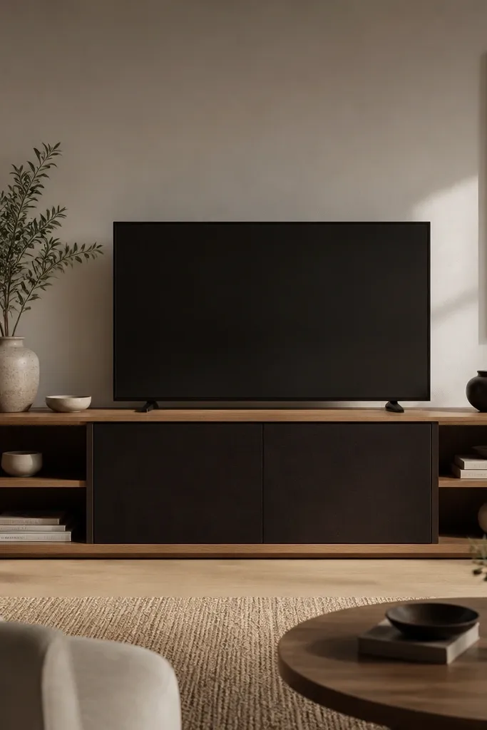
A cosy living room looks expensive when your storage looks intentional. I like entertainment units that mix closed cabinets with a couple open shelves so you can hide the messy stuff but still show a little styling. Warm oak with espresso cabinets reads modern and cosy at the same time. Keep the open shelves styled in warm neutrals so it doesn’t look like a storage room. This setup works best if you have cables, remotes, and extra blankets that usually end up in sight.
Choose a unit where the TV sits centered and the cabinet height doesn’t block your sightline too much. Put everyday items behind the closed doors: chargers, spare blankets, and games. Style the open shelves with two books stacks, one ceramic piece, and one small plant. Keep the shelf styling to a strict rule: no more than four items per shelf zone so the room doesn’t look cluttered.
Label the inside of the closed cabinets with small tags. You will keep it tidy longer when you know where things go.
Avoid an all-open shelving unit. It looks messy fast unless you’re constantly styling it.
16. Round mirror with warm frame above a console for light bounce
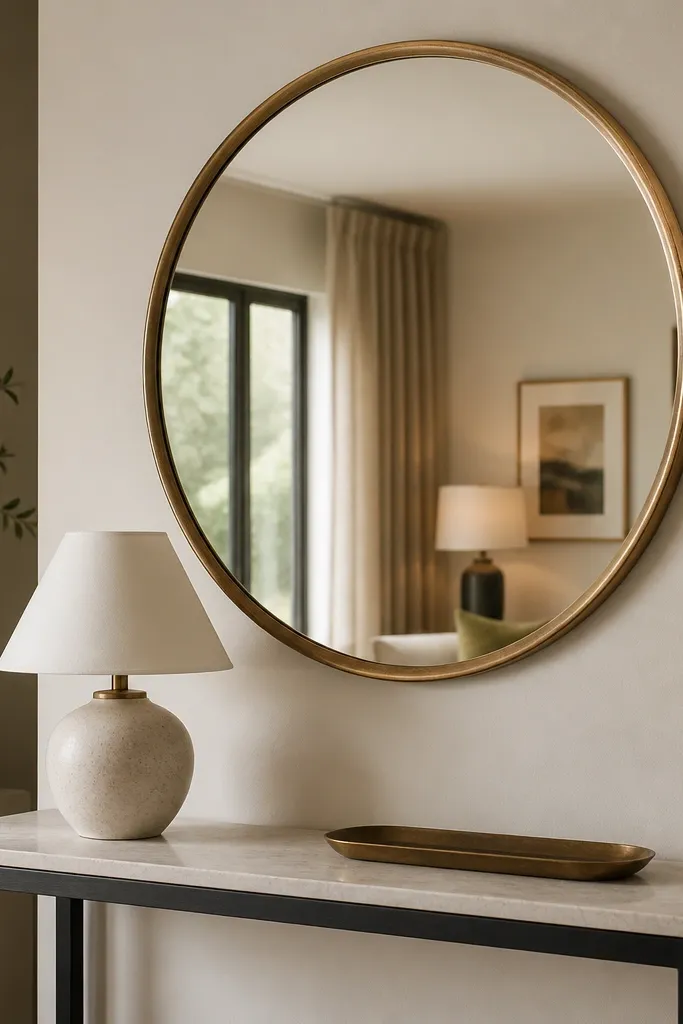
A mirror makes a living room look more expensive because it multiplies light and adds depth. Round mirrors feel softer than rectangles, which fits cosy interiors. I pick warm gold or aged brass because it harmonizes with fabric textures and wood tones. Place it opposite a lamp or window so it reflects warmth rather than a blank wall. This works especially well in small living rooms where you need visual expansion without changing furniture.
Hang the mirror so the bottom edge sits about 15-25 cm above the console surface. Position it so it reflects the side lamp or window light, not the ceiling light. Keep the console decor minimal: one tray and one lamp base or vase so the mirror doesn’t multiply clutter. Choose a frame thickness that looks substantial — thin frames can read cheap.
Wipe the mirror edges and frame weekly. Smudges show more on warm-toned frames than on black ones.
Avoid placing the mirror too high. If it sits above eye level, it looks decorative instead of functional.
17. Two-tone cushions with a soft pattern on only one pillow
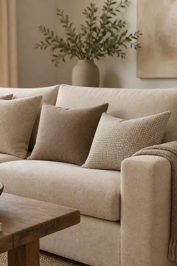
Patterns can make a room look expensive when you limit them. I use two-tone cushions for the base and add one patterned pillow to keep things interesting without turning the sofa into a fabric collage. The pattern should match the room’s palette — same undertones, not a totally different colour story. This approach makes the sofa feel styled and cohesive, even if your furniture is plain. It’s also flattering on camera because solids read cleaner while the one pattern adds human warmth.
Start with two solid cushions in warm taupe and oatmeal, sized to fill the back row. Add one patterned cushion in the same colour family — keep the pattern scale small so it doesn’t fight the rug. Place the patterned cushion in the middle or slightly offset so it becomes the focal point. Finish with a throw that matches one of the cushion tones, then fluff cushions so seams sit crisp.
If your rug has pattern, keep the sofa cushions mostly solid. If the rug is plain, a small pattern on one cushion looks perfect.
Avoid matching three different patterns. It usually reads chaotic, not designer.
18. Layered lighting: table lamp at seat height plus wall sconce
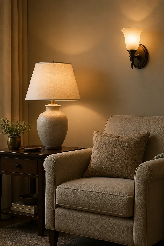
Expensive cosy rooms have layers of light, not one bright overhead. A table lamp at seat height makes the room feel lived-in because it lights faces and textiles where you actually look. A wall sconce adds height and reduces shadows that make rooms feel gloomy. I match both fixtures in warm finishes — aged brass or warm black with warm bulbs — so the light feels cohesive. This works for rooms that have awkward corners or where the sofa blocks the ceiling light from reaching the far side.
Good to knowTest your bulbs at night before you commit. Some 2700K bulbs still look greenish in warm rooms.
Place the table lamp so the shade sits roughly 5-10 cm above your seated eye line. Install or add a wall sconce on the opposite side of the room so it balances the light. Use 2700K bulbs in both fixtures and aim the light so it hits a wall or artwork, not just the floor. If you can’t install a sconce, use a second table lamp on the other side of the seating zone.
AvoidAvoid mixing warm lamps with a cool ceiling bulb. The clash makes the whole room look unfinished.
19. Charcoal accent chair with cream cushions and a textured rug
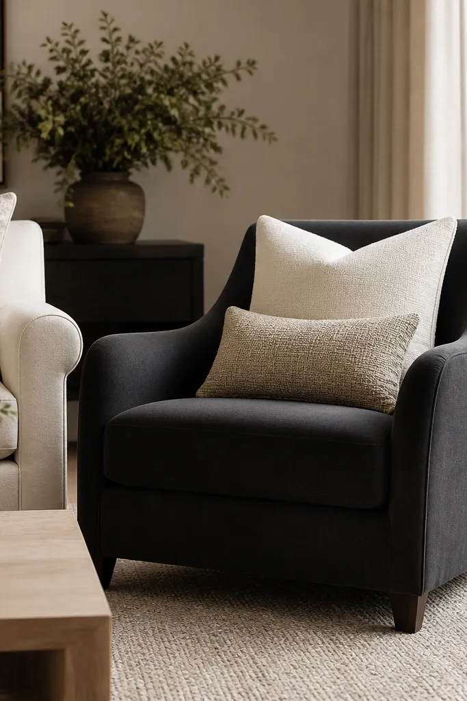
Dark upholstery makes a room look high-end when it’s balanced with warm light and soft neutrals. Charcoal reads modern and cosy because it grounds the colour palette, especially against cream curtains and light wood. Keep cushions in cream and oatmeal so the chair doesn’t swallow the space. This combination also flatters a lot of interiors because charcoal works with both warm and cool flooring. If your living room is small, a single dark chair adds depth without making the whole room feel heavy.
Place the charcoal chair so it creates an L-shape with the sofa, then position it on or near the rug so it feels anchored. Add two cream cushions sized to fit the chair back and one lumbar cushion in oatmeal with a visible weave. Choose one throw in a knit or woven texture and drape it over the sofa arm, not the chair, so the chair remains the focal anchor. Keep the rug texture subtle so it supports the dark upholstery instead of competing.
Use a cushion cover with a matte finish. Glossy fabric catches light and looks less expensive.
Avoid pairing charcoal with bright white walls and chrome. That combo makes it feel sterile.
20. Coffee table books in neutral tones with one oversized ceramic
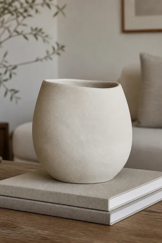
Books and ceramics look expensive when they’re organised by height and kept in a narrow colour family. I stack two books so the spine colours read uniform, then place one oversized ceramic piece to add softness. Matte ceramics in off-white or sand look great beside wood and textiles. This styling gives you a focal point that doesn’t look fussy. It also works for small tables because the objects are bigger and fewer, so you get visual impact without clutter.
Start with a clean tabletop and place a book stack slightly off-center toward the seating. Choose book covers in cream, oatmeal, or taupe so they blend with your room palette. Add the ceramic vessel on top of the books, then adjust the stack so the tallest point sits about at the middle height of the lamp or chair arm. Keep one empty corner of the table so the arrangement breathes.
If your books have loud colours, rotate them so the spines show the muted side and hide the bright ones.
Avoid tiny decor pieces scattered across the table — they read cheap because they look like leftover items.
21. Draped window valance effect using a single long scarf-like fabric panel
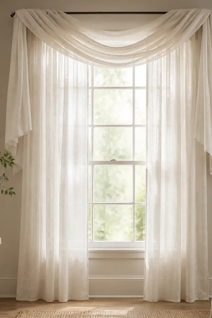
You can get that designer window softness without buying a whole new set. The trick is using one long fabric panel in a light, warm tone that drapes and folds naturally. It creates a valance effect that adds height and movement, which makes the room feel styled. This works best in rooms with straight modern lines because the draped fabric softens the geometry. It also helps if you want privacy but still want daylight.
Good to knowSteam the drape before hanging. A wrinkled drape looks like you rushed it.
Choose a lightweight fabric in warm cream or oat — something that falls in folds, not stiff. Mount a rod or tension wire above the window and hang the panel so it drops symmetrically. Create one gentle fold line by pulling the fabric slightly at the center, then let the ends fall. Keep the actual side curtains simple and neutral so the draped panel becomes the focal point.
AvoidAvoid heavy blackout fabric for this look — it won’t drape and it will look boxy.
22. Use warm wood and one dark metal finish on hardware and frames
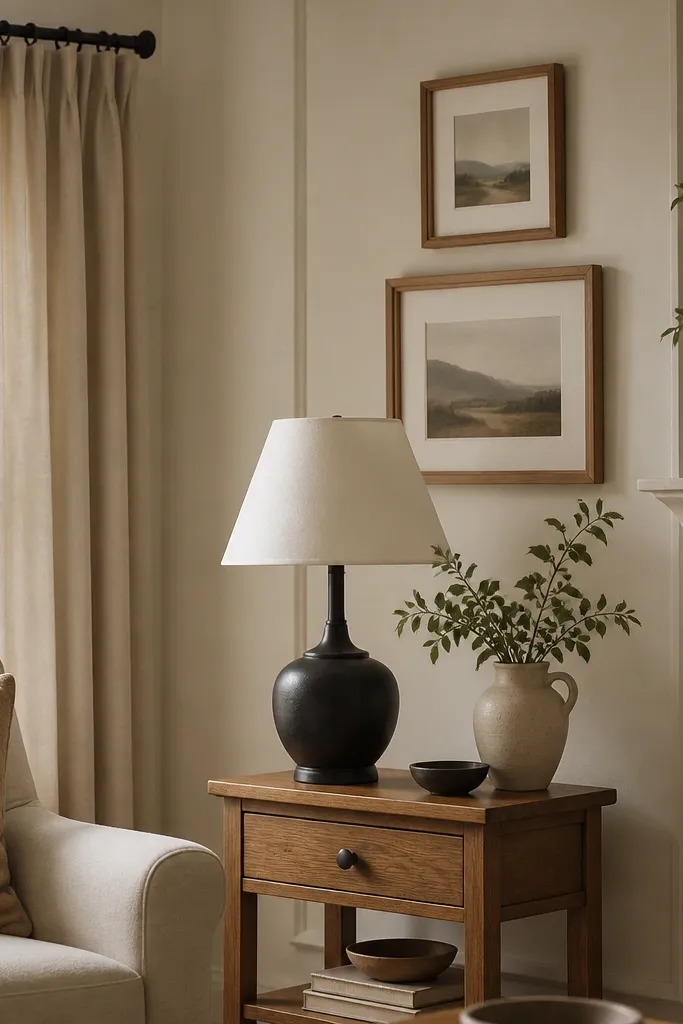
Consistency in materials is what makes a room look expensive. When you mix too many finishes, the eye keeps jumping and the room stops feeling cohesive. I like warm wood as the main material because it plays well with cosy textiles, then I add one dark metal finish as a grounding note. Black works well with warm oak and cream fabrics, while aged brass works with lighter wood and gold tones. This approach fits modern cosy because it keeps the palette warm and textured, not shiny and cold. It also helps when you’re piecing the room together over time.
Pick one dominant wood tone — warm oak or honey teak — and repeat it in at least two furniture pieces. Then choose one dark metal finish and repeat it in a lamp base, a curtain rod, or a frame. Keep other metals out of the room, including silver. If you already have chrome somewhere, cover it with a black tray or swap one visible item so the finish story stays clean.
Take a quick phone photo at night and check if you see more than two metal colours. If you do, remove or hide one.
Avoid mixing warm brass with bright silver hardware in the same sightline.
23. Wool-blend cushion covers with visible weave and a cream base
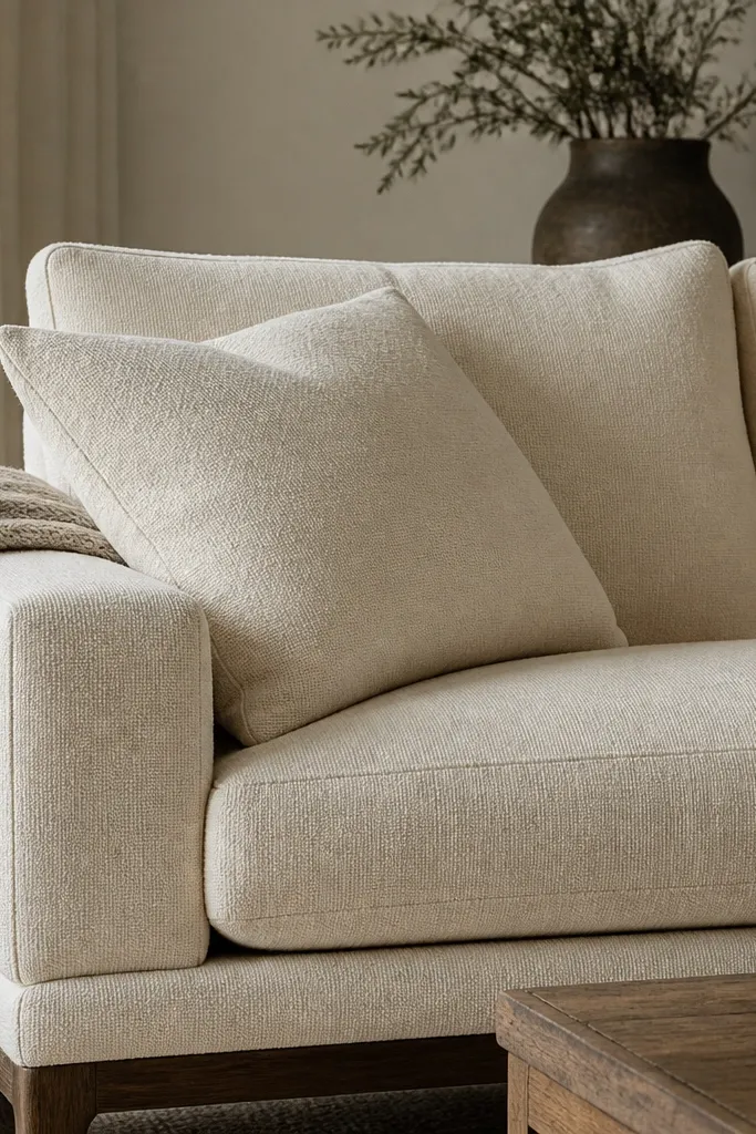
Cushion covers are where cosy becomes tactile. Wool-blend covers with a visible weave add depth because the fibres catch light in a soft, irregular way. Start with a cream base so the room stays bright, then add one oatmeal or warm taupe tone. I avoid super smooth faux suede because it looks flat and slippery once it’s in a living room. This setup works for people who want cosy without adding more furniture. It also photographs well because the weave texture shows up even under warm lighting.
Choose cushion covers that have a real texture you can feel with your fingertips. Use a 45x45 cm size for most living room sofas, then add one smaller lumbar in 30x50 cm if your sofa has space. Place two covers in cream and one in oatmeal across the back row, then add the throw on one arm. Fluff the cushions so the seams look rounded and full, not tight and stretched.
Put the most textured cover in the middle position. It becomes the visual anchor when you sit down.
Avoid cushion covers that pill quickly. If the fabric looks fuzzy in the store, it will look worse after a month.
24. Small side table with a thick book stack and a warm candle
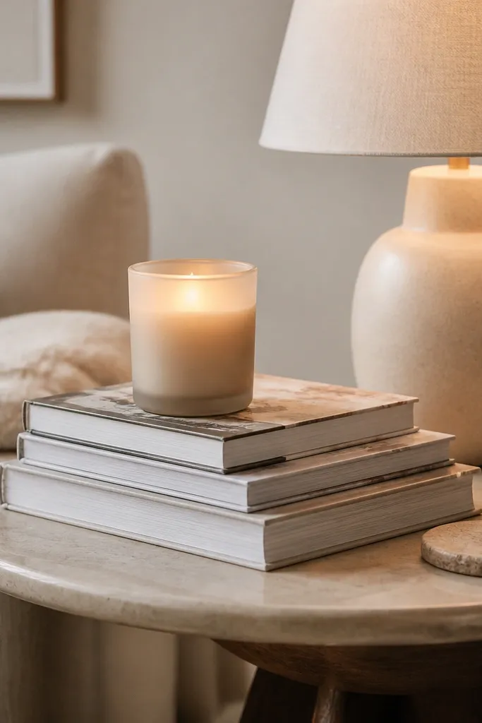
Side tables are where the room feels lived-in, not staged. A thick book stack adds height, and a warm candle adds colour and glow you can’t fake with overhead light. I like matte glass candles because they look soft against fabric and wood. This works in modern cosy spaces because it keeps styling minimal but intentional. It also helps if you want to add warmth without changing your furniture set.
Good to knowChoose book covers in cream or oatmeal so they blend with cushions and curtains.
Place the side table next to your seating so the top edge sits roughly at arm-rest height. Add a thick book stack as the base, then place a matte sand candle on top. Keep a coaster under the candle if your glass sweats, and add one small tray or dish nearby for matches or a remote. Light the candle in the evening or swap to a battery candle if you want it all day.
AvoidAvoid tall decor that blocks the lamp light. If it hides the shade, the glow won’t reach the seating.
25. Oversized framed art with off-white matting and warm wood frame
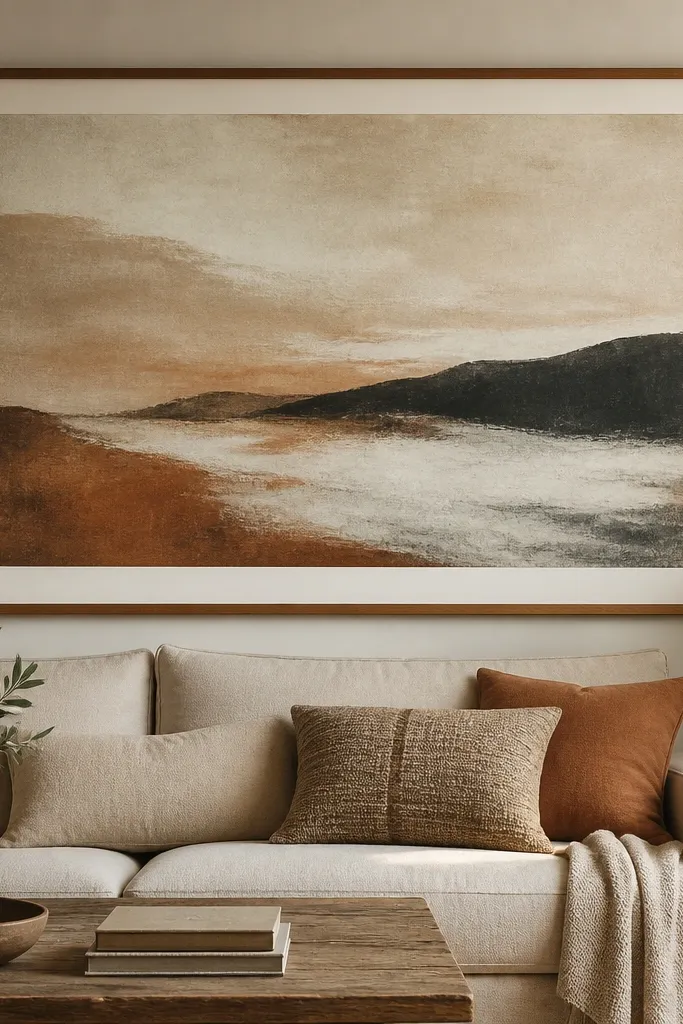
Large art makes a room feel expensive because it fills space with intention. When the mat is off-white and the frame is warm wood, it ties together curtains, cushions, and floor tones. I prefer muted prints with warm greys, clay browns, and gentle contrast because they look good under warm lighting. Oversized art also fixes the “my wall looks empty” problem that makes rooms feel cheap even when the furniture is nice. It’s the easiest update when your living room has a big blank wall behind the sofa.
Measure the wall above your sofa and aim for art that spans about two-thirds of the sofa width. Choose a warm wood frame and an off-white mat so the artwork has breathing room. Hang it so the center sits at about eye level — roughly 150 cm from the floor to the middle of the piece. Keep the rest of the sofa styling simple: one throw and two cushion tones so the art stays the hero.
If your art is too busy, reduce the number of accent colours elsewhere. One deep tone is enough.
Avoid small art hung too high. It makes the wall look like you ran out of budget.