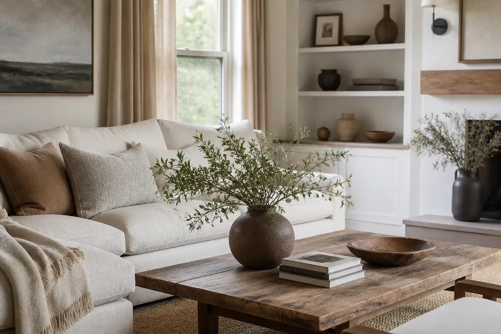
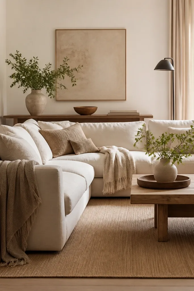
1. Teddy throw drape over the sofa arm (cream + oat)
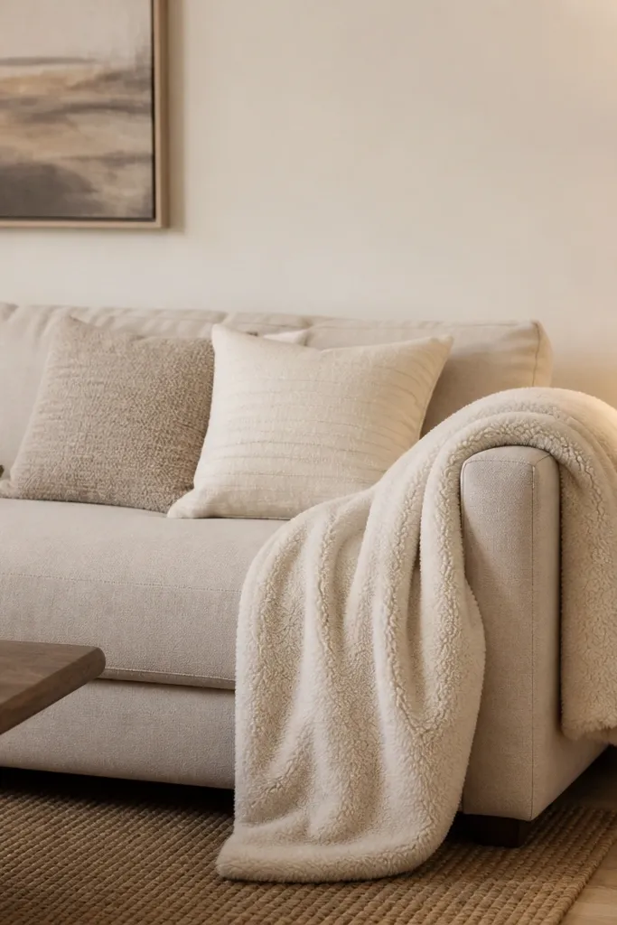
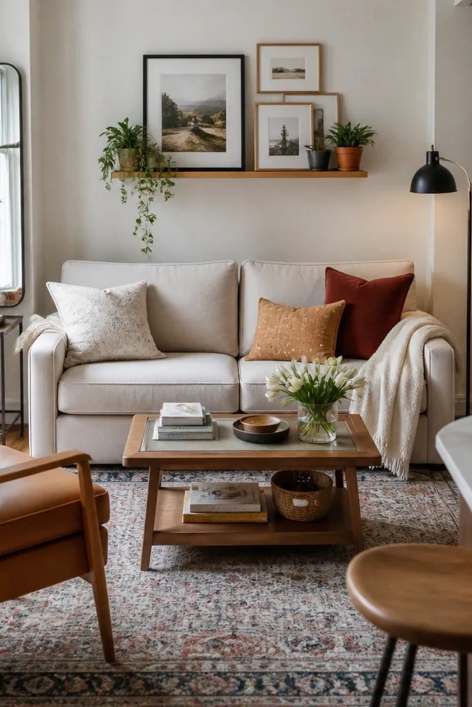
This is the fastest cosy move I’ve done because a teddy throw grabs attention without adding loud color. I like cream teddy against a beige or oatmeal sofa, then I repeat oat in the cushions so it looks planned, not accidental. The effect is soft and slightly plush, which makes people want to sit closer and stay longer. It’s flattering in almost every room because teddy reads warm even when the rest of the palette is simple. If you have fair skin and light hair, cream tones look clean and flattering; if you have deeper skin tones, oat and sand look warm and grounding in photos and in person.
Good to knowShake the throw once after you hang it — the fibers settle and the drape looks thicker.
Start by folding the throw into a wide rectangle so it doesn’t look scrunched. Drape it over one sofa arm with about 20-30 cm hanging down the side, then let the top edge rest naturally along the arm curve. Place two cushions in front of it: one solid cream and one textured oat (like a short-pile knit or linen blend). Finish by pulling the coffee table rug or edge rug slightly forward so the throw sits in the same visual zone as the coffee area.
AvoidDon’t drape it flat across the back like a blanket on a bed; you want arm-and-side softness, not a stretched sheet look.
2. Three-cushion repeat with one stripe in greige
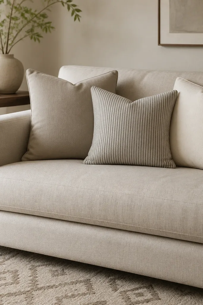
When a room feels too “flat,” it’s usually because the cushions are all the same finish. This setup keeps neutrals but adds rhythm through a single stripe cushion. Greige stripe works because the line sits between warm and cool, so it doesn’t clash with most wood tones. I’ve used this on both light and dark sofas, and it still reads cosy because the fabric looks lived-in rather than crisp. In real life, this also photographs well since the stripe gives the eye a focal point without adding color drama.
Good to knowChoose a stripe with thin lines; thick stripes can read bold fast in neutral rooms.
Start with three cushions that are the same size or close — aim for 45x45 cm for most sofas. Put the stripe cushion in the center, then flank it with two solids that match the stripe’s warm base (cream or warm greige). Add a fourth cushion only if it’s smaller — 30-40 cm — and keep it in a textured fabric like chunky cotton or a subtle boucle. Finally, align the cushion seams so they sit straight; a crooked stack makes the whole sofa look messy.
AvoidAvoid mixing random cushion sizes without a repeat pattern; it turns into clutter instead of cosy styling.
3. Linen-cotton slipcovered chairs with a warm throw-back
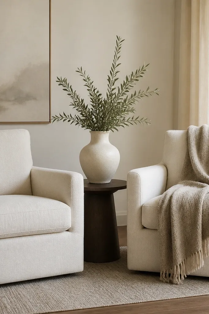
If you want cosy without heavy color, linen-cotton slipcovered seating is your friend. The fabric has that slightly textured look that catches light gently, so it never looks shiny or cold. I pair off-white chairs with an oatmeal throw because it adds warmth at a glance and makes the chair look inviting to sit on. This works especially well if your room has smooth surfaces like glass or polished stone, because linen adds softness. It also looks great across skin tones since the warmth sits in the neutral zone and doesn’t wash people out in photos.
Start by draping the throw back over the chair so it creates a soft “U” shape, not a straight line. Let it fall about halfway down the back cushion, then tuck the corner near the front seam. Add one cushion on the chair seat if you need extra comfort — keep it in a plain cream or oat cover. Place a lamp or candle-like light source near the chair so the linen texture shows; cosy is about the way fabric looks under warm light.
Press the chair cushions with your hands after placing the throw — linen looks best when it forms natural folds.
Don’t use a silky throw over linen; it creates a contrast that reads formal instead of cosy.
4. Layered rug anchoring: 8x10 base + 2x3 jute runner
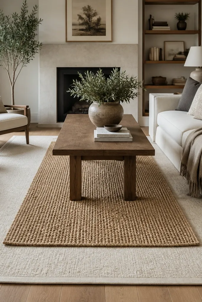
This idea makes the whole room feel grounded, and cosy usually starts with your feet. A large base rug in cream or warm greige gives you softness under furniture, while a jute runner adds texture without adding color noise. I like this combo because jute is matte and slightly rough — it stops the room from looking too smooth and showroom-like. It also makes the coffee table area feel more intentional, especially if you have a low sofa and simple side tables. The warm natural jute tone looks flattering with most wood floors and almost any wall paint.
Good to knowUse a thin rug pad under both layers so the jute doesn’t slide and the pile stays even.
Start by placing your larger rug so the front legs of the sofa sit on it — aim for at least 15-20 cm of rug visible behind each front leg. Then center the jute runner under the coffee table, leaving equal gaps on both sides so it looks balanced. If your furniture is close to the rug edge, move the rug slightly forward before adding the runner. Finally, check the alignment by stepping back and making sure the runner lines up with a wall or with the coffee table’s long edge.
AvoidDon’t go too small with the base rug; if only the coffee table sits on it, the room stays visually floating.
5. Corner reading nook: floor lamp + knit pouf + small tray
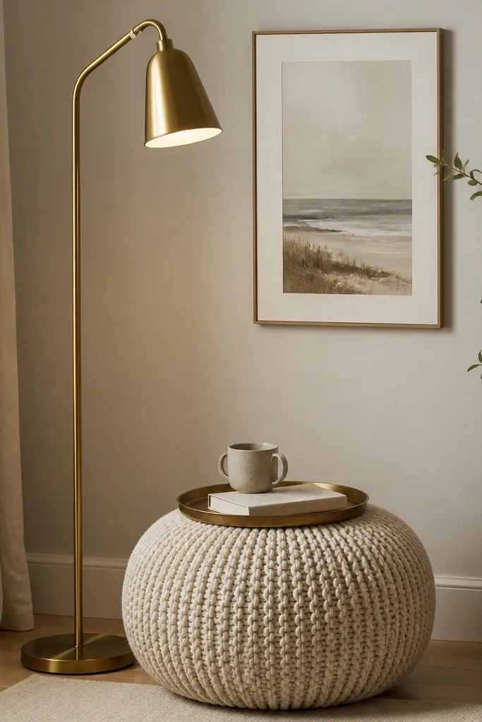
Cosy isn’t only on the sofa. This corner setup creates a “sit and stay” spot using height, softness, and a clear surface for daily items. I use a floor lamp with a fabric shade in oat or warm white because it diffuses light and makes the room feel calmer. The knit pouf adds that squishy texture you want when you’re winding down. A small tray keeps the corner looking tidy, which matters because cosy rooms get messy quickly. It also works for different spaces, from small apartments to larger rooms, because it uses one corner instead of spreading decor everywhere.
Good to knowPut the tray on a rotating rule: coffee today, tea tomorrow — same tray, different daily items.
Start by placing the floor lamp so the light lands on the wall or nearby bookcase, not straight into the eyes. Position the knit pouf about 30-45 cm from the lamp base so you can comfortably tuck a leg or set a drink. Add a small tray on the pouf or side table and keep it to three items: one cup, one book, one small object like a candle or coaster. Finish by adding one framed print or a small mirror behind the pouf to bounce light around the corner.
AvoidAvoid placing the lamp too far from the seating; if the light doesn’t reach the pouf area, the corner feels decorative, not cosy.
6. Warm white curtains with a 15 cm puddle
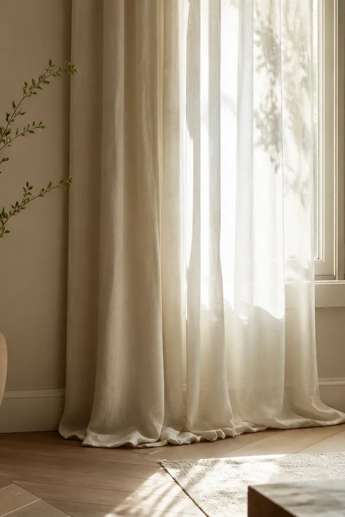
Curtains are where cosy shows up in the real world because they soften hard lines like windows and radiators. Warm white curtains with a slight puddle look relaxed and expensive without needing bold patterns. I aim for 15 cm of pooling on the floor because it creates that gentle drape people notice when they walk in. The fabric matters: choose a medium-weight linen blend or cotton voile with a bit of body so it holds folds. This works beautifully with both cool and warm palettes since warm white sits between them and doesn’t look icy.
Start by hanging the curtain rod 10-20 cm above the window frame and as close to the ceiling as you can. Then choose panels wide enough for fullness — aim for 1.5 to 2 times the window width in total fabric. Let the bottom hang and adjust until you get about 15 cm puddle on the floor. Steam the curtains and pull them to one side when you want the cosy, lived-in look.
If your floor is dark, choose a slightly thicker fabric so the folds don’t look see-through.
Don’t hem curtains so they stop right at the floor; that “cut-off” length reads unfinished and makes the room feel smaller.
7. Wood + rattan side table with a cream ceramic lamp
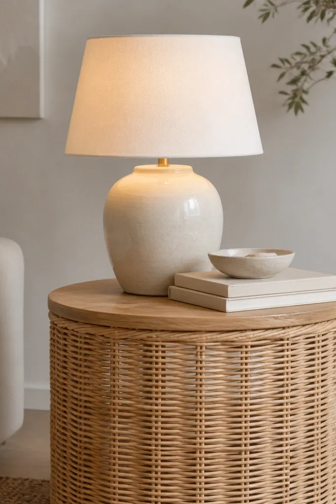
This combo makes neutral rooms feel warm without adding color. Natural rattan has a light, airy texture that looks good in daylight and glows under lamp light, which is why it’s such a reliable cosy ingredient. The cream ceramic lamp base gives you a soft, rounded look and makes the whole corner feel gentler than black or chrome. I’ve used this in living rooms with grey walls and it still looks inviting because the materials add warmth in different ways. It’s also friendly in photos because the surfaces catch highlights instead of reflecting harsh glare.
Good to knowUse a dimmable bulb and set it low at night; cosy is mostly about light levels, not more decor.
Start by placing the side table next to the sofa arm so the lamp light reaches the seating area. Choose a cream lamp shade that’s not too white — warm white looks better with neutrals than bright white. Add a small ceramic dish or coaster so the surface looks styled, not bare. Finally, keep the book stack to two or three items and tuck one slightly under the lamp base so it looks intentional.
AvoidAvoid overly glossy rattan-look finishes; they flash under light and read cheap fast.
8. Round coffee table with a thick tray and linen runner
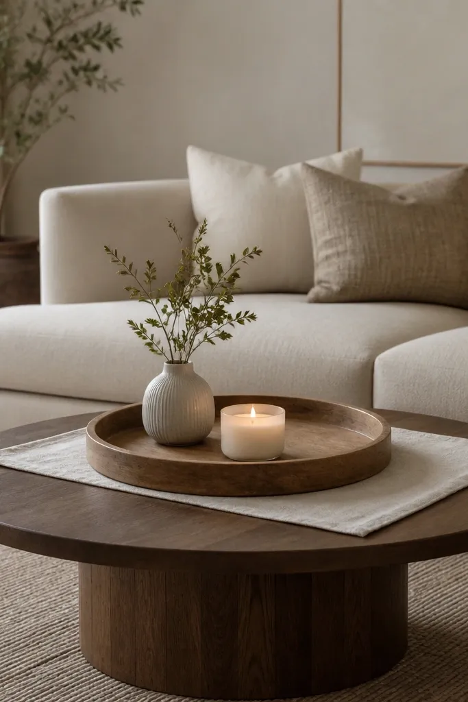
A coffee table can make a neutral room feel either calm or cluttered, and trays fix that quickly. A thick wooden tray has weight, so it makes the table look styled even when you don’t have lots of objects out. I like a short linen runner under the tray because it softens the hard table surface and adds that cosy texture you can feel with your eyes. This setup works well for people who like hosting because it lets you swap items without changing the whole look. It also flatters most living room layouts because round tables make everything feel less sharp.
Good to knowUse a tray with raised edges so items don’t slide when you move the cushion or pass drinks.
Start by centering a thick tray on the coffee table so there’s even space around it. Place a small oatmeal linen runner under the tray or just slightly to one side if the table has a lot of visual space. Add three items inside the tray: one candle (or candle-style LED), one small vase, and one book or folded cloth. Keep the candle height consistent so the tray doesn’t look top-heavy.
AvoidDon’t overload the tray; five small items look like a craft table and kill cosy.
9. Neutral art wall with one oversized print and two small frames
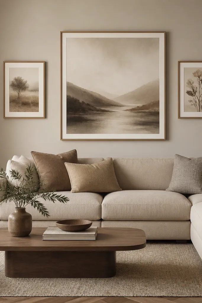
Cosy neutral rooms need a focal point that isn’t a bunch of tiny decor pieces. One oversized print gives the wall breathing room, and two small frames add balance without turning the wall into a gallery grid. I choose artwork with warm greys, oat tones, and soft shapes, because those colors blend with textiles and don’t compete with cushions. This works especially well if your living room has a large sofa or a long wall — it makes the room look intentional. In person, it also makes the room feel softer because the shapes are calm and the wall isn’t busy.
Start by measuring the wall space and pick an oversized frame that’s about two-thirds the width of the sofa. Hang the center print first at eye level (around 150 cm from floor to the print center), then place two smaller frames so the vertical alignment matches the center piece. Use painter’s tape to test spacing — I usually leave 10-15 cm between frames. Keep all frames in the same finish, like matte black or natural wood, so the wall reads coherent.
If you’re unsure, pick a print with one dominant warm tone and one light neutral tone only.
Avoid mixing frame finishes like gold, black, and silver together; it makes neutrals look messy.
10. Corner shelf styling: books + ceramic + one dried branch
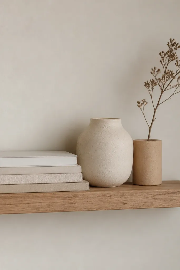
This is cosy because it looks lived-in, not decorated once and forgotten. Books in neutral covers add color harmony without needing prints, and the ceramic vase softens the shelf with a rounded shape. One dried branch gives movement and height, which makes a small shelf look taller and more intentional. I keep the palette to cream, oat, and warm greys so the shelf doesn’t fight the sofa textiles. It also works for different ages of homes — even if your room is older with visible baseboards, the shelf makes it feel cared for.
Start by stacking books vertically and horizontally so you get two height levels, not one flat row. Put the ceramic vase slightly off-center and use it as the anchor. Add the dried branch at the back so it leans forward a little and casts a soft shadow. Leave a visible gap between items — spacing is what makes it look cosy instead of cluttered.
Dust the shelf with a dry microfiber cloth first; dried branches look messy if there’s even a little dust on the leaves.
Don’t add multiple sticks or multiple vases; one height element is enough.
11. Biscuit and mocha cushion combo with chunky knit
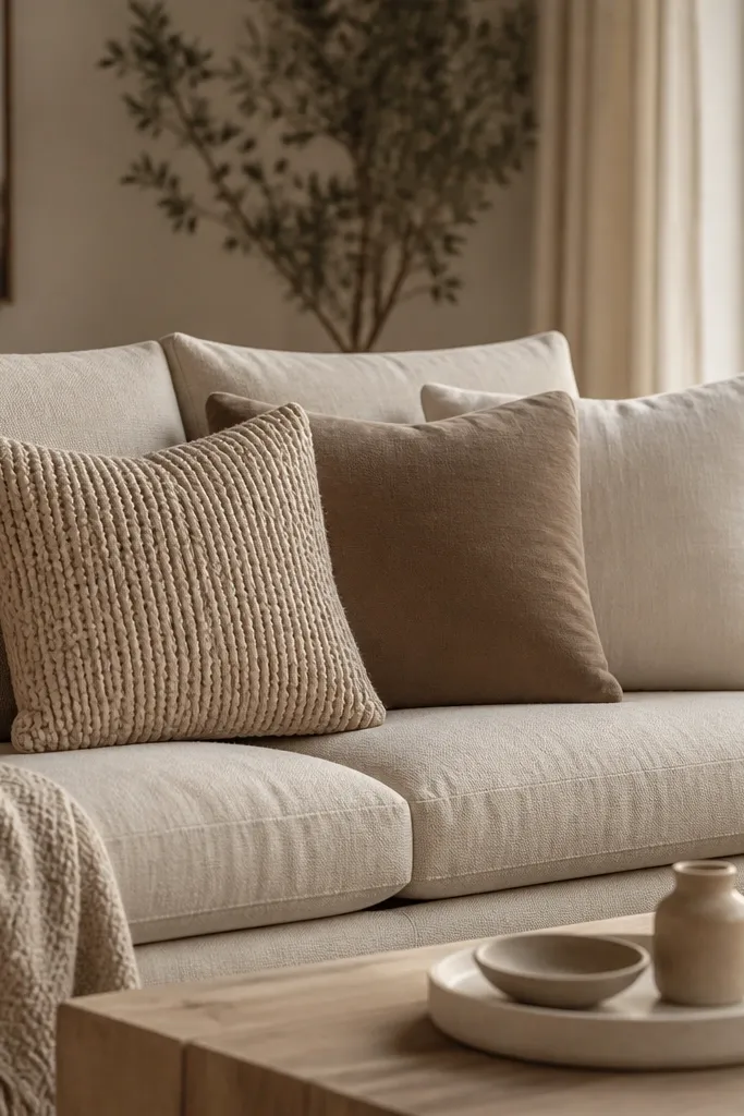
This palette is cosy because it’s not just “beige.” Biscuit and mocha give you depth, and chunky knit adds the tactile softness that makes a neutral room feel inviting. I use one chunky knit cushion as the texture hero, then balance it with one smooth cushion so the sofa doesn’t look like it’s covered in yarn everywhere. This works great if your room has a neutral wall and you want warmth without going brown-heavy. It also flatters warm undertones in skin because the colors sit in the same warm family.
Good to knowIf the knit sheds, put it at the back so the front cushion cover still looks clean.
Start by choosing three cushions that share one common base tone — biscuit. Place the chunky knit cushion in the back row or center so it’s visible when you sit. Add one mocha cushion on the side to bring depth, and keep the third cushion a lighter cream to brighten the stack. Fluff the knit by hand so it looks airy, not flattened.
AvoidAvoid using all three cushions in chunky knit — it turns cosy into bulky and visually heavy.
12. Matte black curtain rods with warm linen sheers
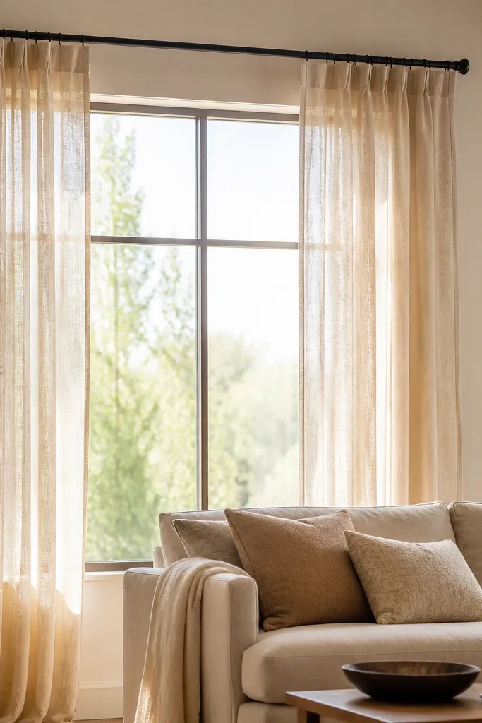
Matte black hardware makes neutral rooms look finished because it adds a thin line of contrast. When you pair it with warm linen sheers, the contrast stays calm and doesn’t feel harsh. I like this when your room has lots of light neutrals and you want structure without adding color blocks. The sheers diffuse daylight into a warm glow, which instantly makes everything feel cosy. It also looks good with both light and medium wood — black ties into dark legs, black frames, and lamp bases.
Start by installing the curtain rod so it’s centered above the window and hangs slightly wider than the window edge. Choose warm linen sheers in a cream-oat tone, then hang two panels so they meet in the middle with gentle overlap. Pull the sheers open fully during the day so the fabric shows its texture, then close them at night for softness. Style the sofa below with one matching warm throw so the window and seating look connected.
Use black binder clips to secure the sheers temporarily while you steam and settle them into folds.
Avoid shiny curtain rods; glossy metal makes neutral rooms look like a rental.
13. Low bookshelf styling with baskets for instant tidiness
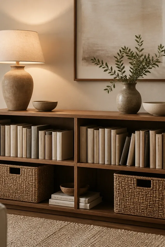
Cosy neutral rooms look best when clutter is hidden, not because you have fewer things, but because you separate “display” from “storage.” Woven baskets in natural tones keep the shelf warm while swallowing remotes, extra throws, and random living room bits. I use baskets with a light color so they blend with greige walls and cream curtains. This also helps if you’re someone who puts things down and forgets — baskets bring everything back into order in one motion. The result feels calmer, and calm reads cosy.
Good to knowLabel baskets with a small tag underneath, not on the front — it keeps the shelf pretty but makes cleanup quick.
Start by taking everything off the shelves for five minutes and grouping items into three piles: books, decor, and daily clutter. Put the clutter into baskets first — choose basket sizes that leave about 2-3 cm of breathing room around edges. Line books vertically by height so you get a stepped look, then place decor items only on the top shelf. Finish by placing one lamp nearby and making sure the shelf isn’t in deep shadow.
AvoidAvoid mixing too many basket colors; two basket tones max looks intentional.
14. Warm neutral candle cluster on a tray (three heights)
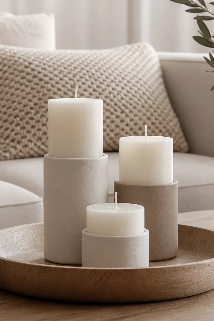
Candles make a neutral living room feel like a place you can exhale. The trick is not “more candles,” it’s height and material. I use three candles with different heights so the cluster looks sculptural rather than flat, and I choose matte cream or sand holders so the light doesn’t look harsh. In a cosy neutral room, this creates a soft glow that matches textiles like linen and knit. It’s also a great option if you want ambience without adding wall decor.
Good to knowUse LED candles on weekdays if real flames feel like extra work; the holders still look right in photos.
Start by choosing a tray that’s wide enough so the three candles don’t touch — aim for at least 35-45 cm wide. Place the tallest candle in the center, then two shorter ones on either side, keeping the distance even. Add one small grounding element like a thin book or a small stone dish so the tray feels styled even when candles are off. Light them and check how the glow hits the sofa cushions; reposition if the light is too focused on the table only.
AvoidAvoid glossy candle holders; they reflect overhead light and ruin the cosy softness.
15. Cream boucle accent chair with a warm grey lumbar
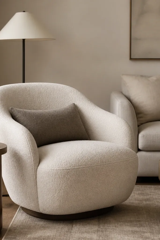
Boucle is cosy because it looks forgiving. The small loops create a soft visual texture, so the chair reads warm even if the room is otherwise minimal. I pair a cream boucle chair with a warm grey lumbar because it adds shape and contrast without turning the palette cold. This works well if your walls are white or grey — boucle gives you warmth instantly. In terms of comfort, boucle also looks plush, so even a firmer chair feels more inviting. It flatters different skin tones because the warm cream doesn’t pull people into a grey cast.
Good to knowVacuum boucle gently with a soft brush attachment so it stays fluffy and doesn’t look flattened.
Start by placing the chair so it’s angled slightly toward the sofa, not staring straight at the TV or a wall. Add a lumbar cushion that’s about 30x50 cm and keep it centered at the back seam. Choose a warm grey that has brown in it, not blue-grey, so it works with neutrals. If you’re adding a throw, keep it off the chair seat and instead drape it over one arm so the boucle texture stays visible.
AvoidAvoid pairing boucle with shiny leather cushions; the textures fight and the room looks mismatched.
16. Oat knitted throw laddered across the back and seat
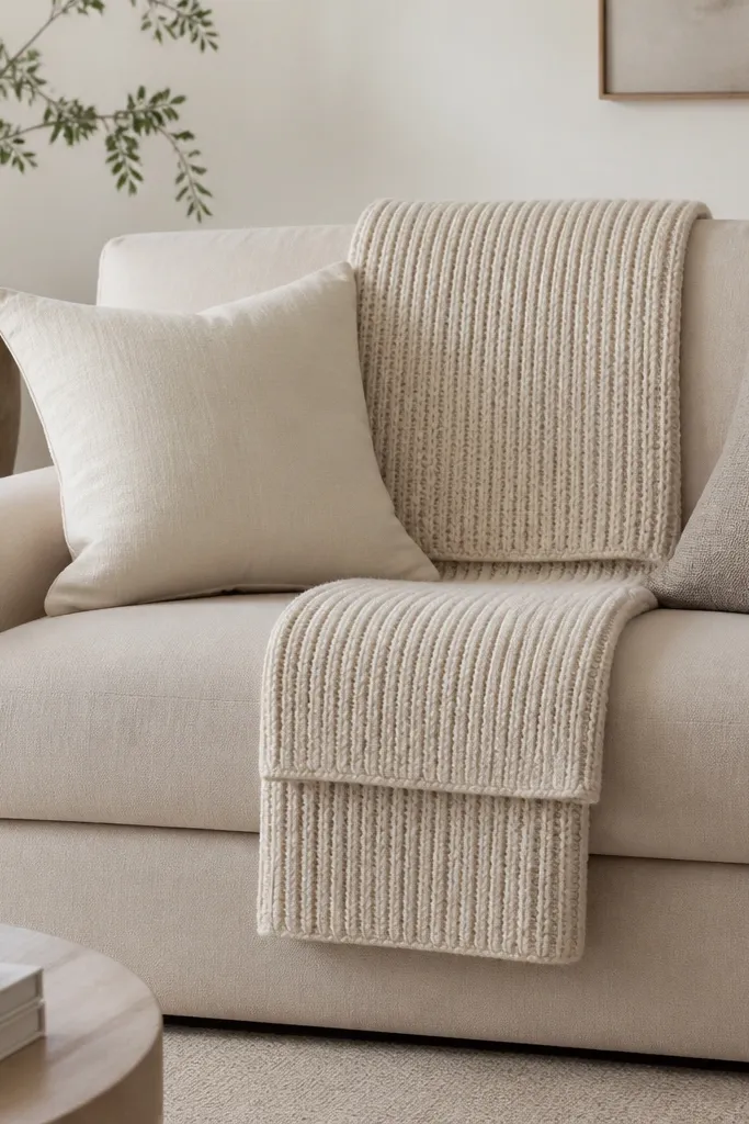
This is cosy because it creates structure with softness. Instead of one throw drape, you use two folds so it looks styled from every angle — from the front, and when you sit down. Oat knitted throws look warm and casual, especially with cream cushions, because the knit texture creates depth even when the colors are close. I like this on sofas with clean lines, like modern low-profile frames, because the throw adds human warmth. It also works well for people who host and want the sofa to look good even if someone moves a cushion.
Start by folding your knitted throw into a rectangle and then split it visually into two sections. Place one section across the back cushion, centered, with the edges hanging slightly over the sides. Place the second section across the seat edge, but keep it shorter so you still see the seat cushion line. Fluff the knit by pulling it gently at the corners so it looks airy, not tight.
Use two throw clips or fabric ties inside the back fold so it stays put when people sit.
Don’t make the throw too long; if it spills across the floor, it reads messy.
17. Neutral ceramic vase cluster with one dried pampas-style stem
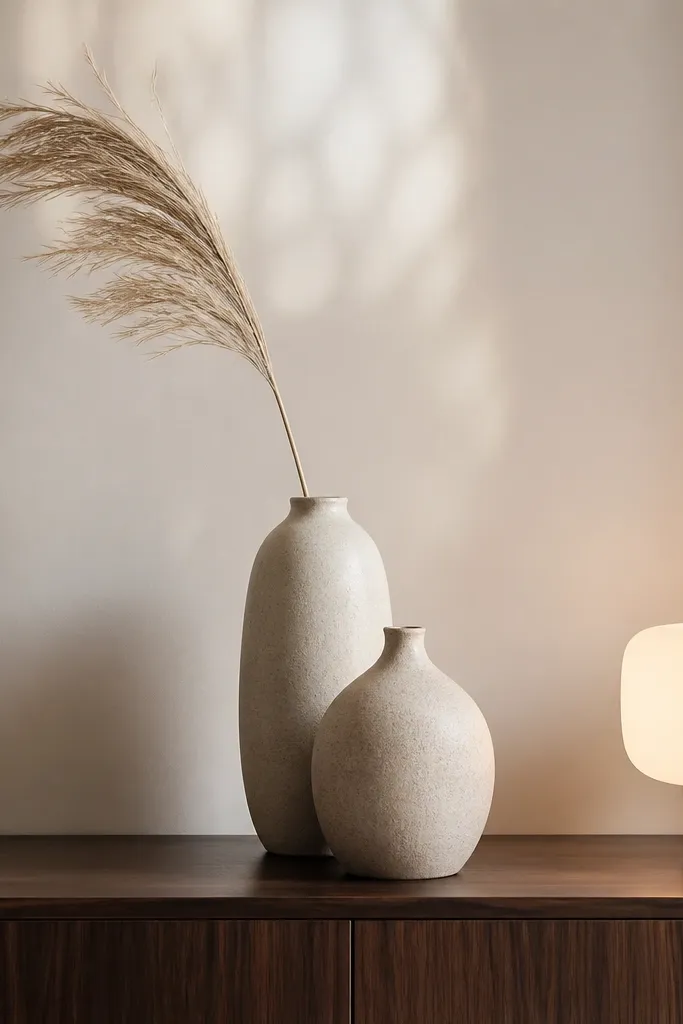
Neutral rooms need one “organic” element, and dried stems do that without adding bright color. A cluster of two ceramic vases creates interest through shape, while one dried stem brings movement and a soft shadow. I choose warm whites and sand ceramics because they match linen curtains and boucle textures. This looks cosy because it adds a slightly natural, lived-in feeling — like someone actually put thought into the room. It also works if you hate clutter: the stems fill vertical space so you don’t need many small items.
Start by placing the taller vase slightly behind the shorter one on the sideboard, so you get depth. Add the dried stem into the taller vase first, then trim it so it ends about 10-15 cm below the top of the vase. Keep the stem facing one direction so it fans naturally instead of looking random. Finish by adding one small tray or candle next to the vases to tie the styling together with your lighting.
Spritz dried stems lightly with hair spray before placing so loose bits don’t shed onto your rug.
Avoid using multiple stems in different directions; too many fanning shapes makes the whole cluster look chaotic.
18. Warm neutral dining chair styling with seat cushions
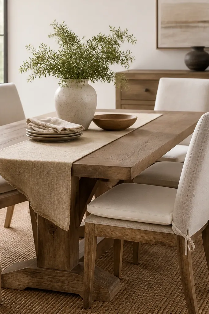
Even if your target is the living room, dining chairs affect what you see when you glance from the sofa. Seat cushions in cream or oat make the whole open-plan space feel softer and more lived-in. I like cushions with a simple cover and a slightly textured weave so the neutral palette doesn’t look flat. This idea is cosy because it’s comfort-forward — it invites sitting, lingering, and eating without looking like you’re setting up for a special occasion. It also helps if your chairs are plain and your room needs warmth without adding more decor.
Start by choosing seat cushions that match your living room throw or cushion tones, not just the wall color. Place them centered on each dining chair seat and make sure the front edge aligns so the pattern looks consistent. Add a warm linen table runner in the same palette, but keep it simple — no busy stripes. If you have space, add one small centerpiece like a ceramic bowl with lemons or a single neutral vase with one stem.
Use non-slip backing or ties so cushions don’t slide when people pull chairs out.
Avoid mismatched cushion covers across chairs; uneven colors read messy even when each piece is nice.
19. Beige sofa, charcoal accents: one throw pillow in textured charcoal
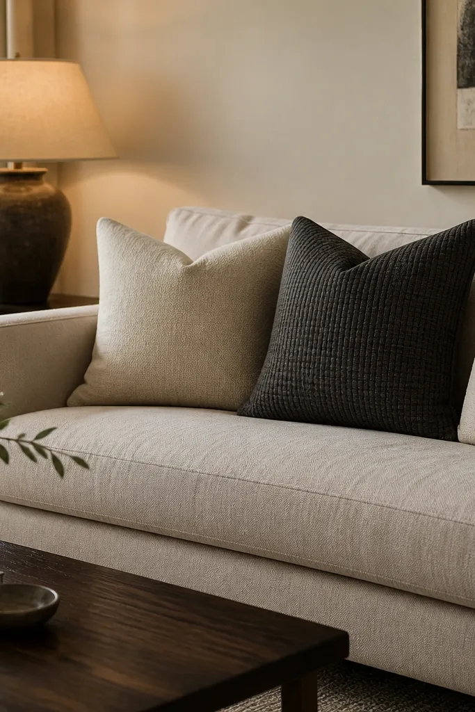
If your neutrals feel too gentle, charcoal adds the “grown-up” contrast that makes everything else look warmer. The key is restraint: one charcoal accent pillow with texture, not a whole set of dark items. Charcoal works because it grounds the sofa visually while staying neutral enough to keep the room cosy. Textured charcoal — like a woven or small-rib fabric — reads softer than smooth velvet. This is flattering in almost every home because it adds depth without changing your walls, your floors, or your furniture.
Good to knowChoose charcoal with a warm undertone; blue-black can make beige look dull.
Start with your base cushions in cream and warm greige. Add one charcoal pillow that’s slightly different in fabric texture, ideally with a woven or ribbed surface. Place the charcoal pillow either on the outer side of the stack or in the back corner so it frames the lighter cushions. Then repeat charcoal once elsewhere, like a black frame or a dark wood object, so it doesn’t look random.
AvoidDon’t add charcoal to everything at once; it kills the cosy warmth and turns the room into a monochrome mood.