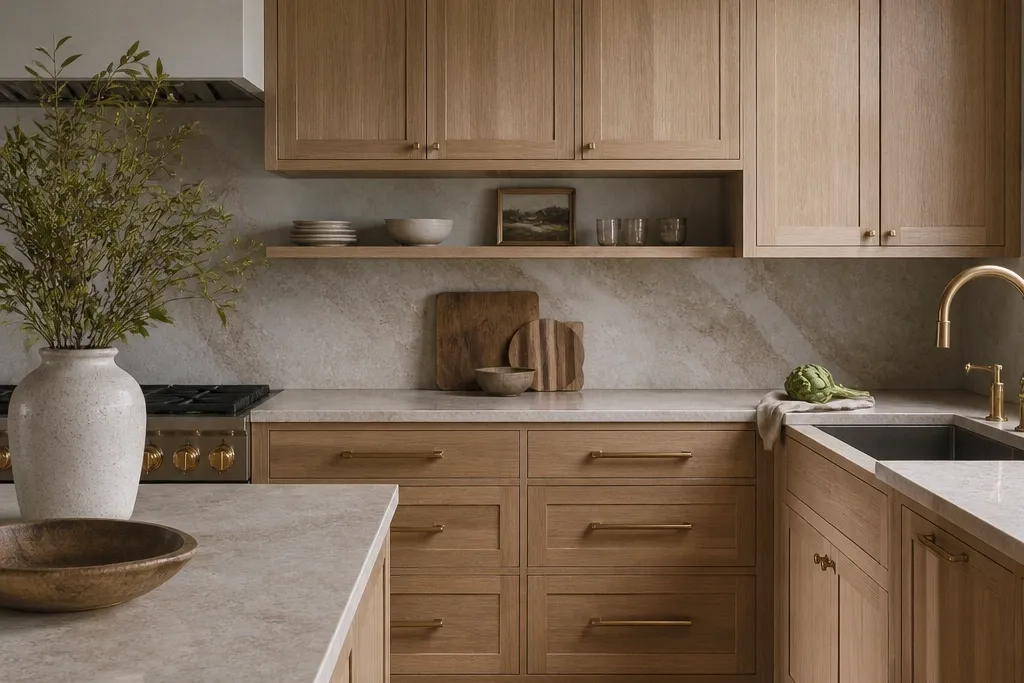
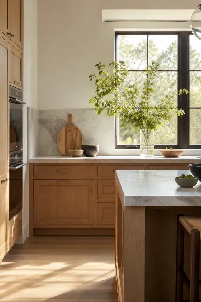
1. Satin white oak with a creamy countertop edge
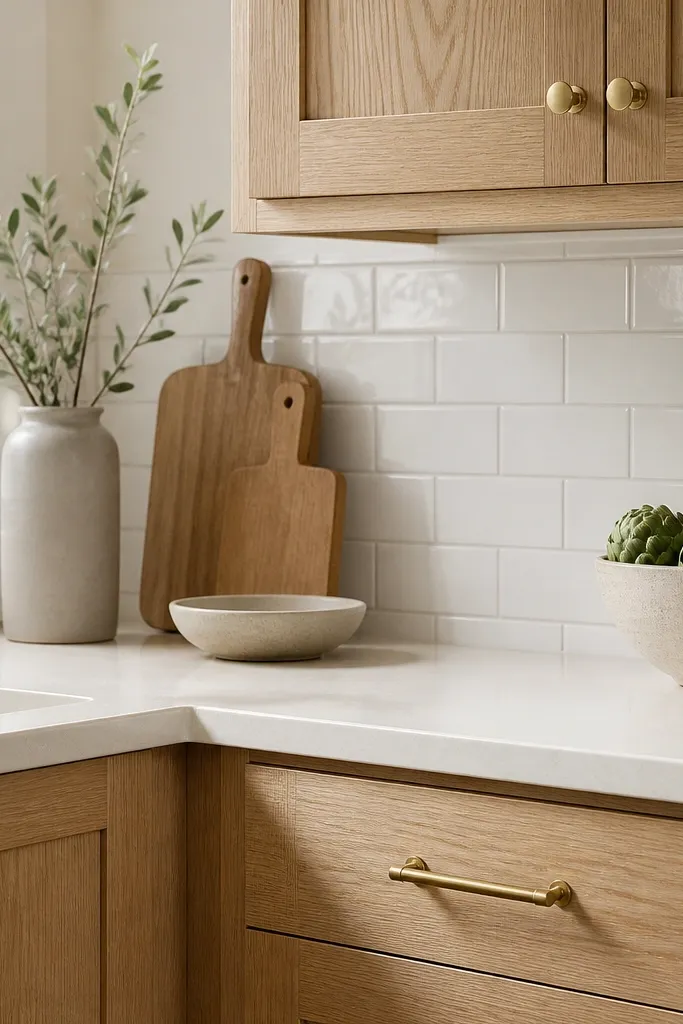
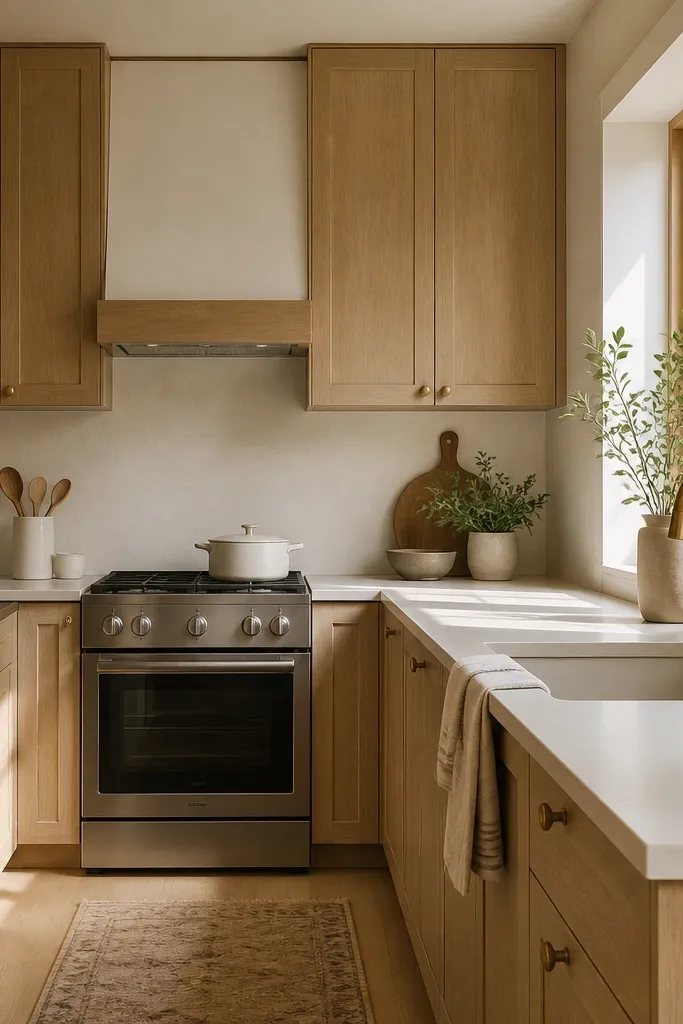
I picked satin-finished white oak because it keeps the grain visible without turning every touch into a shine spot. The oak reads creamy next to an off-white countertop edge, so the cabinets feel warm instead of yellow. Brushed brass hardware adds a gentle glow that doesn’t fight the wood’s undertone. This combo flatters kitchens with north-facing light because it prevents the cabinets from looking gray. It also works well for small dining areas, since the creamy counter keeps the whole corner brighter.
Start by placing your oak sample against the countertop you’re actually using, not a “similar” one. Then choose satin clear coat on the cabinet doors and drawer fronts, and request the same sheen level for the interior door panels if they’ll show. Finally, set your hardware finish to brushed brass or satin nickel depending on your faucet — match the temperature, not the brand. Keep the backsplash bright and simple, like white subway tile, so the oak grain stays the star.
Hold the sample under your kitchen bulbs at night for 10 minutes. If you see glare or a “wet” look, ask for a lower sheen option.
Avoid semi-gloss on white oak — it makes fingerprints obvious and flattens the grain over time.
2. Gray-leaning white oak with warm white walls
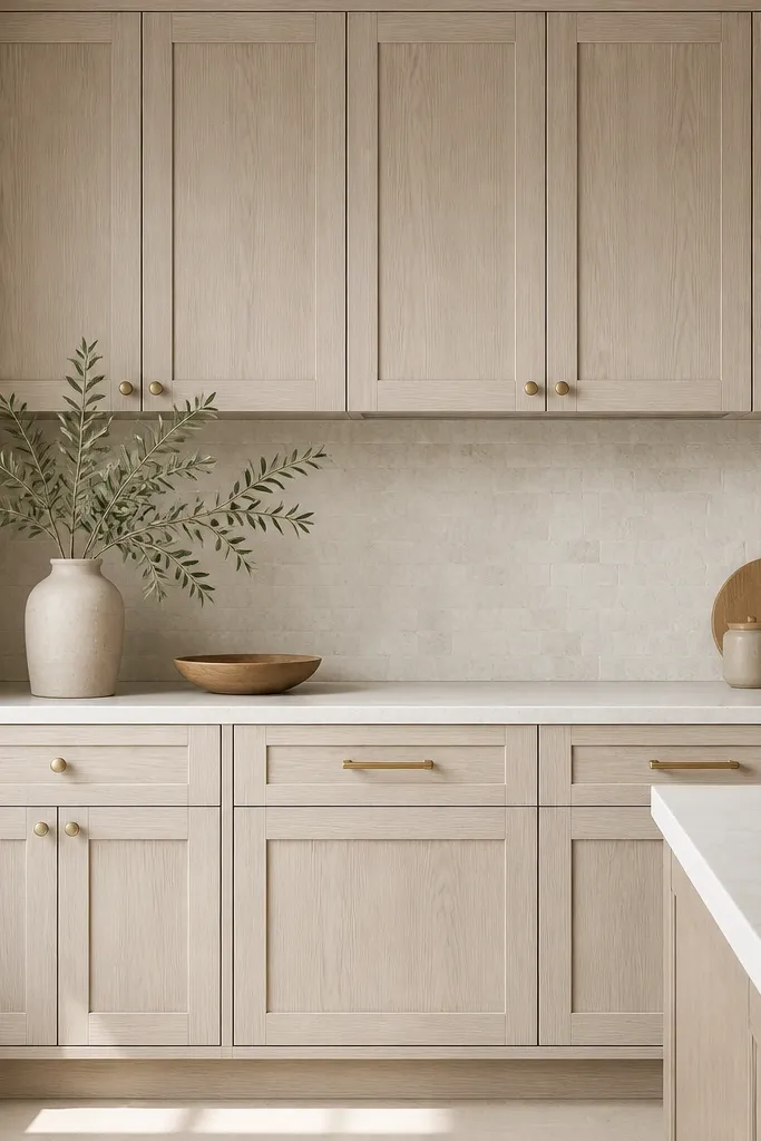
Some white oak finishes pull gray-green, and that’s not a problem if you pair it with warm whites. I learned this after my first sample looked perfect in daylight but turned chilly under warm bulbs. With warm white walls (not stark bright white), the gray-leaning oak looks clean and modern instead of dull. This is especially flattering if your kitchen has stainless appliances and you want a softer, less industrial vibe. It also helps if you have cooler skin undertones in your household — the overall palette reads balanced rather than washed out.
Start by selecting a warm white wall paint swatch and hold it next to the cabinet sample. Then pick a white oak finish that clearly shows a light gray cast in the sample, not one that’s honey-toned. Finally, keep countertops light with subtle veining and choose matte hardware like brushed nickel to avoid clashing with the gray undertone. Add a light stone backsplash with tiny movement so the cabinets don’t look isolated.
Good to knowIf your oak sample looks green, don’t “fix” it with a cooler wall. Match with warm whites and matte metal hardware.
AvoidAvoid pairing gray oak with crisp bright white walls — it makes the kitchen feel cold and flat.
3. Two-tone look using white oak uppers and painted lowers
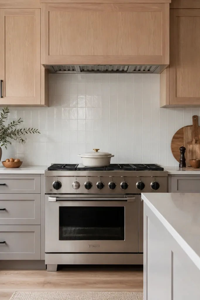
I used white oak only on the uppers because I wanted the warmth at eye level while keeping the lower run grounded. Painted lowers in a soft warm gray keep the kitchen from feeling too “wood heavy,” especially if you have a lot of cabinet height. Matte black hardware ties the two materials together and gives the layout crisp lines. This combination flatters kitchens where the dining table is dark wood or where the floor is mid-tone — it keeps the visual weight balanced. It also photographs well because the oak grain stays visible where your eyes land first.
Start by choosing the painted lower color from a physical sample next to your countertop, then lock it in before ordering doors. Order white oak uppers in satin finish and keep the painted lowers in a durable kitchen-rated paint finish with a matte or eggshell sheen. Then install matte black pulls and knobs consistently — same spacing rules on every door. Finally, style the open areas with one warm texture like a woven runner so the painted lowers don’t look stark.
Keep the cabinet heights consistent across the two-tone line. Uneven top rails make the look feel accidental.
Avoid using two-tone with glossy paint — it makes the wood grain look muted and the kitchen feels dated fast.
4. Full-height pantry panels for a clean grain run
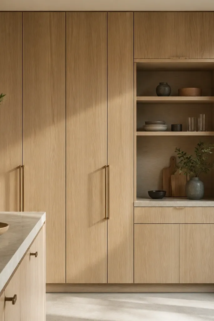
A full-height pantry gives you the best “white oak” effect because the grain has room to breathe. I learned to pay attention to how the cabinet door panels align vertically so the grain doesn’t break awkwardly. With a satin finish, the grain reads as a warm texture instead of a busy pattern. Slim vertical pulls keep the lines tall and make the pantry feel intentional rather than like a pile of cabinets. This setup flatters narrow kitchens because it pulls the eye upward. It also works well for households that store a lot — the pantry becomes a visual anchor, not a clutter spot.
Start by choosing door panel layout so the grain direction stays consistent across the pantry doors. Then install a full-height trim or panel frame rather than separate box tops — it keeps the oak looking like one piece. Pick slim pulls in brushed brass or satin nickel, and keep them aligned at the same height on every door. Finally, leave the pantry door faces un-styled and let the inside shelves do the work with baskets that match the wood tone.
Ask for the grain-matched option if your vendor offers it. Even a minor mismatch shows up on tall doors.
Avoid mixing different oak finishes within one pantry wall — it creates a visible “patchwork” effect.
5. Shaker doors with soft-close that actually feels quiet
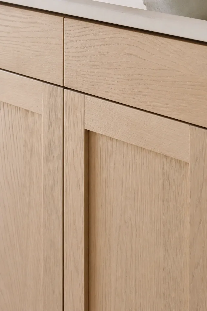
I went with shaker-style doors because the panel lines make white oak look structured, not rustic. The trick is soft-close hinges that close with a slow, controlled motion — you shouldn’t hear a hard “thunk.” When you pair shaker lines with satin white oak, you get a clean kitchen that still feels warm. This is a good choice if you have kids or roommates because the sound level drops immediately when everyone starts using cabinets. It also flatters smaller dining spaces since the shaker lines add order to the room.
Start by choosing a hinge brand with a true soft-close feature, and request the same hinge model across all doors. Then pick a shaker door profile with a panel depth that doesn’t look too shallow — shallow panels can look flat in oak. Install the doors so the reveal lines are even; uneven reveals make the grain look off too. Finish by adjusting the soft-close speed so drawers glide in at a consistent pace.
Good to knowTest the hinge by closing one drawer with your palm at different speeds. If it slams or bounces, switch hinge settings before install is complete.
AvoidAvoid cheap soft-close kits — they add friction and make doors feel sticky after a few months.
6. Glass-front uppers only above the dining side
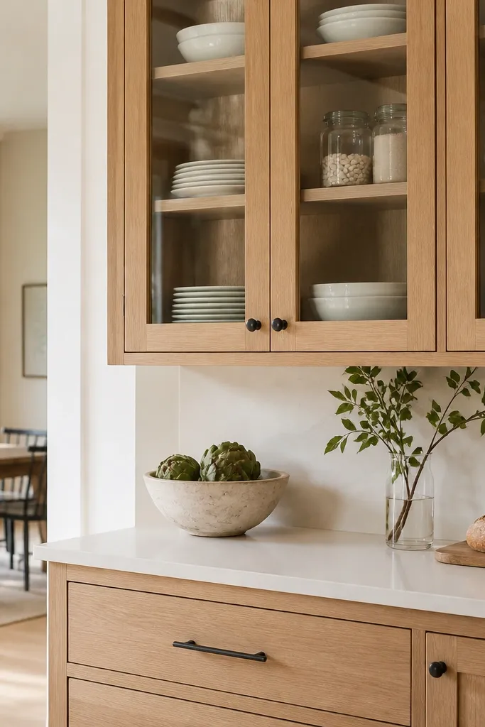
I used glass-front uppers on only one run to keep the kitchen airy without turning it into a display cabinet. Clear glass shows the cabinet interior, so you need a tight organization system — otherwise the kitchen looks messy even when it’s clean. The white oak frame warms the glass, and the satin finish prevents glare that can make the glass look cloudy. This works best if you have a dining nook or an open doorway where you see the cabinets from another angle. It also flatters kitchens where you want to add texture without adding more wood everywhere.
Start by choosing clear glass with minimal tint and install it in the upper doors only. Then plan your shelf layout inside: I used matching heights for plate stacks and left a small “jar zone” so everything isn’t mixed. Keep the cabinet frames satin white oak and choose slim pulls so the glass feels light. Style the inside with white dishes or clear glass jars so the wood grain stays the background, not the main clutter.
Use risers for plates so the bottom shelf doesn’t show random stacks.
Avoid frosted glass across everything — it hides the wood grain and makes the upper cabinets look dull.
7. Open shelf ledge in white oak with a linen runner

I added one open shelf zone with a white oak ledge when I realized my kitchen needed a texture break. Closed cabinets can feel too uniform, especially with shaker doors and lots of uppers. The open shelf makes the wood look intentional and gives you a place for everyday items, like mugs, that are already pretty. A linen runner adds softness and prevents the wood from feeling too “hard” visually. This setup flatters kitchens with light floors or minimal wall art because it adds a warm focal point. It also works for people who actually use their coffee station daily.
Start by picking a single shelf location, usually near a coffee bar or near the dining nook. Then finish the ledge in satin to match the cabinet doors and keep the shelf brackets hidden or minimal. Arrange items by height: mugs on the front edge, one taller ceramic canister in the back. Finally, add a linen runner on the counter below and keep it slightly wrinkled — pressed linen looks staged and cheap.
Wipe the ledge with a dry microfiber cloth after styling. Oils from hands show faster on open shelves.
Avoid mixing too many wood tones on open shelves — it makes the oak cabinets feel less cohesive.
8. Matte black hardware with warm brass accents
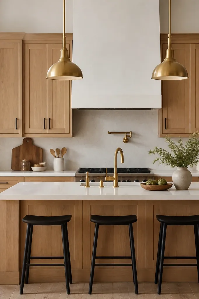
Matte black hardware gives the oak a crisp outline. I paired it with warm brass accents because it adds glow without making the kitchen feel like a “trend board.” The satin oak stays warm, and the black keeps the look grounded so the cabinets don’t float. This combination flatters kitchens with darker countertops or stone with gray movement. It also works well if your floor has some black undertones or if your dining chairs have black legs.
Start by matching the cabinet hardware finish across pulls, knobs, and any appliance handles you can. Then choose one warm brass element — I used a brass faucet and pendant lights — and keep it limited so the palette doesn’t get busy. Install the pulls at consistent height; I used a height that puts the pull center around 2.5 inches below the top rail on most doors. Finish by adding a black-framed mirror or black barstool accents so the hardware doesn’t feel random.
Good to knowIf you have stainless appliances, keep the hardware black and the faucet brass. The contrast looks intentional, not mismatched.
AvoidAvoid mixing polished black with satin oak — the shiny hardware looks out of place and shows scratches.
9. Brushed nickel hardware for cooler, clean kitchens
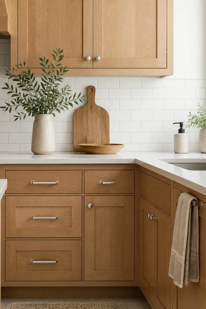
Brushed nickel is my go-to when the rest of the kitchen reads cooler: stainless appliances, light gray grout, and a countertop with gray veining. With satin white oak, nickel keeps the hardware from turning too yellow next to the grain. The result looks clean up close and calm from a distance. This is flattering for kitchens that are bright and airy, where you want the cabinets to feel crisp instead of cozy. It also makes the oak look more “true” to its grain rather than turning honey-toned.
Start by matching brushed nickel to your faucet or match it to your lighting hardware if the faucet is already fixed. Then choose satin white oak doors so the cabinet sheen doesn’t compete with the metal. Install pulls with consistent spacing and align them across all doors in that run. Finally, use light gray grout or a backsplash with soft gray movement so the nickel and oak sit together without fighting.
Good to knowWipe nickel hardware once a week with a slightly damp microfiber cloth. It keeps the brushed texture from looking dull.
AvoidAvoid mixing brushed nickel with polished chrome accents — the shine levels look sloppy.
10. Counter-to-cabinet reveal that makes oak look custom
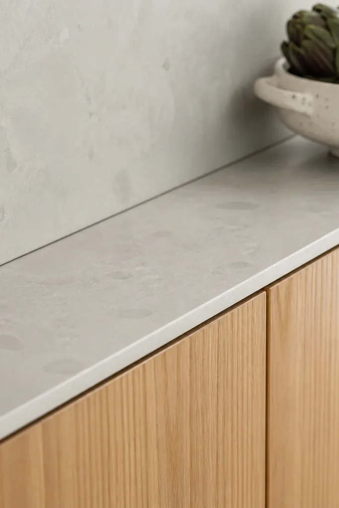
The gap between your countertop and the cabinet face changes how “built” the kitchen looks. I learned this when I compared two mockups: one had a tight, even reveal, and the other had a wider gap that made the cabinets look like boxes sitting on a counter. With white oak, a clean reveal makes the grain look intentional and gives the cabinets breathing room. This looks best when the backsplash meets the cabinet neatly and the countertop edge is consistent. It’s flattering for kitchens with busy stone counters because the reveal line creates order. It also makes the space feel more expensive even when the cabinet style is simple.
Start by measuring your countertop thickness and edge profile before you order any trim. Then plan an even reveal line so your cabinet face sits consistently above the counter — you want the same shadow gap along the run. Use a backsplash that goes up cleanly to the cabinet line so you don’t get a chunky transition. Finally, check the reveal from eye level and from across the room, since perspective changes how wide it looks.
Good to knowAsk your installer to dry-fit the backsplash and check the reveal with the countertop in place. Fixing it after the stone is cut is more painful.
AvoidAvoid uneven caulk lines at the cabinet bottom — they make oak look like it was rushed.
11. White oak cabinets with a light stone backsplash and warm grout
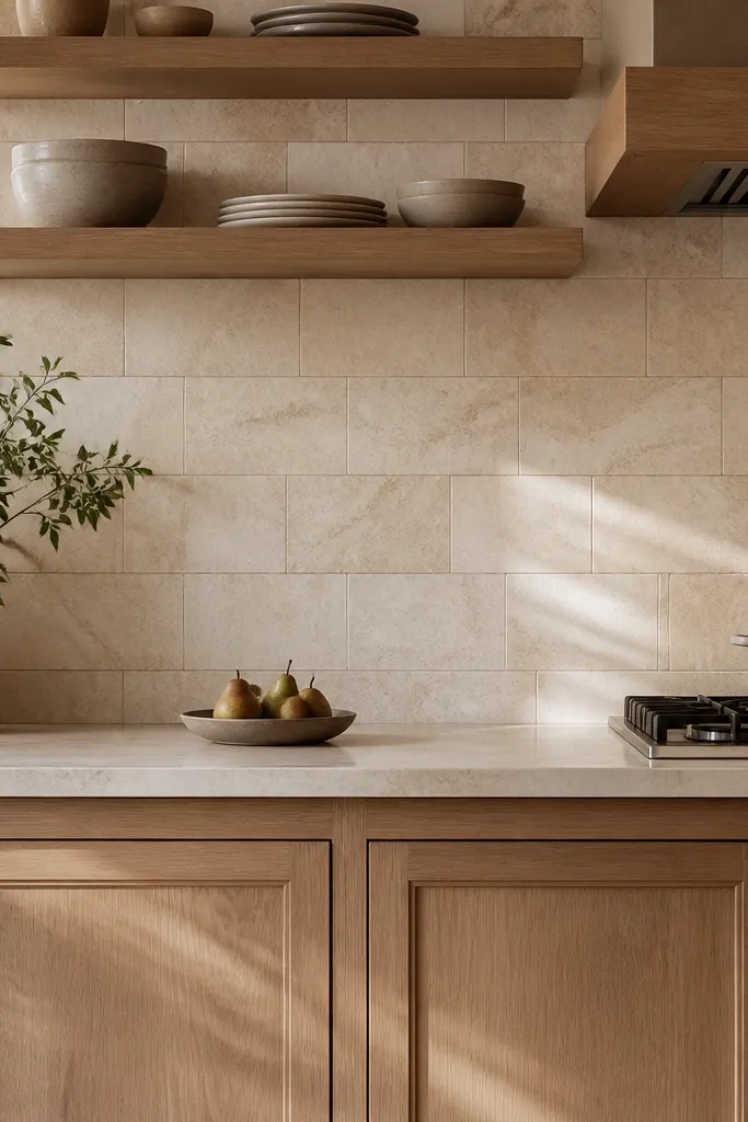
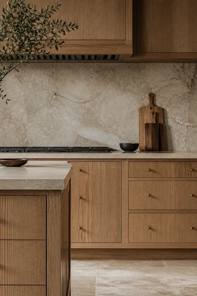
I chose a light stone backsplash because it gives the oak a soft backdrop, and warm grout keeps the whole kitchen from turning gray. When grout is too cool, the oak undertone looks wrong even if the cabinet finish is correct. The stone’s subtle movement keeps the backsplash from looking flat, so the grain stays readable. This pairing works especially well with white oak that leans creamy or slightly honey. It also makes the kitchen flattering for warmer skin tones and adds a “friendly” feel when guests walk in. If your kitchen sees a lot of natural light, the stone movement looks crisp instead of busy.
Start by picking a light stone tile with fine veining, not big dramatic chunks. Then choose warm grout — I used a light beige grout, not bright white, because it softens the lines. Install the backsplash so it aligns with the cabinet stiles and keep the caulk line tight at the edges. Finally, style the counter with one warm element like a terracotta soap dispenser or a wood utensil crock to echo the grout.
Good to knowTest grout samples in the actual lighting. Warm grout can look gray if your kitchen bulbs are too cool.
AvoidAvoid bright white grout behind warm oak — the contrast can look harsh and cheap.
12. Farmhouse sink zone with oak panels and a narrow trim
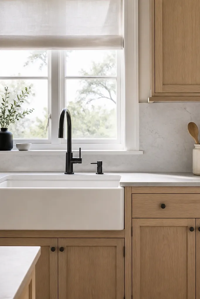
I framed my sink wall with white oak panels and kept the trim narrow. That detail matters because farmhouse sinks already pull visual weight, and you don’t want chunky cabinet trim fighting the sink apron. The satin oak makes the sink zone feel warm and practical instead of rustic overload. Matte black on the faucet ties the sink hardware to the rest of the kitchen. This setup flatters kitchens with neutral countertops and a bit of contrast in the flooring. It also works well if you have a window above the sink because the oak paneling creates a calm frame.
Start by choosing a narrow trim profile around the sink cabinet run so the oak frame looks intentional. Then install the farmhouse sink and confirm the cabinet front alignment with the sink apron before final caulk. Use matte black faucet and soap pump so the sink zone doesn’t look disconnected. Finally, choose a backsplash that stays simple behind the sink — small tile or a single slab keeps focus on the sink and oak grain.
Good to knowDry-fit the cabinet fronts around the sink before you drill — farmhouse sinks can shift the line by a few millimeters.
AvoidAvoid thick, chunky trim around a farmhouse sink. It makes the whole wall heavy and dated.
13. Open corner cabinet with angled shelves
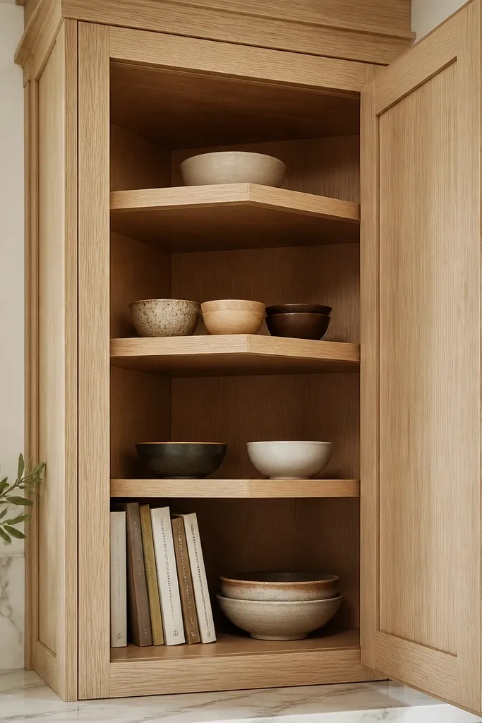
Corners are where kitchens look either thoughtful or messy fast. I installed a corner cabinet with angled shelves and a white oak frame so the space feels usable and intentional. Angled shelves turn awkward depth into a neat viewing angle, and satin oak makes the corner feel warm rather than cramped. This works best in kitchens that have lots of cookware storage and need a “grab zone.” It also flatters smaller layouts because the corner becomes a functional display instead of a dead space. If you entertain, it’s handy for serving bowls and extra glassware.
Start by planning what you’ll store in the corner — I used bowls, platters, and a few everyday cookbooks. Then choose angled shelf units sized to your cabinet opening so there’s no weird overhang. Keep the cabinet frame satin white oak and match the hardware style with the rest of the kitchen. Finally, style with a repeating color set, like white bowls with one black ceramic canister, so the corner looks edited.
Use small baskets or risers so items don’t slide forward on the angled shelves.
Avoid stuffing a corner with mixed items. Angled shelves show everything.
14. White oak cabinets with a dark walnut dining table
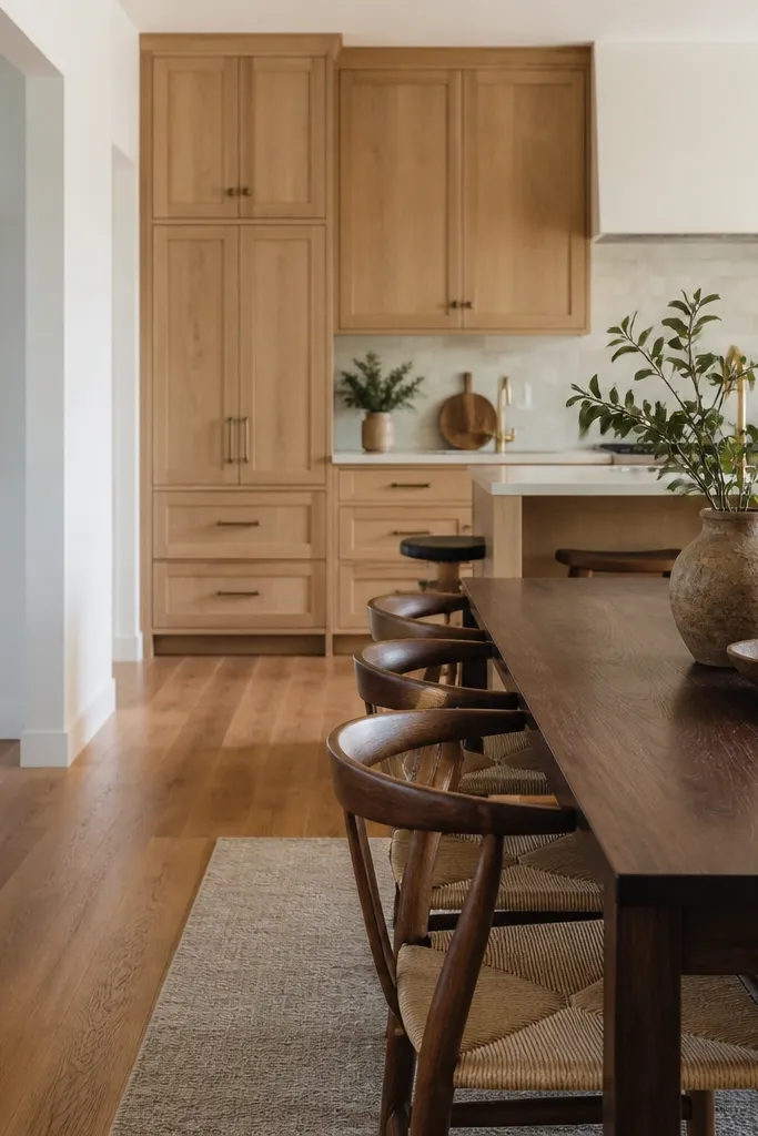
This is the pairing that made my whole kitchen feel grounded. White oak cabinets look lighter than they feel, so a dark walnut dining table gives you the anchor your eye needs. The warm tones sit together, but they’re not identical, which keeps the space from looking like one big block of brown. I kept my hardware in brushed brass or satin nickel so it didn’t fight the walnut’s warmth. This combination flatters open-plan homes where the kitchen and dining share sightlines. It also makes the cabinets look more expensive because the surrounding furniture has depth.
Start by choosing your dining table first if it’s already in the room — match the oak undertone to it. Then keep your backsplash light and simple so the table can provide the dark contrast. Install satin white oak cabinets with grain-forward doors so the wood texture reads clearly. Finally, add a runner or placemats in a neutral fabric, like oatmeal or light linen, to bridge between oak and walnut.
Good to knowIf your walnut table is very reddish, pick a white oak finish with less honey and more creamy neutral tone.
AvoidAvoid pairing honey-toned oak with a red-brown table. The kitchen turns too warm and looks tired.
15. Soft warm lighting to bring out oak grain
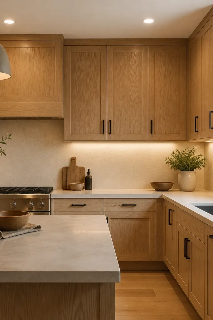
I learned quickly that white oak looks different under cool lighting. With bright white LEDs, the grain looks gray and the finish looks flat. When I switched to warmer bulbs and used under-cabinet lighting, the oak grain popped without turning yellow. This matters because white oak is a “texture wood.” It needs light that shows micro-contrast across the grain. This setup flatters kitchens with quartz counters because the warmer light softens the quartz shine. It also makes glassware look better if you have glass-front uppers.
Start by choosing a lighting temperature around 2700K to 3000K for kitchen bulbs. Then add under-cabinet LED strips with diffusers so you don’t get bright hotspots on the cabinet faces. Position the lighting so it grazes the wood grain, usually angled slightly from the front edge upward. Finally, test with the same plates and countertop items you’ll use daily. The goal is a calm glow on the oak, not a glare line across the doors.
Turn off overhead lights during a test. If the oak looks dull, your under-cabinet angle needs adjustment.
Avoid mixing bulb temperatures. If one light is 4000K and another is 2700K, the oak undertone will look inconsistent.