1. Linen runner under the tray with a matching canister set
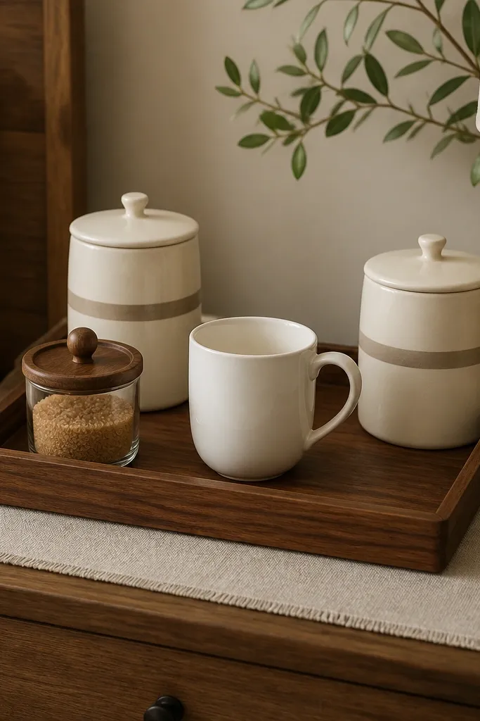
In my place, the “before” version looked like a laptop setup — everything spread out and the water rings showed through the wood. The runner fixes that by adding a soft buffer and making the tray feel like a planned vignette. I like linen because it hides minor stains better than cotton and it catches light in a way that feels warm at 7 a.m. The cream and taupe combo works especially well if your bedding is white, oatmeal, or greige. It also flatters cooler skin tones because cream reads clean and not yellow.
Start by cutting your linen runner to fit the tray footprint. Leave 1-2 inches of runner visible on the left and right edges so it frames the tray without bunching. Then place the two matching canisters in the back corners and keep the mug centered. Finally, add one small item — a sugar jar or a spoon crock — so the front doesn’t look empty. Keep everything on the tray so the bedroom stays visually calm.
Good to knowSpritz the linen lightly with water and press it flat so the edges look crisp instead of wavy.
AvoidDon’t use a slippery satin runner — it shifts every time you lift the tray.
2. Two-tier riser for mugs and filters (the height cheat)
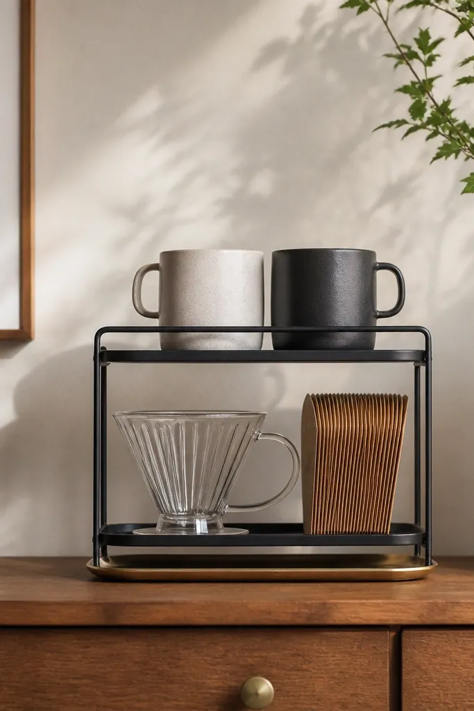
This is the fastest way I’ve found to fix the flat, cluttered “before” look. A two-tier riser turns your coffee tools into a mini display with clear zones, and it makes your corner look taller even in a narrow bedroom. I used a black stand because it ties into most bedroom hardware — bed frames, curtain rods, and nightstand knobs. The stand also keeps filters off the surface, which reduces that sticky, lived-in mess feel. If your room is mostly light wood and white bedding, black adds contrast without looking heavy.
Place the riser on a tray so spills don’t hit the dresser directly. Put mugs on the top shelf first, spacing them about one mug width apart. Then load the bottom shelf with your dripper and one side of filter packets so the other side stays open for a small spoon dish. Add a small tray liner or a thin paper towel roll tucked behind the dripper for a clean look. Keep the same color for the mug exteriors (white or one solid tone).
Angle the mug handles outward like a book cover so the handles read clearly from across the room.
Don’t stack mugs on the same shelf edge — it makes the corner look crowded and uneven.
3. Brass tray + black ceramic mugs for instant contrast
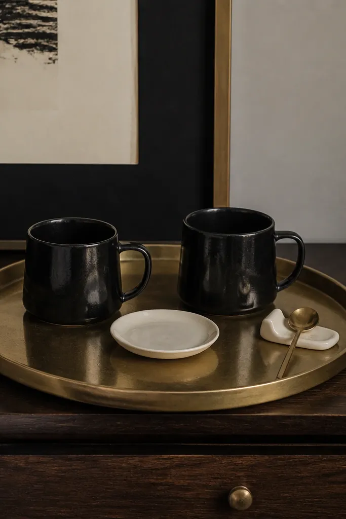
I love brass here because it reflects morning light and makes the corner feel polished without being shiny-to-the-point-of-cheap. In the before photos I’d use a plain silver tray, and everything looked dull and gray. Brass warms the space, especially if your bedroom runs beige, cream, or light oak. Black mugs add a strong anchor so the corner doesn’t blend into the nightstand. This combo looks especially good if your bedding has black piping, a charcoal throw, or dark patterned pillow covers.
Start with a brass tray that’s wider than your mug set by at least 4 inches total. Center two black mugs with equal spacing, then place a small saucer or spoon holder in the gap. Add one framed piece behind — keep the frame color in the same brass tone or go black to match the mugs. Finish by adding a single accent item like a small brass spoon or a black-and-cream stir stick jar. Keep labels facing inward so the tray looks tidy from the door.
Good to knowWipe the brass with a dry microfiber cloth after each use so it stays golden, not smudgy.
AvoidAvoid mixing three metal finishes on the same tray — brass, silver, and copper all together makes it look random.
4. Clear glass cloche to hide the sugar and sweeteners
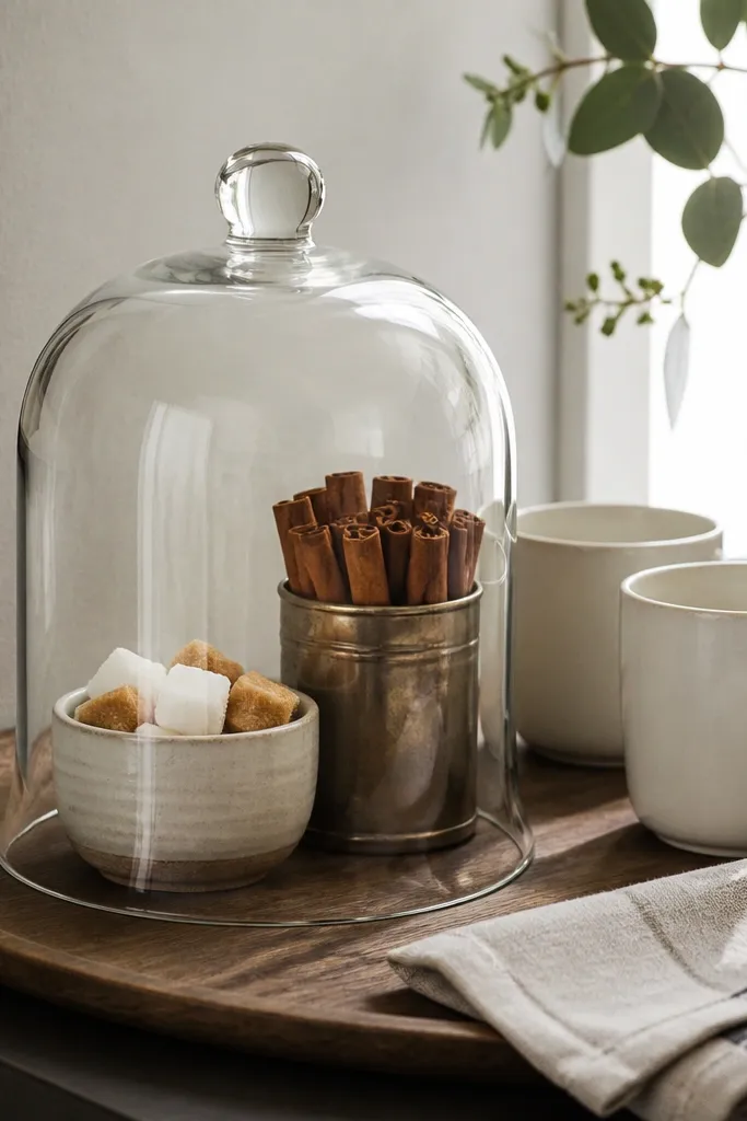
This one is a life-saver if your bedroom coffee area turns into a dumping ground. The cloche makes the “before” mess disappear because everything small and messy lives under glass. It also adds a little drama without taking over the room, and the glass makes your corner feel airy. I used a white ceramic base under the cloche so the contents don’t look cluttered. This style flatters rooms with soft neutrals — it looks clean against light walls and it doesn’t fight patterned bedding.
Start by placing the cloche on the back half of your tray. Put your sugar and sweeteners in a single bowl arrangement so you’re not hunting for items. Then set one mug on the left and one on the right, leaving the center for the cloche. Fold a linen napkin and tuck it near the front edge so the tray looks styled, not storage. Finally, keep any packets (if you use them) out of sight — either inside the tin or behind the cloche.
Good to knowDust the inside of the cloche with a dry cloth once a week so it stays crystal clear in photos.
AvoidDon’t put loose sugar packets on top — they break the clean, contained look.
5. Wallpaper-backed mini shelf behind the coffee station
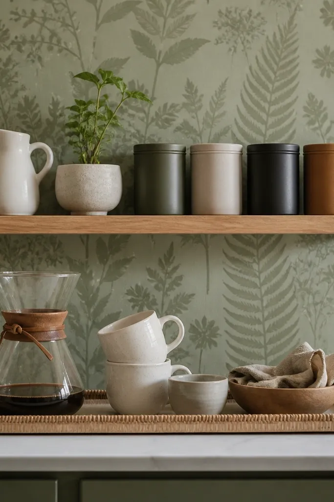
A plain wall makes the coffee corner look like it’s sitting on furniture instead of belonging to the room. Adding wallpaper behind the shelf gives you instant depth and a “designed” backdrop, which fixes the before photos where the corner looks like an afterthought. I picked sage because it works with both warm oak and cool gray bedding. A floating shelf also keeps your tray surface clear, so your morning setup feels easier. This is the best move if your bedroom has a blank wall spot near the dresser or headboard.
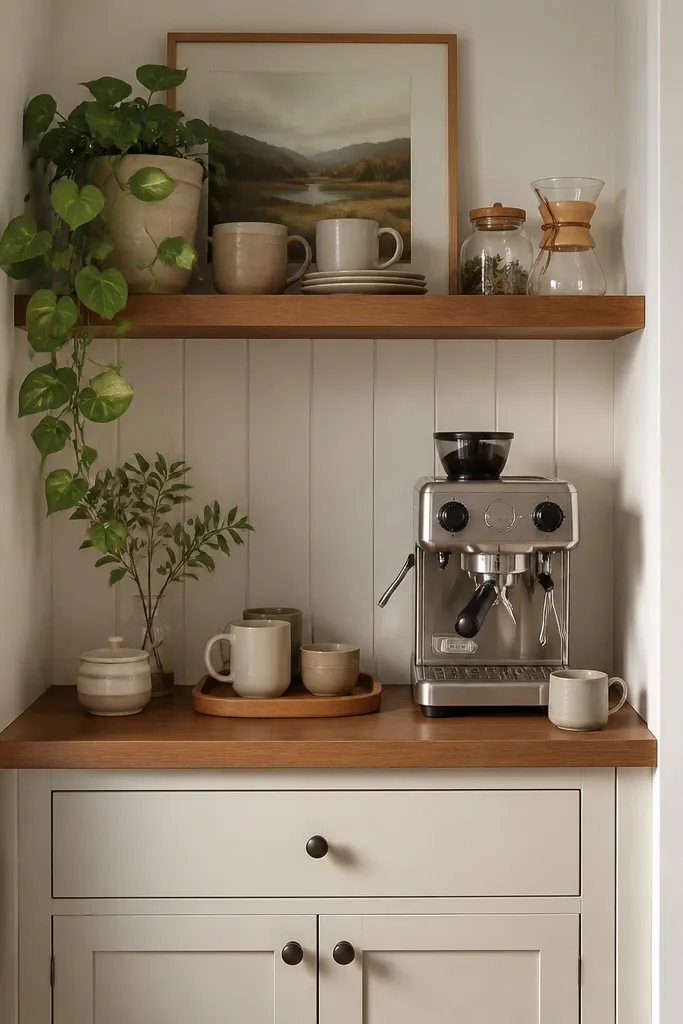
Start by choosing a small shelf width that matches your tray — aim for the shelf to be 2-4 inches wider than the tray. Mount it so the bottom of the shelf sits about 8-10 inches above the tray surface. Then hang or place three vertical items on the shelf: a pitcher, a small plant, and one coffee tin. Put the tray in front with mugs and a dripper centered. Keep the color of shelf accessories aligned — sage wall + white ceramics + one wood or brass accent.
Good to knowUse a level and mark the wall holes before you peel any wallpaper — straight shelves make everything look expensive.
AvoidDon’t choose busy wallpaper if your bedding is already patterned — you’ll end up with visual noise.
6. Wallpaper strip + command hooks for a utensil rail
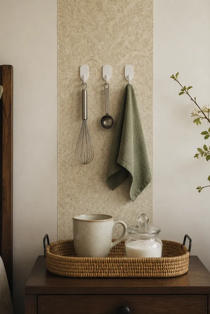
I did this after my coffee scoop disappeared into a kitchen drawer every other day. Hooks keep small tools where your hand expects them, and the towel gives the corner a lived-in, bedroom-friendly vibe. The wallpaper strip adds personality without covering the whole wall. I’ve used this in small rooms where a shelf felt too bulky. If your bedroom is neutral, the patterned strip adds just enough color to make the corner feel styled, not cluttered.
Start by applying a vertical wallpaper strip only 10-14 inches wide so it looks intentional as a backdrop. Mark the hook spacing so the utensils hang at different heights — whisk at the top, scoop in the middle, towel at the bottom. Mount the hooks on the strip area and keep the hooks aligned with the tray centerline. Then build the tray with one mug, one sugar jar, and your dripper. Finish by choosing one towel color that matches a pillow or throw in the room.
Hang the towel so it overlaps the tray by about an inch — it visually ties the wall hooks to the surface.
Avoid hanging wet tools — let them dry first or you’ll get water spotting on the wallpaper.
7. Color-matched tray liner with a simple mug grid
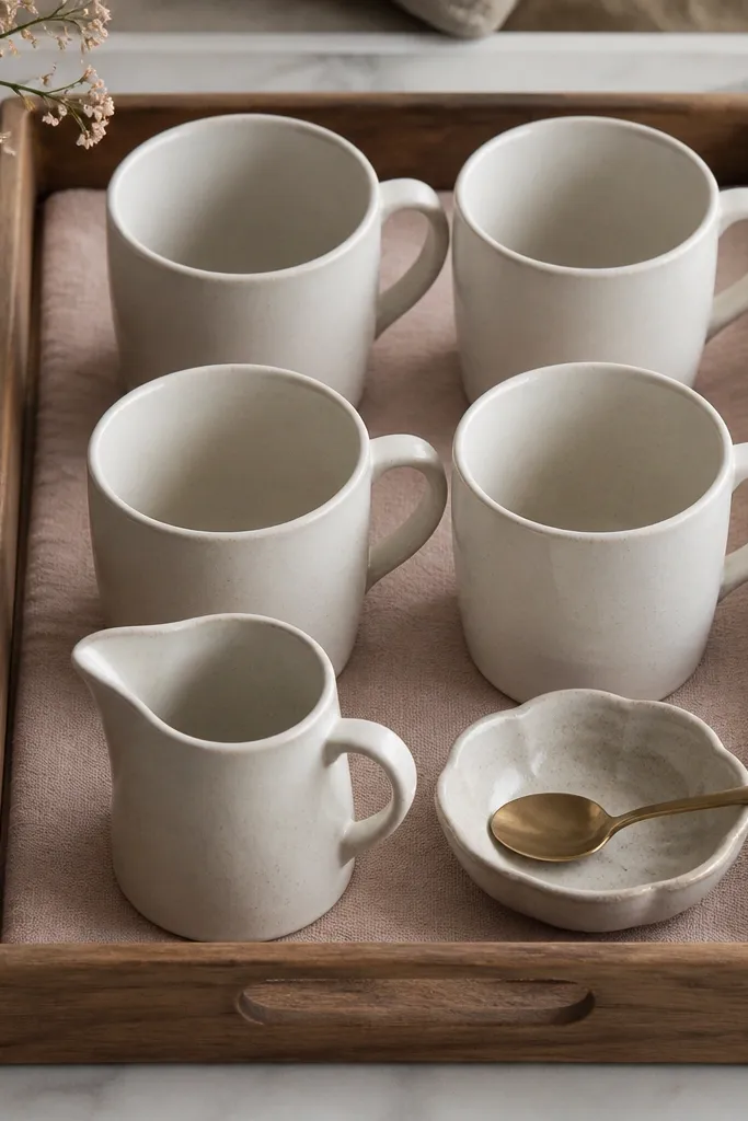
This is the “before” problem I fix the most: mugs scatter like a garage sale. A tray liner gives you a soft boundary, and the mug grid makes it look like you planned it for guests. I like blush or dusty rose liners because they blend with lots of bedroom palettes — cream, gray, and even olive. The grid also flatters narrow nightstands because it uses the tray space efficiently. If your bedding has pink tones (pillowcases, throw blanket), the match looks natural and calming.
Start by cutting a tray liner to the exact tray shape, then fold the corners under so it doesn’t bunch. Place the mugs in a 2x2 grid with handles facing the same direction. Keep a small gap of about 1 inch between mugs so they don’t look pressed together. Add a small pitcher and spoon dish at the front edge, centered. Choose one tray color that matches your liner — I used a dark wood tray so the blush liner stands out.
Use painter’s tape to mark mug positions before you place anything — you’ll get symmetry faster.
Don’t mix mug shapes in a grid — two heights max or it looks mismatched.
8. Tall plant behind the corner to lift the whole vibe
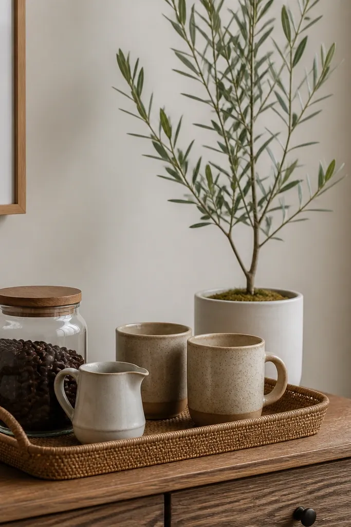
When your coffee corner sits low, it reads like clutter sitting on a surface. A tall plant fixes the vertical balance, and it does it without adding more tiny objects. I’ve found that a slim plant in a white pot makes the corner feel cleaner than chunky planters. It also softens the hard lines of trays and canisters. This works best in bedrooms with neutral walls and a bit of natural light because the leaves catch it and make the corner look alive.
Start by placing the tray on the dresser so it’s centered under the plant’s pot. Put the two mugs on the tray, one left and one right, with the coffee tools in the middle. Add a small jar or creamer in front so the tray has depth. Then place the plant behind the tray with the tallest leaves just above the top of the mug handles. Keep the plant pot color in the same family as your ceramics — white with white, or black with black.
Good to knowRotate the plant pot weekly so the leaves keep a symmetrical shape behind the coffee corner.
AvoidAvoid a plant with big blooms if your bedding is already busy — it competes with the coffee setup.
9. Framed menu board for coffee names and a single chalk marker

I used to keep coffee notes on sticky tabs, and the corner looked messy even when everything was clean. A framed menu board turns that note habit into decor. The key is to keep the writing minimal — two drinks max — so it reads intentional, not chaotic. Chalk or chalk marker looks great in bedrooms because it feels human and soft. This works especially well if your bedroom already has black accents like picture frames or mirror frames.
Start by choosing a frame that’s narrow, about 8-12 inches wide, so it doesn’t dominate the wall. Use a board inside that has a matte surface — chalkboard paint or a chalk marker sheet. Write two drink options and keep the handwriting consistent in one size. Place the frame behind the tray, leaning it so it sits at the same height as the mugs. Then style the tray with one dripper, one mug, and one labeled sugar jar so the board doesn’t carry all the visual weight.
Use a single chalk marker color like white on black so the board matches the tray accents.
Don’t add five menu lines — too much text makes the corner look like a temporary sign.
10. Monogrammed towel + matching mug color for a guest-ready feel
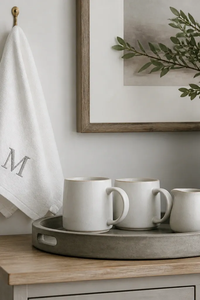
The before version always looked like I grabbed whatever towel was closest. A monogram towel changes that because it looks chosen, not random. I like gray thread on white because it stays neutral and doesn’t clash with most bedding colors. Matching the towel with your mug color makes the whole corner feel coordinated even if the rest of the room is plain. This is a great move if you want the coffee corner to feel like a hotel detail without buying a ton of decor.
Start by hanging the towel so it’s visible when you glance at the dresser from the doorway. Choose a monogram color that matches one other element in the room — gray throw, gray pillow, or gray frame. Keep the tray simple: two mugs in the same color family and one small creamer pitcher. Add a sugar jar or spoon holder that matches the towel thread tone with a label or simple design. Make sure the towel doesn’t touch the tray surface — keep it beside, not draped over.
Good to knowFold the towel in a crisp triangle so the monogram stays centered.
AvoidAvoid bright neon monograms — they make the corner feel like craft supplies.
11. Oversized art print behind the tray with a small coffee vignette
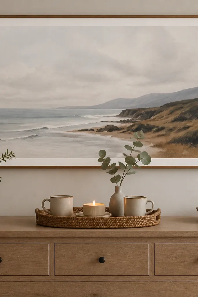
If your coffee corner is competing with the rest of the bedroom, it looks messy no matter how tidy you keep it. An oversized art print gives your eye a strong anchor above the tray, and then the coffee vignette can stay minimal. I like keeping the coffee items fewer here because the art already gives drama. A faux eucalyptus stem in a slim vase adds a bedroom softness without taking over. This works best when your bedroom walls are blank or when you want the coffee corner to feel like part of the room, not an island.
Start by centering the art print over the dresser so the bottom edge sits about 6-10 inches above the tray area. Place the tray centered under the art, then limit the tray to two mugs and one or two accessories. Put the bud vase with eucalyptus in the back center, then place mugs left and right. Add a small candle or matchbox holder at the front corner. Keep your color palette to what’s in the art — I used off-white and muted green to match eucalyptus tones.
Choose art with one dominant light color so the tray doesn’t look dim under it.
Don’t add lots of tiny trinkets when the wall art is busy — it looks cluttered fast.
12. Vintage tray with patina + matching wood spoon rest
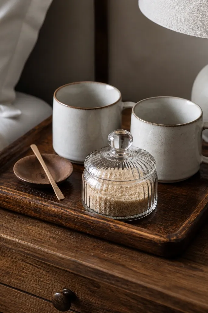
This style is for people who like lived-in, not precious. A vintage tray with patina hides small scratches and water spots better than a glossy new tray, so your after photos stay flattering longer. I paired it with a matching wood spoon rest because wood-on-wood looks intentional instead of random. The cream mugs keep it bright and bedroom-friendly. This corner style is forgiving if you drink coffee daily because it hides wear. It also looks great in bedrooms with wood headboards or rattan textures.
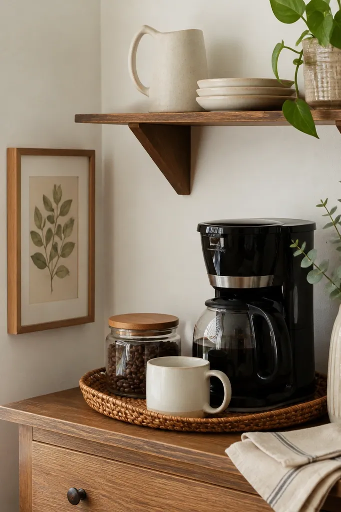
Start by placing the vintage tray on a stable surface and wipe it so the patina looks even. Put the glass sugar jar toward the back left and the two mugs toward the back right. Add the wood spoon rest at the front so your hand naturally reaches for it. Keep the front edge clear except for one small item like the stirrer. Finally, choose one extra accent that matches wood — a small frame, or a single wood picture ledge.
Good to knowSeal the wood spoon rest lightly with food-safe wax so it stays smooth and easy to clean.
AvoidAvoid pairing patina wood with sleek chrome accessories — it makes the corner feel mismatched.
13. Glass jar apothecary system for beans and tea
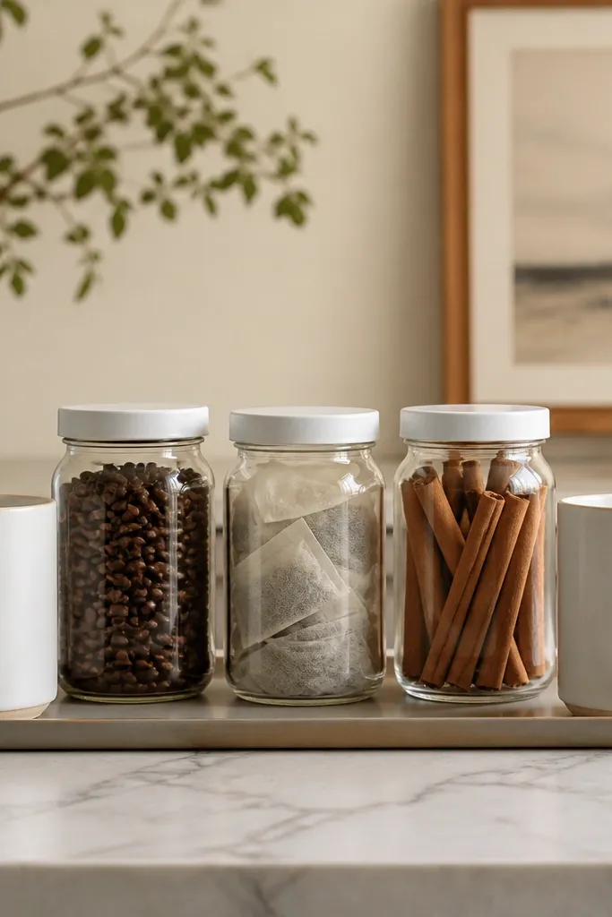
When your coffee corner has loose packets everywhere, it looks chaotic even if you’re organized. The apothecary jar setup turns ingredients into decor and keeps your daily grab items visible. I like clear glass because it shows texture — beans look good, tea bags look neat. White lids keep it clean and match most bedroom palettes. This style works best if your bedding is white, light gray, or soft beige because it keeps the corner from looking too dark. It also flatters people who like a clean, minimal look but still want warmth.
Start by grouping three jars so they fit on the back of the tray with 1-2 inches of spacing. Label them with simple white paper labels or vinyl labels in one font style. Place the jars first, then add mugs on the left and right. Keep the front area for one practical item like a small spoon dish. Finally, wipe the jar lids so fingerprints don’t make the tray look messy in daylight.
Good to knowUse the same lid size for all jars so the corner looks like a set, not a collection.
AvoidDon’t overfill jars — leave a 1-inch gap so labels stay readable and lids don’t stick from overflow.
14. Black-and-white striped mug stack with a rolling cart base
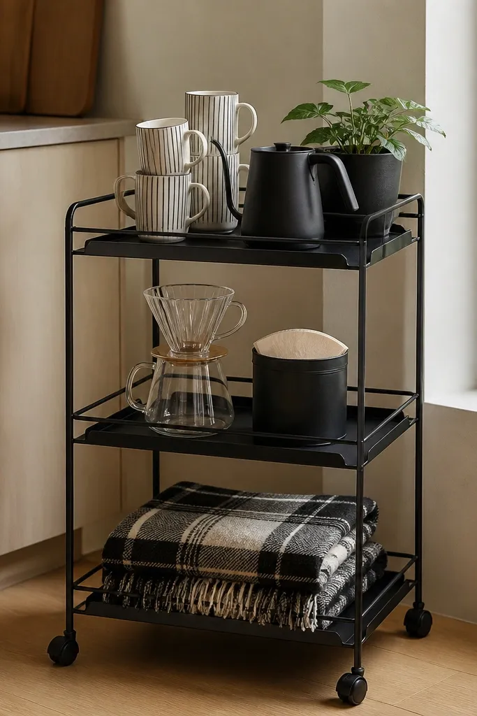
A rolling cart is the secret when your bedroom needs flexibility. In my case, the before setup lived on the nightstand and blocked my lamp at night. With a cart, everything moves together and your coffee corner stays tidy. The striped mugs add a graphic look that feels fun without being loud. The plaid throw on the bottom shelf is a hidden softness trick — it makes the cart feel bedroom-made, not kitchen-made. This works if you like black-and-white accents or if your bedroom has a striped rug or pillow.
Start by placing the cart so the top shelf sits at about the same height as your nightstand lamp base. Put the mug stack on the top shelf, but keep the number to two or three mugs so it doesn’t look like a storage bin. On the middle shelf, set the dripper and filter tin side by side. Add one tray or small basket to keep small items from sliding. Roll the cart to the wall when you want the corner to look clean, and pull it out only during coffee time.
Good to knowLine the cart shelves with thin felt or non-slip liner to stop mugs from clacking and shifting.
AvoidAvoid carts with too many open compartments — it turns into visual clutter fast.
15. Slim cabinet door shelf with labeled tins (closed storage look)
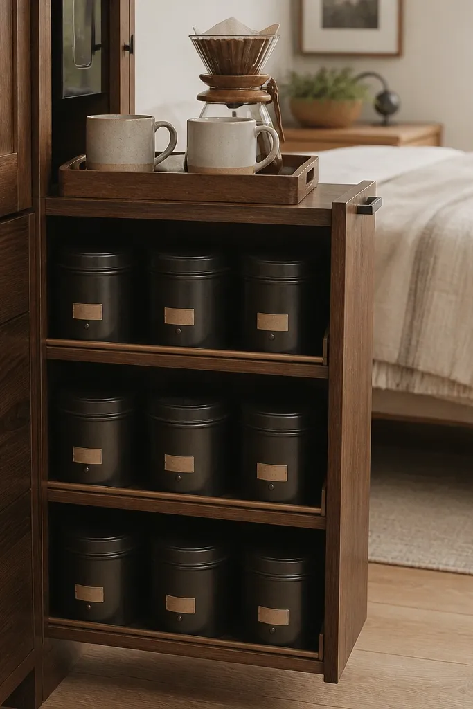
If you hate seeing clutter, closed storage is your best friend. The before version of my corner was open baskets, and it always looked busy because the lids were missing. With a slim cabinet shelf, only the daily coffee items are visible on top, while everything else stays tucked away. Labeled tins keep the system working even when you’re half asleep. This style looks clean in bedrooms with minimal decor because the coffee corner doesn’t become a visual burden.
Start by measuring your cabinet interior and choose a shelf insert that fits snugly. Keep three tins inside — coffee, tea, and sweetener — and label them with small tags facing outward. Then place a tray on the top of the cabinet shelf with two mugs and one pour-over dripper. Put the dripper in the back center so it doesn’t slide. Finally, keep the tray accessories limited to the items you use daily so you don’t overload the visible surface.
Good to knowUse a label maker and print labels in one font size so the system looks consistent.
AvoidDon’t store sticky items in open containers — they’ll leave residue inside the cabinet.
16. Ceramic tray with raised edges for a tidy spill zone
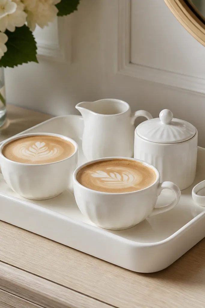
This is the practical style that still looks pretty. Raised-edge ceramic trays catch small drips and water rings, so the before problem (mess creeping across furniture) doesn’t happen. I picked a white tray because it looks crisp against wood and it matches bedding neutrals easily. The raised edges also make the tray feel like a “station” instead of a random plate. This works especially well if you’re using real milk or creamers and you want cleanup to be easy.
Start by choosing a ceramic tray with edges high enough to contain spills — at least 1/2 inch. Place it centered on the dresser so the tray edges are visible on all sides. Put the creamer and sugar dish toward the back, then set cups in front. Add a spoon holder at one front corner so it doesn’t cross the center line. Finish by wiping the tray edge after each use so it stays bright.
Good to knowKeep a small microfiber cloth folded next to the tray so you can wipe drips immediately.
AvoidAvoid glossy trays with deep colors if your bedroom is low light — smudges show up instantly.
17. Wood crate + pull-out basket for coffee essentials
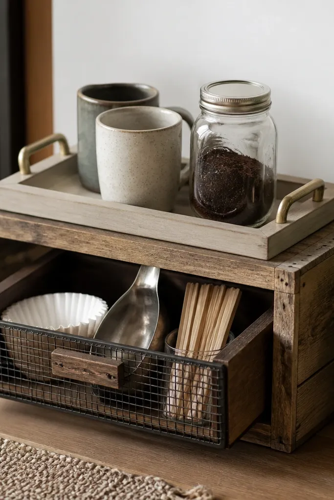
A crate makes the corner feel like part of a relaxed, lived-in bedroom. The before version looked like I had loose items on the dresser, and the whole corner felt temporary. A crate with a pull-out basket solves that because the messy stuff lives in the basket and the top stays styled. I like reclaimed wood because it brings warmth even in cool-toned rooms. This works great if your bedroom has natural textures — rattan, linen, or wood blinds.
Start by choosing a crate size that fits your space without blocking movement. Place a tray on top of the crate with two mugs centered. Then load the pull-out basket with filters, stir sticks, and a scoop — keep each category in a small container or zip pouch. Add one glass jar on the crate top for sugar or beans to keep the look intentional. Finally, keep the crate front visible so the basket pull looks like part of the design, not hidden storage.
Wrap the basket handle with twine or a ribbon in a neutral color so it looks finished.
Don’t use a crate with sharp edges near where you reach — it feels annoying and you’ll stop styling it.
18. Color-blocked wall shelf with one coffee book + small objects
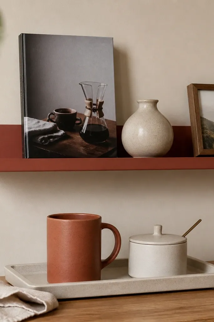
A shelf color that matches a pillow or throw can make the coffee corner look like it belongs to the room’s palette. In my bedroom, terracotta brought warmth to otherwise cool gray bedding, and the before corner looked too sterile. Keeping one coffee book upright gives you a natural vertical shape without buying extra decor. Small objects like a vase and a framed photo keep it personal. This style works best if you have at least one terracotta or warm clay item already.
Start by painting or choosing a shelf color that matches one accent in your room — terracotta, rust, or warm clay. Place the shelf above the tray so the book stands about 2-3 inches taller than the mugs. Put the book in the center, then add a small vase on one side and a framed photo on the other. On the tray below, choose mugs that match the shelf color family and keep the sugar dish in a neutral like cream. Arrange the tray items so the tallest object stays in the back.
Use book covers as color accents — pick one with cream, black, or warm tones so it blends.
Avoid crowding the shelf — three items max looks styled; five items starts to look like storage.
19. Desk-style lamp glow with a warm bulb for morning photos
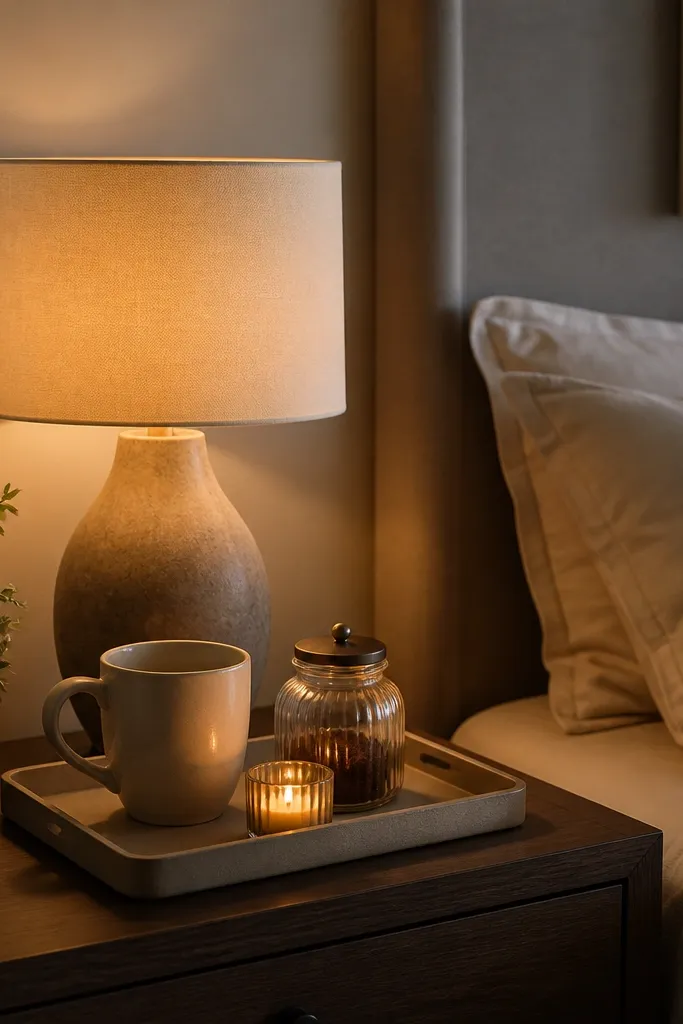
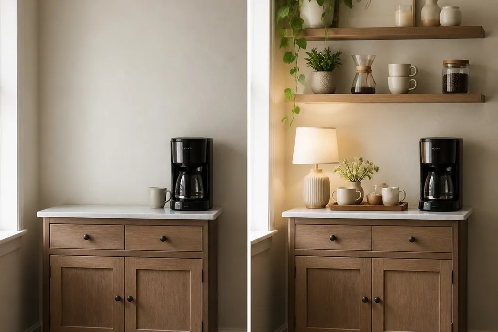
Lighting changes how your coffee corner looks more than any decor purchase. My “before” corner was styled the same, but it photographed gray because the overhead light was harsh. A small lamp with a warm bulb makes the tray look cozy and intentional, even when you’re using it daily. I like the lamp because it adds a second light source and makes shadows look flattering instead of stark. This works in bedrooms with cool walls or daylight that hits in a weird angle.
Start by placing a small lamp next to the tray rather than behind it. Use a warm bulb, around 2700K, so the light reads golden. Put the mug and one accent item on the tray so they catch the light — glass jar and ceramic look best. Add a short candle holder or matchbox at the front for a reflective point. Finally, adjust the lamp angle so the light hits the back half of the tray, not the floor.
Turn the lamp on before you take after photos — warm light makes everything look cleaner instantly.
Avoid daylight bulbs (5000K) — they make beige bedding and wood trays look dull.
20. Monochrome green setup with olive mugs and a sage tray
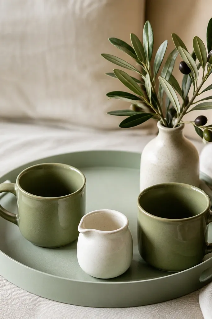
Monochrome doesn’t mean boring if you use different shades and finishes. Olive mugs against a sage tray look intentional because the colors are related but not identical. I used this when my bedroom had green accents in the bedding pattern, and the before corner looked disconnected. The faux olive branch adds a natural theme without adding clutter. This style flatters people who like botanical decor but want it clean and modern, not farmhouse-heavy. It also looks good with warm wood because green tones warm it up.
Start by choosing two green items in different shades — olive and sage, or forest and muted mint. Place the sage tray on the nightstand and center two olive mugs on it. Put the creamer in the middle front area so it breaks the symmetry just a little. Add the faux olive branch at the back corner, not in the center, so it doesn’t block the mugs. Keep labels minimal and remove any bright packaging from view by using plain jars or tins.
Good to knowWipe condensation off mugs right away — green ceramic shows water spots more than white.
AvoidAvoid mixing green with too many other colors on the tray — it turns into a random color pile.
21. White subway shelf + small hanging cups under it
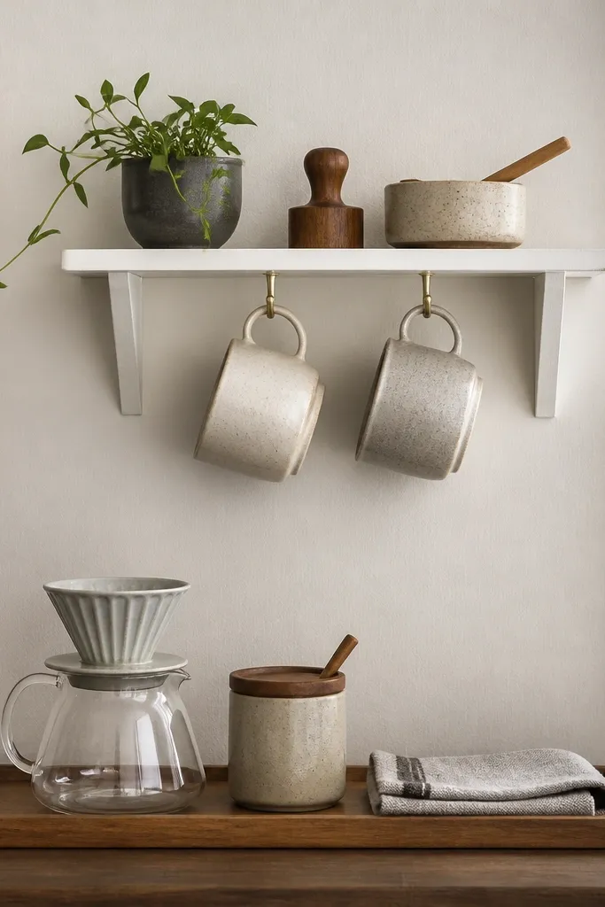
Hanging cups under a shelf is one of those moves that makes the corner look like a real setup, not a temporary station. The before version in my apartment had mugs sitting everywhere, and the counter looked crowded. With hooks, mugs stay out of the way and the tray surface stays clean. I like white shelves because they read airy and they match most bedroom walls. This works best if you’re okay with a small wall installation and you want a clean, vertical organization.
Start by mounting a small shelf above the tray area, keeping it high enough that you can reach comfortably. Install two cup hooks under the shelf and hang two mugs by their handles. Then place the dripper and sugar jar on the tray below, centered. Add a folded cloth or small linen napkin near the front edge. Keep the color palette to shelf white and one mug color so the corner doesn’t look busy.
Good to knowHang mugs upside down so dust and water drops don’t collect inside the cup rim.
AvoidDon’t hang mugs too close together — handles get stuck and it looks messy.
22. Rattan tray + woven basket for filter storage
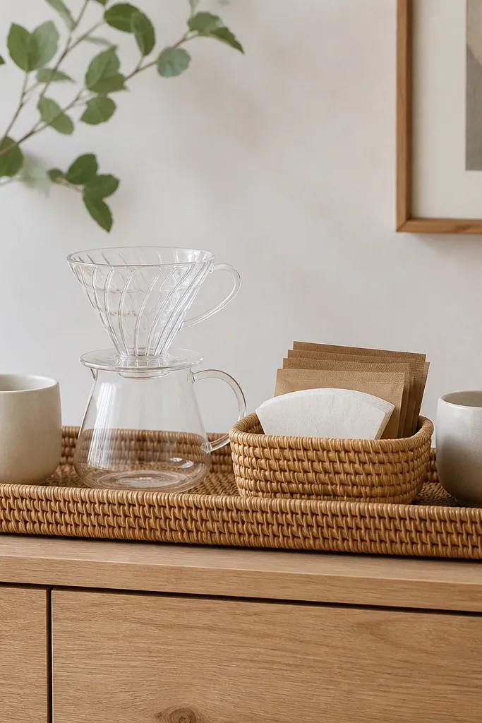
Rattan adds texture without looking heavy, which is why it works so well in bedrooms. The before version I had was smooth plastic trays, and everything looked cheap and flat. A rattan tray brings warmth and makes the coffee corner feel like part of a cozy room. Pairing it with a woven basket for filters keeps the corner from turning into a packet pile. This style flatters rooms with light wood, beige rugs, and natural linen curtains. It also looks good on camera because texture catches light.
Start by choosing a rattan tray with edges thick enough to feel sturdy. Place the dripper in the center and the two mugs at the left and right ends so the tray looks balanced. Put filter packets in a woven basket beside the tray or inside a separate basket compartment on the tray if it fits. Add a small glass or ceramic jar for sugar so the corner has a smooth contrast. Finally, keep the basket lid open only during use; otherwise, tuck it in so it looks neat.
Good to knowUse a liner under the rattan tray to protect surfaces and stop small crumbs from getting trapped.
AvoidAvoid mixing rattan with shiny chrome — it makes the warmth feel accidental.
23. Tiny battery candle + ceramic match holder for cozy nights
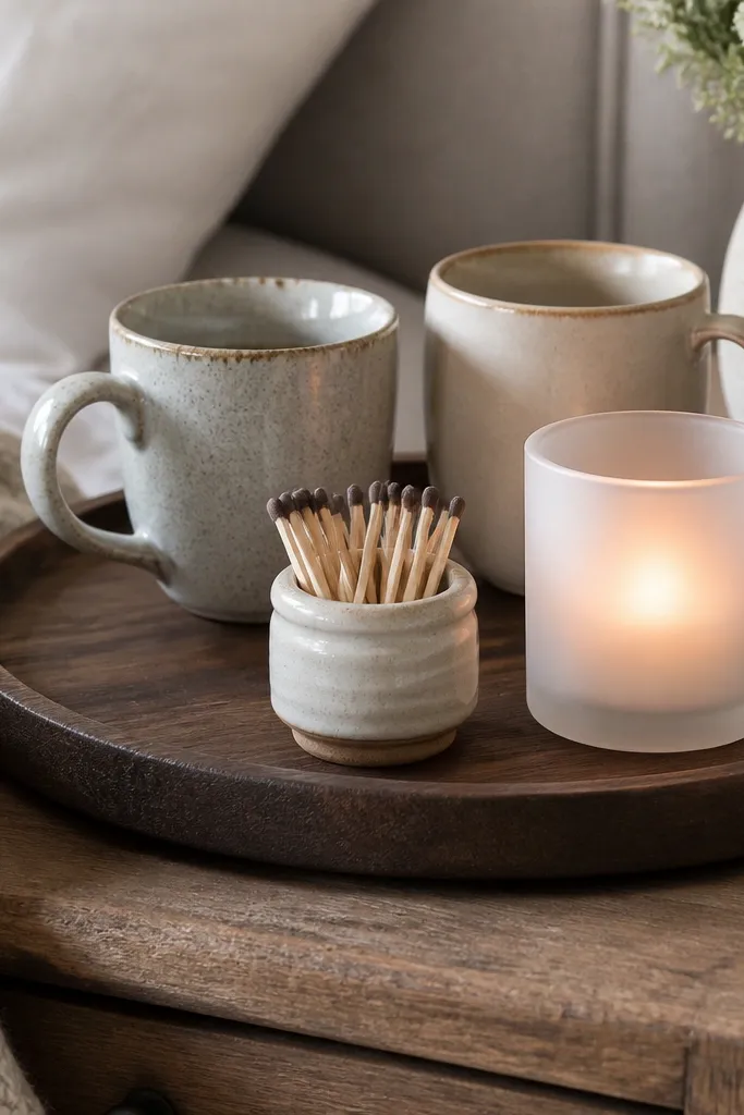
A coffee corner in a bedroom should feel calm at night, not like a kitchen counter. A battery candle gives you that warm flicker without the safety hassle of real flames. I like frosted glass because it softens the glow and hides the candle unit. A ceramic match holder adds a classic detail and makes the after look intentional. This style works best if your bedroom has soft textiles like knits, flannel, or thick cotton curtains.
Start by placing the frosted battery candle in the center front of the tray. Put your mugs behind it, spaced evenly left and right. Add a small ceramic match holder or mini tray at the candle’s side so it looks like part of the display, not random decor. Finally, add one practical item like a sugar jar and keep all labels facing inward. Turn the candle on when you style so the glow settles naturally and the scene looks warm.
Choose a candle with a timer so the corner looks consistent in evenings without thinking about it.
Avoid real candles near coffee tools — wax drips and soot risk ruin the clean look.
24. Black tray with white pebbled stone base for a spa look
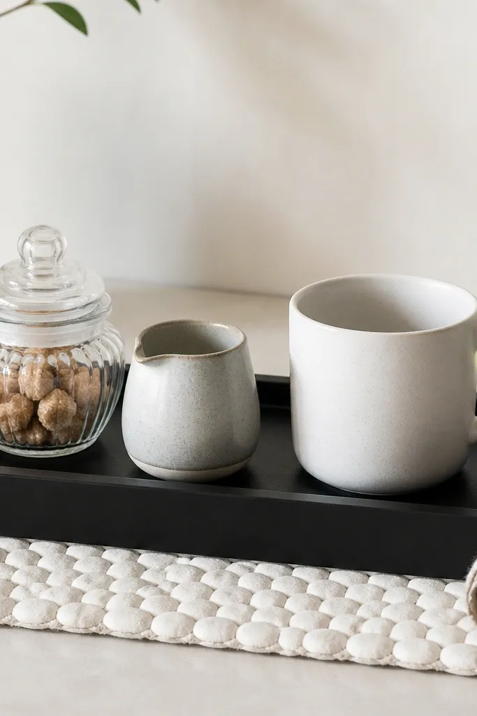
Spa vibes happen when you use texture and contrast, not when you add more stuff. The before corner I had with a plain wood mat felt unfinished, like the coffee tools lacked a base. A white pebbled stone mat gives you that clean, spa feel and it makes black trays look crisp. It also hides small spills better because the texture breaks up visible rings. This is a great move for bedrooms with black-and-white decor or marble-look surfaces. It flatters cooler color palettes and keeps the coffee corner from feeling too warm or too rustic.
Start by placing a pebbled stone mat under your tray — make sure it’s centered and doesn’t peek out unevenly. Then set the black tray on top and arrange one mug in the center or slightly back. Put the sugar jar on one side and the creamer on the other so the tray stays balanced. Add a rolled linen napkin at the edge for softness. Keep the rest minimal: no extra tins unless you can fit them without crowding.
Good to knowWipe the stone mat weekly with a damp cloth and dry fully so it doesn’t hold odors.
AvoidAvoid using a high-shine black tray with lots of fingerprints — it looks messy in daylight.
25. Two small shelves: one for coffee, one for books and cups
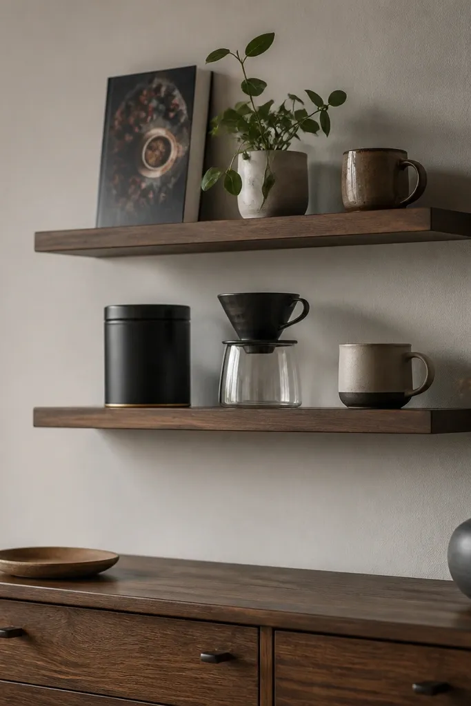
This is how you make a coffee corner look intentional even when the bedroom is small. The before setup was all on the dresser, and my eye had nowhere to rest. Two shelves give you vertical organization: coffee tools stay at the lower shelf and decor stays above. I like narrow shelves because they don’t overpower the room, and they keep the coffee corner from swallowing the dresser space. This style works best if you already have wall space near the bed or dresser and you want the corner to look like a mini feature.
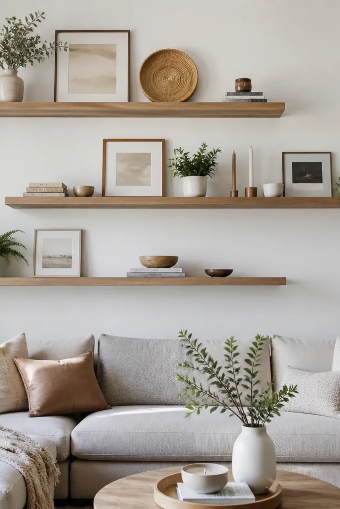
Start by installing the lower shelf so it’s about 6-8 inches above the dresser surface. Put coffee essentials there: tin, dripper, and one mug. Install the upper shelf higher so the book can stand upright comfortably. Place a coffee book in the center of the upper shelf, then add a small plant and a second mug spaced on opposite sides. On the dresser, keep only a tray with the daily sugar and one small item so the shelves do the heavy lifting.
Good to knowUse the same wood finish on both shelves so your eye reads it as one system.
AvoidDon’t mix shelf sizes randomly — one shelf should feel like it was planned for the other.