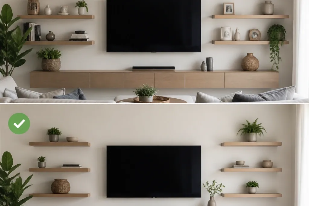
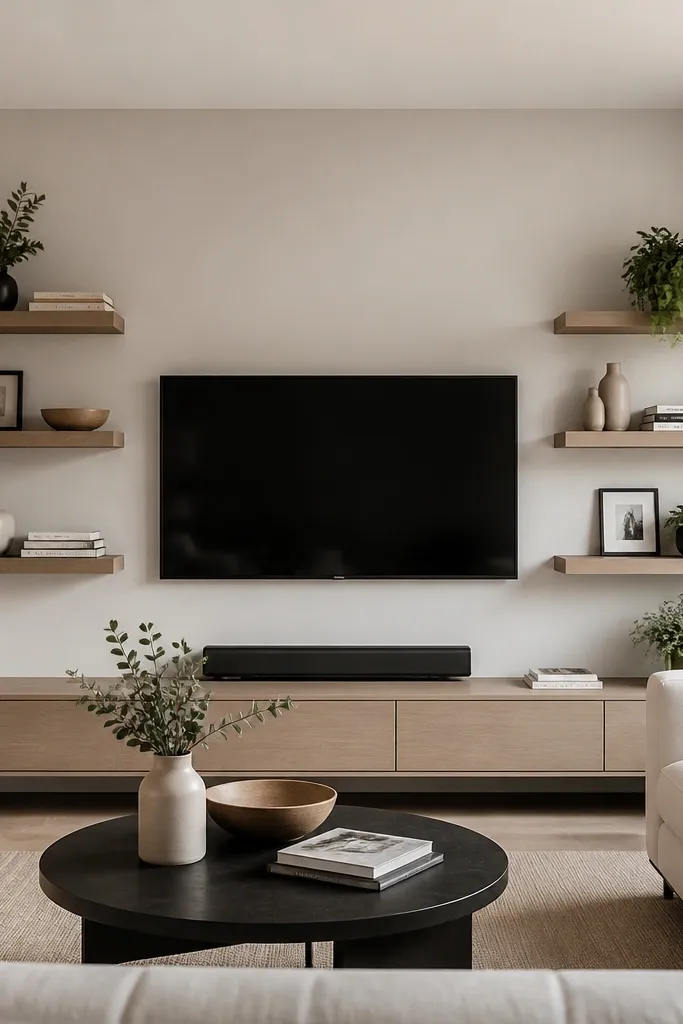
1. TV Centerline Corner Ledge Grid
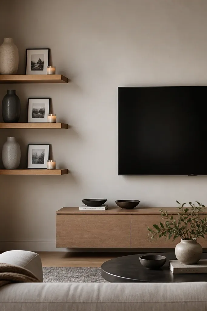
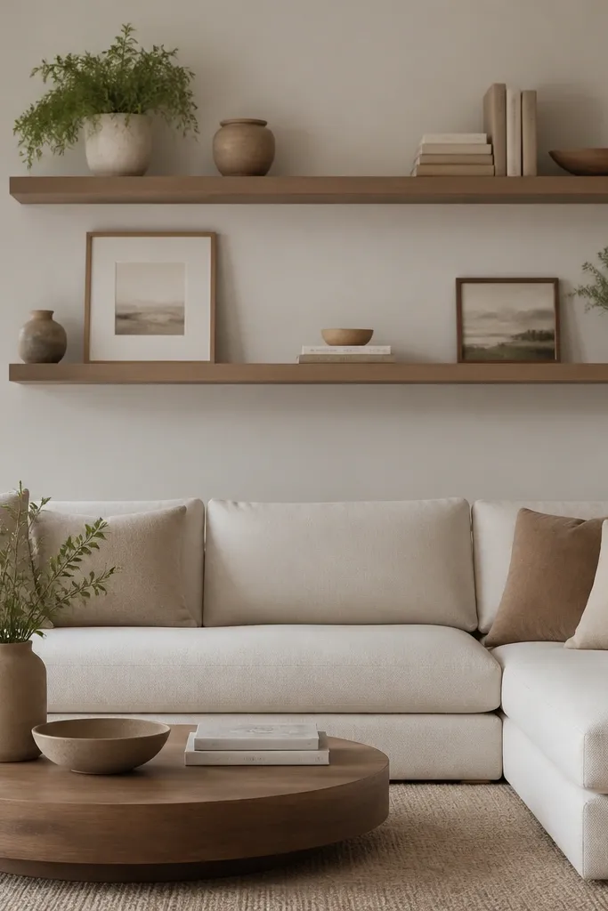
This layout works when you want the corner to feel connected to the TV instead of separate from it. I’ve used warm oak shelves here because they soften the hard angles of a corner and read cozy beside a TV screen. The trick is that the shelf height lines up with where your eyes land when you’re seated — usually just above the TV midpoint. It flatters most rooms, especially if your wall is painted a cool white or greige, because the wood adds warmth without looking heavy.
Start by marking the TV centerline on the wall and then measure out to the corner walls so you know where your shelves will “point” visually. Mount the top shelf so its front edge sits around eye line minus 2 to 3 inches, then set the next shelf 10 to 12 inches below it. Keep the shelves parallel to the floor, and use a level on the wall face you’re drilling into, not the corner seam. Finally, style each shelf with one tall object (at least 9 inches), one medium item (around 5-7 inches), and one small accent so the corner doesn’t turn into a clutter pile.
Good to knowUse the same frame color on every shelf — I stick to black or dark walnut so your eye doesn’t bounce around.
AvoidAvoid mounting shelves by “eyeballing” the corner — it looks off even when measurements are close.
2. Hidden Bracket Corner for a Clean Media Wall
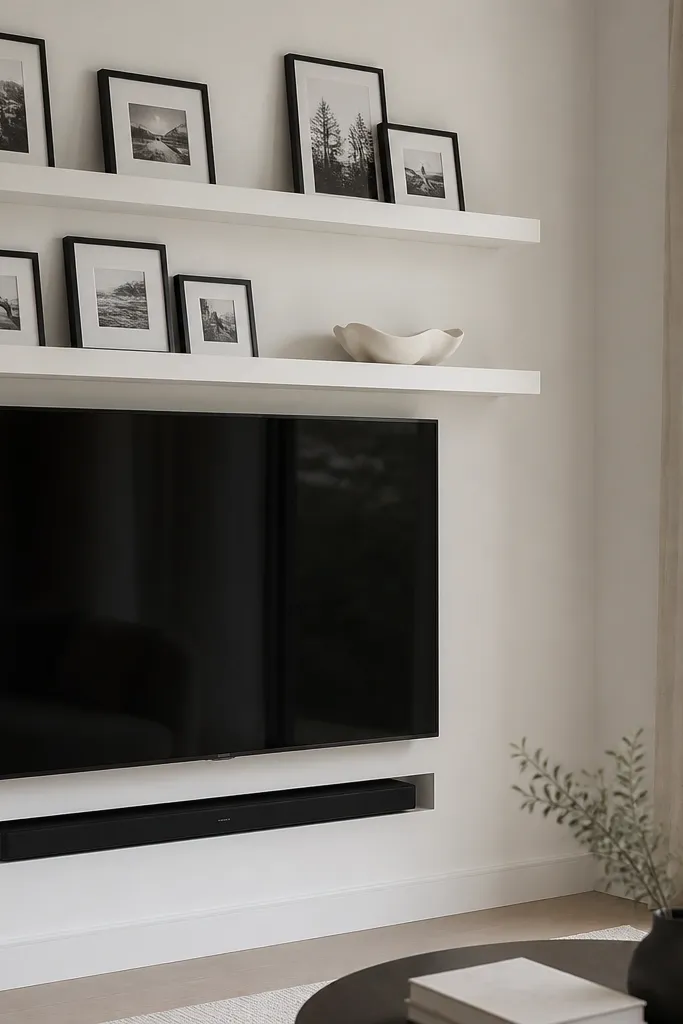
Hidden brackets are my go-to when the living room already has a lot going on, like a TV, console, and wall art. Matte white shelves look crisp against darker wall paint, and they reflect less glare than glossy finishes. This setup flatters modern interiors and small rooms because the hardware disappears, so the corner reads lighter. It also works well if you have overhead lighting that creates harsh shadows — hidden brackets keep the shadow pattern clean.
Choose matte white shelving boards at least 3/4 inch thick so they don’t look thin when light hits them. Mount the first shelf so it sits 12 to 16 inches above the TV console top, then place the second shelf 10 inches below the first. Use a stud finder and mount into studs on both walls if possible; if you can’t, use proper anchors rated for the shelf weight. Style by keeping the objects shallow and aligned — place frames flush to the shelf back edge and leave 1 to 2 inches of empty space on the front so it doesn’t look crowded.
Good to knowWipe the shelf with a microfiber cloth before styling — matte paint shows dust fast under living room lights.
AvoidSkip visible chunky brackets if your room is already visually busy; they make the corner look heavy.
3. Warm Walnut Corner Shelves with Leaning Art
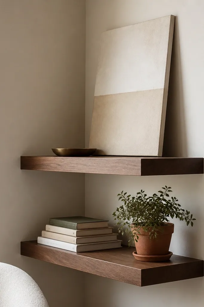
Walnut shelves make corners feel intentional because the color reads rich without being dark and oppressive. Leaning art is a smart trick in corners because it follows the angle instead of fighting it. I’ve used this in rooms where the wall color is warm beige or soft cream; the walnut pulls it together. It flatters people who like a more lived-in look, since the art and books feel like real daily objects rather than perfect decor.
Start by mounting the bottom shelf first, keeping it about 14 inches above the console or mantel surface. Then install the top shelf 10 to 13 inches above the bottom shelf so the leaning art has room to breathe. Use a back edge stop if your shelves are very shallow; I like a 1/2 inch lip so objects don’t creep toward the corner. Style with one anchoring art piece on the top shelf, then balance with a tray or small plant. On the bottom shelf, stack two books flat and one book slightly turned for a subtle diagonal.
Good to knowUse museum putty or felt dots under the leaning art so it doesn’t slide when someone bumps the wall.
AvoidDon’t place large frames flat on both shelves; corners look cramped when everything lies in the same plane.
4. Book Spines + Small Objects Corner Stack
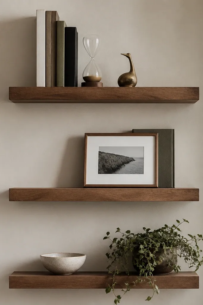
This is the corner setup I use when I want the shelves to look styled without showing clutter. Book spines add visual texture and color, and the small objects give you that tidy “collected” feel. It looks best with wood-tone shelves or painted shelves in soft off-white because the book colors become the main palette. It flatters people who like reading, since the shelves read functional, not purely decorative.
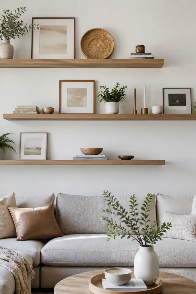
Measure your shelf depth first — aim for at least 8 inches so book spines don’t hang over. Mount the bottom shelf 16 inches above the console, then put the middle shelf 10 to 12 inches above the bottom. Install the top shelf 10 inches above the middle so the stack rhythm stays consistent. Style by putting books in the back third of the shelf, then place the small objects in the front third. Keep one color finish repeated — I repeat brass for hourglass and sculpture so the corner looks intentional.
Good to knowPick three book spine colors max — I rotate between cream, navy, and terracotta so it never turns into rainbow chaos.
AvoidAvoid mixing tall objects on every shelf; it makes the corner feel top-heavy.
5. Black Floating Shelves for Contrast with Light Walls
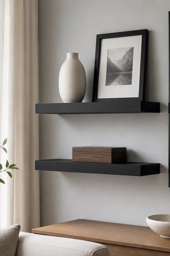
Black shelves give you a crisp frame effect, especially when your walls are light gray, warm white, or pale stone. I like this for TV rooms because black visually connects the corner to the TV hardware and media console. The contrast also hides minor wall unevenness because the shelf reads as a strong line. It flatters modern and farmhouse mixes, since you can soften the black with wood objects and warm ceramics.
Use black shelves with a matte powder-coat or satin finish so glare doesn’t spike under ceiling lights. Mount the first shelf 12 to 15 inches above the TV console top, then add the second shelf 10 inches above it. Keep a consistent spacing from the corner seam so the shelf faces look like they’re part of one design. Style by placing a white vase or cream ceramic on one side, then add a black frame and a wood box on the other. Leave 2 inches of clear space between the vase and frame so the corner doesn’t look like it’s packed tight.
Good to knowIf your wall is glossy, switch to matte shelves and avoid shiny décor — glare makes corners look messy.
AvoidDon’t paint black over thin shelves without sealing — chips around the edges look cheap fast.
6. Corner Shelf Pair with One Mirrored Piece
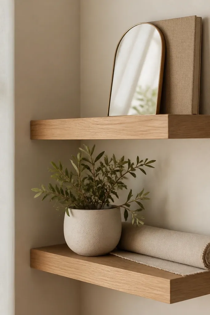
A mirrored piece in a corner is a practical trick for making the room feel brighter without adding more lighting. The arch shape also softens the corner geometry compared to square decor. I’ve done this in living rooms with north-facing windows where the corner always looked dim. Light oak keeps the mirror from feeling too stark, and the linen runner adds texture that reads “soft” next to the reflective surface. This setup flatters smaller spaces because the mirror gives depth.
Mount the bottom shelf first about 15 inches above the console so the mirror sits at a comfortable viewing height. Install the top shelf 10 to 12 inches above the bottom, leaving enough vertical gap so the mirror doesn’t look squeezed. Place the mirror slightly off-center toward the wall you see most from the couch. Style the bottom shelf with one planter and one textural piece like a folded linen runner or a small tray. Keep the rest of the shelf empty so the mirror can do its job.
Good to knowAngle the mirror a few degrees toward the room, not straight at the wall, so it catches light instead of reflecting clutter.
AvoidSkip putting mirrors on every shelf — two mirrors in a corner can turn into a glare mess.
7. Narrow Corner Shelves with Vertical Plant Lines
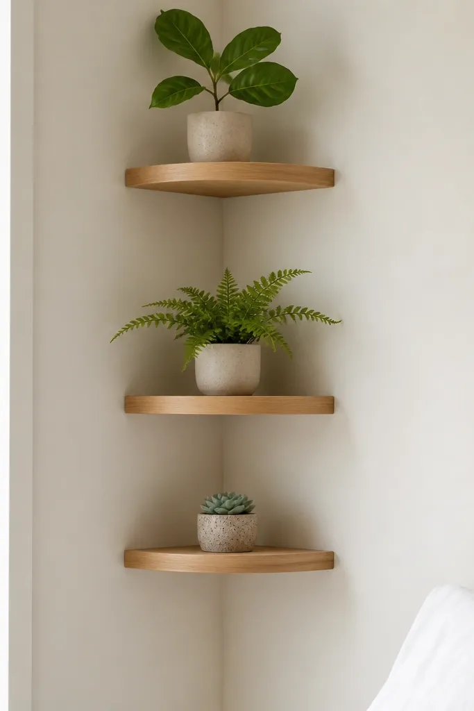
If your corner is tight or your living room is narrow, narrow shelves and vertical plant lines are the cleanest fix. Plants create height without adding visual bulk, and different leaf shapes keep the corner from looking repetitive. I like light wood here because it makes the green feel fresh instead of heavy. This flatters rooms with lots of horizontal furniture, like long sectional couches, because the plants add a vertical rhythm. It also works for people who hate clutter — you’re basically designing with one theme.
Choose shelves that are 6 to 7 inches deep so they don’t stick into walkways. Mount the bottom shelf 14 to 16 inches above the console, then space the next shelves 10 inches apart. Put the largest plant on the lowest shelf so it feels grounded, and use smaller pots as you go up. Anchor the plant pots on a small saucer or tray so water doesn’t stain the shelf. Keep all pots the same pot finish, like matte terracotta or black plastic inside a ceramic cover, so the line looks intentional.
Good to knowRotate plants every two weeks so the leaves stay “facing” the room and don’t lean into the corner seam.
AvoidDon’t cram multiple plant pots on one shelf — narrow shelves make that look chaotic.
8. Corner Shelves with Floating Book Ledges
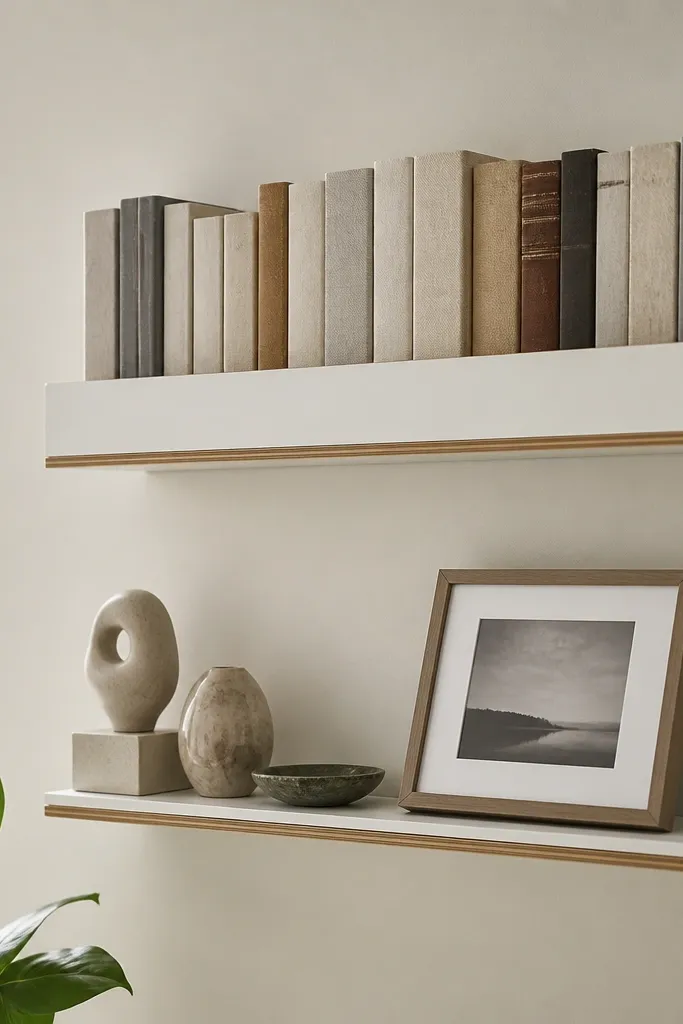
This idea gives you that gallery wall feeling without hanging anything on the wall. Upright books create a built-in backdrop, and that makes the corner look designed even when you change decor seasonally. I use this in living rooms with neutral walls because the book colors become the accent. It flatters people who like a tidy look because the books naturally create structure. If you have a TV in the same wall, this also keeps the corner from competing by adding vertical texture rather than more frames.
Mount the top shelf about 10 to 12 inches above where you want the photo line to sit, then place the bottom shelf 10 inches below. Use shelves at least 9 inches deep so upright books don’t tip forward. Start styling by building the upright book “wall” first, then nestle one framed photo behind or beside it. Add small sculptures on the far left and far right to balance the center. Leave a gap in the middle if your books are busy; empty space keeps it from looking like a stack sale.
Use bookends in a single finish, like black metal, so the upright books stay straight.
Avoid mixing upright books with chunky decor on the same shelf; the corner looks crowded quickly.
9. Sculptural Ceramic Trio Corner
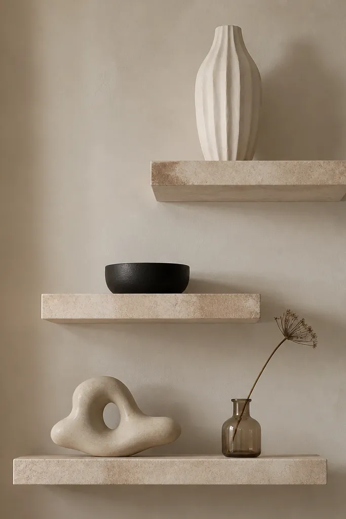
A sculptural trio is the simplest way to make corner shelves look expensive without buying a bunch of different decor styles. The key is keeping the color family tight — I use off-white, cream, and black — so the pieces feel like a set. Textures matter too: fluted ceramic reads dimensional under side lighting. This setup flatters rooms with clean lines, because the decor becomes the texture. If you have pets or kids and want fewer small items, ceramics and dried stems are easier to manage than glass and fragile figurines.
Mount the bottom shelf 16 inches above the console so the low piece sits at a natural viewing height. Place the middle shelf 10 inches above the bottom and the top shelf 12 inches above the middle. Style by putting the tallest piece on the top shelf, then the smaller bowl in the center, and the low sculpture on the bottom. Keep all items within the back half of the shelf so they don’t look like they’re falling forward. Finish with one dried stem in a jar only — one plant-like element is enough to bring softness.
Good to knowDust ceramic textures with a soft brush — microfiber can smear grooves and make the fluting look dull.
AvoidSkip mixing too many textures at once; if everything is rough and glossy, the corner turns noisy.
10. Floating Shelves as TV Surround Frame
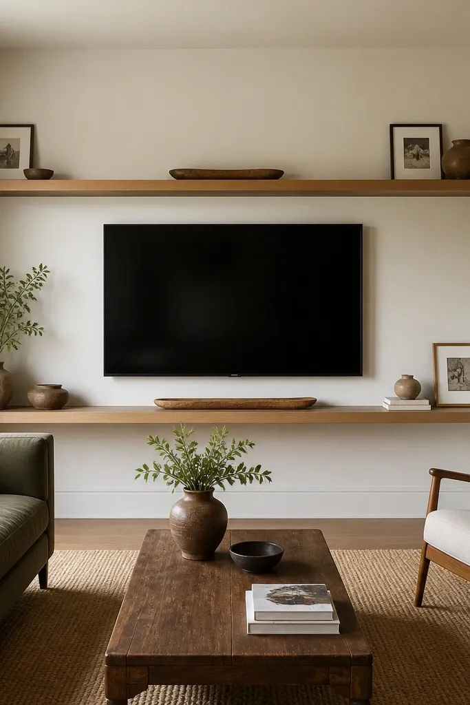
When you run shelves along both walls near the TV, you create a built-in look even if you didn’t remodel. This is the corner setup I recommend when the TV area feels plain and you want a “surround” effect. Medium oak works because it has enough warmth to look intentional, but it still reads light enough for most living rooms. The shelves also guide the eye toward the TV, which makes the whole wall feel composed. It flatters rooms with neutral paint and simple curtains, since the shelves become the main visual feature.
Mark the TV center and plan your shelf line so it sits at the same height on both walls. Mount the left and right shelf supports into studs, then attach the shelves so the front edges line up to create a continuous visual frame. Keep the shelf depth consistent on both sides, around 8 to 10 inches, so the frame doesn’t look lopsided. Style with a long thin runner on the shelf and two small framed prints spaced evenly. Leave the center area slightly calmer so the TV stays the focal point.
Good to knowUse painter’s tape to mask the intended shelf line before drilling — seeing it on the wall prevents height regret.
11. Corner Ledge with Color-Blocked Baskets
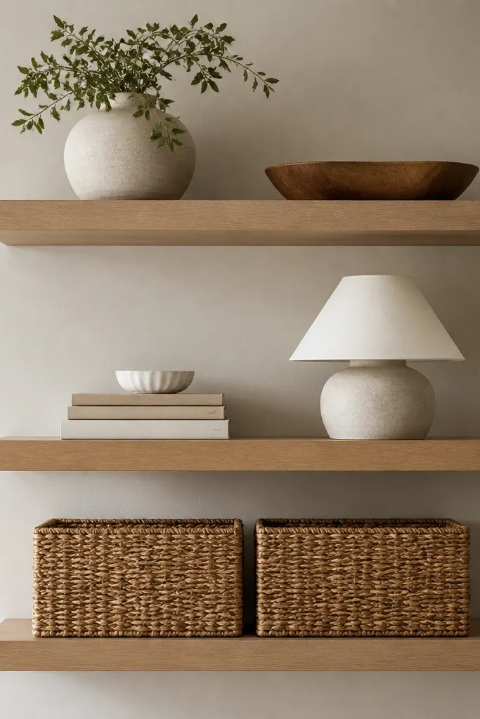
This layout is for people who want floating shelves but also need storage. Baskets hide clutter, and they look good in corners because the weave texture breaks up the wall’s flatness. I like color-blocked baskets — like natural tan with a black band — because they give you a graphic element without loud patterns. It flatters lived-in homes where you don’t want every remote, charger, and throw folded into sight. It also helps if your living room has a lot of small items that creep onto surfaces.
Mount the bottom shelf first so baskets can sit fully without overhang; aim for at least 10 inches above the console if you’re using medium baskets. Install the middle shelf 10 to 12 inches above the bottom shelf, then set the top shelf another 10 inches up. Choose baskets that match your shelf color warmth — tan baskets with oak look natural. Style the middle and top shelves with one tray and one stack of books, then add a small lamp-like decor piece only if it doesn’t block sightlines to the TV. Keep basket lids off if you want the shelves to look lighter.
Good to knowMeasure basket width and leave 2 inches between basket edges and the corner seam for a clean look.
AvoidDon’t put baskets on a shallow shelf — they’ll look like they’re squeezing and the weave will hang over.
12. Painted Corner Shelves with One Statement Frame
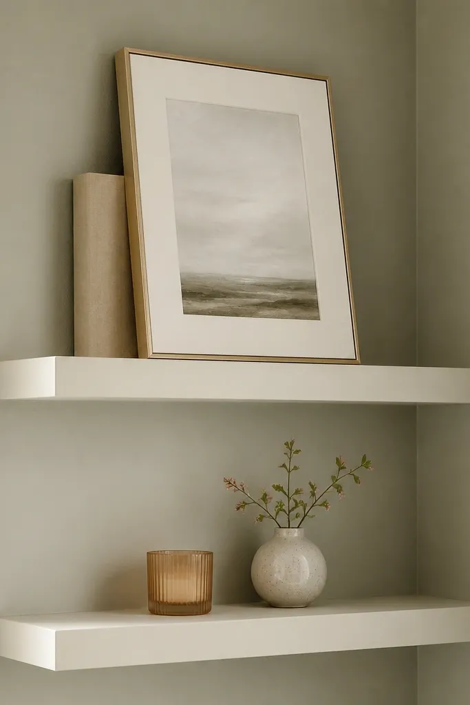
When your wall color is strong, shelves need to behave. Warm white shelves calm the room and make the wall color feel intentional instead of loud. One statement frame gives you the focal point, and everything else stays quiet. I’ve done this in living rooms with sage or muted green walls, and the corner looks designed without needing a full gallery wall. It flatters people who like clean spacing and fewer objects because you’re basically curating one hero piece.
Mount the bottom shelf 15 inches above the console and keep the top shelf 12 inches above the bottom so the frame has room to lean. Use shelves with a smooth finish so the statement frame reflects light gently. Choose a frame size that covers at least half the shelf length; anything smaller looks lost in a corner. Place the frame on the top shelf slightly toward the wall you see most from the couch. Add only two small items on the bottom shelf, spaced apart left and right, so the corner stays airy.
Good to knowUse a matte frame finish — glossy frames flash in daylight and can feel harsh near a TV.
13. Floating Shelves with a Long Low Tray
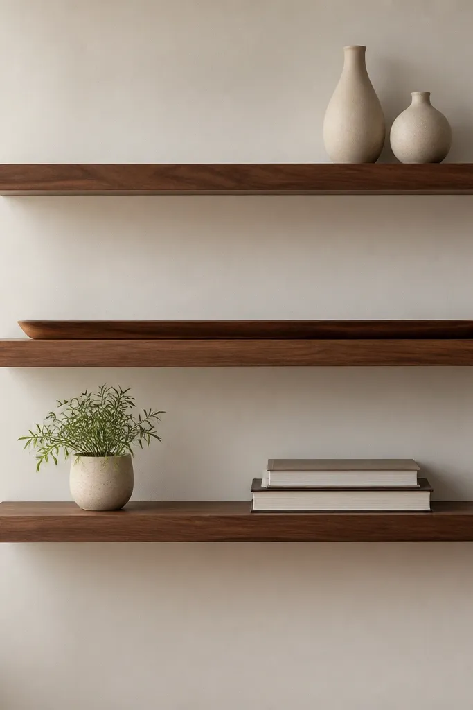
A long low tray is a styling shortcut that makes shelves look finished even if you change small decor often. It creates a base line, and that matters a lot in corners where angles can make everything feel scattered. Walnut shelves add warmth, and a tray in black or dark wood looks grounded next to the TV. This setup flatters people who want structure but don’t want to commit to matching multiple decor pieces. It also works well with neutral or monochrome rooms because the tray gives a single bold shape.
Install the middle shelf first at a height that puts the tray handle or edge around the TV’s lower third. Then mount the top shelf 10 inches above and the bottom shelf 10 to 12 inches below the middle. Use a tray that’s about 70 percent of the shelf length so it fills space without touching the sides. Put two small vases on the top shelf — one tall, one shorter — and keep them centered above the tray. On the bottom shelf, place a plant in a pot that matches the tray finish and add a book stack behind it for height.
Good to knowUse adhesive felt pads on the tray corners so it doesn’t slide and doesn’t scratch the shelf finish.
AvoidAvoid tiny trays on wide shelves — the emptiness around them makes the corner look unfinished.
14. Corner Shelves with Symmetry on One Side
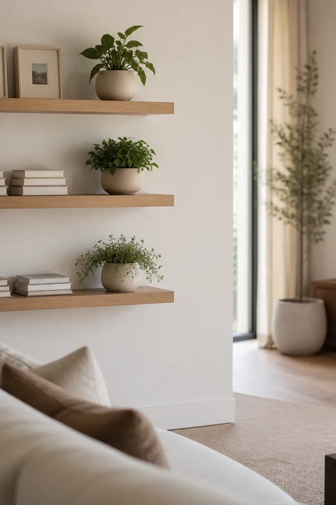
This is a trick for corners that are visible from one seating angle only. By creating symmetry on the visible side, the corner looks intentional even if the other side is more relaxed. I’ve used this in living rooms with L-shaped seating where one wall gets most attention. Natural wood shelves keep the look warm and balanced, and the repeated objects on the left provide order. It flatters homeowners who like a structured look but don’t want every shelf to feel identical.
Mount the shelves so the left wall has the main decor placement — I mark a “visible zone” by standing where you watch TV and checking what you can see. Install the bottom shelf 16 inches above the console, then place the middle shelf 10 inches above and the top shelf 10 inches above that. Style the visible side with matching objects — like two identical frames or two small book stacks — keeping them evenly spaced from the shelf edges. On the other side, use one plant or one small bowl to balance the weight visually. Keep all items in the back half of the shelf so the corner seam doesn’t slice through the decor.
Good to knowUse identical frame sizes or identical candle holders so symmetry reads instantly.
AvoidDon’t force symmetry across both walls if one side is barely visible — it makes the corner feel contrived.
15. Layered Corner Shelves with Different Depths
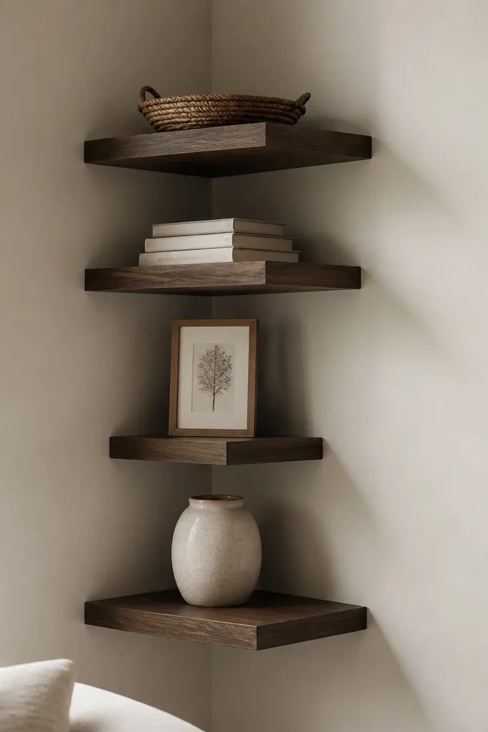
Different shelf depths create a layered look that feels architectural, not decorative clutter. I use this when the corner is large and you want depth without adding a third wall feature. The deeper top shelf holds wider objects like shallow baskets or trays, while the narrower ones hold framed prints and small decor. This setup flatters rooms with tall walls because the steps guide your eye upward. It also makes the corner look more expensive because shadow layers show up even when decor is minimal.
Plan your depth differences before mounting by buying shelves in two depths — for example 10 inches for the top and 7 inches for the lower shelves. Mount the bottom shelf first at 14 to 16 inches above the console, then position the next shelf 10 inches up. For each upper shelf, align the front edges so you see a stepped silhouette. Style the deeper shelves with wider items that sit flat; keep narrow shelves to one framed piece or a small sculpture. Leave at least 2 inches of empty shelf front space on every shelf so the steps don’t look crowded.
Good to knowUse the same shelf finish across depths, even if the boards differ, so the layering looks intentional.
AvoidAvoid mixing random depths without a front-edge alignment plan; it reads messy.