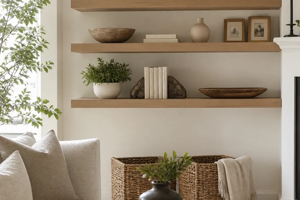
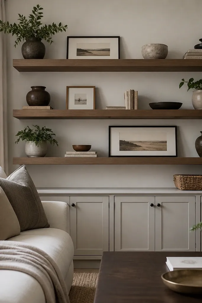
1. Cream Linen Vase + Olive Stem Pair
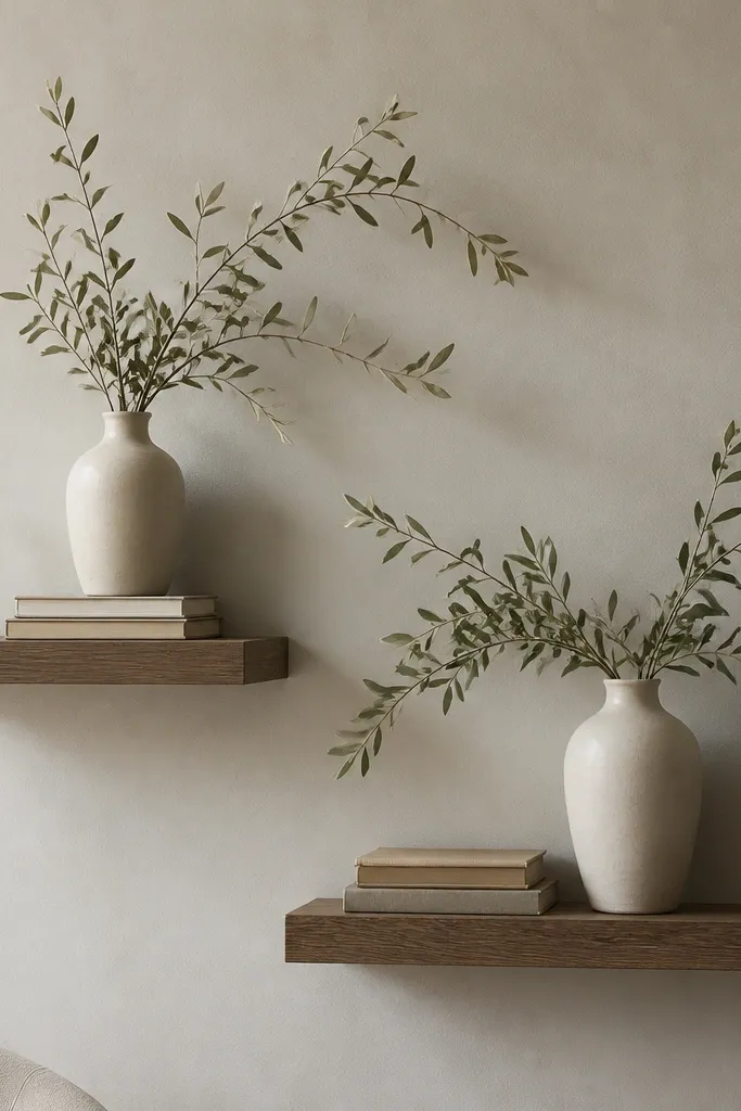
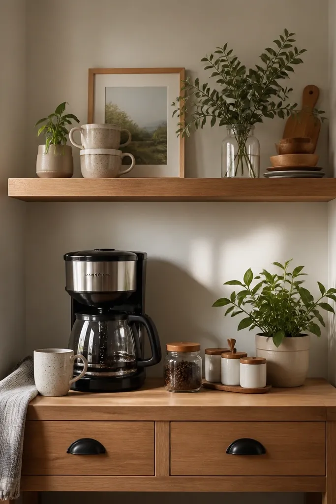
This setup works because the cream ceramic and olive stems create a warm, natural contrast that reads clean in every season. I like cream because it hides dust better than bright white and looks softer than beige-gold. The olive stems add color that feels springy and also holds up through fall when you swap in darker greenery. It looks best when your room has warm wood tones or soft neutrals, and it flatters people who like calm, low-contrast decorating without going gray-on-gray.
Start with one anchor piece per shelf: place the tall cream vase slightly toward the center so it doesn’t feel “stuck to the wall.” Put a book stack (1-2 books, horizontal) at the base of the vase, then mirror the height with a small brass candle holder on the opposite end. Add your stems by inserting them into the vase, then curve them outward so the silhouette reaches the shelf edges. Finally, adjust spacing so the vase center sits about 10-12 inches from the shelf ends, leaving breathing room on both sides.
Use faux stems with wired branches so you can reshape them for every season without replacing everything.
Avoid mixing three different greens — olive plus one other green is enough.
2. Black Tray + Spun Brass Candles
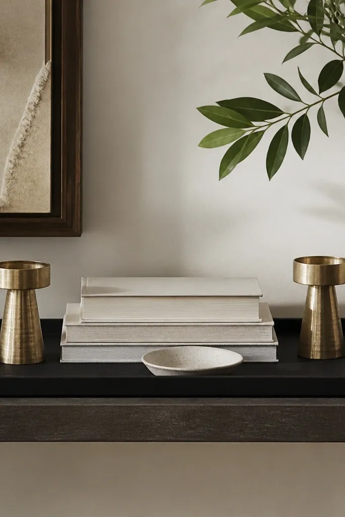
Black trays and brass candle holders give you that “designer shelf” look with almost no effort. The matte black grounds the shelf and keeps it from looking light or messy, while brass adds warmth instead of harsh shine. This pairing looks great in living rooms with black frames, black light fixtures, or dark wood — it makes the whole wall feel intentional. I’ve used it in small apartments where the shelf needs to look styled but not bulky.
Good to knowWipe brass with a dry microfiber cloth before you style; fresh shine makes the whole shelf look new.
Place the black tray dead center on the shelf and leave 1 inch of tray margin from the front edge. Stack two books under the tray edge only if you need a slight lift; otherwise keep it flat. Set two brass candle holders on the tray, with one slightly forward so the pair doesn’t look perfectly symmetrical. Add a small ceramic dish at the front corner for a “collected” feeling, then keep the rest of the shelf empty.
AvoidAvoid using glossy black lacquer trays with brass that’s too yellow — the mismatch looks cheap fast.
3. Framed Art Strip Above a Book Stack
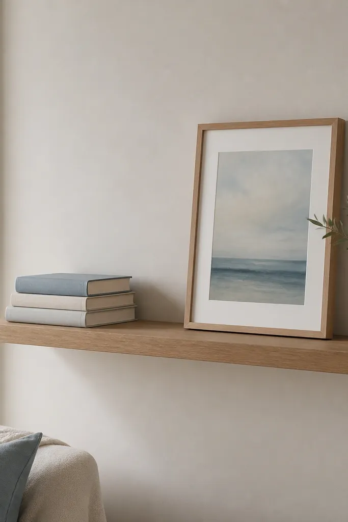
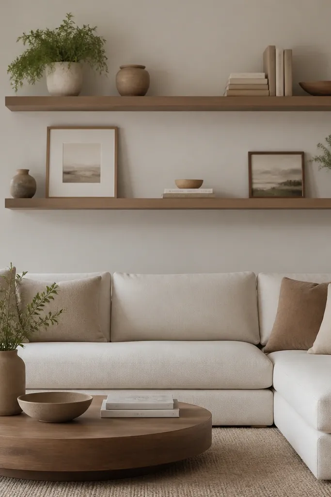
This is the shelf trick I use when I don’t want vases or plants. Framed art gives you vertical interest, and book stacks give you weight so the shelf doesn’t look like a photo ledge. Choose a frame color that matches something already in the room — in my case, a soft blue throw pillow — so it looks like it belongs. It flatters rooms with neutral walls and people who like a curated, slightly gallery feel without clutter.
Good to knowUse painter’s tape to mock the frame position for 10 minutes; you’ll feel the balance before you commit.
Start by placing a book stack on one side of the shelf, not centered. Lean a framed print against the back wall on the other side, with the bottom edge about 1-2 inches above the shelf surface so it doesn’t press into the books. Keep the frame size smaller than you think — a 5x7 or 8x10 reads right on a floating shelf. If the shelf is wide, add one thin object at the front center like a slim ceramic vase or a short candle; otherwise stop at the frame and books.
AvoidAvoid stacking books too high — if the top book hits the frame mid-height, it looks crowded.
4. Monochrome Ceramic Collection in a Row
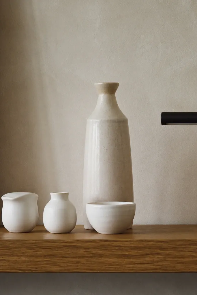
Monochrome shelves look expensive because your brain reads them as a single material story. Matte white and off-white ceramics keep the look soft and forgiving, and they work year-round because you can swap the smallest color accent. I’ve done this in living rooms that get bright morning sun where shiny items glare — matte ceramics stay calm. This setup flatters people who like minimalist styling but still want the shelf to feel “alive.”
Good to knowPick ceramics from one finish family — matte, speckled, or glazed — and stick to that finish on the shelf.
Start by placing the tallest vessel toward the center back, leaving at least 2-3 inches of space between it and side items. Put three to five smaller matte ceramic pieces in a straight line along the shelf front, keeping their heights within a 1-inch range. Add one black metal element at an end (like a small picture light or a slender tray) to echo hardware in the room. Step back and check that the silhouette forms a gentle slope from tall center to shorter sides.
AvoidAvoid adding patterned ceramics into a monochrome row unless the pattern is tiny and muted.
5. Stacked Books + Woven Basket Hideaway
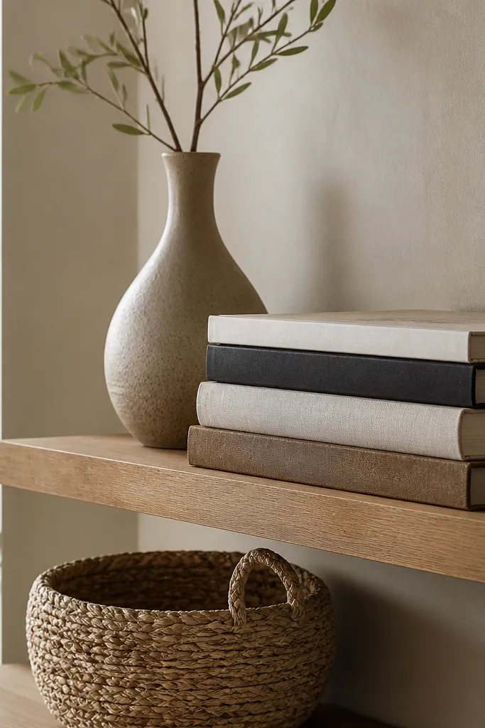
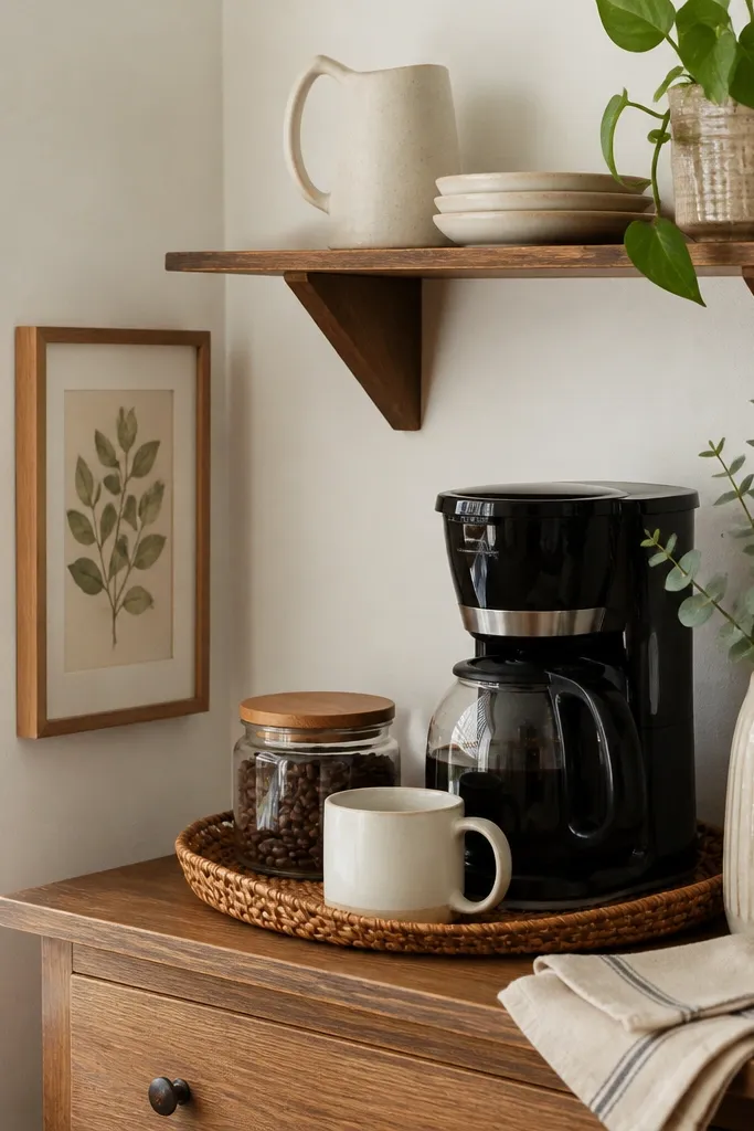
This one solves the problem of shelf clutter without looking like you’re hiding things. Woven baskets add texture and a casual warmth, while book stacks give you structure. The tall vase behind keeps the shelf from feeling like a desk organizer. I’ve used this in family living rooms where you need storage nearby for remotes, coasters, and small throws. It flatters warmer interiors with natural fibers like jute, rattan, or linen.
Place the tall vase first, centered and slightly back. Stack books horizontally on one side so their spines face outward; keep the stack height under 4 inches. Set the woven basket at the front corner so it overlaps the books by about half its depth. Add one small decor item on top of the basket — a single candle or a tiny dried bouquet — and stop there.
Choose a basket that matches your rug or curtain weave; texture repetition makes it look planned.
Avoid baskets that are too tall — if it reaches the vase height, the shelf turns heavy.
6. Spring to Fall Switch with Seasonal Candle Trio
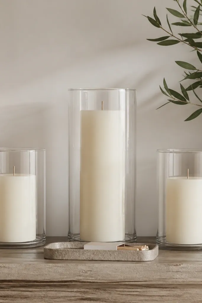
Candles give you instant season energy because you can rotate holders and colors without changing the shelf base. I like a trio because it creates rhythm and keeps the shelf from looking empty when you’re not using tall objects. For all-year styling, keep the candle arrangement the same and switch only the glass color or wax color. This looks best in living rooms with wall sconces or a coffee table lamp because it amplifies the warm lighting effect.
Good to knowUse unscented candles and add scent through a diffuser in the room — it keeps the shelf looking clean and not “perfume-y.”
Start with a small tray centered on the shelf front. Place one tall candle holder in the middle, then two shorter holders equidistant on each side, leaving 4-6 inches between each holder. Keep the wax tones consistent within the shelf set: creamy for spring, deep olive or smoky gray for fall. Add a matchbox or small ceramic dish on the tray and nothing else so the candle trio stays the focal point.
AvoidAvoid mixing candle heights randomly; three with a clear center reads intentional.
7. Terracotta Planter + White Books for Warmth
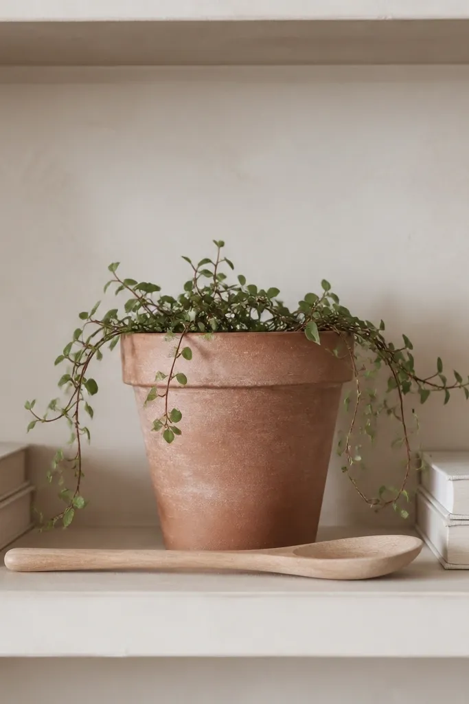
Terracotta and white books look warm without going heavy. The terracotta planter adds a grounded earth color that feels right in summer and still works in winter when the air is dry. White books keep the palette bright, so the shelf doesn’t turn orange-brown. This setup flatters people who have light walls and want a touch of warmth that isn’t too dark.
Good to knowIf your plant is real, use a cachepot that’s the same terracotta tone so you don’t see plastic inside.
Place the terracotta planter at the shelf center back, with the trailing leaves spilling slightly over the front edge. Stack two white books on the left and two on the right, keeping their top edges level. Lay a light wood serving spoon across the front edge like a casual prop, with the handle pointing inward. Add one small accent at the far right such as a tiny ceramic bud vase, then stop.
AvoidAvoid a planter that’s too bright red — it can clash with warm neutrals and look harsh.
8. Matte Stoneware + Brass Ring Handles
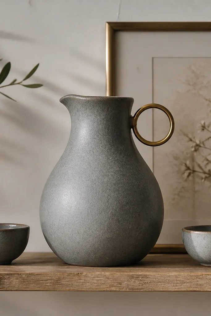
Matte gray stoneware looks calm and modern, and brass ring details add a soft glow without going flashy. I like this when your living room has cool undertones like charcoal, slate, or gray upholstery. It also works beautifully year-round because gray is the neutral that lets you change only the smallest accent color. If you’re someone who gets tired of seasonal clutter, this palette stays put while you swap one stem or one candle.
Good to knowStick to one metal finish — if your room has brass lighting, keep it all brass on the shelf too.
Start by centering the stoneware pitcher behind the front line of objects. Put one small bowl on the left and one on the right, keeping their openings facing forward. Lean a thin brass frame against the back wall behind the pitcher, with the top edge about 2 inches above the pitcher height. Finish with a single small stem in a matching gray vase or a brass-handled utensil at the front.
AvoidAvoid adding shiny chrome pieces next to matte stoneware; the contrast reads “random shopping.”
9. Long Wooden Board + Black-and-White Photos
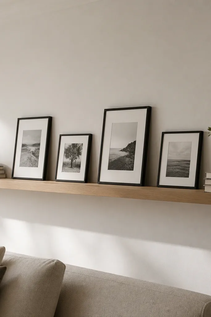
Wood boards add a practical surface for everyday objects, and black-and-white photos bring personality without bright color. I’ve used this in living rooms where the wall is blank and the shelf needs to do the work of a gallery wall. The light oak tone keeps it warm, and the monochrome photos keep it from looking too busy. This setup flatters people who like documentary-style decor and want something that doesn’t scream “holiday.”
Good to knowUse photo frames with the same thickness so the spacing looks deliberate from across the room.
Lay the wooden board across the shelf middle so it spans about 70% of the shelf length. Place book stacks at both ends, but keep them low so the board stays the main horizontal line. Stand small black-and-white frames along the back edge of the board, evenly spaced. Add one thin vase or a rolled linen napkin at the front center for balance.
AvoidAvoid mixing frame sizes too much — three sizes max on one shelf looks cleaner.
10. Navy Book Spines + Gold Mini Sculpture
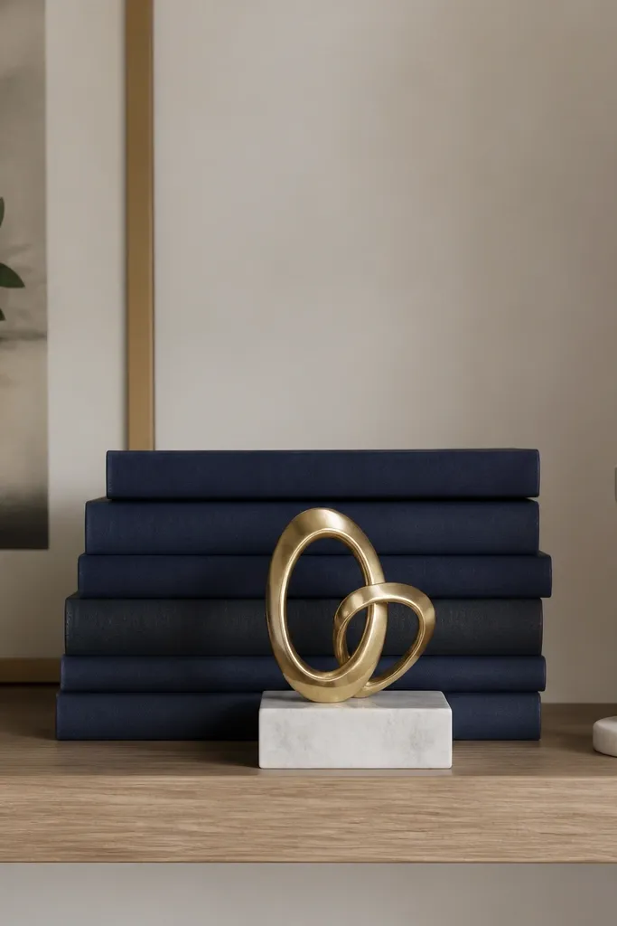
Navy and gold is a dependable combo that looks crisp in daylight and cozy at night. The navy books create a strong visual block, and the gold sculpture adds a little sparkle without needing a lamp. This is the shelf I reach for when your living room has navy throw pillows, a blue rug, or brass hardware. It flatters rooms with warm whites and light wood because the contrast is clear but not harsh.
Good to knowPick one reflective element (gold sculpture) and keep everything else matte for a clean look.
Center the navy book stack first, keeping it about 10-12 inches wide. Place the gold sculpture on a small marble base right in front of the books, leaving a 1-inch gap from the shelf front. Add a single white candle holder on the right end to lighten the palette. On the left side, leave space — a gap is part of the design here, so don’t fill every inch.
AvoidAvoid adding more than one gold item; it can tip from chic to cluttered fast.
11. White Oversized Vase + Dried Pampas (No Fluff)
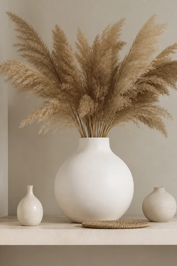
A big white vase gives you the “air” factor that makes shelves feel lighter, even when you have several items. Dried pampas adds texture that reads soft in spring, summer, and fall, and it still works when you swap to darker dried grasses in winter. I like matte white because it hides fingerprints and keeps the pampas from looking too bright. This setup flatters rooms with neutral walls and people who want a cozy, airy look without bright patterns.
Good to knowSpray dried grass with a light hairspray mist from 12 inches away to reduce shedding.
Place the oversized vase slightly off-center (about 1-2 inches) so it feels styled, not factory-perfect. Fan the pampas outward so the highest plume reaches the back edge but doesn’t hit the ceiling when you stand in front of it. Add two small bud vases on the opposite side from where the pampas is densest, so the visual weight balances. Put a slim woven coaster at the front center and keep the rest of the shelf open.
AvoidAvoid packing pampas too tightly; thin, spaced plumes look intentional.
12. Black-Rim Mirror + Tiny Vessels
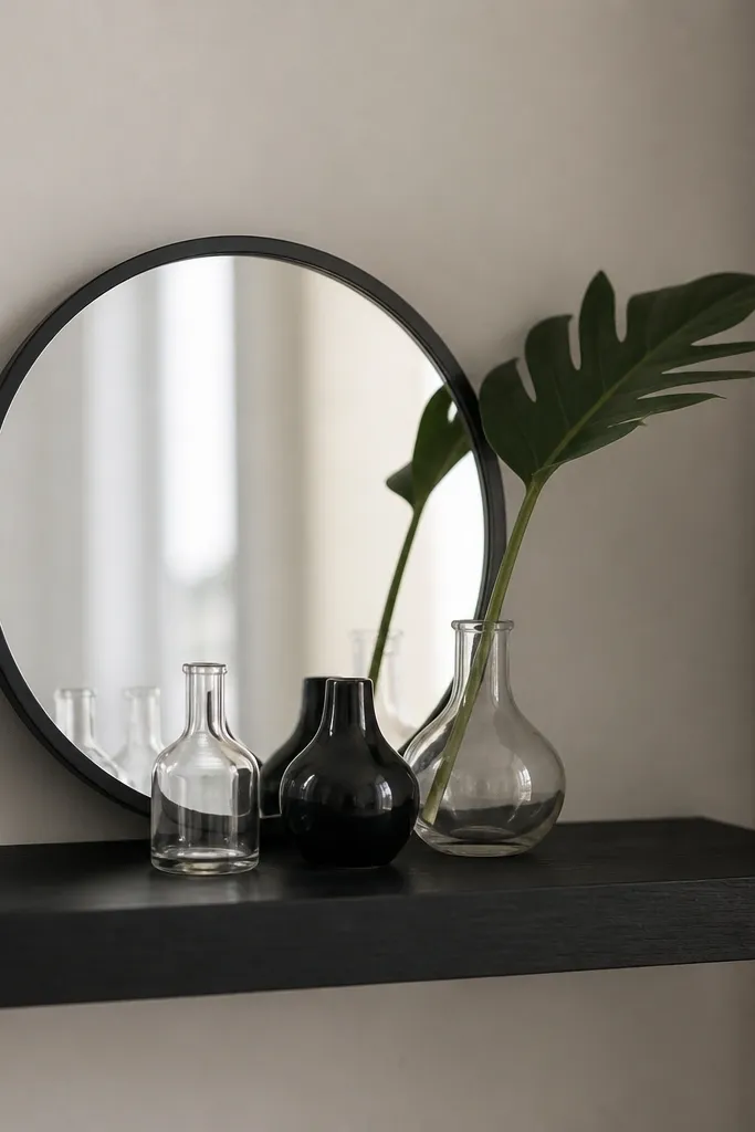
A mirror on a shelf adds depth fast, and it makes the decor look like it continues behind the shelf. The black rim ties into modern lighting and keeps the mirror from feeling delicate. Tiny vessels in clear glass prevent the shelf from looking heavy, and the diagonal leaf stem gives you a directional line. This setup flatters small living rooms because it visually expands the wall area, especially when you have a lamp that hits the shelf.
Good to knowAngle the mirror slightly by rotating it 10-15 degrees; it catches light without looking crooked.
Set the mirror toward the back center of the shelf, leaving at least 2 inches from the shelf edges. Place three tiny vessels in a loose triangle in front of the mirror, with the largest vessel centered and the two smaller ones slightly forward. Add one diagonal stem across the front corner so it points toward the mirror. Keep the palette tight: black, clear, and one green accent.
AvoidAvoid putting large objects in front of a shelf mirror; it blocks the depth effect.
13. Color-Block Throw + Shelf Reflection Styling
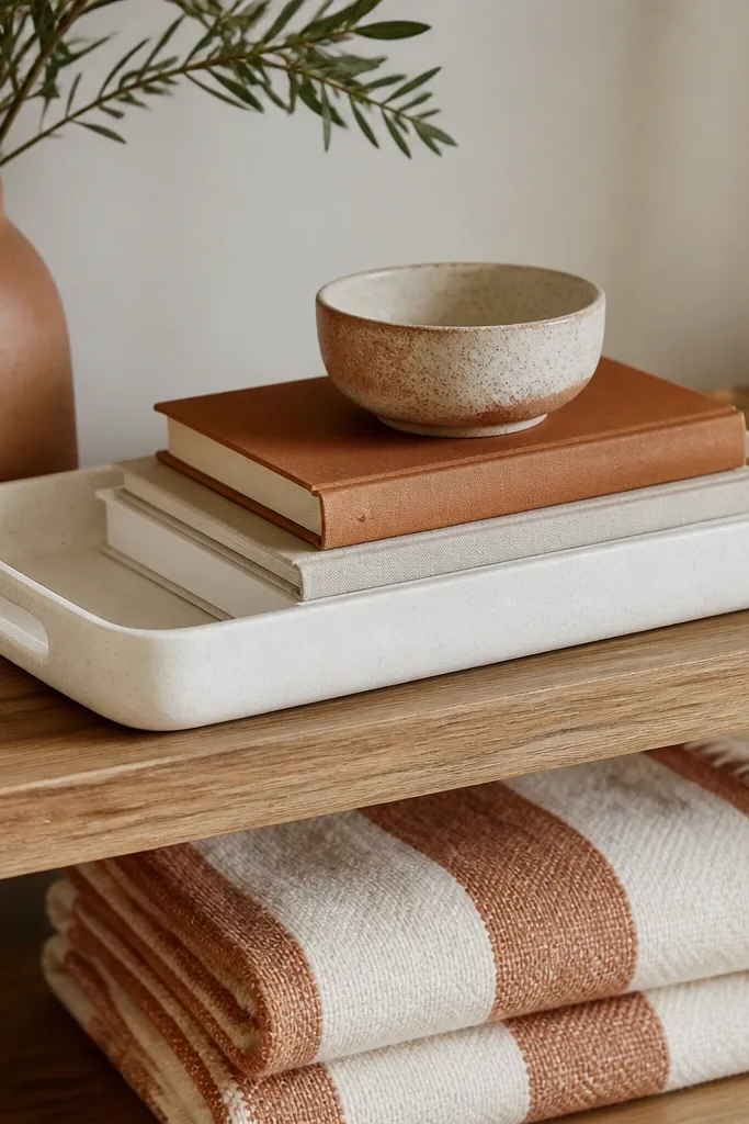
This idea uses the shelf and the nearby throw as one combined composition. When the shelf colors match the blanket stripes, the whole wall feels designed even if the shelf itself is simple. I’ve done this in living rooms with neutral walls where the only color comes from a sofa throw — the shelf makes that color feel intentional. It flatters people who like cozy, lived-in decorating but still want clean lines on the wall.
Good to knowFold the throw so the stripe line is straight — shelves look better when the nearby textiles are crisp too.
Start by choosing one dominant blanket color from the throw (terracotta, for example) and match it with one ceramic piece or candle holder on the shelf. Put a white tray centered on the shelf and place a book stack inside it so the tray acts like a frame. Add a small ceramic bowl on the tray edge and one thin decorative stem or branch. Leave 4-6 inches of space on at least one side of the shelf so the blanket stripe can carry the rest of the visual weight.
AvoidAvoid mismatching shelf colors that are close but not the same undertone — “beige” and “cream” can fight.
14. Seasonal Garland on a Back Rail
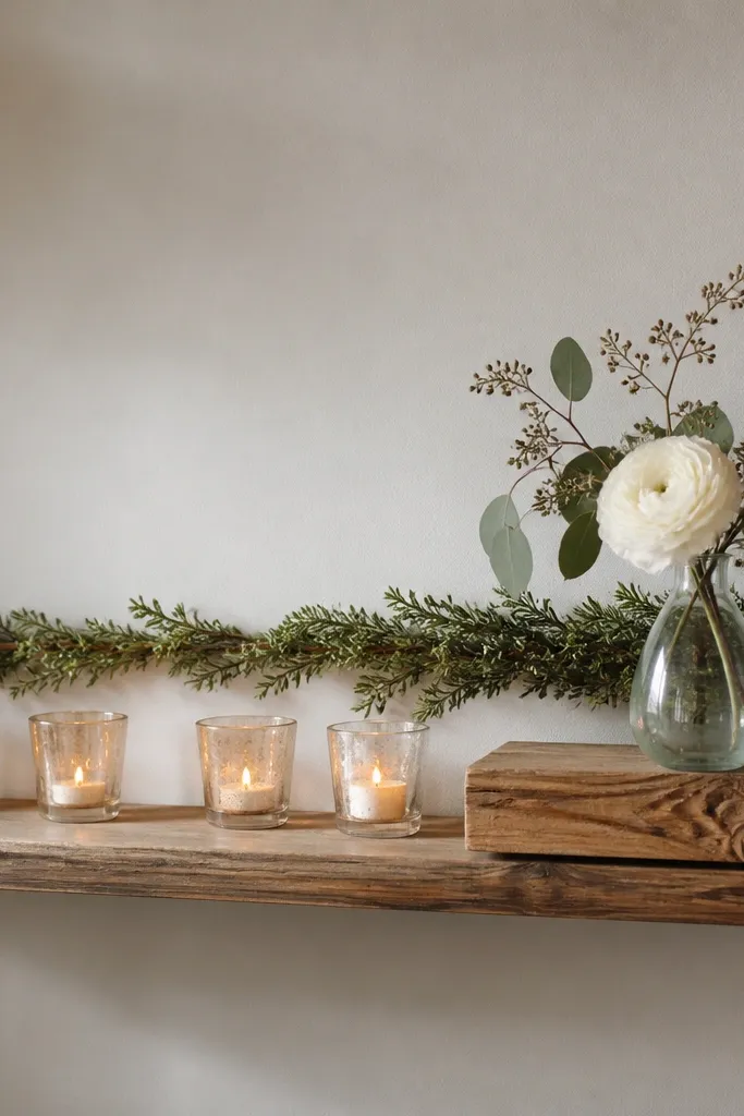
Garlands look great on floating shelves when you treat them like a background line, not a pile. A thin garland draped along the back edge gives you a seasonal cue while keeping the front clean and usable. I use this when I need “all year” styling but don’t want to swap big decor items every season. It flatters almost any room because you can choose garland tones that match your wall color and your existing metals.
Good to knowUse clear command hooks behind the shelf line so the garland doesn’t slide forward.
Attach or place your garland along the back edge so it stays behind the main objects. Start the front styling with a row of candles in glass holders — three for a shorter shelf, five for a longer one. Add one wood block or slim tray in the center front so the garland doesn’t look like it’s just hanging. For seasonal changes, swap only the garland (green pine look in winter, light florals in spring) while keeping the candle and wood block positions the same.
AvoidAvoid garlands that are too thick — they block the shelf view and look like a craft project.
15. Greenery in Glass Bottles with Clear Air
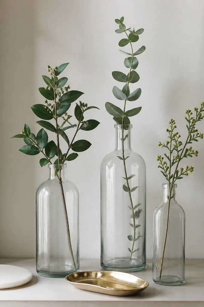
Clear glass bottles give you that airy look that stays fresh year-round because they don’t visually weigh down the shelf. Greenery in individual bottles keeps things from turning into one big mass, and it looks good even when you’re not replacing flowers often. This setup works especially well in living rooms with glass coffee tables, light curtains, or lots of natural light. It flatters people who like modern, clean styling but still want organic texture.
Place the tallest bottle in the center back, then put two shorter bottles on either side with about 6 inches between them. Use stems that have similar leaf size so the shelf looks intentional, not random. Add a small gold tray at the front center and place a white ceramic coaster or tiny dish on it. Step back and adjust bottle angles so the leaves don’t all lean the same direction.
Top off water weekly and keep stems trimmed to the same height so the shelf stays balanced.
Avoid opaque bottles in a light room — they can make the shelf feel heavier than you want.
16. Tall Vase + Floating Shelf Book Spine Color Theme
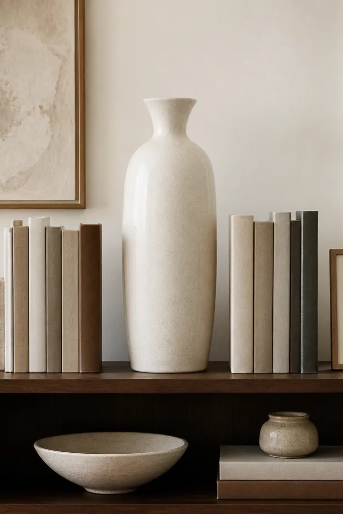
Coordinated book spines turn a shelf into a color system. A tall warm-white vase acts like a neutral anchor so your color theme stays the star. I’ve used this in living rooms with patterned rugs where you don’t want more prints — the books give structure without adding chaos. It flatters rooms that need order and people who like a calm, curated look that still feels cozy.
Pick one color family for the book spines (like sage, cream, and soft gray) and stick to it across both sides. Place the tall vase first at the back center. Build two book stacks on each side, keeping their heights within 1 inch of each other. Add one small framed piece at one end — not centered — so the shelf has a clear focal path from vase to books to frame.
Use book jackets you can remove so the spines match your theme exactly.
Avoid mixing spine colors that are too close to each other but different undertones — it looks accidental.
17. Woven Charger + Ceramic Bowls for Everyday Entertaining
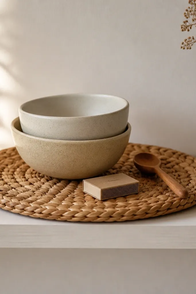
This is the shelf styling I use when people actually use the space. A woven charger gives you a defined base, and ceramic bowls look good even when they’re empty because their shape holds the eye. The muted sand and oat tones look right in every season because they don’t rely on bright seasonal colors. This setup flatters homes that have a coffee table vibe — it feels ready for guests without looking like holiday decor.
Good to knowChoose chargers with a tight weave — loose weaves catch dust and look messy faster.
Place the woven charger centered on the shelf front, then put two ceramic bowls on top with one slightly larger and moved a couple inches forward. Add a small wooden spoon or utensil across one bowl like a casual prop. Put a matchbox or small dish at the far edge so it looks like part of the set. Keep the background simple: if your wall is busy, don’t add extra frames behind the charger.
AvoidAvoid glossy ceramic bowls on a shelf with heavy sunlight; glare makes them look cheap.
18. Two-Tier Look with Small Sculpture and Leaning Frame
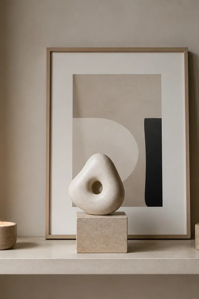
You get a two-tier effect without stacking big items. The pedestal sculpture creates height, and the leaning frame creates a back layer that reads like a gallery wall. Candles at the ends complete the symmetry and make the shelf feel finished even when you’re not adding seasonal pieces. This setup flatters living rooms with neutral walls and people who want a clean, modern look with one “wow” object.
Good to knowPick one sculpture material to match your room metal — brass pedestal for brass lighting, black pedestal for black hardware.
Center a pedestal sculpture at the back of the shelf so it’s the anchor. Lean a medium framed print behind it, with the bottom edge just above the shelf surface. Place two short candle holders at each end, keeping their heights matched. Leave the front center clear except for the sculpture base so the shelf doesn’t look crowded.
AvoidAvoid placing the leaning frame too low; if it sits flat against objects, it looks like a stack.
19. Monochrome Tray + Mini Plant Rotate Station
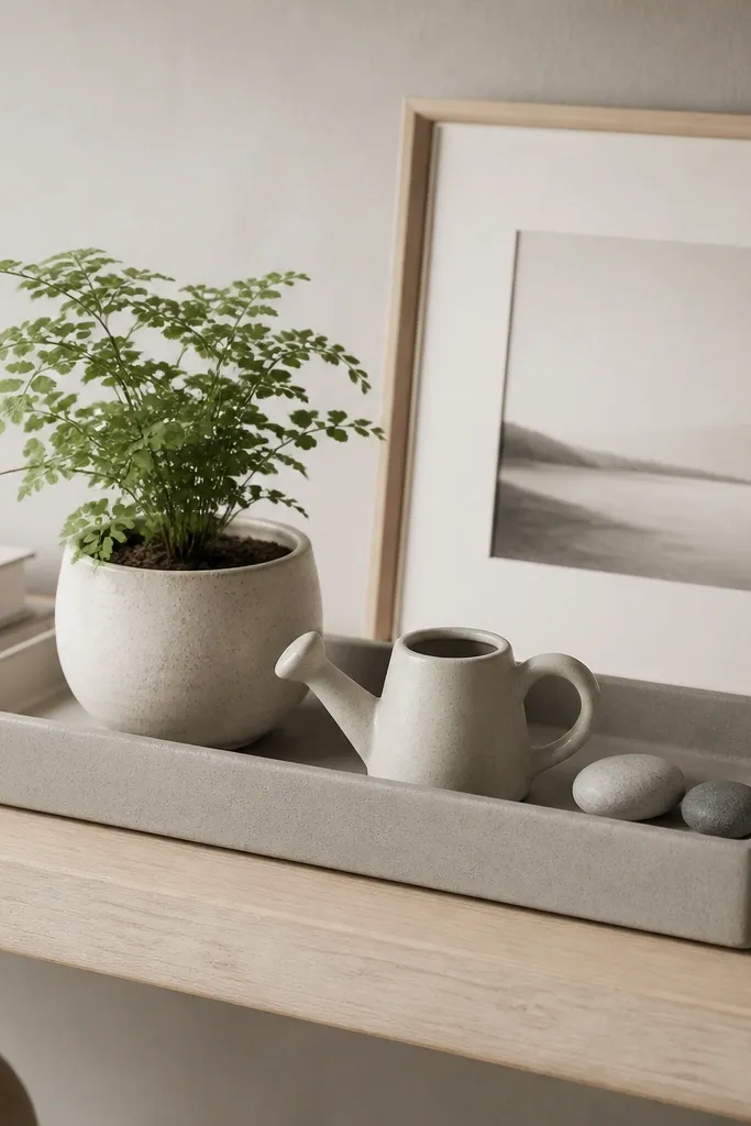
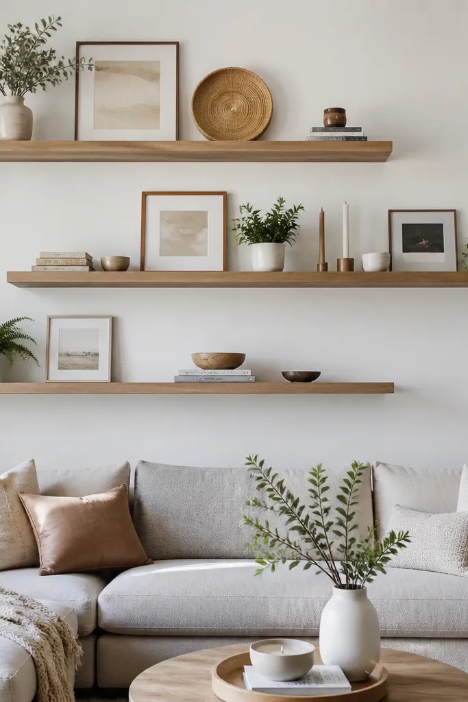
This is the easiest way to keep Floating Shelves Living Room all year looking fresh: you rotate one mini plant and keep everything else in place. A rectangular tray creates a clean boundary so the shelf reads organized even when the plant changes. Monochrome trays in black, charcoal, or matte white work with almost any room palette. It flatters people who like low-maintenance decor and want seasonal variety without big purchases.
Good to knowUse one pot size and swap only the plant type seasonally — pothos in summer, small winter-friendly greens in colder months.
Place the monochrome tray centered on the shelf, leaving equal space on both ends. Add one mini plant pot inside the tray and push it slightly back so it doesn’t sit at the front edge. Add a tiny ceramic watering can on one side of the tray and a small set of stones or pebbles on the other. Lean a small framed print behind the tray, then keep the shelf otherwise empty so the rotation feels intentional.
AvoidAvoid using a tray that’s too small for the plant pot; it looks like it’s crammed in.
20. Oversized Oval Tray + Stacked Coasters
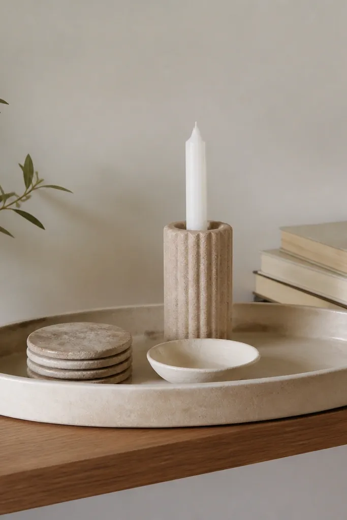
An oversized tray is the cheat code for looking styled even when you’re not. It creates a single “zone,” and the objects inside can be practical — coasters, a dish for keys, candle holders. I like oval trays because they look softer than rectangles and they fit the flow of a living room wall. This setup flatters people who entertain and want decor that doesn’t feel precious.
Set the oval tray centered and keep it parallel to the shelf edge. Stack four to six coasters inside the tray on one side, then place a small ceramic dish on top or beside the stack. Put one taller candle holder at the tray opposite side so the height difference reads clearly. Add a book stack at the back corner outside the tray only if your shelf is wide; otherwise keep it all inside the tray.
Choose coasters with a texture you can see — cork, linen, or stone — so the tray looks interesting up close.
Avoid leaving the tray empty in the middle; a tray needs at least one stacked or layered element.